Category Archives: design

G4M3R 7H30RY: part 4

screencap.gif
We’ve moved past the design stage with the GAM3R 7H30RY blog and forum. We’re releasing the book in two formats: all at once (date to be soon decided), in the page card format, and through RSS syndication. We’re collecting user input and feedback in two ways: from comments submitted through the page-card interface, and in user posts in the forum.
The idea is to nest Ken’s work in the social network that surrounds it, made visible in the number of comments and topics posted. This accomplishes something fairly radical, shifting the focus from an author’s work towards the contributions of a work’s readers. The integration between the blog and forums, and the position of the comments in relation to the author’s work emphasizes this shift. We’re hoping that the use of color as an integrating device will further collapse the usual distance between the author and his reading (and writing) public.
To review all the stages that this project has been through before it arrived at this, check out Part I, Part II, and Part III. The design changes show the evolution of our thought and the recognition of the different problems we were facing: screen real estate, reading environment, maintaining the author’s voice but introducing the public, and making it fun. The basic interaction design emerged from those constraints. The page card concept arose from both the form of Ken’s book—a regimented number of paragraphs with limited length—and the constraints of screen real estate (1024×768). The overlapping arose from the physical handling of the ‘Oblique Strategies’ cards, and helps to present all the information on a single screen. The count of pages (five per section, five sections per chapter) is a further expression of the structure that Ken wrote into the book. Comments were lifted from their usual inglorious spot under the writer’s post to be right beside the work. It lends them some additional weight.
We’ve also reimagined the entry point for the forums with the topic pool. It provides a dynamic view of the forums, raising the traditional list into the realm of something energetic, more accurately reflecting the feeling of live conversation. It also helps clarify the direction of the topic discussion with a first post/last post view (visible in the mouseover state below). This simple preview will let users know whether or not a discussion has kept tightly to the subject or spun out of control into trivialities.
topicpool_screencap.gif
We’ve been careful with the niceties: the forum indicator bars turned on their sides to resemble video game power ups; the top of the comments sitting at the same height as the top of their associated page card; the icons representing comments and replies (thanks to famfamfam).
Each of the designed pages changed several times. The page cards have been the most drastically and frequently changed, but the home page went through a significant series of edits in a matter of a few days. As with many things related to design, I took several missteps before alighting on something which seems, in retrospect, perfectly obvious. Although the ‘table of contents’ is traditionally an integrated part of a bound volume, I tried (and failed) to create a different alignment and layout with it. I’m not sure why—it seemed like a good idea at the time. I also wanted to include a hint of the pages to come—unfortunately it just made it difficult for your eye move smoothly across the page. Finally I settled on a simpler concept, one that harmonized with the other layouts, and it all snapped into place.
homepage_screencap.gif

homepage_screencap.gif
With that we began the production stage, and we’re making it all real. Next update will be a pre-launch announcement.

serial killer

Alex Lencicki is a blogger with experience serializing novels online. Today, in a comment to my Slate networked book post, he links to a wonderful diatribe on his site deconstructing the myriad ways in which Slate’s web novel experiment is so bad and so self-defeating — a pretty comprehensive list of dos and don’ts that Slate would do well to heed in the future. In a nutshell, Slate has taken a novel by a popular writer and apparently done everything within its power to make it hard to read and hard to find. Why exactly they did this is hard to figure out.
Summing up, Lencicki puts things nicely in context within the history of serial fiction:

The original 19 th century serials worked because they were optimized for newsprint, 21st century serials should be optimized for the way people use the web. People check blogs daily, they download pages to their phones, they print them out at work and take them downstairs on a smoke break. There’s plenty of room in all that activity to read a serial novel – in fact, that activity is well suited to the mode. But instead of issuing press releases and promising to revolutionize literature, publishers should focus on releasing the books so that people can read them online. It’s easy to get lost in a good book when the book adapts to you.

sonogram of networked book in embryo (GAM3R 7H30RY part 3)

It probably won’t be until mid to late March that we finally roll out McKenzie Wark’s GAM3R 7H30RY Version 10.1, but substantial progress is being made. Here’s a snapshot:
kenwark.final.jpg
After debating (part 1) our way to a final design concept (part 2), we’re now focused (well, mainly Jesse at this point) on hammering the thing together. We’re using all open source software and placing the book under a Creative Commons Attribution-NonCommercial-ShareAlike 2.0 license. Half the site will consist of a digital edition of the book in Word Press with a custom-built card shuffling interface. As mentioned earlier, Ken has given us an incredibly modular structure to work with (a designer’s dream): nine chapters (so far), each consisting of 25 paragraphs. Each chapter will contain five five-paragraph stacks with comments popping up to the side for whichever card is on top. No scrolling is involved except in the comment field, and only then if there is a substantial number of replies.
The graphic above shows the color scale we’re thinking of for the different chapters. As they progress, each five-card stack will move from light to dark within the color of its parent chapter. Floating below the color spectrum is the proud parent of the born-digital book: McKenzie Wark, Space Invader (an image that will appear in some fashion throughout the site). Right now he’s a fairly mean-looking space invader — on a bombing run or something. But we’re thinking of shuffling a few pixels to give him a friendlier appearance.
You are also welcome to view an interactive mock-up of the card view (click on the image below):
wark cards 1.jpg
The other half of the site will be a discussion forum set up in PHP Bulletin Board. Actually, it’ll be a collection of nine discussion forums: one for each chapter of the book, each focusing (except for the first, which is more of an introduction) on a specific video game. Here’s how it breaks down:
* Allegory (on The Sims)
* America (on Civilization III)
* Analog (on Katamari Damarcy)
* Atopia (on Vice City)
* Battle (on Rez)
* Boredom (on State of Emergency)
* Complex (on Deus Ex)
* Conclusions (on SimEarth)
The gateway to each forum will be a two-dimensional topic graph where forum threads float in an x-y matrix. Their position in the graph will be determined by the time they were posted and the number of comments they’ve accumulated so far. Thus, hot topics will rise toward the top while simultaneously being dragged to the left (and eventually off the chart) by the progression of time. Something like this:
topic-graph.jpg
At this point there’s no way of knowing for sure which part of the site will be more successful. The book view is designed to gather commentary, and Ken is sincerely interested in reader feedback as he writes and rewrites. There will also be the option of syndicating the book to be digested serially in an RSS reader. We’re very curious to see how readers interact with the text and hope we’ve designed a compelling environment in which to do so.
Excited as we are about the book interface, our hunch is that the discussion forum component has the potential to become the more vital half of the endeavor. The forum will be quite different from the thousands of gaming sites already active on the web in that it will be less utilitarian and more meditative in its focus. This won’t be a place for posting cheats and walk-throughs but rather a reflective space for talking about the experience of gaming and what players take games to mean. Our hope is that people will have quite a bit to say about this — some of which may end up finding its way into the book.
Although there’s still a ways to go, the process of developing this site has been incredibly illuminating in our thinking about the role of the book in the network. We’re coming to understand how the book might be reinvented as social software while still retaining its cohesion and authorial vision. Stay tuned for further developments.

travel blindness

I went to Paris last weekend. I have a friend there with an apartment, flights are cheap in the off season, and I’ve never been there before. As might have been expected, I learned absolutely nothing about France. But I did come away with a lot of food for thought about America – specifically, how books work in the United States. Says Gilles Deleuze: “travel does not connect places, but affirms only their difference.” He’s right: sometimes you needs to get away from a place to think about it.

Three observations, then, on how books work in the United States w/r/t my French observations. This post is perhaps less liberal in its interpretation of books than we usually are around here: bear with me for a bit, there’s still plenty of rampant generalizing.

*     *     *     *     *

Wandering around the Sorbonne, my friend & I came upon the Librerie Philosophique J. Vrin and went in. It’s a good-sized bookshop that’s devoted entirely to used and new philosophy books, mostly in French, although the neatly categorized shelves are noticeably peppered with other languages. On the Saturday evening I was there, it was full of browsing customers: it’s obviously a working bookstore. We don’t have philosophy book stores in the U.S. One finds, of course, no end of religious bookstores, but unless I’m tremendously mistaken, there’s none dedicated solely to philosophy. (And as far as I know, there’s only one poetry bookstore remaining in the U.S.)

It’s a(n admittedly minor) shock to find oneself in a philosophy bookstore. But a deeper question tugs at me: why aren’t there philosophy book stores in the United States? I’m certainly not qualified to judge what the existence of J. Vrin says about France, but its lack of an analogue in the U.S. clearly says something (besides the obvious “the market won’t support it”). Are we not thinking about big ideas and shipping them about in books? Are the only people who need to read Plato our neocon overlords? Why don’t we need books like these?

*     *     *     *     *

Another thing you notice at J. Vrin, as well as elsewhere in Paris: how monotone the books are. It’s not quite a color-coordinated bookstore but it’s close: just about every spine is white, a smaller number being yellow, a smattering of other colors. If you pull a book out, the cover designs are mostly in a classic French style: lots of space, Didot type, some discreet flourishes. These two are typical:

agamben.jpg     derrida.jpg

I’m not tremendously interested in French book style of itself, though: I’m more interested in what this minimalist tendency reveals about American book design and the ideas behind it. A trio of comparisons: the French on the left of each pair, the American on the right:

deleuze.french.gif     deleuze.english.jpg

casanova.french.jpg     casanova.english.jpg

nothomb.french.jpg     nothomb.english.jpg

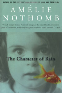
The American covers seem more designed – not necessarily better designed, that goes both ways – but they clearly exist as marketing. The French book covers aren’t advertising in the same way that the American book covers are. The implication here seems to be that French books are for reading, rather than for looking at. Nobody’s going to pick up one of those because of the way the cover looks. It’s presumed that the reader is already interested in the content of the book; what’s on the cover won’t change that interest. There’s a lot more variety in the American books: I might be persuaded to pick up the Deleuze book on Proust (where the quotation above came from) because it looks nice, or dissuaded from picking up the Amélie Nothomb book because it looks so horrible & the title was mangled into something out of Crate & Barrel.

herr tschicholdThere’s an essay by Jan Tschichold, the doyen of modern book design, advising the reader that the jacket of a hardcover book should be taken off and thrown away as soon as you get the book home. This seems heretical to a book collector (or designer), but I think his point ultimately makes sense: books shouldn’t exist as art objects, they exist to be read. Design should focus attention on, not deflect attention from, the ideas in the book. American book design has drifted away from that precept. (Tschichold, were he still alive, might argue that it’s failed entirely: that essay appears in a book titled The Form of the Book: Essays on the Morality of Good Design which has hardened into an art object: get a used copy for $102.50.)

Probably I didn’t need to go to France to figure this out: scrutinizing the Spanish and Bangla bookshops and bookcarts in my neighborhood reveals book covers that are closer to French than American design.

*     *     *     *     *

Back to advertising: in the windows of wine bars, one sees volumes of Deleuze and Julia Kristeva, not exactly what we usually construe as light café reading. These books are cultural signifiers: presumably the right sort of passersby see them and understand that the winebar is the right sort of place for people like them. Could you do this in the U.S.? You could; by putting Stanley Cavell and Peter Singer in the window, I suspect that you’d attract a lot of confusion and maybe, if you were lucky, some shabby grad students. In Paris: pretty people. (Are they actually interested in Kristeva and Deleuze, or are they just interested in the wine? Again: no idea.)

It’s worth pointing out that Paris didn’t seem technologically reactionary to me: books haven’t succeeded at the expense of newer media. Paris is full of wireless, for example, and URLs are splattered all over advertisements. If anything, books seem to have succeeded with new media: a casual flip through the enormous number of channels on my friend’s television yielded a couple of book review programs. Again: books are part of the cultural discourse there in a way that isn’t the case here.

*     *     *     *     *

I haven’t mentioned snobbery yet, though that’s obviously an essential part of this discourse. No one imagines that the majority of the French care that much about Derrida, and it’s clear the French have their own problems which don’t need my interpretations. And more importantly: it would be foolish to jump to the conclusion that America is anti-literary. I’m reminded of the bit in Proust’s Time Regained where the Baron de Charlus, equally drawn to both sides in WWI, declares himself pro-German because he’s surrounded by people parroting pro-French platitudes and he can’t stand them. I won’t deny that there’s a little bit of Charlus in my stance. But I do think that the lens of snobbery can be a useful way to scrutinize how cultural capital works, and this analysis can be broadened to look at the sort of big-picture questions we’re interested in at the Institute. Nor am I the only one who’s noticed this: a better analysis than my own can be found in Pascale Casanova’s The World Republic of Letters (depicted above in both French and American editions), a book from a few years ago:

. . . New York and London cannot be said to have replaced Paris in the structure of literary power: one can only note that, as a result of the generalization of the Anglo-American model and the growing influence of financial considerations, these two capitals tend to acquire more and more power in the literary world. But one must not oversimplify the situation by applying a political analysis that opposes Paris to New York and London, or France to the United States.”

(p. 168.) Casanova’s book is a nice (and readable) study of how literature functions globally as cultural capital; this review by William Deresiewicz in The Nation is a serviceable introduction. It’s a useful text for thinking about how big ideas have historically been “legitimated” (her term) and disseminated. Along the way, she can’t help but make a strong case for Paris being the historic arbiter of much of the world’s taste: Joyce, Faulkner, Borges, Wiesel (a list which could be extended at length) all first came to global prominence through French interest.

Another reminder that things are different in different countries: earlier this week, Pedro Meyer, the Mexican photographer who runs ZoneZero had a long lunch with the Institute, where he reiterated that the way books function in the U.S. is not necessarily the way they function in Latin America, where books are much scarcer and bookshops generally nonexistent. Meyer’s concerns echo those of Nigerian writer Chinua Achebe who blisters at American critics arguing that African novels are universal, only with different names:

“Does it ever occur to these [academics] to try out their game of changing names of characters and places in an American novel, say, a Philip Roth or an Updike, and slotting in African names just to see how it works? But of course it would not occur to them. It would never occur to them to doubt the universality of their own literature. In the nature of things the work of a Western writer is automatically informed by universality. It is only others who must strain to achieve it . . . I should like to see the word ‘universal’ banned altogether from discussions of African literature until such time as people cease to use it as a synonym for the narrow, self-serving parochialism of Europe, until their horizon extends to include all the world.”

(p. 156 in Casanova.) Culture cuts both ways. It’s important to remember that the ways books (and, by extension, their electronic analogues) function in American society isn’t the only way they can or should function. We tend to fall into the assumption that there is no alternative to the way we live. This is myopia, a myopia we need to continually recognize.

yahoo! ui design library

yahoo! logoThere are several reasons that Yahoo! released some of their core UI code for free. A callous read of this would suggest that they did it to steal back some goodwill from Google (still riding the successful Goolge API release from 2002). A more charitable soul could suggest that Yahoo! is interested in making the web a better place, not just in their market-share. Two things suggest this—the code is available under an open BSD license, and their release of design patterns. The code is for playing with; the design patterns for learning from.
The code is squarely aimed at folks like me who would struggle mightily to put together a default library to handle complex interactions in Javascript using AJAX (all the rage now) while dealing with the intricacies of modern and legacy browsers. Sure, I could pull together the code from different sources, test it, tweak it, break it, tweak it some more, etc. Unsurprisingly, I’ve never gotten around to it. The Yahoo! code release will literally save me at least a hundred hours. Now I can get right down to designing the interaction, rather than dealing with technology.
The design patterns library is a collection of best practice instructions for dealing with common web UI problems, providing both a solution and a rationale, with a detailed explanation of the interaction/interface feedback. This is something that is more familiar to me, but still stands as a valuable resource. It is a well-documented alternate viewpoint and reminder from a site that serves more users in one day than I’m likely to serve in a year.
Of course Yahoo! is hoping to reclaim some mind-space from Google with developer community goodwill. But since the code is general release, and not brandable in any particular way (it’s all under-the-hood kind of stuff), it’s a little difficult to see the release as a directly marketable item. It really just seems like a gift to the network, and hopefully one that will bear lovely fruit. It’s always heartening to see large corporations opening their products to the public as a way to grease the wheels of innovation.

who really needs to turn the pages?

The following post comes from my friend Sally Northmore, a writer and designer based in New York who lately has been interested in things like animation, video game theory, and (right up our alley) the materiality of books and their transition to a virtual environment. A couple of weeks ago we were talking about the British Library’s rare manuscript digitization project, “Turning the Pages” — something I’d been meaning to discuss here but never gotten around to doing. It turns out Sally had some interesting thoughts about this so I persuaded her to do a brief write-up of the project for if:book. Which is what follows below. Come to think of it, this is especially interesting when juxtaposed with Bob’s post earlier this week on Jefferson Han’s amazing gestural interface design. Here’s Sally… – Ben
The British Library’s collaboration with multimedia impresarios at Armadillo Systems has led to an impressive publishing enterprise, making available electronic 3-D facsimiles of their rare manuscript collection.
“Turning the Pages”, available in CD-ROM, online, and kiosk format, presents the digital incarnation of these treasured texts, allowing the reader to virtually “turn” the pages with a touch and drag function, “pore over” texts with a magnification function, and in some cases, access extras such as supplementary notes, textual secrets, and audio accompaniment.
turning pages mozart.jpg
Pages from Mozart’s thematic catalogue — a composition notebook from the last seven years of his life. Allows the reader to listen to works being discussed.
The designers ambitiously mimicked various characteristics of each work in their 3-D computer models. For instance, the shape of a page of velum turning differs from the shape of a page of paper. It falls at a unique speed according to its weight; it casts a unique shadow. The simulation even allows for a discrepancy in how a page would turn depending on what corner of the page you decide to peel from.
Online visitors can download a library of manuscripts in Shockwave although these versions are a bit clunkier and don’t provide the flashier thrills of the enormous touch screen kiosks the British Library now houses.
turning pages map.jpg
Mercator’s first atlas of Europe – 1570s
Online, the “Turning the Pages” application forces you to adapt to the nature of its embodiment–to physically re-learn how to use a book. A hand cursor invites the reader to turn each page with a click-and-drag maneuver of the mouse. Sounds simple enough, but I struggled to get the momentum of the drag just right so that the page actually turned. In a few failed attempts, the page lifted just so… only to fall back into place again. Apparently, if you can master the Carpal Tunnel-inducing rhythm, you can learn to manipulate the page-turning function even further, grabbing multiple of pages at once for a faster, abridged read.
The value of providing high resolution scans of rare editions of texts for the general public to experience, a public that otherwise wouldn’t necessarily ever “touch” say, the Lindisfarne Gospels, doesn’t go without kudos. Hey, democratic right? Armadillo Systems provides a list of compelling raisons d’être on their site to this effect. But the content of these texts is already available in reprintable (democratic!) form. Is the virtual page-turning function really necessary for greater understanding of these works, or a game of academic scratch-n-sniff?
turning pages davinci.jpg
The “enlarge” function even allows readers to reverse the famous mirror writing in Leonardo da Vinci’s notebooks
At the MLA conference in D.C. this past December, where the British Library had set up a demonstration of “Turning the Pages”, this was the question most frequently asked of the BL’s representative. Who really needs to turn the pages? I learned from the rep’s response that, well, nobody does! Scholars are typically more interested studying the page, and the turning function hasn’t proven to enhance or revive scholarly exploration. And surely, the Library enjoyed plenty of biblio-clout and tourist traffic before this program?
But the lure of new, sexy technology can’t be underestimated. From what I understood, the techno-factor is an excellent beacon for attracting investors and funding in multimedia technology. Armadillo’s web site provides an interesting sales pitch:

By converting your manuscripts to “Turning the Pages” applications you can attract visitors, increase website traffic and add a revenue stream – at the same time as broadening access to your collection and informing and entertaining your audience.

The program reveals itself to be a peculiar exercise, tangled in its insistence on fetishizing aspects of the material body of the text–the weight of velum, the karat of gold used to illuminate, the shape of the binding. Such detail and love for each material manuscript went into this project to recreate, as best possible, the “feel” of handling these manuscripts.
Under ideal circumstances, what would the minds behind “Turning the Pages” prefer to create? The original form of the text–the “alpha” manuscript–or the virtual incarnation? Does technological advancement seduce us into valuing the near-perfect simulation over the original? Are we more impressed by the clone, the “Dolly” of hoary manuscripts? And, would one argue that “Turning the Pages” is the best proxy for the real thing, or, another “thing” entirely?

GAM3R 7H30RY: part 2

Read Part 1
We had a highly productive face to face meeting with Ken this afternoon to review the prior designs and to try and develop, collaboratively, a solution based on the questions that arose from those designs. We were aiming for a solution that provides a compelling interface for Ken’s book and also encourages open-ended discussion of the themes and specific games treated in the book.
What we came up with was a prototype of a blog/book page that presents the entire text of GAM3R 7H30RY, and a discussion board based around the games covered in the book, each corresponding with a specific chapter. These are:

  • Allegory (on The Sims)
  • America (on Civilization III)
  • Analog (on Katamari Damarcy)
  • Atopia (on Vice City)
  • Battle (on Rez)
  • Boredom (on State of Emergency)
  • Complex (on Deus Ex)
  • Conclusions (on SimEarth)

Unlike the thousand of gaming forums that already exist throughout the web, this discussion space will invite personal and social points of view, rather than just walkthroughs and leveling up cheats.
We also discussed the fact that discussion boards tend towards opacity as they grow, and ways to alleviate that situation. Growth is good; it reflects a rich back and forth between board participants. Opacity is bad; it makes it harder for new voices to join the discussion. To make it easier for people to join the discussion, Ken envisioned an innovative gateway into the boards based on a shifting graph of topics ranked by post date (x-axis) and number of responses (y-axis). This solution was inspired in part by “The Pool” — “a collaborative online environment for creating art, code, and texts” developed by Jon Ippolito at the University of Maine — in which ideas and project proposals float in different regions of a two-dimensional graph depending on quantity and tenor of feedback from the collective.
Returning to the book view, to push the boundaries of the blog form, we introduced a presentation format that uniquely fits around McKenzie’s book form—twenty-five regularly sized paragraphs in nine different chapters. Yes, each chapter has exactly 25 paragraphs, making mathematically consistent presentation possible (as an information designer I am elated at this systematic neatness). We decided on showing a cascade of five paragraphs, with one paragraph visible at a time, letting you navigate through chapters and then sets of five paragraphs within a chapter.
As a delightful aside, we started prototyping with a sheet of paper and index cards, but by some sideways luck we pulled out a deck of Brian Eno and Peter Schmidt’s Oblique Strategies cards, which suited our needs perfectly. The resulting paper prototype (photo w/ wireframe cues photoshop’d in):
IMG_0794.jpg
This project has already provided us with a rich discussion regarding authorship and feedback. As we develop the prototypes we will undoubtedly have more questions, but also, hopefully, more solutions that help us redefine the edges and forms of digital discourse.
Ben Vershbow contributed to this post.

GAM3R 7H30RY: a work in progress… in progress

SpaceInvader.jpg
McKenzie Wark

I’m pleased to report that the institute is gearing up for another book-blog experiment to run alongside Mitchell Stephens’ ongoing endeavor at Without Gods — this one a collaboration with McKenzie Wark, professor of cultural and media studies at the New School and author most recently of A Hacker Manifesto. Ken’s next book, Gamer Theory, is an examination of single-player video games that comes out of the analytic tradition of the Frankfurt School (among other influences). Unlike Mitch’s project (a history of atheism), Ken’s book is already written — or a draft of it anyway — so in putting together a public portal, we are faced with a very different set of challenges.
As with Hacker Manifesto, Ken has written Gamer Theory in numbered paragraphs, a modular structure that makes the text highly adaptable to different formats and distribution schemes — be it RSS syndication, ebook, or print copy. We thought the obvious thing to do, then, would be to release the book serially, chunk by chunk, and to gather commentary and feedback from readers as it progressed. The trouble is that if you do only this — that is, syndicate the book and gather feedback — you forfeit the possibility of a more free-flowing discussion, which could end up being just as valuable (or more) as the direct critique of the book. After all, the point of this experiment is to expose the book to the collective knowledge, experience and multiple viewpoints of the network. If new ideas are to be brought to light, then there ought to be ways for readers to contribute, not just in direct response to material the author has put forth, but in their own terms (this returns us to the tricky proprietary nature of blogs that Dan discussed on Monday).
So for the past couple of weeks, we’ve been hashing out a fairly ambitious design for a web site — a blog, but a little more complicated — that attempts to solve (or at least begin to solve) some of the problems outlined above. Our first aim was to infuse the single-author book/blog with the democratic, free-fire discussion of list servers — a feat, of course, that is far easier said than done. Another concern, simply from an interface standpoint, was to find ways of organizing the real estate of the screen that are more intuitive for reading.
Another thing we’ve lamented about blogs, and web sites in general, is their overwhelming verticality. Vertical scrolling fields — an artifact of supercomputer terminals and the long spools of code they spit out — are taken for granted as the standard way to read online. But nowhere was this ordained as the ideal interface — in fact it is designed more for machines than for humans, yet humans are the users on the front end. Text does admittedly flow down, but we read left to right, and its easier to move your eye across a text that is fixed than one that is constantly moving. A site we’ve often admired is The International Herald Tribune, which arranges its articles in elegant, fixed plates that flip horizontally from one to the next. With these things in mind, we set it as a challenge for ourselves to try for some kind of horizontally oriented design for Ken’s blog.
There’s been a fairly rigorous back and forth on email over the past two weeks in which we’ve wrestled with these questions, and in the interest of working in the open, we’ve posted the exchange below (most of it anyway) with the thought that it might actually shed some light on what happens — from design and conceptual standpoints — when you try to mash up two inherently different forms, the blog and the book. Jesse has been the main creative force behind the design, and he’s put together a lovely annotated page explaining the various mockups we’ve developed over the past week. If you read the emails (which are can be found directly below this paragraph) you will see that we are still very much in the midst of figuring this out. Feedback would be much appreciated. (See also GAM3R 7H30RY: part 2).

Continue reading

two newspapers

the usa today from todayI picked up The New York Times from outside my door this morning knowing that the lead headline was going to be wrong. I still read the print paper every morning – I do read the electronic version, but I find that my reading there tends to be more self-selecting than I’d like it to be – but lately I find myself checking the Web before settling down to the paper and a cup of coffee. On the Web, I’d already seen the predictable gloating and hand-wringing in evidence there. Because of some communication mixup, the papers went to press with the information that the trapped West Virginia coal miners were mostly alive; a few hours later it turned out that they were, in fact, mostly dead. A scrutiny of the front pages of the New York dailies at the bodega this morning revealed that just about all had the wrong news – only Hoy, a Spanish-language daily didn’t have the story, presumably because it went to press a bit earlier. At right is the front page of today’s USA Today, the nation’s most popular newspaper; click on the thumbnail for a more legible version. See also the gallery at their “newseum”. (Note that this link won’t show today’s papers tomorrow – my apologies, readers of the future, there doesn’t seem to be anything that can be done for you, copyright and all that.)

the new york times from 1950At left is another front page of a newspaper, The New York Times from April 20, 1950 (again, click to see a legible version). I found it last night at the start of Marshall McLuhan’s The Mechanical Bride: Folklore of Industrial Man. Published in 1951, The Mechanical Bride is one of McLuhan’s earliest works; in it, he primarily looks at the then-current world of print advertising, starting with the front page shown here. To my jaundiced eye, most of the book hasn’t stood up that well; while it was undoubtedly very interesting at the time – being one of the first attempts to seriously deal with how people interact with advertisements from a critical perspective – fifty years, and billions and billions of advertisements later, it doesn’t stand up as well as, say, Judith Williamson‘s Decoding Advertisements manages to. But bits of it are still interesting: McLuhan presents this front page to talk about how Stephane Mallarmé and the Symbolists found the newspaper to be the modern symbol of their day, with the different stories all jostling each other for prominence on the page.

But you don’t – at least, I don’t – immediately see that when you look at the front page that McLuhan exhibits. This was presumably an extremely ordinary front page when he was exhibiting it, just as the USA Today up top might be representative today. Looked at today, though, it’s something else entirely, especially when you what newspapers look like now. You can notice this even in my thumbnails: when both papers are normalized to 200 pixels wide, you can’t read anything in the old one, besides that it says “The New York Times” as the top, whereas you can make out the headlines to four stories in the USA Today. Newspapers have changed, not just from black & white to color, but in the way the present text and images. In the old paper there are only two photos, headshots of white men in the news – one a politician who’s just given a speech, the other a doctor who’s had his license revoked. The USA Today has perhaps an analogue to that photo in Jack Abramoff’s perp walk; it also has five other photos, one of the miners’ deluded family members (along with Abramoff, the only news photos), two sports-related photos – one of which seems to be stock footage of the Rose Bowl sign, a photo advertising television coverage inside, and a photo of two students for a human interest story. This being the USA Today, there’s also a silly graph in the bottom left; the green strip across the bottom is an ad.
Photos and graphics take up more than a third of the front page of today’s paper.

What’s overwhelming to me about the old Times cover is how much text there is. This was not a newspaper that was meant to be read at a glance – as you can do with the thumbnail of the USA Today. If you look at the Times more closely it looks like everything on the front page is serious news. You could make an argument here about the decline of journalism, but I’m not that interested in that. More interesting is how visual print culture has become. Technology has enabled this – a reasonably intelligent high-schooler could, I think, create a layout like the USA Today. But having this possibility available would also seem to have had an impact on the content – and whether McLuhan would have predicted that, I can’t say.