Monthly Archives: June 2007

the paper e-book

Manolis Kelaidis, a designer at the Royal College of Art in London, has found a way to make printed pages digitally interactive. His “blueBook” prototype is a paper book with circuits embedded in each page and with text printed with conductive ink. When you touch a “linked” word on the page and your finger completes a circuit, sending a signal to a processor in the back cover which communicates by Bluetooth with a nearby computer, bringing up information on the screen.
bluebook_touch.jpg
(image from booktwo.org)
I’ve heard from a number of people that Kelaidis brought down the house last week at O’Reilly’s “Tools of Change for Publishing” conference in San Jose. Andrea Laue, who blogs at jusTaText, did a nice write-up:

He asked the audience if, upon encountering an obscure reference or foreign word on the page of a book, we would appreciate the option of touching the word on the page and being taken (on our PC) to an online resource that would identify or define the unfamiliar word. Then he made it happen. Standing O.
Yes, he had a printed and bound book which communicated with his laptop. He simply touched the page, and the laptop reacted. It brought up pictures of the Mona Lisa. It translated Chinese. It played a piece of music. Kelaidis suggested that a library of such books might cross-refer, i.e. touching a section in one book might change the colors of the spines of related books on your shelves. Imagine.

So there you have it. A networked book – in print. Amazing.
It’s not surprising to hear that the O’Reilly crowd, filled with anxious publishers, was ecstatic about the blueBook. Here was tangible proof that print can be meaningfully integrated with the digital world without sacrificing its essential formal qualities: the love child of the printed book and the companion CD-ROM. And since so much of the worry in publishing is really about the crumbling of business models and only secondarily about the essential nature of books or publishing, it was no doubt reassuring to imagine something like the blueBook as the digital book of the future: a physical object that can be reliably bought and sold (and which, with all those conductors, circuits and processors involved, would be exceedingly difficult to copy).
Kelaidis’ invention definitely sounds wonderful, but is it a plausible vision of things to come? I suppose electronic paper of all kinds, pulp and polymer, will inevitably get better and cheaper over time. How transient and historically contingent is our attachment to paper? There’s a compelling argument to be made (Gary Frost makes it, and we frequently debate it around the table here) that, in spite of all the new possibilities opened up by digital technologies, the paper book is a unique ergonomic fit for the human hand and mind, and, moreover, that its “bounded” nature allows for a kind of reading that people will want to keep distinct from the more fragmentary and multi-directional forms of reading we do on computers and online. (That’s certainly my personal reading strategy these days.) Perhaps, with something like the blueBook, it would be possible to have the best of both worlds.
But what about accessibility? What about trees? By the time e-paper is a practical reality, will attachment to print have definitively ebbed? Will we be used to a greater degree of interactivity (the ability not only to link text but to copy, edit and recombine it, and to mix it directly, on the “page,” with other media) than even the blueBook can provide?
Subsequent thought:A discussion about this on an email list I subscribe to reminded me of the intellectual traps that I and many others fall into when speculating about future technologies: the horse race (which technology will win?), the either/or question. What do I really think? The future of the book is not monolithic but rather a multiplicity of things – the futures of the book – and I expect (and hope) that well-crafted hyrbrid works like Kelaidis’ will be among those futures./thought
We just found out that next week Kelaidis will be spending a full day at the Institute so we’ll be able to sift through some of these questions in person.

poetry in motion

I’m not sure why we didn’t note QuickMuse last year when it debuted. No matter: the concept isn’t dated and the passing year has allowed it to accrue an archive worth visiting. On the backend, QuickMuse is a project built on software by Fletcher Moore that tracks what a writer does over time; when played back, the visitor with a Javascript-enabled browser sees how the composition was written over time, sped up if desired. On the front, editor Ken Gordon has invited a number of poets to compose a poem in fifteen minutes, based, usually, on some found text. The poetry thus created isn’t necessarily the best, but that’s immaterial: it’s interesting to see how people write. (If you’d like to try this yourself, you can use Dlog.)
Composition speeds vary. Rick Moody starts writing early, making mistakes and minor corrections, but ceaselessly moving forward at a formidable clip until his fifteen minutes are up; you get the impression he could happily keep writing at the same pace for hours. The sentence “Every year South American disappears” hangs alone in Mary Jo Salter’s composition for thirty seconds; you imagine the poet turning the phrase over in her mind to find the next sentence. Lines are added, slowly, always with time passing.
What this underscores in my mind is how writing is a weirdly private act. In a sense, the reader of QuickMuse is very close to the writer, watching the poem as it unfolds; the letters appear at the exact speed at which the writer’s fingers type them in. There’s a sense of intimacy that comes with the shared time. But the thought behind the action of typing is conspicuously absent. Is the pause a pregnant moment of decision? or simply the writer not paying attention? It’s impossible to say.

johannes who?

firstmovabletype.jpg
This is the oldest existing document in the world printed with metal movable type: an anthology of Zen teachings, Goryeo Dynasty, Korea… 1377. It’s a little known fact, at least in the West, that movable type was first developed in Korea circa 1230, over 200 years before that goldsmith from Mainz came on the scene. I saw this today in the National Library of Korea in Seoul (more on that soon). This book is actually a reproduction. The original resides in Paris and is the subject of a bitter dispute between the French and Korean governments.

a quick note on commentpress

Apologies to all who have been waiting so patiently for CommentPress (our open source theme for WordPress that enables paragraph-level commenting on blogs and other documents). Many of you have told us about specific projects you’re dying to start if only you had the plugin… Believe me, we can’t wait to get it out into the world so people can start playing with it (and improving it). We’re sorry this has gotten so delayed.
Unfortunately, what with Sophie, MediaCommons and the pressing task of raising more funds to keep the Institute going, finishing up CommentPress keeps getting relegated to the back burner. Add to that a more or less lost month of June with many of our number scattered around the world for weddings and long overdue vacations (I’m writing this from South Korea).
The good news is that we’ve been making progress all along, slowly but surely cleaning up the code, streamlining the interface, and making a simple, clean out-of-the-box design. It looks like we’re nearly there. I can say with 99% confidence that we’ll have this puppy ready by mid-July, probably sometime in the week of the 16th through 20th.
Thanks again for your patience. We’ll have this for you soon.
(Reposted from comments.)

digital editions

Yesterday Adobe announced the release of their Digital Editions software. The software’s been available in a beta format for a while; I downloaded it back then & didn’t think it was interesting enough to write about. I’ve spent the past two days playing with the new release. I’m still not sure that it’s worth attention, but I’ll try to explain why it’s not interesting.
What is Digital Editions? It’s still a bit hard to tell. When I downloaded the beta version, it seemed to be a lightweight remake of Adobe Reader (née Acrobat Reader), Adobe’s PDF viewer. The full release expands the capabilities of Digital Editions: in addition to being a PDF viewer, it’s also a viewer for the new EPUB format. It also seems to be a front end for future web-based electronic book sellers, like Apple’s iTunes for music. I’ll go through each of these three uses in turn, but first a few notes on how Digital Editions works.
Digital Editions looks more like a web application than a desktop application. There are no menu bars to speak of, and its interface borrows nothing from the operating system. This is nice in that it feels like it’s a reading environment: the interface is black-on-black, which should block out the distractions rampant on the desktop. Certainly there’s none of the excess frippery that comes with Acrobat. However, the minimalism may be a bit excessive: it can be difficult to find black buttons and sliders to turn pages. (I’d be curious to see a review of the application from someone interested in accessibility for the disabled.) And some controls don’t behave the way a user might expect: given a scrollbar along the right edge of a page, I expect to be able to click at a point where the slider isn’t to move the slider. No such luck. Nor can you drag-select to change which part of the page is visible when the page is larger than the window, or drag a file into the window to open it.
Many of my problems with it stem from it not behaving like Mac software; I suspect a PC user would have similar complaints about it not behaving like PC software. This wouldn’t matter if the interface were an improvement over the operating systems – in both there’s plenty of room for improvement – but it’s not a noticeable improvement. It’s simply different, and that slows users down.
1. as a PDF reader
As mentioned above, Digital Editions initially seemed to be a remake of Adobe Reader, which has become hideously bloated with time. The current OS X version of the software is 108Mb; it’s a slow program. While I look at a fair number of PDFs on a daily basis, I’ve long since stopped using Acrobat in any of its forms if I don’t have to; Apple’s Preview application is much faster and delivers almost all the functionality that I want out of a PDF reader. I suspect most other Mac users do the same. Acrobat can be useful if you’re doing print pre-press work or working with forms, but neither of those are things I do that often.
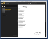
Digital Editions does work as a PDF viewer. It’s based around a library concept, so every time you open a PDF in DE, an image of the front page is saved in the library; you can click on this image to open it. Once you have a PDF, you can look at it as a single page, as a double page (even if the PDF hasn’t been set up for this), at the width of the screen, or with a zoom widget that lets you use 18 levels of zoom from 87% to 919%. Here’s how a PDF from /ubu editions looks:

basic screenshot

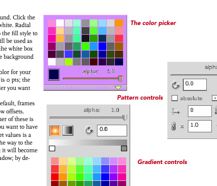
Digital Editions is clearly built around a different PDF rendering engine than the rest of Adobe’s software. (The FAQ explains that this engine was designed to be used on cellphones.) Image quality is noticeably worse than in Acrobat or Preview. Text is poorly aliased, and spacing between characters seems to be off for some fonts at some zoom levels. Graphics are notably grainy, and weird rendering artifacts sometimes show up. (In the image above, for example, note that there’s a light blue rectangle under the text on the left. This doesn’t show up in any other PDF viewer.) Some PDFs have extras that shouldn’t have been there, blocks of background color, for example. One illustration of the color picker in the Sophie help PDF I made a couple weeks back turns a lovely shade of purple:

colorpicker.png

This is frustrating: one of Adobe’s chief selling points of PDF as a format has been that a PDF will look the same on every machine in every viewer. Not this one. Adobe offers sample PDFs for download at their Digital Editions website (see below), which are similarly perplexing. Although these appear to be ordinary PDFs (with no restrictions), they don’t behave like regular PDFs. They can’t be opened in any PDF viewer that’s not Digital Editions. Preview shows only blank pages; opening them in the current Adobe Reader takes you to a webpage where you can download Digital Editions; and opening them in an older version of Acrobat brings up a message asking whether I’d like to learn more about documents protected with Adobe DRM. Clicking yes takes me to a pre-Digital Editions Adobe ebooks page. PDFs have become popular because they can be used in a variety of ways across a variety of platforms. This seems like a significant step backwards for Adobe: interoperability is taking a back seat to DRM.
2. as an EPUB reader
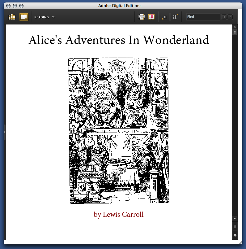
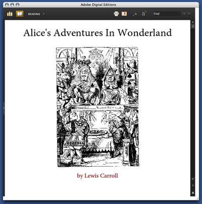
But Digital Editions isn’t only a PDF viewer; it’s also a viewer for EPUB format. EPUB is the work of the IDPF; it’s essentially an XHTML format for ebooks. You can get sample EPUBs from Adobe’s website. If you have the latest version of Adobe InDesign, you can make them yourself (more about that in a bit). Here’s the front page of their edition of Alice’s Adventures in Wonderland:

epub cover.png

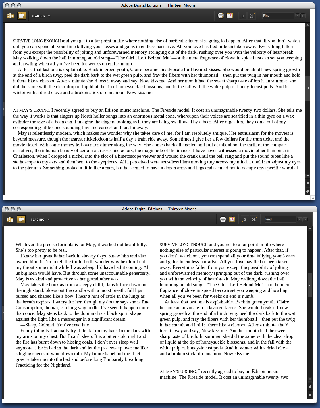
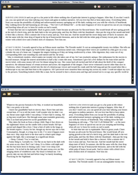
Perhaps not surprisingly for an XHTML format, the experience of reading an EPUB in Digital Editions is similar to reading a web page. The text becomes as wide as the Digital Editions window; if the window is wide enough, the text may reflow into more columns. When this happens is unclear to me: in some books, the text column is much too wide to read well before the text is reflowed:

wideness.png

You can choose between 4 different font sizes; you can’t change the fonts. (Some EPUB books include their own fonts; some use system fonts.) As in the Digital Editions PDF viewer, there’s some bookmarking capability: you can select text and click “Add bookmark” to add a note at a particular point in the text. Books have tables of contents; there’s a search function. You can print books (or, on a Mac, convert them to PDFs); this seems to be in two columns by default.
That seems to be all you can do with these books. The books that Adobe provides are noticeably ugly: most of the graphics included are low resolution. Text looks weirdly bad: in the default font, the italic text seems to actually be slanted roman characters, which you’d think Adobe would be embarrassed about. To my eye, the text looks much better in Safari or even Firefox. You can make this comparison if you rename the .epub file .zip and unzip it; in the resulting folder, you’ll find a bunch of HTML pages, the images used, and fonts, if they’re included.
Adobe trumpets the one-click creation of EPUB files in the new version of InDesign. So I fired up InDesign and made some EPUBs to see how those worked in Digital Editions. Try for yourself: here is a version of the Sophie help PDF in EPUB format. The results are a bit disappointing: all the graphics have been dumped at the end of the document, much of the formatting has been lost, and the table of contents I laboriously set up for PDF export has been eliminated. One-click conversion evidently doesn’t allow exporting the fonts the document uses; and even though I have the Avenir and Scala fonts on my machine, it displays in the default Digital Editions font. The graphics do display in their real color, which is more than you can say for the way Digital Editions handles the PDF, though many of them do seem to have been converted to JPEGs in a lossy way.
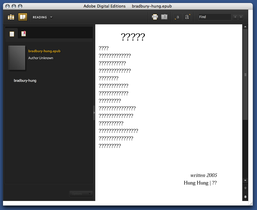
As a whim, I fed InDesign’s converter some foreign-language poetry to see how it would handle Unicode text. French came through okay. Lithuanian was mangled beyond recognition. Some Chinese poetry didn’t work at all:

chinese poetry.png

It’s clear that this needs a lot of work before it can be taken seriously.
3. as a store
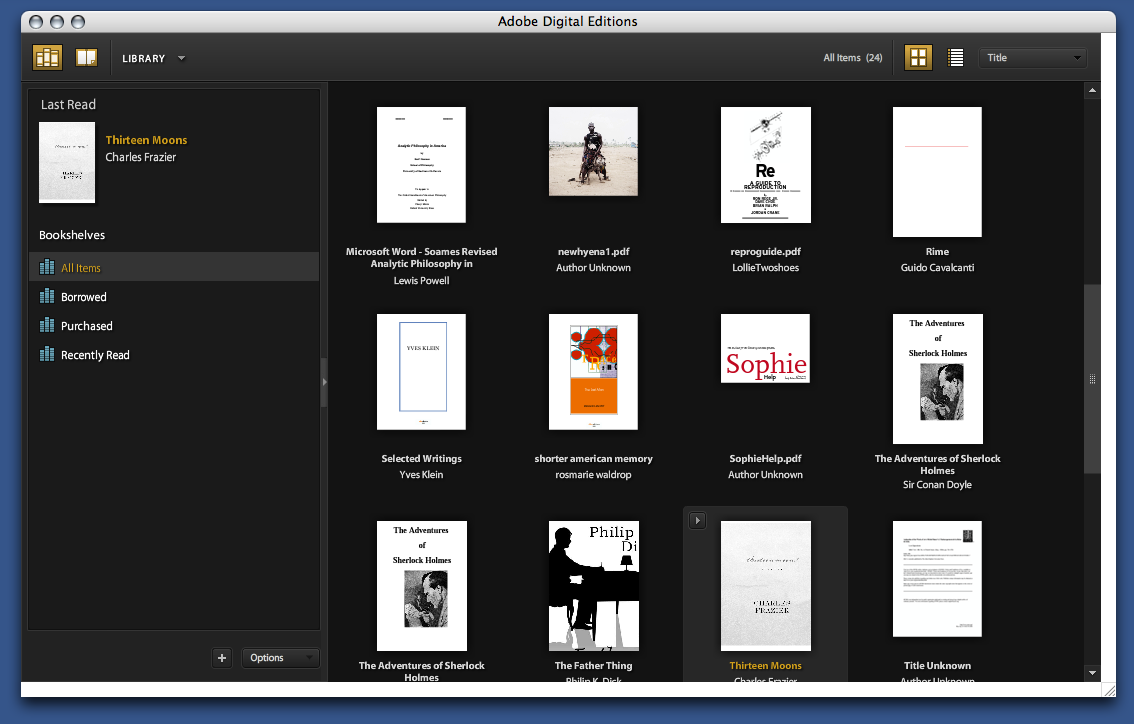
From Adobe’s press release, it’s clear that the main impetus behind Digital Editions is to provide a local front end for web-based selling of ebooks. The model that Adobe is working on becomes apparent when you open it up: the program maintains a library of all the PDF files you look at, in the same way that iTunes maintains a library of the MP3s on your computer:

library.png

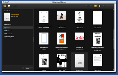
Categories of books (on the left in the above screenshot) include “Borrowed” and “Purchased”. The iTunes model of incorporating a store in software isn’t necessarily a bad one: Linotype has embedded a font store in their free font management software, with some degree of success. It’s hard to tell how well Adobe’s integration will work. They’ve tried selling ebooks before with little success; I have a couple of PDFs bought from Amazon that I’ve long since despaired of ever opening again. (Some progress may be reported: clicking on these now now opens DigitalEditions, where I get a different cryptic error than I did before in Acrobat.) The same sort of problems are likely with ebooks designed for DigitalEditions; it does worry me that even PDFs without DRM can’t be opened outside of the software.
DRM are probably the logical place to end this overlong review. One of the major reasons that we haven’t spent much time covering the efforts of the IDPF is that it’s devoted to standards that satisfy producers rather than consumers; many producers are concerned with locking down their products as thoroughly as possible. It may be a reasonable position from their perspective, but it’s resulted in products that aren’t particularly useful to consumers. DigitalEditions looks like it might be a big piece in the puzzle for DRM-focused producers. Unfortunately, readers are being neglected.

nature opens slush pile to the world

This is potentially a big deal for scholarly publishing in the sciences. Inspired by popular “preprint” servers like the Cornell-hosted arXiv.org, the journal Nature just launched a site, “Nature Precedings”, where unreviewed scientific papers can be posted under a CC license, then discussed, voted upon, and cited according to standards usually employed for peer-reviewed scholarship.
Over the past decade, preprint archives have become increasingly common as a means of taking the pulse of new scientific research before official arbitration by journals, and as a way to plant a flag in front of the gatekeepers’ gates in order to outmaneuver competition in a crowded field. Peer review journals are still the sine qua non in terms of the institutional warranting of scholarship, and in the process of academic credentialling and the general garnering of prestige, but the Web has emerged as the arena where new papers first see the light of day and where discussion among scholars begins to percolate. More and more, print publication has been transforming into a formal seal of approval at the end of a more unfiltered, networked process. Clearly, Precedings is Nature‘s effort to claim some of the Web territory for itself.
From a cursory inspection of the site, it appears that they’re serious about providing a stable open access archive, referencable in perpetuity through broadly accepted standards like DOI (Digital Object Identifier) and Handles (which, as far as I can tell, are a way of handling citations of revised papers). They also seem earnest about hosting an active intellectual community, providing features like scholar profiles and a variety of feedback mechanisms. This is a big step for Nature, especially following their tentative experiment last year with opening up peer review. At that time they seemed almost keen to prove that a re-jiggering of the review process would fail to yield interesting results and they stacked their “trial” against the open approach by not actually altering the process, or ultimately, the stakes, of the closed-door procedure. Not surprisingly, few participated and the experiment was declared an interesting failure. Obviously their thinking on this matter did not end there.
Hosting community-moderated works-in-development might just be a new model for scholarly presses, and Nature might just be leading the way. We’ll be watching this one.
More on David Weinberger’s blog.

design proposal for ipod-based e-book reader

I got an email the other day from the fellow who made this: an interesting proposal and, incidentally, a clever use of Google SketchUp for modeling gadgets.

The central thesis is that, unlike the Sony Librie or other tablets currently available, a dual-screen reader with a dock for the iPod is the most viable design for a) popularizing the use of an ebook reader and b) streamlining the use of an ebook store.

He’s interested in getting feedback so leave your two cents.

the institute on the millions

There is a piece about the Institute on the book/literary blog the millions, by Buzz Poole, a writer who came down to visit us for a long afternoon late last summer. Buzz takes solid a crack at describing what we do and why. He starts out by briefly sketching out the increasingly unstable ground that defines contemporary publishing, and nails one of the major problems we often lament here:

In the realm of publishing, however, especially mainstream publishing, the concerns and campaigns are geared to getting better at selling books, not to how the very nature of books is, and has been, changing for years.

Poole then describes the Institute and the intellectual and material history that we come out of, namely Voyager and similar interactive multimedia development. But then he says something that I think is really on point about us and our work:

The most influential people behind the Institute are not so much about the technology; rather they are about intellectual economies where theory and practice are equally valued. The Institute wants to do more than democratize information; it wants to reappraise the exchange of information and how it is valued.

The next section is all about our projects, our forays into the intellectual economies and our attempts to participate in the wide world of the web. (You can get a sense of our projects on our site). Poole closes with a discussion of what his text would be like if the Institute conceived of the format: how it would include reading lists and links (and probably full texts, if we really could have our way), examples of media, drafts/versioning, and the ability to interact with the author. What he doesn’t say is that this piece was originally being pitched as a magazine article, which fortuitously landed on a blog instead. We like being written up in paper, but even the most common digital form allows for a much wider range of instantaneous interaction and investigation. The fact that this piece is on a blog—and not an expanded (expandable?) format—is a testament to how much further the tools and practices of writing still need to advance before we begin to approach our vision of ‘networked book’.