

Moby Dick Chapter 55 or 9200 times E”, 2004, graphite on hemp paper, 11 x 9″
In one of those odd, blogospheric delayed reactions, I just came across (via Information Aesthetics, via Kottke) a fabulous exhibit that took place this past March by an artist named Justin Quinn, who does beautiful, mysterious work with text. Quinn’s Moby-Dick series is made up of obsessively detailed prints and graphite drawings composed entirely of the letter E. Each E corresponds to a letter in a chapter of Melville’s book, so each piece is composed of literally thousands of characters. The effect is almost that of a mosaic or a concrete poem. This series was shown at MMGalleries in San Francisco and has since moved elsewhere (Miami possibly?), but there are still a number of images online (also here). Quinn explains his obsession with E:
The distance between reading and seeing has been an ongoing interest for me. Since 1998 I have been exploring this space through the use of letterforms, and have used the letter E as my primary starting point for the last two years. Since E is often found at the top of vision charts, I questioned what I saw as a familiar hierarchy. Was this letter more important than other letters? E is, after all, the most commonly used letter in the English language, it denotes a natural number (2.71828), and has a visual presence that interests me greatly. In my research E has become a surrogate for all letters in the alphabet. It now replaces the other letters and becomes a universal letter (or Letter), and a string of Es now becomes a generic language (or Language). This substitution denies written words their use as legible signifiers, allowing language to become a vacant parallel Language -? a basis for visual manufacture.
After months of compiling Es into abstract compositions through various systemic arrangements, I started recognizing my studio time as a quasi-monastic experience. There was something sublime about both the compositions that I was making and the solitude in which they were made. It was as if I were translating some great text like a subliterate medieval scribe would have years ago – ?with no direct understanding of the source material. The next logical step was to find a source. Herman Melville’s novel Moby Dick, a story rich in theology, philosophy, and psychosis provides me with a roadmap for my work, but also with a series of underlying narratives. My drawings, prints, and collages continue to speak of language and the transferal of information, but now as a conduit to Melville’s sublime narratives.
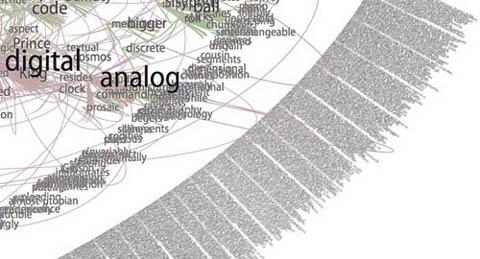
Gazing at these for a while (digital reproductions of course… and on my browser… and brought to my attention through technology blogs), I couldn’t help but start to draw some connections between Quinn’s work and computers. There’s plenty of digital artwork and visualization programs that render text into complex visual formations, sometimes with the intention of discovering new meanings and relationships, other times purely to play with form. Every now and then, someone manages to achieve both. This is a detail from Brad Paley’s rendering of Gamer Theory through his program Text Arc:
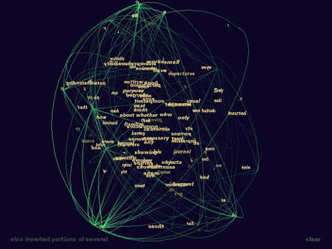
Others can be beautiful to handle, but are ultimately opaque, like Ben Fry’s “Valence”:
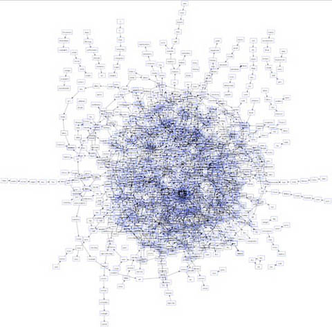
These two images are from another work submitted to our Gamer Theory visualization gallery, a map of nouns and verbs in Wark’s text (first is full, second is a detail). It’s pretty, but basically meaningless.
Quinn’s work is also difficult to penetrate, but something about it holds my attention. I’m not sure how aware Quinn is of the digital work being done today, but viewing his pieces against the contemporary technological backdrop, and his own self-described feeling of being the “subliterate medieval scribe” as he makes his minute articulations, my mind runs off in a number of directions. Seeing that his work is in a way “pixelated” – ?his Es a “basis for visual manufacture” – ?I imagine him as a sort of human computer – ?a monastic machine – ?processing (or intuiting) the text by infintessimal degrees through his own inner algorithm.
After all, a computer’s work is “subliterate.” Algorithms must be designed with intelligence, but the actual running of the program is physical, mindless. Viewed this way, Quinn’s work is like a dive into the mania of operations usually carried out with blazing speed by microprocessors. This is not to diminish it, or to call it cold and mechanical. Rather I’m pondering whether there is perhaps a spiritual dimension to the repetitive, sub-rational activities of our machines, which, if transposed to human scale, can become a sort of devotional exercise, like the routines of Buddhist monks, endlessly painting and carving Chinese characters in order to empty their minds (other links between monks and computers here and here).
What’s particularly evocative to me about the work, however, is how it treads the line between that meditative quality and the obsessive. There is something frightening about them (or about any kind of fanatically detailed artwork, or about computers for that matter), like the reams of psychotic babble typed out ceaselessly by Jack Nicholson in “The Shining.” Or is it Ahab’s vengeance algorithm we’re seeing, running on overdrive until the machine (or ship) crashes?
In the end, Quinn’s images are mysterious, his algorithm inscrutable, although my mind immediately goes to work trying to link up Melville’s themes and images to those endless strings of Es.
Here’s that first image again with a quote from the source text that seemed to me to connect. Chapter 55, “Of the Monstrous Pictures of Whales”:
Moby Dick Chapter 55 or 9200 times E”, 2004, graphite on hemp paper, 11 x 9″
But these manifold mistakes in depicting the whale are not so very surprising after all. Consider! Most of the scientific drawings have been taken from the stranded fish; and these are about as correct as a drawing of a wrecked ship, with broken back, would correctly represent the noble animal itself in all its undashed pride of hull and spars. Though elephants have stood for their full-lengths, the living Leviathan has never yet fairly floated himself for his portrait. The living whale, in his full majesty and significance, is only to be seen at sea in unfathomable waters; and afloat the vast bulk of him is out of sight, like a launched line-of-battle ship; and out of that element it is a thing eternally impossible for mortal man to hoist him bodily into the air, so as to preserve all his mighty swells and undulations.
This one is of chapter 71, “The Jeroboam’s Story” (I spoke briefly on the phone with one of the curators who told me that Quinn had explained this as an inverted halo, reflecting the anti-Christ-like character described in the chapter – ?I almost see an aerial view of a whale cutting through water):

Moby Dick Chapter 71 or 9,814 times E”, 2006, mixed media, 11 x 15″
…but straightway upon the ship’s getting out of sight of land, his insanity broke out in a freshet. He announced himself as the archangel Gabriel, and commanded the captain to jump overboard. He published his manifesto, whereby he set himself forth as the deliverer of the isles of the sea and vicar-general of all Oceanica. The unflinching earnestness with which he declared these things; – the dark, daring play of his sleepless, excited imagination, and all the preternatural terrors of real delirium, united to invest this Gabriel in the minds of the majority of the ignorant crew, with an atmosphere of sacredness. Moreover, they were afraid of him. As such a man, however, was not of much practical use in the ship, especially as he refused to work except when he pleased, the incredulous captain would fain have been rid of him; but apprised that that individual’s intention was to land him in the first convenient port, the archangel forthwith opened all his seals and vials – devoting the ship and all hands to unconditional perdition, in case this intention was carried out. So strongly did he work upon his disciples among the crew, that at last in a body they went to the captain and told him if Gabriel was sent from the ship, not a man of them would remain.


