Category Archives: reader

digital editions

Yesterday Adobe announced the release of their Digital Editions software. The software’s been available in a beta format for a while; I downloaded it back then & didn’t think it was interesting enough to write about. I’ve spent the past two days playing with the new release. I’m still not sure that it’s worth attention, but I’ll try to explain why it’s not interesting.
What is Digital Editions? It’s still a bit hard to tell. When I downloaded the beta version, it seemed to be a lightweight remake of Adobe Reader (née Acrobat Reader), Adobe’s PDF viewer. The full release expands the capabilities of Digital Editions: in addition to being a PDF viewer, it’s also a viewer for the new EPUB format. It also seems to be a front end for future web-based electronic book sellers, like Apple’s iTunes for music. I’ll go through each of these three uses in turn, but first a few notes on how Digital Editions works.
Digital Editions looks more like a web application than a desktop application. There are no menu bars to speak of, and its interface borrows nothing from the operating system. This is nice in that it feels like it’s a reading environment: the interface is black-on-black, which should block out the distractions rampant on the desktop. Certainly there’s none of the excess frippery that comes with Acrobat. However, the minimalism may be a bit excessive: it can be difficult to find black buttons and sliders to turn pages. (I’d be curious to see a review of the application from someone interested in accessibility for the disabled.) And some controls don’t behave the way a user might expect: given a scrollbar along the right edge of a page, I expect to be able to click at a point where the slider isn’t to move the slider. No such luck. Nor can you drag-select to change which part of the page is visible when the page is larger than the window, or drag a file into the window to open it.
Many of my problems with it stem from it not behaving like Mac software; I suspect a PC user would have similar complaints about it not behaving like PC software. This wouldn’t matter if the interface were an improvement over the operating systems – in both there’s plenty of room for improvement – but it’s not a noticeable improvement. It’s simply different, and that slows users down.
1. as a PDF reader
As mentioned above, Digital Editions initially seemed to be a remake of Adobe Reader, which has become hideously bloated with time. The current OS X version of the software is 108Mb; it’s a slow program. While I look at a fair number of PDFs on a daily basis, I’ve long since stopped using Acrobat in any of its forms if I don’t have to; Apple’s Preview application is much faster and delivers almost all the functionality that I want out of a PDF reader. I suspect most other Mac users do the same. Acrobat can be useful if you’re doing print pre-press work or working with forms, but neither of those are things I do that often.
Digital Editions does work as a PDF viewer. It’s based around a library concept, so every time you open a PDF in DE, an image of the front page is saved in the library; you can click on this image to open it. Once you have a PDF, you can look at it as a single page, as a double page (even if the PDF hasn’t been set up for this), at the width of the screen, or with a zoom widget that lets you use 18 levels of zoom from 87% to 919%. Here’s how a PDF from /ubu editions looks:

basic screenshot

Digital Editions is clearly built around a different PDF rendering engine than the rest of Adobe’s software. (The FAQ explains that this engine was designed to be used on cellphones.) Image quality is noticeably worse than in Acrobat or Preview. Text is poorly aliased, and spacing between characters seems to be off for some fonts at some zoom levels. Graphics are notably grainy, and weird rendering artifacts sometimes show up. (In the image above, for example, note that there’s a light blue rectangle under the text on the left. This doesn’t show up in any other PDF viewer.) Some PDFs have extras that shouldn’t have been there, blocks of background color, for example. One illustration of the color picker in the Sophie help PDF I made a couple weeks back turns a lovely shade of purple:
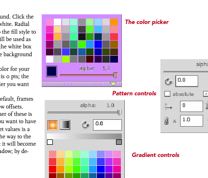
colorpicker.png

This is frustrating: one of Adobe’s chief selling points of PDF as a format has been that a PDF will look the same on every machine in every viewer. Not this one. Adobe offers sample PDFs for download at their Digital Editions website (see below), which are similarly perplexing. Although these appear to be ordinary PDFs (with no restrictions), they don’t behave like regular PDFs. They can’t be opened in any PDF viewer that’s not Digital Editions. Preview shows only blank pages; opening them in the current Adobe Reader takes you to a webpage where you can download Digital Editions; and opening them in an older version of Acrobat brings up a message asking whether I’d like to learn more about documents protected with Adobe DRM. Clicking yes takes me to a pre-Digital Editions Adobe ebooks page. PDFs have become popular because they can be used in a variety of ways across a variety of platforms. This seems like a significant step backwards for Adobe: interoperability is taking a back seat to DRM.
2. as an EPUB reader
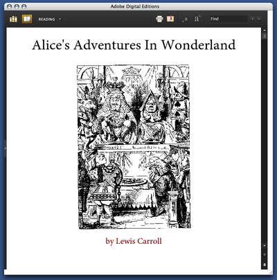
But Digital Editions isn’t only a PDF viewer; it’s also a viewer for EPUB format. EPUB is the work of the IDPF; it’s essentially an XHTML format for ebooks. You can get sample EPUBs from Adobe’s website. If you have the latest version of Adobe InDesign, you can make them yourself (more about that in a bit). Here’s the front page of their edition of Alice’s Adventures in Wonderland:

epub cover.png

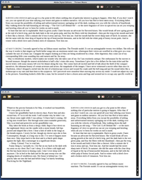
Perhaps not surprisingly for an XHTML format, the experience of reading an EPUB in Digital Editions is similar to reading a web page. The text becomes as wide as the Digital Editions window; if the window is wide enough, the text may reflow into more columns. When this happens is unclear to me: in some books, the text column is much too wide to read well before the text is reflowed:

wideness.png

You can choose between 4 different font sizes; you can’t change the fonts. (Some EPUB books include their own fonts; some use system fonts.) As in the Digital Editions PDF viewer, there’s some bookmarking capability: you can select text and click “Add bookmark” to add a note at a particular point in the text. Books have tables of contents; there’s a search function. You can print books (or, on a Mac, convert them to PDFs); this seems to be in two columns by default.
That seems to be all you can do with these books. The books that Adobe provides are noticeably ugly: most of the graphics included are low resolution. Text looks weirdly bad: in the default font, the italic text seems to actually be slanted roman characters, which you’d think Adobe would be embarrassed about. To my eye, the text looks much better in Safari or even Firefox. You can make this comparison if you rename the .epub file .zip and unzip it; in the resulting folder, you’ll find a bunch of HTML pages, the images used, and fonts, if they’re included.
Adobe trumpets the one-click creation of EPUB files in the new version of InDesign. So I fired up InDesign and made some EPUBs to see how those worked in Digital Editions. Try for yourself: here is a version of the Sophie help PDF in EPUB format. The results are a bit disappointing: all the graphics have been dumped at the end of the document, much of the formatting has been lost, and the table of contents I laboriously set up for PDF export has been eliminated. One-click conversion evidently doesn’t allow exporting the fonts the document uses; and even though I have the Avenir and Scala fonts on my machine, it displays in the default Digital Editions font. The graphics do display in their real color, which is more than you can say for the way Digital Editions handles the PDF, though many of them do seem to have been converted to JPEGs in a lossy way.
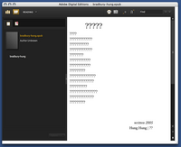
As a whim, I fed InDesign’s converter some foreign-language poetry to see how it would handle Unicode text. French came through okay. Lithuanian was mangled beyond recognition. Some Chinese poetry didn’t work at all:

chinese poetry.png

It’s clear that this needs a lot of work before it can be taken seriously.
3. as a store
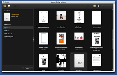
From Adobe’s press release, it’s clear that the main impetus behind Digital Editions is to provide a local front end for web-based selling of ebooks. The model that Adobe is working on becomes apparent when you open it up: the program maintains a library of all the PDF files you look at, in the same way that iTunes maintains a library of the MP3s on your computer:

library.png

Categories of books (on the left in the above screenshot) include “Borrowed” and “Purchased”. The iTunes model of incorporating a store in software isn’t necessarily a bad one: Linotype has embedded a font store in their free font management software, with some degree of success. It’s hard to tell how well Adobe’s integration will work. They’ve tried selling ebooks before with little success; I have a couple of PDFs bought from Amazon that I’ve long since despaired of ever opening again. (Some progress may be reported: clicking on these now now opens DigitalEditions, where I get a different cryptic error than I did before in Acrobat.) The same sort of problems are likely with ebooks designed for DigitalEditions; it does worry me that even PDFs without DRM can’t be opened outside of the software.
DRM are probably the logical place to end this overlong review. One of the major reasons that we haven’t spent much time covering the efforts of the IDPF is that it’s devoted to standards that satisfy producers rather than consumers; many producers are concerned with locking down their products as thoroughly as possible. It may be a reasonable position from their perspective, but it’s resulted in products that aren’t particularly useful to consumers. DigitalEditions looks like it might be a big piece in the puzzle for DRM-focused producers. Unfortunately, readers are being neglected.

design proposal for ipod-based e-book reader

I got an email the other day from the fellow who made this: an interesting proposal and, incidentally, a clever use of Google SketchUp for modeling gadgets.

The central thesis is that, unlike the Sony Librie or other tablets currently available, a dual-screen reader with a dock for the iPod is the most viable design for a) popularizing the use of an ebook reader and b) streamlining the use of an ebook store.

He’s interested in getting feedback so leave your two cents.

NYTimes reader

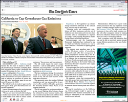
[editor’s note: The New York Times released a new software reader. It is Windows only. No Mac compatibility at this time. We asked Christine Boese, of serendipit-e.com, to post her thoughts on the matter.]

StoryLargeAppThumb.jpg

I got this off another news clip service I’m on…

NYT Finally Creates a Readable Online Newspaper (Slate)

Jack Shafer: About six months ago, I canceled my New York Times subscription because I had found the newspaper’s redesigned Web site to be superior to the print Times. I’ve now abandoned the Web version for the New York Times Reader, a new computer edition that has entered general beta release.

I went around to try to sign up for it and get a look. I couldn’t, because the Times IT dept overlooked making its beta available for Macs. I scanned through the screenshots, tho, and the comments on the blog preview of features, sneek peek #1 and #2.
Jack Shafer isn’t exactly an expert in interactive design, so I don’t know if his endorsement means anything other than, "Gee whiz, here’s a neato new thing!".
My initial impressions are that it looks like the International Herald Tribune
with a horizontal orientation I just can’t stand (the Herald Tribune often requires horizontal scrolling, and it’s far easier to read the printable version of stories). Yes, I see there is a narrow screen screenshot, but I’m thinking more about the text flow nightmares this design must cause.
But I think I have bigger reservations about the entire concept behind the Times Reader beta.
Here’s just a summary of questions I’d want answered, if I were actually able to test the beta:

  1. How is re-creating a facsimile of a print newspaper online a step forward for interactive media? Is it really, or is it just a kind of "horseless carriage" retrenchment? Shafer talks about some non-print-like pages that tell you what you’ve read or haven’t read, to assist browsing and search, but notes that the archives are thin. I wonder if the Times "Most Popular" feature makes the cut.
  2. Code. The big deal here is that it uses Microsoft .NET and advancers on Vista technology. I smell a walled garden. Is this XML-compatible? RSS-enabled? Is it even in HTML code that can be easily copied and pasted? (Shafer’s piece says it can be, but I want to see for myself) W3 validated? Does its content management system have permalinks? How do bookmarks work?
  3. Hyperlinks. Will the text accomodate them? Will the Times use them? Or by anchoring themselves firmly in a "reader" technology, perhaps a completely web-independent application, is the Times trying to go beyond simply a code-walled garden and also create a strong CONTENT walled garden as well? Is this a variant of TimesSelect on speed?
  4. Audience. Presumably the Times has some research that shows a need to court its paper-bound print-loving audience to its online products by making the online products more like the print products.
  5. But my question about audience is this: is there a REASON to make heroic efforts to lure print readers online? Isn’t the bigger issue trying to keep print readers attached to print, so that the ad-driven print editions don’t have to go the way of the dinosaur? The online news audience is already massive, and (Pew, Poynter) studies show that during the recent wars, large numbers of people were turning away from traditional news providers and outlets to seek out other sources of information, particularly international information, on the Internet and with news feed readers (RSS/Atom).
    So in a competitive online news landscape, the Times makes a strategic turn to become more like its print product? And this will lure large numbers of online news readers back exclusively to the Times exactly HOW? Especially if it is a walled garden that doesn’t integrate well into the Blogosphere or in RSS news feed readers?
    People like Terry Heaton and other media consultants (Heaton has a terrific blog, if you haven’t found it yet) are going out and telling traditional news media outlets that they have to move more strongly into an environment of UNBOUND media, to make their products more maleable for an unbound Internet environment. It appears the Times is not a company that has purchased Heaton’s services lately.

  6. Usability and Design. I’ve already mentioned the Mac incompatiblity. What other usability and design issues are present in this Times Reader technology? I’ll leave that to people who actually get use it.

From the screenshots I’ve seen, there seems to be very little functionality or interactive user-customizable features at all. I don’t know. Color me stupid, but my gut reaction is that this is nothing more than another variant of the exact PDF version of the paper that the Times put out, only perhaps with better text searching features and dynamic text flow (meaning I’d bet it is XML-based instead of PDF-based, only with some custom-built or Microsoft-blessed walled garden DTD).
You know, for the money the Times spent on this (and the experienced journalists the Times Group laid off this past year), I’d have thought the best use of resources for a big media company would be to develop a really KILLER RSS feed reader, one that finally gets over the usability threshold that keeps feed readers in "Blinking 12-land" for most casual Internet users.
I mean, I know there are a lot of good feed readers out there (I favor Bloglines myself), but have any of you tried to convert non-techie co-workers into using a feed reader lately? I can’t for the LIFE of me figure out why there’s so much resistance to something so purely wonderful and empowering, something I believe is clearly the killer app on par with the first Mosaic browser in 1993. But because feed readers caught on bottom up instead of top down, there’s not only usability problems for the broadest audiences, there’s also a void at the top of the technology industry, by companies that fail to catch on to the RSS vision, mainly because they didn’t think it up themselves.

an ipod for text

tt55_top_01.jpg
When I ride the subway, I see a mix of paper and plastic. Invariably several passengers are lost in their ipods (there must be a higher ipod-per-square-meter concentration in New York than anywhere else). One or two are playing a video game of some kind. Many just sit quietly with their thoughts. A few are conversing. More than a few are reading. The subway is enormously literate. A book, a magazine, The Times, The Post, The Daily News, AM New York, Metro, or just the ads that blanket the car interior. I may spend a lot of time online at home or at work, but on the subway, out in the city, paper is going strong.
Before long, they’ll be watching television on the subway too, seeing as the latest ipod now plays video. But rewind to Monday, when David Carr wrote in the NY Times about another kind of ipod — one that would totally change the way people read newspapers. He suggests that to bounce back from these troubled times (sagging print circulation, no reliable business model for their websites), newspapers need a new gadget to appear on the market: a light-weight, highly portable device, easy on the eyes, easy on the batteries, that uploads articles from the web so you can read them anywhere. An ipod for text.
This raises an important question: is it all just a matter of the reading device? Once there are sufficient advances in display technology, and a hot new gadget to incorporate them, will we see a rapid, decisive shift away from paper toward portable electronic text, just as we have witnessed a widespread migration to digital music and digital photography? Carr points to a recent study that found that in every age bracket below 65, a majority of reading is already now done online. This is mostly desktop reading, stationary reading. But if the greater part of the population is already sold on web-based reading, perhaps it’s not too techno-deterministic to suppose that an ipod-like device would in fact bring sweeping change for portable reading, at least periodicals.
But the thing is, online reading is quite different from print reading. There’s a lot of hopping around, a lot of digression. Any new hardware that would seek to tempt people to convert from paper would have to be able to surf the web. With mobile web, and wireless networks spreading, people would expect nothing less (even the new Sony PSP portable gaming device has a web browser). But is there a good way to read online text when you’re offline? Should we be concerned with this? Until wi-fi is ubiquitous and we’re online all the time (a frightening thought), the answer is yes.
We’re talking about a device that you plug into your computer that automatically pulls articles from pre-selected sources, presumably via RSS feeds. This is more or less how podcasting works. But for this to have an appeal with text, it will have to go further. What if in addition to uploading new articles in your feed list, it also pulled every document that those articles linked to, so you could click through to referenced sites just as you would if you were online?
It would be a bounded hypertext system. You could do all the hopping around you like within the cosmos of that day’s feeds, and not beyond — you would have the feeling of the network without actually being hooked in. Text does not take up a lot of hard drive space, and with the way flash memory is advancing, building a device with this capacity would not be hard to achieve. Of course, uploading link upon link could lead down an infinite paper trail. So a limit could be imposed, say, a 15-step cap — a limit that few are likely to brush up against.
So where does the money come in? If you want an ipod for text, you’re going to need an itunes for text. The “portable, bounded hypertext RSS reader” (they’d have to come up with a catchier name –the tpod, or some such techno-cuteness) would be keyed in to a subscription service. It would not be publication-specific, because then you’d have to tediously sign up with dozens of sites, and no reasonable person would do this.
So newspapers, magazines, blogs, whoever, will sign licensing agreements with the tpod folks and get their corresponding slice of the profits based on the success of their feeds. There’s a site called KeepMedia that is experimenting with such a model on the web, though not with any specific device in mind (and it only includes mainstream media, no blogs). That would be the next step. Premium papers like the Times or The Washington Post might become the HBOs and Showtimes of this text-ripping scheme — pay a little extra and you get the entire electronic edition uploaded daily to your tpod.
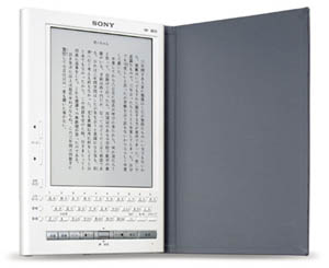
sony librie.jpg As for the device, well, the Sony Librie has had reasonable success in Japan and will soon be released in the States. The Librie is incredibly light and uses an “e-ink” display that is reflective like paper (i.e. it can be read in bright sunlight), and can run through 10,000 page views on four triple-A batteries.
The disadvantages: it’s only black-and-white and has no internet connectivity. It also doesn’t seem to be geared for pulling syndicated text. Bob brought one back from Japan. It’s nice and light, and the e-ink screen is surprisingly sharp. But all in all, it’s not quite there yet.
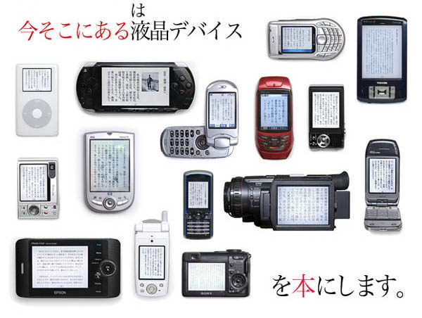
There’s always the do-it-yourself approach. The Voyager Company in Japan has developed a program called T-Time (the image at the top is from their site) that helps you drag and drop text from the web into an elegant ebook format configureable for a wide range of mobile devices: phones, PDAs, ipods, handheld video games, camcorders, you name it. This demo (in Japanese, but you’ll get the idea) demonstrates how it works.
Presumably, you would also read novels on your text pod. I personally would be loathe to give up paper here, unless it was a novel that had to be read electronically because it was multimedia, or networked, or something like that. But for syndicated text — periodicals, serials, essays — I can definitely see the appeal of this theoretical device. I think it’s something people would use.