Category Archives: design_curmudgeonry

serial killer

Alex Lencicki is a blogger with experience serializing novels online. Today, in a comment to my Slate networked book post, he links to a wonderful diatribe on his site deconstructing the myriad ways in which Slate’s web novel experiment is so bad and so self-defeating — a pretty comprehensive list of dos and don’ts that Slate would do well to heed in the future. In a nutshell, Slate has taken a novel by a popular writer and apparently done everything within its power to make it hard to read and hard to find. Why exactly they did this is hard to figure out.
Summing up, Lencicki puts things nicely in context within the history of serial fiction:

The original 19 th century serials worked because they were optimized for newsprint, 21st century serials should be optimized for the way people use the web. People check blogs daily, they download pages to their phones, they print them out at work and take them downstairs on a smoke break. There’s plenty of room in all that activity to read a serial novel – in fact, that activity is well suited to the mode. But instead of issuing press releases and promising to revolutionize literature, publishers should focus on releasing the books so that people can read them online. It’s easy to get lost in a good book when the book adapts to you.

who really needs to turn the pages?

The following post comes from my friend Sally Northmore, a writer and designer based in New York who lately has been interested in things like animation, video game theory, and (right up our alley) the materiality of books and their transition to a virtual environment. A couple of weeks ago we were talking about the British Library’s rare manuscript digitization project, “Turning the Pages” — something I’d been meaning to discuss here but never gotten around to doing. It turns out Sally had some interesting thoughts about this so I persuaded her to do a brief write-up of the project for if:book. Which is what follows below. Come to think of it, this is especially interesting when juxtaposed with Bob’s post earlier this week on Jefferson Han’s amazing gestural interface design. Here’s Sally… – Ben
The British Library’s collaboration with multimedia impresarios at Armadillo Systems has led to an impressive publishing enterprise, making available electronic 3-D facsimiles of their rare manuscript collection.
“Turning the Pages”, available in CD-ROM, online, and kiosk format, presents the digital incarnation of these treasured texts, allowing the reader to virtually “turn” the pages with a touch and drag function, “pore over” texts with a magnification function, and in some cases, access extras such as supplementary notes, textual secrets, and audio accompaniment.
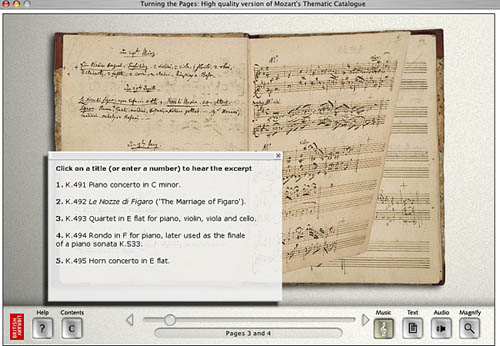
turning pages mozart.jpg
Pages from Mozart’s thematic catalogue — a composition notebook from the last seven years of his life. Allows the reader to listen to works being discussed.
The designers ambitiously mimicked various characteristics of each work in their 3-D computer models. For instance, the shape of a page of velum turning differs from the shape of a page of paper. It falls at a unique speed according to its weight; it casts a unique shadow. The simulation even allows for a discrepancy in how a page would turn depending on what corner of the page you decide to peel from.
Online visitors can download a library of manuscripts in Shockwave although these versions are a bit clunkier and don’t provide the flashier thrills of the enormous touch screen kiosks the British Library now houses.
turning pages map.jpg
Mercator’s first atlas of Europe – 1570s
Online, the “Turning the Pages” application forces you to adapt to the nature of its embodiment–to physically re-learn how to use a book. A hand cursor invites the reader to turn each page with a click-and-drag maneuver of the mouse. Sounds simple enough, but I struggled to get the momentum of the drag just right so that the page actually turned. In a few failed attempts, the page lifted just so… only to fall back into place again. Apparently, if you can master the Carpal Tunnel-inducing rhythm, you can learn to manipulate the page-turning function even further, grabbing multiple of pages at once for a faster, abridged read.
The value of providing high resolution scans of rare editions of texts for the general public to experience, a public that otherwise wouldn’t necessarily ever “touch” say, the Lindisfarne Gospels, doesn’t go without kudos. Hey, democratic right? Armadillo Systems provides a list of compelling raisons d’ĂȘtre on their site to this effect. But the content of these texts is already available in reprintable (democratic!) form. Is the virtual page-turning function really necessary for greater understanding of these works, or a game of academic scratch-n-sniff?
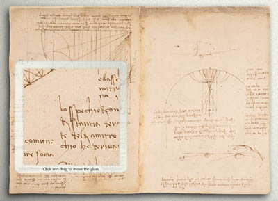
turning pages davinci.jpg
The “enlarge” function even allows readers to reverse the famous mirror writing in Leonardo da Vinci’s notebooks
At the MLA conference in D.C. this past December, where the British Library had set up a demonstration of “Turning the Pages”, this was the question most frequently asked of the BL’s representative. Who really needs to turn the pages? I learned from the rep’s response that, well, nobody does! Scholars are typically more interested studying the page, and the turning function hasn’t proven to enhance or revive scholarly exploration. And surely, the Library enjoyed plenty of biblio-clout and tourist traffic before this program?
But the lure of new, sexy technology can’t be underestimated. From what I understood, the techno-factor is an excellent beacon for attracting investors and funding in multimedia technology. Armadillo’s web site provides an interesting sales pitch:

By converting your manuscripts to “Turning the Pages” applications you can attract visitors, increase website traffic and add a revenue stream – at the same time as broadening access to your collection and informing and entertaining your audience.

The program reveals itself to be a peculiar exercise, tangled in its insistence on fetishizing aspects of the material body of the text–the weight of velum, the karat of gold used to illuminate, the shape of the binding. Such detail and love for each material manuscript went into this project to recreate, as best possible, the “feel” of handling these manuscripts.
Under ideal circumstances, what would the minds behind “Turning the Pages” prefer to create? The original form of the text–the “alpha” manuscript–or the virtual incarnation? Does technological advancement seduce us into valuing the near-perfect simulation over the original? Are we more impressed by the clone, the “Dolly” of hoary manuscripts? And, would one argue that “Turning the Pages” is the best proxy for the real thing, or, another “thing” entirely?

harper-collins half-heartedly puts a book online

As noted in The New York Times, Harper-Collins has put the text of Bruce Judson’s Go It Alone: The Secret to Building a Successful Business on Your Own online; ostensibly this is a pilot for more books to come.

Harper-Collins isn’t doing this out of the goodness of their hearts: it’s an ad-supported project. Every page of the book (it’s paginated in exactly the same way as the print edition) bears five Google ads, a banner ad, and a prominent link to buy the book at Amazon. Visiting Amazon suggests other motives for Harper-Collins’s experiment: new copies are selling for $5.95 and there are no reader reviews of the book, suggesting that, despite what the press would have you believe, Judson’s book hasn’t attracted much attention in print format. Putting it online might not be so much of a brave pilot program as an attempt to staunch the losses for a failed book.

Certainly H-C hasn’t gone to a great deal of trouble to make the project look nice. As mentioned, the pagination is exactly the same as the print version; that means that you get pages like this, which start mid-sentence and end mid-sentence. While this is exactly what print books do, it’s more of a problem on the web: with so much extraneous material around it, it’s more difficult for the reader to remember where they were. It wouldn’t have been that hard to rebreak the book: on page 8, they could have left the first line on the previous page with the paragraph it belongs too while moving the last line to the next page.

It is useful to have a book that can be searched by Google. One suspects, however, that Google would have done a better job with this.

two newspapers

the usa today from todayI picked up The New York Times from outside my door this morning knowing that the lead headline was going to be wrong. I still read the print paper every morning – I do read the electronic version, but I find that my reading there tends to be more self-selecting than I’d like it to be – but lately I find myself checking the Web before settling down to the paper and a cup of coffee. On the Web, I’d already seen the predictable gloating and hand-wringing in evidence there. Because of some communication mixup, the papers went to press with the information that the trapped West Virginia coal miners were mostly alive; a few hours later it turned out that they were, in fact, mostly dead. A scrutiny of the front pages of the New York dailies at the bodega this morning revealed that just about all had the wrong news – only Hoy, a Spanish-language daily didn’t have the story, presumably because it went to press a bit earlier. At right is the front page of today’s USA Today, the nation’s most popular newspaper; click on the thumbnail for a more legible version. See also the gallery at their “newseum”. (Note that this link won’t show today’s papers tomorrow – my apologies, readers of the future, there doesn’t seem to be anything that can be done for you, copyright and all that.)

the new york times from 1950At left is another front page of a newspaper, The New York Times from April 20, 1950 (again, click to see a legible version). I found it last night at the start of Marshall McLuhan’s The Mechanical Bride: Folklore of Industrial Man. Published in 1951, The Mechanical Bride is one of McLuhan’s earliest works; in it, he primarily looks at the then-current world of print advertising, starting with the front page shown here. To my jaundiced eye, most of the book hasn’t stood up that well; while it was undoubtedly very interesting at the time – being one of the first attempts to seriously deal with how people interact with advertisements from a critical perspective – fifty years, and billions and billions of advertisements later, it doesn’t stand up as well as, say, Judith Williamson‘s Decoding Advertisements manages to. But bits of it are still interesting: McLuhan presents this front page to talk about how Stephane Mallarmé and the Symbolists found the newspaper to be the modern symbol of their day, with the different stories all jostling each other for prominence on the page.

But you don’t – at least, I don’t – immediately see that when you look at the front page that McLuhan exhibits. This was presumably an extremely ordinary front page when he was exhibiting it, just as the USA Today up top might be representative today. Looked at today, though, it’s something else entirely, especially when you what newspapers look like now. You can notice this even in my thumbnails: when both papers are normalized to 200 pixels wide, you can’t read anything in the old one, besides that it says “The New York Times” as the top, whereas you can make out the headlines to four stories in the USA Today. Newspapers have changed, not just from black & white to color, but in the way the present text and images. In the old paper there are only two photos, headshots of white men in the news – one a politician who’s just given a speech, the other a doctor who’s had his license revoked. The USA Today has perhaps an analogue to that photo in Jack Abramoff’s perp walk; it also has five other photos, one of the miners’ deluded family members (along with Abramoff, the only news photos), two sports-related photos – one of which seems to be stock footage of the Rose Bowl sign, a photo advertising television coverage inside, and a photo of two students for a human interest story. This being the USA Today, there’s also a silly graph in the bottom left; the green strip across the bottom is an ad.
Photos and graphics take up more than a third of the front page of today’s paper.

What’s overwhelming to me about the old Times cover is how much text there is. This was not a newspaper that was meant to be read at a glance – as you can do with the thumbnail of the USA Today. If you look at the Times more closely it looks like everything on the front page is serious news. You could make an argument here about the decline of journalism, but I’m not that interested in that. More interesting is how visual print culture has become. Technology has enabled this – a reasonably intelligent high-schooler could, I think, create a layout like the USA Today. But having this possibility available would also seem to have had an impact on the content – and whether McLuhan would have predicted that, I can’t say.

ted nelson & the ideologies of documents

I. Nelson’s criticism

Ted Nelson (introduced last week by Ben) is a lonely revolutionary marching a lonely march, and whenever he’s in the news mockery is heard. Some of this is with good reason: nobody’s willing to dismantle the Internet we have for his improved version of the Internet (which doesn’t quite work yet). You don’t have to poke around too long on his website to find things that reek of crackpottery. But the problems that Nelson has identified in the electronic world are real, even if the solutions he’s proposing prove to be untenable. I’d like to expand on on one particular aspect of Nelson’s thought prominent in his latest missive: his ideas about the inherent ideologies of document formats. While this sounds very blue sky, I think his ideas do have some repercussions for what we’re doing at the Institute, and it’s worth investigating them, if not necessarily buying off on Xanadu.

Nelson starts from the position that attempting to simulate paper with computers is a mistaken idea. (He’s not talking about e-ink & the idea of electronic paper, though a related criticism could be made of that: e-ink by itself won’t solve the problem of reading on screens.) This is correct: we could do many more things with virtual space than we can with a static page. Look at this Flash demonstration of Jef Raskin’s proposed zooming interface (previously discussed here), for example. But we don’t usually go that far because we tend to think of electronic space in terms of the technology that preceded it – paper space. This has carried over into the way in which we structure documents for online reading.

There are two major types of electronic documents online. In one, the debt to paper space is explicit: PDFs, one of the major formats currently used for electronic books, are a compressed version of Postscript, a specification designed to tell a printer exactly what should be on a printed page. While a PDF has more functionality than a printed page – you can search it, for example, and if you’re tricky you can embed hyperlinks and tables of content in them – it’s built on the same paradigm. A PDF is also like a printed page in that it’s a finalized product: while content in a PDF can be written over with annotations, it’s difficult to make substantial changes to it. A PDF is designed to be an electronic reproduction of the printed page. More functionality has been welded on to it by Adobe, who created the format, but it is, at its heart attempting to maintain fidelity to the printed page.

The other dominant paradigm is that of the markup language. A quick, not too technical introduction: a markup language is a way of encoding instructions for how a text is to be structured and formatted in the text. HTML is a markup language; so is XML. This web page is created in a markup language; if you look at it with the “View Source” option on your browser, you’ll see that it’s a text file divided up by a lot of HTML tags, which are specially designed to format web pages: putting <i> and </i> around a word, for example, makes it italic. XML is a broader concept than HTML: it’s a specification that allows people to create their own tags to do other things: some people are using their own version of XML to represent ebooks.

There’s a lot of excitement about XML – it’s a technology that can be (and is)bent to many different uses. A huge percentage of the system files on your computer, for example, probably use some flavor of XML, even if you’ve never thought of composing an XML documents. Nelson’s point, however, is that there’s a central premise to all XML: that all information can be divided up into a logical hierarchy – an outline, if you will. A lot of documents do work this way: book is divided into chapters; a chapter is divided into paragraphs; paragraphs are divided into words. A newspaper is divided into stories; each story has a headline and body copy; the body copy is divided into paragraphs; a paragraph is divided into sentences; a sentence is divided into words; and words are divided into letters, the atom of the markup universe.

II. A Victorian example

But while this is the dominant way we arrange information, this isn’t necessarily a natural way to arrange things, Nelson points out, or the only way. It’s one way of many possible ones. Consider this spread of pages (double-click to enlarge them):

Click here to enlarge this image.

This is a title page from a book printed by William Morris, another self-identified humanist. We mostly think of William Morris (when we’re not confusing him with the talent agency) as a source of wallpaper, but his work as a book designer can’t be overvalued. The book was printed in 1893; it’s entitled The Tale of King Florus and the Fair Jehane. Like all of Morris’s books, it’s sumptuous to the point of being unreadable: Morris was dead set on bringing beauty back into design’s balance of aesthetics & utility, and maybe over-corrected to offset the Victorian fixation on the latter.

I offer this spread of pages as an example because the elements that make up the page don’t break down easily into hierarchical units. Let’s imagine that we wanted to come up with an outline for what’s on these pages – let’s consider how we would structure them if we wanted to represent them in XML. I’m not interested in how we could represent this on the Web or somewhere else – it’s easy enough to do that as an image. I’m more interested in how we would make something like this if we were starting from scratch & wanted to emulate Morris’s type and woodcuts – a more theoretical proposition.

First, we can look at the elements that comprise the page. We can tell each page is individually important. Each page has a text box, with decorative grapevines around the text box; inside the text box, the title gets its own page; on the second page, there’s the title repeated, followed by two body paragraphs, separated by a fleuron. The first paragraph gets an illustrated dropcap. Each word, if you want to go down that far, is composed of letters.

But if you look closer, you’ll find that the elements on the page don’t decompose into categories quite so neatly. If you look at the left-hand page, you can see that the title’s not all there – this is the second title page in the book. The title isn’t part of the page – as would almost certainly be assumed under XML – rather, they’re overlapping units. And the page backgrounds aren’t mirror images of each other: each has been created uniquely. Look at the title at the top of the right-hand page: it’s followed by seven fleurons because it takes seven of them to nicely fill the space. Everything here’s been minutely adjusted by hand. Notice the characters in the title on the right and how they interact with the flourishes around them: the two A’s are different, as are the two F’s, the two N’s, the two R’s, the two E’s. You couldn’t replicate this lettering with a font. You can’t really build a schema to represent what’s on these two pages. A further argument: to make this spread of pages rigorous, as you’d have to to represent it in XML, would be to ruin them aesthetically. The vines are the way they are because the letters are the way they are: they’ve been created together.

The inability of XML to adequately handle what’s shown on these pages isn’t a function of the screen environment. It’s a function of the way we build electronic documents right now. Morris could build pages this way because he didn’t have to answer to the particular restraints we do now.

III. The ideologies of documents

Let’s go back to Ted:

Nearly every form of electronic document- Word, Acrobat, HTML, XML- represents some business or ideological agenda. Many believe Word and Acrobat are out to entrap users; HTML and XML enact a very limited kind of hypertext with great internal complexity. All imitate paper and (internally) hierarchy.

For years, hierarchy simulation and paper simulation have been imposed throughout the computer world and the world of electronic documents. Falsely portrayed as necessitated by “technology,” these are really just the world-view of those who build software. I believe that for representing human documents and thought, which are parallel and interpenetrating– some like to say “intertwingled”– hierarchy and paper simulation are all wrong.

It’s possible to imagine software that would let us follow our fancy and create on the screen pages that look like William Morris’s – a tool that would let a designer make an electronic woodcut with ease. Certainly there are approximations. But the sort of tool I imagine doesn’t exist right now. This is the sort of tool we should have – there’s no reason not to have it already. Ted again:

I propose a different document agenda: I believe we need new electronic documents which are transparent, public, principled, and freed from the traditions of hierarchy and paper. In that case they can be far more powerful, with deep and rich new interconnections and properties- able to quote dynamically from other documents and buckle sideways to other documents, such as comments or successive versions; able to present third-party links; and much more.

Most urgently: if we have different document structures we can build a new copyright realm, where everything can be freely and legally quoted and remixed in any amount without negotiation.

Ben does a fine job of going into the ramifications of Nelson’s ideas about transclusion, which he proposes as a solution. I think it’s an interesting idea which will probably never be implemented on a grand scale because there’s not enough of an impetus to do so. But again: just because Nelson’s work is unpragmatic doesn’t mean that his critique is baseless.

I feel there’s something similar in the grandiosity of Nelson’s ideas and Morris’s beautiful but unreadable pages. William Morris wasn’t just a designer: he saw his program of arts and crafts (of which his books were a part) as a way to emphasize the beauty of individual creation as a course correction to the increasingly mechanized & dehumanized Victorian world. Walter Benjamin declares (in “The Author as Producer”) that there is “a difference between merely supplying a production apparatus and trying to change the production apparatus”. You don’t have to make books exactly like William Morris’s or implement Ted Nelson’s particular production apparatus to have your thinking changed by them. Morris, like Nelson, was trying to change the production apparatus because he saw that another world was possible.

And a postscript: as mentioned around here occasionally, the Institute’s in the process of creating new tools for electronic book-making. I’m in the process of writing up an introduction to Sophie (which will be posted soon) which does its best to justify the need for something new in an overcrowded world: Nelson’s statement neatly dovetailed with my own thinking on the subject on why we need something new: so that we have the opportunity to make things in other ways. Sophie won’t be quite as radical as Nelson’s vision, but we will have something out next year. It would be nice if Nelson could do the same.

blogs — trying to fit round pegs into square holes

i’ve been without an internet connection for a few days. was catching up on if:book posts and finding myself delighted by the wonderful range of interesting posts my colleagues had managed in just a few days. which made me want to send a note to lots of friends and acquaintances urging them to check out our blog. but then my more nervous, modest side took over and convinced me that urging people to sample a blog as wide-ranging as if:book is a dicey proposition since sampling one day’s posts doesn’t necessarily indicate the extent of our interests. the structure of blogs favors the chronology of entry; thematic categories are listed on the side but without much fanfare. wonder if we could re-arrange the “front page” to be more magazine like, where for example “recent posts” would be one feature among many.

a book is not a text: the noise made by people

The frontispiece for _Tristram Shandy_
Momus – a.k.a. Nick Currie, electronic folk musician, Wired columnist, and inveterate blogger – has posted an interesting short video on his blog, Click Opera. He’s teaching a class on electronic music composition & narrative for Benneton’s Fabrica in Venice. His video encourages students to listen for the environmental sounds that they can make with electronic instruments: not the sounds that they’re designed to make, but the incidental noises that they make – the clicking of keys on a Powerbook, for example – that we usually ignore as being just that, incidental. We ignore the fact that these noises are made directly by people, without the machine’s intercession.

Momus’s remarks put me in mind of something said by Jerome McGann at the Transliteracies conference in Santa Barbara last June – maybe the most important thing that was said at the conference, even if it didn’t warrant much attention at the time. What we tend to forget when talking about reading, he said, was that books – even regular old print books – are full of metadata. (Everybody was talking about metadata in June, like they were talking about XML a couple of years ago – it was the buzzword that everyone knew they needed to have an opinion about. If not, they swung the word about feverishly in the hopes of hitting something.) McGann qualified his remarks by referring to Ezra Pound’s idea of melopoeia, phanopoeia, and logopoeia – specific qualities in language that make it evocative:

. . . you can still charge words with meaning mainly in three ways, called phanopoeia, melopoeia, logopoeia. You can use a word to throw a visual image on to the reader’s imagination, or you charge it by sound, or you use groups of words to do this.

(The ABC of Reading, p.37) In other words, words aren’t always just words: when used well, they refer beyond themselves. This process of referring, McGann was claiming, is a sort of metadata, even if technologists don’t think about it this way: the way in which words are used provides the attuned reader with information about their composition beyond the meaning of the words themselves.

But thinking about McGann’s comments in terms of book design might suggest wider implications for the future of the book. Let’s take a quick excursion to the past of the book. Once it was true that you couldn’t judge a book by its cover. Fifty years ago, master book designer Jan Tschichold opined about book jackets:

A jacket is not an actual part of the book. The essential portion is the inner book, the block of pages . . . [U]nless he is a collector of book jackets as samples of graphic art, the genuine reader discards it before he begins.

(“Jacket and Wrapper,” in The Form of the Book: Essays on the Morality of Good Design) Tschichold’s statement seems bizarre today: nobody throws away book jackets, especially not collectors. Why? Because today we take it for granted that we judge books by their covers. The cover has been subsumed into our idea of the book: it’s a signifying part of the book. By looking at a cover, you, the prospective book-buyer, can immediately tell if a recently-published piece of fiction is meant to be capital-L Literature, Nora Roberts-style fluff, or somewhere in between. Contextual details like the cover are increasingly important.

Where does the electronic book fit into this, if at all? Apologists for the electronic book are constantly about the need for an ideal device as the be-all and end-all: when we have e-Ink or e-Paper and a well-designed device which can be unrolled like a scroll, electronic books will suddenly take off. This isn’t true, and I think it has something to do with the way people read books, something that hasn’t been taken into account by soi-disant futurists, and something like what Jerome McGann was gesturing at. A book is not a text. It’s more than a text. It’s a text and a collection of information around that text, some of which we consciously recognize and some of which we don’t.

A few days ago, I excoriated Project Gutenberg’s version of Tristram Shandy. This is why: a library of texts is not the same thing as a library of books. A quick example: download, if you wish, the plain text or HTML version of Tristram Shandy, which you can get here. Look at the opening pages of the HTML version. Recognizing that this particular book needs to be more than plain old seven-bit ASCII, they’ve included scans of the engravings that appear in the book (some by William Hogarth, like this; a nice explication of this quality of the book can be found here). What’s interesting to me about these illustrations that Project Gutenberg is how poorly done these are. These are – let’s not beat around the bush – bad scans. The contrast is off; things that should be square look rectangular. The Greek on the title page is illegible.

Let’s go back to Momus listening to the unintentional noises made by humans using machines: what we have here is the debris of another noisy computer, the noise of a key that we weren’t supposed to notice. Something about the way these scans is dated in a very particular way – half of the internet looked like this in 1997, before everyone learned to use Photoshop properly. Which is when, in fact, this particular document was constructed. In this ugliness we have, unintentionally, humanity. John Ruskin (not a name often conjured with when talking about the future) declared that one of the hallmarks of the Gothic as an architectural style was a perceived “savageness”: it was not smoothed off like his Victorian contemporaries would have liked. But “savageness”, for him, was no reproach: instead, it was a trace of the labor that went into it, a trace of the work’s humanity. Perfection, for him, was inhumane: humanity

. . . was not intended to work with the accuracy of tools, to be precise and perfect in all their actions. If you will have that precision out of them, and make their fingers measure degrees like cog-wheels, and their arms strike curves like compasses, you must unhumanize them . . 

(The Stones of Venice) What we have here is, I think, something similar. While Project Gutenberg is probably ashamed of the quality of these graphics, there’s something to be appreciated here. This is a text on its way to becoming a book; it unintentionally reveals its human origins, the labor of the anonymous worker who scanned in the illustrations. It’s a step in the right direction, but there’s a great distance still to go.

ron silliman: “the chinese notebook”

5. Language is, first of all, a political question.

The cover of Ron Silliman's _The Chinese Notebook_Like the problem of hunger in the world, the problem with publishing in the United States isn’t one of supply but one of distribution.

What’s worried me lately: that I go to airport bookshops and always see the same books. Because I live in New York, I can go to any number of specialized bookshops & find just about anything I want. The same is not true in many other parts of the country; the same is certainly not true in many other parts of the world. What worries me about airport bookshops is how few books they carry: how narrow a range of ideas is presented. May God help you if you’d like to buy anything other than Dan Brown in the Minneapolis/St. Paul airport. This is an exaggeration, but not by much. James Patterson is also available, as are the collected works of J. K. Rowling, and, for a limited time, those of J. R. R. Tolkien.

Into this emptiness is paraded the miracle of electronic publishing. As pushed by Jason Epstein, amongst others, the idea of print-on-demand will solve the question of supply forever more – you could go to a bookstore, request a book, and Barnes & Noble would print it out for you. (Let’s not think about copyright for the moment.) Jason Epstein believes these machines will be small enough to fit into an airport bookstore. This hasn’t happened yet, and I’m doubtful that it will any time soon, if at all. Booksellers have the supply & distribution issue down cold for Brown & Patterson & J. K. Rowling – they have no incentive to invest in these machines. When was the last time you, member of the reading public, went to complain to Barnes & Noble about their selection?

Until this marvelous future creates itself out of publishers’ good will towards humanity, people are presenting texts online, with varying degrees of success. If you have a laptop in the MSP airport (& a credit card to pay for wireless internet there), or, for that matter, any computer connected to the internet, you can go to ubu.com and browse their archive of documents of the avant-garde. Among the treasures are /ubu editions, an imprint that electronically reprints various texts as PDFs. They’re free. I have a copy of Ron Silliman’s The Chinese Notebook, a reprint of a 26-page poem which originally appeared in The Age of Huts. Ubu reprinted it (and the other two parts of The Age of Huts) with Silliman’s permission.

6. I wrote this sentence with a ballpoint pen. If I had used another, would it be a different sentence?

/Ubu editions (edited by Brian Kim Stefans) aren’t really electronic books, and don’t conceive of themselves as such. Rather, they are a way of electronically distributing a book. This PDF is 8.5” x 11”. While you can read it from a screen – I did – it’s meant to be printed out at home & read on paper. That said, this isn’t a quick and dirty presentation. Somebody (a mysterious “Goldsmith”) has gone to the trouble of making it an attractive object. It has a title page with attractive, interesting, and appropriate art (an interactive study by Mel Bochner from Aspen issue 5–6; ubu.com graciously hosts this online as well). There’s a copyright page that explains the previous. There’s even a half title page – somebody clearly knows something about book design. (How useful a half title page is in a book that’s meant to be printed out I’m not sure. It’s a pretty half title page, but it’s using another piece of your paper to print itself.) There’s also a final page, rounding off the total to 30 pages; if you print this off double-sided, you’ll have your very own beautiful stack of paper.

(Which is better than nothing.)

8. This is not speech. I wrote it.

Silliman’s text is (as these quotes might suggest) a list of 223 numbered thoughts about poetry and writing that forms a (self-contained) poem in prose. It is explicitly concerned with the form of language.

Karl Marx anticipating Walter J. Ong: “Is the Iliad possible when the printing press, and even printing machines, exist? Is it not inevitable that with the emergence of the press, the singing and the telling and the muse cease; that is, that the conditions necessary for epic poetry disappear?” (The German Ideology, p. 150; quoted in Neil Postman’s A Bridge to the 18th Century: How the Past Can Improve Our Future).

17. Everything here tends away from an aesthetic decision, which, in itself, is one.

Silliman’s text is nicely set – not beautifully, but well enough, using Baskerville. Baskerville is a neoclassical typeface, cool and rational, a product of the 18th century. Did Silliman think about this? Was the designer thinking about this? Is this how his book looked in print? in the eponymous Chinese notebook in which he wrote it? I don’t know, although my recognition of the connotations of the type inflects itself on my reading of Silliman’s poem.

21. Poem in a notebook, manuscript, magazine, book, reprinted in an anthology. Scripts and contexts differ. How could it be the same poem?

Would Silliman’s poem be the same poem if it were presented as, say, HTML? Could it be presented as HTML? This section of The Age of Huts is prose and could be without too many changes; other sections are more dependent on lines and spacing. Once a poem is in a PDF (or on a printed page), it is frozen, like a bug in amber; in HTML, type wiggles around at the viewer’s convenience. (I speak of the horrors HTML can wreak on poetry from some experience: in the evenings, I set non-English poems (in print, for the most part) for Circumference.)

47. Have we come so very far since Sterne or Pope?

Neil Postman, in his book, wonders about the same thing, answers “no”, and explains that in fact we’ve gone backwards. Disappointingly, there’s little reference to Sterne in Postman’s book, although he does point out that Oliver Goldsmith’s The Vicar of Wakefield was more widely read in the eighteenth century: possibly the literary public has never cared for the challenging.

Project Gutenberg happily presents their version of Tristram Shandy online in a plain text version: at certain points, the reader sees “(two marble plates)” or “(two lines of Greek)” and is left to wonder how much the text has changed between the page and the screen. Sterne’s novel, like Pope’s poetry, is agreeably self-aware: how Sterne would have laughed at “(page numbering skips ten pages)” in an edition without page numbers. There are a few lapses in ubu.com’s presentation of Silliman, but they’re comparably minor: some of the entries in Silliman’s list aren’t separated by a blank space, leading one to suspect the pagination was thrown out of whack in Quark. When something’s free . . .

53. Is the possibility of publishing this work automatically a part of the writing? Does it alter decisions in the work? Could I have written that if it did not?

A writer writes to communicate with a reader unknown. Publishers publish to make money. These statements are not always true – there’s no shortage of craven writers if there’s a sad dearth of virtuous publishers – but they can be taken as general rules of thumb. Where does electronic publishing fit into this set of equations? Certainly when Silliman was writing this twenty years ago he wasn’t thinking seriously about distributing his work over the Internet.

(Silliman has, for what it’s worth, an excellent blog, suggesting that had the possiblity been around twenty years ago, he would have been thinking about it.)

56. As economic conditions worsen, printing becomes prohibitive. Writers posit less emphasis on the page or book.

Why does ubu.com’s reprinting of Ron Silliman’s poetry seem more interesting to me than what Project Gutenberg is doing? Even the cheapest edition of Tristram Shandy that I can buy looks better than what they put out. (Ashamed of their text edition, one supposes, they’ve put out an HTML version of the book, which is an improvement, but not enough of one that I’d consider reading it for six hundred pages.) More to the point: it’s not that hard to find a copy of Tristram Shandy. You can even find one in one of the better airport bookstores. It’s out of copyright and any would-be publisher who wants to can print their own version of it without bothering with paying for rights.

I could not, alas, go to a bookstore and buy myself a copy of The Age of Huts because it’s been out of print for years. Thanks a lot, publishing. Good work. I could go to Amazon.com and buy a “used/collectible” copy for $113.20 – but precisely none of that money would go to Ron Silliman. But I don’t want a collectible copy: I’m interested in reading Silliman, not hoarding him. (Perhaps I start to contradict myself here.)

223. This is it.

But there are still questions. How do we ascribe value to a piece of art in a market economy? Are Plato’s ideas less valuable than those of Malcolm Gladwell because you can easily pick up the collected works of the first for less than 10% of what the two books of the second would cost you? when you can download old English translations for free on the Internet?

How valuable is a free poem on the Internet? How much more valuable is an attractive edition of a free poem on the Internet? even if you have to print it out to read it?

Why aren’t more people doing this?

lost recording of Douglas Adams, and, Flash in the pan

Douglas Adams recorded this (slightly hyperbolic) audio piece back in 1993 to promote the Voyager Expanded Books series. On “getting the book invented”:


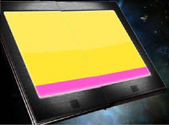
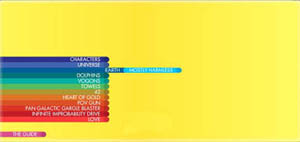
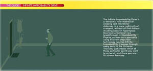
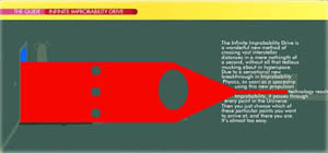
hitchhiker5.jpg I recently saw the new Hitchhiker’s Guide to the Galaxy movie, which features as one of its central characters a very powerful electronic book – a guide to “life, the universe and everything.” Coming away, I felt a bit uneasy. Could this be the future of the book in the age of Adobe-Macromedia? As portrayed in the film, the Guide is essentially a compendium of Flash animations, with a little bit of text, and a wry British voiceover. Granted, it’s just a narrative device in a film, designed more for style than for content. But is this any less true in real life?.. with all these websites built in Flash, and all the Flash-enhanced garbage on television – especially in ads and sports coverage (notice how TV’s become a lot more like a video game?). The same goes for the film. Though chock-a-block with spiffy visual effects, and flavored with Douglas Adams’ unmistakable wit, it’s basically all style, all pose – visual fireworks for a passive viewer. We have only just started to explore the frontier of media-rich, networked books. But if “FlashAcrobat” becomes the writing tool of choice, that just might end up preempting any serious consideration of an active, critical role for the reader. Books become the half time show at the Super Bowl. Flash frenzy…
hitchhiker3.jpg hitchhiker4.jpg
hitchhiker1.jpg hitchhiker2.jpg
Paul Boutin, writing last week in Slate, makes draws a more encouraging parallel to the fictional Guide: Wikipedia. “..a real-life Hitchhiker’s Guide: huge, nerdy, and imprecise.” I had not been aware that Adams, before his untimely death in 2001, had experimented with his own web version of the Guide, a sort of proto-Wikipedia called h2g2, hosted by the BBC. Flipping through just a few of the articles, it’s interesting to see a collaborative work sustaining a unified authorial voice. The tone, not to mention the choice of subjects, comes across as unmistakably Adams – the ur-author – even though the guide was built by diverse contributors, in more or less the same fashion as Wikipedia. Here’s the intro paragraph from the article “The Problem with Driving Directions”:
“In the absence of in-car electronic route maps, driving directions are sets of instructions given to drivers in order for them to reach their desired destination. These basically come in two different forms: oral and written. Whether oral or written, they are widely used due to the fact that people often have no idea how to get to where they are going, and naturally assume that they are the only ones that do not know, and so ask someone else. Unfortunately, this other person tends not to know either.”
Building on Boutin’s comparison, you could argue that Wikipedia is simply imitating the tone and format of a paper encyclopedia, much as Adams’ followers in h2g2 are emulating the style of his novels. As a reference tool, Wikipedia may have far outstripped Adams’ project, but questions of accuracy and reliability persist. h2g2, on the other hand, sits much more comfortably in its skin, cheerfully acknowledging that it contains “many omissions,” and “much that is apocryphal, or at least wildly inaccurate.” A much more serious and important endeavor, Wikipedia is still wrestling with the anxiety of influence exerted by its forebear, the encyclopedia. Over time, will its voice change?