
Sebastian Mary and i were talking last week about the need to re-conceive the format of if:book so that interesting posts which initiate lively discussions don’t get pushed to the bottom. a few days later i met with Rene Daalder who showed me his new site, Space Collective which is a gorgeous and brilliant re-thinking of the blog. click on “new posts” and notice how you can view them by “Recently Active, Most Popular, Newest First, and Most Active.” Also notice the elegant way individual posts emerge from the pack when you click on one of them. Please, if you know of other sites which are exploring new directions for the blog, please put the URL into a comment on this post.
Category Archives: design
thinking about tex
Chances are that unless you’re a mathematician or a physicist you don’t know anything about TeX. TeX is a computerized typesetting system begun in the late 1970s; since the 1980s, it’s been the standard way in which papers in the hard sciences are written on computers. TeX preceded PostScript, PDF, HTML, and XML, though it has connections to all of them. In general, though, people who aren’t hard scientists don’t tend to think about TeX any more; designers tend to think of it as a weird dead end. But TeX isn’t simply computer history: it’s worth thinking about in terms of how attitudes towards design and process have changed over time. In a sense, it’s one of the most serious long-term efforts to think about how we represent language on computers.
TeX famously began its life as a distraction. In 1977, Donald Knuth, a computer scientist, wanted a better way to typeset his mammoth book about computer science, The Art of Computer Science, a book which he is still in the process of writing. The results of phototypesetting a book heavy on math weren’t particularly attractive; Knuth reasoned that he could write a program that would do a better job of it. He set himself to learning how typesetting worked; in the end, what he constructed was a markup language that authors could write in and a program that would translated the markup language into files representing finished pages that could be sent to any printer. Because Knuth didn’t do anything halfway, he created this in his own programming language, WEB; he also made a system for creating fonts (a related program called Metafont) and his own fonts. There was also his concept of literate programming. All of it’s open source. In short, it’s the consummate computer science project. Since its initial release, TeX has been further refined, but it’s remained remarkably stable. Specialized versions have been spun off of the main program. Some of the most prominent are LaTeX, for basic paper writing, XeTeX, for non-Roman scripts, and ConTeXt, for more complex page design.
How does TeX work? Basically, the author writes entirely in plain text, working with a markup language, where bits of code starting with “” are interspersed with the content. In LaTeX, for example, this:
frac{1}{4}
results in something like this:
![]()
The “1” is the numerator of the fraction; the “4” is the denominator, and the frac tells LaTeX to make a top-over-bottom fraction. Commands like this exist for just about every mathematical figure; if commands don’t exist, they can be created. Non-math text works the same way: you type in paragraphs separated by blank lines and the TeX engine figures out how they’ll look best. The same system is used for larger document structures: the documentstyle{} command tells LaTeX what kind of document you’re making (a book, paper, or letter, for example). chapter{chapter title} makes a new chapter titled “chapter title”. Style and appearance is left entirely to the program: the author just tells the computer what the content is. If you know what you’re doing, you could write an entire book without leaving your text editor. While TeX is its own language, it’s not much more complicated than HTML and generally makes more sense; you can learn the basics in an afternoon.
To an extent, this is a technologically determined system. It’s based around the supposition of limited computing power: you write everything, then dump it into TeX which grinds away while you go out for coffee, or lunch, or home for the night. Modern TeX systems are more user friendly: you can type in some content and press the “Typeset” button to generate a PDF that can be inspected for problems. But the underlying concept is the same: TeX is document design that works in exactly the same way that a compiler for computer programs. Or, to go further back, the design process is much the same as metal typesetting: a manuscript is finished, then handed over to a typesetter.
This is why, I think, there’s the general conception among designers that TeX is a sluggish backwater. While TeX slowly perfected itself, the philosophy of WYSIWYG – What You See Is What You Get – triumphed. The advent of desktop publishing – programs like Quark XPress and Pagemaker – gave anyone with a computer the ability to change the layouts of text and images. (Publishing workflows often keep authors from working directly in page layout programs, but this is not an imposition of software. While it was certainly a pain to edit text in old versions of PageMarker, there’s little difference between editing text in Word and InDesign.) There’s an immediate payoff to a WYSIWYG system: you make a change and its immediately reflected in what you see on the screen. You can try things out. Designers tend to like this, though it has to be said that this working method has enabled a lot of very bad design.
(There’s no shortage of arguments against WYSIWYG design – the TeX community is nothing if not evangelical – but outside of world of scientific writing, it’s an uphill battle. TeX seems likely to hold ground in the hard sciences. There, perhaps, the separation between form and content is more absolute than elsewhere. Mathematics is an extremely precise visual embodiment of language; created by a computer scientist, TeX understands this.)
As print design has changed from a TeX-like model to WYSIWYG, so has screen design, where the same dichotomy – code vs. appearance – operates. Not that document design hasn’t taken something from Tex: TeX’s separation of content from style becomes a basic principle in XML, but where TeX has a specific task, XML generalizes. But in general, the idea of leaving style to those who specialize in it (the designer, in the case of print book design, the typesetting engine in TeX) is an idea that’s disappearing. The specialist is being replaced by the generalist. The marketer putting bulletpoints in his PowerPoint probably formats it himself, though it’s unlikely he’s been trained to do so. The blogger inadvertently creates collages by mixing words and images. Design has been radically decentralized.
The result of this has been mixed: there’s more bad design than ever before, simply because there’s more design. Gramsci comes uncomfortably to mind: “The crisis consists precisely in the fact that the old is dying and the new cannot be born; in this interregnum a great variety of morbid symptoms appear.” If TeX comes from an old order, it’s an order with admirable clarity of purpose. Thinking about TeX points out an obvious failure in the educational system that creates the current environment: while most of us are taught, in some form or another, to write, very few are taught to visually present information, and it’s not clear that a need for this is generally perceived. If we’re all to e designers, we have to all think like designers.
a serious shot at screen reading
Another new online magazine: Triple Canopy (noted by Ed Park). Unlike Issue and Rosa B. this isn’t a design magazine – although the content is very interesting – but like them, it’s a serious attempt to construct a new kind of magazine for the screen-reading environment. While Rosa B.‘s design uses the affordances of dynamic layering, Issue concentrates on reader annotation, Triple Canopy simply does away with the scroll bar.
Removing the scroll bar is an obvious idea for improving screen reading that’s only rarely implemented: when you read text with a scroll bar (like this blog), the reader is forced to remove their concentration from the text to scroll down and then to find where the reading left off. It’s something we’re all quite used to, but that doesn’t mean it’s an advantageous reading behavior; we put up with because we rarely have a choice. Triple Canopy reverts from the scroll bar to the paged model of the codex book: if you click on the “+” sign to the right of the page, a new page slides in. It’s obvious where to resume reading. The text itself is well-cared for: it’s presented in columns of legible width, another lesson of print design that’s too often ignored in the online world. Worth noting as well is the way that images are integrated into some of the texts; again, there’s a clear and understood model for how reading works. Video can be slotted into some of the pieces without causing a disturbance or overwhelming: it appears on a page by itself, meant to be the primary focus of attention.
It’s not entirely perfect: while the “+” sign always advances a page, “–” sometimes goes back a page and sometimes goes to the previous article (if clicked on the first page of the article). I wish clicking the “triplecanopy” at the bottom took you back to the issue’s table of contents and not the magazine’s front page. Because the site’s made in HTML, the design breaks if you increase or decrease the font size in your browser. And the Powerpoint-style wipe when the pages change quickly grows tiresome. But these are minor quibbles with a design that’s overwhelmingly successful. I’ll be curious to see if this is sustainable over more issues.
expressive processing: post-game analysis begins
So Noah’s just wrapped up the blog peer review of his manuscript in progress, and is currently debating whether to post the final, unfinished chapter. He’s also just received the blind peer reviews from MIT Press and is in the process of comparing them with the online discussion. That’ll all be written up soon, we’re still discussing format.
Meanwhile, Ian Bogost (the noted game designer, critic and professor) started an interesting thread a couple of weeks back on the troubles of reading Expressive Processing, and by extension, any long-form text or argument, on the Web:
The peer review part of the project seems to be going splendidly. But here’s a problem, at least for me: I’m having considerable trouble reading the book online. A book, unlike a blog, is a lengthy, sustained argument with examples and supporting materials. A book is textual, of course, and it can thus be serialized easily into a set of blog posts. But that doesn’t make the blog posts legible as a book…
…in their drive to move textual matter online, creators of online books and journals have not thought enough about the materiality of specific print media forms. This includes both the physicality of the artifacts themselves (I violently dogear and mark up my print matter) and the contexts in which people read them (I need to concentrate and avoid distraction when reading scholarship). These factors extend beyond scholarship too: the same could be said of newspapers and magazines, which arguably read much more casually and serendipitously in print form than they do in online form.
I’ve often considered Bolter and Grusin’s term “remediation” to be a derogatory one. Borrowing and refashioning the conventions of one medium in another opens the risk ignoring what unremediated features are lost. The web has still not done much more than move text (or images, or video) into a new distribution channel. Digitizing and uploading analog material is easy and has immediate, significant impact: web, iPod, YouTube. We’ve prized simple solutions because they are cheap and easy, but they are also insufficient. In the case of books and journal articles, to offer a PDF or print version of the online matter is to equivocate. And the fashionable alternative, a metaverse-like 3D web of the sort to which Second Life points, strikes me as a dismal sidestepping of the question.
issue magazine
Hot on the heels of Rosa B. (mentioned last week) comes Issue Magazine, another new web-based publication looking at the changing world of publishing and design. Issue #0, edited by Alexandre Leray and Stéphanie Vilayphiou, is undergoing a slow rollout this week, culminating in a live chat with Arie Altena, Jouke Kleerebezem, and Harrisson on Friday. Currently they’re featuring an essay and an interview with David Reinfurt of Dexter Sinister and Dot Dot Dot on the idea of open-source design and publishing; an interview with Kleerebezem and a piece by Roger Chartier will be up before the end of the week.
What’s particularly interesting about the format of Issue – and one area in which it differs from Rosa B. – is the way that commenting has been integrated into the articles: after units of the text, there’s the opportunity for the reader to add comments. It’s a bit like CommentPress in conception, but the prompts to comment in Issue appear less frequently than every paragraph. This makes sense: paragraph-level commenting is invaluable for close-reading, but less necessary for the general discussion of an essay. Because it’s early, there don’t seem to be any comments yet, but it’s a promising model of how the readers can be more immediately integrated into a publication.
rosa b.
A quick note to point out Rosa B, a new online publication in French and English from the CAPC Museum of Contemporary Art Bordeaux and the Bordeaux School of Fine Arts. Their first issue, online now, is about contemporary publishing and edited by the very interesting Thomas Boutoux. More of an art slant than a business one, but the features would probably interest readers of this site: an interview with Stuart Bailey of dot dot dot and Dexter Sinister about his publishing and design-related activities; novelist and critic Matthew Stadler talks about the social space of reading; and a nicely excerpted bit of Friedrich Kittler’s Gramophone, Film, Typewriter, which has been out in English translation for a while but could stand more readers.
Worth noting as much as the content is the form: Rosa B. is clearly designed for online reading, and takes advantages of the affordances of the web; it’s nice to see texts on reading that have been designed by someone who thinks about how they’ll be read. Texts overlap and intersect with other texts and illustrations; long filmed interviews mix with text amiably.
student designer envisions a more credible kindle
Engagdet points to an award winning Australian student design for an e-book reader that combines the gesture-based “multi-touch” interface of the iPhone with the e-ink display of the Kindle.
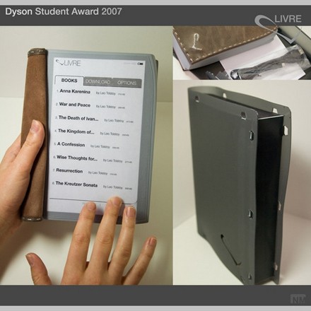
LIVRE design concept -? Nedzad Mujcinovic, Monash University
“Interaction happens via a thin capacitive touch screen mounted on top of an electronic paper screen (‘eINK’). Browsing pages happens by striking the screen from right bottom corner towards the centre of page to go forward or from the left hand corner to go backwards. Doing that using one finger will browse one page, two will browse ten pages and three will browse fifty pages at a time.”
If simple reenactment of basic black-and-white, illustration-light print reading is your goal, I’d say that this is a far more viable proposition than Amazon’s clunky gadget. (Thanks, Peter Brantley, for the link!)
biblical interweave
The image below shows every cross-references in the Bible. Definitely more the eye candy variety of information visualization, but I thought it was pretty.
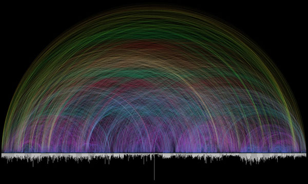
Chris Harrison, the creator, explains: “Different colors are used for various arc lengths, creating a rainbow like effect. The bar graph running along the bottom shows every chapter in the Bible and their respective lengths (in verses). Books alternate in color between white and light gray.”
(Via Information Aesthetics)
of forests and trees
On Salon Machinist Farhad Manjoo considers the virtues of skimming and contemplates what is lost in the transition from print broadsheets to Web browsers:
It’s well-nigh impossible to pull off the same sort of skimming trick on the Web. On the Times site, stories not big enough to make the front page end up in one of the various inside section pages — World, U.S., etc. — as well as in Today’s Paper, a long list of every story published that day.
But these collections show just a headline and a short description of each story, and thus aren’t nearly as useful as a page of newsprint, where many stories are printed in full. On the Web, in order to determine if a piece is important, you’ve got to click on it — and the more clicking you’re doing, the less skimming.
Manjoo notes the recent Poynter study that used eye-tracking goggles to see how much time readers spent on individual stories in print and online news. The seemingly suprising result was that people read an average of 15% more of a story online than in print. But this was based on a rather simplistic notion of the different types of reading we do, and how, ideally, they add up to an “informed” view of the world.
On the Web we are like moles, tunneling into stories, blurbs and bliplets that catch our eye in the blitzy surface of home pages, link aggregators, search engines or the personalized recommendation space of email. But those stories have to vie for our attention in an increasingly contracted space, i.e. a computer screen -? a situation that becomes all the more pronounced on the tiny displays of mobile devices. Inevitably, certain kinds of worthy but less attention-grabby stories begin to fall off the head of the pin. If newspapers are windows onto the world, what are the consequences of shrinking that window to the size of an ipod screen?
This is in many ways a design question. It will be a triumph of interface design when a practical way is found to take the richness and interconnectedness of networked media and to spread it out before us in something analogous to a broadsheet, something that flattens the world into a map of relations instead of cramming it through a series of narrow hyperlinked wormholes. For now we are trying to sense the forest one tree at a time.
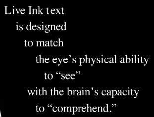
cascading phrases
Live Ink is an alternative approach to presenting texts in screen environments, arranging them in series of cascading phrases to increase readability (I saw this a couple of years ago at an educational publishing conference but it was brought to my attention again on Information Aesthetics). Live Ink was developed by brothers Stan and Randall Walker, both medical doctors (Stan an ophthalmologist), who over time became interested in the problems, especially among the young, of reading from computer displays. In their words:
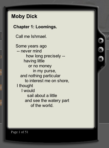
Here’a screenshot of their sample reader with chapter 1 of Moby-Dick:
Thoughts?