Category Archives: design

how would you design the iraq study group report for the web?

The Washington Post:

The “Iraq Study Group Report” paperback could have been wrapped in a brown paper bag, its title scrawled in Magic Marker. It would still sell. This is a book, unlike trillions of others on the market, whose substance and national import sell it, not its cover…Disproving the adage, this genre of book can indeed be judged by its cover. From the reports on the Warren Commission to Watergate, Iran-contra and now the Iraq war, such books are anomalies for a publishing industry that churns out covers intended to seduce readers, to reach out and grab them, and propel them to the cash register.

iraqreport.jpg 911report.jpg

watergatereport.jpg warrenreport.jpg

How would you design an unauthorized web edition of the ISG Report? Would you keep to the sober, no-nonsense aesthetic of the iconic print editions of past government documents like the 9/11 Commission Report or the Warren Commission Report? Or would you shake things up? A far more interesting question: what functionality would you add? What kind of discussion capabilities would you build into it? Who would you most like to see annotate or publicly comment on the document?
The electronic edition that has been making the rounds is an austere PDF made available by the United States Institute of Peace. A far more useful resource for close reading of the text was put out by Vivismo as a demonstration of its new Velocity Search Engine. They crawled the PDF and broke it into individual paragraphs, adding powerful clustered search tools.
The US Government Printing Office has a slew of public documents available on its website, mostly as PDFs or bare-bones HTML pages. How should texts of “national import” be reconceived for the network?

thoughts? suggestions?

holyallcomments.jpg We’re in the midst of making improvements to the commenting interface that we developed for Mitch Stephens’ Holy of Holies paper, readying it for another project (more about that soon) and, eventually, for general release as a Word Press theme. Trusting the old saw that with a million eyes, all bugs are shallow, we wanted to ask for your help — and on one area in particular.
You’ll notice that on any section of the paper, the default state for the discussion area in the righthand margin is a list of all the comments for that section. Our intention with this was to give readers a sense of the overall flow of the discussion, permitting them to tunnel into individual paragraphs by way of the comments rather than just the other way around. Our concern, however, is that in its current rough state it might be more confusing than helpful. We’d be grateful if you could take a moment to look at this feature again, click around, and let us know what we could do to make it better (and feel free to mention anything else you think needs work).

small steps toward an n-dimensional reading/writing space

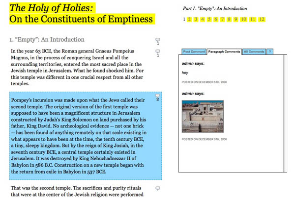
A few weeks ago, Mitch Stephens came to us with an interesting challenge: to design a social reading environment for a paper he will be presenting this Friday, Dec. 8 at a conference on religion and media at New York University. The paper, Holy of Holies: On the Constituents of Emptiness”, is now live. This paper draws on the research Mitch has been doing for his book-length study of the history of atheism. It concerns the 1st century B.C.E. episode of the Roman general Pompey’s incursion into the tabernacle of the Second Temple. What he finds there… well, you’ll see. It’s a fascinating piece, which makes some interesting connections between belief systems and media systems, and it’s ready for your comments, annotations and criticims which you can post paragraph by paragraph through the text. It’s a new format that we’re playing with that could give new meaning to the idea of the “working paper.” We’re still fixing bugs and adding new features, but the basic apparatus is there. Take a look.
holyofholiesscreenshot.jpg
Over the past few months, Mitch has been moving out of the research stage and into full-on writing of his manuscript, and as a result he’s been thinking about workshopping larger chunks of text on his blog. This presents something of a quandary, however, as the short, pithy format of the blog, so good at sparking discussions generally, is not very good at dealing with longer expository texts. Earlier in November Mitch posted a draft of his book’s prologue with the hopes of getting substantive feedback from readers. The response was interesting but meager, largely owing to the fact that the discussion (on the blog) was so totally divorced from the actual text (a Word doc download). He had opted not to publish the prologue directly onto the site, since that would have meant breaking it up into multiple posts to create more points for commenting. This struck him as too clunky, especially considering the reverse-chronological order of the blog would necessitate posting the paper back to front. So he went with the download option. With his new paper he hoped to do something better, so he came to the Institute, or the “garage” as he calls it, to see if we could engineer a new approach.
g7atopiascreenshot.jpg 
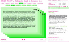
We had of course already done this with Gamer Theory. Our goal there had been to create a more richly interactive reading environment than was typically found in things broadly designated as “e-books,” an environment that offered multiple entry points for discussion and which placed reader input on roughly equal footing with the author’s text. This led to the deck of cards structure with comment areas to the side. Networked marginalia you might say, but far from marginal in its impact. As we had hoped/suspected, the discussion became a vital part of the book as a whole.
Now keep in mind that Ken submitted himself to a rigid rule set in writing his book: a uniform number of paragraphs per chapter (25), a strict word limit for paragraphs (250 or less), chapter titles in alphabetical order etc. In many ways, this made our design job easy. Just learn the rules and play the game. But it didn’t leave us with a tool that we could handily apply to other expository texts that are less consistently structured than Gamer Theory.
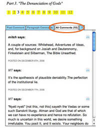
This experimental paper of Mitch’s is first stab at such a tool. Our solution was simply to give every paragraph (or block quote, or image) its own comment area. The commenting happens, as in Gamer Theory, alongside the text in the right margin but since the text isn’t broken up into cards, the comment area moves with you as you scroll down the page, changing its contents depending on which paragraph you’ve selected. It’s a small step, and although we’re pleased to be inching along toward better social document design, we’re painfully aware of the limitations, both technical and conceptual, that we have still to surmount.
Placing reader contributions alongside a text tends to involve breaking things up into columns, boxes and tabs, all of which are legacies of paper and print (not a crime in itself, but the point of this work is to move beyond simple mimicry of print into genuinely new structures for the electronic screen). In the digital environment, we can do nifty things like make boxes and columns overlap, hide areas of text behind other areas, or place windows within windows with multiple scrollbars, but we’re still thinking in two dimensions. We’re still thinking about the flat page. The question is, how many 2-D spaces can we layer together on a single flat plane before the whole thing collapses? How far can we hack Word Press before we rip open a worm hole that takes us to a reading/writing space where altogether different rules apply?
In October, a few of us went to see a fascinating panel (nominally on the topic of blogging, though it went off in various other directions) at the Hyperpolis conference at Brooklyn Polytechnic. It brought together a terrific lineup of internet theorists: Jodi Dean, Steven Shaviro, McKenzie Wark and Geert Lovink:
hyperpolispanel.JPG
Ken showed Gamer Theory and discussed its successes and failures. On the one hand, he was delighted that we’d managed to build something that allowed readers to get intimately (and socially) involved with the text. On the other, he was dismayed that to do this we had to construct what Jodi Dean described as “a textual fortress,” a hyper-structured reading space with strictly prescribed parameters for reader participation (two types of input were permitted: paragraph-specific comments and general discussion in the forum). This is not to mention the other fortress-like attribute of the site: its brittleness. We built the site according to the blueprint of Ken’s manuscript, which made it prohibitively difficult to adapt to other texts, or even to accomodate revisions of restructuring of the present one.
If these forms are to be adaptable to a wider range of writing endeavors then we’ll need, in Ken’s words, “a new spatial architecture for dealing with text….like a nine-dimensional string theory space. An n-dimensional space is needed.”
I like this way of putting it, an n-dimensional space. And we’re still stuck on two. Social reading, collaborative authorship and multimedia are all introducing new variables, but at best we’re hovering somewhere just shy of 2.5 dimensions in our ability to design for these new conditions. Although… maybe a rich 2.5 is actually what we should be striving for, at least as far as text is concerned. If we venture into 3-D (into Second Life?), don’t we shed that degree of abstraction that is best suited for conceptual thought? 2.5 then, perhaps with flashes of three (like this zooming interface after Jef Raskin) for moving between texts in ways that explore the semantics of spacial relations. We’ll have to keep tinkering…
This is not to say that we’re not optimistic about where this modest experiment with Mitch’s paper might lead. We’re going to continue to develop this format and will be using it, or variations of it, for a number of projects in the near future. We’re also working on something that allows highly flexible line by line, even word-level, commentary. So go read Mitch’s thought-provoking paper, use the discussion areas, and tell us what works and what doesn’t, keeping in mind that this is a rough prototype that we threw together in a very short amount of time.
Kudos especially to Jesse for the beautifully understated design, and to Eddie for making such elegant pretzels out of the Word Press architecture. Thanks also to Jack Slocum, whose work was a great inspiration to us.

ITIN place | 2007 redux: design journal, parts 1 & 2

ITIN place — May 2006 archives (left two columns with live links):


[1] SUMMER 2006
At the beginning of the summer, Ben Vershbow, Alex Itin, and I began to discuss a redesign of IT IN place‘s archives. Itin blogs prolifically, his posts rich with media: scans of paintings, animated .gifs, Vimeo linked video collages. As a result, at present, his blog archive is enormous, slow loading, and unweildy. The archive requires better display and search capabilities—a map— to foreground the sheer volume of Itin’s work, rather than bury it. Below is a series of exchanges, both visual and conversational, following the redesign of IT IN place‘s archives…

Continue reading

blogs and time (links for 11.1.06)

Interesting links that crossed my path over the past few days that I haven’t time to post on (and likely never will):

  • “French publishers join fight against Google Book Search”: Le Syndicat National de l’édition (SNE), a trade association of French publishers, has joined a suit brought against Google by the Le Martiniè re conglomerate in August for “counterfeiting and breach of intellectual property rights” in its book digitization program.
  • outside.in is a new web service co-created by Steven Johnson and John Geraci that aggregates blog content according to zip code, giving you a regularly updated guide to where you live. It uses a little Google map as a navigation tool — a dynamic table of contents.
  • US intelligence agencies use wikis: The CIA and other agencies have begun using an internal wiki site called the “Intellipedia” where staff post current events updates and colloborate on intelligence assessments, supposedly to avoid repeating mistakes like Iraq WMD. “‘I think in the future you’ll press a button and this will be the NIE,’ said Michael Wertheimer, assistant deputy director of national intelligence for analysis.”
  • Clay Shirky on “meganiches”
  • Wikipedia and the academy: To contribute or not to contribute? Article in Chronicle of Higher Ed. on the fraught relationship between academics and the online encyclopedia. Among other things discusses troubling disparity in quality between science articles and humanities articles. Is there a “two cultures” problem in online scholarly collaboration?
  • Ehon: The Artist and the Book in Japan: Glorious exhibit at the New York Public Library. A totally different way of thinking about books.

Should if:book serve as a filter and recommender, providing nutritious lists of links like the one above, or purely as a source of original ideas and commentary? If the answer is both, then what should be the ratio of shorter, “pointier” posts to longer, “thinkier” ones? Blogs are agnostic as to the varying size and speed of thoughts — everything goes into the same sinking scroll, soon vanishing into the catacombs of the monthly archives and category pages.
This works fine for news cycle or daily diary-type blogs, but it’s a handicap for a site like ours where longer meditations — the kind that would benefit from longer exposure — are the more common fare, and where extended, multi-post arcs on a relatively small cluster of central ideas are more what constitute the “story” of this blog than any given week’s smattering of entries. As I write, there are several extended conversations taking place within posts that, though only a few days old, are being pushed further and further down the scroll as newer content accumulates. The only hint of their still being active is the “recent comments” link to the right, which is at best an overheard whisper.
Given these constraints, and figuring that it’s the slower moving ideas that matter most, we generally try to avoid posting quick linkdumps like the one above — useful as they might be for annotating our wider web readings and pointing readers to interesting sites — simply because they have the unfortunate effect of pushing the other stuff down. But this only slightly mitigates the still unsolved problem of portraying complex movements of ideas over time on a dinky little blog.
As a side project, we’re thinking about how we could redesign if:book to keep the thinky stuff visible for longer and tied to past related discussions, while also keeping a swift current of useful annotated links and shorter observational posts. This might mean dividing our content into two separate feeds, as on this site.
We’ve also thought about ways to organize content thematically rather than temporally, so what you see at the top isn’t just the newest content, but a cluster of our most important and long-abiding conversations arranged by subject. We’re also considering changes to the individual permalinked pages of posts, perhaps adding dynamically generated links to related posts.
We’ve played around a bit with thematic arrangements on Mitch Stephens’ blog Without Gods. First, just below his banner there’s this tag cloud, which serves as a mental map of Mitch’s writing and interests:
mitchtagcloud.jpg
Then there are four side menus with recent posts divided up by general area. “Bonner’s Field” is current events, “Tales of Disbelief” deals with characters in his book, “Thinking Out Loud” is sort of free-form jamming on ideas, and “Book Writer’s Journal” is meta-commentary on the writing process:
mitchmenus1.jpgmitchmenus2.jpg
I’m also very taken with what this site, an NYU webzine on media and religion called The Revealer. They have a lovely section on the front page that divides articles and blog postings into three distinct tempos, or traffic lanes (which brings us back to the multiple streams/feeds idea):
todaytimelytimeless.jpg
“Time signature” is something we need to add to our design vocabulary for dealing with evolutionary, never-finished documents. Having multiple rates of movement in a single space can create interesting tensions and provide more points of entry to for the reader. I’m hoping we can put some of this into practice with if:book, and soon.
What are other sites that do a good job of handling time? Any other ideas as to how we might do better here?

phony reader 2: the ipod fallacy

Since the release of the Sony Reader, I’ve been thinking a lot about the difference between digital text and digital music, and why an ebook device is not, as much as publishers would like it to be, an iPod. This is not an argument over the complexity of literature versus the complexity of music, rather it is a question of interfaces. It seems to me that reading interfaces are much more complicated than listening ones.
sony-reader.jpg ipod.jpg 
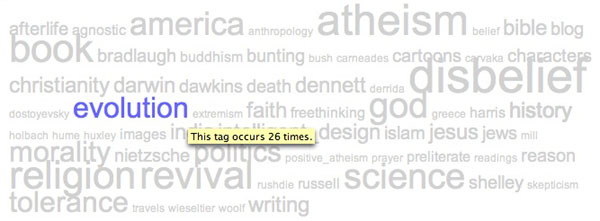
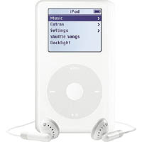
The iPod is, as skeptics initially complained, little more than a hard drive with earphones. But this is precisely its genius: the simplicity of its interface, the sleekness of its form, the radical smallness of its immense storage capacity. All these allow us to spend less time sorting through our music — lugging around stacks of albums, ejecting and inserting tapes or discs — and more time listening to it.
A sequence of smooth thumb gestures leads to the desired track. Once the track has commenced, the device is tucked away into a pocket or knapsack, and the music takes over. That’s the simplicity of the iPod. Reading devices, on the other hand — whether paperback, web page or specialized ebook hardware — are felt and perceived throughout the reading experience. The text, the visual design, and the reader’s movement through them are all in constant interaction. So the device necessarily must be more complex.
In other words, a book — even a digital one — is something you have to “handle” in order to process its contents. The question Sony should be asking is what handling a book should mean in a digital, networked context? Obviously, it’s something very different than in print.
Another thing about portable music players from Walkmen to iPods is that music, in its infinite variety, can be delivered to the senses through a uniform channel: from the player, through the wire, to the ear. Again, with books it’s not so simple. Different books have different looks, and with good reason: they are visual media. This is something we tend to forget because we so strongly associate books with intangible things like stories and abstract ideas. But writing is a manipulation of visual symbols, and reading is something we do with our eyes. So well-considered visual design, of both documents and devices, is crucial — as much for electronic documents as for print ones.
Publishers want their ipod, a simple gadget locked into a content channel (like iTunes), but they’re going to have to do a lot better than the Sony Reader. To date, the web has done a much better job at fostering a wide variety of reading forms, primitive as they may still be, than any specialized ebook device or ebook format. A hard drive with ear phones may work for music, but a hard drive (and a pitifully small one at that) with an e-ink screen won’t be sufficient for books.

the good life: part 1

The Van Alen Institute has organized an exhibition that explores new design and use of public space for recreation. The exhibition displays innovative designs for reimagined and reclaimed public spaces from various architects and urban planners. The projects are organized into five categories: The Connected City, the Cultural City, the 24-Hour City, the Fun City, and the Healthy City. As part of the exhibition, the Van Alen Institute has been holding weekly panel discussions about designing public space from international and local (NYC) perspectives. The participants have been high level partners in some of the most widely regarded architecture firms in NYC and the world. The questions and discussions afterwards, however, have proved to be the most interesting part; there have been questions about autonomy and conformity in public space, and how much of the new public space has been designed for safety, but little else. They have become ‘non-spaces’, and fail to support public needs for engagement, relaxation, and health.
This week their discussion will move away from the architectural and planning and into new technology. It will be interesting to see how technology supports and influences ideas of connectedness in a public place; while the value of connecting to others from a private, isolated space seems obvious, doing so from a public place seems less common and less intuitive than face-to-face interaction. The panel, including Christina Ray (responsible for the Conflux Festival ) and Nick Fortugno (Come Out & Play Festival), will present and discuss “The Wired City” at 6:30 pm on Wednesday, Sep. 27.

NYTimes reader

[editor’s note: The New York Times released a new software reader. It is Windows only. No Mac compatibility at this time. We asked Christine Boese, of serendipit-e.com, to post her thoughts on the matter.]

StoryLargeAppThumb.jpg

I got this off another news clip service I’m on…

NYT Finally Creates a Readable Online Newspaper (Slate)

Jack Shafer: About six months ago, I canceled my New York Times subscription because I had found the newspaper’s redesigned Web site to be superior to the print Times. I’ve now abandoned the Web version for the New York Times Reader, a new computer edition that has entered general beta release.

I went around to try to sign up for it and get a look. I couldn’t, because the Times IT dept overlooked making its beta available for Macs. I scanned through the screenshots, tho, and the comments on the blog preview of features, sneek peek #1 and #2.
Jack Shafer isn’t exactly an expert in interactive design, so I don’t know if his endorsement means anything other than, "Gee whiz, here’s a neato new thing!".
My initial impressions are that it looks like the International Herald Tribune
with a horizontal orientation I just can’t stand (the Herald Tribune often requires horizontal scrolling, and it’s far easier to read the printable version of stories). Yes, I see there is a narrow screen screenshot, but I’m thinking more about the text flow nightmares this design must cause.
But I think I have bigger reservations about the entire concept behind the Times Reader beta.
Here’s just a summary of questions I’d want answered, if I were actually able to test the beta:

  1. How is re-creating a facsimile of a print newspaper online a step forward for interactive media? Is it really, or is it just a kind of "horseless carriage" retrenchment? Shafer talks about some non-print-like pages that tell you what you’ve read or haven’t read, to assist browsing and search, but notes that the archives are thin. I wonder if the Times "Most Popular" feature makes the cut.
  2. Code. The big deal here is that it uses Microsoft .NET and advancers on Vista technology. I smell a walled garden. Is this XML-compatible? RSS-enabled? Is it even in HTML code that can be easily copied and pasted? (Shafer’s piece says it can be, but I want to see for myself) W3 validated? Does its content management system have permalinks? How do bookmarks work?
  3. Hyperlinks. Will the text accomodate them? Will the Times use them? Or by anchoring themselves firmly in a "reader" technology, perhaps a completely web-independent application, is the Times trying to go beyond simply a code-walled garden and also create a strong CONTENT walled garden as well? Is this a variant of TimesSelect on speed?
  4. Audience. Presumably the Times has some research that shows a need to court its paper-bound print-loving audience to its online products by making the online products more like the print products.
  5. But my question about audience is this: is there a REASON to make heroic efforts to lure print readers online? Isn’t the bigger issue trying to keep print readers attached to print, so that the ad-driven print editions don’t have to go the way of the dinosaur? The online news audience is already massive, and (Pew, Poynter) studies show that during the recent wars, large numbers of people were turning away from traditional news providers and outlets to seek out other sources of information, particularly international information, on the Internet and with news feed readers (RSS/Atom).
    So in a competitive online news landscape, the Times makes a strategic turn to become more like its print product? And this will lure large numbers of online news readers back exclusively to the Times exactly HOW? Especially if it is a walled garden that doesn’t integrate well into the Blogosphere or in RSS news feed readers?
    People like Terry Heaton and other media consultants (Heaton has a terrific blog, if you haven’t found it yet) are going out and telling traditional news media outlets that they have to move more strongly into an environment of UNBOUND media, to make their products more maleable for an unbound Internet environment. It appears the Times is not a company that has purchased Heaton’s services lately.

  6. Usability and Design. I’ve already mentioned the Mac incompatiblity. What other usability and design issues are present in this Times Reader technology? I’ll leave that to people who actually get use it.

From the screenshots I’ve seen, there seems to be very little functionality or interactive user-customizable features at all. I don’t know. Color me stupid, but my gut reaction is that this is nothing more than another variant of the exact PDF version of the paper that the Times put out, only perhaps with better text searching features and dynamic text flow (meaning I’d bet it is XML-based instead of PDF-based, only with some custom-built or Microsoft-blessed walled garden DTD).
You know, for the money the Times spent on this (and the experienced journalists the Times Group laid off this past year), I’d have thought the best use of resources for a big media company would be to develop a really KILLER RSS feed reader, one that finally gets over the usability threshold that keeps feed readers in "Blinking 12-land" for most casual Internet users.
I mean, I know there are a lot of good feed readers out there (I favor Bloglines myself), but have any of you tried to convert non-techie co-workers into using a feed reader lately? I can’t for the LIFE of me figure out why there’s so much resistance to something so purely wonderful and empowering, something I believe is clearly the killer app on par with the first Mosaic browser in 1993. But because feed readers caught on bottom up instead of top down, there’s not only usability problems for the broadest audiences, there’s also a void at the top of the technology industry, by companies that fail to catch on to the RSS vision, mainly because they didn’t think it up themselves.

physical books and networks 2

Much of our time here is devoted to the extreme electronic edge of change in the arena of publishing, authorship and reading. For some, it’s a more distant future than they are interested in, or comfortable, discussing. But the economics and means/modes of production of print are being no less profoundly affected — today — by digital technologies and networks.
The Times has an article today surveying the landscape of print-on-demand publishing, which is currently experiencing a boom unleashed by advances in digital technologies and online commerce. To me, Lulu is by far the most interesting case: a site that blends Amazon’s socially networked retail formula with a do-it-yourself media production service (it also sponsors an annual “Blooker” prize for blog-derived books). Send Lulu your book as a PDF and they’ll produce a bound print version, in black-and-white or color. The quality isn’t superb, but it’s cheap, and light years ahead of where print-on-demand was just a few years back. The Times piece mentions Lulu, but focuses primarily on a company called Blurb, which lets you design books with customized software called BookSmart, which you can download free from their website. BookSmart is an easy-to-learn, template-based assembly tool that allows authors to assemble graphics and text without the skills it takes to master professional-grade programs like InDesign or Quark. Blurb books appear to be of higher quality than Lulu’s, and correspondingly, more expensive.
nomadeconomics.jpg Reading this reminded me of an email I received about a month back in response to my “Physical Books and Networks” post, which looked at authors who straddle the print and digital worlds. It came from Abe Burmeister, a New York-based designer, writer and artist, who maintains an interesting blog at Abstract Dynamics, and has also written a book called Economies of Design and Other Adventures in Nomad Economics. Actually, Burmeister is still in the midst of writing the book — but that hasn’t stopped him from publishing it. He’s interested in process-oriented approaches to writing, and in situating acts of authorship within the feedback loops of a networked readership. At the same time, he’s not ready to let go of the “objectness” of paper books, which he still feels is vital. So he’s adopted a dynamic publishing strategy that gives him both, producing what he calls a “public draft,” and using Lulu to continually post new printable versions of his book as they are completed.
His letter was quite interesting so I’m reproducing most of it:

Using print on demand technology like lulu.com allows for producing printed books that are continuously being updated and transformed. I’ve been using this fact to develop a writing process loosely based upon the linux “release early and release often” model. Books that essentially give the readers a chance to become editors and authors a chance to escape the frozen product nature of traditional publishing. It’s not quite as radical an innovation as some of your digital and networked book efforts, but as someone who believes there always be a particular place for paper I believe it points towards a subtly important shift in how the books of the future will be generated.
…one of the things that excites me about print on demand technology is the possibilities it opens up for continuously evolving books. Since most print on demand systems are pdf powered, and pdfs have a degree of programability it’s at least theoretically possible to create a generative book; a book coded in such a way that each time it is printed an new result comes out. On a more direct level though it’s also very practically possible for an author to just update their pdf’s every day, allowing for say a photo book to contain images that cycle daily, or the author’s photo to be a web cam shot of them that morning.
When I started thinking about the public drafting process one of the issues was how to deal with the fact that someone might by the book and then miss out on the content included in the edition that came out the next day. Before I received my first hard copies I contemplated various ways of issuing updated chapters and ways to decide what might be free and what should cost money. But as soon as I got that hard copy the solution became quite clear, and I was instantly converted into the Cory Doctrow/Yochai Benkler model of selling the book and giving away the pdf. A book quite simply has a power as an object or artifact that goes completely beyond it’s content. Giving away the content for free might reduce books sales a bit (I for instance have never bought any of Doctrow’s books, but did read them digitally), but the value and demand for the physical object will still remain (and I did buy a copy of Benkler’s tome.) By giving away the pdf, it’s always possible to be on top of the content, yet still appreciate the physical editions, and that’s the model I have adopted.

And an interesting model it is too: a networked book in print. Since he wrote this, however, Burmeister has closed the draft cycle and is embarking on a total rewrite, which presumably will become a public draft at some later date.

the networked book: an increasingly contagious idea

pulselogo3.gif Farrar, Straus and Giroux have ventured into waters pretty much uncharted by a big commercial publisher, putting the entire text of one of their latest titles online in a form designed to be read inside a browser. “Pulse,” a sweeping, multi-disciplinary survey by Robert Frenay of “the new biology” — “the coming age of systems and machines inspired by living things” — is now available to readers serially via blog, RSS or email: two installments per day and once per day on weekends.
Naturally, our ears pricked up when we heard they were calling the thing a “networked book” — a concept we’ve been developing for the past year and a half, starting with Kim White’s original post here on “networked book/book as network.” Apparently, the site’s producer, Antony Van Couvering, had never come across if:book and our mad theories before another blogger drew the connection following Pulse’s launch last week. So this would seem to be a case of happy synergy. Let a hundred networked books bloom.
The site is nicely done, employing most of the standard blogger’s toolkit to wire the book into the online discourse: comments, outbound links (embedded by an official “linkologist”), tie-ins to social bookmarking sites, a linkroll to relevant blog carnivals etc. There are also a number of useful tools for exploring the book on-site: a tag cloud, a five-star rating system for individual entries, a full-text concordance, and various ways to filter posts by topic and popularity.
My one major criticism of the Pulse site is that the site is perhaps a little over-accessorized, the design informed less by the book’s inherent structure and themes than by a general enthusiasm for Web 2.0 tools. Pulse clearly was not written for serialization and does not always break down well into self-contained units, so is a blog the ideal reading environment or just the reading environment most readily at hand? Does the abundance of tools perhaps overcrowd the text and intimidate the reader? There has been very little reader commenting or rating activity so far.
But this could all be interpreted as a clever gambit: perhaps FSG is embracing the web with a good faith experiment in sharing and openness, and at the same time relying on the web’s present limitations as a reading interface (and the dribbling pace of syndication — they’ll be rolling this out until November 6) to ultimately drive readers back to the familiar print commodity. We’ll see if it works. In any event, this is an encouraging sign that publishers are beginning to broaden their horizons — light years ahead of what Harper Collins half-heartedly attempted a few months back with one of its more beleaguered titles.
I also applaud FSG for undertaking an experiment like this at a time when the most aggressive movements into online publishing have issued not from publishers but from the likes of Google and Amazon. No doubt, Googlezon’s encroachment into electronic publishing had something to do with FSG’s decision to go ahead with Pulse. Van Couvering urges publishers to take matters into their own hands and start making networked books:

Why get listed in a secondary index when you can be indexed in the primary search results page? Google has been pressuring publishers to make their books available through the Google Books program, arguing (basically) that they’ll get more play if people can search them. Fine, except Google may be getting the play. If you’re producing the content, better do it yourself (before someone else does it).

I hope tht Pulse is not just the lone canary in the coal mine but the first of many such exploratory projects.
Here’s something even more interesting. In a note to readers, Frenay talks about what he’d eventually like to do: make an “open source” version of the book online (incidentally, Yochai Benkler has just done something sort of along these lines with his new book, “The Wealth of Networks” — more on that soon):

At some point I’d like to experiment with putting the full text of Pulse online in a form that anyone can link into and modify, possibly with parallel texts or even by changing or adding to the wording of mine. I like the idea of collaborative texts. I also feel there’s value in the structure and insight that a single, deeply committed author can bring to a subject. So what I want to do is offer my text as an anchor for something that then grows to become its own unique creature. I like to imagine Pulse not just as the book I’ve worked so hard to write, but as a dynamic text that can continue expanding and updating in all directions, to encompass every aspect of this subject (which is also growing so rapidly).

This would come much closer to the networked book as we at the institute have imagined it: a book that evolves over time. It also chimes with Frenay’s theme of modeling technology after nature, repurposing the book as its own intellectual ecosystem. By contrast, the current serialized web version of Pulse is still very much a pre-network kind of book, its structure and substance frozen and non-negotiable; more an experiment in viral marketing than a genuine rethinking of the book model. Whether the open source phase of Pulse ever happens, we have yet to see.
But taking the book for a spin in cyberspace — attracting readers, generating buzz, injecting it into the conversation — is not at all a bad idea, especially in these transitional times when we are continually shifting back and forth between on and offline reading. This is not unlike what we are attempting to do with McKenzie Wark’s “Gamer Theory,” the latest draft of which we are publishing online next month. The web edition of Gamer Theory is designed to gather feedback and to record the conversations of readers, all of which could potentially influence and alter subsequent drafts. Like Pulse, Gamer Theory will eventually be a shelf-based book, but with our experiment we hope to make this networked draft a major stage in its growth, and to suggest what might lie ahead when the networked element is no longer just a version or a stage, but the book itself.