
Though a substantial portion of our reading now takes place online, we still chafe against the electronic page, in part because today’s screens are hostile to the eye, but also, I think, because we are waiting for something new – something beyond a shallow mimicry of print. Occasionally, however, you come across something that suggests a new possibility for what a page, or series of pages, can be when words move to the screen.
I came across such a thing today on CNET’s new site, which has a feature called “The Big Picture,” a dynamic graphical display that places articles at the center of a constellation, drawing connections to related pieces, themes, and company profiles.

Click on another document in the cluster and the items re-arrange around a new center, and so on – ontologies are traced. But CNET’s feature does not go terribly far in illuminating the connections, or rather the different kinds of connections, between articles and ideas. They should consider degrees of relevance, proximity in time, or overlaps in classification. Combined with a tagging system, this could get interesting. As it stands, it doesn’t do much that a simple bullet list of related articles can’t already do admirably, albeit with fewer bells and whistles.
But this is pushing in an interesting direction, testing ways in which a web publication can organize and weave together content, shedding certain holdovers from print that are no longer useful in digital space. CNET should keep playing with this idea of an article ontology viewer – it could be refined into a legitimately useful tool.
Category Archives: design
blogs — trying to fit round pegs into square holes
i’ve been without an internet connection for a few days. was catching up on if:book posts and finding myself delighted by the wonderful range of interesting posts my colleagues had managed in just a few days. which made me want to send a note to lots of friends and acquaintances urging them to check out our blog. but then my more nervous, modest side took over and convinced me that urging people to sample a blog as wide-ranging as if:book is a dicey proposition since sampling one day’s posts doesn’t necessarily indicate the extent of our interests. the structure of blogs favors the chronology of entry; thematic categories are listed on the side but without much fanfare. wonder if we could re-arrange the “front page” to be more magazine like, where for example “recent posts” would be one feature among many.
fertile pages
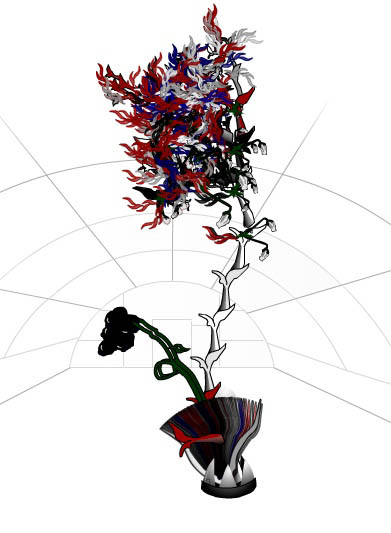
Organic HTML is a wonderful little applet I came across that turns websites into bizarre-looking plants. information aesthetics speculates on how it might work:
the emerging plant appears to use the colors similar to those found in the website HTML, CSS or images, while its size & branches depend on the site structure, content or number of pages. without any readily provided explanation or legend, one keeps trying to feed it URLs to derive the most beautiful flower (while avoiding the sometimes appearing flies)
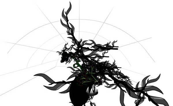
Plug in a URL and try it out (be warned: it might crash your browser). if:book is apparently an inky species of blog (see above). I’ll add this to our garden. I wonder why there aren’t more sprouts of orange? The New York Times comes out more floral.
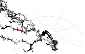
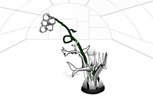
Something interesting I found, take a look at these two plants. One is Google, the other Yahoo! Can you guess which is which? (The larger plant has been scaled down.)
NYPL ebook collection leaves much to be desired
I just checked out two titles from the New York Public Library’s ebook catalog, only to learn, to my great astonishment, that those books are now effectively “checked out,” and cannot be downloaded again by anyone else until my copies time out.
It boggles the mind that NYPL would go to the trouble of establishing a collection of electronic titles, only to wipe out every advantage offered by digital texts. In fact, they do more than simply keep the ebooks on the level of print, they limit them further than that, since there are generally multiple copies of most print titles in the NYPL system.
The people responsible for this catalog have either entirely failed to grasp the concept of infinitely accessible, screen-based books, or they grasp it all too well and are trying to stunt it at its inception, perhaps out of fear of extinction of the print librarian. More likely, they are under heavy pressure by a paranoid copyright regime. Whatever the reason, the new ebook catalog shows a total lack of imagination and offers nearly no tangible benefit for the reader.
Beyond that, the books themselves are poorly designed and unpleasant to read. My downloaded copy of Conrad’s Heart of Darkness (which, by the way, I found in the “Romance” section) evidences no more than ten minutes worth of design work, and appears to be simply a cut-and-pasted ASCII file from Gutenberg with a garish graphic slapped on the cover. My copy of Chain of Command by Seymour Hersh was a bit more respectable – more or less a pdf facsimile of the print edition.
On an amusing note, the “literary criticism” section is populated almost entirely by Cliff’s Notes.