Category Archives: interface

interface culture

Omnisio, a new Y Combinator startup, lets people grab clips from the Web and mash them up. Users can integrate video with slide presentations, and enable time-sensitive commenting in little popup bubbles layered on the video.
MediaCommons was founded partly to find a way of conducting media studies discussions at a pace more congruent with changes in the media landscape. It’s tempting to see this as part of that same narrative: crowdsourcing media commentary for the ADHD generation. For me, though, it evokes a question that Kate Pullinger raised during the research Chris and I conducted for the Arts Council. Namely: are we seeing an ineluctable decline of text on the Web? Are writers becoming multi-skilled media assemblers, masher-uppers, creators of Slideshares and videocasts and the rest? And if so, is this a bad thing?
I’ve been re-reading In The Beginning Was The Command Line, a 1999 meditation by Neal Stephenson on the paradigm shift from command line to GUI interactions in computer use. In a discussion on Disneyland, he draws a parallel between ‘Disneyfication’ and the shift from command line to GUI paradigm, and thence to an entire approach to culture:

Why are we rejecting explicit word-based interfaces, and embracing graphical or sensorial ones–a trend that accounts for the success of both Microsoft and Disney?
Part of it is simply that the world is very complicated now–much more complicated than the hunter-gatherer world that our brains evolved to cope with–and we simply can’t handle all of the details. We have to delegate. We have no choice but to trust some nameless artist at Disney or programmer at Apple or Microsoft to make a few choices for us, close off some options, and give us a conveniently packaged executive summary.
But more importantly, it comes out of the fact that, during this century, intellectualism failed, and everyone knows it. In places like Russia and Germany, the common people agreed to loosen their grip on traditional folkways, mores, and religion, and let the intellectuals run with the ball, and they screwed everything up and turned the century into an abbatoir. Those wordy intellectuals used to be merely tedious; now they seem kind of dangerous as well.
We Americans are the only ones who didn’t get creamed at some point during all of this. We are free and prosperous because we have inherited political and values systems fabricated by a particular set of eighteenth-century intellectuals who happened to get it right. But we have lost touch with those intellectuals, and with anything like intellectualism, even to the point of not reading books any more, though we are literate. We seem much more comfortable with propagating those values to future generations nonverbally, through a process of being steeped in media.

So this culture, steeped in media, emerges from intellectualism and arrives somewhere quite different. Stephenson goes on to discus the extent to which word processing programs complicate the assumed immutability of the written word, whether through system crashes, changing formats or other technical problems:

The ink stains the paper, the chisel cuts the stone, the stylus marks the clay, and something has irrevocably happened (my brother-in-law is a theologian who reads 3250-year-old cuneiform tablets–he can recognize the handwriting of particular scribes, and identify them by name). But word-processing software–particularly the sort that employs special, complex file formats–has the eldritch power to unwrite things. A small change in file formats, or a few twiddled bits, and months’ or years’ literary output can cease to exist.

For Stephenson, a skilled programmer as well as a writer, the solution is to dive into FLOSS tools, to become adept enough at the source code to escape reliance on GUIs. But what about those who do not? This is the deep anxiety that underpins the Flash-is-evil debate that pops up now and again in discussions of YouTube: when you can’t ‘View Source’ any more, how are you supposed to learn? Mashup applications like Microsoft’s Popfly give me the same nervous feeling of wielding tools that I don’t – and will never – understand.
And it’s central to the question confronting us, as the Web shifts steadily away from simple markup and largely textual interactions, toward multifaceted mashups and visual media that relegate the written word to a medium layered over the top – almost an afterthought. Stephenson is ambivalent about the pros and cons of ‘interface culture’: “perhaps the goal of all this is to make us feckless so we won’t nuke each other”, he says, but ten years on, deep in the War on Terror, it’s clear that hypermediation hasn’t erased the need for bombs so much as added webcams to their explosive noses so we can cheer along. And despite my own streak of techno-meritocracy (‘if they’ve voted it to the top then dammit, it’s the best’) I have to admit to wincing at the idea that intellectualism is so thoroughly a thing of the past.
This was meant to be a short post about how exciting it was to be able to blend video with commentary, and how promising this was for new kinds of literacy. But then I watched this anthology of Steve Ballmer videos, currently one of the most popular on the Omnisio site, and (once I stopped laughing) started thinking about the commentary over the top. What it’s for (mostly heckling), what it achieves, and how it relates to – say – the kind of skill that can produce an essay on the cultural ramifications of computer software paradigms. And it’s turned into a speculation about whether, as a writer, I’m on the verge of becoming obsolete, or at least in need of serious retraining. I don’t want this to lapse into the well-worn trope that conflates literacy with moral and civic value – but I’m unnerved by the notion of a fully post-literate world, and by the Flash applications and APIs that inhabit it.

a new blog format avoids the tyranny of chronology

Sebastian Mary and i were talking last week about the need to re-conceive the format of if:book so that interesting posts which initiate lively discussions don’t get pushed to the bottom. a few days later i met with Rene Daalder who showed me his new site, Space Collective which is a gorgeous and brilliant re-thinking of the blog. click on “new posts” and notice how you can view them by “Recently Active, Most Popular, Newest First, and Most Active.” Also notice the elegant way individual posts emerge from the pack when you click on one of them. Please, if you know of other sites which are exploring new directions for the blog, please put the URL into a comment on this post.

…and cinematic photographs

image from the whale hunt by jonathan harrisTo make a trifecta of film posts for the day, I’ll point out Jonathan Harris’s The Whale Hunt. Properly speaking, this isn’t a film at all; rather, it’s a sequence of 3,214 photographs which Jonathan Harris took over a week’s trip to Alaska to observe a traditional whale hunt. Harris has date-stamped, captioned, and tagged (in three ways) each photograph. They appear in a Flash interface which displays the images in sequence: a very long slideshow. What’s interesting about Harris’s work – and which may merit his declaration that it’s “an experiment in human storytelling” is they way in which tags are used in the interface: if you click the whale that appears in the top center of each photographs, you can change the constraints on the sequence of photographs that you’re looking at. You can choose to see, for example, only photographs taken in Barrow, Alaska; only photographs featuring the first whale killed; only photographs that show children. Or you can choose a mixture of qualifications. One particularly interesting qualifier is the use of “cadence”: you can choose to see pictures that were taken close together in time – presumably when more interesting things were happening – or further apart – when, for example, the narrator is sleeping and has the camera set up to automatically photograph every five minutes.

My sense in playing with it for a bit is that using constraint in this manner isn’t a tremendously compelling method of storytelling. It is, however, a powerful way of drilling into an archive to see exactly what you want to see.

wood book seed key water word

Thanks to James Long of Pan Macmillan for this link to the 370 Day Project, a huge wooden book made by South African artist Willem Boshoff:
CLICK HERE
Boshoff writes:
“I have been playing with the concept of secrecy in my work,” Boshoff said, “because I believe it plays a vital part in nature and in the universe. But I have tried to use it creatively.
“This is an intensely personal statement, and I look upon it in the same light as a book. A book is closed and concealed once it is read until you reopen it, perhaps only once or twice in a lifetime, for a reminder, or for a refreshment…”
Steve Dearden, a key figure on the Literature Development scene in the UK sent me this link to Christopher Woebken’s http://NEW SENSUAL INTERFACES
Finally, Julius Popp’s bit.fall, seems relevant here – it isn’t new, but it’s beautiful.

Bit.Fall – MyVideo

of forests and trees

On Salon Machinist Farhad Manjoo considers the virtues of skimming and contemplates what is lost in the transition from print broadsheets to Web browsers:

It’s well-nigh impossible to pull off the same sort of skimming trick on the Web. On the Times site, stories not big enough to make the front page end up in one of the various inside section pages — World, U.S., etc. — as well as in Today’s Paper, a long list of every story published that day.
But these collections show just a headline and a short description of each story, and thus aren’t nearly as useful as a page of newsprint, where many stories are printed in full. On the Web, in order to determine if a piece is important, you’ve got to click on it — and the more clicking you’re doing, the less skimming.

Manjoo notes the recent Poynter study that used eye-tracking goggles to see how much time readers spent on individual stories in print and online news. The seemingly suprising result was that people read an average of 15% more of a story online than in print. But this was based on a rather simplistic notion of the different types of reading we do, and how, ideally, they add up to an “informed” view of the world.
On the Web we are like moles, tunneling into stories, blurbs and bliplets that catch our eye in the blitzy surface of home pages, link aggregators, search engines or the personalized recommendation space of email. But those stories have to vie for our attention in an increasingly contracted space, i.e. a computer screen -? a situation that becomes all the more pronounced on the tiny displays of mobile devices. Inevitably, certain kinds of worthy but less attention-grabby stories begin to fall off the head of the pin. If newspapers are windows onto the world, what are the consequences of shrinking that window to the size of an ipod screen?
This is in many ways a design question. It will be a triumph of interface design when a practical way is found to take the richness and interconnectedness of networked media and to spread it out before us in something analogous to a broadsheet, something that flattens the world into a map of relations instead of cramming it through a series of narrow hyperlinked wormholes. For now we are trying to sense the forest one tree at a time.

cascading phrases

Live Ink is an alternative approach to presenting texts in screen environments, arranging them in series of cascading phrases to increase readability (I saw this a couple of years ago at an educational publishing conference but it was brought to my attention again on Information Aesthetics). Live Ink was developed by brothers Stan and Randall Walker, both medical doctors (Stan an ophthalmologist), who over time became interested in the problems, especially among the young, of reading from computer displays. In their words:
liveinktext.jpg
Here’a screenshot of their sample reader with chapter 1 of Moby-Dick:
liveinkdemo.jpg
Thoughts?

the open library

openLibrary.jpg 
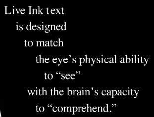
A little while back I was musing on the possibility of a People’s Card Catalog, a public access clearinghouse of information on all the world’s books to rival Google’s gated preserve. Well thanks to the Internet Archive and its offshoot the Open Content Alliance, it looks like we might now have it – ?or at least the initial building blocks. On Monday they launched a demo version of the Open Library, a grand project that aims to build a universally accessible and publicly editable directory of all books: one wiki page per book, integrating publisher and library catalogs, metadata, reader reviews, links to retailers and relevant Web content, and a menu of editions in multiple formats, both digital and print.

Imagine a library that collected all the world’s information about all the world’s books and made it available for everyone to view and update. We’re building that library.

The official opening of Open Library isn’t scheduled till October, but they’ve put out the demo now to prove this is more than vaporware and to solicit feedback and rally support. If all goes well, it’s conceivable that this could become the main destination on the Web for people looking for information in and about books: a Wikipedia for libraries. On presentation of public domain texts, they already have Google beat, even with recent upgrades to the GBS system including a plain text viewing option. The Open Library provides TXT, PDF, DjVu (a high-res visual document browser), and its own custom-built Book Viewer tool, a digital page-flip interface that presents scanned public domain books in facing pages that the reader can leaf through, search and (eventually) magnify.
Page turning interfaces have been something of a fad recently, appearing first in the British Library’s Turning the Pages manuscript preservation program (specifically cited as inspiration for the OL Book Viewer) and later proliferating across all manner of digital magazines, comics and brochures (often through companies that you can pay to convert a PDF into a sexy virtual object complete with drag-able page corners that writhe when tickled with a mouse, and a paper-like rustling sound every time a page is turned).
This sort of reenactment of paper functionality is perhaps too literal, opting for imitation rather than innovation, but it does offer some advantages. Having a fixed frame for reading is a relief in the constantly scrolling space of the Web browser, and there are some decent navigation tools that gesture toward the ways we browse paper. To either side of the open area of a book are thin vertical lines denoting the edges of the surrounding pages. Dragging the mouse over the edges brings up scrolling page numbers in a small pop-up. Clicking on any of these takes you quickly and directly to that part of the book. Searching is also neat. Type a query and the book is suddenly interleaved with yellow tabs, with keywords highlighted on the page, like so:
openlibraryexample.jpg
But nice as this looks, functionality is sacrificed for the sake of fetishism. Sticky tabs are certainly a cool feature, but not when they’re at the expense of a straightforward list of search returns showing keywords in their sentence context. These sorts of references to the feel and functionality of the paper book are no doubt comforting to readers stepping tentatively into the digital library, but there’s something that feels disjointed about reading this way: that this is a representation of a book but not a book itself. It is a book avatar. I’ve never understood the appeal of those Second Life libraries where you must guide your virtual self to a virtual shelf, take hold of the virtual book, and then open it up on a virtual table. This strikes me as a failure of imagination, not to mention tedious. Each action is in a sense done twice: you operate a browser within which you operate a book; you move the hand that moves the hand that moves the page. Is this perhaps one too many layers of mediation to actually be able to process the book’s contents? Don’t get me wrong, the Book Viewer and everything the Open Library is doing is a laudable start (cause for celebration in fact), but in the long run we need interfaces that deal with texts as native digital objects while respecting the originals.
What may be more interesting than any of the technology previews is a longish development document outlining ambitious plans for building the Open Library user interface. This covers everything from metadata standards and wiki templates to tagging and OCR proofreading to search and browsing strategies, plus a well thought-out list of user scenarios. Clearly, they’re thinking very hard about every conceivable element of this project, including the sorts of things we frequently focus on here such as the networked aspects of texts. Acolytes of Ted Nelson will be excited to learn that a transclusion feature is in the works: a tool for embedding passages from texts into other texts that automatically track back to the source (hypertext copy-and-pasting). They’re also thinking about collaborative filtering tools like shared annotations, bookmarking and user-defined collections. All very very good, but it will take time.
Building an open source library catalog is a mammoth undertaking and will rely on millions of hours of volunteer labor, and like Wikipedia it has its fair share of built-in contradictions. Jessamyn West of librarian.net put it succinctly:

It’s a weird juxtaposition, the idea of authority and the idea of a collaborative project that anyone can work on and modify.

But the only realistic alternative may well be the library that Google is building, a proprietary database full of low-quality digital copies, a semi-accessible public domain prohibitively difficult to use or repurpose outside the Google reading room, a balkanized landscape of partner libraries and institutions left in its wake, each clutching their small slice of the digitized pie while the whole belongs only to Google, all of it geared ultimately not to readers, researchers and citizens but to consumers. Construed more broadly to include not just books but web pages, videos, images, maps etc., the Google library is a place built by us but not owned by us. We create and upload much of the content, we hand-make the links and run the search queries that program the Google brain. But all of this is captured and funneled into Google dollars and AdSense. If passive labor can build something so powerful, what might active, voluntary labor be able to achieve? Open Library aims to find out.

time machine

The other day, a bunch of us were looking at this new feature promised for Leopard, the next iteration of the Mac operating system, and thinking about it as a possible interface for document versioning.

I’ve yet to find something that does this well. Wikis and and Google Docs give you chronological version lists. In Microsoft Word, “track changes” integrates editing history within the surface of the text, but it’s ugly and clunky. Wikipedia has a version comparison feature, which is nice, but it’s only really useful for scrutinizing two specific passages.
If a document could be seen to have layers, perhaps in a similar fashion to Apple’s Time Machine, or more like Gamer Theory‘s stacks of cards, it would immediately give the reader or writer a visual sense of how far back the text’s history goes – not so much a 3-D interface as 2.5-D. Sifting through the layers would need to be easy and tactile. You’d want ways to mark, annotate or reference specific versions, to highlight or suppress areas where text has been altered, to pull sections into a comparison view. Perhaps there could be a “fade” option for toggling between versions, slowing down the transition so you could see precisely where the text becomes liquid, the page in effect becoming a semi-transparent membrane between two versions. Or “heat maps” that highlight, through hot and cool hues, the more contested or agonized-over sections of the text (as in the Free Software Foundations commentable drafts of the GNU General Public License).
And of course you’d need to figure out comments. When the text is a moving target, which comments stay anchored to a specific version, and which ones get carried with you further through the process? What do you bring with you and what do you leave behind?

screenreading reconsidered

There’s an interesting piece by Cory Doctorow in Locus Magazine, a sci-fi and fantasy monthly, entitled “You Do Like Reading Off a Computer Screen.” discussing the differences between on and offline reading.

The novel is an invention, one that was engendered by technological changes in information display, reproduction, and distribution. The cognitive style of the novel is different from the cognitive style of the legend. The cognitive style of the computer is different from the cognitive style of the novel.
Computers want you to do lots of things with them. Networked computers doubly so — they (another RSS item) have a million ways of asking for your attention, and just as many ways of rewarding it.

And he illustrates his point by noting throughout the article each time he paused his writing to check an email, read an RSS item, watch a YouTube clip etc.
I think there’s more that separates these forms of reading than distracted digital multitasking (there are ways of reading online reading that, though fragmentary, are nonetheless deep and sustained), but the point about cognitive difference is spot on. Despite frequent protestations to the contrary, most people have indeed become quite comfortable reading off of screens. Yet publishers still scratch their heads over the persistent failure of e-books to build a substantial market. Befuddled, they blame the lack of a silver bullet reading device, an iPod for books. But really this is a red herring. Doctorow:

The problem, then, isn’t that screens aren’t sharp enough to read novels off of. The problem is that novels aren’t screeny enough to warrant protracted, regular reading on screens.
Electronic books are a wonderful adjunct to print books. It’s great to have a couple hundred novels in your pocket when the plane doesn’t take off or the line is too long at the post office. It’s cool to be able to search the text of a novel to find a beloved passage. It’s excellent to use a novel socially, sending it to your friends, pasting it into your sig file.
But the numbers tell their own story — people who read off of screens all day long buy lots of print books and read them primarily on paper. There are some who prefer an all-electronic existence (I’d like to be able to get rid of the objects after my first reading, but keep the e-books around for reference), but they’re in a tiny minority.
There’s a generation of web writers who produce “pleasure reading” on the web. Some are funny. Some are touching. Some are enraging. Most dwell in Sturgeon’s 90th percentile and below. They’re not writing novels. If they were, they wouldn’t be web writers.

On a related note, Teleread pointed me to this free app for Macs called Tofu, which takes rich text files (.rtf) and splits them into columns with horizontal scrolling. It’s super simple, with only a basic find function (no serious search), but I have to say that it does a nice job of presenting long print-like texts. By resizing the window to show fewer or more columns you can approximate a narrowish paperback or spread out the text like a news broadsheet. Clicking left or right slides the view exactly one column’s width — a simple but satisfying interface. I tried it out with Doctorow’s piece:
doctorowtofu.jpg
I also plugged in Gamer Theory 2.0 and it was surprisingly decent. Amazing what a little extra thought about the screen environment can accomplish.

gamer theory 2.0 – visualize this!

Call for participation: Visualize This!
WARGAM.jpg How can we ‘see’ a written text? Do you have a new way of visualizing writing on the screen? If so, then McKenzie Wark and the Institute for the Future of the Book have a challenge for you. We want you to visualize McKenzie’s new book, Gamer Theory.
Version 1 of Gamer Theory was presented by the Institute for the Future of the Book as a ‘networked book’, open to comments from readers. McKenzie used these comments to write version 2, which will be published in April by Harvard University Press. With the new version we want to extend this exploration of the book in the digital age, and we want you to be part of it.
All you have to do is register, download the v2 text, make a visualization of it (preferably of the whole text though you can also focus on a single part), and upload it to our server with a short explanation of how you did it.
All visualizations will be presented in a gallery on the new Gamer Theory site. Some contributions may be specially featured. All entries will receive a free copy of the printed book (until we run out).
By “visualization” we mean some graphical representation of the text that uses computation to discover new meanings and patterns and enables forms of reading that print can’t support. Some examples that have inspired us:

Understand that this is just a loose guideline. Feel encouraged to break the rules, hack the definition, show us something we hadn’t yet imagined.
All visualizations, like the web version of the text, will be Creative Commons licensed (Attribution-NonCommercial). You have the option of making your code available under this license as well or keeping it to yourself. We encourage you to share the source code of your visualization so that others can learn from your work and build on it. In this spirt, we’ve asked experienced hackers to provide code samples and resources to get you started (these will be made available on the upload page).
Gamer 2.0 will launch around April 18th in synch with the Harvard edition. Deadline for entries is Wednesday, April 11th.
Read GAM3R 7H30RY 1.1.
Download/upload page (registration required):
http://web.futureofthebook.org/gamertheory2.0/viz/