 We’re in the midst of making improvements to the commenting interface that we developed for Mitch Stephens’ Holy of Holies paper, readying it for another project (more about that soon) and, eventually, for general release as a Word Press theme. Trusting the old saw that with a million eyes, all bugs are shallow, we wanted to ask for your help — and on one area in particular.
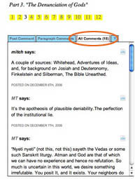
You’ll notice that on any section of the paper, the default state for the discussion area in the righthand margin is a list of all the comments for that section. Our intention with this was to give readers a sense of the overall flow of the discussion, permitting them to tunnel into individual paragraphs by way of the comments rather than just the other way around. Our concern, however, is that in its current rough state it might be more confusing than helpful. We’d be grateful if you could take a moment to look at this feature again, click around, and let us know what we could do to make it better (and feel free to mention anything else you think needs work).
if:book
A Project of the Institute for the Future of the Book

It’s looking really fantastic – round of applause guys! But since you asked for comments, here’s a couple of small things.
In Livejournal, comments to a blog post are threaded; ie you can reply to a specific comment and it appears in relation to it. Contrast the ‘Comment is free’ pages at http://www.guardian.co.uk, where posts follow one after the other regardless of which thread they’re responding to. To my mind that creates a kind of discursive white noise which makes it harder, not easier, to follow specific argumetns.
Not sure if it’s doable, but it strikes me that if comments in the margin could be threaded it’d be very helpful. It’s not a problem for the ‘Holy of Holies’ text at present, as most paragraphs currently have only a handful of comments. But for contentious points it will no doubt become very useful to have more ways of navigating the debate.
Oh, and – is there any way of making it clearer which paragraph the comments you’re viewing belong to?
Once again, this looks really exciting! Can’t wait to see how it evolves.
I think this is great! It’s so easy to use and I love how the comments pertaining to certain paragraphs show up when you click on “paragraph comments” so you don’t have to say in your comment “in the third paragraph on the fifth page, etc.” I also like how the paragraph is highlighted when you click on the speech bubble, and if there are paragraph comments it opens the comments tab, and if there are none it opens the post comments tab, so there is no question which paragraph it is that you’re commenting on/reading comments on…great job!
Not that I’m a expert, far from it, but I think this is ready now!!! How will we know when it’s available as a WP theme/add-in? Can’t wait!
absolutely agree about threaded comments. there will be at least a rudimentary mechanism for threaded comments in the new project we’re putting up next week.
One thing to alleviate confusion would be to simply call it Section Comments instead of All… To make it work in your template…
You could put a headline on top of the box:
Discussion:
Then the tabs would read, left to right:
Post, Paragraph Comments, Section Comments
I also third the calls for threaded comments.
Another suggestion.
Across the top, you have the small, square yellow boxes for navigating to each section. With the current section being unhighlited. I think there is more opportunities here for navigation here.
How about when you click on that section, a row underneath is activated with the number of paragraphs in that section. Clicking on each would scroll u to that para, highlight it, and also show you the comments for that para.
I would also recommend a line/para/section count running as a right margin. To make annotating discussions easier.
hope this helps. Looking GREAT.
This is an amazing idea — could revolutionize online collaboration. Once this is up and running, my advice would be to get in touch with the people at 37signals about mashing this up with Basecamp. I would find that extremely useful.
Anyway, as per design issues, my two cents:
user-friendly is good. I use computers a lot, but was rather confused when I first opened it up: what are all these comments? how are they organized? it took me a while to read and register the dark-blue-on-light-blue (low contrast) tabs.
But beyond that, I would keep the comments box closed until the reader clicks on a specific paragraph to discuss/read, and I would consider putting some sort of column header above the discussion bubble graphics to indicate that that’s what they’re for.
My UI advice is based on the fact that I envision non-techies using this with great results, and for that audience it is best to be very simple, very intuitive right off the bat.
Hope it’s not too late to comment on this – Great effort at trying to make sense out of interaction between reader and writer.
I think the site is great – although I feel like the comments are more annotative than conversational (and may be that’s the intent). I think the site would benefit from something right up front highlighting the most recent exchange of comments and/or what’s getting the most attention in terms of comments.
I also might suggest you reiterate the chapter headings where you now just have numbers to make moving around the document more easy because now you have to flip through the pages or go back to the beginning (you could probably do something to partially hide or minimize the footprint that takes)
All in all, I think it’s pretty cool.