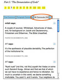
 We’re in the midst of making improvements to the commenting interface that we developed for Mitch Stephens’ Holy of Holies paper, readying it for another project (more about that soon) and, eventually, for general release as a Word Press theme. Trusting the old saw that with a million eyes, all bugs are shallow, we wanted to ask for your help — and on one area in particular.
You’ll notice that on any section of the paper, the default state for the discussion area in the righthand margin is a list of all the comments for that section. Our intention with this was to give readers a sense of the overall flow of the discussion, permitting them to tunnel into individual paragraphs by way of the comments rather than just the other way around. Our concern, however, is that in its current rough state it might be more confusing than helpful. We’d be grateful if you could take a moment to look at this feature again, click around, and let us know what we could do to make it better (and feel free to mention anything else you think needs work).
if:book
A Project of the Institute for the Future of the Book
