We’re taking ben’s leaving as an opportunity to think about the institute’s mission and the role of if:book within that context. and most importantly we’re trying to figure out the best way to involve the readers of if:book in this discussion. if you have any immediate suggestions or thoughts, please comment here or send me an email. we’ll try to kick off the discussion within a week.
Category Archives: Uncategorized
Sophie vs. Powerpoint and Keynote
Longtime visitors to if:book have heard about Sophie, the reading/writing environment we’ve been working on since the inception of the institute in 2004. Version 1.0 of Sophie was quietly released last month. We’ll make a number of Sophie-related posts over the next few months, starting with todays’ which attempts to distinguish Sophie’s feature-set from presentation apps such as Powerpoint or Keynote.
Here is a list of four key features which distinguish Sophie from Powerpoint and Keynote.
[note: PowerPoint and Keynote include a lot of features -? e.g. geometric primitives, transitions or layout tools which make it easier to design the graphic look of a page. however Sophie’s distinguishing features go way beyond manipulating appearance to the affordance of new classes of functionality.
flowing text
since they are entirely page-based, neither Powerpoint or Keynote are useful if an argument needs to be sustained over several pages. when scholars try to use presentation software for “papers” they find that their arguments must of necessity be reduced to bullet point format. Additionally Sophie takes the concept of flowing text well beyond what traditional word processors can do. Sophie allows for completely separate flows to exist on the same page thus enabling bi-lingual editions or texts with commentaries.
timelines
neither Powerpoint or Keynote have the ability create time-based events. here are just a few ways that users might employ timelines in a Sophie document
• create narrated slide-shows which combine audio and illustrations (images or video); this could have huge implications for distance learning modules
• textual commentary tracks which explicate an audio or video presentation (e.g. the close-reading of a piece of music or film).
• sub-titling of video. useful in it’s own right, but also could be the basis of interesting language-learning modules where students are asked to provide English subtitles for a Spanish film or vice versa.
• just-in-time linking which presents hyper-links to a web-page or to other elements in a Sophie doc at specific times -? overlayed on a video or just popping up on a page.
embedding remote objects
one of the substantial problems with multimedia, even in the present period of faster pipes, is that audio and video files are huge. this is particularly a problem for students who often shift from machine to machine (classroom, library, home or dorm room). sophie potentially solves this problem by permitting the “big” media to be left on a central server but embedded in the sophie file as if it were “in the book.” this will be even more powerful as archives of rich media are developed (by professors, academic departments, commercial firms (such as publishers, J-Stor, Art-Stor, etc.) for the use of students. the NEH recently gave us a grant to develop a search gateway within Sophie into the Internet Archive. When completed, a user will be able to search the audio and video holdings of the Internet Archive, choose a file, open it in Sophie, choose IN and OUT points and embed that clip in a Sophie document without the actual audio or video content ever needing to actually be downloaded into the Sophie document.
networked dynamic comment fields
none of the presentation apps allow “readers” to carry on a conversation about the contents of the document from within the document itself. all our experiments so far suggest that this has huge implications for scholarly discourse at all levels from course modules to mechanisms of peer review and the transformation of academic papers into “places” where conversations occur.
triangulating reality — the net at its best
Now that Hussein and Zarqawi are dead, the U.S. propoganda machine is working overtime to demonize Moqtada al-Sadr as the key obstacle to “peace in Iraq.” It’s fairly easy for them to do that since no mainstream U.S. news outlet bothers to interview him or present his ideas in any coherent fashion. Last week the Italian paper, La Repubblica published an interview with him that was not covered here. Helena Cobban (who was the first commenter in our edition of the Iraq Study Group Report), has just put up a translation on her blog. Read it to see a completely different view of the man than the one you get here. Read it to realize the power of the internet to get people working together to present a more complex view of reality than the one we get via the mainstream press. Here is Helena Cobban’s postscript to the post:
Update Saturday p.m.: Christiane just sent me a great document that’s a three-column tabulation of the Italian original, JHM’s translation, and her own. It’s a Word doc. She has picked out in red the few points where she feels JHM probably misunderstood the Italian, but says in an accompanying email that she thinks his English is far better than hers. Thanks, Christiane, and thanks again, JHM. You’re once again showing us the great information-leveraging power of the internet.
we’ve come unstuck
Something’s gone wrong with our server, and if:book has gone back in time three years. We’re attempting to figure out the problem. In the meantime, if you’re looking for Bob Stein’s post on a unified field theory of publishing, click here to go directly to that post. Things will be back to normal soon! we hope.
hyperlinks in print
 There’s increasingly a give-and-take between print and screen text design. A prime example of this: David Foster Wallace’s cover story about talk radio in the April issue of The Atlantic Monthly. It’s unfortunate this article is only online for subscribers. However, clicking on the thumbnail at right will give you an idea of how the pages work, and there are a couple of working hyperlinks in The Atlantic‘s HTML preview of the article.
Wallace is well-known for his copious use of footnotes & endnotes, and this article is no exception. However, either Wallace or The Atlantic‘s art director have decided to treat his digressions differently in this case: words or phrases in the main text that signal a jumping-off point have lightly colored boxes drawn around them, rather than a superscripted numeral after them. In the print edition, boxes in the margins – one immediately thinks of windows – with notes in them appear, color-coded to match the set-off phrases. Some of the notes have notes; they get more boxes of their own.
It’s subtle and well thought out, and considerably more inviting to read over 23 pages than footnotes or endnotes would be. Most interesting is how the aesthetic draws inspiration from the web: the boxed notes suggest pop-up windows (or the electronic – not so much the paper – version of Post-It notes), especially when they’re layered. And the boxed phrases suggest nothing so much as the underlining that the Web has taught us signifies a hyperlink. The HTML version on their website follows this exactly, presenting the notes as pop-up windows (some of which pop up their own windows).
There’s also a PDF version available to subscribers. Unlike the Kembrew McLeod PDF I posted about a few weeks back, some thought has clearly gone into making this article screen-friendly. What you get is just the article: there aren’t any crop marks or ads or any of the detritus which crowd an article when it appears in a magazine. Nor, interestingly, are there page numbers, which aren’t quite as necessary in a PDF environment: Adobe Reader tells you what page you’re on. To complain: it does, however, still replicate the print environment in ways which make on-screen reading suffer. Like the magazine and unlike computer screens, the page is vertically oriented, rather than horizontally. The Bodoni type – which looks fantastic on the glossy paper that The Atlantic uses – loses its narrow horizontal strokes on screen except when zoomed in to a very high resolution. To be fair to The Atlantic, these concessions to the print design are understandable: the typeface does form a good part of the magazine’s image, and it would be a fair amount of work to rework such a carefully designed article to appear in a horizontal, rather than a vertical, format.
powers of 10
 The Pew Internet & American Life project’s recent report, The Future of the Internet, surveys the opinions of a broad assortment of scholars, web pioneers and technophiles on where they think the Internet is headed over the coming decade. Partnering with the Pew project, Elon University is running a related initiative, Imagining the Internet, which “examines the potential future of the Internet while simultaneously providing a peek back into its history.” The centerpiece of this project is a “Predictions Database,” pooling the prognostications of web luminaries and average joes alike. A great resource.
Pew and Elon aren’t the only ones talking about that slender ten-year slice known as the history of the Internet. A conference next week in Amsterdam at The Institute of Network Cultures will be spending two days discussing “a decade of web design.” Future of the Book will be coming to you live from the conference.
Pew participants more or less agreed on a few broad projections: that publishing and the news will undergo further dramatic change as blogs and other web phenomena continue to break apart and redefine the mass media structures of the past century (see also the Pew report on blogging); that “the Internet will be more deeply integrated in our physical environments and high-speed connections will proliferate – with mixed results”; and that network infrastructure will likely suffer a major attack.
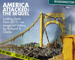
 This last point is echoed in another recent speculative work, in this case, a work of fiction by former white house counter-terrorism chief Richard Clarke in the latest issue of The Atlantic Monthly (which annoyingly isn’t readable on the web without subscription). The story, titled Ten Years Later, is a concocted transcript of the Tenth Anniversary 9/11 Lecture given at the Kennedy School of Government in Cambridge. If you like having nightmares, go read this piece. At this imaginary lectern, Clarke delivers a hellish litany of terrorist attacks and domestic security crackdowns, painting an America even more paranoid and locked-down than the one we live in now. Among his grim predictions is “virtual war” in 2008 in the form of a “Zero Day worm” launched by Iran in cooperation with al-Qaeda which effectively shuts down the US economy.
Scary stuff, but probably important to keep in the back of one’s mind as we try to imagine the future of books and communication in the digital era. Technology does not develop in a vacuum, nor does culture. Think of the massive creative response to the wars that ravaged the earth in the twentieth century. How will artists and culture as a whole respond to the ravaging of a virtual world that is increasingly as real as the material one?
the digital aesthetic: what are we losing?
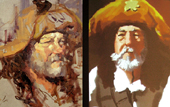
Much as I love most things digital, I occassionally come across an example of how lacking the virtual still is in comparison to the material. A recent staged showdown between a traditional oil painter and a digital “painter” makes this all too clear. Somehow the digital “painting” just doesn’t have the same vitality as the old-fashioned brush and paint version. Compare, which do you think is better?

I think there is some equivalent for books, but only for really fine books with delicious velvety (or thick toothy) paper, elegant typography, masterful craftsmanship. In short, the book as art object has the kind of appeal that probably will not be userped by its digital counterpart. However, there is a certain excitement to live, electric, dynamic, cinematic, interactive digital media that traditional forms can’t compete with. Maybe the mistake of this “showdown” was to ask digital art to try to be traditional oil painting and what’s the point of that?
One more thing, I will never give up my gorgeous Lynd Ward books, but if a digital version came along full of annotations, images of Ward at work, video or audio clips, biographical information, links to other fans of Ward, etc… I would buy it in a heartbeat.
top selling ebooks of 2004 announced
 Though still tiny, the ebook industry has been growing steadily since everyone pronounced its stillbirth a few years back. But right now it pretty much tracks the print figures – a faint, crackling aura around the print goliath. Pretty predictable stuff. I say it’s time for something new, for something born digital, to occur…
The Open eBook Forum (OeBF) announced the bestselling electronic titles of 2004 (press release) and reported double digit growth for the fledgling industry. Sci-fi, reference books, and the work of Dan Brown (who holds places 1 through 4) figure prominently on the top 30 list, along with a smattering of other print bestsellers. (yawn)
lunch with alex itin


While we wait for our offices at Columbia, the Institute for the Future of the Book is conducting business in Bob Stein’s kitchen on the upper west side of Manhattan. Though our location affords almost limitless opportunities for cuisine, we have, for various reasons, limited our gustatory experience to three restaurants: Saigon Grill, Miyako Sushi, Pizza Perfecto. This limitation makes choosing what to have for lunch both easier and more difficult at the same time, as no one wants to be the one who cries sushi on a clearly Italian sort of day. So we were all glad when Alex arrived to settle the question. Saigon Grill.
Alex also treated us to a viewing of his latest work-in-progress, an electronic book/hybrid artwork entitled “Willoughby.” Alex uses electronic book technology (TK3, to be exact) to cast his black and white drawings as stage sets into which he embeds video clips of his performance. In the clips, he appears in elaborate make-up enacting bits of Willoughby’s tortured monologue (“I don’t want to die,” is Willoughby’s refrain). As Alex pages through the ebook, he casually narrates the story. This narration creates an engaging framework for the piece.
For a full-on Itin experience, you can download his electronic sketchbooks or visit the exhibitions section of our site for a description of his latest work-in-progress. Why are we so interested in his work? Bob, who has known Alex for some time, describes the progression, “When Alex started to bring his work as a painter into the electronic medium, an impulse to combine those images with sound, video, and narrative, quickly emerged and Alex went with it. It’s interesting to watch an artist follow these impulses to invent a new form of expression.”
e-culture report from the netherlands
Recently translated into english, From ICT to E-culture is an “advisory report on the digitalisation of culture and the implications for cultural policy” submitted by the Netherlands Council for Culture in 2003. Survey of the changing landscape..
