Category Archives: journalism

networked journalism in action

An excellent piece in the LA Times this weekend looks at how Josh Marshall’s little Talking Points Memo blog network led the journalistic charge that helped bring the US attorneys scandal to light. As the article details, TPM’s persistent muckraking was also instrumental in bringing national attention to the 2002 racial gaffe that cost Trent Lott his Senate leadership, to the Jack Abramoff lobbying scandals, and to the initially underappreciated public opposition to Bush’s plan to privatize social security. Truly a force to be reckoned with. And most important, it was all achieved through sustained collaboration with its readership:

The bloggers used the usual tools of good journalists everywhere — determination, insight, ingenuity — plus a powerful new force that was not available to reporters until blogging came along: the ability to communicate almost instantaneously with readers via the Internet and to deputize those readers as editorial researchers, in effect multiplying the reporting power by an order of magnitude.
In December, Josh Marshall, who owns and runs TPM , posted a short item linking to a news report in the Arkansas Democrat-Gazette about the firing of the U.S. attorney for that state. Marshall later followed up, adding that several U.S. attorneys were apparently being replaced and asked his 100,000 or so daily readers to write in if they knew anything about U.S. attorneys being fired in their areas.
For the two months that followed, Talking Points Memo and one of its sister sites, TPM Muckraker, accumulated evidence from around the country on who the axed prosecutors were, and why politics might be behind the firings. The cause was taken up among Democrats in Congress. One senior Justice Department official has resigned, and Atty. Gen. Alberto R. Gonzales is now in the media crosshairs.

This is precisely what Jeff Jarvis means by “networked journalism“: a more nuanced notion than “citizens journalism” in that it doesn’t insist on a strict distinction between professional and amateur. The emphasis instead is on a productive blurring of that boundary through collaboration and distribution of labor. There’s no doubt that what we’re seeing here is a democratization of the journalistic process, but this bottom-up movement doesn’t mean the end of hierarchy. Marshall and his small staff are clearly the leaders here, a new breed of editors coordinating complex chains of effort.

the future of the times

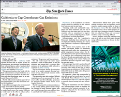
Here’s a great item from last week that slipped through the cracks… A rare peek into the mind of New York Times publisher Arthur Sulzberger, which grew out of a casual conversation with Haaretz‘s Eytan Avriel at the World Economic Forum in Davos. A couple of choice sections follow…
On moving beyond print:

Given the constant erosion of the printed press, do you see the New York Times still being printed in five years?
“I really don’t know whether we’ll be printing the Times in five years, and you know what? I don’t care either,” he says…..”The Internet is a wonderful place to be, and we’re leading there,” he points out.
The Times, in fact, has doubled its online readership to 1.5 million a day to go along with its 1.1 million subscribers for the print edition.
Sulzberger says the New York Times is on a journey that will conclude the day the company decides to stop printing the paper. That will mark the end of the transition. It’s a long journey, and there will be bumps on the road, says the man at the driving wheel, but he doesn’t see a black void ahead.

On the persistent need for editors — Sulzberger talks about newspapers reinventing themselves as “curators of news”:

In the age of bloggers, what is the future of online newspapers and the profession in general? There are millions of bloggers out there, and if the Times forgets who and what they are, it will lose the war, and rightly so, according to Sulzberger. “We are curators, curators of news. People don’t click onto the New York Times to read blogs. They want reliable news that they can trust,” he says.
“We aren’t ignoring what’s happening. We understand that the newspaper is not the focal point of city life as it was 10 years ago.
“Once upon a time, people had to read the paper to find out what was going on in theater. Today there are hundreds of forums and sites with that information,” he says. “But the paper can integrate material from bloggers and external writers. We need to be part of that community and to have dialogue with the online world.”

belgian news sites don cloak of invisibility

In an act of stunning shortsightedness, a consortium of 19 Belgian newspapers has sued and won a case against Google for copyright infringement in its News Search engine. Google must now remove all links, images and cached pages of these sites from its database or else face fines. Similar lawsuits from other European papers are likely to follow soon.
The main beef in the case (all explained in greater detail here) is Google’s practice of deep linking to specific articles, which bypasses ads on the newspapers’ home pages and reduces revenue. This and Google’s caching of full articles for search purposes, copies that the newspapers contend could be monetized through a pay-for-retrieval service. Echoes of the Book Search lawsuits on this side of the Atlantic…
What the Belgians are in fact doing is rendering their papers invisible to a potentially global audience. Instead of lashing out against what is essentially a free advertising service, why not rethink your own ad structure to account for the fact that more and more readers today are coming through search engines and not your front page? While you’re at it, rethink the whole idea of a front page. Or better yet, join forces with other newspapers, form your own federated search service and beat Google at its own game.

bush’s iraq speech: a critical edition

Last month we published an online edition of the Iraq Study Group Report in a new format we’re developing (in-house name is “Comment Press”) that allows readers to enter into conversation with a text and with one another. This was a first step in a creative partnership with Lewis Lapham and Lapham’s Quarterly, a new journal that will look at contemporary issues through the lens of history. Launching only a few days before Christmas, the timing was certainly against us. Only a handful of commenters showed up in those first few days, slowing down almost to a halt as the holiday hibernation period set in. Since New Year’s, however, the site has been picking up momentum and has now amassed a sizable batch of commentary on the Report from a diverse group of respondents including Howard Zinn, Frances FitzGerald and Gary Hart.
While that discussion continues to develop in the Report’s margins, we are following it up with a companion text: the transcript and video of President Bush’s address to the nation last night where he outlined his new strategy for Iraq, presented in a similarly Talmudic fashion with commentary accreting around the central text. To these two documents invited readers and other interested members of the public can continue to append their comments, criticisms and clarifications, “at liberty to find,” in Lapham’s words, “‘the way forward’ in or out of Iraq, back to the future or across the Potomac and into the trees.”
An added feature this time around is that we’re opening the door to general commenters, although with a fairly high barrier to entry. This is an experiment with a more rigorously moderated kind of web discussion and a chance for Lapham and his staff to begin to explore what it means to be editors in the network environment. Anyone is welcome to apply for entry into the discussion by providing a little background on themselves and a sample first comment. If approved by the Lapham’s Quarterly editors (this will all happen within the same day), they will be given a login, at which point they can fire at will on both the speech and the report.
Together these two publications comprise Operation Iraqi Quagmire, a journalistic experiment and a gesture toward a new way of handling public documents in a networked democracy.
***Note: we strongly recommend viewing this on Firefox***

live, on the web, it’s the iraq study group report!

ISGscreenshot1.jpg
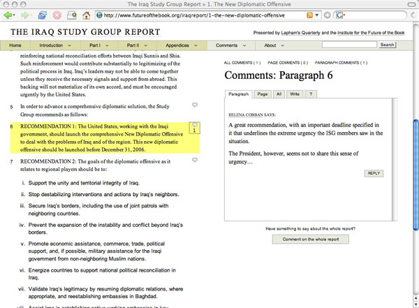
Since leaving Harper’s last spring, Lewis Lapham has been developing plans for a new journal, Lapham’s Quarterly, which will look at important contemporary subjects (one per issue) through the lens of history. Not long ago, Lewis approached the Institute about helping him and his colleagues to develop a web component of the Quarterly, which he imagined as a kind of unorthodox news site where history and source documents would serve as a decoder ring for current events — a trading post of ideas, facts, and historical parallels where readers would play a significant role in piecing together the big picture. To begin probing some of the possibilities for this collaboration, we came up with an exciting and timely experiment: we’ve taken the granular commenting format that we hacked together just a few weeks ago for Mitch Stephens’ paper and plugged in the Iraq Study Group Report. The Lapham crew, for their part, have taken their first editorial plunge into the web, using their broad print network to assemble an astonishing roster of intellectual heavyweights to collectively annotate the text, paragraph by paragraph, live on the site. Here’s more from Lewis:

As expected and in line with standard government practice, the report issued by the Iraq Study Group on December 6th comes to us written in a language that guards against the crime of meaning–a document meant to be admired as a praise-worthy gesture rather than understood as a clear statement of purpose or an intelligible rendition of the facts. How then to read the message in the bottle or the handwriting on the wall?
Lapham’s Quarterly and the Institute for the Future of the Book answers the question with a new form of discussion and critique– an annotated edition of the ISG Report on a website programmed to that specific purpose, evolving over the course of the next three weeks into a collaborative illumination of an otherwise black hole. What you have before you is the humble beginnings of that effort–the first few marginal notes and commentaries furnished by what will eventually be a large number of informed sources both foreign and domestic (historians, military officers, politicians, intelligence operatives, diplomats, some journalists), invited to amend, correct, augment or contradict any point in the text seemingly in need of further clarification or forthright translation into plain English.
As the discussion adds to the number of its participants so also it will extend the reach of its memory and enlarge its spheres of reference. What we hope will take shape on short notice and in real time is the publication of a report that should prove to be a good deal more instructive than the one distributed to the members of Congress and the major news media.

Being at the very beginning of the experiment, what you’ll see on the site today is more or less a blank slate. Our hope is that in the days and weeks ahead, a lively conversation will begin to bubble up in the pages of the report — a kind of collaborative marginalia on a grand scale — mounting toward Bush’s big Iraq strategy speech next month. Around that time, the Lapham’s editors will open up commenting to the public. Until then, here are just some of the people we expect to participate: Anthony Arnove, Helena Cobban, Joshua Cohen, Jean Daniel, Raghida Dergham, Joan Didion, Mark Danner, Barbara Ehrenrich, Daniel Ellsberg, Tom Engelhardt, Stanley Fish, Robert Fisk, Eric Foner, Christopher Hitchens, Rashid Khalidi, Chalmers Johnson, Donald Kagan, Kanan Makiya, William Polk, Walter Russel Mead, Karl Meyer, Ralph Nader, Gianni Riotta, M.J. Rosenberg, Gary Sick, Matthew Stevenson, Frances Stonor, Lally Weymouth, and Wayne White.
Not too shabby.
The form is still very much in the R&D phase, but we’ve made significant improvements since the last round. Add this to your holiday reading stack and watch how it develops.
(We strongly recommend viewing the site in Firefox.)

on today’s publications

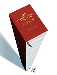
notbles190.jpg On November 27 the Pulitzer Prize Board announced that “newspapers may now submit a full array of online material-such as databases, interactive graphics, and streaming video-in nearly all of its journalism categories,” while the closest The New York Times’ 100 Notable Books of the Year came to documenting any changes in the publishing world is one graphic memoir (Fun Home by Alison Bechdel.)
Only last year the Pulitzer Prize Board allowed for the first time some online content, but now, it will permit a broader, and much more current assortment of online elements, according to the different Pulitzer categories. The seemingly obvious restrictions are for photography, which permit still images only. They have decided to catch up with the times: “This board believes that its much fuller embrace of online journalism reflects the direction of newspapers in a rapidly changing media world,” said Sig Gissler, administrator of the Pulitzer Prizes. With its new rules for online submissions, the Pulitzer Board acknowledges that online elements such as a database, blog, interactive graphic, slide show, or video presentation count as items in the total number of elements, print or online, that can be considered worth a prize.
Even though the use of multimedia and computer technology has become ubiquitous not only in the media world but also in the performing arts, the book world seems absorbed in its own universe. The notion of “digital book” continues to mean digital copies of books and the consequent battle among those who want the lion’s share of the market (see “Yahoo Rebuffs Google on Digital Books”). And, when we talk about ebooks we mean devices for reading digital copies of books. Interestingly, most of the books published today are written, composed and set using electronic technology. So much of what we read online is full of distracting, sometimes quite interesting, advertising. On Black Friday, lots of people following the American tradition of shopping on that day did it online. It would seem that we are more than ready for real ebooks. I wonder how long it would take for one of them to hit the top lists of the year.

backwards into the future

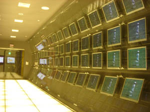
Reading Christine Boese’s anticipatory critique of the new NY Times Reader, I was reminded of something I saw last winter in Seoul at Chosun Ilbo, which is pretty much the Korean equivalent of The New York Times. Off the main lobby, the newspaper has set up an exhibition space called the “Media Lab,” where the latest prototypes from the paper’s digital technology wing are on public display. A sneak peak at the future of news.
chosunilbomedialab1.jpg chosunilbomedialab2.jpg
While there, I taped a demo that shows a new reading interface they’ve developed called “T-Paper,” which was supposedly slated for release this year (though I haven’t heard anything about it since). Strolling through the gallery, I found it running across a range of devices, from large flat-screen televisions to laptops, to Sony PSPs, to tiny pocket assistants. Here’s the wall display:

My first reaction was much like Chris’s: “a ‘horseless carriage’ retrenchment” — porting the artifact of the broadsheet newspaper into a digital environment. I have to admit, though, that I was slightly seduced by the zoom interface, which reminded me of this proof of a similar concept by the late interface pioneer Jef Raskin. It’s especially impressive to see it done with video. Though the Times Reader doesn’t sport anything as fancy as this, a commenter named Kevin (who I can only assume works for the Times — or Microsoft) insists that it will have much of the reader-driven functionality we would hope for (including the ability to share comments and annotations with other readers), in spite of the fact that it will be, as Chris puts it, “a walled garden.”
Kevin also refers to usability studies that suggest the Times Reader helps users “retain more information and read for longer periods.” I’ll buy longer periods — I always read more of the paper when I have it in print, and this new device certainly replicates much of the experience of print reading, while incorporating some nice new features. But still, are these proprietary, bound devices really going to replace newspapers? It seems doubtful when news consumption is such a multi-sourced affair these days (though to some extent that’s an illusion). A device that allows readers to design their news menu seems more the ticket. Maybe the Times should be thinking more in terms of branded software than proprietary hardware. Make the best news reader on the web, prominently featuring Times content, but allowing users to customize their reading experience. Keep it open and plugged in. Let the Times be your gateway to more than just the Times.
Chosun Ilbo’s vision seemed similarly constrained. As much as they tried to create a futuristic atmosphere with their Media Lab, much of the technology on display seemed, like the Times Reader, to be stuck in old mindsets — fixated more on the digital apotheosis of their product than on really grappling with the realities of the new media environment. 180px-MarshallMcLuhan.gif T-Paper also reminded of another museum piece, the British Museum’s “Turning the Pages,” which remounts famous old manuscripts like DaVinci’s journals in a fancy page-turning interface. A while back, Sally Northmore wrote a nice piece for if:book pondering this strange print-digital artifact, and what it means to electronically replicate the turning of a page. All of this recalls Marshall McLuhan’s famous observation in The Medium is the Massage:

“When faced with a totally new situation, we tend always to attach ourselves to the objects, to the flavor of the most recent past. We look at the present through a rear-view mirror. We march backwards into the future…”

Much of the disoreintation I felt while in Korea came from this feeling of time pulling in different directions. A society saturated in technology, far more wired than ours, Korea rushes headlong into the future, yet at the same time digs its heels obstinately into the past. At the end of the Korean War, Seoul was a bombed-out pit of some half million people. Now it’s a sprawling megalopolis of over 20 million, and though many centuries-old, it feels streamlined and new. There’s no “old city” in any real sense. Shiny glass towers and enormous shopping centers loom over the streets, pedestrian shopping lanes explode into jungles of neon, tiny alleys teem with life like fissures in a coral reef, and a vast network of subways rumbles beneath. And yet this dynamic scene — the swirl of steaming tripe vendors and blinking electronics — is periodically interrupted by a medieval gate or pagoda, a historic remainder sitting tranquilly amid the churn of modern life.
garagebuddha.jpg seoulneon.jpg
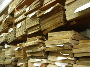
Spend an afternoon walking through Seoul and you’ll see the full pageant of the local techno-culture. Cell phones are clearly several generations further evolved than anything we have here in the States. People seem to be doing just about everything with their mobile devices: playing games, watching TV, surfing the web. I even saw one woman on a train using her phone’s video camera as a pocket mirror to fix her make-up. Young men spend hours tucked away in smoky, windowless internet cafes known as “PC Bangs,” playing multi-player online games that involve a quarter of the citizenry. At the same time, you are frequently reminded of Korea’s abiding infatuation with printing, paper crafts and calligraphy: stores sumptuously arrayed with handmade paper hung on racks, prodigiously plumed ink brushes hanging like icicles from the ceiling, and delicate little rice paper journals piled neatly on the shelves.
seoulbooks.jpg daegupaperrack.jpg
Mountains also serve to anchor swift-moving Seoul in time. 70 percent of the Korean peninsula is mountainous and the Seoul region is no exception. Sitting in the heart of downtown is the petite Namsan peak, surrounded by one of the city’s best-loved parks and sporting at its summit Seoul’s most recognizable landmark, Seoul Tower, a rocket ship awaiting blastoff. Facing Namsan, the snow-streaked Bugaksan peak rises over one of Seoul’s central boulevards, an avenue running through what feels like the Korean equivalent of Rockefeller Plaza, past City Hall, the big newspaper offices, the Ubiquitous Dream Hall and the Ministry of Reunification, leading to the Gyeongbok Palace, and beyond that the Presidential “Blue House,” nestled in Bugaksan’s shade.
yi.jpg yi2.jpg
Framed by the mountain, presiding over the unending traffic of Hyundais, Kias, Daewoos, and Samsungs, is an imposing statue of Admiral Yi, the famous military leader who in the late 16th century dealt a humiliating blow to the Japanese navy with the most advanced technology of his time: a fleet of armor-plated, smoke-breathing “turtle boats.”
cheonggyecheon.jpg cheonggyecheon2.jpg
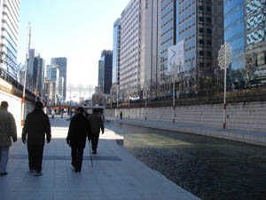
Much of Seoul’s past lies beneath the modern streets, and occasionally something is unearthed and restored (or reinvented). Announced by a waterfall perpendicular to the grand boulevard is the Cheonggyecheon, an ancient stream running through the heart of the city into the countryside beyond, and which until very recently was covered over by an elevated highway. Last year, the city demolished the roadway, uncovered the stream and built a lovely sunken path alongside it cutting quietly through six miles of the city’s bustle. If you’ve ever been to Paris and walked directly along the Seine on the lower walkways, you can sort of picture this, though the Cheonggyecheon is no Seine — a small stream and a fairly narrow trench. But walking there, with the tops of buildings peeking over, an improbable calm steals over you in the heart of town.
korea street news.jpg korea street news 2.jpg
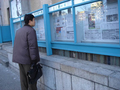
And because this reminiscence began with newspapers, take a look at these pictures. A few blocks from the waterfalls that reintroduce the Cheonggyecheon to the city after all these years, the very same newspapers that pride themselves on publishing at the cutting edge of technology still mount their daily editions, page by page, in glass cases on the street for all to read.

NYTimes reader

[editor’s note: The New York Times released a new software reader. It is Windows only. No Mac compatibility at this time. We asked Christine Boese, of serendipit-e.com, to post her thoughts on the matter.]

StoryLargeAppThumb.jpg

I got this off another news clip service I’m on…

NYT Finally Creates a Readable Online Newspaper (Slate)

Jack Shafer: About six months ago, I canceled my New York Times subscription because I had found the newspaper’s redesigned Web site to be superior to the print Times. I’ve now abandoned the Web version for the New York Times Reader, a new computer edition that has entered general beta release.

I went around to try to sign up for it and get a look. I couldn’t, because the Times IT dept overlooked making its beta available for Macs. I scanned through the screenshots, tho, and the comments on the blog preview of features, sneek peek #1 and #2.
Jack Shafer isn’t exactly an expert in interactive design, so I don’t know if his endorsement means anything other than, "Gee whiz, here’s a neato new thing!".
My initial impressions are that it looks like the International Herald Tribune
with a horizontal orientation I just can’t stand (the Herald Tribune often requires horizontal scrolling, and it’s far easier to read the printable version of stories). Yes, I see there is a narrow screen screenshot, but I’m thinking more about the text flow nightmares this design must cause.
But I think I have bigger reservations about the entire concept behind the Times Reader beta.
Here’s just a summary of questions I’d want answered, if I were actually able to test the beta:

  1. How is re-creating a facsimile of a print newspaper online a step forward for interactive media? Is it really, or is it just a kind of "horseless carriage" retrenchment? Shafer talks about some non-print-like pages that tell you what you’ve read or haven’t read, to assist browsing and search, but notes that the archives are thin. I wonder if the Times "Most Popular" feature makes the cut.
  2. Code. The big deal here is that it uses Microsoft .NET and advancers on Vista technology. I smell a walled garden. Is this XML-compatible? RSS-enabled? Is it even in HTML code that can be easily copied and pasted? (Shafer’s piece says it can be, but I want to see for myself) W3 validated? Does its content management system have permalinks? How do bookmarks work?
  3. Hyperlinks. Will the text accomodate them? Will the Times use them? Or by anchoring themselves firmly in a "reader" technology, perhaps a completely web-independent application, is the Times trying to go beyond simply a code-walled garden and also create a strong CONTENT walled garden as well? Is this a variant of TimesSelect on speed?
  4. Audience. Presumably the Times has some research that shows a need to court its paper-bound print-loving audience to its online products by making the online products more like the print products.
  5. But my question about audience is this: is there a REASON to make heroic efforts to lure print readers online? Isn’t the bigger issue trying to keep print readers attached to print, so that the ad-driven print editions don’t have to go the way of the dinosaur? The online news audience is already massive, and (Pew, Poynter) studies show that during the recent wars, large numbers of people were turning away from traditional news providers and outlets to seek out other sources of information, particularly international information, on the Internet and with news feed readers (RSS/Atom).
    So in a competitive online news landscape, the Times makes a strategic turn to become more like its print product? And this will lure large numbers of online news readers back exclusively to the Times exactly HOW? Especially if it is a walled garden that doesn’t integrate well into the Blogosphere or in RSS news feed readers?
    People like Terry Heaton and other media consultants (Heaton has a terrific blog, if you haven’t found it yet) are going out and telling traditional news media outlets that they have to move more strongly into an environment of UNBOUND media, to make their products more maleable for an unbound Internet environment. It appears the Times is not a company that has purchased Heaton’s services lately.

  6. Usability and Design. I’ve already mentioned the Mac incompatiblity. What other usability and design issues are present in this Times Reader technology? I’ll leave that to people who actually get use it.

From the screenshots I’ve seen, there seems to be very little functionality or interactive user-customizable features at all. I don’t know. Color me stupid, but my gut reaction is that this is nothing more than another variant of the exact PDF version of the paper that the Times put out, only perhaps with better text searching features and dynamic text flow (meaning I’d bet it is XML-based instead of PDF-based, only with some custom-built or Microsoft-blessed walled garden DTD).
You know, for the money the Times spent on this (and the experienced journalists the Times Group laid off this past year), I’d have thought the best use of resources for a big media company would be to develop a really KILLER RSS feed reader, one that finally gets over the usability threshold that keeps feed readers in "Blinking 12-land" for most casual Internet users.
I mean, I know there are a lot of good feed readers out there (I favor Bloglines myself), but have any of you tried to convert non-techie co-workers into using a feed reader lately? I can’t for the LIFE of me figure out why there’s so much resistance to something so purely wonderful and empowering, something I believe is clearly the killer app on par with the first Mosaic browser in 1993. But because feed readers caught on bottom up instead of top down, there’s not only usability problems for the broadest audiences, there’s also a void at the top of the technology industry, by companies that fail to catch on to the RSS vision, mainly because they didn’t think it up themselves.

“a duopoly of Reuters-AP”: illusions of diversity in online news

Newswatch reports a powerful new study by the University of Ulster Centre for Media Research that confirms what many of us have long suspected about online news sources:

Through an examination of the content of major web news providers, our study confirms what many web surfers will already know – that when looking for reporting of international affairs online, we see the same few stories over and over again. We are being offered an illusion of information diversity and an apparently endless range of perspectives which in fact what is actually being offered is very limited information.

The appearance of diversity can be a powerful thing. Back in March, 2004, the McClatchy Washington Bureau (then Knight Ridder) put out a devastating piece revealing how the Iraqi National Congress (Ahmad Chalabi’s group) had fed dubious intelligence on Iraq’s WMDs not only to the Bush administration (as we all know), but to dozens of news agencies. The effect was a swarm of seemingly independent yet mutually corroborating reportage, edging American public opinion toward war.

A June 26, 2002, letter from the Iraqi National Congress to the Senate Appropriations Committee listed 108 articles based on information provided by the INC’s Information Collection Program, a U.S.-funded effort to collect intelligence in Iraq.
The assertions in the articles reinforced President Bush’s claims that Saddam Hussein should be ousted because he was in league with Osama bin Laden, was developing nuclear weapons and was hiding biological and chemical weapons.
Feeding the information to the news media, as well as to selected administration officials and members of Congress, helped foster an impression that there were multiple sources of intelligence on Iraq’s illicit weapons programs and links to bin Laden.
In fact, many of the allegations came from the same half-dozen defectors, weren’t confirmed by other intelligence and were hotly disputed by intelligence professionals at the CIA, the Defense Department and the State Department.
Nevertheless, U.S. officials and others who supported a pre-emptive invasion quoted the allegations in statements and interviews without running afoul of restrictions on classified information or doubts about the defectors’ reliability.
Other Iraqi groups made similar allegations about Iraq’s links to terrorism and hidden weapons that also found their way into official administration statements and into news reports, including several by Knight Ridder.

The repackaging of information goes into overdrive with the internet, and everyone, from the lone blogger to the mega news conglomerate, plays a part. Moreover, it’s in the interest of the aggregators and portals like Google and MSN to emphasize cosmetic or brand differences, so as to bolster their claims as indispensible filters for a tidal wave of news. So whether it’s Bush-Cheney-Chalabi’s WMDs or Google News’s “4,500 news sources updated continuously,” we need to maintain a skeptical eye.
***Related: myths of diversity in book publishing and large-scale digitization efforts.

google launches archival news search

Today Google unveiled a major extension of its news search service, expanding into periodical archives that stretch back to the mid-18th century. Most of the articles are pay downloads, or pay-per-view, and are offered by Google through licensing agreements with newspapers and existing document retrieval services including The New York Times Co., The Washington Post Co., The Wall Street Journal, Reed Elsevier, LexisNexis and Factiva. Google won’t actually host content or handle payments, it simply presents items with titles, brief excerpts and ordering information. Google also crawls free archives already on the web and mixes these in, and (a nice touch) links all search results to “related web pages,” plugging keywords into a general web search. Google won’t run adds in this service, at least for now. More coverage here and here.
This is a fine service, but it only underscores the need for a non-commercial alternative. Much of the material here is public domain, but is provided through commercial services. Google simply adds a new web-integrated layer. Anyone who believes that the public domain ought to be fully accessible to all should be thinking bigger than Google.