Category Archives: interface

the sea change is coming…

Eons ago, when the institute was just starting out, Ben and I attended a web design conference in Amsterdam where we had the good fortune to chat with Steven Pemberton about the future of the book. Pemberton’s prediction, that “the book is doomed,” was based on the assumption that screen technologies would develop as printer technologies had. When the clunky dot-matrix gave way to the high-quality laser printer, desk top publishing was born and an entire industry changed form almost overnight.
“The book, Pemberton contends, will experience a similar sea-change the moment screen technology improves enough to compete with the printed page.”
This seemed like a logical conclusion. It seemed like the screen technology innovations we were waiting for had to do with resolution and legibility. Over the last two years if:book has reported on digital ink and other innovations that seemed promising. But the fact that we were looking out for a screen technology that could “compete with the printed page,” made it difficult for us to see that the real contender was not page-like at all.
It’s interesting that we made the same assumptions about the structure of the ebook itself. Early ebook systems tried to compete with the book by duplicating conventions like the Table of Contents navigational strategy, and discreet “pages,” that have to be “turned” with the click of a mouse. (And, I’m sorry to report, most contemporary ebooks continue to cling to print book structure). We now understand that networked technologies can interface with book content to create entirely new and revolutionary delivery systems. The experiments the institute has conducted: “Gam3r Th30ry” and the “Iraq Quagmire Project” prove beyond question that the book is evolving and adapting to networked culture.
What kind of screen technology will support this new kind of book? It appears that touch-screen hardware paired with zooming interface software will be the tipping point Pemberton was anticipating. There are many examples of this emerging technology. In particular, I like Jeff Han’s experimental work (his TED presentation is below): Jeff demonstrates an “interface free” touch screen that responds to gesture and lets users navigate through a simulated 3D environment. This technology might allow very small surfaces (like the touchpads on hand-held devices) to act as portals into limitless deep space.

And that brings me around to the real reason the touchscreen zooming interface is the key to the next generation of “books.” It allows users to move into 3D networked space easily and fluently and it gets us beyond the linearity that is the hallmark and the limitation of the paper book. To come into its own, the networked book is going to require three-dimensional visualizations for both content and navigation. Here’s an example of how it might work, imagine the institute’s Iraq Study Group Report in 3D. Main authors would have nodes or “homesites” close to the book with threads connecting them to sections they authored. Co-authors/commentors might have thinner threads that extend out to their, more remotely located, sites. The 3D depiction would allow readers to see “threads” that extend out from each author to everything they have created in digital space. In other words, their entire network would be made visible. Readers could know an author’s body of work in a new way and they could begin to see how collaborative works have been understood and shaped by each contributor. It would be ultimate transparency. It would be absolutely fascinating to see a 3D visualization of other works and deeds by the Iraq Study Groups’ authors, and to “see” the interwoven network spun by Washington’s policy authors. Readers could zoom out to get a sense of each author’s connections. Imagine being able to follow various threads into territories you never would have found via other, more conventional routes. This makes me really curious about what the institute will do in Second Life. I wonder if you can make avatars that act as the nodes for all their threads? Perhaps they could go about like spiders, connecting strands to everything they touch? Hmmm.
But anyway, in my humble opinion the sea change is coming. It’s going to be three-pronged: screen technology, networked content, and 3D visualization. And it’s going to be very, very cool.

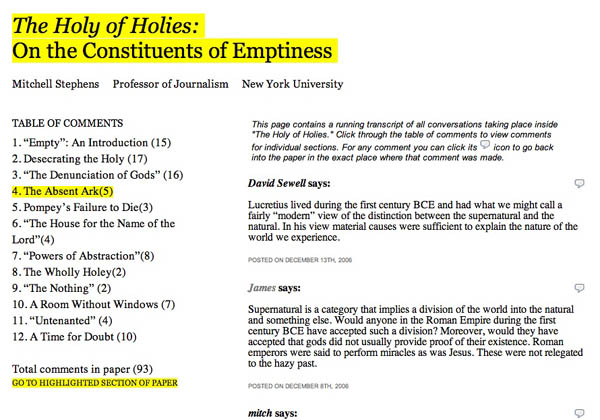
table of comments

Yesterday Bud Parr made the following suggestion regarding the design of Mitch Stephens’ networked paper, “The Holy of Holies”:

I think the site would benefit from something right up front highlighting the most recent exchange of comments and/or what’s getting the most attention in terms of comments.

It just so happens that we’ve been cooking up something that does more or less what he describes: a simple meta comment page, or “table of comments,” displaying a running transcript of all the conversations in the site filtered by section. You can get to it from a link on the front page next to the total comment count for the paper (as of this writing there are 93).
It’s an interesting way to get into the text: through what people are saying about it. Any other ideas of how something like this could work?
holymetacomments.jpg

2 – dimensions just aren’t enough

We’re burning way too much midnight oil this weekend trying to ready a networked version of the Iraq Study Group report for release next week. We’ll introduce the project itself in a few days, but right now i just want to mention that i think we’re about at the end of our ability to organize these very complex reading/writing projects using the 2-dimensional design constraints inherited from print. Ben came to the same conclusion in his recent post inspired by the difficulty of designing the site for Mitch Stephens’ paper, Holy of Holies. My first resolution for 2007 is to try an experiments building a networked book inside of Second Life or some other three-dimensional environment.

thoughts? suggestions?

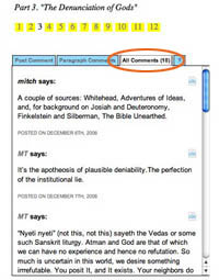
holyallcomments.jpg We’re in the midst of making improvements to the commenting interface that we developed for Mitch Stephens’ Holy of Holies paper, readying it for another project (more about that soon) and, eventually, for general release as a Word Press theme. Trusting the old saw that with a million eyes, all bugs are shallow, we wanted to ask for your help — and on one area in particular.
You’ll notice that on any section of the paper, the default state for the discussion area in the righthand margin is a list of all the comments for that section. Our intention with this was to give readers a sense of the overall flow of the discussion, permitting them to tunnel into individual paragraphs by way of the comments rather than just the other way around. Our concern, however, is that in its current rough state it might be more confusing than helpful. We’d be grateful if you could take a moment to look at this feature again, click around, and let us know what we could do to make it better (and feel free to mention anything else you think needs work).

google makes slight improvements to book search interface

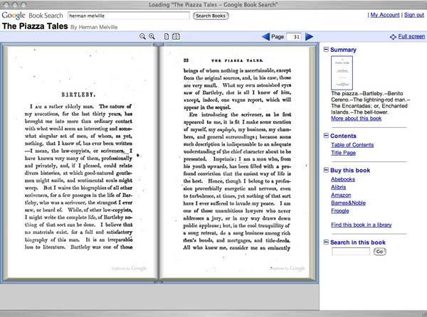
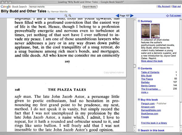
Google has added a few interface niceties to its Book Search book viewer. It now loads multiple pages at a time, giving readers the option of either scrolling down or paging through left to right. There’s also a full screen reading mode and a “more about this book” link taking you to a profile page with links to related titles plus references and citations from other books or from articles in Google Scholar. Also on the profile page is a searchable keyword cluster of high-incidence names or terms from the text.
bartlebygoogle2.jpg
Above is the in-copyright Signet Classic edition of Billy Budd and Other Tales by Melville, which contains only a limited preview of the text. You can also view the entire original 1856 edition of Piazza Tales as scanned from the Stanford Library. Public domain editions like this one can now be viewed with facing pages.
Still a conspicuous lack of any annotation or social reading tools.
bartlebygoogle.jpg

HASTAC international conference: call for papers

Call for Papers
HASTAC International Conference
“Electronic Techtonics: Thinking at the Interface”
April 19-21, 2007
Deadline for proposals: Dec 1, 2006
HASTAC is now soliciting papers and panel proposals for “Electronic Techtonics: Thinking at the Interface,” the first international conference of HASTAC (“haystack”: Humanities, Arts, Science and Technology Advanced Collaboratory). The interdisciplinary conference will be held April 19-21, 2007, in Durham, North Carolina, co-sponsored by Duke University in Durham and RENCI (Renaissance Computing Institute), an innovative technology consortium in Chapel Hill, North Carolina. Details concerning registration fees, hotel accommodations, and the full conference agenda will be posted to www.hastac.org as they become available.

backwards into the future

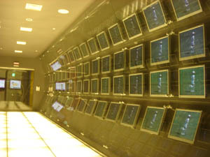
Reading Christine Boese’s anticipatory critique of the new NY Times Reader, I was reminded of something I saw last winter in Seoul at Chosun Ilbo, which is pretty much the Korean equivalent of The New York Times. Off the main lobby, the newspaper has set up an exhibition space called the “Media Lab,” where the latest prototypes from the paper’s digital technology wing are on public display. A sneak peak at the future of news.
chosunilbomedialab1.jpg chosunilbomedialab2.jpg
While there, I taped a demo that shows a new reading interface they’ve developed called “T-Paper,” which was supposedly slated for release this year (though I haven’t heard anything about it since). Strolling through the gallery, I found it running across a range of devices, from large flat-screen televisions to laptops, to Sony PSPs, to tiny pocket assistants. Here’s the wall display:

My first reaction was much like Chris’s: “a ‘horseless carriage’ retrenchment” — porting the artifact of the broadsheet newspaper into a digital environment. I have to admit, though, that I was slightly seduced by the zoom interface, which reminded me of this proof of a similar concept by the late interface pioneer Jef Raskin. It’s especially impressive to see it done with video. Though the Times Reader doesn’t sport anything as fancy as this, a commenter named Kevin (who I can only assume works for the Times — or Microsoft) insists that it will have much of the reader-driven functionality we would hope for (including the ability to share comments and annotations with other readers), in spite of the fact that it will be, as Chris puts it, “a walled garden.”
Kevin also refers to usability studies that suggest the Times Reader helps users “retain more information and read for longer periods.” I’ll buy longer periods — I always read more of the paper when I have it in print, and this new device certainly replicates much of the experience of print reading, while incorporating some nice new features. But still, are these proprietary, bound devices really going to replace newspapers? It seems doubtful when news consumption is such a multi-sourced affair these days (though to some extent that’s an illusion). A device that allows readers to design their news menu seems more the ticket. Maybe the Times should be thinking more in terms of branded software than proprietary hardware. Make the best news reader on the web, prominently featuring Times content, but allowing users to customize their reading experience. Keep it open and plugged in. Let the Times be your gateway to more than just the Times.
Chosun Ilbo’s vision seemed similarly constrained. As much as they tried to create a futuristic atmosphere with their Media Lab, much of the technology on display seemed, like the Times Reader, to be stuck in old mindsets — fixated more on the digital apotheosis of their product than on really grappling with the realities of the new media environment. 180px-MarshallMcLuhan.gif T-Paper also reminded of another museum piece, the British Museum’s “Turning the Pages,” which remounts famous old manuscripts like DaVinci’s journals in a fancy page-turning interface. A while back, Sally Northmore wrote a nice piece for if:book pondering this strange print-digital artifact, and what it means to electronically replicate the turning of a page. All of this recalls Marshall McLuhan’s famous observation in The Medium is the Massage:

“When faced with a totally new situation, we tend always to attach ourselves to the objects, to the flavor of the most recent past. We look at the present through a rear-view mirror. We march backwards into the future…”

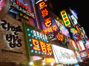
Much of the disoreintation I felt while in Korea came from this feeling of time pulling in different directions. A society saturated in technology, far more wired than ours, Korea rushes headlong into the future, yet at the same time digs its heels obstinately into the past. At the end of the Korean War, Seoul was a bombed-out pit of some half million people. Now it’s a sprawling megalopolis of over 20 million, and though many centuries-old, it feels streamlined and new. There’s no “old city” in any real sense. Shiny glass towers and enormous shopping centers loom over the streets, pedestrian shopping lanes explode into jungles of neon, tiny alleys teem with life like fissures in a coral reef, and a vast network of subways rumbles beneath. And yet this dynamic scene — the swirl of steaming tripe vendors and blinking electronics — is periodically interrupted by a medieval gate or pagoda, a historic remainder sitting tranquilly amid the churn of modern life.
garagebuddha.jpg seoulneon.jpg
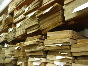
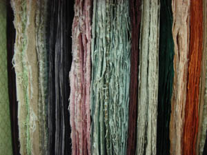
Spend an afternoon walking through Seoul and you’ll see the full pageant of the local techno-culture. Cell phones are clearly several generations further evolved than anything we have here in the States. People seem to be doing just about everything with their mobile devices: playing games, watching TV, surfing the web. I even saw one woman on a train using her phone’s video camera as a pocket mirror to fix her make-up. Young men spend hours tucked away in smoky, windowless internet cafes known as “PC Bangs,” playing multi-player online games that involve a quarter of the citizenry. At the same time, you are frequently reminded of Korea’s abiding infatuation with printing, paper crafts and calligraphy: stores sumptuously arrayed with handmade paper hung on racks, prodigiously plumed ink brushes hanging like icicles from the ceiling, and delicate little rice paper journals piled neatly on the shelves.
seoulbooks.jpg daegupaperrack.jpg
Mountains also serve to anchor swift-moving Seoul in time. 70 percent of the Korean peninsula is mountainous and the Seoul region is no exception. Sitting in the heart of downtown is the petite Namsan peak, surrounded by one of the city’s best-loved parks and sporting at its summit Seoul’s most recognizable landmark, Seoul Tower, a rocket ship awaiting blastoff. Facing Namsan, the snow-streaked Bugaksan peak rises over one of Seoul’s central boulevards, an avenue running through what feels like the Korean equivalent of Rockefeller Plaza, past City Hall, the big newspaper offices, the Ubiquitous Dream Hall and the Ministry of Reunification, leading to the Gyeongbok Palace, and beyond that the Presidential “Blue House,” nestled in Bugaksan’s shade.
yi.jpg yi2.jpg
Framed by the mountain, presiding over the unending traffic of Hyundais, Kias, Daewoos, and Samsungs, is an imposing statue of Admiral Yi, the famous military leader who in the late 16th century dealt a humiliating blow to the Japanese navy with the most advanced technology of his time: a fleet of armor-plated, smoke-breathing “turtle boats.”
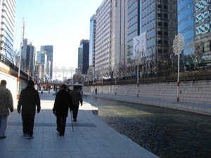
cheonggyecheon.jpg cheonggyecheon2.jpg
Much of Seoul’s past lies beneath the modern streets, and occasionally something is unearthed and restored (or reinvented). Announced by a waterfall perpendicular to the grand boulevard is the Cheonggyecheon, an ancient stream running through the heart of the city into the countryside beyond, and which until very recently was covered over by an elevated highway. Last year, the city demolished the roadway, uncovered the stream and built a lovely sunken path alongside it cutting quietly through six miles of the city’s bustle. If you’ve ever been to Paris and walked directly along the Seine on the lower walkways, you can sort of picture this, though the Cheonggyecheon is no Seine — a small stream and a fairly narrow trench. But walking there, with the tops of buildings peeking over, an improbable calm steals over you in the heart of town.
korea street news.jpg korea street news 2.jpg
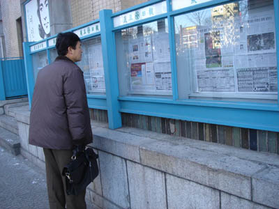
And because this reminiscence began with newspapers, take a look at these pictures. A few blocks from the waterfalls that reintroduce the Cheonggyecheon to the city after all these years, the very same newspapers that pride themselves on publishing at the cutting edge of technology still mount their daily editions, page by page, in glass cases on the street for all to read.

the bible on dvd: another weird embodiment of the book on screen

The bible has long been a driver of innovation in book design, and this latest is no exception: an ad I saw today on TV for the complete King James Bible on DVD. Not a film, mind you, but an interactive edition of the old and new testaments built around a graphical rendering of an old bible open on a lectern that the reader, uh viewer, uh… reader controls. Each page is synched up to a full-text narration in the “crystal clear, mellow baritone” of Emmy-winning Bible reader Stephen Johnston, along with assorted other actors and dramatic sound effects bringing the stories to life.

There’s the ad to the right (though when I saw it on BET the family was black). You can also download an actual demo (Real format) here. It’s interesting to see the interactivity of the DVD used to mimic a physical book — even the package is designed to suggest the embossed leather of an old bible, opening up to the incongruous sight of a pair of shiny CDs. More than a few analogies could be drawn to the British Library’s manuscript-mimicking “Turning the Pages,” which Sally profiled here last week, though here the pages replace each other with much less fidelity to the real.
There’s no shortage of movie dramatizations aimed at making the bible more accessible to churchgoers and families in the age of TV and the net. What the makers of this DVD seem to have figured out is how to combine the couch potato ritual of television with the much older practice of group scriptural reading. Whether or not you’d prefer to read the bible in this way, with remote control in hand, you can’t deny that it keeps the focus on the text.
Last week, Jesse argued that it’s not technology that’s causing a decline in book-reading, but rather a lack of new technologies that make books readable in the new communications environment. He was talking about books online, but the DVD bible serves just as well to illustrate how a text (a text that, to say the least, is still in high demand) might be repurposed in the context of newer media.
Another great driver of innovation in DVDs: pornography. No other genre has made more creative use of the multiple camera views options that can be offered simulataneously on a single film in the DVD format (I don’t have to spell out what for). They say that necessity is the mother of invention, and what greater necessities than sex and god? You won’t necessarily find the world’s most elegant design, but it’s good to keep track of these uniquely high-demand areas as they are consistently ahead of the curve.

who really needs to turn the pages?

The following post comes from my friend Sally Northmore, a writer and designer based in New York who lately has been interested in things like animation, video game theory, and (right up our alley) the materiality of books and their transition to a virtual environment. A couple of weeks ago we were talking about the British Library’s rare manuscript digitization project, “Turning the Pages” — something I’d been meaning to discuss here but never gotten around to doing. It turns out Sally had some interesting thoughts about this so I persuaded her to do a brief write-up of the project for if:book. Which is what follows below. Come to think of it, this is especially interesting when juxtaposed with Bob’s post earlier this week on Jefferson Han’s amazing gestural interface design. Here’s Sally… – Ben
The British Library’s collaboration with multimedia impresarios at Armadillo Systems has led to an impressive publishing enterprise, making available electronic 3-D facsimiles of their rare manuscript collection.
“Turning the Pages”, available in CD-ROM, online, and kiosk format, presents the digital incarnation of these treasured texts, allowing the reader to virtually “turn” the pages with a touch and drag function, “pore over” texts with a magnification function, and in some cases, access extras such as supplementary notes, textual secrets, and audio accompaniment.
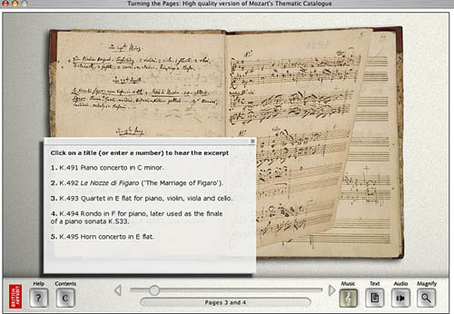
turning pages mozart.jpg
Pages from Mozart’s thematic catalogue — a composition notebook from the last seven years of his life. Allows the reader to listen to works being discussed.
The designers ambitiously mimicked various characteristics of each work in their 3-D computer models. For instance, the shape of a page of velum turning differs from the shape of a page of paper. It falls at a unique speed according to its weight; it casts a unique shadow. The simulation even allows for a discrepancy in how a page would turn depending on what corner of the page you decide to peel from.
Online visitors can download a library of manuscripts in Shockwave although these versions are a bit clunkier and don’t provide the flashier thrills of the enormous touch screen kiosks the British Library now houses.
turning pages map.jpg
Mercator’s first atlas of Europe – 1570s
Online, the “Turning the Pages” application forces you to adapt to the nature of its embodiment–to physically re-learn how to use a book. A hand cursor invites the reader to turn each page with a click-and-drag maneuver of the mouse. Sounds simple enough, but I struggled to get the momentum of the drag just right so that the page actually turned. In a few failed attempts, the page lifted just so… only to fall back into place again. Apparently, if you can master the Carpal Tunnel-inducing rhythm, you can learn to manipulate the page-turning function even further, grabbing multiple of pages at once for a faster, abridged read.
The value of providing high resolution scans of rare editions of texts for the general public to experience, a public that otherwise wouldn’t necessarily ever “touch” say, the Lindisfarne Gospels, doesn’t go without kudos. Hey, democratic right? Armadillo Systems provides a list of compelling raisons d’être on their site to this effect. But the content of these texts is already available in reprintable (democratic!) form. Is the virtual page-turning function really necessary for greater understanding of these works, or a game of academic scratch-n-sniff?
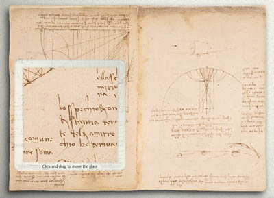
turning pages davinci.jpg
The “enlarge” function even allows readers to reverse the famous mirror writing in Leonardo da Vinci’s notebooks
At the MLA conference in D.C. this past December, where the British Library had set up a demonstration of “Turning the Pages”, this was the question most frequently asked of the BL’s representative. Who really needs to turn the pages? I learned from the rep’s response that, well, nobody does! Scholars are typically more interested studying the page, and the turning function hasn’t proven to enhance or revive scholarly exploration. And surely, the Library enjoyed plenty of biblio-clout and tourist traffic before this program?
But the lure of new, sexy technology can’t be underestimated. From what I understood, the techno-factor is an excellent beacon for attracting investors and funding in multimedia technology. Armadillo’s web site provides an interesting sales pitch:

By converting your manuscripts to “Turning the Pages” applications you can attract visitors, increase website traffic and add a revenue stream – at the same time as broadening access to your collection and informing and entertaining your audience.

The program reveals itself to be a peculiar exercise, tangled in its insistence on fetishizing aspects of the material body of the text–the weight of velum, the karat of gold used to illuminate, the shape of the binding. Such detail and love for each material manuscript went into this project to recreate, as best possible, the “feel” of handling these manuscripts.
Under ideal circumstances, what would the minds behind “Turning the Pages” prefer to create? The original form of the text–the “alpha” manuscript–or the virtual incarnation? Does technological advancement seduce us into valuing the near-perfect simulation over the original? Are we more impressed by the clone, the “Dolly” of hoary manuscripts? And, would one argue that “Turning the Pages” is the best proxy for the real thing, or, another “thing” entirely?

this is exciting.

every once in a while we see something that quickens the pulse. Jefferson Han, a researcher at NYU’s Computer Science Dept. has made a video showing a system which allows someone to manipulate objects in real time using all the fingers of both hands. watch the video and get a sense of what it will be like to be able to manipulate data in two and someday three dimensions by using intuitive body gestures.