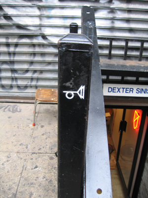
 Deep in Manhattan where the lines between Chinatown and the Lower East Side blur, the basement of a non-descript building houses a graphic design firm / publishing house / bookstore. The entrance is easy to miss, with a small spray-painted trumpet, taken from Thomas Pynchon’s The Crying Lot of 49, marking a handrail. However on Saturdays, hinged metal basement doors are left open, signaling that “Dexter Sinister: Just-In-Time Workshop & Occasional Bookstore” is open.
Dexter Sinister is the moniker that designers David Reinfurt and Stuart Bailey adopted last spring to describe the various forms their work takes. I’ve known David for a number of years, but haven’t talked to him in a while. A few Saturdays ago I stopped by Dexter Sinister catch up with him to see “Just in Time Workshop” in action.
Before stopping by, I checked out their website, and saw that they are playing with and pushing against traditions of publishing in some interesting ways.
From their site:
“In the basement at 38 Ludlow Street we will set up a fully-functioning Just-In-Time workshop, against waste and challenging the current state of over-production driven by the conflicting combination of print economies-of-scale (it only makes financial sense to produce large quantities) and the contained audiences of art world marketing (no profit is really expected, and not many copies really need to be made.) These divergent criteria are too often manifested in endless boxes of unsaleable stock taking up space which needs to be further financed by galleries, distributors, bookstores, etc. This over-production then triggers a need to overcompensate with the next, and so on and so on. Instead, all our various production and distribution activities will be collapsed into the basement, which will double as a bookstore, as well as a venue for intermittent film screenings, performance and other events.”
The Occasional bookstore sells copies of works of their own, their colleagues, and work put out from other small presses. The inventory consists of a handful of these titles at a time, which can fit on one shelf in the corner, in my estimation without irony. In fact, the bookstore’s size precisely fits the overall Dexter Sinister ethos.
Further back, I saw a mimeograph, an Apple Image Write printer and an IBM electric typewriter that were all lined up in a row. David noted that he does not overly romanticize the mechanical age of print technology with these similarly monochromatic tan-brown machines. This is, his interest is not in retro for retro’s own sake. Rather, when printer technology was mostly mechanical (rather than computerized,) designers and publishers could tinker, fix and modify their equipment. Car enthusiasts have noted a similar loss, as automobiles have become increasingly computerized as well.
Dexter Sinister produce their books in small runs that are meant to sell out. Further, their publications tend to be highly selective, limited, and personal. However, they aren’t gatekeepers. Instead, the overall impression is that they are interested in supportive projects that matter to them. For instance, Dexter Sinister now produces “dot dot dot,” the design periodical that Stuart co-edited and designed while living in the Netherlands. When the print runs do sell out, they can issue re-prints in any number of printing options depending upon the circumstance, if they want to, or not.
 Some of their publications are printed on their mimeograph. While being well designed, the printing is fast and inexpensive, but avoids feeling overly cheap. Although, the final result reminds me of the pirated textbooks I encountered in China in the mid 90s. Inexpensive doesn’t necessarily mean boring and poor quality. Rather, it provides another design constraint under which to find new solutions. They’re also experimenting with lulul.com and have done born-digital projects as well.
What’s really interesting to me is that DS and the institute share many ideas in common. However the execution of these ideas and solutions are entirely different. Although, the institute’s foci are often pointed at the digital, we certainly support the future of print (despite the fact that we get asked to comment or qualify the position of “death of print” quite often.) Distribution of digital media via the network is one vector. Small run, niche, highly curated, print publishing is another. In both cases, we have run into the failures of the current economic models of many traditional kinds of publishing. I’m reminded of the analogy of water, flowing down a mountain, seeking a path of minimal resistance. Similarly, information “wants” to intrinsically find its expression by the easiest pathways.
Later in a follow-up email exchange, we were talking about these various new modes of publishing. David noted that, “it feels like some particular in-between moment, just in general, with an overall apocalyptic vibe. It’s definitely the end of something and I suppose the beginning of something else.” Exactly.
Category Archives: graphic_design
media consumption #2
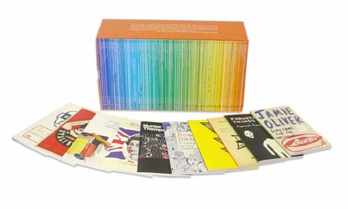
While browsing bookstores in london yesterday — still one of my most favorite pastimes — i came across a beautiful box of 70 thin-spined pocketbooks, the colors of the spine intentionally creating a stunning run of the spectrum from blue to orange. turns out it is a series of 70 essays and short fiction celebrating Penguin’s 70th anniversary and its claim to have initiated the ‘paperback revolution.’ [note: legendary editor jason epstein claims to have done this for Doubleday. does anyone have any insight into whether either claimant really has bragging rights?].

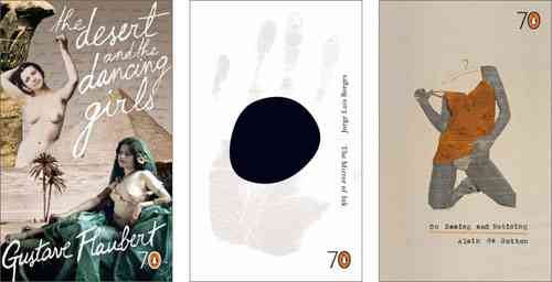
Although i wanted to spring for the whole box, the $125 price tag was too daunting so i bought 3 of the slim volumes — “The Desert and the Dancing Girls,”, a travelogue by Gustave Flaubert describing his journey to Egypt; On Seeing and Noticing,” a collection of philosopher Alain de Botton’s short essays, and “The Mirror of Ink,” seven of Jorge Luis Borge’s wonderful short stories. the cover of each volume is exquisitely and thoughtfully designed, each by a different artist.

Each title is so beautiful in its own right, Penguin has succeeded in putting together a series which underlines the appeal of books as objects. the success of the series stems less from the elegance of the graphic design than from the decision to “go small.” none of the books in the series exceeds 60 pages; given the size of the page and the font, they are probably equivalent to a long piece in the New Yorker or the chapter of a book. had Penguin decided to celebrate their birthday with 70 beautifully designed books i would have wanted to own the objects but wouldn’t necessarily expect to read any of them. however, the curatorial intelligence behind this series seems to have come up with a concept which is “just right.” there is something about the discrete boundaries of these short volumes which makes me think i could read them and that i want to read them, not just own them. the closest analogy is to a box of deliciously appetizing chocolates where i browse the contents over and over, making decsions about which to eat first and which to save for later.
Sad to say i can’t even imagine writing the above to describe offerings in the digital domain. we may get there, but the terms will be different.
(media consumption #1)
