While browsing bookstores in london yesterday — still one of my most favorite pastimes — i came across a beautiful box of 70 thin-spined pocketbooks, the colors of the spine intentionally creating a stunning run of the spectrum from blue to orange. turns out it is a series of 70 essays and short fiction celebrating Penguin’s 70th anniversary and its claim to have initiated the ‘paperback revolution.’ [note: legendary editor jason epstein claims to have done this for Doubleday. does anyone have any insight into whether either claimant really has bragging rights?].
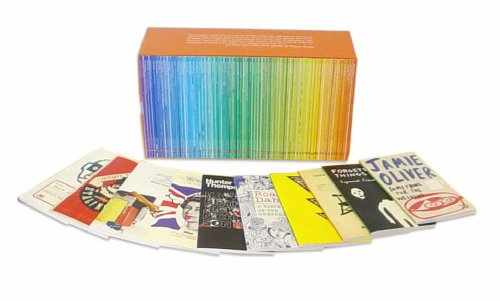
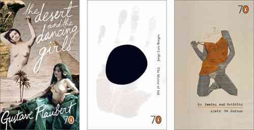
Although i wanted to spring for the whole box, the $125 price tag was too daunting so i bought 3 of the slim volumes — “The Desert and the Dancing Girls,”, a travelogue by Gustave Flaubert describing his journey to Egypt; On Seeing and Noticing,” a collection of philosopher Alain de Botton’s short essays, and “The Mirror of Ink,” seven of Jorge Luis Borge’s wonderful short stories. the cover of each volume is exquisitely and thoughtfully designed, each by a different artist.
Each title is so beautiful in its own right, Penguin has succeeded in putting together a series which underlines the appeal of books as objects. the success of the series stems less from the elegance of the graphic design than from the decision to “go small.” none of the books in the series exceeds 60 pages; given the size of the page and the font, they are probably equivalent to a long piece in the New Yorker or the chapter of a book. had Penguin decided to celebrate their birthday with 70 beautifully designed books i would have wanted to own the objects but wouldn’t necessarily expect to read any of them. however, the curatorial intelligence behind this series seems to have come up with a concept which is “just right.” there is something about the discrete boundaries of these short volumes which makes me think i could read them and that i want to read them, not just own them. the closest analogy is to a box of deliciously appetizing chocolates where i browse the contents over and over, making decsions about which to eat first and which to save for later.
Sad to say i can’t even imagine writing the above to describe offerings in the digital domain. we may get there, but the terms will be different.
(media consumption #1)
if:book
A Project of the Institute for the Future of the Book

Have you seen Penguin’s “Great Ideas” series? I saw a gorgeous stand of them in Shakespeare and Co. These take seminal tracts from throughout history – ranging from Seneca, to Paine, to Marx, to Orwell to name a few – and re-issue them in gorgeous paperback editions, many (or all) of them re-producing a classic cover design.
http://www.amazon.co.uk/exec/obidos/tg/listmania/list-browse/-/2VOQIP5UM3LLL/026-0309645-3526014
This could be a great concept to borrow and expand for an electronic title series.
There’s a beautiful recent history of the company’s design entitled Penguin by Design: a cover story 1935-2005 which I have around the house somewhere. What’s interesting is how public-spirited so much of their design seems to be: the company has a long history of wanting to make great ideas accessible to the general public. This does seem much more apparent in their British series than their American counterparts: compare, for example, this Malcolm Lowry cover or this Virginia Woolf to their American equivalents. American book design too often bows to commercial pressures & the resulting books don’t look at all appealing.
To return to Bob’s idea circuitously: the length of these is interesting. You don’t see books this length in bookshops very often, and I suspect that commercial pressures have a lot to do with it: readers won’t want to pay for something short. (I’m talking about mass-market books – certainly there are loads of poetry chapbooks at exactly this length, but these don’t often make it in to mainstream bookstores.) There’s no inherent reason that a good idea needs to be presented at what we think of as book length – that’s just a function of the marketplace, right?
Some /ubu editions are about this length; they fit the “electronic & beautifully designed” criteria, although, like chapbooks, they are aimed at an esoteric audience. I’d love to see more electronic things of this length, just to see how readable they are. Maybe I’ll make some.
A quick experiment: I made decent-looking PDFs optimized for screen reading out of a couple of short texts (in the spirit of the Penguin shorts). Option-click or righ-click to download these – don’t look at them in your browser. They are:
These have all been formatted for reading on the screen – they’re 800 x 600, so they should show up at a manageable size for most everyone. How readable are they? Would you read something that’s ten pages long like this? twenty pages? fifty pages? if you don’t usually read on screen?
(Has anybody done anything like this? it seems like an obvious thing to do & it didn’t take long to throw together, but I haven’t seen a lot of documents specifically formatted for ease of on-screen reading.)
I’ve just glanced at the Weinberger and the Melville – they’re quite nice to read, as screenreading goes. I think the difference that a fixed rectangular plate sans scrollbars makes is incalculable. Especially on my little screen (12.1″), I always find it incredibly unpleasant to read .pdfs that require scrolling – feels like tugging paper towels from the dispenser.
I like the red, black and white – matches the Penguin Great Ideas series.
wow dan, the typographic design on these is stunning. how i wish we could have done this quality work with TK3. fingers crossed for Sophie.
the 800×600 horizontal shape however is quite problematic for me. it looks nice, but a lifetime of vertically oriented pages with more information in the vertical than the horizontal makes me uncomfortable. i can probably get used to it but my mind instinctively wants differently shaped chunks.
Huymans Against Nature came to me, in English, through the Penguin Classics’ cover, a portrait of Count Robert de Montesquieu, immortalized by Proust in the guise of Baron de Charlus in Remembrance of Things Past. The editors made the perfect match of the visual and the Proustian to illustrate this amazing book.
In the digital domain I browse for contents, images come when I’m looking for a particular artist, film, and so on. In bookstores my eye is
checking simultaneously images and text. On the other hand, blogs, as A. O. Scott says in “Among Believers” (New York Time Magazine, Sept. 11, 2005) “embody and perpetuate a discourse based on speed, topicality, cleverness and contention –all qualities very much ascendant in American media culture these days. ” Images don’t seem to play a major role here. Blogs are for the initiated in whatever the topic is.
From the very beginning, mankind has tried to interpret the world through images, and today they have become essential. So, it seems that the
blog is skipping this connection, or if it’s doing it, it’s not succeeding. Hiroshi Sugimoto makes a major point in his show “History of History” at the Japan Society in New York. He sees that history is to a great extent shaped by artists. Seeing the show I kept on thinking about Bob’s “trying to fit round pegs into square holes” because for Sugimoto “writing” goes beyond words. Talking about recorded and unrecorded history he says: “… we assume that the history of material things will continue to be rewritten after us. What, then, of art history? Ever since the age of cave painting, humans have wanted a unified vision with which to see the chaos of this world of
ours. It has been largely those people known as artists who have filled such role –and they still hold this function today.”
If this is the age of brevity it’s also the age of the image. Art is ubiquitous today not only because tools are easily accessible, but also
because of the need to decode an immensely complex, busy, chaotic world. It seems that we have all that is needed to make the leap, but there are choices to be made.
To Sol: thanks for a beautiful post, which this workaday followup doesn’t do justice to. Wasn’t Des Esseintes also modeled on Robert de Montesquiou? Or am I misremembering that?
Responding to Bob’s comment: this is probably an enormous can of worms to open, but one of the major differences between the screen & the page is the use of the horizontal vs. the vertical axis – “landscape” & “portrait”. I’ve actually been looking for a good study on this for a while & haven’t found one yet. (I’m sure there’s a good visual studies thesis to be written on this – anybody?)
Historically the computer screen (generally a 4 x 3 horizontal to vertical ratio) followed the television (also 4 x 3), which followed the cinema (at minimum 4 x 3, but often wider), which (probably) followed the theater. It might be getting moreso, if Apple’s widescreen 17” Powerbooks & and DVDs presented in the original aspect ratio are a sign of things to come.
This is a bit problematic for text: people find it easier to read text when the lines aren’t very wide (in typography, this is called the “measure”). If a line’s too long, the eye has a harder time finding its way back to the next line; this becomes tiring. This is why type’s frequently set in columns, although these introduce problems of their own: you have to find your way from the bottom of one column to the top of the next. It’s easier with a book when you only have a single block of text on a page.
At Bob’s suggestion, here are a couple of more vertical treatments of the same texts. They’re actually more squarish than anything else.
When something’s tall (like these) on a wide screen, there’s another problem that comes up: there’s extra screen area to the side, which can provide distractions, not so good for screen reading. So this still isn’t a good solution. Were I making these PDFs just for myself, I’d make them full-screen for my screen resolution. But the best designs are solutions to particular problems, and screens vary widely, so I’m not sure a perfect solution for everyone is possible with one PDF.