Here’s a wonderful thing I stumbled across the other day: GAM3R 7H30RY has its very own listing in North Carolina State University’s online library catalog.
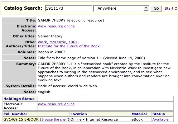
The catalog is worth browsing in general. Since January, it’s been powered by Endeca, a fantastic library search tool that, among many other things, preserves some of the serendipity of physical browsing by letting you search the shelves around your title.
(Thanks, Monica McCormick!)
Category Archives: ebook
amazon looks to “kindle” appetite for ebooks with new device

Engadget has uncovered details about a soon-to-be-released upcoming/old/bogus(?) Amazon ebook reading device called the “Kindle,” which appears to have an e-ink display, and will presumably compete with the Sony Reader. From the basic specs they’ve posted, it looks like Kindle wins: it’s got more memory, it’s got a keyboard, and it can connect to the network (update: though only through the EV-DO wireless standard, which connects Blackberries and some cellphones; in other words, no basic wifi). This is all assuming that the thing actually exists, which we can’t verify.

Regardless, it seems the history of specialized ebook devices is doomed to repeat itself. Better displays (and e-ink is still a few years away from being really good) and more sophisticated content delivery won’t, in my opinion, make these machines much more successful than their discontinued forebears like the Gemstar or the eBookMan.
Ebooks, at least the kind Sony and Amazon will be selling, dwell in a no man’s land of misbegotten media forms: pale simulations of print that harness few of the possibilities of the digital (apparently, the Sony Reader won’t even have searchable text!). Add highly restrictive DRM and vendor lock-in through the proprietary formats and vendor sites made for these devices and you’ve got something truly depressing.
Publishers need to get out of this rut. The future is in networked text, multimedia and print on demand. Ebooks and their specialized hardware are a red herring.
Teleread also comments.
wall street journal on networked books and GAM3R 7H30RY
The Wall Street Journal has a big story today on networked books (unfortunately, behind a paywall). The article covers three online book experiments, Pulse, The Wealth of Networks, and GAM3R 7H30RY. The coverage is not particularly revelatory. What’s notable is that the press, which over the past decade-plus has devoted so much ink and so many pixels to ebooks, is now beginning to take a look at a more interesting idea. (“The meme is launched!” writes McKenzie.) Here’s the opening section:
Boundless Possibilities
As ‘networked’ books start to appear, consumers, publishers and authors get a glimpse of publishing to come
“Networked” books — those written, edited, published and read online — have been the coming thing since the early days of the Internet. Now a few such books have arrived that, while still taking shape, suggest a clearer view of the possibilities that lie ahead.
In a fairly radical turn, one major publisher has made a networked book available free online at the same time the book is being sold in stores. Other publishers have posted networked titles that invite visitors to read the book and post comments. One author has posted a draft of his book; the final version, he says, will reflect suggestions from his Web readers.
At their core, networked books invite readers online to comment on a written text, and more readers to comment on those comments. Wikipedia, the open-source encyclopedia, is the ultimate networked book. Along the way, some who participate may decide to offer up chapters translated into other languages, while still others launch Web sites where they foster discussion groups centered on essays inspired by the original text.
In that sense, networked books are part of the community-building phenomenon occurring all over the Web. And they reflect a critical issue being debated among publishers and authors alike: Does the widespread distribution of essentially free content help or hinder sales?
If the Journal would make this article available, we might be able to debate the question more freely.
pinkwater dips his toes (and quill) into the web
The Institute is back in Los Angeles at USC, our home away from home in academe, where, for the next two days, we’re holding an introductory “boot camp” session with a small group of professors who will begin using Sophie in their classes this fall. USC is just southwest of downtown LA, right near the La Brea Tar Pits, which, incidentally, is the starting point of the latest book by one of my favorite childhood writers, Daniel Manus Pinkwater, who, I just read in Publishers Weekly, is publishing his newest book online.
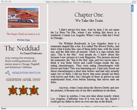
Pinkwater, author of Lizard Music, The Hoboken Chicken Emergency, the Snarkout Boys novels, and many, many others, is publishing his newest effort, The Neddiad, “a rip-roaring, foot-stomping, blood-curdling adventure, with station stops in Chicago, Flagstaff, and Hollywood, California,” free on his website as a serial.
With the blessing of his publisher, Houghton Mifflin, Pinkwater has set up a simple, very readable little site, where readers can imbibe the book, in slightly raw form, one chapter per week.
What we are presenting is the original author’s manuscript. There are some typos, and editorial corrections, and changes by me are not included. So the published book will be slightly different. I am a careful writer, and worked with a fine editor, so the differences are not great, but I thought it might be of interest for some to see what the book was like when handed in.
In many ways, this is a very PInkwater move — plugging his book into an electrical socket and watching it glow. There’s also a discussion forum, so it’s something of a networked book:
Readers are welcome to post comments, criticisms, complaints, and exchange remarks–a link will be provided, and I may periodically chime in to discuss and argue with the posters.
Pinkwater told PW:
When I was younger a circus hand showed me how they let kids sneak into the circus. If they were bold enough to try, they got to stay. I’m trying to keep that feeling for kids with this project. It lets kids sneak into the tent. We’re deliberately keeping it from looking slick; there are no ads. Of course, it’s with Houghton Mifflin’s kind permission that we can offer this, but it’s still a bit of homebrew, slightly different from the finished version. We hope that the readers who enjoy what they find online will want to buy the book, too.
If nothing else, Pinkwater has grasped an important (and counterintuitive) principle of web publishing: that giving stuff away can help sell books. It helps facilitate a discussion about that stuff, and can make readers feel better disposed toward you and your work (i.e. more likely to buy it in print). One chapter per week is a rather dribbling pace, however (recall the somewhat disingenuous serialization of Pulse by FSG), and might be a bit like Chinese water torture for Pinkwater’s ardent fans. But we’ll see.
e-paper takes another step forward
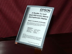
With each news item of flexible display technology, I get the feeling that we are getting closer to the wide spread use of e-paper. The latest product to appear is Seiko Epson’s QXGA e-paper, which was recently introduced at a symposium given by the Society for Information Display. Even from the small jpeg, the text looks sharp and easy to read. Although e-paper will not replace all paper, I’m looking forward to the day I can store all my computer manuals on e-paper. Computer manuals are voluminous and quickly become outdated with each new upgrade. I typically repeatedly use only a few pages of the entire manual. All these reasons makes them a great candidate for e-paper. Perhaps, the best benefit is that I can use the new found shelf space for print books where I value the vessel as much as the content.
Via Engadget
inanimate alice

My friend Sue Thomas sent me a link to work by an artist going by the name of Babel. The first piece I looked at, Inanimate Alice is a wonderful throwback to early interactive media work which mixed audio, video, text and images in simple ways but to powerful effect. Josh Feldman’s Consciousness, Amanda Goodenough’s charming Inigo and Faithful Camel stories, Rodney Greenblatt’s Wonder Window, and Eric Swenson’s notorious BLAM! come immediately to mind. (Looked for links to online versions of these works but didn’t find any — not surprising since they are 14-19 years old. I Think I’ll write the authors and try to assemble an online exhibit of some of this early work. ) If you like Inanimate Alice and know of similar work (past or present) please send us a reference.
G4M3R 7H30RY: part 4

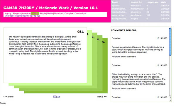
We’ve moved past the design stage with the GAM3R 7H30RY blog and forum. We’re releasing the book in two formats: all at once (date to be soon decided), in the page card format, and through RSS syndication. We’re collecting user input and feedback in two ways: from comments submitted through the page-card interface, and in user posts in the forum.
The idea is to nest Ken’s work in the social network that surrounds it, made visible in the number of comments and topics posted. This accomplishes something fairly radical, shifting the focus from an author’s work towards the contributions of a work’s readers. The integration between the blog and forums, and the position of the comments in relation to the author’s work emphasizes this shift. We’re hoping that the use of color as an integrating device will further collapse the usual distance between the author and his reading (and writing) public.
To review all the stages that this project has been through before it arrived at this, check out Part I, Part II, and Part III. The design changes show the evolution of our thought and the recognition of the different problems we were facing: screen real estate, reading environment, maintaining the author’s voice but introducing the public, and making it fun. The basic interaction design emerged from those constraints. The page card concept arose from both the form of Ken’s book—a regimented number of paragraphs with limited length—and the constraints of screen real estate (1024×768). The overlapping arose from the physical handling of the ‘Oblique Strategies’ cards, and helps to present all the information on a single screen. The count of pages (five per section, five sections per chapter) is a further expression of the structure that Ken wrote into the book. Comments were lifted from their usual inglorious spot under the writer’s post to be right beside the work. It lends them some additional weight.
We’ve also reimagined the entry point for the forums with the topic pool. It provides a dynamic view of the forums, raising the traditional list into the realm of something energetic, more accurately reflecting the feeling of live conversation. It also helps clarify the direction of the topic discussion with a first post/last post view (visible in the mouseover state below). This simple preview will let users know whether or not a discussion has kept tightly to the subject or spun out of control into trivialities.

We’ve been careful with the niceties: the forum indicator bars turned on their sides to resemble video game power ups; the top of the comments sitting at the same height as the top of their associated page card; the icons representing comments and replies (thanks to famfamfam).
Each of the designed pages changed several times. The page cards have been the most drastically and frequently changed, but the home page went through a significant series of edits in a matter of a few days. As with many things related to design, I took several missteps before alighting on something which seems, in retrospect, perfectly obvious. Although the ‘table of contents’ is traditionally an integrated part of a bound volume, I tried (and failed) to create a different alignment and layout with it. I’m not sure why—it seemed like a good idea at the time. I also wanted to include a hint of the pages to come—unfortunately it just made it difficult for your eye move smoothly across the page. Finally I settled on a simpler concept, one that harmonized with the other layouts, and it all snapped into place.


With that we began the production stage, and we’re making it all real. Next update will be a pre-launch announcement.
google buys writely, or, the book is reading you, part 2
Last week Google bought Upstartle, a small company that created an online word processing program called Writely.  Writely is like a stripped-down Microsoft Word, with the crucial difference that it exists entirely online, allowing you to write, edit, publish and store documents (individually or in collaboration with others) on the network without being tied to any particular machine or copy of a program. This evidently confirms the much speculated-about Google office suite with Writely and Gmail as cornerstone, and presumably has Bill Gates shitting bricks .
Back in January, I noted that Google requires you to be logged in with a Google ID to access full page views of copyrighted works in its Book Search service. Which gave me the eerie feeling that the books are reading us: capturing our clickstreams, keywords, zip codes even — and, of course, all the pages we’ve traversed. This isn’t necessarily a new thing. Amazon has been doing it for a while and has built a sophisticated personalized recommendation system out of it — a serendipity engine that makes up for some of the lost pleasures of browsing a physical store. There it seems fairly harmless, useful actually, though it depends on who you ask (my mother says it gives her the willies). Gmail is what has me spooked. The constant sprinkle of contextual ads in the margin attaching like barnacles to my bot-scoured correspondences. Google’s acquisition of Writely suggests that things will only get spookier.
I’ve been a webmail user for the past several years, and more recently a blogger (which is a sort of online word processing) but I’m uneasy about what the Writely-Google union portends — about moving the bulk of my creative output into a surveilled space where the actual content of what I’m working on becomes an asset of the private company that supplies the tools.
Imagine you’re writing your opus and ads, drawn from words and themes in your work, are popping up in the periphery. Or the program senses line breaks resembling verse, and you get solicited for publication — before you’ve even finished writing — in one of those suckers’ poetry anthologies.  Leave the cursor blinking too long on a blank page and it starts advertising cures for writers’ block. Copy from a copyrighted source and Writely orders you to cease and desist after matching your text in a unique character string database. Write an essay about terrorists and child pornographers and you find yourself flagged.
Reading and writing migrated to the computer, and now the computer — all except the basic hardware — is migrating to the network. We here at the institute talk about this as the dawn of the networked book, and we have open source software in development that will enable the writing of this new sort of born-digital book (online word processing being just part of it). But in many cases, the networked book will live in an increasingly commercial context, tattooed and watermarked (like our clothing) with a dozen bubbly logos and scoured by a million mechanical eyes.
Suddenly, that smarmy little paper clip character always popping up in Microsoft Word doesn’t seem quite so bad. Annoying as he is, at least he has an off switch. And at least he’s not taking your words and throwing them back at you as advertisements — re-writing you, as it were. Forgive me if I sound a bit paranoid — I’m just trying to underscore the privacy issues. Like a frog in a pot of slowly heating water, we don’t really notice until it’s too late that things are rising to a boil. Then again, being highly adaptive creatures, we’ll more likely get accustomed to this softer standard of privacy and learn to withstand the heat — or simply not be bothered at all.
sophie is coming!
 Though we haven’t talked much about it here, the Institute is dedicated to practice in addition to the theory we regularly spout here. In July, the Institute will release Sophie, our first piece of software. Sophie is an open-source platform for creating and reading electronic books for the networked environment. It will facilitate the construction of documents that use multimedia and time in ways that are currently difficult, if not impossible, with today’s software. We spend a fair amount of time talking about what electronic books and documents should do on this blog. Hopefully, many of these ideas will be realized in Sophie.
A beta release for Sophie will be upon us before we know it, and readers of this blog will be hearing (and seeing) more about it in the future. We’re excited about what we’ve seen Sophie do so far; soon you’ll be able to see too. Until then, we can offer you this 13-page PDF that attempts to explain exactly what Sophie is, the problems that it was created to solve, and what it will do. An HTML version of this will be arriving shortly, and there will soon be a Sophie version. There’s also, should you be especially curious, a second 5-page PDF that explains Sophie’s pedigree: a quick history of some of the ideas and software that informed Sophie’s design.
sonogram of networked book in embryo (GAM3R 7H30RY part 3)
It probably won’t be until mid to late March that we finally roll out McKenzie Wark’s GAM3R 7H30RY Version 10.1, but substantial progress is being made. Here’s a snapshot:
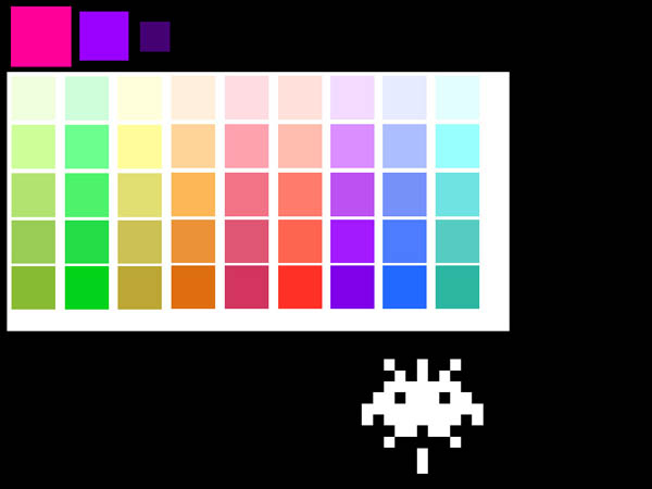
After debating (part 1) our way to a final design concept (part 2), we’re now focused (well, mainly Jesse at this point) on hammering the thing together. We’re using all open source software and placing the book under a Creative Commons Attribution-NonCommercial-ShareAlike 2.0 license. Half the site will consist of a digital edition of the book in Word Press with a custom-built card shuffling interface. As mentioned earlier, Ken has given us an incredibly modular structure to work with (a designer’s dream): nine chapters (so far), each consisting of 25 paragraphs. Each chapter will contain five five-paragraph stacks with comments popping up to the side for whichever card is on top. No scrolling is involved except in the comment field, and only then if there is a substantial number of replies.
The graphic above shows the color scale we’re thinking of for the different chapters. As they progress, each five-card stack will move from light to dark within the color of its parent chapter. Floating below the color spectrum is the proud parent of the born-digital book: McKenzie Wark, Space Invader (an image that will appear in some fashion throughout the site). Right now he’s a fairly mean-looking space invader — on a bombing run or something. But we’re thinking of shuffling a few pixels to give him a friendlier appearance.
You are also welcome to view an interactive mock-up of the card view (click on the image below):
The other half of the site will be a discussion forum set up in PHP Bulletin Board. Actually, it’ll be a collection of nine discussion forums: one for each chapter of the book, each focusing (except for the first, which is more of an introduction) on a specific video game. Here’s how it breaks down:
* Allegory (on The Sims)
* America (on Civilization III)
* Analog (on Katamari Damarcy)
* Atopia (on Vice City)
* Battle (on Rez)
* Boredom (on State of Emergency)
* Complex (on Deus Ex)
* Conclusions (on SimEarth)
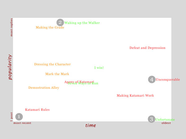
The gateway to each forum will be a two-dimensional topic graph where forum threads float in an x-y matrix. Their position in the graph will be determined by the time they were posted and the number of comments they’ve accumulated so far. Thus, hot topics will rise toward the top while simultaneously being dragged to the left (and eventually off the chart) by the progression of time. Something like this:
At this point there’s no way of knowing for sure which part of the site will be more successful. The book view is designed to gather commentary, and Ken is sincerely interested in reader feedback as he writes and rewrites. There will also be the option of syndicating the book to be digested serially in an RSS reader. We’re very curious to see how readers interact with the text and hope we’ve designed a compelling environment in which to do so.
Excited as we are about the book interface, our hunch is that the discussion forum component has the potential to become the more vital half of the endeavor. The forum will be quite different from the thousands of gaming sites already active on the web in that it will be less utilitarian and more meditative in its focus. This won’t be a place for posting cheats and walk-throughs but rather a reflective space for talking about the experience of gaming and what players take games to mean. Our hope is that people will have quite a bit to say about this — some of which may end up finding its way into the book.
Although there’s still a ways to go, the process of developing this site has been incredibly illuminating in our thinking about the role of the book in the network. We’re coming to understand how the book might be reinvented as social software while still retaining its cohesion and authorial vision. Stay tuned for further developments.
