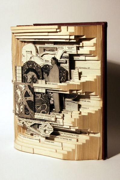
“The Physiological Basis of Medical Practice, 2006”, Altered book, 9 x 7-1/2 x 3-1/4 inches.
By Brian Dettmer at Haydee Rovirosa Gallery, New York.
(via Ron Silliman)
Category Archives: art
candida höfer: the library as museum
The photographs of libraries in “Portugal,” the current exhibition of Candida Höfer at Sonnabend, show libraries as venerable places where precious objects are stored.

The large format that characterizes Höfer’s photographs of public places, the absence of people, and the angle from which she composes them, invite the viewer “to enter” the rooms and observe. Photography is a silent medium and in Höfer’s libraries this is magnified, creating that feeling of “temple of learning” with which libraries have often been identified. On the other hand, the meticulous attention to detail, hand-painted porcelain markers, ornately carved bookcases, murals, stained glass windows, gilt moldings, and precious tomes are an eloquent representation of libraries as palaces of learning for the privileged. In spite of that, and ever since libraries became public spaces, anyone, in theory, has access to books and the concept of gain or monetary value rarely enters the user’s mind.
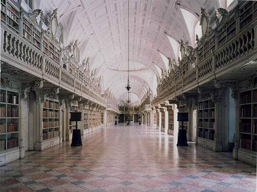
Libraries are a book lover’s paradise, a physical compilation of human knowledge in all its labyrinthine intricacy. With digitization, libraries gain storage capacity and readers gain accessibility, but they lose both silence and awe. Even though in the digital context, the basic concept of the library as a place for the preservation of memory remains, for many “enlightened” readers the realization that human memory and knowledge are handled by for-profit enterprises such as Google, produces a feeling of merchants in the temple, a sense that the public interest has fallen, one more time, into private hands.
As we well know, the truly interesting development in the shift from print to digital is the networked environment and its effects on reading and writing. If, as Umberto Eco says, books “are machines that provoke further thoughts” then the born-digital book is a step toward the open text, and the “library” that eventually will hold it, a bird of different feather.
stencil hypertext
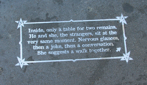
Not sure if it’s been washed away yet, but folks in the Bay Area should keep an eye out for this charming urban hypertext:
The mission stencil story is an interactive, choose-your-own-adventure story that takes place on the sidewalks of the Mission district in San Francisco. It is told in a new medium of storytelling that uses spraypainted stencils connected to each other by arrows. The streetscape is used as sort of an illustration to accompany each piece of text.
More images and some press links on this Flickr photoset.
(Thanks sMary!)
moby-dick animated
Alex Itin has done it again. Here it is: “Orson Whales,” an intertextual fantasia on Moby-Dick and Orson Welles set to the savage drums of John Bonham. Each frame is a page of this edition of the Melville text, painted and photographed and strung together in iMovie.
What you’re seeing is the entire book (actually two full copies – Alex can only paint on one side of each page because of bleed-through, so to get the whole text he had to double up). Here’s some of it stacked up in the studio (this is months of work):

The soundtrack is detritus gathered from web searches, a hunt for the white whale through a sea of tangents – appropriate, really, for the great book, which is so notoriously (and gloriously) tangential.
Alex: “The soundtrack is built from searching “moby dick” on You Tube (I was looking for Orson’s Preacher from the Huston film from the fifties) I couldn’t find the preacher, but did find tons of Led Zep and drummers doing Bonzo and a little Orson……. makes for a nice Melville in the end.”
Also check out his animation, same technique, of Ulysses. Bravo, Alex! (and happy birthday)!
alex itin netrospectives

Our dear friend and artist in residence Alex Itin has been getting noticed of late. Yesterday he was profiled on The Daily Reel, a popular site that curates quality video from around the web and frequently features his work. Other interesting video sites have also been a-knockin’.
An even better meditation on Alex’s work is this comment posted by Sol Gaitan last month in response to his popular piece, “I Made Pictures of Making a Picture of Everyone Who Might Be Looking At These Pictures of Everyone” (a bona fide blockbuster on Vimeo). I’ve reproduced it in full:
Robert Rauschenberg’s fabulous exhibition of 43 transfer drawings at Jonathan O’Hara Gallery produce that feeling, in retrospective, of seeing something that is going to mean a lot in the future. And they did. Executed in the 60’s they were the precursors, as well as the result, of appropriation. Duchamp and Picasso are two obvious examples that come to mind when one thinks of the origins of appropriation, today we prefer the term “mash-up.” The exciting thing about Rauschenberg is his extraordinary use of the quotidian to create highly manipulated works that elude classification. As his combines include and exclude us, the transfer drawings leave us with a feeling of immediacy and at the same time of blurry memories.
Alex Itin’s play with appropriation produces the same feeling. He is doing something that is going to mean a lot. His investigations of the uses of technology to produce an art as dynamic as its medium, is evident in these “horizontal scrolls.” The medium is limiting, so Alex is searching for a way to blog that defies its verticality, very much along the lines of the Institute, where his art resides. There are extraordinarily beautiful artist homepages on the Internet, but Alex’s redefinition of the blog as a place of encounter, intentional or by chance, a place of fusion where he produces and manipulates his mash-ups is unprecedented. With this “horizontal scroll” he moves a very important step forward. He addresses us in all our anonymity while creating the piece in front of our very individual eyes. His use of the blog as a way of communication through live creation makes it burst along its seams.
The way Rauschenberg’s transfer drawings fall on the paper seems aleatory, but it responds to the limitations he found in both collage and monotype before he started his silkscreen explorations: “I felt I had to find a way to use collage in drawing to incorporate my own way of working on that intimate scale,” (as cited on the show’s catalogue by Lewis Kachur from art historian Roni Feinstein’s dissertation, NYU 1990.) The result are aerial collages of images transferred from newspaper that become a testimony of their times. The 60’s were charged times, and the newsprint chosen by Rauschenberg; the civil rights movement, Vietnam, the invasion of Czechoslovakia, astronauts, consumer products, address high modernism, while their heterogeneity alludes to the fragmentary condition of postmodernism. Alex’s depiction of those looking at his blog is highly charged in a similar manner; who are us anyway? What seems improvisation takes the form of social commentary, as he says on his blog:
who is my audience?… I think I’ll draw them and perform in front of the drawing. Today’s post also asks the question (more than most), which here is the real work of art? The drawing, or the film of the drawing, or the whole thing together on the blog, or what?
Rauschenberg’s masterful use of gouache, watercolor and ink washes lends coherence to the whole. It centers the viewers attention on image and text, fusing them. Their dynamism makes us think of the artist at work. Alex has the medium, and the shrewdness, to put both, process and work, in front of our eyes. The result is not the voyeuristic epiphany of seeing Pollock dripping paint on a canvas that would become the actual piece, here it is the artist at work, moving in precarious terrain, which IS the piece.
Rauschenberg’s pieces elude nomenclature, they are neither painting, nor collage, nor sculpture, they are thresholds to new forms of perception. Today’s challenge is to rethink the meaning of appropriation in a moment when capitalist commodity culture has become the determinant of our daily lives. To appropriate today is to expose the unresolved questions of a world shaped by the information era. Permanence is constantly challenged and the evolution of Alex Itin’s work on his blog shows this as clearly as it can be.
this might just blow your mind
“I should try to draw everybody out there, I mean everybody who might be looking at this. I should try to draw all of you (and that’s an awful lot of people)…So then I thought I’d try to draw everyone on the Internet. More or less. I should try to draw all of you…”

See much more here.
alex itin at monkeytown
Last night’s Monkeybook event was a big hit. Thanks to all who came. Very soon, we’ll be announcing the relaunch of IT IN place with its fancy new archive interface. Just fixing a few last bugs. In the meantime, here’s a little clip from last night shot by Vimeo founder Jakob Lodwick:
Alex Itin night at Monkeytown on Vimeo
Vimeo user Alex Itin presented a show last night at Monkeytown, screening videos from Vimeo as well as paintings, animated GIFs, and HTML experiments.
It was an inspiring, relaxing night … just laying around, eating food, drinking wine, and enjoying some commercial free video for a few hours.
Thanks Alex!
monkeybook
 New York readers save the date!
Next Wednesday the 28th the Institute is hosting the first of what hopes to be a monthly series of new media evenings at Brooklyn’s premier video salon and A/V sandbox, Monkeytown. We’re kicking things off with a retrospective of work by our longtime artist in residence, Alex Itin. February 15th marked the second anniversary of Alex’s site IT IN place, which we’re preparing to relaunch with a spruced up design and a gorgeous new interface to the archives (design of this interface chronicled here and here). We’d love to see you there.
For those of you who don’t know it, Monkeytown is unique among film venues in New York — an intimate rear room with a gigantic screen on each of its four walls, low comfy sofas and fantastic food. A strange and special place. If you think you can come, be sure to make a reservation ASAP as seating will be tight.
More info about the event here.
ITIN place | 2007 redux: design journal, part 3
 (read parts 1&2)
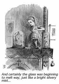
[3] I’d just begun hard coding navigational elements for the new ITIN archives, when I suspected Through the Looking-Glass might be an apt, fun read to offset the growing angst around coding. Maybe something in literature would provide the gestalt I felt missing from the minutia of writing lines of functions, booleans, and parameters. Sounds holistic maybe, but this suspicion plus a Wikipedia entry I’d read on Lewis Carol convinced me it’d be the perfect read just now. So, when I was walking through Penn Staten earlier last month, I found a bookseller in the LIRR station and, all excited, I picked up a copy of Alice’s Adventures, with the intentions of breezing through it in order to move onto Looking-Glass. It was nice to open ITIN place the next day to find Stormy Blues For Alice In The Looking Glass. Somehow, the two had already met.
Sally: I’ve been trying to figure out some of the back-end stuff for the past few days, namely, how to get your entire archive to link up to something like this. Do you have any programming / web design wizard friends who might be able to offer me some technical advice?
Alex: God know…. I guess we’ll have to build them manually…some 700 links? yipes.
Alex: I mean, god no….LOL
Sally: Hey, I’m working with a programmer now on a script that will allow the archive to thumbnail images from your entries and automatically load them (& URLs to the corresponding entries) into the Flash file. I don’t know PHP, which is likely the language needed to thumbnail your images automatically, so I’m getting help on that. Once that’s in place, we should be able to (a) play further with layout aspects! and (b) the archive should automatically update every time you publish an entry. Getting closer…
Alex: and it will still do that animated scale up and down trick?
Sally: my PHP programmer who would work on the thumbnail-ing flaked out on me, seems programmers can be as flaky as drummers… So, I set it upon myself to teach myself Flash-based blog applications. At its simplest, it requires a little PHP, a little XML and Flash, all in conversation with what you post online.

Ben: As for PHP gurus… We do in fact have someone working with us right now who’s an experience PHP coder. We’re keeping him pretty busy right now with MediaCommons stuff, but I think he could help you out with this stuff in a few weeks.
Sally: I also imagine there should be more than one way to search / browse the archives. One might be a linear “wall” from month to month that we could click/scroll through, another might be a drop-down menu of months say, to the right of the “wall” of images. Any thoughts on that?
Meanwhile, I’d plotted out on my whiteboard a map of the flash file. It looked to me that there were two methods of approach, interface-wise. Either the zoom function would scale up the size of an entire month’s calendar, and a re-center or panning function would allow the user to focus on a particular entry – or – the zoom function would simply scale up one entry at a time onrollOver (the original idea).
I am (still) drawn to the first idea, even though I’ve put it aside, since that would best recreate the sense of approaching a gallery wall, or landing on the (x,y) of Alex’s blog. But, caveats abound — if an onPress fires the zoom and re-center, then how do you click the entry’s permalink and/or zoom out? Is this overcomplicating things? Here is an example of an unweildy new zoom (an attempt to manage dragging and zooming).
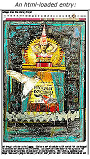 Then I started to think about loading in individual blog entries from the XML. I talked to my friend Mike about this for a while and in exchange for some brownies (although really only out of his extreme kindness and generosity) he constructed an XML format, sample.xml, and guided me on a way to load in the HTML of each individual entry into a small clip.
The great thing about using the HTML of each entry in the previous example is that it would allow the archives to build completely dynamically. Any changes Alex made in an archived post would reflect in real time in the flash file. Unfortunately, this doesn’t cut down on load time and I can’t coax the videos and animated .gifs to appear (of which there are considerable number). Here is an example of one entry pulled into the Flash file with HTML. CSS can be incorporated, but it’s obviously slow loading.
Mike brought up something I’d wondered too too: are we going to have one XML file for the entire archive? It seems to make more sense for each month to have it’s own.
So, after a few weeks, I caught up with Future of the Book’s expert developer Eddie Tejeda, and we decided to put an XML document within each month. On an exciting note, Eddie devised a great scheme (script) to take screen shots of all of ITIN place’s entries. He’s working on getting the image size down, so as to minimize loading time.
Eddie’s screen shots would load much faster than pure HTML, but it could possibly cut the dynamism. This would build something like this, only faster:
Most of the hard coding of the archive is done. Design matters remain: At the moment, the entries load in rather like a retro computer solitaire game, and drop down menus are disconnected and unskinned. It’s a task to go back and forth between design and developing — I’m just cutting my teeth on some of this and the dryness of programming can dilute creative inspiration (if this is anything to go by). The archive is very close to complete; it will be a thrill to use this gentler beast.
talk about an active “reader”
Alex Itin commenting on this video:
“. . . it’s great that video games involve the body. It is in this way that new media will pass literature. I quit writing for painting, because I couldn’t stand the loss of the physical that went into writing novels…. but in painting it is hard keep the intellectual (so much good about painting is metaphysical and physical and theory and ideas seem to get in the way of the act)…The reason I keep beating my head against the new media wall is that I sense it will allow me to have my cake and eat it too.”
