
Yet one more reason to check in to Alex Itin’s remarkable blog if you haven’t recently or ever. As you may have read here several weeks ago, alex started a group on Flickr, The Library Project, for people to post works that have been created by two or more artists, building serially on each other’s efforts. Last October Alex posted a beautiful video he made as an homage to the mystical Alpine light know as die alpen lumen. In a nod to the exquisite corpse form of The Library Project, a Japanese artist, Eat A Bug, posted a film he made in response. Serious kudos to alex and all his fellow artists who are demonstrating the power of collaboration and remix culture.
Category Archives: art
ITIN place | 2007 redux: design journal, parts 1 & 2
ITIN place — May 2006 archives (left two columns with live links):
[1] SUMMER 2006
At the beginning of the summer, Ben Vershbow, Alex Itin, and I began to discuss a redesign of IT IN place‘s archives. Itin blogs prolifically, his posts rich with media: scans of paintings, animated .gifs, Vimeo linked video collages. As a result, at present, his blog archive is enormous, slow loading, and unweildy. The archive requires better display and search capabilities—a map— to foreground the sheer volume of Itin’s work, rather than bury it. Below is a series of exchanges, both visual and conversational, following the redesign of IT IN place‘s archives…
the library project: a networked art experiment
Digital collaboration with me-jade, dou_ble_you and others in the Flickr Library Project
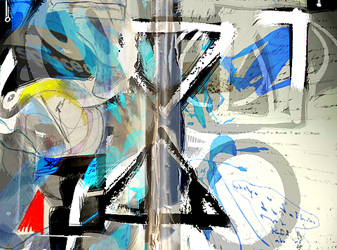
As he recently reflected upon here, Alex Itin has long been working at the border zones of art forms, moving in recent years to the strange intersection of paint and pixels. His blog is one of the most wildly inventive uses of that form, combining blazing low-res images of his paintings with text, photographs, short films, animated GIFs and audio mashups. All of this is done within the constraints of the blog’s scroll-like form — a constraint which Alex embraces, even relishes. I sometimes imagine the scroll endlessly emitting from Alex’s head like tape from a cash register, a continuous record of his transactions with the world.
ITIN place has been on the web for nearly two years now. In his second year, Alex began to explore new avenues out of the blog, establishing a presence on social media sites like Flickr, YouTube, Vimeo (a classier YouTube) and MySpace. Through these networked rovings, Alex has found a larger audience for his work, attracting new “readers” back to the blog where the various transmitted videos and images are reassembled in the scroll. He’s also established relationships with a number of other artists making interesting use of the web, particularly on Flickr and Vimeo. Recently, Alex invited a number of folks from the Flickr community to participate in a collaborative art project — a kind of exquisite corpse game via post. Here’s Alex:
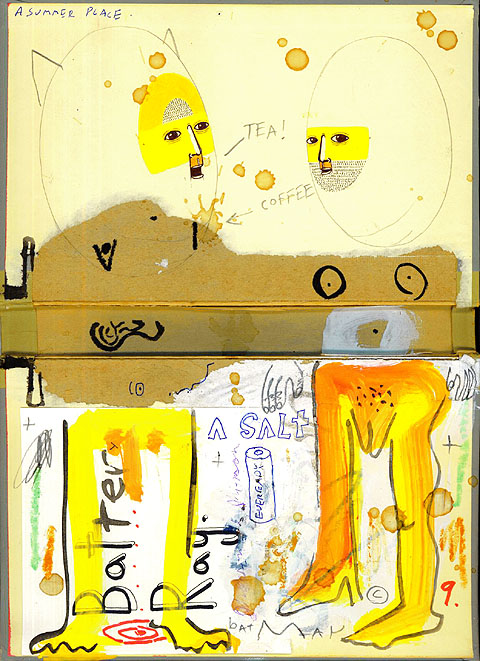
The idea is that one artist takes a hardcover from a book, tears out the pages and draws in one half (or half draws in both halves) of the binder/diptyque. In a nod to Ray Johnson, the two books are mailed (swapped) and Each of these will be finished by the other. The results are posted in a Flicker group called (what else) The Library Project. From this group, hopefully a show will be curated for New York, or Paris, or Basel, or Berlin, or wherever anyone wants to show this project. It should be deliciously portable… get working…get collaborating…get reading!
As of this writing, the Library has racked up 278 members and has 205 images in its pool. A few of these are collaborations that have already made their trek across land, sea and air, others are purely digital combinations, while still others are simply book-inspired works submitted in the spirit of the project.
Alex has been documenting the process on his blog, weaving in some of the images. Styles combine, narratives emerge. In one video (excerpted here) he films himself receiving his first half-completed book from a Canadian artist known as driftwould. He unpacks the drawings and lets out a “wow,” than a sort of humbled sigh. It’s a nice moment of return to the physical world after several years of probing the digital ether.
And here’s how that turned out:
Read Alex’s documentation here and here.
Stay tuned for more — the project has only just begun. Plus, we’ve begun designing a fantastic new interface for Alex’s blog archives, which we’ll talk more about soon.
plato’s cave
HiddenHistory on Vimeo
Ben’s post last week on the darker side of flash shone like a light bulb. I’d spent the morning manipulating a scanned image of Ditr Roth, by taking this video clip from Vimeo and downloading the source quicktime (which Vimeo allows you to do) importing that into i-movie and exporting thirteen still images as jpegs to sequence into an animated gif. Then I started pulling wav. files off cds and layering tracks and looping them and turning them into mpegs. In other words, it was a day like any other, but when I read Social Powerpoint, I considered how many little media format borders I’d just crossed and how many times I cross those borders on any given day in any given post and how much I take that freedom for granted. So, is flash like that damn wall they keep threatening to build in Texas, or built once in Germany and before that in China (and as a bird, or a bowerbird knows….walls never really work if you can fly over them, or go around)?
I don’t know enough about flash coding, but I worry that these walls are all already there in the very way that people read different media. In the way that their eyeballs see them and their earballs hear them. A photograph and a drawing will both appear on a digital page as jpegs, but it still seems a little tricky to get people to look at them in relation to each other. In painting, you take two paintings and put them side by side: BANG, you have a diptych. It becomes a third thing. I thought that logic would translate very easily to a still image and a moving one, or a sound and word, but It seems that people like compartments. They like to have their still photos at flickr and their video on You tube and their music on i-tunes, and their book on tape as a podcast, etc. If things appear on a digital page together, they are meant to be surrounded by a trompe l’oeil metallic players just so that there’s no aesthetic miscegenation going on. It’s what we’re used to.
I tend to use a bunch of media sharing services for IT IN place both as a way to host media and as a way of advertising. One of the realities I’ve come to deal with is that many more people are going to see my work as discrete media objects on flickr and vimeo than will ever make it to the blog to read these things together in the way that I intended. People seem to get something out of the picutres and the videos as pictures and videos, etc., but I always feel they are missing half the point. I think of it as reading sentence fragments, or stanzas and never seeing the whole poem.
At this point, each media is like a different language and trying to put them all together into a single whole is a Wasteland exercise… and the wasteland is patrolled by Minutemen and snakes.
Maybe, in some ways throwing these fragments out into the digital desert is part of the poetry. Maybe the networked landscape offers the thrill of archeology for the reader, like digging up little photo, sound, and video tiles that lead the reader on to find the mosaic. Today someone left a comment on flickr:
“your pieces are like secret boxes.. when i click the link it’s like lifting a lid and inside there is always something surprisingly ‘other’ and beautiful..”
….I could tack a hundred paintings on a hundred walls and never get a such a nice sentence in return.
But then there is the voice of my mother and also the significant other saying, “So how do you make money?”
It’s important to point out that for me the nexus of meaning is in mark making (wether as writing, or drawing which I think are intimately and evolutionarily (?) cave connected). My practice always revolves around drawing… All the different media I use are like a series of mirrors that multiply all the possible ways to see and understand things, but as an art animal, my primary way of knowing where I stand in the funhouse is to make a mark and so I think my practice revolves around the drawings… they are the map, if you will. While not exactly having any sort of business model, I always figured digital media would lead people to want to see and maybe own the “original” drawings and paintings. Of course, I thought of it this way, because that’s just what people traditionally have done: they sell things to people who collect things. It’s what we’re used to.
Maybe the past few months of deciphering fluxus history (and it’s anti-art leanings) has put the zap on my head, but lately I’m a bit lost in a Labyrinth of my own creation. The blog has sort of become the work of art and none of it’s discrete parts (read media) are more or less important…not when I’m successful in a post. It may be Greek and Latin and French and German and English and Japanese, but it has to be read together if you want to get the jokes. I don’t know… maybe I’m speaking in tongues. I have a feeling the youtube generation will be malf blahming flah wast di blamspoontoop dang glover….
* addendum: as I wrote this, three people on flickr enquired about buying work.
– my Flickr page
– my Vimeo page
carbon and silver
 Carbon and Silver is a small show of Walker Evans‘ 1935-36 photographs at the UBS gallery in New York. The purpose of this exhibit is to compare printing technologies. It focuses primarily on ink-jet prints in relation to gelatin silver prints, with a small sample of books side by side with their digitally printed counterparts, revealing how lithography literally pales next to the crispness of the digital.
The show invites meditations on the “authenticity” of reproductions, especially in a medium such as photography, in itself based upon printing technology. In this show it is quite difficult to discern the original from the copy, and one questions, as Baudrillard would have it, to which point the copy has come to replace the original.
 Most of the prints exhibited at the UBS belong to Evans’ body of work documenting the effect of the Great Depression on rural families for the Farm Security Administration in 1935-36. As a photographer, he was not particularly interested in producing his own prints as his main interest was to record information. These photographs were originally printed by the FSA as visual evidence reinforcing the New Deal.
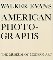
Evans’ own interpretation of them appeared in American Photographs, the book that accompanied his exhibition at the Museum of Modern art (the first one-man photography show ever mounted by a major museum.) John T. Hill says in this exhibition’s catalogue that Evans “scrupulously controlled corrections of the printing plates, and using this process as an extension of his darkroom became a habit.” The interesting thing is that he understood that the book has a permanence that the exhibition does not.
Evans’ photographs have such crispness that they lend themselves to reproduction, even when the print is less than perfect. As a master of his medium he was absolutely aware of the difficulties of rendering full tonal scale in a black and white print. The ink-jet prints in this show are so remarkably close to their gelatin silver sisters that the viewer has to go back and forth from print to print in order to discern any possible difference. Evans loved the detail that an enlarged print brings out and the enlarged digital prints in this exhibition certainly do that.
Hill sums up the advantages of technology without denigrating the magnificence of the original process:
All new media affect voice and timbre. A greater tonal scale and more precise control of values are the two most significant tools offered by digital technology. The information so difficult to maintain in the dark and light ends of the scale using gelatin silver materials is now printable. Gelatin silver has been replaced by carbon black pigments laid onto archival paper. The music is the same; certain subtle notes are now heard more clearly.
shifting forms of graffiti
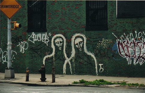
A few weekends ago, I was returning into Manhattan from upstate New York. Coming down the FRD along the East River, we past Keith Haring’s “Crack is Wack” mural on 128th and 2nd. I remember the first time I saw it in the 80s on a family day trip into the city. The work is strikes me as quite extraordinary, even 20 years after its creation in 1986. By that time, Haring was established in the art world, having already shown at the Venice Biennale and the Whitney Biennial and had solo shows at the Tony Shafrazi Gallery and the Leo Castelli Gallery. Even though Haring was part of that contemporary/ high brow art world, he still maintained a connection to his roots of skirting the lines between public street art and illegal graffiti. “Crack is Wack” mixed of graffiti street culture, political and social messages, and high art. Although, the mural was quickly placed under the protection and jurisdiction of the City Department of Parks.
Haring took cues from graffiti, among other sources of influence, and created his own style and form. Revisiting “Crack is Wack” got me thinking about graffiti and how it has evolved of the past few decades. The funny thing about living in New York is that, after a while, you start seeing through the visual chaos of our surroundings. When you take a moment to stop and look, it is amazing what you can actually see. The things that you walk by everyday, especially stand out.
Graffiti, which had faded into the background visual noise of New York, was back on my radar screen. It was, of course, everywhere, but it had also changed since I really paid attention to it. Ben posted about a show on graffiti at the Brooklyn Museum, and that was just one aspect of how graffiti has expanded beyond the traditional notions of the form. At the institute, we spend a lot of time thinking about the evolution of media, and it seems that graffiti is no different.
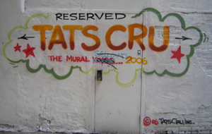 On a side street near Little Italy, there used to be an advertisement for the Sony PSP done by the graffiti artists Tat’s Cru. Now, the brick space has a place holder of an advertisement for these graffiti artists for hire. An interesting comment was left by a rival tagger, saying “sell out.” And then someone else left their tag over the unsolicited commentary. I love the on-going asynchronous dialogue occurring on this brick wall of this corner deli. It is not surprising that others would be upset at Tat’s Cru getting paid by advertisers for marketing. The website shows a piece that they did for BP. Working for the oil industry certainly will raise doubts to the authenticity and street credibility by purists of the form.
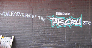
Perhaps, the work of the Tats Cru has not branched off to the new genre of graffiti but circled back to another form. Take this painted billboard for the debut solo record by Radiohead frontman Thom Yorke. The billboard appeared in Williamsburg in the weeks leading up to its release. Within moments, my initial thought that it was some hard core fan’s ode to British rock was replaced with the realization that this was paid for by a record label.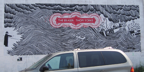
Referencing graffiti in advertising is nothing new. Turning actual graffiti into the advertising was the obvious next step. If graffiti is paid for and created for marketing purposes, at what point does it stop being graffiti? Has it turned into something else? Is it just a style of art using spray paint to create forms referencing hip-hop?
 Sometime after seeing Haring work, I passed this stoop a few blocks north of Chinatown. There was another similar work by the same artist I saw in the Lower East Side, however, I couldn’t find it again.
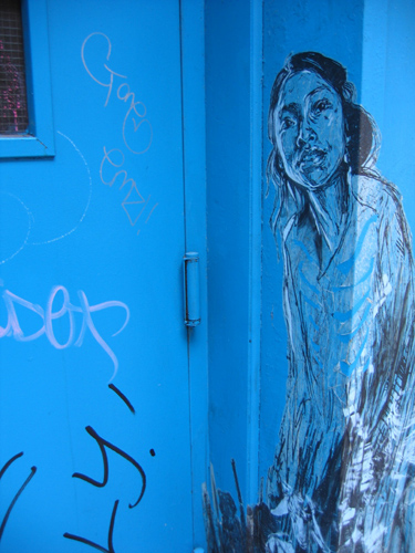
But the work kept on reappearing. And then, I noticed another one a few blocks from the institute’s office in Brooklyn. I probably walked past it hundreds of times before stopping to notice it. You can see where someone tried to tear it off, because in fact, the figures are not drawn on the wall, but on paper. The image is then transferred to the wall. Is this cheating? Suddenly, form and material are being challenged.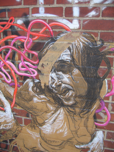
I did stumble upon Ping Magazine, when a friend sent me another article from the site. I finally learned that these pieces were created by an artist who goes by Swoon. She gave an interview for the New York Times, and describes herself as street artist, but considers her work graffiti. More importantly, she does not talk about the legal nature or the materiality of her work, but focuses on its location in public spaces and its direction interaction with people.
Keith Haring ended up being a great starting point, because of his work is a hybrid many forms and influences, including graffiti but also things beyond it. His mural reminded me that graffiti has embodied a range of politics, material and cultures for decades. Forms of expression emerge, branch off and circle back. Subsequent generations focus on different areas, be it monetary or expressive. Today, art and advertising are often re-appropriations of each other, as forms blend into one another. Empty spaces are filled with media by both artists and advertisers. The arts organization the Wooster Collective shows how broadly the concept of street art can extended. Trying to restrict these forms to bounded definitions is marginally useful, and often futile.
In this investigation, I was surprised at what I found, and amused at how often I circled back to the question of what is graffiti? The question or process of re-seeing something itself is not that surprising, particularly in the context of our work at the institute. Although, we focus more time on textual media, many of the questions remain the same. As we witness the evolving forms of text and the book, we can learn from other forms that turn into something slightly familiar but also remarkably new.
flickr as virtual museum
A local story. The Brooklyn Museum has been availing itself of various services at Flickr in conjunction with its new “Grafitti” exhibit, assembling photo sets and creating a group photo pool. In addition, the museum welcomes anyone to contribute photographs of grafitti from around Brooklyn to be incorporated into the main photo stream, along with images of a growing public grafitti mural on-site at the museum where visitors can pick up a colored pencil and start scribbling away. Here’s a picture from the first week of the mural:
This is an interesting case of a major cultural institution nurturing an outer curatorial ring to complement, and even inform, a central exhibit (the Institute conducted a similar experiment around Christo’s Gates installation in Central Park, 2005). It’s especially well suited to a show about grafitti, which is already a popular subject of amateur street photography. The museum has cleverly enlisted the collective eyes of the community to cover a terrain (a good chunk of the total surface area of Brooklyn) far too vast for any single organization to fully survey. (The quip has no doubt already been made that users be sure not forget to tag their photos.)
Thanks, Alex, for pointing this out.
incredible ulysses animation
Alex Itin, our ever-astonishing resident artist/blogger, has been playing around with viral video outlets like YouTube, Google Video, Vimeo and MySpace, embedding movies on his site and re-mounting some of his older film projects, which were previously too cumbersome for quick-and-dirty webcasting.
The following (originally posted here) is a short animated riff on Joyce’s Ulysses, in which actual pages from the book serve as frames, with figures painted over text. Joyce himself provides the vocal track. The drawings and sound apparently were not synched, which at times is hard to believe since they can be strikingly consonant.
NSFW!
Alex has been painting on books for years, exploring a kind of palimpsest style — old, yellowed texts or roadmaps like the walls of a decaying city, against which sinewy, calligraphic figures move. Some of his mixed media works, like Odd City (re-mounted recently on the blog as an animated GIF) have involved the flipping of pages, which yields a crude filmic effect. “You Cities” works on a grander scale, opening up new dimensions on the 2-D page. You find yourself pulled into a visual stream of consciousness.
art as politics
The term “political art” has implications that might well deter people from viewing it, especially here where the political is regarded as unaesthetic. It is sad that when an American artist makes “political art” it becomes news. This has been the case with the presence of political films in Cannes, as chronicled by A. O. Scott in the New York Times. He makes a parallel with the 60’s as a golden age of filmmaking, and in particular the 1968 Cannes Film Festival, where the artistic and the political were absolutely interconnected. To say that the problems we are facing today are less significant than those of the 60’s is to exchange lack of hope for the authentic belief in change that permeated that era.
The big difference today is that communications are immediate and indispensable, but that their ubiquity has also numbed us. War and catastrophe as spectacle have always fed the public imagination, but today fiction and fact, reality and artifice, have collapsed into yet another consumer product. On the other hand, the availability of affordable technology has made photography, video and filmmaking accessible to many. Now, it is possible to see interesting and good quality pieces from places far away from the established centers of film production. Cannes is still the favorite showplace of international cinema, but it doesn’t mean that many movies that make it there ever go beyond the art houses. So, the presence of Al Gore’s “An Inconvenient Truth,” Richard Linklater and Eric Schlosser’s “Fast Food Nation” or Linklater’s “A Scanner Darkly” and Richard Kelly’s “Southland Tales” are news not because they are represented in Cannes but because they tell stories based on present circumstances without fear of being “political.”
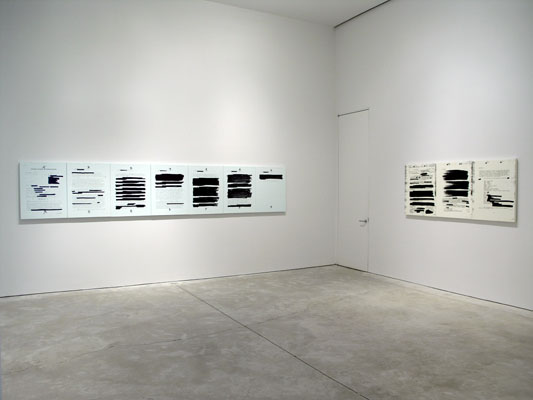
Holland Cotter the art critic of The New York Times reviews some current exhibitions that make political commentary noting that in 21st-century America political art is not “protest art” but a mirror. But, what else is art, past and present, than a mirror that uncannily shows political realities? The fact that many artists insist on looking at their belly buttons instead of at the world, is in itself a political commentary of the times. Cotter reviews Harrell Fletcher’s http://www.harrellfletcher.com/# show at White Columns, images from a museum in Ho Chi Minh City, as a horrific document of the Vietnam War. Jenny Holzer at Cheim and Read shows a series of silk screens of declassified documents related to Abu Ghraib, which are faithful to each official word with the exception of their magnification, thus becoming a commentary on our nation’s violence.
from Archive — Jenny Holzer
Coco Fusco‘s video, “Operation Atropos,” documenting the training on interrogation and resistance program she and six women went through in the woods of the Poconos, offers a political glance at the methods of physical and mental persuasion. Apart from the obviously political, the viewer realizes that this program, run by former members of the CIA, has been conceived for the private sector.
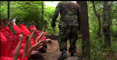
Operation Atropos
Cotter concludes his article asking, “So what kind of political art is this? It isn’t moralizing or accusatory. It’s art for a time when play-acting and politics seem to be all but indistinguishable.” They are.
It is always enormously refreshing to visit the art galleries, and to be reminded that many artists in many places, perhaps because they are faced with stark realities on a daily basis, have indeed a lot to comment. The Asian Contemporary Art Week (5/22-5/27) was one of those occasions (and still is since many galleries will continue displaying Asian art for a few more weeks.) Shilpa Gupta‘s interactive video environments at Bose Pacia offer a comment on power, militarism and imperialism. In one of the pieces the viewer sees a bucolic landscape in Kashmir and as s/he touches the screen military guards appear. Truth is indeed a fragile and many times deceiving construction.
Untitled, 2005 — Shilpa Gupta
Tejal Shah‘s video installation at Thomas Erben presents the transgender community in India from within, a reality that is equally painful and celebratory. At the Sculpture Center, as part of the Grey Flags exhibition, there is a film by Apichatpong Weerasethakul the Thai filmmaker whose fresh approach to reality has taken him to use non-professional actors and improvised dialogue, offering a sober and supetcharged vision of reality in Thailand. Tilton Gallery brings together 34 contemporary Chinese artists entitled “Jiang Hu” whose literal meaning is “rivers and lakes” but that metaphorically means a place removed from the mainstream. In medieval literature it means a realm inhabited by outsiders, monks, fortune-tellers and artists who had magical powers. In the context of this exhibit that shows an interesting and disparate group, “Jiang Hu” evokes a complex reality: China an outsider within the global world.
sculpture as book

Last weekend, I found myself in the familiar position of racing to catch a long-running art show before it closed. This time it was the David Smith retrospective at the Guggengheim. (The show ends on May 14th.) The collection includes sculptural nods to Abstract Expressionism and Surrealism, as well as, foreshadowing Minimalism. Once an ironmonger, Smith employs found objects, he molds and welds into sculpture influenced as much by painting as the traditions of sculpture. While I generally prefer his larger scale pieces he produced late in his career, I was struck by a fascinating mid-career piece entitled, “The Letter” (1950).
The sculpture is a representation of a letter, that begins with a salutation in the upper right hand corner and closes with a signature. A range of theories abound to its meaning. Are the glyphs letters, words, human figures, or scenes? Is this a letter to his wife? One art historian suggests the text references a line from Wonderful Town and about leaving the state Ohio, where Smith spent part of this youth.
Or could it be a response to an author’s writing? The audio tour offered interpretations of a hint to the work of James Joyce that Smith gave in an interview. Listening to these following quotes from Joyce’s Finnegans Wake (0:40 – 1:16 of the audio fiie) while looking at the piece, I see and hear relevance to our work at the institute.
“ruled barriers, along which the traced words run, march, halt, walk, stumble”
and
“lines of litters slittering up and louds of ladders slettering down”
Whether it is our overarching discussion of the shift of print text to the computer screen or an overheard criticism of the latest sacrilegious film adaptation of a beloved book, the evolution of text beyond the printed page is clearly a dynamic process. We are aided when any creative mind can demonstrate these emerging relationships in a meaningful way.
In “the Letter,” Smith coyly reveals partial hints to the artist’s intentions, freeing the viewer to create her own insights. Smith is able to simultaneously display a multitude of reflections of meaning, with each suggestion containing a seemingly direct message to the viewer (as seen by the wide ranging interpretations.) Although the iconography could and does represent letters, words and bodies, I remain continuously enamored with the Joycian interpretation.
In that, Smith transforms a book into a sculpture. “The Letter” is bounded like a book, but within those boundaries, the gestures of abstracted forms (rather than letters), the use of open space, and the three dimensionality of the work surpasses that which it mimics. Further, the abstracted sculptural forms with their multiple readings comment upon the various meanings we take from words, which are also open to multiple readings. Therefore, Smith’s vision leaves us with a physical object that embodies not just the words, themes, and emotions of the book (that is the content), but also comments on the limitations of the book as an object (or vessel which holds the content).
Smith’s work, now 56 years old, seemingly poses to us two challenges. First, when we translate print text into the digital or create born-digital books, “the Letter” reminds us that in deciding to keep or reject aspects of both the content and the vessel of the traditional book, we must be conscious of the choices we make in that process. What are we willing to sacrifice in order to achieve something greater? Second, it asks us to look at these new forms with eyes unfettered by past conventions and to focus on, appreciate, and take advantage of the potentials of the new medium.