Monthly Archives: June 2005

a literary map of manhattan

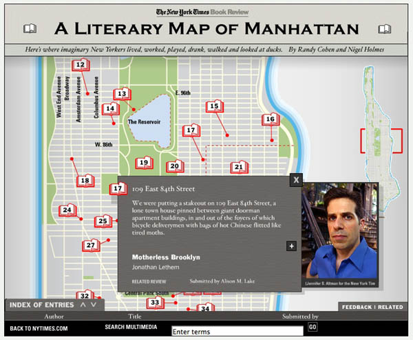
Maps maps maps. Everyone’s playing with maps as interface (see here and here). Check out this multimedia feature at the NY Times. Doesn’t go very deep, but fun all the same. Each item was reader-submitted over the past month – a collective effort to map the rich fictional life of Manhattan. They should do one of these for Brooklyn.

NYT lit map.jpg

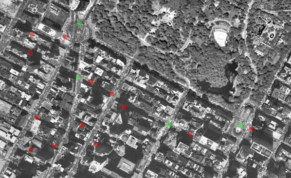
Reminds me of Mr. Beller’s Neighborhood. Each of the red dots below links to a story or article set in that location.
mrbellers.jpg

remixing the news

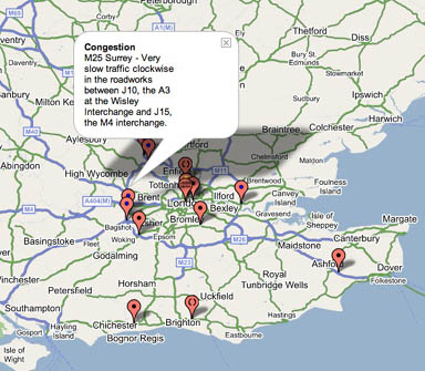
There’s been an explosion of creative tinkering since the BBC opened up its API (applications programming interface) last month. An API is a window into a site’s code and content allowing techie types to build new applications with BBC material. It’s really worth going over to the BBC Backstage blog to take a look at the first batch of prototypes and demos. The majority are clever splicings of BBC data – news, traffic reports, images etc. – with Google Maps (everyone’s favorite lately), not unlike chicagocrime.org. Other notable examples: an RSS feed of BBC complaints; a feature that allows you to tag articles and read tags left by other readers; and a nice “tag soup” visualization of financial news.

Correction: A reader kindly pointed out that BBC Backstage hasn’t actually released APIs yet (though they intend to soon). The projects I’ve referenced use BBC feeds, or have scraped content directly from the BBC site. APIs are to follow soon (more info here). When they do, the scaping process will become much cleaner. For now, the BBC welcomes projects that “use our stuff to build your stuff” the rough-and-tumble way, and is happy to showcase them on the Backstage site.

The API is becoming a powerful tool for creative reinvention of the web. Back in April, I wrote about Dan Gillmor’s piece on “Web 3.0”.. Web 1.0 was the early web, a place you went to read – a series of interconnected brochures. Web 2.0 is the “read-write” web – it’s a place you go to interact. Web 3.0 is where we start weaving the disparate pieces into new forms. APIs let you do this. You take one application and design a new front end that shows your point of view. Or you take two applications and mix them together, creating something new and illuminating. Right now, Web 2.0 is pretty well in place. The tools for self-expression and interaction are pretty accessible – email, chat, blogs, etc. But the weaving tools required for 3.0 are available only to advanced users. We’ll see if that changes.
Here are grabs from four of the map prototypes at BBC Backstage:
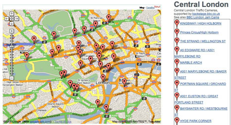
Traffic Maps:
BBC traffic map.jpg

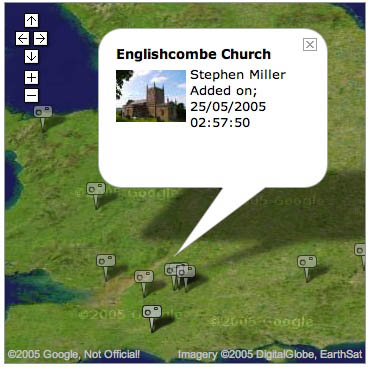
Map of BBC London Jam Cams:

BBC traffic cam map.jpg

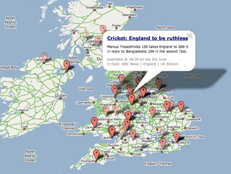
Photo Mapping:

BBC photo map.jpg

Map of the News:

BBC news map cricket.jpg
For more analysis, check out this article on O’Reilly Radar.
80 years of the New Yorker on disc

The New Yorker has never seemed terribly interested in going digital. Despite maintaining the obligatory website, with a smattering of free content and online features, the magazine exists somewhat apart from the daily swarm of the web. The print format still works quite well for them, and they have the legions of loyal subscribers to prove it.
But their latest publishing project does take them into digital territory. This October, in a big legacy move, the venerable weekly will release 4,109 issues – every single page since the February 1925 founding and the 80th anniversary issue this year – on an eight-DVD set. “The Complete New Yorker” (see NY Times story) will go for about $100 (though Walmart is already listing it for $59.22), and will also contain a 123-page book with an introduction by editor David Remnick. A big improvement on microfilm, the discs will allegedly be searchable by computer, though how granular the search is remains to be seen. For it to be more than just a collector’s item, it should be fully structured and offer fine-toothed find functionality. Remnick confirms, however, that readers will have the option of browsing just the cartoons (as many of us do).

visual bookmarks

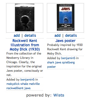
wist jaws tag.jpgWists is a visual bookmarking system for the web, doing for images what del.icio.us does for web pages. It’s like browsing the web with a camera, or creating your own hand-selected Google image search. Find an image you want to keep track of and Wists will create a thumbnail for you, linking back to the original site. If it’s a whole page you want to capture, Wists will take an automatic screenshot of the entire page. Add a title, tags and description and it goes into the system – a photo album of the web. Much like del.icio.us, Wists arranges popular tags on the sidebar and allows you to browse the latest entries. It also enables you to add other users’ bookmarks to your own gallery, clearing the slate for your own tags and descriptions. Best of all, it keeps track of people you’ve taken items from, and people who have taken items from you. Trails become apparent and the archive becomes interconnected. Here’s a grab of my “jaws” tag page – combing around for images, I found an amusing juxtaposition.
These are the kind of basic curatorial tools that would be great on Flickr. Currently, you are only able to apply tags to your own photos, or the those of friends, family or mutual contacts. But part of the fun of Flickr is browsing the photos of total strangers. You can comment on any photo or mark it as a favorite, but there is no way to curate your own collection of images from the community at large. Wists suggests how the gap between del.icio.us and Flickr might be bridged.

useful fun with Technorati tags

You may have noticed a new line of metadata at the bottom of posts on if:book – Technorati tags. Technorati is perhaps the most dynamic blog-tracking site on the web, scanning over 10 million weblogs and ranking their authority according to the number of links they receive from around the blogosphere. Technorati tags are socially constructed classification terms – keywords or categories that authors apply to their entries so that they show up in Technorati searches. Taken together, these thousands of tags are what make up the Technorati folksonomy – a taxonomic system created by users from the bottom-up, instead of by an information architect (like a librarian) from the top-down. Folksonomies are less rigid than shelf-based hierarchies (see “the only group that can organize everything is everybody”). They can cope with subtle but crucial differences between synonyms like movies, films, flicks, and cinema – or devlish distinctions like art versus entertainment. Tags can help bloggers reach small niche areas of interest, trickling content down into the hard-to-reach corners. But being highly idiosyncratic, folksonomic tags tend to proliferate rapidly. Most are too obscure or particularly worded to become widely adopted points of reference. Right now, sites like Technorati or Flickr deal with this problem by ranking. The irony is that, for all the promise of personal expression through folksonomy, the tags that make it to the top of the pile tend to be pretty conventional. Less formal than a library catalogue, to be sure, but nothing terribly colorful (nuance fares better in personal bookmarking systems like del.icio.us). And again, we are struck with this problem, endemic on the web, of authority meaning simply who’s popular. In that regard, the web is still a lot like high school.
(Mechanics: we’re able to ping specific tags with the great Technorati Tag plugin for Movable Type)

Google Print gets its own address

Google Print now has its own exclusive search page. But make no mistake, this is not a library. Google makes it very clear in a paragraph intended to reassure nervous publishers:

Google Print is a book marketing program, not an online library, and as such your entire book will not be made available online unless you expressly permit it.

If you reach your limit of permitted pages you get this:
googleprintrestrictedpage.jpg
(Technorati Tags: , , )