
ITIN place — May 2006 archives (left two columns with live links):
[1] SUMMER 2006
At the beginning of the summer, Ben Vershbow, Alex Itin, and I began to discuss a redesign of IT IN place‘s archives. Itin blogs prolifically, his posts rich with media: scans of paintings, animated .gifs, Vimeo linked video collages. As a result, at present, his blog archive is enormous, slow loading, and unweildy. The archive requires better display and search capabilities—a map— to foreground the sheer volume of Itin’s work, rather than bury it. Below is a series of exchanges, both visual and conversational, following the redesign of IT IN place‘s archives…
Alex: I’ve more or less figured out an idea of how to maybe make it work… I want to show the sense of time and the sense of connectivity of the posts. I’ve always been paying attention to relations of color and shape on the vertical axis… I’m hoping and wondering if something cool might be seen on the horizontal too…. …using scale might be interesting and helpful (if it’s not to complex to do)… so that you see a tiny map of the whole thing and then you can zoom in…. Kind of like Eames “Powers of Ten”…. but the original thumbnail variation might be easier to make.
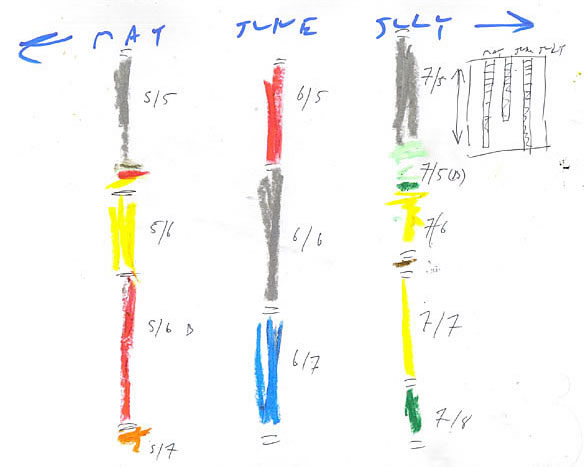
Sally: I think the current blog as a large strip and the archive as streams of film to one side would work… We can use size to mark the most recent post, but we could also use other design choices as well (say highlighting or animating, playing with transparency, etc.)
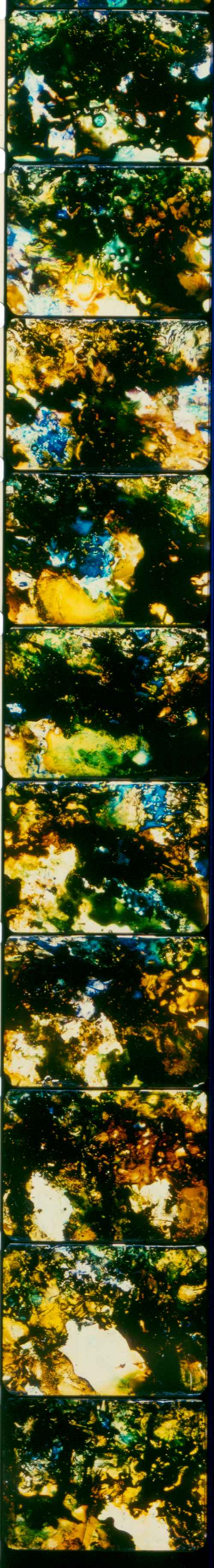
Alex: At this point I think we’re more or less talking about a sort of map, or key page to open up the blog archive to easy spelunking without huge load times. It did seem to me that it would be interesting to have these “bands of abstract color” (like a stan brakhage strip of film) and then you could bring them “closer” to the eye an reveal a thumbnail-like image … so that one could search for a favorite entry, or search by a more graphic abstract randomness. Maybe the feature should be sexy enough to encourage play?
Sally: We could start with something relatively static like you suggested: the lengths of film and the thumbnails (as links to indv. posts.)
Then, we could juice it up. Some ideas:
– We could animate the ribbons so that the visitor could scroll up/down the length of the ribbon either with a scrollbar-like object or by clicking and dragging the ribbon itself…
– We could add a magnifying function that might magnify frame by frame (post by post) on mouse rollover.
– We could mess with magnification to give a sense of zooming in and out on posts. This is, of course, running wild with your first design idea.
Alex: sort of like the osx animated side menu?
Ben: What is the relationship between all this meta-film strip/Stan Brakhage goodness and the actual blog ( i.e. the week or so of latest material, as one accesses it now?) Are these in separate places or are they somehow juxtaposed?
Alex: A good question and one that has been puzzling me… I suppose the first notion is that at the bottom of the page you have the “continued” button and that would call up this “menu” page… as a way of browsing the archive without getting stuck in lengthy loads… However, it might also be interesting to come up with a way of having the main blog as a large strip and the archive as sort of streams of film to one side… this would be a different looking blog, but maybe it’s time for a rethink.
Sally: On a tech note: I’m entering from an XML/Flash background, so at this point I imagine organizing the posts on the back end of the site and using Flash & XML to visually map. I’m not up on blogging technology so by default, I envision this xml driven Flash site. At this point, I’m unsure of how to fold in the dynamic (blog) aspects of IT IN: user comments, relative ease for Alex to regularly post, etc.
[2] SEPTEMBER
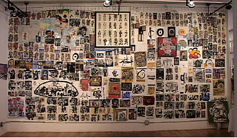
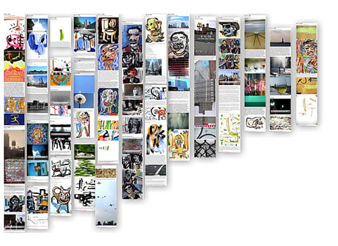
Experimenting with interactive elements. I began to manipulate a month of Alex’s blog, May 2006. As he suspected, the bird’s eye view of a month looks fantastic. Presenting a map that one can pull closer or push away works, now just to sort out what the map should look like. Alex directed me to images of a show he had in 2003, his paintings tiled on one wall. If we think of Alex’s blog as a curated space, reading the present form (verticle, with scrolling) is tantamount to standing nose up against the gallery wall. How should we curate virtual space—as though it were physical space? Should we allow the reader to ‘step’ back, virtually? What should that look like?
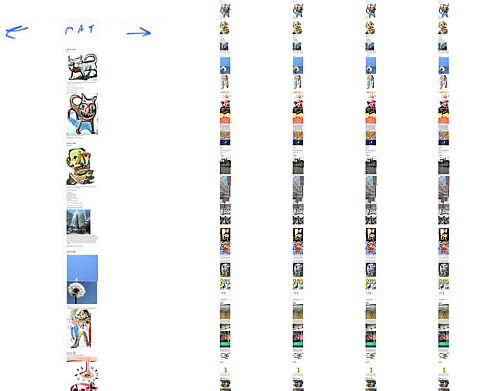
Sally: Hi Alex, When we met up a couple weeks ago, we talked about making a mock up of a few months to see how it looked. Here’s a link to a few static jpgs online. Your entries look great en masse!!! I’m pretty excited to see what could happen when we add a little interactivity to it, tool around more. I tried to put up several different versions of the same thing–all attempting what we talked about.
Alex: I…think…it’s…going…to…look…great!
Sally: I thought i’d get to work this weekend animating the bits we talked about making interactive, and see what happens. How’s that sound?
Alex: I did sort of think that it would be cool that by opening one entry you’d open the one above it and below it…. but that sound kind of tricky…
Sally: It’s late, and I’ve just dropped a scroll bar into the example… I am starting to jot down some questions… So far, we have the blog entries arranged chronologically and I inserted them in the flash file by date. But, there are sometimes several entries per date. Would you want each clickable item to be an entry, or a date? I thought date would be easier… but then I realized each entry’s url is not uniform, but the title of the entry (i had thought it’d be the date… hmmm).
Alex: I would go by each titled entry (sometimes a lot of disparate things will all come together on one day to publish, but they’re still discreet “chapters”… Does that make sense?
Sally: Yep, that makes sense! Thanks. Still hammering away. I got sidetracked with a few ideas. Meantime, an experiment along the way:
<< panel.onPress = function(){ this.startDrag();>> (give it a drag!)
Alex: that’s pretty cool! Different from what I thought… being about to drag it around like that…. Definitely going to make people want to play around with the archive.
Sarah: scrolls are in!
Alex: That seems to work pretty great.
Sally: Neat, this was good to hear! I’ll keep on tinkering with the layout.
<< myScroll = function () { >>
Ben: We were all just looking over the mockups and all agreed that some combination of 2 and 5 seems ideal. In 2, we like the fact that there’s no scrolling required (though I do love the little Itin-esque scroll bar you devised). In 5, we like that there’s more space between columns, and obviously, that there’s the zooming action when you mouse over. Seems that if 5 was representing a single month, you could fit everything into a fixed frame, sans scrolling. We could then have one of these pages per month, with the nice little backwards/forwards navigation you sketched out in the first mockup.
Sally: Hey Alex, I linked Ben to the mockups I’ve been posting. He preferred elements of test02 and test05, which led me to 06 (at the top of this post)–imagining what one month per page would look like. Thoughts? There’s no fancy coding here, just screen shots of your entries as before. The zooming function I’ve been using isn’t working best, as you can see the resolution isn’t good and it’s a bit irritating to manipulate. So, I’m learning a new one that I hope will work better.
<< panel.onRollOver = function() { _parent.zoom(x2);} >>
Stay tuned: parts 3 & 4 coming soon!
I hope that once this is complete you post a tutorial. I can think of tons of other sites this would be applicable to. It takes a little getting used to, but the final effect looks great!
Wow, this is kind of facinating for me to see all together…. Like old family films. Led Zepplin was playing as I checked out the interface, and it was so beautifully musical. Sally, you are brilliant. In an odd fluke. Me Jade from the Library project sent me a puzzle map from Australia to finish as collaboration…. It functions in paper like the digital space for the archive.
I feel I am living in an aboriginal dream.. or maybe I’ve gone through the looking glass.
Cheers.
Thanks Karin! A tutorial is a neat idea–a lot of the code for the above experiments was pulled from Web tutorials and repurposed for Alex’s work. The final project will be pretty modular–which currently makes one design choice difficult to commit to (my forthcoming entry delves into this.) But, I think this is also its strength. I wonder what other types of sites would benefit–where were you thinking? And I wonder where seasoned coders would take it.
Thanks Alex! I suspect Looking-Glass figures more than I know. From what I understand of Adventures in Wonderland, the text abounds with references to mathematical logic, rules of inference and algebraic-like symbols. And in Looking-Glass, well, I believe there’s a map the size of the country? The map there an absurd unit of scale — in your archives, a function. Also, I remember reading somewhere that Carroll created pictograms of trig functions (sin, cos, etc.) which lends itself nicely to thinking about what you do with music annotation and printed text in your media.
I love the elegant bandoliers of graphics. Immediately I wondered how the mobilities and navigations through this content would convey back into paper. Certainly the bandoliers would then be duplex, not just simplex and the pathways of mobilities would be much more dynamic as currents scoured though the long leaves. Another layer would be added with gravity, tensile and torque. Why do I feel that this application is at least as suggestive for paper as it is for screen presentation?
Sarah, I can see the technique being used on Art Journals (http://artspreserve.blogspot.com/), Flickr Photo Streams and Artist’s pages (http://lolo-art.livejournal.com/) (http://duanekeiser.blogspot.com/). I would like to see the effect on a text only blog, too- It would be an interesting exercise in texture.
I’ve been struggling with the constraints of the date based blogging mechanism for art- it’s great because it allows for ease of use and constant posting of new material, but archives are a pain to browse. This seems like a wonderful compromise.
What a fascinating exercise. This approach to the blog “pulled from Web tutorials and repurposed for Alex’s work” is brilliant because Alex, with just a few tools and his talent, has been reinventing it all along. The final choice is going to be a difficult one, but as Sally says; this is also its strength. Gary Frost calls the blog strips “elegant bandoliers of graphics” while Alex thought of them in terms of Brackhage strips of film that when seen closer reveal image (and text) strips. What you are doing is putting the real gallery and the virtual one together. This makes so much sense in an art blog, because it allows for both feelings; the sheer beauty of the works displayed one next to the other on the gallery walls and the possibility of looking inside the bandolier’s pockets to bring out a strip of posts. The fact that you are opening the process to all sorts of readers invites collaboration. This is as clear an approximation to the concept of the networked book as any. Borrowing from McKenzie Wark’s interview on the Creative Commons Text site referring to GAM3R 7H3ORY: this experiment is “reinventing the connective tissue between books, across space and time, and between different kinds of reader. It’s about making an end-run around monopolies of knowledge and culture.” We not only need to relearn how to read and write, we need to relearn how to look. The art world has a lot to (re)learn from this.
Like a bulletin board that sometimes falls down, and sometimes lunges at you. Like art.