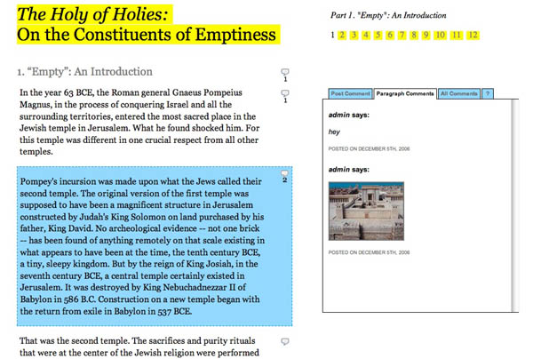
A few weeks ago, Mitch Stephens came to us with an interesting challenge: to design a social reading environment for a paper he will be presenting this Friday, Dec. 8 at a conference on religion and media at New York University. The paper, “Holy of Holies: On the Constituents of Emptiness”, is now live. This paper draws on the research Mitch has been doing for his book-length study of the history of atheism. It concerns the 1st century B.C.E. episode of the Roman general Pompey’s incursion into the tabernacle of the Second Temple. What he finds there… well, you’ll see. It’s a fascinating piece, which makes some interesting connections between belief systems and media systems, and it’s ready for your comments, annotations and criticims which you can post paragraph by paragraph through the text. It’s a new format that we’re playing with that could give new meaning to the idea of the “working paper.” We’re still fixing bugs and adding new features, but the basic apparatus is there. Take a look.

Over the past few months, Mitch has been moving out of the research stage and into full-on writing of his manuscript, and as a result he’s been thinking about workshopping larger chunks of text on his blog. This presents something of a quandary, however, as the short, pithy format of the blog, so good at sparking discussions generally, is not very good at dealing with longer expository texts. Earlier in November Mitch posted a draft of his book’s prologue with the hopes of getting substantive feedback from readers. The response was interesting but meager, largely owing to the fact that the discussion (on the blog) was so totally divorced from the actual text (a Word doc download). He had opted not to publish the prologue directly onto the site, since that would have meant breaking it up into multiple posts to create more points for commenting. This struck him as too clunky, especially considering the reverse-chronological order of the blog would necessitate posting the paper back to front. So he went with the download option. With his new paper he hoped to do something better, so he came to the Institute, or the “garage” as he calls it, to see if we could engineer a new approach.
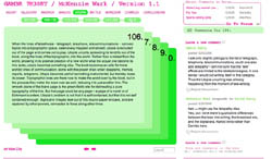
 We had of course already done this with Gamer Theory. Our goal there had been to create a more richly interactive reading environment than was typically found in things broadly designated as “e-books,” an environment that offered multiple entry points for discussion and which placed reader input on roughly equal footing with the author’s text. This led to the deck of cards structure with comment areas to the side. Networked marginalia you might say, but far from marginal in its impact. As we had hoped/suspected, the discussion became a vital part of the book as a whole.
Now keep in mind that Ken submitted himself to a rigid rule set in writing his book: a uniform number of paragraphs per chapter (25), a strict word limit for paragraphs (250 or less), chapter titles in alphabetical order etc. In many ways, this made our design job easy. Just learn the rules and play the game. But it didn’t leave us with a tool that we could handily apply to other expository texts that are less consistently structured than Gamer Theory.
This experimental paper of Mitch’s is first stab at such a tool. Our solution was simply to give every paragraph (or block quote, or image) its own comment area. The commenting happens, as in Gamer Theory, alongside the text in the right margin but since the text isn’t broken up into cards, the comment area moves with you as you scroll down the page, changing its contents depending on which paragraph you’ve selected. It’s a small step, and although we’re pleased to be inching along toward better social document design, we’re painfully aware of the limitations, both technical and conceptual, that we have still to surmount.
Placing reader contributions alongside a text tends to involve breaking things up into columns, boxes and tabs, all of which are legacies of paper and print (not a crime in itself, but the point of this work is to move beyond simple mimicry of print into genuinely new structures for the electronic screen). In the digital environment, we can do nifty things like make boxes and columns overlap, hide areas of text behind other areas, or place windows within windows with multiple scrollbars, but we’re still thinking in two dimensions. We’re still thinking about the flat page. The question is, how many 2-D spaces can we layer together on a single flat plane before the whole thing collapses? How far can we hack Word Press before we rip open a worm hole that takes us to a reading/writing space where altogether different rules apply?
In October, a few of us went to see a fascinating panel (nominally on the topic of blogging, though it went off in various other directions) at the Hyperpolis conference at Brooklyn Polytechnic. It brought together a terrific lineup of internet theorists: Jodi Dean, Steven Shaviro, McKenzie Wark and Geert Lovink:
Ken showed Gamer Theory and discussed its successes and failures. On the one hand, he was delighted that we’d managed to build something that allowed readers to get intimately (and socially) involved with the text. On the other, he was dismayed that to do this we had to construct what Jodi Dean described as “a textual fortress,” a hyper-structured reading space with strictly prescribed parameters for reader participation (two types of input were permitted: paragraph-specific comments and general discussion in the forum). This is not to mention the other fortress-like attribute of the site: its brittleness. We built the site according to the blueprint of Ken’s manuscript, which made it prohibitively difficult to adapt to other texts, or even to accomodate revisions of restructuring of the present one.
If these forms are to be adaptable to a wider range of writing endeavors then we’ll need, in Ken’s words, “a new spatial architecture for dealing with text….like a nine-dimensional string theory space. An n-dimensional space is needed.”
I like this way of putting it, an n-dimensional space. And we’re still stuck on two. Social reading, collaborative authorship and multimedia are all introducing new variables, but at best we’re hovering somewhere just shy of 2.5 dimensions in our ability to design for these new conditions. Although… maybe a rich 2.5 is actually what we should be striving for, at least as far as text is concerned. If we venture into 3-D (into Second Life?), don’t we shed that degree of abstraction that is best suited for conceptual thought? 2.5 then, perhaps with flashes of three (like this zooming interface after Jef Raskin) for moving between texts in ways that explore the semantics of spacial relations. We’ll have to keep tinkering…
This is not to say that we’re not optimistic about where this modest experiment with Mitch’s paper might lead. We’re going to continue to develop this format and will be using it, or variations of it, for a number of projects in the near future. We’re also working on something that allows highly flexible line by line, even word-level, commentary. So go read Mitch’s thought-provoking paper, use the discussion areas, and tell us what works and what doesn’t, keeping in mind that this is a rough prototype that we threw together in a very short amount of time.
Kudos especially to Jesse for the beautifully understated design, and to Eddie for making such elegant pretzels out of the Word Press architecture. Thanks also to Jack Slocum, whose work was a great inspiration to us.
if:book
A Project of the Institute for the Future of the Book
