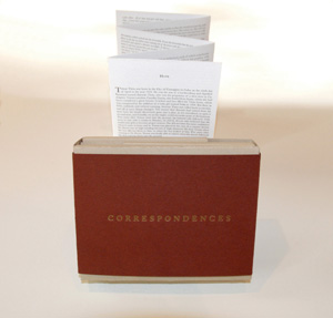
 One of the most attractive books I picked up last year was a copy of Ben Greenman’s Correspondences, a collection of short stories published by Hotel St. George Press. Strictly speaking, you could argue that Correspondences isn’t a book: a maroon band surrounds an ingeniously constructed box which, when unfolded, turns out to contain three pamphlets folded accordion-style and a postcard, to which I’ll return. Each pamphlet is encircled by two stories, all of which share a theme of letter-writing. The whole thing was printed letterpress; it’s a limited edition, and each copy is signed by the author. Although it’s a relatively pricey book, I can’t imagine that the publisher’s making much money on it: clearly it cost a lot to make.
As a print book, Correspondences is very much of the present moment, inauspicious as it might be for print publishers. Hotel St. George hasn’t bothered with distribution in bookstores; the primary mode of distribution is HSG’s website. Ben Greenman has enough of a following that they’ll probably do well this way. The extraordinary form of the book is a recognition that in an age when content has become almost infinitely cheap an object needs to stand out to be bought. (One might analogously consider the CDs of Raster-Noton or Touch.) Appealing to the collector’s market makes sense for print publishing: all of Hotel St. George’s books are beautifully produced, but Correspondences takes their work to another level.
What’s most interesting to me about Ben Greenman’s book, however, is the postcard. As the box is opened, a seventh story, titled “What He’s Poised to Do,” is disclosed, printed on the box itself. A note from the author describes it as
the tale of a man who walks out on his marriage and reconsiders it from a distance. The man is staying in a hotel. While he is there, he writes ad receives a number of postcards. Some carry messages of love, others messages of regret, others still are confessions or rationalizations. There are nine postcard messages in all, not a single one of which is actually reprinted in the text of the story.
At nine points in the story there are bracketed numbers, indicating the points in the story where a postcard is read or sent; the reader is invited to take the postcard include and to compose a message to be a part of the story, and possibly part of future editions of the book. There’s a lovely tension here between the intent of the author and the wishes of the collector: filling out the postcard and dropping it in the mail destroys the unity of the book. The Mail Room at Hotel St. George’s website might convince the wary book-owner: on display are some postcards that have already been sent back. (One does note that a few of the postcard writers seem to have shied away from using the postcard that came with the book.)
The copy of Correspondences that I own – postcard still tucked in its flap – is precisely situated in time: it’s a book that prefigures its own destruction and, in a way, its own obsolescence. While this book is very firmly an object, it’s also aware of itself as a process: while the writing and the printing of the book has already happened, the reader’s response may yet happen. It’s a book that wouldn’t have existed in this form if the web hadn’t changed our understanding of how books work.
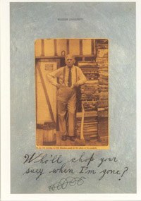 Ben Greenman’s postcard project might be seen as a recapitulation of themes present in the mail art of Ray Johnson. Trained at Black Mountain College as a painter, Johnson began making collages, which he sent to friends through the mail in the early 1950s; his use of the postal service quickly became a major focus of his art. Others followed his example; the movement he started was termed “mail art,” and it continues to this day. Although Johnson was well known and admired in the New York art world, much of his work operated outside the normal channels of the art world and he’s still surprisingly unknown to the general public. How to Draw a Bunny, John Walter’s 2002 documentary, is perhaps the easiest way in to the artist’s work. Interviews with Johnson’s friends and associates focus on the nature of their interactions with him; these interactions, it becomes clear, were as much a part of Johnson’s work as the work itself.
The mail was a primary method of communication for Johnson, particularly after he left New York City for Long Island in 1968; his death in 1995 came just at the cusp of broad use of the Internet to communicate. Mail art, he told James Rosenquist, was an extension of Cubism: he put things in the mail and they got spread all over the place. It was also an attempt to take art out of the commercial sphere, setting up a gift-based economy in its stead. The critic Ina Blom describes it in The Name of the Game: Ray Johnson’s Postal Performance as being
one of several art movements that tried to create an alternative space for art – a space that would be radically social and interactive, intermedial and performative. Mail art seemed to focus explicitly on the communicational aspects of both art production and reception, creating a huge network of correspondent who could communicate and exchange objects and messages through the postal system
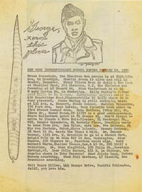 (p. 6.) Johnson ran what he called the New York Correspondence School; he used the word correspondence not simply for its reference to communication but for the way he made associations with words and graphic elements in his collages. Mailings were sent out, like this New York Correspondence School Report from January 19, 1970. William S. Wilson, in an essay entitled With Ray: The Art of Friendship, gives a sample of his working method:
Walking on the Lower East Side Ray frequently saw a Ukrainian sign advertising a dance in letters which looked to him like “3-A-BABY”. He then equated “dance” with “three”, so that when three babies were involved with his life, he put the dance of three into the word “correspondence”, thereafter usually writing New York Correspondance School. Because Ray wanted to respond to accidents with spontaneities, he needed accidents to produce something more and other than he had planned to produce. In that spirit I showed him how he had happened to construct the French word,
correspondance, and gave him a copy of Baudelaire’s poem “Les Correspondances”. Later he improvised “corraspongence” and other permutations.
(p. 34) Membership was seemingly capricious and full of contradictions: members included institutions and the dead; the school committed suicide publicly at least once; and it was at best the most constant member of a baffling parade of clubs and organizations that Johnson ran, including, at random, Buddha University, the Deadpan Club, the Odilon Redon Fan Club, the Nancy Sinatra Fan Club. The Whitney Museum organized a show of the Correspondence School’s work, entitled Ray Johnson: New York Correspondance School in 1970; the museum exhibited everything Johnson’s network of collaborators mailed to it.
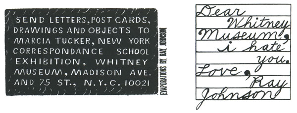
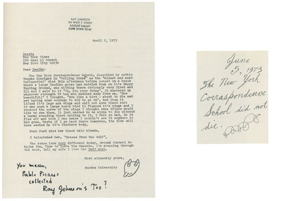
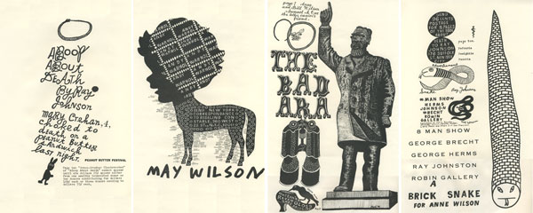
“The whole idea of the Correspondence School,” Johnson told Richard Bernstein in an interview with Andy Warhol’s Interview in August, 1972 “is to receive and dispense with these bits of information, because they all refer to something else. It’s just a way of having a conversation or exchange, a kind of social intercourse.” Emblematic of Johnson’s work might be his Book about Death, begun in 1963, which consisted of thirteen printed pages of collaged images and text, which were mailed individually to Clive Phillpot, chief librarian at the Museum of Modern Art, and others. (A few pages are reproduced below.) The Book about Death was discorporate, as befits a book about death; more than being unbound, Johnson made sure that none of his readers received a complete set of the pages of the book. The book could only be assembled and read in toto by the correspondents working in concert: it was a book that demanded active participation in its reading. The content as well as the form of the Book about Death request active participation: the names of his correspondents feature prominently in it, but understanding of what Johnson was doing with those names requires some knowledge of the people who had those names.
Much of Johnson’s work is interesting because it’s so dependent upon its audience. It’s not something that can exist under glass: rather, it’s a work that’s based upon personal relationships. Henry Martin writes about Ray Johnson’s work in a way that makes it sound like he’s talking about a social networking platform:
To me, Ray Johnson’s Correspondence School seems simply an attempt to establish as many significantly human relationships with as many individual people as possible. All of the relationships of which the School is made are personal relationship: relationships with a tendency towards intimacy: relationships where true experiences are truly shared and where what makes an experience true is its real participation in a secret libidinal charge. And the relationships that the artist values so highly are something he attempts to pass on to others. The classical exhortation in a Ray Johnson is “please send to . . . .” Person A will receive an object or an image and be asked to pass it on to person B, and the image will probably be appropriate to these two different people in two entirely different ways, or in terms of two entirely different chains of association. It thus becomes a kind of totem that can connect them, and whatever latent relationship may possibly exist between person A and person B becomes a little less latent and a little more real. It’s a beginning of an uncommon sense of community, and this sense of community grows as persons A and B send something back through Ray to each other, or through each other back to Ray.
(p. 186 in Ray Johnson: Correspondences.) Johnson’s work was about connection, the “art of friendship” as the title of Wilson’s essay has it. Work about personal connection has a necessarily uneasy relationship with the idea of art as a commodity; a great deal of Johnson’s work (including some of the pages of the Book about Death above) references money and remuneration in some way. Looked at through the lens of 2009, Johnson’s work seems remarkably prescient in its recognition of the importance of the network and the problems still inherent in it.
Who, if I cried out, would hear me? asks Rainer Maria Rilke at the start of the first Duino Elegy. It’s a rhetorical question that might be worth consideration: who does Rilke – or his speaker – think will hear him? Completing the line provides a superficial answer: “who” becomes someone “among the angels’ hierarchies”. But if the cry of Rilke’s speaker is directed at the angels, it’s heard by us, the readers of the poem: as a published work, the Duino Elegies function as a cry from a poet who desires to be heard. Rilke dedicated his poems to the Princess Marie von Thurn and Taxis-Hohenlohe, who brought him to Duino; she is perhaps the most proximate reader that Rilke expected. We are not the audience that Rilke envisioned; by now, everyone that Rilke might have reasonably expected to read his poem is dead.
Such authorial intent, if it existed, can’t stand in the way of the reader’s response. While reading is often a solitary act, a sense of connection can be engendered: a grieving reader might read Rilke’s poem and feel a sense of empathy, a commonality of experience. This is anticipated by Rilke’s poem (here in Stephen Mitchell’s translation):
Ah, whom can we ever turn to
in our need? Not angels, not humans,
and already the knowing animals are aware
that we are not really at home in
our interpreted world.
Rilke isn’t presumptuous enough to propose his own work as the answer to his question, though plenty of his readers would be happy to do just that. This empathy between the author and the reader is not empathy as empathy is generally understood to exist between two people: Rilke is of course dead and does not know the reader or the suffering that the reader might be undergoing. The reader may not even speak the same language as the author. Rilke is not your friend and almost certainly would not cheer you up if he were. But this is immaterial, the feeling still exists: the reader knows Rilke even if Rilke does not know the reader. To move from the specific to the overly general, this sort of response is perhaps why people describe themselves as having a visceral connection with books: our terror of print being dead isn’t so much for the books themselves but for the associations inherent in those physical objects, the sense of connection with the author even if that connection is unreciprocated.
The question of the audience of a book, and the connection of the audience to the author, is one that’s currently in a state of flux. Historically authors were something like mother sea turtles; publishing a book was something like laying eggs on a beach to hatch as they might: a reader might find a book, or a reader might not. An author could conceivably write a book for a single reader, but this doesn’t happen very often. A reader could, in the days before the Internet, find the author’s contract information from the publisher and write a letter to the author, but that happened comparatively rarely. The relationship between readers and authors is different now: after reading Greenman’s book I emailed him wondering if he’d been influenced by Ray Johnson’s work – no, he said – a behavior I find myself indulging in more and more lately. Greenman’s work, like that of Johnson’s before him, anticipates a new kind of relation between the author and the reader. The reworking of this relationship in increasingly varied ways will be the most significant aspect of the way our reading changes as it moves from the printed page to the networked screen.


