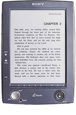
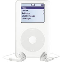
Since the release of the Sony Reader, I’ve been thinking a lot about the difference between digital text and digital music, and why an ebook device is not, as much as publishers would like it to be, an iPod. This is not an argument over the complexity of literature versus the complexity of music, rather it is a question of interfaces. It seems to me that reading interfaces are much more complicated than listening ones.

 The iPod is, as skeptics initially complained, little more than a hard drive with earphones. But this is precisely its genius: the simplicity of its interface, the sleekness of its form, the radical smallness of its immense storage capacity. All these allow us to spend less time sorting through our music — lugging around stacks of albums, ejecting and inserting tapes or discs — and more time listening to it.
A sequence of smooth thumb gestures leads to the desired track. Once the track has commenced, the device is tucked away into a pocket or knapsack, and the music takes over. That’s the simplicity of the iPod. Reading devices, on the other hand — whether paperback, web page or specialized ebook hardware — are felt and perceived throughout the reading experience. The text, the visual design, and the reader’s movement through them are all in constant interaction. So the device necessarily must be more complex.
In other words, a book — even a digital one — is something you have to “handle” in order to process its contents. The question Sony should be asking is what handling a book should mean in a digital, networked context? Obviously, it’s something very different than in print.
Another thing about portable music players from Walkmen to iPods is that music, in its infinite variety, can be delivered to the senses through a uniform channel: from the player, through the wire, to the ear. Again, with books it’s not so simple. Different books have different looks, and with good reason: they are visual media. This is something we tend to forget because we so strongly associate books with intangible things like stories and abstract ideas. But writing is a manipulation of visual symbols, and reading is something we do with our eyes. So well-considered visual design, of both documents and devices, is crucial — as much for electronic documents as for print ones.
Publishers want their ipod, a simple gadget locked into a content channel (like iTunes), but they’re going to have to do a lot better than the Sony Reader. To date, the web has done a much better job at fostering a wide variety of reading forms, primitive as they may still be, than any specialized ebook device or ebook format. A hard drive with ear phones may work for music, but a hard drive (and a pitifully small one at that) with an e-ink screen won’t be sufficient for books.
if:book
A Project of the Institute for the Future of the Book
