Interesting links that crossed my path over the past few days that I haven’t time to post on (and likely never will):
- “French publishers join fight against Google Book Search”: Le Syndicat National de l’édition (SNE), a trade association of French publishers, has joined a suit brought against Google by the Le Martiniè re conglomerate in August for “counterfeiting and breach of intellectual property rights” in its book digitization program.
- outside.in is a new web service co-created by Steven Johnson and John Geraci that aggregates blog content according to zip code, giving you a regularly updated guide to where you live. It uses a little Google map as a navigation tool — a dynamic table of contents.
- US intelligence agencies use wikis: The CIA and other agencies have begun using an internal wiki site called the “Intellipedia” where staff post current events updates and colloborate on intelligence assessments, supposedly to avoid repeating mistakes like Iraq WMD. “‘I think in the future you’ll press a button and this will be the NIE,’ said Michael Wertheimer, assistant deputy director of national intelligence for analysis.”
- Clay Shirky on “meganiches”
- Wikipedia and the academy: To contribute or not to contribute? Article in Chronicle of Higher Ed. on the fraught relationship between academics and the online encyclopedia. Among other things discusses troubling disparity in quality between science articles and humanities articles. Is there a “two cultures” problem in online scholarly collaboration?
- Ehon: The Artist and the Book in Japan: Glorious exhibit at the New York Public Library. A totally different way of thinking about books.
Should if:book serve as a filter and recommender, providing nutritious lists of links like the one above, or purely as a source of original ideas and commentary? If the answer is both, then what should be the ratio of shorter, “pointier” posts to longer, “thinkier” ones? Blogs are agnostic as to the varying size and speed of thoughts — everything goes into the same sinking scroll, soon vanishing into the catacombs of the monthly archives and category pages.
This works fine for news cycle or daily diary-type blogs, but it’s a handicap for a site like ours where longer meditations — the kind that would benefit from longer exposure — are the more common fare, and where extended, multi-post arcs on a relatively small cluster of central ideas are more what constitute the “story” of this blog than any given week’s smattering of entries. As I write, there are several extended conversations taking place within posts that, though only a few days old, are being pushed further and further down the scroll as newer content accumulates. The only hint of their still being active is the “recent comments” link to the right, which is at best an overheard whisper.
Given these constraints, and figuring that it’s the slower moving ideas that matter most, we generally try to avoid posting quick linkdumps like the one above — useful as they might be for annotating our wider web readings and pointing readers to interesting sites — simply because they have the unfortunate effect of pushing the other stuff down. But this only slightly mitigates the still unsolved problem of portraying complex movements of ideas over time on a dinky little blog.
As a side project, we’re thinking about how we could redesign if:book to keep the thinky stuff visible for longer and tied to past related discussions, while also keeping a swift current of useful annotated links and shorter observational posts. This might mean dividing our content into two separate feeds, as on this site.
We’ve also thought about ways to organize content thematically rather than temporally, so what you see at the top isn’t just the newest content, but a cluster of our most important and long-abiding conversations arranged by subject. We’re also considering changes to the individual permalinked pages of posts, perhaps adding dynamically generated links to related posts.
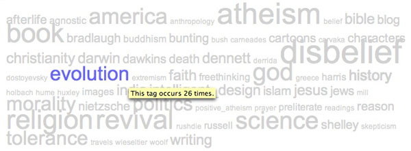
We’ve played around a bit with thematic arrangements on Mitch Stephens’ blog Without Gods. First, just below his banner there’s this tag cloud, which serves as a mental map of Mitch’s writing and interests:

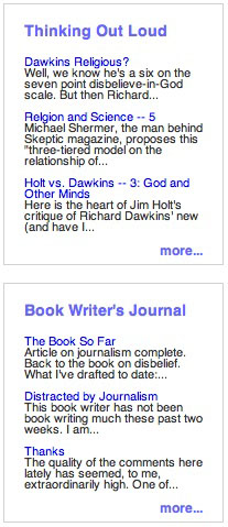
Then there are four side menus with recent posts divided up by general area. “Bonner’s Field” is current events, “Tales of Disbelief” deals with characters in his book, “Thinking Out Loud” is sort of free-form jamming on ideas, and “Book Writer’s Journal” is meta-commentary on the writing process:


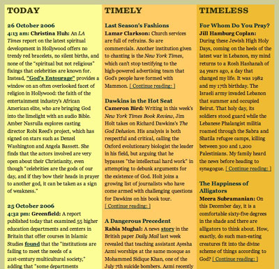
I’m also very taken with what this site, an NYU webzine on media and religion called The Revealer. They have a lovely section on the front page that divides articles and blog postings into three distinct tempos, or traffic lanes (which brings us back to the multiple streams/feeds idea):

“Time signature” is something we need to add to our design vocabulary for dealing with evolutionary, never-finished documents. Having multiple rates of movement in a single space can create interesting tensions and provide more points of entry to for the reader. I’m hoping we can put some of this into practice with if:book, and soon.
What are other sites that do a good job of handling time? Any other ideas as to how we might do better here?
