We were talking yesterday (and Bob earlier) about how to better organize content on if:book – how to highlight active discussion threads, or draw attention to our various categories. Something more dynamic than a list of links on the sidebar, or a bunch of hot threads advertised at the top. A significant problem with blogs is the tyranny of the vertical column, where new entries call out for attention on a stack of rapidly forgotten material, much of which might still be worth reading even though it was posted back in the dark ages (i.e. three days ago). Some of the posts that get buried still have active discussions stemming from them. Just today, “ways of seeing, ways of writing” – posted nearly two weeks ago – received another comment. The conversation is still going. (See also Dan’s “blog reading: what’s left behind”.)
This points to another thorny problem, still unsolved nearly 15 years into the world wide web, and several years into the blogging craze: how to visualize asynchronous conversations – that is, conversations in which time lapses between remarks. If the conversation is between only two people, a simple chronological column works fine – it’s a basic back-and-forth. But consider the place where some of the most dynamic multi-person asynchronous conversations are going on: in the comment streams of blog entries. Here you have multiple forking paths, hopping back and forth between earlier and later remarks, people sticking close to the thread, people dropping in and out. But again, you have the tyranny of the vertical column.
We’re using an open source platform called Drupal for our NextText project, which has a blog as its central element but can be expanded with modular units to do much more than we’re able to do here. The way Drupal handles comments is nice. You have the usual column arranged chronologically, with comments streaming downward, but readers have the option of replying to specific comments, not just to the parent post. Replies to specific comments are indented slightly, creating a sort of sub-stream, and the the fork can keep on going indefinitely, indenting rightward.
This handles forks and leaps fairly well, but offers at best only a partial solution. We’re still working with a print paradigm: the outline. Headers, sub-headers, bullet points. These distinguish areas in a linear stream, but they don’t handle the non-linear character of complex conversations. There is always the linear element of time, but this is extremely limiting as an organizing principle. Interesting conversations make loops. They tangle. They soar. They sag. They connect to other conversations.
But the web has so far been dominated by time as an organizing principle, new at the top and old at the bottom (or vice versa), and this is one the most-repeated complaints people have about it. The web favors the new, the hot, the immediate. But we’re dealing with a medium than can also handle space, or at least the perception of space. We need not be bound to lists and outlines, we need not plod along in chronological order. We could be looking at conversations as terrains, as topographies.
The electronic word finds itself in an increasingly social context. We need to design a better way to capture this – something that gives the sense of the whole (the big picture), but allows one to dive directly into the details. This would be a great challenge to drop into a design class. Warren Sack developed a “conversation map” for news groups in the late 90s. From what I can tell, it’s a little overwhelming. I’m talking about something that draws people right in and gets them talking. Let’s look around.
Category Archives: viz
the big picture
Though a substantial portion of our reading now takes place online, we still chafe against the electronic page, in part because today’s screens are hostile to the eye, but also, I think, because we are waiting for something new – something beyond a shallow mimicry of print. Occasionally, however, you come across something that suggests a new possibility for what a page, or series of pages, can be when words move to the screen.
I came across such a thing today on CNET’s new site, which has a feature called “The Big Picture,” a dynamic graphical display that places articles at the center of a constellation, drawing connections to related pieces, themes, and company profiles.

Click on another document in the cluster and the items re-arrange around a new center, and so on – ontologies are traced. But CNET’s feature does not go terribly far in illuminating the connections, or rather the different kinds of connections, between articles and ideas. They should consider degrees of relevance, proximity in time, or overlaps in classification. Combined with a tagging system, this could get interesting. As it stands, it doesn’t do much that a simple bullet list of related articles can’t already do admirably, albeit with fewer bells and whistles.
But this is pushing in an interesting direction, testing ways in which a web publication can organize and weave together content, shedding certain holdovers from print that are no longer useful in digital space. CNET should keep playing with this idea of an article ontology viewer – it could be refined into a legitimately useful tool.
fertile pages

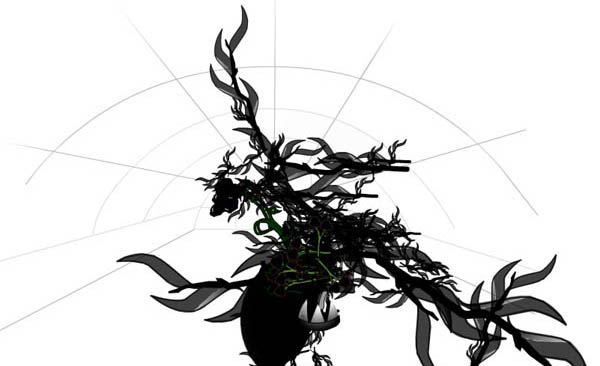
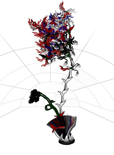
Organic HTML is a wonderful little applet I came across that turns websites into bizarre-looking plants. information aesthetics speculates on how it might work:
the emerging plant appears to use the colors similar to those found in the website HTML, CSS or images, while its size & branches depend on the site structure, content or number of pages. without any readily provided explanation or legend, one keeps trying to feed it URLs to derive the most beautiful flower (while avoiding the sometimes appearing flies)
Plug in a URL and try it out (be warned: it might crash your browser). if:book is apparently an inky species of blog (see above). I’ll add this to our garden. I wonder why there aren’t more sprouts of orange? The New York Times comes out more floral.

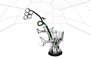
Something interesting I found, take a look at these two plants. One is Google, the other Yahoo! Can you guess which is which? (The larger plant has been scaled down.)


