At TED 2008, visual cartographers David Sibbet and Kevin Richards produced over 700 spontaneous sketches of the keynote presenters’ ideas, using Autodesk visualization tools. These sketches have now been turned into The BIGVIZ, a downloadable 200-page interactive ebook.
Parts of it are rather gnomic without reference to the talks that inspired them; but it’s a fascinating glimpse into the way ideas mutate as they are filtered through different forms.
Category Archives: visualization
hypertextopia
We were recently alerted, via Grand Text Auto, to a new hypertext fiction environment on the Web called Hypertextopia:
Hypertextopia is a space where you can read and write stories for the internet. On the surface, it looks like a mind-map, but it embeds a word-processor, and allows you to publish your stories like a blog.
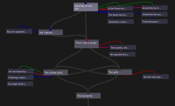
The site is gorgeously done, applying a fresh coat of Web 2.0 paint to the creaky concepts of classical hypertext. I find myself strangely conflicted, though, as I browse through it. Design-wise, it is a triumph, and really gets my wheels spinning w/r/t the possibilities of online writing systems. The authoring tools they’ve developed are simple and elegant, allowing you to write “axial hypertexts”: narratives with a clear beginning and end but with multiple pathways and digressions in between. You read them as a series of textual screens, which can include beautiful fold-out boxes for annotations and illustrations, and various color-coded links (the colors denote different types of internal links, which the author describes). You also have the option of viewing stories as nodal maps, which show the story’s underlying structure. This is part of the map of “The Butterfly Boy” by William Vollmann (by all indications, the William Vollmann):
Lovely as it all is though, it doesn’t convince me that hypertext is any more viable a literary form now, on the Web, than it was back in the heyday of Eastgate and Storyspace. Outside its inner circle of devotees, hypertext has always been more interesting in concept than in practice. A necessary thought experiment on narrative’s deconstruction in a post-book future, but not the sort of thing you’d want to read for pleasure.
It’s always felt to me like a too-literal reenactment of Jorge Luis Borges’ explosion of narrative in The Garden of Forking Paths. In the story, the central character, a Chinese double agent in WWI being pursued by a British assassin who has learned of his treachery, recalls a lost, unfinished novel written by a distant ancestor. It is an infinte story that encompasses every possible event and outcome for its characters: a labyrinth, not in space but in time. Borges meant the novel not as a prescription for a new literary form but as a metaphor of parallel worlds, yet many have cited this story as among the conceptual forebears of hypertext fiction, and Borges is much revered generally among technophiles for writing fables that eerily prefigure the digital age.
I’ve always found it odd how people (techies especially) seem to get romantic (perhaps fetishistic is the better word) about Borges. Prophetic he no doubt was, but his tidings are dark ones. Tales like “Forking Paths,” Funes the Memorious and The Library of Babel are ideas taken to a frightening extreme, certainly not things we would wish to come true. There are days when the Internet does indeed feel a bit like the Library of Babel, a place where an infinity of information has led to the death of meaning. But those are the days I wish we could put the net back in the box and forget it ever happened. I get a bit of that feeling with literary hypertext -? insofar as it reifies the theoretical notion of the death of the author, it is not necessarily doing the reader any favors.
Hypertext’s main offense is that it is boring, in the same way that Choose Your Own Adventure stories are fundamentally boring. I know that I’m meant to feel liberated by my increased agency as reader, but instead I feel burdened. What are offered as choices -? possible pathways though the maze -? soon start to weigh like chores. It feels like a gimmick, a cheap trick, like it doesn’t really matter which way you go (that the prose tends to be poor doesn’t help). There’s a reason hypertext never found an audience.
I can, however, see the appeal of hypertext fictions as puzzles or games. In fact, this may be their true significance in the evolution of storytelling (and perhaps why I don’t get them, because I’m not a gamer). Thought of this way, it’s more about the experience of navigating a narrative landscape than the narrative itself. The story is a sort of alibi, a pretext, for engaging with a particular kind of form, a form which bears far more resemblance to a game than to any kind of prose fiction predecessor. That, at any rate, is how I’ve chosen to situate hypertext. To me, it’s a napkin sketch of a genuinely new form -? video games -? that has little directly to do with writing or reading in the traditional sense. Hypertext was not the true garden of forking paths (which we would never truly want anyway), but a small box of finite options. To sift through them dutifully was about as fun as the lab rat’s journey through the maze. You need a bigger algorithmic engine and the sensory fascinations of graphics (and probably a larger pool of authors and co-creators too) to generate a topography vast enough to hide, at least for a while, its finiteness -? long enough to feel mysterious. That’s what games do, and do well.
I’m sure this isn’t an original observation, but it’s baggage I felt like unloading since classical hypertext is a topic we’ve largely skirted around here at the Institute. Grumbling aside though, Hypertextopia offers much to ponder. Recontextualizing a pre-Web form in the Web is a worthwhile experiment and is bound to shed some light. I’m thinking about how we might play around in it…
biblical interweave
The image below shows every cross-references in the Bible. Definitely more the eye candy variety of information visualization, but I thought it was pretty.
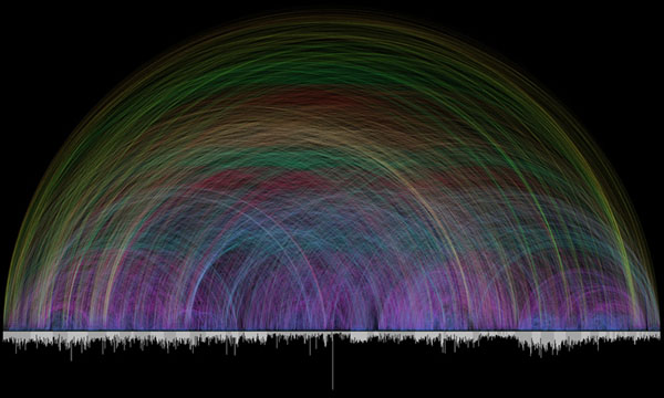
Chris Harrison, the creator, explains: “Different colors are used for various arc lengths, creating a rainbow like effect. The bar graph running along the bottom shows every chapter in the Bible and their respective lengths (in verses). Books alternate in color between white and light gray.”
(Via Information Aesthetics)
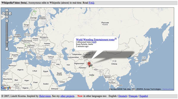
watch wikipedia happen
NEA reading debate round 2: an exchange between sunil iyengar and nancy kaplan
Last week I received an email from Sunil Iyengar of the National Endownment for the Arts responding to Nancy Kaplan’s critique (published here on if:book) of the NEA’s handling of literacy data in its report “To Read or Not to Read.” I’m reproducing the letter followed by Nancy’s response.
Sunil Iyengar:
The National Endowment for the Arts welcomes a “careful and responsible” reading of the report, To Read or Not To Read, and the data used to generate it. Unfortunately, Nancy Kaplan’s critique (11/30/07) misconstrues the NEA’s presentation of Department of Education test data as a “distortion,” although all of the report’s charts are clearly and accurately labeled.
For example, in Charts 5A to 5D of the full report, the reader is invited to view long-term trends in the average reading score of students at ages 9, 13, and 17. The charts show test scores from 1984 through 2004. Why did we choose that interval? Simply because most of the trend data in the preceding chapters–starting with the NEA’s own study data featured in Chapter One–cover the same 20-year period. For the sake of consistency, Charts 5A to 5D refer to those years.
Dr. Kaplan notes that the Department of Education’s database contains reading score trends from 1971 onward. The NEA report also emphasizes this fact, in several places. In 2004, the report observes, the average reading score for 17-year-olds dipped back to where it was in 1971. “For more than 30 years…17-year-olds have not sustained improvements in reading scores,” the report states on p. 57. Nine-year-olds, by contrast, scored significantly higher in 2004 than in 1971.
Further, unlike the chart in Dr. Kaplan’s critique, the NEA’s Charts 5A to 5D explain that the “test years occurred at irregular intervals,” and each test year from 1984 to 2004 is provided. Also omitted from the critique’s reproduction are labels for the charts’ vertical axes, which provide 5-point rather than the 10-point intervals used by the Department of Education chart. Again, there is no mystery here. Five-point intervals were chosen to make the trends easier to read.
Dr. Kaplan makes another mistake in her analysis. She suggests that the NEA report is wrong to draw attention to declines in the average reading score of adult Americans of virtually every education level, and an overall decline in the percentage of adult readers who are proficient. But the Department of Education itself records these declines. In their separate reports, the NEA and the Department of Education each acknowledge that the average reading score of adults has remained unchanged. That’s because from 1992 to 2003, the percentage of adults with postsecondary education increased and the percentage who did not finish high school decreased. “After all,” the NEA report notes, “compared with adults who do not complete high school, adults with postsecondary education tend to attain higher prose scores.” Yet this fact in no way invalidates the finding that average reading scores and proficiency levels are declining even at the highest education levels.
“There is little evidence of an actual decline in literacy rates or proficiency,” Dr. Kaplan concludes. We respectfully disagree.
Sunil Iyengar
Director, Research & Analysis
National Endowment for the Arts
Nancy Kaplan:
I appreciate Mr. Iyengar’s engagement with issues at the level of data and am happy to acknowledge that the NEA’s report includes a single sentence on pages 55-56 with the crucial concession that over the entire period for which we have data, the average scale scores of 17 year-olds have not changed: “By 2004, the average scale score had retreated to 285, virtually the same score as in 1971, though not shown in the chart.” I will even concede the accuracy of the following sentence: “For more than 30 years, in other words, 17year-olds have not sustained improvements in reading scores” [emphasis in the original]. What the report fails to note or account for, however, is that there actually was a period of statistically significant improvement in scores for 17 year-olds from 1971 to 1984. Although I did not mention it in my original critique, the report handles data from 13 year-olds in the same way: “the scores for 13-year-olds have remained largely flat from 1984-2004, with no significant change between the 2004 average score and the scores from the preceding seven test years. Although not apparent from the chart, the 2004 score does represent a significant improvement over the 1971 average – ?a four-point increase” (p. 56).
In other words, a completely accurate and honest assessment of the data shows that reading proficiency among 17 year-olds has fluctuated over the past 30 years, but has not declined over that entire period. At the same time, reading proficiency among 9 year-olds and 13 year-olds has improved significantly. Why does the NEA not state the case in the simple, accurate and complete way I have just written? The answer Mr. Iyengar proffers is consistency, but that response may be a bit disingenuous.
Plenty of graphs in the NEA report show a variety of time periods, so there is at best a weak rationale for choosing 1984 as the starting point for the graphs in question. Consistency, in this case, is surely less important than accuracy and completeness. Given the inferences the report draws from the data, then, it is more likely that the sample of data the NEA used in its representations was chosen precisely because, as Mr. Iyengar admits, that sample would make “the trends easier to read.” My point is that the “trends” the report wants to foreground are not the only trends in the data: truncating the data set makes other, equally important trends literally invisible. A single sentence in the middle of a paragraph cannot excuse the act of erasure here. As both Edward Tufte (The Visual Display of Quantitative Information) and Jacques Bertin (Semiology of Graphics), the two most prominent authorities on graphical representations of data, demonstrate in their seminal works on the subject, selective representation of data constitutes distortion of that data.
Similarly, labels attached to a graph, even when they state that the tests occurred at irregular intervals, do not substitute for representing the irregularity of the intervals in the graph itself (again, see Tufte and Bertin). To do otherwise is to turn disinterested analysis into polemic. “Regularizing” the intervals in the graphic representation distorts the data.
The NEA report wants us to focus on a possible correlation between choosing to read books in one’s leisure time, reading proficiency, and a host of worthy social and civic activities. Fine. But if the reading scores of 17 year-olds improved from 1971 to 1984 but there is no evidence that during the period of improvement these youngsters were reading more, the case the NEA is trying to build becomes shaky at best. Similarly, the reading scores of 13 year-olds improved from 1971 to 1984 but “have remained largely flat from 1984-2004 ….” Yet during that same period, the NEA report claims, leisure reading among 13 year-olds was declining. So what exactly is the hypothesis here -? that sometimes declines in leisure reading correlate with declines in reading proficiency but sometimes such a decline is not accompanied by a decline in reading proficiency? I’m skeptical.
My critique is aimed at the management of data (rather than the a-historical definition of reading the NEA employs, a somewhat richer and more potent issue joined by Matthew Kirschenbaum and others) because I believe that a crucial component of contemporary literacy, in its most capacious sense, includes the ability to understand the relationships between claims, evidence and the warrants for that evidence. The NEA’s data need to be read with great care and its argument held to a high scientific standard lest we promulgate worthless or wasteful public policy based on weak research.
I am a humanist by training and so have come to my appreciation of quantitative studies rather late in my intellectual life. I cannot claim to have a deep understanding of statistics, yet I know what “confounding factors” are. When the NEA report chooses to claim that the reading proficiency of adults is declining while at the same time ignoring the NCES explanation of the statistical paradox that explains the data, it is difficult to avoid the conclusion that the report’s authors are not engaging in a disinterested (that is, dispassionate) exploration of what we can know about the state of literacy in America today but are instead cherry-picking the elements that best suit the case they want to make.
Nancy Kaplan, Executive Director
School of Information Arts and Technologies
University of Baltimore
anatomy of a debate
The New York Times continues to do quality interactive work online. Take a look at this recent feature that allows you to delve through video and transcript from the final Democratic presidential candidate debate in Iowa (Dec. 13, ’07). It begins with a lovely navigation tool that allows you to jump through the video topic by topic. Clicking text in the transcript (center column) or a topic from the list (right column) jumps you directly to the corresponding place in the video.
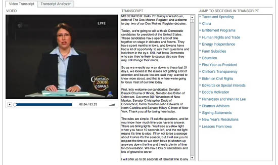
The second part is a “transcript analyzer,” which gives a visual overview of the debate. The text is laid out in miniature in a simple, clean schematic, navigable by speaker. Click a name in the left column and the speaker’s remarks are highlighted on the schematic. Hover over any block of text and that detail of the transcript pops up for you to read. You can also search the debate by keyword and see word counts and speaking times for each candidate.
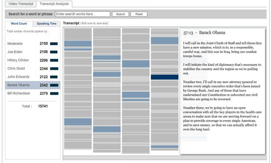
These are fantastic tools -? if only they were more widely available. These would be amazing extensions to CommentPress.
eeeeeeeeeee…..eeeeeeee…eeeee

Moby Dick Chapter 55 or 9200 times E”, 2004, graphite on hemp paper, 11 x 9″
In one of those odd, blogospheric delayed reactions, I just came across (via Information Aesthetics, via Kottke) a fabulous exhibit that took place this past March by an artist named Justin Quinn, who does beautiful, mysterious work with text. Quinn’s Moby-Dick series is made up of obsessively detailed prints and graphite drawings composed entirely of the letter E. Each E corresponds to a letter in a chapter of Melville’s book, so each piece is composed of literally thousands of characters. The effect is almost that of a mosaic or a concrete poem. This series was shown at MMGalleries in San Francisco and has since moved elsewhere (Miami possibly?), but there are still a number of images online (also here). Quinn explains his obsession with E:
The distance between reading and seeing has been an ongoing interest for me. Since 1998 I have been exploring this space through the use of letterforms, and have used the letter E as my primary starting point for the last two years. Since E is often found at the top of vision charts, I questioned what I saw as a familiar hierarchy. Was this letter more important than other letters? E is, after all, the most commonly used letter in the English language, it denotes a natural number (2.71828), and has a visual presence that interests me greatly. In my research E has become a surrogate for all letters in the alphabet. It now replaces the other letters and becomes a universal letter (or Letter), and a string of Es now becomes a generic language (or Language). This substitution denies written words their use as legible signifiers, allowing language to become a vacant parallel Language -? a basis for visual manufacture.
After months of compiling Es into abstract compositions through various systemic arrangements, I started recognizing my studio time as a quasi-monastic experience. There was something sublime about both the compositions that I was making and the solitude in which they were made. It was as if I were translating some great text like a subliterate medieval scribe would have years ago – ?with no direct understanding of the source material. The next logical step was to find a source. Herman Melville’s novel Moby Dick, a story rich in theology, philosophy, and psychosis provides me with a roadmap for my work, but also with a series of underlying narratives. My drawings, prints, and collages continue to speak of language and the transferal of information, but now as a conduit to Melville’s sublime narratives.
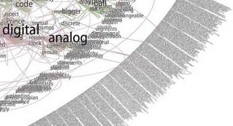
Gazing at these for a while (digital reproductions of course… and on my browser… and brought to my attention through technology blogs), I couldn’t help but start to draw some connections between Quinn’s work and computers. There’s plenty of digital artwork and visualization programs that render text into complex visual formations, sometimes with the intention of discovering new meanings and relationships, other times purely to play with form. Every now and then, someone manages to achieve both. This is a detail from Brad Paley’s rendering of Gamer Theory through his program Text Arc:
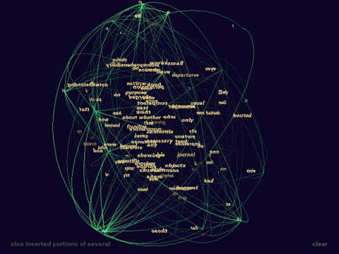
Others can be beautiful to handle, but are ultimately opaque, like Ben Fry’s “Valence”:
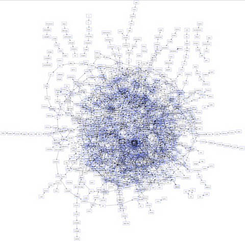
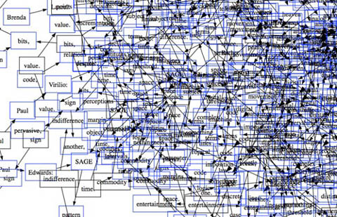
These two images are from another work submitted to our Gamer Theory visualization gallery, a map of nouns and verbs in Wark’s text (first is full, second is a detail). It’s pretty, but basically meaningless.
Quinn’s work is also difficult to penetrate, but something about it holds my attention. I’m not sure how aware Quinn is of the digital work being done today, but viewing his pieces against the contemporary technological backdrop, and his own self-described feeling of being the “subliterate medieval scribe” as he makes his minute articulations, my mind runs off in a number of directions. Seeing that his work is in a way “pixelated” – ?his Es a “basis for visual manufacture” – ?I imagine him as a sort of human computer – ?a monastic machine – ?processing (or intuiting) the text by infintessimal degrees through his own inner algorithm.
After all, a computer’s work is “subliterate.” Algorithms must be designed with intelligence, but the actual running of the program is physical, mindless. Viewed this way, Quinn’s work is like a dive into the mania of operations usually carried out with blazing speed by microprocessors. This is not to diminish it, or to call it cold and mechanical. Rather I’m pondering whether there is perhaps a spiritual dimension to the repetitive, sub-rational activities of our machines, which, if transposed to human scale, can become a sort of devotional exercise, like the routines of Buddhist monks, endlessly painting and carving Chinese characters in order to empty their minds (other links between monks and computers here and here).
What’s particularly evocative to me about the work, however, is how it treads the line between that meditative quality and the obsessive. There is something frightening about them (or about any kind of fanatically detailed artwork, or about computers for that matter), like the reams of psychotic babble typed out ceaselessly by Jack Nicholson in “The Shining.” Or is it Ahab’s vengeance algorithm we’re seeing, running on overdrive until the machine (or ship) crashes?
In the end, Quinn’s images are mysterious, his algorithm inscrutable, although my mind immediately goes to work trying to link up Melville’s themes and images to those endless strings of Es.
Here’s that first image again with a quote from the source text that seemed to me to connect. Chapter 55, “Of the Monstrous Pictures of Whales”:

Moby Dick Chapter 55 or 9200 times E”, 2004, graphite on hemp paper, 11 x 9″
But these manifold mistakes in depicting the whale are not so very surprising after all. Consider! Most of the scientific drawings have been taken from the stranded fish; and these are about as correct as a drawing of a wrecked ship, with broken back, would correctly represent the noble animal itself in all its undashed pride of hull and spars. Though elephants have stood for their full-lengths, the living Leviathan has never yet fairly floated himself for his portrait. The living whale, in his full majesty and significance, is only to be seen at sea in unfathomable waters; and afloat the vast bulk of him is out of sight, like a launched line-of-battle ship; and out of that element it is a thing eternally impossible for mortal man to hoist him bodily into the air, so as to preserve all his mighty swells and undulations.
This one is of chapter 71, “The Jeroboam’s Story” (I spoke briefly on the phone with one of the curators who told me that Quinn had explained this as an inverted halo, reflecting the anti-Christ-like character described in the chapter – ?I almost see an aerial view of a whale cutting through water):

Moby Dick Chapter 71 or 9,814 times E”, 2006, mixed media, 11 x 15″
…but straightway upon the ship’s getting out of sight of land, his insanity broke out in a freshet. He announced himself as the archangel Gabriel, and commanded the captain to jump overboard. He published his manifesto, whereby he set himself forth as the deliverer of the isles of the sea and vicar-general of all Oceanica. The unflinching earnestness with which he declared these things; – the dark, daring play of his sleepless, excited imagination, and all the preternatural terrors of real delirium, united to invest this Gabriel in the minds of the majority of the ignorant crew, with an atmosphere of sacredness. Moreover, they were afraid of him. As such a man, however, was not of much practical use in the ship, especially as he refused to work except when he pleased, the incredulous captain would fain have been rid of him; but apprised that that individual’s intention was to land him in the first convenient port, the archangel forthwith opened all his seals and vials – devoting the ship and all hands to unconditional perdition, in case this intention was carried out. So strongly did he work upon his disciples among the crew, that at last in a body they went to the captain and told him if Gabriel was sent from the ship, not a man of them would remain.
visual search
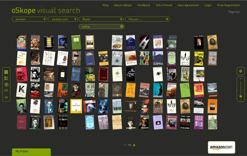
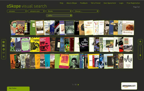
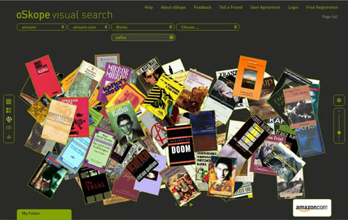
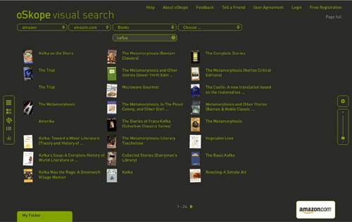
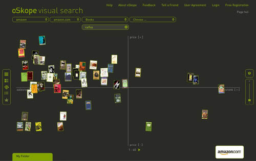
I just came across oSkope, a snazzy new “visual search assistant” built by a Zurich/Berlin outfit that allows you to graphically browse items on Amazon, ebay, Flickr or YouTube. More than a demo or prototype, it’s a fully functioning front end to the search engines of the afore-mentioned sites. I played around a bit in Amazon mode… below are some screenshots of a search for “Kafka” in Amazon’s book category. Each search cluster can be displayed in five different configurations (grid, stack, pile, list and graph), re-scaled with a slide bar, or rearranged manually by dragging items around. Click any cover and a small info window pops up with a link to the Amazon page. You can also drag items down into a folder for future reference. Very smooth, very tactile.
Grid:
Stack:
Pile:
List:
Graph (arranges items along axes of price and sales rank):
A few months back I linked to another visual Amazon browser from TouchGraph that arranges book clusters according to customer purchase patterns (the “people who purchased this also bought…”). I’m still waiting for someone to visualize the connections in the citation indexes: create a cross-referential map that shows the ligatures between texts (as pondered here). Each of these ideas is of course just an incremental step toward more advanced methods of getting the “big picture” view of digital collections.
oSkope, though it could still use some work (Flickr searching was unpredictable and didn’t seem to turn up nearly as much as what I’m sure is in their system, Ebay wasn’t working at all), is a relatively straightforward and useful contribution – ?more than just eye candy. It even helped me stumble upon something wonderful: a recently published study (appropriately, visual) of Kafka, a collab between comic artist R. Crumb and Kafka scholar David Mairowitz.
Browsing graphically is often more engaging than scanning a long list of results, and a crop of new tools – ?LibraryThing, Shelfari, Delicious Library, and now Google Books – ?have recently emerged to address this, all riffing in similar, somewhat nostalgic ways on the experience of shelves (Peter Brantley just blogged another idea in this vein). iTunes too has gotten in on this, its album cover flipper becoming a popular way to sift through one’s music collection.
Perhaps it’s telling, though, that these visual, shelf-inspired browsing tools are focused on old media: books, albums… all bounded objects. You couldn’t simply graft this onto web search and get the same effect (although page previews, of the sort that Snap provides, are becoming increasingly popular). For vast, shifting collections of unbounded, evolving, recombining, and in many cases ephemeral media, different vizualization tools are most likely needed. What might those be?
(oSkope link via Information Aesthetics)
stunning views
Amazing. I’ve installed the Photosynth preview on my own machine (sadly it seems to work in IE only on a PC—not surprising, but a little disappointing), and I am zooming around in the Piazza San Marco courtesy of photos shot by a Photosynth Program Manager. The experience is incredible, and totally unique.
There are questions that arise: Is participation something that is voluntary, or is it something more ubiquitous and automatic that will just happen when you upload pictures to the web? (In the case of the preview that I’m running, we can assume it was a Microsoft sponsored trip. But the question is pertinent for future plans.) What are the mechanisms in place to provide privacy? What are the mechanisms to allow for editorializing; for instance, what if I wanted to see only shots taken at night? The images I’m looking at of Saint Mark’s Plaza were all shot by the same person on what looks like the same day with the same camera. How will this work with a different set of images taken with different hands, shutter speeds, attention to details like focus, lighting, foregrounding, etc.? And a larger, geographical and geopolitical question: how were these sites chosen? Will we (the public) be able to contribute models as well as photos so that I can make my city block a photo-navigable space? Or, more importantly, someone in São Paulo can make a map of their city block?
But aside from the questions, this is the most exciting way to view photos from the ‘net that I have ever seen.
visual amazon browser
The interface design firm TouchGraph recently released a free visual browsing tool for Amazon’s books, movies, music and electronics inventories. My first thought was, aha, here’s a tool that can generate an image of Bob’s thought experiment, which reimagines The Communist Manifesto as a networked book, connected digitally to all the writings it has influenced and all the commentaries that have been written about it. Alas no.
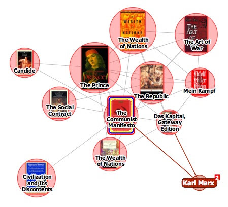
It turns out that relations between items in the TouchGraph clusters are based not on citations across texts but purely on customer purchase patterns, the data that generates the “customers who bought this item also bought” links on Amazon pages. The results, consequently, are a tad shallow. Above you see The Communist Manifesto situated in a small web of political philosophy heavyweights, an image that reveals more about Amazon’s algorithmically derived recommendations than any actual networks of discourse.
TouchGraph has built a nice tool, and I’m sure with further investigation it might reveal interesting patterns in Amazon reading (and buying) behaviors (in the electronics category, it could also come in handy for comparison shopping). But I’d like to see a new verion that factors in citation indexes for books – data that Amazon already provides for many of its titles anyway. They could also look at user-supplied tags, Listmania lists, references from reader reviews etc. And perhaps with the option to view clusters across media types, not simply broken down into book, movie and music categories.

