 There are several reasons that Yahoo! released some of their core UI code for free. A callous read of this would suggest that they did it to steal back some goodwill from Google (still riding the successful Goolge API release from 2002). A more charitable soul could suggest that Yahoo! is interested in making the web a better place, not just in their market-share. Two things suggest this—the code is available under an open BSD license, and their release of design patterns. The code is for playing with; the design patterns for learning from.
The code is squarely aimed at folks like me who would struggle mightily to put together a default library to handle complex interactions in Javascript using AJAX (all the rage now) while dealing with the intricacies of modern and legacy browsers. Sure, I could pull together the code from different sources, test it, tweak it, break it, tweak it some more, etc. Unsurprisingly, I’ve never gotten around to it. The Yahoo! code release will literally save me at least a hundred hours. Now I can get right down to designing the interaction, rather than dealing with technology.
The design patterns library is a collection of best practice instructions for dealing with common web UI problems, providing both a solution and a rationale, with a detailed explanation of the interaction/interface feedback. This is something that is more familiar to me, but still stands as a valuable resource. It is a well-documented alternate viewpoint and reminder from a site that serves more users in one day than I’m likely to serve in a year.
Of course Yahoo! is hoping to reclaim some mind-space from Google with developer community goodwill. But since the code is general release, and not brandable in any particular way (it’s all under-the-hood kind of stuff), it’s a little difficult to see the release as a directly marketable item. It really just seems like a gift to the network, and hopefully one that will bear lovely fruit. It’s always heartening to see large corporations opening their products to the public as a way to grease the wheels of innovation.
Category Archives: user_interface
who really needs to turn the pages?
The following post comes from my friend Sally Northmore, a writer and designer based in New York who lately has been interested in things like animation, video game theory, and (right up our alley) the materiality of books and their transition to a virtual environment. A couple of weeks ago we were talking about the British Library’s rare manuscript digitization project, “Turning the Pages” — something I’d been meaning to discuss here but never gotten around to doing. It turns out Sally had some interesting thoughts about this so I persuaded her to do a brief write-up of the project for if:book. Which is what follows below. Come to think of it, this is especially interesting when juxtaposed with Bob’s post earlier this week on Jefferson Han’s amazing gestural interface design. Here’s Sally… – Ben
The British Library’s collaboration with multimedia impresarios at Armadillo Systems has led to an impressive publishing enterprise, making available electronic 3-D facsimiles of their rare manuscript collection.
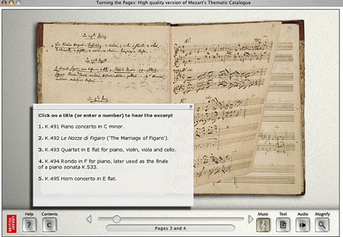
“Turning the Pages”, available in CD-ROM, online, and kiosk format, presents the digital incarnation of these treasured texts, allowing the reader to virtually “turn” the pages with a touch and drag function, “pore over” texts with a magnification function, and in some cases, access extras such as supplementary notes, textual secrets, and audio accompaniment.

Pages from Mozart’s thematic catalogue — a composition notebook from the last seven years of his life. Allows the reader to listen to works being discussed.
The designers ambitiously mimicked various characteristics of each work in their 3-D computer models. For instance, the shape of a page of velum turning differs from the shape of a page of paper. It falls at a unique speed according to its weight; it casts a unique shadow. The simulation even allows for a discrepancy in how a page would turn depending on what corner of the page you decide to peel from.
Online visitors can download a library of manuscripts in Shockwave although these versions are a bit clunkier and don’t provide the flashier thrills of the enormous touch screen kiosks the British Library now houses.

Mercator’s first atlas of Europe – 1570s
Online, the “Turning the Pages” application forces you to adapt to the nature of its embodiment–to physically re-learn how to use a book. A hand cursor invites the reader to turn each page with a click-and-drag maneuver of the mouse. Sounds simple enough, but I struggled to get the momentum of the drag just right so that the page actually turned. In a few failed attempts, the page lifted just so… only to fall back into place again. Apparently, if you can master the Carpal Tunnel-inducing rhythm, you can learn to manipulate the page-turning function even further, grabbing multiple of pages at once for a faster, abridged read.
The value of providing high resolution scans of rare editions of texts for the general public to experience, a public that otherwise wouldn’t necessarily ever “touch” say, the Lindisfarne Gospels, doesn’t go without kudos. Hey, democratic right? Armadillo Systems provides a list of compelling raisons d’être on their site to this effect. But the content of these texts is already available in reprintable (democratic!) form. Is the virtual page-turning function really necessary for greater understanding of these works, or a game of academic scratch-n-sniff?

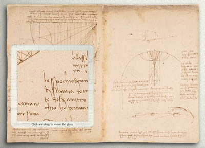
The “enlarge” function even allows readers to reverse the famous mirror writing in Leonardo da Vinci’s notebooks
At the MLA conference in D.C. this past December, where the British Library had set up a demonstration of “Turning the Pages”, this was the question most frequently asked of the BL’s representative. Who really needs to turn the pages? I learned from the rep’s response that, well, nobody does! Scholars are typically more interested studying the page, and the turning function hasn’t proven to enhance or revive scholarly exploration. And surely, the Library enjoyed plenty of biblio-clout and tourist traffic before this program?
But the lure of new, sexy technology can’t be underestimated. From what I understood, the techno-factor is an excellent beacon for attracting investors and funding in multimedia technology. Armadillo’s web site provides an interesting sales pitch:
By converting your manuscripts to “Turning the Pages” applications you can attract visitors, increase website traffic and add a revenue stream – at the same time as broadening access to your collection and informing and entertaining your audience.
The program reveals itself to be a peculiar exercise, tangled in its insistence on fetishizing aspects of the material body of the text–the weight of velum, the karat of gold used to illuminate, the shape of the binding. Such detail and love for each material manuscript went into this project to recreate, as best possible, the “feel” of handling these manuscripts.
Under ideal circumstances, what would the minds behind “Turning the Pages” prefer to create? The original form of the text–the “alpha” manuscript–or the virtual incarnation? Does technological advancement seduce us into valuing the near-perfect simulation over the original? Are we more impressed by the clone, the “Dolly” of hoary manuscripts? And, would one argue that “Turning the Pages” is the best proxy for the real thing, or, another “thing” entirely?
