Category Archives: the_form_of_the_book

the life and afterlife of vinyl records

45rpm.jpg
I often find myself talking to people about their relationships to books and printed matter. I wonder out loud, if we are the transitional (read: last) generation who will revere both print and screen. Because books have been the primary mode of storing and communicating knowledge for over five hundred years, we have a strong attachment to print text. The shift to from the page to the digital, and all its implications are difficult to grasp. Through these conversations, I have found that modern recorded music and especially the vinyl record, are useful cultural reference points for myself and others in understanding how media technology evolves and our preferences with it. For people born before, say the Reagan administration, they mostly likely have bought and used a variety of recorded music media, including vinyl records and audio cassette tapes. Further, they generally know people born during or after the Reagan administration who have never played, owned and even heard a LP record. This point demonstrates how we have witnessed the conversion of media technology from the analogue to the digital. Further, we can clearly see a subsequent generation who has a very different relationship to recorded music, rooted in a solely digital frame of reference.
The evolution and adoption of recorded music technology have occurred over a compressed period of time as compared to the historic primacy of the book. Early movable type was available in China in the 11th century. The invention of the printing press in the 15th century gives print a legacy that dwarfs the 20th century dominance of the vinyl record. It is not surprising that print is more entrenched in our culture. The vinyl record was able to be inexpensively mass produced, although vinyl records were fragile and their players were not easily transportable. New media technologies and formats appeared. In one case, the audio cassette tape complemented the LP, because the format and player was smaller and portable, and you could also make recordings on them. In another case of the digital CD, LPs were replaced because CDs had higher quality sound and did not scratch as easily as vinyl. We should also note that some technologies failed, such as the 8 track, which did not gain traction and faded to the background of ironic 70s pop culture references. This reminds us that we need to take each “next great” invention with a healthy bit of skepticism. Because the transitions from LPs to CDs and now to MP3s occurred in a span of twenty years, we have the benefit of living through the shifts. Therefore, the transition is less disconcerting even if its transition is not complete or fully understood. The current shift from CD to MP3 introduces us to a host of transitional issues that we will soon face with print books.
With the MP3, recorded music no longer has a physical form, just as digital text no longer embodies the physical page. Music’s transition from the analogue to the digital is far from complete. Musicians, distributors, and listeners are still adapting to the changes that going digital is causing. Musicians have new methods of recording and are experimenting with new ways reaching their audiences. Distributors of music are struggling to develop new business models in the digital, online and networked world. Listeners have a new relationship with music, now that they can access their entire music collection from an iPod. Music’s pioneering shift to the digital shows what lies ahead for the digital book in many ways. For example, we are learning from initial applications of DRM, including Apple restrictions on songs bought in the iTunes Music Store, Sony’s disastrous attempt to deploy its DRM Rootkit and Sun’s Open DRM initiatives. Some ideas will work, and some will not. These early implementations of DRM will certainly inform how it is applied to digital texts.
haroldfaltermeyer_beverlyhillscop_45.jpg 45rpminsert.jpg

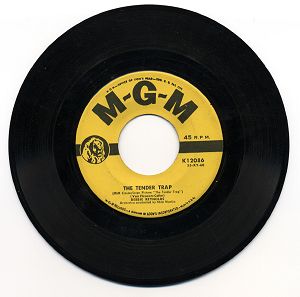
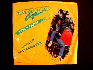
We can also see how the aspects of these older forms reappear in interesting ways. This continuity removes some of the disorientation that occurs in any period of transition. In middle school, I bought my first 45 single, the theme song from Beverly Hills Cop, “Axel F” by Harold Faltermeyer. As a format, the 45 single had its height of popularity in the 50s and 60s. In the 1970s, recording industry shifted their focus on creating and promoting album-oriented music. Today, the emergence of the MP3 music file marked the return of the single. As the preferred format for buying and downloading MP3s, tastes have cycled back to popularize the single in a digital form. Further, we maintain our nostalgia for the plastic insert that 45s required to be able to be played on LP record players. Nostalgia and forms reappearing is a common occurrence in the evolution of media.
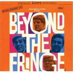
beyond_the_fringe.jpg
Likewise, despite the fact that the LP is no longer as widely produced and used as it once was, it still has cultural relevance. Looking at the LP shows glimpses of a possible future for the print book in the digital age. One future of the print book, which Bob has mentioned, is the book as art object. This transformation is being foretold by the transformation of the vinyl LP as art object. The vinyl LP for newly recorded music is now a niche market. The only people I know, who still actively purchase vinyl records are DJs and indie rock purists. For the rest of us, we have moved on to CDs and MP3s. I have not owned a record player in years. However, if you go into my bedroom, you will see LPs prominently displayed. I have two (different) original “Beyond the Fringe” cast recordings of LPs hanging on my wall. Within these frames, the vinyl record is now an art object. Partially because the CD jewel box is much smaller, the LP is able to leverage its size and proportion of its record cover to maintain relevance of an cultural artifact. The Equator Bookstore in Los Angeles has taken a similar attitude towards the book. Their website explains that “all books are hand-picked by ownership and are sold in collectable condition, cleaned and wrapped in protective archival covering.” Thus, the owners are curating a collection of archival objects. They sell books as art objects, akin to the records hanging on my walls. (Although, interestingly, they also have a small publishing arm, which suggests that they are interested in publishing the book art object of the future.)
Because we have seen a radical shift in the ways people listen to music within our own lifetime, we can apply this experience to our understanding of the older, more entrenched and slower to adapt form of the book. Through this process, we see that we will maintain our attachments to older forms of media. Through nostalgia, transformation, repurposing of these beloved forms, a legacy is sustained. This occurrence should come as no surprise, as media, technology and culture has always been built upon older iterations of itself.

digital comics

If you want to learn how to draw comics you can go to the art section of any bookstore and pick up books that will tell you how to draw the marvel way, how to draw manga, how to draw cutting edge comics, how to draw villains, women, horror, military, etc. But drawing characters is different than making comics. Will Eisner was the generator of the term ‘sequential art’ and the first popular theory of comics. Scott McCloud is his recent successor. Eisner created the vocabulary of sequential art in his long-running course at the School of Visual Arts in NYC. McCloud helped a generation of comic book readers grasp that vocabulary in Understanding Comics, by creating a graphic novel that employed comic art to explain comic theory. But both Eisner and McCloud wrote about a time when comic delivery was bound to newspapers and twenty-two page glossy, stapled pages.
digitalcomics2.jpg
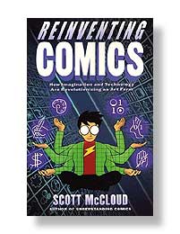
Whither the network? McCloud treats the possibilities of the Internet in his second book, Reinventing Comics, but mostly as a distribution mechanism. We shouldn’t overlook the powerful affect the ‘net has had on individual producers who, in the past, would have created small runs of photocopied books to distribute locally. Now, of course, they can put their panels on the web and have a potential audience of millions. Some even make a jump from the web into print. Most web comics are sufficiently happy to ride the network to a wider audience without exploring the ‘net as vehicle to transform comics into uniquely non-print artifacts with motion, interactivity, sound.
But how might comics mutate on the web? At the recent ITP Spring show I saw a digital comics project from Tracy Ann White’s class. The class asks the question: “What happens when comics evolve from print to screen? How does presentation change to suit this shift?” Sounds like familiar territory. White, a teacher at ITP, has been a long time web comic artist (one of the first on the web, and certainly one of the first to incorporate comments and forums as part of the product.
When I did a little research on her, I found an amazing article on Webcomics Review discussing the history of web comics. (There’s also more from White there.) There has been some brilliant work done, making use of scrolling as part of the “infinite canvas,” but more importantly, work that could have no print analog due the incorporation of sound and motion. The discussion in Webcomics Review covers all of the transformative effects of online publishing that we talk about here at the Institute: interlinking, motion, sound, and more profoundly, the immediacy and participative aspects of the network. As an example, James Kochalka, well known for his Monkey vs. Robot comics and a simplistic cartoon style, publishes An American Elf. The four panel personal vignette is published daily-blogging with comics.
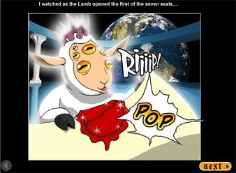
The lamb breaking the first seal, from Apocamon
Other ground breaking work: Nowhere Girl by Justine Shaw, a long form graphic novel that proved that people will read lengthy comics online. Apocamon by Patrick Farley, is a mash up of Pokemon and The Book of Revelations. There is a well known series of bible stories in comic strip format – this raises that tradition to the level of heavenly farce (with anime). Apocamon judiciously uses sound and minor animation effects to create a rich reading experience, but relies on pages—a mode immediately familiar to comic book readers. The comics on Magic Inkwell (Cayetano Garza) use music and motion graphics in a more experimental way. And in Broken Saints we find an example where comic conventions (words in a comic style font, speech bubbles, and sequential images) fade into cinema.
As new technology enables stylistic enhancements to web comics, the boundaries between comics and other media will become more blurred. White says, “In terms of pushing interactive storytelling online games are at the forefront.” This is true, but online games dispense with important conventions that make comics comics. The next step for online comics is to enhance their networked and collaborative aspect while preserving the essential nature of comics as sequential art.

zoom quilt

zoomquilt.jpg Dan came across another nice example of a zooming interface, which we believe suggests a new spacial conception of the page. The “Zoom Quilt” is a playful piece, apparently the fruit of a collaborative art project. I can imagine this working wonderfully for a children’s book. I wish, though, that the path could fork.
For more on zoom:
“infinite canvas comics”

“the page as a spandrel (or not)”

infinite canvas comics

A while back, I posted on this demo (Flash, 8.4Mb) of Jef Raskin‘s proposed zooming interface for his Archy system. There’s more than an echo of that work in these infinite canvas comics made using the Tarquin Engine, a template for Macromedia Flash that lets authors easily create scrolling, zoomable comics. While I can’t say I’m enthralled by the content of any of the comics on display, there’s something exciting about the possibilities of the form. I do wish the format was free & open, enabling more dabbling by amateurs: there are clearly any number of directions that this could take.

easy listening?

After several decades of near-unbroken consolidation of radio broadcasters, the spoken word is enjoying a much needed renaissance driven by satellite radio and podcasting. Audio books too – the much-maligned little nephew of book publishing – have undergone an unprecedented boom, driven by faster internet connections, online retailers devoted exclusively to audio (most notably Audible), and the ubiquity of portable mp3 players that can hold hundreds, even thousands, of hours of audio. For a society of multitaskers, this is undoubtedly a good thing, but the debate rages as to whether listening to a book can in any way compare to reading it with one’s eyes. The NY Times ran a story yesterday about the new craze in auditory reading, and about the stigma that is frequently attached to audio books:

Some critics are dismayed at the migration to audio books. The virtue of reading, they say, lies in the communion between writer and reader, the ability to pause, to reread a sentence, and yes, read it out loud – to yourself. Listeners are opting for convenience, they say, at the expense of engaging the mind and imagination as only real reading can.

Or, as Harold Bloom (quoted in the Times piece) puts it:

Deep reading really demands the inner ear as well as the outer ear. You need the whole cognitive process, that part of you which is open to wisdom. You need the text in front of you.

Scott Esposito over at Conversational Reading agrees. He insists that listening does not equal reading, end of story.
But I would not be so quick to dismiss audio books. They are admittedly a different kind of reading – a subset of visual reading – but important and potentially enriching nonetheless. EaseReader_screen1.gif For many – the blind, the visually impaired, the learning disabled – people for whom visual reading is either impossible or an agonizing trial – this subset of reading is reading. Dolphin, a British software developer, makes EaseReader, an ebook reader for PCs that “combines electronic text with pre-recorded audio.” As you listen, it pages through the book, highlighting the text that is being spoken, and allowing you to jump around, pinpointing passages – re-listening – with incredible precision. For the millions with reading disabilities, this could provide the accessibility of audio without sacrficing close reading of the visual page. Pearson, the biggest educational publisher in America, just announced a strategic partnership with Audible to produce downloadable audio study guides, and perhaps eventually, entire textbooks. In a recent press release, they maintain that:
There is compelling research that identifies 30% of our population as auditory learners. By coupling this research with the growing popularity of downloadable audio, we believe these study guides can make a significant difference in student performance by accommodating diverse learning and life styles. Students today want the option to be untethered from traditional modes of learning. This product line fills a much-needed gap in learning content for a mobile and multitasking generation.

And what about these multitaskers? – the principal target of derision by literary purists.. Few would argue that you can fully engage with a book while simultaneously scooping out a gutter or paying bills. But there are plenty of activities that, while requiring the full involvement of the body, otherwise leave the mind to drift. I read most of my books in the traditional way – with hands and eyes – and for me, this is undoubtedly the fullest, richest kind of engagement. But with audio books, I’m able to read at other, less sedentary, times. When I was little, I listened to books on tape while building Lego cities or Brio trains. I listened over and over to the unabridged “Secret Garden,” “Three Children and It” and the Paddington Bear stories. I also read print books – tons of them – but these trance-like experiences of slowly absorbing the story while moving one’s hands – this was tremendously valuable. And since I listened to them repeatedly, I would argue that I knew those stories better than if I had read them once with my eyes and then shelved the book. You could say that books on tape helped me make the transition from being read to by my parents and becoming a fully independent reader.
Nowadays, I like to run, and for me, the thing that makes running hardest is not the demands it makes on my legs or respiratory system, but rather the way that it fails to occupy my brain. The mind revolts – the customary patter of thoughts, large and small, becomes a kind of torture. Unless you can slow your mind down, it’s impossible to stop thinking: “when is this going to end?” “has it only been eight minutes?!” “why didn’t I just watch TV?”… Sometimes, you can get your mind to behave and sort of synch up with the steadiness of the breathing. It helps to run in a beautiful place. But this isn’t always possible, especially when you live in a big city and a treadmill in a gym is your only option. Lately I’ve been listening to books on an iPod. Not only has it made exercise feel less like a chore, it’s allowing me to absorb “The Devil in the White City” by Erik Larson – a charming popular history of the 1893 Columbian Exposition in Chicago that I never would have had time to read otherwise. While running, I’m a totally captive audience, and the rhythm of the body and the breath actually turns off the rotating critical knives that so frequently hijack my visual reading experience. As I move, the White City is slowly erected in my mind’s eye. If I miss a bit, I simply reread, er, rewind.
Audio books can also be a boon to people who spend a lot of time cooped up in cars. My grandmother is constantly zigzagging all over the northeast United States in her Subaru, and with audio books she’s able to use this time productively. Over the past year, she’s absorbed half a dozen books on the founding period of the American republic. Now I can’t get her to stop talking about Alexander Hamilton and Dolly Madison. For a natural lifelong learner like my grandmother, audio books have yielded great rewards.

web marginalia

NYTwikalong.jpg About a week ago, I attended a fascinating workshop at USC on Social Software in the Academy – a gathering of some of the most interesting thinkers, teachers and innovators at the intersection of technology and education. I learned a great deal, much of which I’m still processing and will be posting about this week. I also found out about some exciting new tools. One of them is Wikalong, a plugin for the Firefox browser. Wikalong makes it possible to write notes in the margin of a web page (something we take for granted in paper books). Reviews, rebuttals, conversations, subversive commentary, a “roving weblog,” or just plain old notes – all of these are possible in the little sidebar wiki notebook that Wikalong places to the left of any web page you go to. Online reading enhanced.
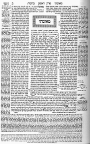
A great part of history is written in the marginalia, and I suspect that networked marginalia is territory worth exploring. Wikalong might be just a literal-minded stepping stone to more interesting forms, but the profundity of the margin (which lies in its spacial relationship to the primary text) shouldn’t be underestimated. 180px-Talmud.png Sparks fly between juxtaposed texts. While hyperlinks enable the reader to leap between textual worlds, they suck you down a wormhole to a distant place. Sometimes it’s better to be in both spaces at the same time (like keeping two browser windows open at once). Think of the Talmud, the great Jewish compendium of law and exegesis. On each page, commentaries are arrayed around a core text. Wikalong may seem insignificant next to this ancient hypertext system, but it points to a related sort of spatial intertextuality that should theoretically be possible in the new medium. If a flat page can be so multi-dimensional, think of how far we might be able to go in a virtual space.
Another handy tool is PurpleSlurple, which provides granular addressability for any existing web page. In other words, it inserts links for paragraphs and headers, allowing you to reference specific sections of text on a given page. Each “slurped” page gets its own URL, as does each individual element that has been anchored with a reference number. It’s primitive, but could come in extremely handy. For bloggers, this provides another way to reference a particular passage in a long web document. Just slurp the page, then link to the specific section.

Nils Peterson
, of Washington State University, presented these tools, along with del.icio.us and a visualization application from Tufts called VUE, as a “juxtaposition of technologies” – a toolkit enabling a web reader or writer to more effectively annotate, reference and quote within the web.

the page as a spandrel (or not)

One of the spandrels in San Marco
One of the great conceptual jumps of the late evolutionary biologist Stephen Jay Gould (with the equally brilliant, if lesser known, Richard Lewontin) was the idea of the spandrel. In “The Spandrels of San Marco and the Panglossian Paradigm”, they wondered about how the spandrels – in architecture, the roughly triangular area between two perpendicular arches – in the cathedral of San Marco in Venice came to be. Looking at how the spandrels are decorated now, they reasoned, you might imagine that they had been designed to feature prominently in the architecture. But this is not necessarily so from an architectural standpoint: if you want to have perpendicular arches, you have to have spandrels between them. Nobody ever wants spandrels by themselves; they’re a side product. Once you have them, of course, you can decorate them as much as you like.

Analogously, Gould and Lewontin reasoned, you could explain many biological features in the same way: a feature may continue to exist in an organism simply because there’s no reason to take it away. One shouldn’t expect features to have functions: they can simply do things (or not) because they’re there. Male nipples are the canonical example of this: there’s no reason for males to have them, but there’s no compelling reason not to have them. So they’re there.

I’ve been thinking for a while about the problem of pages on the screen. We have pages in a book because they make sense there: pages are the easiest way to divide up a long text into hand-sized chunks. Pages on the screen (as they exist in a PDF, say) seem to me to be something of a spandrel: there’s no physical reason that we need to divide text up into hand-sized chunks on a screen. We don’t always: look at the way a webpage scrolls. But what’s worried me is the paucity of the metaphors being used – note the verb “scroll” – against the tabula rasa that computers present.

Looking at a Flash demonstration (8Mb, but very much worth clicking or downloading) of the late Jef Raskin‘s Archy system suggests a way out of the problem. Here we have a two-dimensional space filling the frame of the browser. But this isn’t a two-dimensional space like that of a sheet of paper. The possibility of zooming in to create an infinite plane takes advantage of the virtual environment in a way that a piece of paper cannot. What if you had a novel in a space like this?

This is exciting to me because it’s active design – trying to change the metaphor – instead of being a side effect of trying to re-implement old ideas in a new context.

incredible shrinking newspaper

Facing slipping circulation and massive migration to the web by younger news consumers, a number of top tier newspapers are switching from the traditional broadsheet format to the more handy tabloid, including the European and Asian editions of the Wall Street Journal.
But is this enough? One British advertiser remarks: “We want newspapers to come up with a solution to the threat of marginalization in a digitalized world. But they have to do more than just play around with the size of paper they’re printed on.”
The International Herald Tribune ran this story yesterday. I’ve plugged it before, but the IHT is noteworthy as one of the few online newspapers to eschew vertical scrolling for the layout of articles. Instead, they have simple, attractive (and I would argue, much more readable) horizontal scrolling across fixed, three-column plates. With its long vertical fields, you might say that web news, too, is stuck in the broadsheet model. The problem is that, unlike a print newspaper, a computer screen can’t be folded to improve readability, or to isolate a desired area of the page.

reading, without the book

David Bell, a history professor at Johns Hopkins, has written a smart, well-reasoned article for The New Republic entitled “The Bookless Future,” in which he ponders the changing nature of reading, writing and research in a digital world. Professor Bell and The New Republic have kindly allowed us to reproduce the article in TK3, an e-document reader. Our hope is that it will serve as a springboard for wider discussion, both of the article, and of what is needed to create the optimal electronic reading environment. The downloads are below, followed by some initial thoughts on Bell’s piece. We would love to hear people’s reactions..

First Download and Install the TK3 Reader

Then Download “The Bookless Future”
(when you’ve unzipped the book, you should be able to open it by double-clicking on its icon)

In Bell’s view, the big gains so far have been in the realm of research. “Today, a scholar in South Dakota, or Shanghai, or Albania–anywhere on earth with an Internet connection–has a research library at her fingertips.” A democratization has taken place, comparable only to the change unleashed by the printing press. The ease and speed of searching, comparing, and collating digital documents is similarly a great boon to scholars and students. The benefits afforded by new reading modes far outnumber the losses that opponents of the electronic book frequently lament – the tactile pleasures, the smell of musty bindings, the social environment of bookstores, the art of typography.
This will remain controversial territory for quite some time, but Bell manages to strike the right balance:

What really matters, particularly at this early stage, is not to damn or to praise the eclipse of the paper book or the digital complication of its future, but to ensure that it happens in the right way, and to minimize the risks.

Bell is also thinking what this means for writing. He recognizes the possibilities for new kinds of expression and argumentation that are only possible in the multimedia, not-exclusively-linear, environment of the computer. He cites a few examples in the Gutenberg-e series. But Bell’s enthusiasm is mixed with concern for how we are being affected as readers. First there is the way we absorb content, which has been entirely transformed by hypertext and search – the “browsing” ethos. Bell warns:

Reading in this strategic, targeted manner can feel empowering. Instead of surrendering to the organizing logic of the book you are reading, you can approach it with your own questions and glean precisely what you want from it. You are the master, not some dead author. And this is precisely where the greatest dangers lie, because when reading, you should not be the master. Information is not knowledge; searching is not reading; and surrendering to the organizing logic of a book is, after all, the way one learns.

Questions of form are no less important. Bell reminds us that the digital revolution, unlike the print revolution, is not just about the book. Moveable type may have transformed the means of production for books. But in form, they remained basically the same, and were no less “readable” than their hand-copied forebears. This is not the case with digital books. Until personal computers, and later, the web, it was never assumed that we would do any serious reading on screens. But as technology advanced, we learned that computers were more than just computational tools. A big lesson of the digital revolution is that since all media can be equalized as ones and zeros, then it follows that all media can converge and dance together in a single space. The digital revolution is about this convergence. Text is just one part of it, and so far computers have proven themselves better at handling rich media like graphics, film and sound than at providing satisfactory conditions for sustained reading. This boils down to a few, very simple reasons:
1. Screen display technology is poor – it hurts the eyes, requires large amounts of energy, and cannot be read in sunlight or other such ambient light settings. Progress is being made with the development of electronic ink and cholesteric displays, and Bell hopes that these improvements will deliver us from the headache of liquid crystal displays.
2. Most electronic documents are read in vertical scrolling fields. This is probably descended from the first computer terminal reading which consisted of long batches of code, best read in a scroll, or spit out on long rolls of paper. Horizontal paging keeps words and lines in a fixed position and makes for much easier reading. But you rarely find this today. A good example is the website of the International Herald Tribune. It seems like a no-brainer that screen-based documents should be laid out in this way.
3. And finally, the device is too awkward – heavy, fragile, expensive, and overheated.
Bell recognizes these points, but overemphasizes the need for a device that is tailored exclusively for screen-reading (though he does acknowledge that it would require web-browsing capabilities). One of the reasons book reading devices have consistently failed to catch on is that they are too specialized. In digital space, media can dance together, and there is no reason to corral them off into distinct zones. People are already reading books and other documents on their PDAs, and even their cell phones (check out thread, “the ideal device“). This is not because they offer an ideal reading environment, but because they are indispensable – gadgets that you always have with you. As a consequence, people feel compelled to cram in as many uses as possible. By this logic, the cell phone and the laptop seemed destined to combine. It may end up being something roughly the size of a trade paperback – hold it vertically to read a text, or flip it on its side to watch a widescreen film or play a video game. As with media, it seems inevitable that devices, too, will eventually converge.

mapping memory

flickrmemorymap.jpg
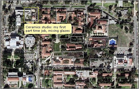
Flickr has a wonderful annotation feature that allows you to attach notes to boxes drawn around sections of an image. Someone had the great idea of using Google satellite images of their hometown, or other significant locales in their life history, to make “memory maps.”
We’ve been thinking a lot about using film or music as a time-based “spine” for an electronic book. This experiment suggests the narrative possibilities of maps and images – not simply as reference points or illustrations on a page, but as dynamic agents. The folks at Grand Text Auto appear to be thinking along similar lines.
This also relates to the institute’s current Born Digital Competition, which deals with reinventing the page illustration in digital space. Memory mappers take notice!