I. Nelson’s criticism
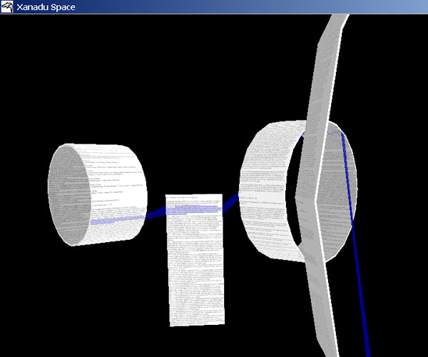
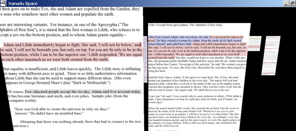
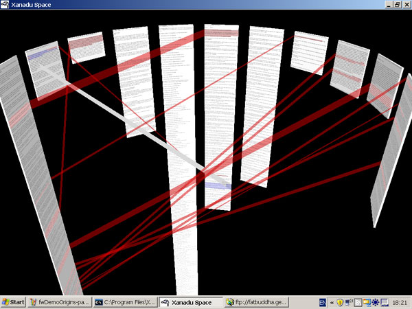
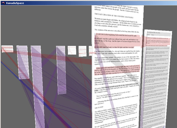
Ted Nelson (introduced last week by Ben) is a lonely revolutionary marching a lonely march, and whenever he’s in the news mockery is heard. Some of this is with good reason: nobody’s willing to dismantle the Internet we have for his improved version of the Internet (which doesn’t quite work yet). You don’t have to poke around too long on his website to find things that reek of crackpottery. But the problems that Nelson has identified in the electronic world are real, even if the solutions he’s proposing prove to be untenable. I’d like to expand on on one particular aspect of Nelson’s thought prominent in his latest missive: his ideas about the inherent ideologies of document formats. While this sounds very blue sky, I think his ideas do have some repercussions for what we’re doing at the Institute, and it’s worth investigating them, if not necessarily buying off on Xanadu.
Nelson starts from the position that attempting to simulate paper with computers is a mistaken idea. (He’s not talking about e-ink & the idea of electronic paper, though a related criticism could be made of that: e-ink by itself won’t solve the problem of reading on screens.) This is correct: we could do many more things with virtual space than we can with a static page. Look at this Flash demonstration of Jef Raskin’s proposed zooming interface (previously discussed here), for example. But we don’t usually go that far because we tend to think of electronic space in terms of the technology that preceded it – paper space. This has carried over into the way in which we structure documents for online reading.
There are two major types of electronic documents online. In one, the debt to paper space is explicit: PDFs, one of the major formats currently used for electronic books, are a compressed version of Postscript, a specification designed to tell a printer exactly what should be on a printed page. While a PDF has more functionality than a printed page – you can search it, for example, and if you’re tricky you can embed hyperlinks and tables of content in them – it’s built on the same paradigm. A PDF is also like a printed page in that it’s a finalized product: while content in a PDF can be written over with annotations, it’s difficult to make substantial changes to it. A PDF is designed to be an electronic reproduction of the printed page. More functionality has been welded on to it by Adobe, who created the format, but it is, at its heart attempting to maintain fidelity to the printed page.
The other dominant paradigm is that of the markup language. A quick, not too technical introduction: a markup language is a way of encoding instructions for how a text is to be structured and formatted in the text. HTML is a markup language; so is XML. This web page is created in a markup language; if you look at it with the “View Source” option on your browser, you’ll see that it’s a text file divided up by a lot of HTML tags, which are specially designed to format web pages: putting <i> and </i> around a word, for example, makes it italic. XML is a broader concept than HTML: it’s a specification that allows people to create their own tags to do other things: some people are using their own version of XML to represent ebooks.
There’s a lot of excitement about XML – it’s a technology that can be (and is)bent to many different uses. A huge percentage of the system files on your computer, for example, probably use some flavor of XML, even if you’ve never thought of composing an XML documents. Nelson’s point, however, is that there’s a central premise to all XML: that all information can be divided up into a logical hierarchy – an outline, if you will. A lot of documents do work this way: book is divided into chapters; a chapter is divided into paragraphs; paragraphs are divided into words. A newspaper is divided into stories; each story has a headline and body copy; the body copy is divided into paragraphs; a paragraph is divided into sentences; a sentence is divided into words; and words are divided into letters, the atom of the markup universe.
II. A Victorian example
But while this is the dominant way we arrange information, this isn’t necessarily a natural way to arrange things, Nelson points out, or the only way. It’s one way of many possible ones. Consider this spread of pages (double-click to enlarge them):

This is a title page from a book printed by William Morris, another self-identified humanist. We mostly think of William Morris (when we’re not confusing him with the talent agency) as a source of wallpaper, but his work as a book designer can’t be overvalued. The book was printed in 1893; it’s entitled The Tale of King Florus and the Fair Jehane. Like all of Morris’s books, it’s sumptuous to the point of being unreadable: Morris was dead set on bringing beauty back into design’s balance of aesthetics & utility, and maybe over-corrected to offset the Victorian fixation on the latter.
I offer this spread of pages as an example because the elements that make up the page don’t break down easily into hierarchical units. Let’s imagine that we wanted to come up with an outline for what’s on these pages – let’s consider how we would structure them if we wanted to represent them in XML. I’m not interested in how we could represent this on the Web or somewhere else – it’s easy enough to do that as an image. I’m more interested in how we would make something like this if we were starting from scratch & wanted to emulate Morris’s type and woodcuts – a more theoretical proposition.
First, we can look at the elements that comprise the page. We can tell each page is individually important. Each page has a text box, with decorative grapevines around the text box; inside the text box, the title gets its own page; on the second page, there’s the title repeated, followed by two body paragraphs, separated by a fleuron. The first paragraph gets an illustrated dropcap. Each word, if you want to go down that far, is composed of letters.
But if you look closer, you’ll find that the elements on the page don’t decompose into categories quite so neatly. If you look at the left-hand page, you can see that the title’s not all there – this is the second title page in the book. The title isn’t part of the page – as would almost certainly be assumed under XML – rather, they’re overlapping units. And the page backgrounds aren’t mirror images of each other: each has been created uniquely. Look at the title at the top of the right-hand page: it’s followed by seven fleurons because it takes seven of them to nicely fill the space. Everything here’s been minutely adjusted by hand. Notice the characters in the title on the right and how they interact with the flourishes around them: the two A’s are different, as are the two F’s, the two N’s, the two R’s, the two E’s. You couldn’t replicate this lettering with a font. You can’t really build a schema to represent what’s on these two pages. A further argument: to make this spread of pages rigorous, as you’d have to to represent it in XML, would be to ruin them aesthetically. The vines are the way they are because the letters are the way they are: they’ve been created together.
The inability of XML to adequately handle what’s shown on these pages isn’t a function of the screen environment. It’s a function of the way we build electronic documents right now. Morris could build pages this way because he didn’t have to answer to the particular restraints we do now.
III. The ideologies of documents
Let’s go back to Ted:
Nearly every form of electronic document- Word, Acrobat, HTML, XML- represents some business or ideological agenda. Many believe Word and Acrobat are out to entrap users; HTML and XML enact a very limited kind of hypertext with great internal complexity. All imitate paper and (internally) hierarchy.
For years, hierarchy simulation and paper simulation have been imposed throughout the computer world and the world of electronic documents. Falsely portrayed as necessitated by “technology,” these are really just the world-view of those who build software. I believe that for representing human documents and thought, which are parallel and interpenetrating– some like to say “intertwingled”– hierarchy and paper simulation are all wrong.
It’s possible to imagine software that would let us follow our fancy and create on the screen pages that look like William Morris’s – a tool that would let a designer make an electronic woodcut with ease. Certainly there are approximations. But the sort of tool I imagine doesn’t exist right now. This is the sort of tool we should have – there’s no reason not to have it already. Ted again:
I propose a different document agenda: I believe we need new electronic documents which are transparent, public, principled, and freed from the traditions of hierarchy and paper. In that case they can be far more powerful, with deep and rich new interconnections and properties- able to quote dynamically from other documents and buckle sideways to other documents, such as comments or successive versions; able to present third-party links; and much more.
Most urgently: if we have different document structures we can build a new copyright realm, where everything can be freely and legally quoted and remixed in any amount without negotiation.
Ben does a fine job of going into the ramifications of Nelson’s ideas about transclusion, which he proposes as a solution. I think it’s an interesting idea which will probably never be implemented on a grand scale because there’s not enough of an impetus to do so. But again: just because Nelson’s work is unpragmatic doesn’t mean that his critique is baseless.
I feel there’s something similar in the grandiosity of Nelson’s ideas and Morris’s beautiful but unreadable pages. William Morris wasn’t just a designer: he saw his program of arts and crafts (of which his books were a part) as a way to emphasize the beauty of individual creation as a course correction to the increasingly mechanized & dehumanized Victorian world. Walter Benjamin declares (in “The Author as Producer”) that there is “a difference between merely supplying a production apparatus and trying to change the production apparatus”. You don’t have to make books exactly like William Morris’s or implement Ted Nelson’s particular production apparatus to have your thinking changed by them. Morris, like Nelson, was trying to change the production apparatus because he saw that another world was possible.
And a postscript: as mentioned around here occasionally, the Institute’s in the process of creating new tools for electronic book-making. I’m in the process of writing up an introduction to Sophie (which will be posted soon) which does its best to justify the need for something new in an overcrowded world: Nelson’s statement neatly dovetailed with my own thinking on the subject on why we need something new: so that we have the opportunity to make things in other ways. Sophie won’t be quite as radical as Nelson’s vision, but we will have something out next year. It would be nice if Nelson could do the same.


