The following quote was in AP story i read in MIT’s Technology Review this morning about Microsoft licensing Adobe’s mobile Flash and PDF software.
“Flash content is the most prolific content on the web today; it is the way people express themselves on the Internet,” Adobe spokesman Gary Kovacs said.
Hmmm . . . . i suppose it might be true that if you add up all the gigabytes of You-Tube videos that more content on the web is in Flash than any other format. But to say that Flash is the way that most people express themselves seems just a tad disingenuous. You-Tube and other sites convert amateur production into Flash; only a small minority of that content is actually created in Flash. But the reason i’m bothering to post this isn’t to call Adobe out for misleading numbers it’s to raise a warning flag — actually two warning flags
1. Converting amateur production into Flash as You-Tube and other for-profit sites do, effectively moves that content into a proprietary format which resists re-use and re-mix. This is not a good thing.
2. Flash is not easy software to master. If it were true that most conent on the web was created natively in Flash rather than converted into it after the fact, that would mean that content creation had moved decisively into the province of the professional, returning us to the built-in the hierarchies of print and broadcast media. Also not a good thing.
Category Archives: software
hypertextopia
We were recently alerted, via Grand Text Auto, to a new hypertext fiction environment on the Web called Hypertextopia:
Hypertextopia is a space where you can read and write stories for the internet. On the surface, it looks like a mind-map, but it embeds a word-processor, and allows you to publish your stories like a blog.
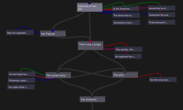
The site is gorgeously done, applying a fresh coat of Web 2.0 paint to the creaky concepts of classical hypertext. I find myself strangely conflicted, though, as I browse through it. Design-wise, it is a triumph, and really gets my wheels spinning w/r/t the possibilities of online writing systems. The authoring tools they’ve developed are simple and elegant, allowing you to write “axial hypertexts”: narratives with a clear beginning and end but with multiple pathways and digressions in between. You read them as a series of textual screens, which can include beautiful fold-out boxes for annotations and illustrations, and various color-coded links (the colors denote different types of internal links, which the author describes). You also have the option of viewing stories as nodal maps, which show the story’s underlying structure. This is part of the map of “The Butterfly Boy” by William Vollmann (by all indications, the William Vollmann):
Lovely as it all is though, it doesn’t convince me that hypertext is any more viable a literary form now, on the Web, than it was back in the heyday of Eastgate and Storyspace. Outside its inner circle of devotees, hypertext has always been more interesting in concept than in practice. A necessary thought experiment on narrative’s deconstruction in a post-book future, but not the sort of thing you’d want to read for pleasure.
It’s always felt to me like a too-literal reenactment of Jorge Luis Borges’ explosion of narrative in The Garden of Forking Paths. In the story, the central character, a Chinese double agent in WWI being pursued by a British assassin who has learned of his treachery, recalls a lost, unfinished novel written by a distant ancestor. It is an infinte story that encompasses every possible event and outcome for its characters: a labyrinth, not in space but in time. Borges meant the novel not as a prescription for a new literary form but as a metaphor of parallel worlds, yet many have cited this story as among the conceptual forebears of hypertext fiction, and Borges is much revered generally among technophiles for writing fables that eerily prefigure the digital age.
I’ve always found it odd how people (techies especially) seem to get romantic (perhaps fetishistic is the better word) about Borges. Prophetic he no doubt was, but his tidings are dark ones. Tales like “Forking Paths,” Funes the Memorious and The Library of Babel are ideas taken to a frightening extreme, certainly not things we would wish to come true. There are days when the Internet does indeed feel a bit like the Library of Babel, a place where an infinity of information has led to the death of meaning. But those are the days I wish we could put the net back in the box and forget it ever happened. I get a bit of that feeling with literary hypertext -? insofar as it reifies the theoretical notion of the death of the author, it is not necessarily doing the reader any favors.
Hypertext’s main offense is that it is boring, in the same way that Choose Your Own Adventure stories are fundamentally boring. I know that I’m meant to feel liberated by my increased agency as reader, but instead I feel burdened. What are offered as choices -? possible pathways though the maze -? soon start to weigh like chores. It feels like a gimmick, a cheap trick, like it doesn’t really matter which way you go (that the prose tends to be poor doesn’t help). There’s a reason hypertext never found an audience.
I can, however, see the appeal of hypertext fictions as puzzles or games. In fact, this may be their true significance in the evolution of storytelling (and perhaps why I don’t get them, because I’m not a gamer). Thought of this way, it’s more about the experience of navigating a narrative landscape than the narrative itself. The story is a sort of alibi, a pretext, for engaging with a particular kind of form, a form which bears far more resemblance to a game than to any kind of prose fiction predecessor. That, at any rate, is how I’ve chosen to situate hypertext. To me, it’s a napkin sketch of a genuinely new form -? video games -? that has little directly to do with writing or reading in the traditional sense. Hypertext was not the true garden of forking paths (which we would never truly want anyway), but a small box of finite options. To sift through them dutifully was about as fun as the lab rat’s journey through the maze. You need a bigger algorithmic engine and the sensory fascinations of graphics (and probably a larger pool of authors and co-creators too) to generate a topography vast enough to hide, at least for a while, its finiteness -? long enough to feel mysterious. That’s what games do, and do well.
I’m sure this isn’t an original observation, but it’s baggage I felt like unloading since classical hypertext is a topic we’ve largely skirted around here at the Institute. Grumbling aside though, Hypertextopia offers much to ponder. Recontextualizing a pre-Web form in the Web is a worthwhile experiment and is bound to shed some light. I’m thinking about how we might play around in it…
new commentpress version available: plays well with latest wordpress!
We’ve finally squashed the bug that made CommentPress incompatible with the latest version of WordPress (2.3), so anyone out there with a CP installation can finally go ahead and upgrade:
CommentPress 1.4.1 »
Other than the compatibility fix, 1.4.1 is exactly the same as 1.4. Of course, there are numerous improvements we’d still like to make, and plans for that are underway. Stay tuned.
Also: tomorrow I’m going to be announcing an exciting new CommentPress publishing experiment that will suggest possible future directions for the tool’s development.
commentpress update
The release of CommentPress has made for exciting times here at the institute (the feedback has also been very encouraging). But as with any piece of software, CommentPress will need constant tending, and with quick succession upgrades, we hope to address the most crucial issues – starting with the first major update, CommentPress version 1.1.
This is a very important update, so everyone is encouraged to upgrade as soon as possible.
For a complete list of the changes, check out the CommentPress download page.
CommentPress 1.0
At long last, we are pleased to release CommentPress, a free, open source theme for the WordPress blog engine designed to allow paragraph-by-paragraph commenting in the margins of a text. To download it and get it running in your WordPress installation, go to our dedicated CommentPress site. There you’ll find everything you need to get started. This 1.0 release represents the most basic out-of-the-box version of the theme. Expect many improvements and new features in the days and weeks ahead (some as soon as tomorrow). We could have kept refining it for another week but we felt that the time was well past due to get it out in the world and to let the community development cycles begin. So here it is:
/commentpress/ »
This little tool is the happy byproduct of a year and a half spent hacking WordPress to see whether a popular net-native publishing form, the blog, which, most would agree, is very good at covering the present moment in pithy, conversational bursts but lousy at handling larger, slow-developing works requiring more than chronological organization – ?whether this form might be refashioned to enable social interaction around long-form texts. Out of this emerged a series of publishing experiments loosely grouped under the heading “networked books.” The first of these, McKenzie Wark’s GAM3R 7H30RY 1.1, was a wildly inventive text whose aphoristic style and modular structure lent it readily to “chunking” into digestible units for online discussion. This is how it ended up looking:
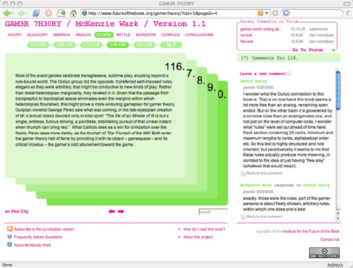
In the course of our tinkering, we achieved one small but important innovation. Placing the comments next to rather than below the text turned out to be a powerful subversion of the discussion hierarchy of blogs, transforming the page into a visual representation of dialog, and re-imagining the book itself as a conversation. Several readers remarked that it was no longer solely the author speaking, but the book as a whole (author and reader, in concert).
Toying with the placement of comments was relatively easy to do with Gamer Theory because of its unusual mathematical structure (25 paragraphs per chapter, 250 words or lessper paragraph), but the question remained of how this format could be applied to expository texts of more variable shapes and sizes. The breakthrough came with Mitchell Stephens’ paper, The Holy of Holies: On the Constituents of Emptiness. The solution we found was to have the comment area move with you in the right hand column as you scrolled down the page, changing its contents depending on which paragraph in the left hand column you selected. This format was inspired in part by a WordPress commenting system developed by Jack Slocum and by the Free Software Foundation’s site for community review of drafts of the GNU General Public License. Drawing on these terrific examples, we at last managed to construct a template that might eventually be exported as a simple toolset applicable to any text.
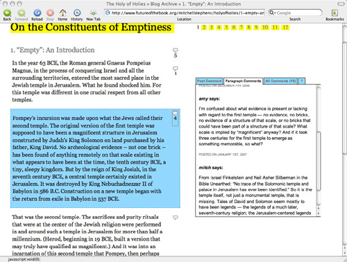
Ever since “Holy of Holies,” people have been clamoring for us to release CommentPress as a plugin so they could start playing with it, improving it and customizing it for more specialized purposes. Now it’s finally here, with a cleaned-up codebase and a simpler interface, and we can’t wait to see how people start putting it to use. We can imagine a number of possibilities:
-? scholarly contexts: working papers, conferences, annotation projects, journals, collaborative glosses
-? educational: virtual classroom discussion around readings, study groups
-? journalism/public advocacy/networked democracy: social assessment and public dissection of government or corporate documents, cutting through opaque language and spin (like our version of the Iraq Study Group Report, or a copy of the federal budget, or a Walmart press release)
-? creative writing: workshopping story drafts, collaborative storytelling
-? recreational: social reading, book clubs
Once again, there are dozens of little details we want to improve, and no end of features we would love to see developed. Our greatest hope for CommentPress is that it take on a life of its own in the larger community. Who knows, it could provide a base for something far more ambitious.
An important last thought, however. While CommentPress presents exciting possibilities for social reading and writing on the Web, it is still very much bound by its technical origins, the blog. This presents significant limitations both in the flexibility of document structures and in the range of media that can be employed in writing and response. Sure, even in the current, ultra-basic version, there’s no reason a CommentPress document can’t incorporate image, video and sound embeds, but they must be fit into the narrow and brittle textual template dictated by the blog.
All of which is to say that we do not view CommentPress or whatever might grow out of it as an end goal but rather as a step along the way. In fact, this and all of the experiments mentioned above were undertaken in large part as field research for Sophie, and they have had a tremendous impact on its development. While there is still much work to be done, the ultimate goal of the Sophie project is to make a tool that handles all the social network interactions (and more) that CommentPress does but within a far more fluid and easy-to-use composition/reading space where media can mix freely. That’s the larger prize. For the moment though, let’s keep hacking the blog to within an inch of its life and seeing what we can discover.
A million thanks go out to our phenomenal corps of first-run testers, particularly Kathleen Fitzpatrick, Karen Schneider, Manan Ahmed, Tom Keays, Luke Rodgers, Peter Brantley and Shana Kimball, for all the thoughtful and technically detailed feedback they’ve showered upon us over the past few days. Thanks to you guys, we’re getting this out of the gate on solid legs and our minds are now churning with ideas for future development.
Here is a chronology of CommentPress projects leading up to the open source release (July 25, 2007):
GAM3R 7H30RY 1.1 by McKenzie Wark (launched May 22, 2006)
The Holy of Holies: On the Constituents of Emptiness by Mitchell Stephens (December 6, 2006)
The Iraq Study Group Report with Lapham’s Quarterly (December 21, 2006)
The President’s Address to the Nation, January 10th, 2007 with Lapham’s Quarterly (together, the Address and the ISG Report comprised Operation Iraqi Quagmire) (January 10, 2007)
The Future of Learning Institutions in a Digital Age with HASTAC (Humanities, Arts, Science, and Technology Advanced Collaboratory) (January 17, 2007)
Scholarly Publishing in the Age of the Internet by Kathleen Fitzpatrick, published at MediaCommons (March 30, 2007)
(All the above are best viewed in Firefox. The new release works in all major browsers and we’re continuing to work on compatibility.)
a quick note on commentpress
Apologies to all who have been waiting so patiently for CommentPress (our open source theme for WordPress that enables paragraph-level commenting on blogs and other documents). Many of you have told us about specific projects you’re dying to start if only you had the plugin… Believe me, we can’t wait to get it out into the world so people can start playing with it (and improving it). We’re sorry this has gotten so delayed.
Unfortunately, what with Sophie, MediaCommons and the pressing task of raising more funds to keep the Institute going, finishing up CommentPress keeps getting relegated to the back burner. Add to that a more or less lost month of June with many of our number scattered around the world for weddings and long overdue vacations (I’m writing this from South Korea).
The good news is that we’ve been making progress all along, slowly but surely cleaning up the code, streamlining the interface, and making a simple, clean out-of-the-box design. It looks like we’re nearly there. I can say with 99% confidence that we’ll have this puppy ready by mid-July, probably sometime in the week of the 16th through 20th.
Thanks again for your patience. We’ll have this for you soon.
(Reposted from comments.)
digital editions
Yesterday Adobe announced the release of their Digital Editions software. The software’s been available in a beta format for a while; I downloaded it back then & didn’t think it was interesting enough to write about. I’ve spent the past two days playing with the new release. I’m still not sure that it’s worth attention, but I’ll try to explain why it’s not interesting.
What is Digital Editions? It’s still a bit hard to tell. When I downloaded the beta version, it seemed to be a lightweight remake of Adobe Reader (née Acrobat Reader), Adobe’s PDF viewer. The full release expands the capabilities of Digital Editions: in addition to being a PDF viewer, it’s also a viewer for the new EPUB format. It also seems to be a front end for future web-based electronic book sellers, like Apple’s iTunes for music. I’ll go through each of these three uses in turn, but first a few notes on how Digital Editions works.
Digital Editions looks more like a web application than a desktop application. There are no menu bars to speak of, and its interface borrows nothing from the operating system. This is nice in that it feels like it’s a reading environment: the interface is black-on-black, which should block out the distractions rampant on the desktop. Certainly there’s none of the excess frippery that comes with Acrobat. However, the minimalism may be a bit excessive: it can be difficult to find black buttons and sliders to turn pages. (I’d be curious to see a review of the application from someone interested in accessibility for the disabled.) And some controls don’t behave the way a user might expect: given a scrollbar along the right edge of a page, I expect to be able to click at a point where the slider isn’t to move the slider. No such luck. Nor can you drag-select to change which part of the page is visible when the page is larger than the window, or drag a file into the window to open it.
Many of my problems with it stem from it not behaving like Mac software; I suspect a PC user would have similar complaints about it not behaving like PC software. This wouldn’t matter if the interface were an improvement over the operating systems – in both there’s plenty of room for improvement – but it’s not a noticeable improvement. It’s simply different, and that slows users down.
1. as a PDF reader
As mentioned above, Digital Editions initially seemed to be a remake of Adobe Reader, which has become hideously bloated with time. The current OS X version of the software is 108Mb; it’s a slow program. While I look at a fair number of PDFs on a daily basis, I’ve long since stopped using Acrobat in any of its forms if I don’t have to; Apple’s Preview application is much faster and delivers almost all the functionality that I want out of a PDF reader. I suspect most other Mac users do the same. Acrobat can be useful if you’re doing print pre-press work or working with forms, but neither of those are things I do that often.
Digital Editions does work as a PDF viewer. It’s based around a library concept, so every time you open a PDF in DE, an image of the front page is saved in the library; you can click on this image to open it. Once you have a PDF, you can look at it as a single page, as a double page (even if the PDF hasn’t been set up for this), at the width of the screen, or with a zoom widget that lets you use 18 levels of zoom from 87% to 919%. Here’s how a PDF from /ubu editions looks:
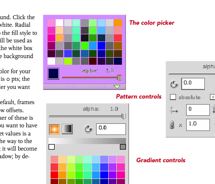
Digital Editions is clearly built around a different PDF rendering engine than the rest of Adobe’s software. (The FAQ explains that this engine was designed to be used on cellphones.) Image quality is noticeably worse than in Acrobat or Preview. Text is poorly aliased, and spacing between characters seems to be off for some fonts at some zoom levels. Graphics are notably grainy, and weird rendering artifacts sometimes show up. (In the image above, for example, note that there’s a light blue rectangle under the text on the left. This doesn’t show up in any other PDF viewer.) Some PDFs have extras that shouldn’t have been there, blocks of background color, for example. One illustration of the color picker in the Sophie help PDF I made a couple weeks back turns a lovely shade of purple:
This is frustrating: one of Adobe’s chief selling points of PDF as a format has been that a PDF will look the same on every machine in every viewer. Not this one. Adobe offers sample PDFs for download at their Digital Editions website (see below), which are similarly perplexing. Although these appear to be ordinary PDFs (with no restrictions), they don’t behave like regular PDFs. They can’t be opened in any PDF viewer that’s not Digital Editions. Preview shows only blank pages; opening them in the current Adobe Reader takes you to a webpage where you can download Digital Editions; and opening them in an older version of Acrobat brings up a message asking whether I’d like to learn more about documents protected with Adobe DRM. Clicking yes takes me to a pre-Digital Editions Adobe ebooks page. PDFs have become popular because they can be used in a variety of ways across a variety of platforms. This seems like a significant step backwards for Adobe: interoperability is taking a back seat to DRM.
2. as an EPUB reader
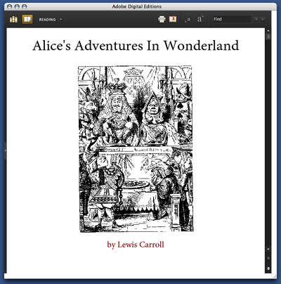
But Digital Editions isn’t only a PDF viewer; it’s also a viewer for EPUB format. EPUB is the work of the IDPF; it’s essentially an XHTML format for ebooks. You can get sample EPUBs from Adobe’s website. If you have the latest version of Adobe InDesign, you can make them yourself (more about that in a bit). Here’s the front page of their edition of Alice’s Adventures in Wonderland:
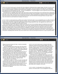
Perhaps not surprisingly for an XHTML format, the experience of reading an EPUB in Digital Editions is similar to reading a web page. The text becomes as wide as the Digital Editions window; if the window is wide enough, the text may reflow into more columns. When this happens is unclear to me: in some books, the text column is much too wide to read well before the text is reflowed:
You can choose between 4 different font sizes; you can’t change the fonts. (Some EPUB books include their own fonts; some use system fonts.) As in the Digital Editions PDF viewer, there’s some bookmarking capability: you can select text and click “Add bookmark” to add a note at a particular point in the text. Books have tables of contents; there’s a search function. You can print books (or, on a Mac, convert them to PDFs); this seems to be in two columns by default.
That seems to be all you can do with these books. The books that Adobe provides are noticeably ugly: most of the graphics included are low resolution. Text looks weirdly bad: in the default font, the italic text seems to actually be slanted roman characters, which you’d think Adobe would be embarrassed about. To my eye, the text looks much better in Safari or even Firefox. You can make this comparison if you rename the .epub file .zip and unzip it; in the resulting folder, you’ll find a bunch of HTML pages, the images used, and fonts, if they’re included.
Adobe trumpets the one-click creation of EPUB files in the new version of InDesign. So I fired up InDesign and made some EPUBs to see how those worked in Digital Editions. Try for yourself: here is a version of the Sophie help PDF in EPUB format. The results are a bit disappointing: all the graphics have been dumped at the end of the document, much of the formatting has been lost, and the table of contents I laboriously set up for PDF export has been eliminated. One-click conversion evidently doesn’t allow exporting the fonts the document uses; and even though I have the Avenir and Scala fonts on my machine, it displays in the default Digital Editions font. The graphics do display in their real color, which is more than you can say for the way Digital Editions handles the PDF, though many of them do seem to have been converted to JPEGs in a lossy way.
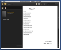
As a whim, I fed InDesign’s converter some foreign-language poetry to see how it would handle Unicode text. French came through okay. Lithuanian was mangled beyond recognition. Some Chinese poetry didn’t work at all:
It’s clear that this needs a lot of work before it can be taken seriously.
3. as a store
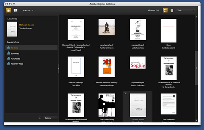
From Adobe’s press release, it’s clear that the main impetus behind Digital Editions is to provide a local front end for web-based selling of ebooks. The model that Adobe is working on becomes apparent when you open it up: the program maintains a library of all the PDF files you look at, in the same way that iTunes maintains a library of the MP3s on your computer:
Categories of books (on the left in the above screenshot) include “Borrowed” and “Purchased”. The iTunes model of incorporating a store in software isn’t necessarily a bad one: Linotype has embedded a font store in their free font management software, with some degree of success. It’s hard to tell how well Adobe’s integration will work. They’ve tried selling ebooks before with little success; I have a couple of PDFs bought from Amazon that I’ve long since despaired of ever opening again. (Some progress may be reported: clicking on these now now opens DigitalEditions, where I get a different cryptic error than I did before in Acrobat.) The same sort of problems are likely with ebooks designed for DigitalEditions; it does worry me that even PDFs without DRM can’t be opened outside of the software.
DRM are probably the logical place to end this overlong review. One of the major reasons that we haven’t spent much time covering the efforts of the IDPF is that it’s devoted to standards that satisfy producers rather than consumers; many producers are concerned with locking down their products as thoroughly as possible. It may be a reasonable position from their perspective, but it’s resulted in products that aren’t particularly useful to consumers. DigitalEditions looks like it might be a big piece in the puzzle for DRM-focused producers. Unfortunately, readers are being neglected.
sophie alpha version is up
As promised, an alpha version of Sophie is available here. As it says on the download page . . . To be honest we’re betwixt and between about releasing Sophie now. On the one hand, it’s definitely not ready for prime-time and we’re not particularly happy about releasing software with so many bugs, no documentation and incomplete features; on the other hand, Sophie is real and promises to be fantastic . . . so we didn’t want people to think it was vaporware either.
the situation with sophie
Someday this week we”ll post an alpha version for people to try out — check here for the announcement. This version won’t have a standalone reader and has lots of bugs but the file format is solid and you can start making real books with it. Our schedule for future releases is as follows.
June — a more robust version of the current feature set
August — a special version of Sophie optimized for the OLPC (aka $100 laptop or XO) in time for the launch of the first six million machines
September — a beta version of Sophie 1.0 which will include the first pass at a Sophe reader
December — release of Sophie 1.0
dotReader is out
 dotReader, “an open source, cross-platform content reader/management system with an extensible, plug-in architecture,” is available now in beta for Windows and Linux, and should be out for Mac any day now. For now, dotReader is just for reading but a content creation tool is promised for the very near future.
The reader has some nice features like shared bookmarks and annotations, a tab system for moving between multiple texts and an embedded web browser. In many ways it feels like a web browser that’s been customized for books. I can definitely see it someday becoming a fully web-based app. The recently released Firefox 2 has a bunch of new features like live bookmarks (live feed headlines in drop-down menus on your bookmarks toolbar) and a really nice embedded RSS reader. It’s a pretty good bet that online office suites, web browsers and standalone reading programs are all on the road to convergence.
Congrats to the OSoft team and to David Rothman of Teleread, who has worked with them on implementing the Open Reader standard in dotReader.


