Category Archives: reading

an encyclopedia in my pocket

A while back – last March – there was a great deal of excitement over Wikipodia, an open source project to install Wikipedia on an iPod. Wanting a portable Wikipedia, I installed Linux on my brand new video iPod, a necessary prerequisite, but was disappointed to discover that Wikipodia only worked on older iPods with smaller screens. I’ve waited for an update to Wikipodia since then, but the project seems to have gone dark. Probably Wikipodia wouldn’t have been an ideal solution anyway: it requires you to reboot your iPod into Linux whenever you want to look at Wikipedia. You could have an iPod to listen to music or a Wikipedia to read, but not both at the same time.
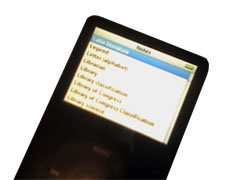
ipodwikipedia.jpgBut a partial fulfillment for my desire to have a portable Wikipedia has come along: Matt Swann has posted a script that puts some of the Wikipedia on an iPod, in iPod Notes format. While it’s much simpler than installing a new operating system on your iPod, it’s still not for everybody – it requires using the OS X command line, although there’s an Automator-based version that’s a bit simpler. (PC versions would seem to be available as well, though I don’t know anything about them – check the comments here.) If you’re willing to take the plunge, you can feed the script a page from Wikipedia and it will start filling up your iPod Notes directory with that page and all the pages linked from it. I started from the entry for book; the script downloaded this, then it downloaded the entries for paper, parchment, page, and so on. When it finished those, it downloads all the pages linked from the linked pages, and it keeps doing this until it runs out of space: regardless of iPod size, you can only have 1000 notes in the Notes directory. This doesn’t meant that you get 1000 articles. Because each iPod note can only be 4 kb long, entries that are longer than 4000 characters are split into multiple notes; thus, I wound up with only 216 entries.

Though 216 entries is a tiny subset of Wikipedia, it’s still an interesting experience having a chunk of an encyclopedia in your pocket. What I find most captivating about approaching Wikipedia this was is that I found myself browsing interesting sounding articles rather than searching them directly. The iPod doesn’t have much input functionality: while you can scroll through the list of entries, you can’t search for a subject, as you usually would. (And with only 216 entries, searching would be of limited utility at best. The Wikipodia project promises full text searching, though text entry is a difficult proposition when you only have five keys to type with.) While you can scroll through the list of entries to find something that looks interesting, you’re likely to get sidetracked by something along the way. So you browse.
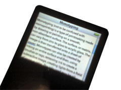
monotyping.jpgTo my mind, browsing is one of the primary virtues of a print encyclopedia: the arbitrary logic of alphabetization makes for a serendipitous reading experience, and you often come away from a print encyclopedia having read something in a nearby article that you didn’t intend to read. This is something that’s generally lost with online reference works: links between articles are supposed to make logical sense. This is also a reflection of our reading behavior: if I search for “book” in Wikipedia, I’m probably looking for something in particular. If I’m interested in book conservation issues, I might click on the link for slow fires. If I’m interested in some other area related to books – how to make vellum, for example – I almost certainly wouldn’t. Instead I’d click on the vellum link and keep looking from there. We tend to be goal-directed when we using Wikipedia online: it’s like going to a library and finding the specific book you want. Wandering in a library is an equally valid behavior: that’s what happens here.

Because you’re not looking for a particular piece of information, you do find yourself reading in a different way. Search-based reading is a different style of reading than browsing, which is slower and more casual. This has a downside when applied to Wikipedia: the often atrocious style is more glaring when you’re reading for pleasure rather than reading for information. And an offline Wikipedia inhibits some of the new reading habits Wikipedia encourages. I caught myself wondering how biased the declarations of the Shāhnāma‘s originality w/r/t other national epics were; without recourse to page histories and talk pages I’m left to wonder until I find myself with an Internet connection.
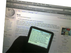
book-bookwhite.jpgThe experience of reading Wikipedia this way isn’t perfect: many links don’t work, and some articles seem to arbitrarily end, some in mid-sentence, some in mid-word. You also realize how many links in Wikipedia aren’t useful at all. If I’m interested in books as a concept, I’m probably not interested in 1907 as a concept, though that is the year that Marc Aurel Stein found The Diamond Sutra, the oldest known block-printed book. Marc Aurel Stein or The Diamond Sutra might be interesting subjects to a book-inclined browser; 1907 isn’t as likely. What you get on your iPod is an arbitrary selection. But there’s something very pleasant about this: it’s nice to have the chance to learn about both Neferirkare Kakai and the Rule of St. Benedict on the subway.

reading buildings

On Monday, Adriene Jenik, who is Associate Professor of Computer & Media Arts at UC San Diego, stopped by for what turned into an interesting discussion on the future of libraries. Adriene is a telecommunications media artist who has experimented extensively in virtual performance with projects like Desktop Theater and SPECFLIC, an ongoing “speculative distributed cinema project.”
More recently, she wrote and produced SPECFLIC 2.0, which explores the intersection of digital media, books, and reading. With the help of a large network of collaborating artists, Jenik transformed the Martin Luther King Library in San Jose into a one night only vision of the future called the InfoSphere, where a computerized reference librarian called The Infospherian provides an interface to all the bits of information what anyone might need, and is in charge of issuing and enforcing reading licenses to the public.
Before the group got to discussing how libraries where changing, Adriene and I first discussed how neighborhoods and cities develop; the way growth is encouraged and discouraged in certain areas, and of those who benefit from seeing either scenario play out.
As in the discussion we had about neighborhoods, I am ambivalent towards the way libraries are changing. People use search engines to find information quickly and are less frequently doing research in libraries. In fact, even in libraries computer labs tend to be the most populous rooms. The act of looking through physical books lends itself well to serendipitous discoveries, and while I agree that many of these kinds of experiences may be lost, it’s hard to really know for sure what is gained and what is lost when you’re in the midst of change.
For better or worse, as a tool, the library, as we know it today, appears to have lived out it’s life. In the future, the idea of a library as a museum, as opposed to an active location like a park makes a lot more sense to me. Something will be lost with the transition, that is for sure, and as much of it as possible should be preserved, but it’s hard to see today’s library being able to compete with the technologies of the future in the same way.
What I find bizarre about all this is that when you walk into a Barnes & Noble all the seats are taken, so it seems that “reading buildings” of some sort have some demand. Maybe it’s the social setting or maybe it’s the Starbucks. Actually, that could be the future of the library: a big empty building that people bring their electronic books to so that they can read and drink their coffee in a social setting… quietly.
“No analog book allowed inside library. Please digitize your analog book at the door.”

books in time

darkpoem2.jpg
This morning I’m giving a talk on networked books at a libraries and technology conference up at Bentley College, just outside of Boston. The program, “Social Networking: Plugging New England Libraries into Web 2.0,” has been organized by NELINET, a consortium of over 600 academic, public and special libraries across the six New England states, so librarians and info services folks from all over the northeast will be in attendance.
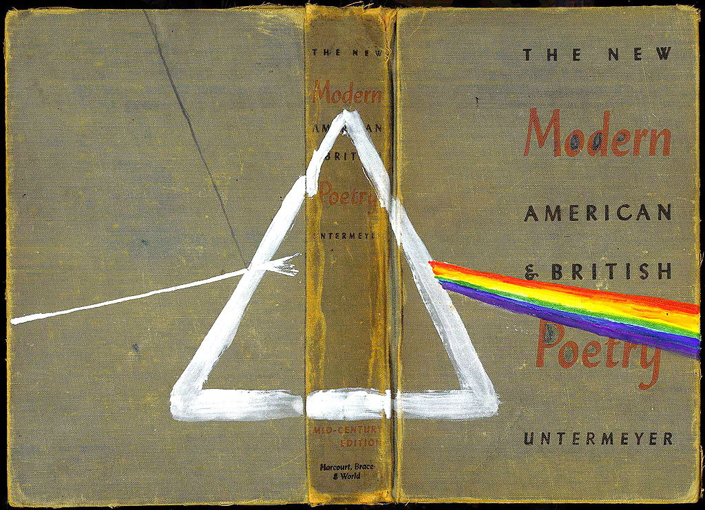
In many ways, our publishing projects fit quite comfortably under the broad, buzz-ridden rubrique of Web 2.0: books as social spaces, “architecture of participation,” “treat your users as co-developers” (or, in our experiments, readers as co-authors). I’m going to be discussing all of these things, but I’m also planning to look at books in a slightly different way: as processes, or movements, in time.
Lately, when we’re explaining our work to the unitiated, Bob picks up whatever book is lying nearby (yes, we do have books), holds it up in the air and indicates with his hands the space on either side of the object: “here’s all the stuff that came before the book, and here’s all the stuff that came after.” That’s the spectrum that networked reading and writing opens up, and what the Institute are trying to do is to explore and open up new ways of thinking about all these different stages of creative flow that go into and out of books. Of our recent projects, you could say that Without Gods focuses on the “into” end of the evolutionary span while GAM3R 7H30RY deals more with the “out of.” Naturally, books have always been this way, but computers and networks make all of it manifest in a very new way that’s difficult to make sense of.
That’s what the picture up top is getting at, in a joshing way. Bob’s depiction of books in time reminded me of the famous prism image on the cover of Pink Floyd’s “Dark Side of the Moon” where pure white light turns to rainbow as it passes through the glass. I was joking about this with Alex Itin, our artblogger in residence, and yesterday he cobbled together this excellent image (and ripped the audio), which I’m going to work into my talk somehow. Wish me luck.
(Incidentally, “Books in Time” is the name of a wonderful essay by Carla Hesse, a Berkeley historian, which has been a big influence on what we do.)

phony reader 2: the ipod fallacy

Since the release of the Sony Reader, I’ve been thinking a lot about the difference between digital text and digital music, and why an ebook device is not, as much as publishers would like it to be, an iPod. This is not an argument over the complexity of literature versus the complexity of music, rather it is a question of interfaces. It seems to me that reading interfaces are much more complicated than listening ones.
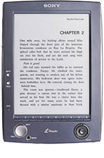
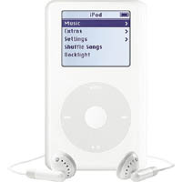
sony-reader.jpg ipod.jpg The iPod is, as skeptics initially complained, little more than a hard drive with earphones. But this is precisely its genius: the simplicity of its interface, the sleekness of its form, the radical smallness of its immense storage capacity. All these allow us to spend less time sorting through our music — lugging around stacks of albums, ejecting and inserting tapes or discs — and more time listening to it.
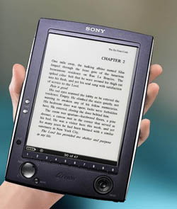
A sequence of smooth thumb gestures leads to the desired track. Once the track has commenced, the device is tucked away into a pocket or knapsack, and the music takes over. That’s the simplicity of the iPod. Reading devices, on the other hand — whether paperback, web page or specialized ebook hardware — are felt and perceived throughout the reading experience. The text, the visual design, and the reader’s movement through them are all in constant interaction. So the device necessarily must be more complex.
In other words, a book — even a digital one — is something you have to “handle” in order to process its contents. The question Sony should be asking is what handling a book should mean in a digital, networked context? Obviously, it’s something very different than in print.
Another thing about portable music players from Walkmen to iPods is that music, in its infinite variety, can be delivered to the senses through a uniform channel: from the player, through the wire, to the ear. Again, with books it’s not so simple. Different books have different looks, and with good reason: they are visual media. This is something we tend to forget because we so strongly associate books with intangible things like stories and abstract ideas. But writing is a manipulation of visual symbols, and reading is something we do with our eyes. So well-considered visual design, of both documents and devices, is crucial — as much for electronic documents as for print ones.
Publishers want their ipod, a simple gadget locked into a content channel (like iTunes), but they’re going to have to do a lot better than the Sony Reader. To date, the web has done a much better job at fostering a wide variety of reading forms, primitive as they may still be, than any specialized ebook device or ebook format. A hard drive with ear phones may work for music, but a hard drive (and a pitifully small one at that) with an e-ink screen won’t be sufficient for books.

phony reader

sony reader in hand.jpg What to say about this thing? After multiple delays, it’s finally out, and in time for the holidays. David Rothman, as usual, has provided exhaustive and entertaining coverage over at Teleread (here, here and here), and points to noteworthy reviews elsewhere.
It’s no secret that our focus here at the Institute isn’t on the kind of ebooks that simply transfer printed texts to the screen. We’re much more interested in the new kinds of reading and writing that become possible in a digital, network environment. But even measuring Sony’s new device against its own rather pedestrian goals — replicating the print reading experience for the screen with digital enhancements — I still have to say that the Reader fails. Here are the main reasons why:
1) Replicating the print reading experience?
E-ink is definitely different than reading off of an LCD screen. The page looks much more organic and is very gentle on the eyes, though the resolution is still nowhere near that of ink on paper. Still, e-ink is undeniably an advance and it’s exciting to imagine where it might lead.
Other elements of print reading are conjured less successfully, most significantly, the book as a “random access” medium. Random access means that the reader has control over their place in the book, and over the rate and direction at which they move through it. The Sony Reader greatly diminishes this control. Though it does allow you to leave bookmarks, it’s very difficult to jump from place to place unless those places have been intentionally marked. The numbered buttons (1 through 10) directly below the screen offer offer only the crudest browsing capability, allowing you to jump 10, 20, 30 percent etc. through the text.
Another thing affecting readability is that action of flipping pages is slowed down significantly by the rearrangement of the e-ink particles, producing a brief but disorienting flash every time you change your place. Another important element of print reading is the ability to make annotations, and on the Sony Reader this is disabled entirely. In fact, there are no inputs on the device at all — no keyboard, no stylus — apart from the basic navigation buttons. So, to sum up, the Sony Reader is really only intended for straight-ahead reading. Browsing, flipping and note-taking, which, if you ask me, are pretty important parts of reading a book, are disadvantaged.
2) Digital enhancements?
Ok, so the Sony Reader doesn’t do such a great job at replicating print reading, but the benefits of having your books in digital form more than make up for that, right? Sadly, wrong. The most obvious advantage of going digital is storage capacity, the ability to store an entire library on a single device. But the Sony Reader comes with a piddling 64 megabytes of memory. 64! It seems a manufacturer would have to go out of its way these days to make a card that small. The new iPod Shuffle is barely bigger than a quarter and they start at one gigabyte. Sony says that 64 MB will store approximately 80 books, but throw a few images and audio files in there, and this will dramatically decrease.
So, storage stinks, but electronic text has other advantages. Searchability, for example. True! But the Sony Reader software doesn’t allow you to search texts (!!!). I’d guess that this is due to the afore-mentioned time lags of turning pages in e-ink, and how that would slow down browsing through search results. And again, there’s the matter of no inputs — keyboard or stylus — to enter the search queries in the first place.
Fine. Then how about internet connectivity? Sorry. There’s none. Well then what about pulling syndicated content from the web for offline reading, i.e. RSS? You can do this, but only barely. Right now on the Sony Connect store, there are feeds available from about ten popular blogs and news sources. Why so few? Well, they plan to expand that soon, but apparently there are tricky issues with reformatting the feeds for the Reader, so they’re building up this service piecemeal, without letting web publishers post their feeds directly. Last night, I attended a press event that Sony held at the W Hotel at Union Square, NYC, where I got to play around with one of the devices hooked up to the online store. I loaded a couple of news feeds onto my Reader and took a look. Pretty ghastly. Everything is dumped into one big, barely formatted file, where it’s not terribly clear where one entry ends and another begins. Unrendered characters float here and there. They’ve got a long way to go on this one.
Which leads us to the fundamental problem with the Sony Reader, or with any roughly equivalent specialized e-reading device: the system is proprietary. Read David Rothman’s post for the technical nuances of this, but the basic fact is that the Sony Reader will only allow you to read ebooks that have been formatted and DRMed specifically for the Sony Reader. To be fair, it will let you upload Microsoft Word documents and unencrypted PDFs, but for any more complex, consciously designed electronic book, you’ve got to go through Sony via the Sony Connect store. Sony not only thinks that it can get away with this lock-in strategy but that, taking its cue from the iPod/iTunes dynamo, this is precisely the formula for success. But the iPod analogy is wrong for a number of reasons, biggest among them that books and music are very different things. I’ll address this in another post shortly.
I’ve said it before and I’ll say it again: ebooks are a dead end. Will it be convenient some day to be able to read print books digitally? Certainly. Will the Sony Reader find a niche? Maybe (but Sony Ericsson’s phones look far more dynamic than this feeble device). Is this the future of reading and writing? I don’t think so. Ebooks and their specialized hardware are a red herring in a much bigger and more mysterious plot that is still unfolding.
See also:
phony reader 2: the ipod fallacy
phony bookstore
an open letter to claire israel

backwards into the future

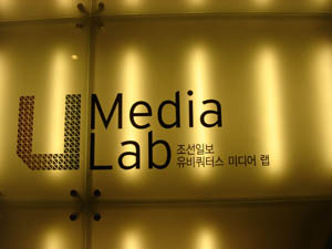
Reading Christine Boese’s anticipatory critique of the new NY Times Reader, I was reminded of something I saw last winter in Seoul at Chosun Ilbo, which is pretty much the Korean equivalent of The New York Times. Off the main lobby, the newspaper has set up an exhibition space called the “Media Lab,” where the latest prototypes from the paper’s digital technology wing are on public display. A sneak peak at the future of news.
chosunilbomedialab1.jpg chosunilbomedialab2.jpg
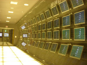
While there, I taped a demo that shows a new reading interface they’ve developed called “T-Paper,” which was supposedly slated for release this year (though I haven’t heard anything about it since). Strolling through the gallery, I found it running across a range of devices, from large flat-screen televisions to laptops, to Sony PSPs, to tiny pocket assistants. Here’s the wall display:

My first reaction was much like Chris’s: “a ‘horseless carriage’ retrenchment” — porting the artifact of the broadsheet newspaper into a digital environment. I have to admit, though, that I was slightly seduced by the zoom interface, which reminded me of this proof of a similar concept by the late interface pioneer Jef Raskin. It’s especially impressive to see it done with video. Though the Times Reader doesn’t sport anything as fancy as this, a commenter named Kevin (who I can only assume works for the Times — or Microsoft) insists that it will have much of the reader-driven functionality we would hope for (including the ability to share comments and annotations with other readers), in spite of the fact that it will be, as Chris puts it, “a walled garden.”
Kevin also refers to usability studies that suggest the Times Reader helps users “retain more information and read for longer periods.” I’ll buy longer periods — I always read more of the paper when I have it in print, and this new device certainly replicates much of the experience of print reading, while incorporating some nice new features. But still, are these proprietary, bound devices really going to replace newspapers? It seems doubtful when news consumption is such a multi-sourced affair these days (though to some extent that’s an illusion). A device that allows readers to design their news menu seems more the ticket. Maybe the Times should be thinking more in terms of branded software than proprietary hardware. Make the best news reader on the web, prominently featuring Times content, but allowing users to customize their reading experience. Keep it open and plugged in. Let the Times be your gateway to more than just the Times.
Chosun Ilbo’s vision seemed similarly constrained. As much as they tried to create a futuristic atmosphere with their Media Lab, much of the technology on display seemed, like the Times Reader, to be stuck in old mindsets — fixated more on the digital apotheosis of their product than on really grappling with the realities of the new media environment. 180px-MarshallMcLuhan.gif T-Paper also reminded of another museum piece, the British Museum’s “Turning the Pages,” which remounts famous old manuscripts like DaVinci’s journals in a fancy page-turning interface. A while back, Sally Northmore wrote a nice piece for if:book pondering this strange print-digital artifact, and what it means to electronically replicate the turning of a page. All of this recalls Marshall McLuhan’s famous observation in The Medium is the Massage:

“When faced with a totally new situation, we tend always to attach ourselves to the objects, to the flavor of the most recent past. We look at the present through a rear-view mirror. We march backwards into the future…”

Much of the disoreintation I felt while in Korea came from this feeling of time pulling in different directions. A society saturated in technology, far more wired than ours, Korea rushes headlong into the future, yet at the same time digs its heels obstinately into the past. At the end of the Korean War, Seoul was a bombed-out pit of some half million people. Now it’s a sprawling megalopolis of over 20 million, and though many centuries-old, it feels streamlined and new. There’s no “old city” in any real sense. Shiny glass towers and enormous shopping centers loom over the streets, pedestrian shopping lanes explode into jungles of neon, tiny alleys teem with life like fissures in a coral reef, and a vast network of subways rumbles beneath. And yet this dynamic scene — the swirl of steaming tripe vendors and blinking electronics — is periodically interrupted by a medieval gate or pagoda, a historic remainder sitting tranquilly amid the churn of modern life.
garagebuddha.jpg seoulneon.jpg
Spend an afternoon walking through Seoul and you’ll see the full pageant of the local techno-culture. Cell phones are clearly several generations further evolved than anything we have here in the States. People seem to be doing just about everything with their mobile devices: playing games, watching TV, surfing the web. I even saw one woman on a train using her phone’s video camera as a pocket mirror to fix her make-up. Young men spend hours tucked away in smoky, windowless internet cafes known as “PC Bangs,” playing multi-player online games that involve a quarter of the citizenry. At the same time, you are frequently reminded of Korea’s abiding infatuation with printing, paper crafts and calligraphy: stores sumptuously arrayed with handmade paper hung on racks, prodigiously plumed ink brushes hanging like icicles from the ceiling, and delicate little rice paper journals piled neatly on the shelves.
seoulbooks.jpg daegupaperrack.jpg
Mountains also serve to anchor swift-moving Seoul in time. 70 percent of the Korean peninsula is mountainous and the Seoul region is no exception. Sitting in the heart of downtown is the petite Namsan peak, surrounded by one of the city’s best-loved parks and sporting at its summit Seoul’s most recognizable landmark, Seoul Tower, a rocket ship awaiting blastoff. Facing Namsan, the snow-streaked Bugaksan peak rises over one of Seoul’s central boulevards, an avenue running through what feels like the Korean equivalent of Rockefeller Plaza, past City Hall, the big newspaper offices, the Ubiquitous Dream Hall and the Ministry of Reunification, leading to the Gyeongbok Palace, and beyond that the Presidential “Blue House,” nestled in Bugaksan’s shade.
yi.jpg yi2.jpg
Framed by the mountain, presiding over the unending traffic of Hyundais, Kias, Daewoos, and Samsungs, is an imposing statue of Admiral Yi, the famous military leader who in the late 16th century dealt a humiliating blow to the Japanese navy with the most advanced technology of his time: a fleet of armor-plated, smoke-breathing “turtle boats.”
cheonggyecheon.jpg cheonggyecheon2.jpg
Much of Seoul’s past lies beneath the modern streets, and occasionally something is unearthed and restored (or reinvented). Announced by a waterfall perpendicular to the grand boulevard is the Cheonggyecheon, an ancient stream running through the heart of the city into the countryside beyond, and which until very recently was covered over by an elevated highway. Last year, the city demolished the roadway, uncovered the stream and built a lovely sunken path alongside it cutting quietly through six miles of the city’s bustle. If you’ve ever been to Paris and walked directly along the Seine on the lower walkways, you can sort of picture this, though the Cheonggyecheon is no Seine — a small stream and a fairly narrow trench. But walking there, with the tops of buildings peeking over, an improbable calm steals over you in the heart of town.
korea street news.jpg korea street news 2.jpg
And because this reminiscence began with newspapers, take a look at these pictures. A few blocks from the waterfalls that reintroduce the Cheonggyecheon to the city after all these years, the very same newspapers that pride themselves on publishing at the cutting edge of technology still mount their daily editions, page by page, in glass cases on the street for all to read.

adobe acrobat 8 is probably not for you

Adobe just announced the release of Acrobat 8, their PDF production software. To promote it, they hosted three “webinars” on Tuesday to demonstrate some of the new features to the interested public. Your correspondent was there (well, here) to see what glimmers might be discerned about the future of electronic reading.

Who cares about Acrobat?

What does Acrobat have to do with electronic books? You’re probably familiar with Acrobat Reader: it’s the program that opens up PDFs. Acrobat is the “author” program: it lets people make PDFs. This is very important in the world of print design and publishing: probably 90% of the new printed material you see every day goes through Acrobat in some form or another. Acrobat’s not quite as ubiquitous as it once was – newer programs like Adobe InDesign, for example, let designers create PDFs that can be sent to the printer’s without bothering with Acrobat, and it’s easy to make PDFs out of anything in Mac OS X. But Acrobat remains an enormous force in the world of print design.

PDF, of course, has been presented as being a suitable format for electronic books; see here for an example. Acrobat provided the ability for publishers to lock down the PDFs that Amazon (for example) sold with DRM; publishers jumped on board. The system wasn’t successful, not least because opening the locked PDFs proved chancey: I have a couple of PDFs I bought during Amazon’s experiment selling them which, on opening, download a lot of “verification information” and then give inscrutable errors. In part because of these troubles, Amazon’s largely abandoned the format – notice their sad-looking ebook store.

Why keep an eye on Acrobat? One reason is because Acrobat 8 is Adobe’s first major release since merging with Macromedia, a union that sent shockwaves across the world of print and web design. Adobe now releases almost most significant programs used in print design. (A single exception is Quark XPress, which has been quietly rolling away towards oblivion of its own accord since around the millennium.) With the acquisition of Macromedia’s web technologies – including Flash and Dreamweaver – Adobe is inching towards a Microsoft-style monopoly of Web design. In short: where Acrobat goes is where Adobe goes; and where Adobe goes is where design goes. And where design goes is where books go, maybe.

So what does Acrobat 8 do?

Acrobat 8 provides a number of updated features that will be useful to people who do pre-press and probably uninteresting to anyone else. They’ve made a number of minor improvements – the U. S. government will be happy to know that they can now use Acrobat to redact information without having to worry about the press looking under their black boxes. You can now use Acrobat to take a bunch of documents (PDF or otherwise) and lump them together into a “bundle”. All nice things, but nothing to get excited about. More DRM than you could shake a stick at, but that’s to be expected.

HERE IS WHAT A WEBINAR LOOKS LIKEThe most interesting thing that Acrobat 8 does – and the reason I’m bringing this up here – is called Acrobat Connect. Acrobat Connect allows users to host web conferences around a document – it was what Adobe was using to hold their “webinars”. (There’s a screenshot to the right; click on the thumbnail for the full-sized image.) These conferences can be joined by anyone with an Internet connection and the Flash plugin. Pages can be turned and annotations can be made by those with sufficient privileges. Audio chatting is available, as is text-based chatting. The whole “conversation” can be recorded for future reference as a Flash-based movie file.

There are a lot of possibilities that this technology suggests: take an electronic book as your source text and you could have an electronic book club. Teachers could work their way through a text with students. You could use it to copy-edit a book that’s being published. A group of people could get together to argue about a particularly interesting blog post. Reading could become a social experience.

But what’s the catch?

There’s one catch, and it’s a big one: the infrastructure that Acrobat 8 uses: you have to use Adobe’s server, and there’s a price for that. It was suggested that chat-hosting access would be provided for $39 a month or $395 a year. This isn’t entirely a surprise: more and more software companies are trying to rope consumers into subscription-based models. This might well work for Adobe: I’m sure there are plenty of corporations that won’t balk at shelling out $395 a year for what Acrobat Connect offers (plus $449 for the software). Maybe some private schools will see the benefit of doing that. But I can’t imagine, however, that there are going to be many private individuals who will. Much as I’d like to, I won’t.

I’m not faulting Adobe for this stance: they know who butters their bread. But I think it’s worth noting what’s happening here: a divide between the technology available to the corporate world and the general public, and, more specifically, a divide that doesn’t need to exist. Though they don’t have the motive to do so, Adobe could presumably make a version of Acrobat Connect that would work on anyone’s server. This would open up a new realm of possibility in the world of online reading. Instead, what’s going to happen is that the worker bees of the corporate world will find themselves forced to sit through more PowerPoint presentations at their desks.

While a bunch of people reading PowerPoint could be seen as a social reading experience, so much more is possible. We, the public, should be demanding more out of our software.

review: the access principle

open_access.jpg
In his book “The Access Principle– The Case for Open Access to Research and Scholarship,” John Willinsky, from the University of British Columbia, tackles the idea that scholarship needs to be more open and accessible than it currently is. He offers a comprehensive and persuasive argument that covers the ethical, political and economic reasons for making scholarship accessible to both scholars and the public. He lives by his words, as a full text version is now available for download on the MIT Press website. The book is an important resource for anyone who is concerned with scholarly communicate. We were also fortunate to have his attendance at our meeting on the formulation of an scholarly press.
Many people have spoken to the situation that raising journal subscription costs and shrinking library acquisition budgets are quickly reaching their limits of feasibility, and now Willinsky provides in one place, a clear depiction of the status quo and the reasons on how it arrived there. He then takes the argument for open access deeper by widening the discussion to address the developing world and the general public.
Willinsky documents a promising trend that several large institutions including the NIH and prestigious journals such as the New England Journal of Medicine, are making their research available. They use different models releasing the research. For example, NEJM makes article accessible six months after its paid publication is released. In attempting to encourage this trend of open access to scholarly work, Willinsky devotes much of “Open Access” to document the business models of scholarly publishing and shows in detail the economic feasibility of open access publishing. He clearly maintains that making scholarship accessible is not necessarily making it free. Walking through the current economic models of academic publishing, Willinsky gives a good overview of the range of publishing models with varying degrees of accesibility. As well, he devotes an entire chapter which proposes an intriguing model of how a journal could be operated by scholars as a cooperative.
To coincide with this effort to argue for the open access of scholarship, Willinsky also works with a group of developers to create an open source and free publication platform, called the Open Journal System. The OJS provides a journal a way to reduce their costs by providing digital tools for editing, management and distribution. Although, it is clear that scholars and publishers still hold on to print as the ideal medium, even as it is becoming increasing economically infeasible to maintain. However, when the breaking point eventually comes to pass, the point in time when shrinking library budgets and raising subscription rates eventually become unworkable, viable options will fortunately already exist. A sample list of journals using OJS shows the breadth of subject matter and international use of the tool.
It is the last chapters of the book, “Reading,” “Indexing” and “History” which leave the biggest impact. In “Reading,” Willinsky explores how the way people read is already being influenced by screen-based text. Initially, the focus on digital publishing was relevant in his analysis and proposals, because the efficiencies gained by digital publishing can be used to balance the costs of accessing print publishing. However, in the shift to digital online publishing, he notes that there exists an opportunity to aid the comprehension of readers that is unrelated to the economics and ethics of access.
He uses the example of how students read a primary history text very differently than a historian reads. A historian quickly jumps from the top to bottom looking for clues concerning geography, time of the events depicted and the time document was written, in order to understand the historical context of the document. On the other hand, a student will typically read a document from start to finish, with less emphasis on building a context for the document.
Scholars’ readings of journal articles have similarities to the way historians read their source documents. Just as there are techniques to assist student of history how to read, there also ways to assist the reading of all scholarly work. Most importantly, these techniques can be integrated into the reading environment of the open and online journal. Addressing and utilizing the potential of digital and networked text, in the end, can assist the overall arguments of Willinsky. Because Willinsky comes from an education and pedagogy background, it is not surprising that he uses an “scaffolding” approach to support learning and reading. In this context, scaffolding refers to the pedagogical idea that knowledge transfer is increased when readers (or learners) are given tools and resources to support their learning experience with the main text.
Currently, there are of course features in print journal publishing to aid the reader. He cites that abstracts, footnotes and citations are ubiquitous tools to aid the reader. In the online environment, these tools can be expanded even further. While Willinsky acknowledges that open access will change the readership of scholarly publishing and that the medium must adapt for these new readers, he does not mean to say that the level of writing itself necessarily has to change. Scholars should still write to expand their field.
One very basic feature that is included the Open Journal System is the ability to comment. This simple feature has the ability to narrow the gap between author and reader. Although as far as I can tell, it is not often used. Also included, “Reading Tools” are basic but significant additions to the reading experience, currently providing supportive information by searching open access databases with author-proscribed key words. Willinsky states these tools are still undergoing development, which is not surprising because our understanding of the digital networked text is still in the formative stage as well. Because OJS is open source, it allows new feature sets to be added into the system as new forms of reading are understood and can be applied onto a large scale. Radical experimentation is not always appropriate. Just getting the journals into an online environment is a significant achievement. It is telling that the default setting for “Reading Tools” is off, although it is being used by some journals.
The chapter “Indexing,” flips the analysis to look at how online and accessibility will change how scholarship is stored, indexed and retrieved on the publisher side. Willinsky notes that in countries as Bangalore, universities cannot even afford the collected abstracts of journals, let alone subscriptions to the actual journal. However, the developing world is starting to benefit from the growing open indexes such as PubMed, ERIC, and CiteSeer.IST and HighWire.
He goes deeper into the issues of indexing by exploring how indexing of schloarly literature can be “more comprehensive, integrated and automated” while being open and accessible. Collaborative indexing is one such route to explore, which begins to blur the lines between publisher, author and reader. Willinsky has documented how fragmented current indexing service are, which leads to overlap and confusion over where journal are indexed. He aptly points out that indexing needs to evolve in step with open access because the amount of information to search vastly increases. Information that cannot located, even if it is openly accessible, has limited social value.
The Access Principle closes with a wonderful look at the historical relationship between scholarship and publishing in the aptly named chapter, “History.” In the early ears of the printing press, scholars where often found at the presses themselves, working with printers to produce their work. Once the printing press matured, a disconnect between the scholar and the press developed. Intermediaries emerged who ordered their subscription preferences and texts were sent off publishers and editors, as scholars moved further away from the physical press. Today, the shift to the digital has allowed the scholar to redevelop a closer relationship with the entire process of publishing. Blogging, print on demand, wikis, online journals and tagging tools are a few examples of how scholars now interact with “not only fonts and layout, but to the economics of distribution and access.”
It’s important that the book closes here, because it illuminates how publishing technology has always been a distruptive force on the way knowledge is stored and shared. Willinsky’s concern is to argue for open access but to also show how interrelated the digital is to that access. Further, there is the opportunity to “improve the quality and value of that access.”
Our work at the institue, including Sophie, MediaCommon, Gamer Theory, and nexttext all point to these new directions that Willinsky share, which not surprisingly make his book particularly relevant to me. However, Willinsky describes something relevant to all scholars as well.

physical books and networks 2

Much of our time here is devoted to the extreme electronic edge of change in the arena of publishing, authorship and reading. For some, it’s a more distant future than they are interested in, or comfortable, discussing. But the economics and means/modes of production of print are being no less profoundly affected — today — by digital technologies and networks.
The Times has an article today surveying the landscape of print-on-demand publishing, which is currently experiencing a boom unleashed by advances in digital technologies and online commerce. To me, Lulu is by far the most interesting case: a site that blends Amazon’s socially networked retail formula with a do-it-yourself media production service (it also sponsors an annual “Blooker” prize for blog-derived books). Send Lulu your book as a PDF and they’ll produce a bound print version, in black-and-white or color. The quality isn’t superb, but it’s cheap, and light years ahead of where print-on-demand was just a few years back. The Times piece mentions Lulu, but focuses primarily on a company called Blurb, which lets you design books with customized software called BookSmart, which you can download free from their website. BookSmart is an easy-to-learn, template-based assembly tool that allows authors to assemble graphics and text without the skills it takes to master professional-grade programs like InDesign or Quark. Blurb books appear to be of higher quality than Lulu’s, and correspondingly, more expensive.
nomadeconomics.jpg Reading this reminded me of an email I received about a month back in response to my “Physical Books and Networks” post, which looked at authors who straddle the print and digital worlds. It came from Abe Burmeister, a New York-based designer, writer and artist, who maintains an interesting blog at Abstract Dynamics, and has also written a book called Economies of Design and Other Adventures in Nomad Economics. Actually, Burmeister is still in the midst of writing the book — but that hasn’t stopped him from publishing it. He’s interested in process-oriented approaches to writing, and in situating acts of authorship within the feedback loops of a networked readership. At the same time, he’s not ready to let go of the “objectness” of paper books, which he still feels is vital. So he’s adopted a dynamic publishing strategy that gives him both, producing what he calls a “public draft,” and using Lulu to continually post new printable versions of his book as they are completed.
His letter was quite interesting so I’m reproducing most of it:

Using print on demand technology like lulu.com allows for producing printed books that are continuously being updated and transformed. I’ve been using this fact to develop a writing process loosely based upon the linux “release early and release often” model. Books that essentially give the readers a chance to become editors and authors a chance to escape the frozen product nature of traditional publishing. It’s not quite as radical an innovation as some of your digital and networked book efforts, but as someone who believes there always be a particular place for paper I believe it points towards a subtly important shift in how the books of the future will be generated.
…one of the things that excites me about print on demand technology is the possibilities it opens up for continuously evolving books. Since most print on demand systems are pdf powered, and pdfs have a degree of programability it’s at least theoretically possible to create a generative book; a book coded in such a way that each time it is printed an new result comes out. On a more direct level though it’s also very practically possible for an author to just update their pdf’s every day, allowing for say a photo book to contain images that cycle daily, or the author’s photo to be a web cam shot of them that morning.
When I started thinking about the public drafting process one of the issues was how to deal with the fact that someone might by the book and then miss out on the content included in the edition that came out the next day. Before I received my first hard copies I contemplated various ways of issuing updated chapters and ways to decide what might be free and what should cost money. But as soon as I got that hard copy the solution became quite clear, and I was instantly converted into the Cory Doctrow/Yochai Benkler model of selling the book and giving away the pdf. A book quite simply has a power as an object or artifact that goes completely beyond it’s content. Giving away the content for free might reduce books sales a bit (I for instance have never bought any of Doctrow’s books, but did read them digitally), but the value and demand for the physical object will still remain (and I did buy a copy of Benkler’s tome.) By giving away the pdf, it’s always possible to be on top of the content, yet still appreciate the physical editions, and that’s the model I have adopted.

And an interesting model it is too: a networked book in print. Since he wrote this, however, Burmeister has closed the draft cycle and is embarking on a total rewrite, which presumably will become a public draft at some later date.