
Readers of this blog will probably find much of interest in Sucking on Words, a new documentary on conceptual poet Kenneth Goldsmith. Goldsmith, as I’ve noted before, is the wizard behind the curtain at ubu.com; this documentary, by Simon Morris, focuses on his work as a conceptual poet. Like much conceptual art, Goldsmith’s work tends to make many sputteringly angry; as he himself readily admits in the film, the idea of reading it can be superior to the act of reading it, and the exploration of his work in this documentary might be the best introduction to it that’s available.
A typical Goldsmith piece is to take all the text of a day’s edition of The New York Times – all of it, from the first ad to the last – and to put it into a standard book format: viewed this way, the daily paper has the heft of a typical novel. It becomes apparent from this that when we talk about “reading” a day’s New York Times, we really only mean reading a tiny subsection of the actual text in the paper. Our act of reading the paper is as much an act of ignoring. (Nor is this limited to print media; taking a typical page on the online Times, one notes that of the 963 words on the page, only 589 are the article proper: our reading of an article online entails ignoring 2/5 of the words. This quick count pays no attention to words in images, which would send the ignored quotient higher.)
Goldsmith starts from the proposition that there’s enough language in the world already. Like many in the digital age, he’s trying to find ways to make sense of it all; in a sense, he’s creating visualizations.
Category Archives: reading
a thought experiment: reading in parallel
I recently picked up Amiri Baraka’s The Autobiography of LeRoi Jones, as I’d been curious about the trajectory of the life of LeRoi Jones/Amiri Baraka, a man who pops up in interesting places. His autobiography is a curious work: for reasons that are unclear to me as a casual reader, names in certain sections of his life have been changed. His first wife, née Hettie Cohen, becomes Nellie Kohn. Yugen, the magazine they started together, becomes Zazen; the Partisan Review becomes The Sectarian Review. As a casual reader, the reasons for these discrepancies are unclear, but they were interesting enough to me that I picked up How I Became Hettie Jones, his first wife’s version of her life. She presents many of the same scenes Baraka narrates, with her own spin on events, a difference that might not be unexpected in the narration of a divorced couple.
The changes in names are an extreme example, but the basic situation is not one that uncommon in how we read: two books share the same subject matter but differ in particulars. As noted, I read the two books in series as a casual reader, but I found myself wishing there were some way to visualize the linkages or correspondences between the books. One could write in the margins of Baraka’s description of a party “cf. Jones pp. 56–57” to point out Hettie Jones’s version of events, but it strikes me that electronic representations of a book could do this better. What I’d like to see, though, isn’t something as simple as a hyperlink; these links should point both ways automatically. Different kinds of links – showing, for example, similarities and differences – might help. Presenting the texts side by side seems obvious; lines could be drawn between the texts. The problem could be expanded: consider comparing and contrasting a Harry Potter book with its film version.
This isn’t an especially complex reading behavior at all: we compare texts (of different sorts) all the time. We look at, for example, how Rudolph Giuliani reads the statistics on survival of prostate cancer and how the New York Times reads the same statistics. Why aren’t there online reading tools that acknowledge this as a problem?
unbound reader
CommentPress, be it remembered, is a blog hack. A fairly robust one to be sure, and one which we expect to get significant near-term mileage out of, but still an adaptation of a relatively brittle publishing architecture. BookGlutton – ?a new community reading site that goes public beta next month – ?takes a shot at building social reading tools from scratch, and the first glimpses look promising. I’m still awaiting my beta tester account so it’s hard to say how well this actually works (and whether it’s Flash-based or Ajax-driven etc.), but a demo on their development blog walks through most of the social features of their browser-based “Unbound Reader.” They seem to have gotten a lot right, but I’m still curious to see how, if at all, they handle multimedia and interlinking between and within books. We’ll be watching this one closely…..Also, below the video, check out some explanatory material by BookGlutton’s creators, Aaron Miller and Travis Alber, that was forwarded to us the other day.
The first, the main BookGlutton website, is a catalog and community where users can upload work or select a piece of public domain writing, create reading groups and tag literature. The second part of the site – its centerpiece – is the Unbound Reader. It has a web-based format where users can read and discuss the book right inside the text. The Unbound Reader uses “proximity chat,” which allows users to discuss the book with other readers close to them in the text (thus focusing discussion, and, as an added benefit, keeping people from hearing about the end). It also has shared annotations, so people can leave a comment on any paragraph and other readers can respond. By encouraging users to talk in a context-specific way about what they’re reading, Bookglutton hopes to help those who want to talk about books (or original writing) with their friends (across cities, for example), students who want to discuss classic works (perhaps for a class), or writers who want to get feedback on their own pieces. Naturally, when the conversation becomes distracting, a user can close off the discussion without exiting the Reader.
Additionally, BookGlutton is working to facilitate adoption of on-line reading. Book design is an important aspect of the reader, and it incorporates design elements, like dynamic dropcaps. Moreover, the works presented in the catalog are standards-based (BookGlutton is an early adopter of the International Digital Publishing Forum’s .epub format for ebooks), and allows users to download a copy of anything they upload in this format for use elsewhere.
of forests and trees
On Salon Machinist Farhad Manjoo considers the virtues of skimming and contemplates what is lost in the transition from print broadsheets to Web browsers:
It’s well-nigh impossible to pull off the same sort of skimming trick on the Web. On the Times site, stories not big enough to make the front page end up in one of the various inside section pages — World, U.S., etc. — as well as in Today’s Paper, a long list of every story published that day.
But these collections show just a headline and a short description of each story, and thus aren’t nearly as useful as a page of newsprint, where many stories are printed in full. On the Web, in order to determine if a piece is important, you’ve got to click on it — and the more clicking you’re doing, the less skimming.
Manjoo notes the recent Poynter study that used eye-tracking goggles to see how much time readers spent on individual stories in print and online news. The seemingly suprising result was that people read an average of 15% more of a story online than in print. But this was based on a rather simplistic notion of the different types of reading we do, and how, ideally, they add up to an “informed” view of the world.
On the Web we are like moles, tunneling into stories, blurbs and bliplets that catch our eye in the blitzy surface of home pages, link aggregators, search engines or the personalized recommendation space of email. But those stories have to vie for our attention in an increasingly contracted space, i.e. a computer screen -? a situation that becomes all the more pronounced on the tiny displays of mobile devices. Inevitably, certain kinds of worthy but less attention-grabby stories begin to fall off the head of the pin. If newspapers are windows onto the world, what are the consequences of shrinking that window to the size of an ipod screen?
This is in many ways a design question. It will be a triumph of interface design when a practical way is found to take the richness and interconnectedness of networked media and to spread it out before us in something analogous to a broadsheet, something that flattens the world into a map of relations instead of cramming it through a series of narrow hyperlinked wormholes. For now we are trying to sense the forest one tree at a time.
booker shortlist set free
CORRECTION: a commenter kindly points out that the Times jumped the gun on this one. What follows is in fact not true. Further clarification here.
The Times of London reports that the Man Booker Prize soon will make the full text of its winning and shortlisted novels free online. Sounds as though this will be downloads only, not Web texts. Unclear whether this will be in perpetuity or a limited-time offer.
Negotiations are under way with the British Council and publishers over digitising the novels and reaching parts – particularly in Africa and Asia – that the actual books would not otherwise reach.
Jonathan Taylor, chairman of The Booker Prize Foundation, said that the initiative was well advanced, although details were still being thrashed out.
The downloads will not impact on sales, it is thought. If readers like a novel tasted on the internet, they may just be inspired to buy the actual book.
doris lessing wins the nobel prize
Given this morning’s announcement i could kick myself for not having written up this post weeks ago. each summer i choose an “important book” to read on my vacation. this year i decided to re-read The Golden Notebook. When I first read it, in 1970 the women’s movement was just taking off and i devoured it hungrily looking for understanding into the sea change that was roiling all our lives. Reading it this summer was a revelation on many levels. i’ll write a longer post after the Really Modern Library meetings explaining this in some detail and also some of the interesting ideas i’ve got about how we might “read” this novel in a networked environment.
penguin enlists amazon reviewers to sift fiction slush pile
In an interesting mashup of online social filtering and old-fashioned publishing, Penguin, Amazon and Hewlett Packard have joined forces to present a new online literary contest, the Amazon Breakthrough Novel Award. From the NY Times:
From today through Nov. 5, contestants from 20 countries can submit unpublished manuscripts of English-language novels to Amazon, which will assign a small group of its top-rated online reviewers to evaluate 5,000-word excerpts and narrow the field to 1,000. The full manuscripts of those semifinalists will be submitted to Publishers Weekly, which will assign reviewers to each. Amazon will post the reviews, along with excerpts, online, where customers can make comments. Using those comments and the magazine’s reviews, Penguin will winnow the field to 100 finalists who will get two readings by Penguin editors. When a final 10 manuscripts are selected, a panel including Elizabeth Gilbert, the author of the current nonfiction paperback best seller “Eat, Pray, Love,” and John Freeman, the president of the National Book Critics Circle, will read and post comments on the novels at Amazon. Readers can then vote on the winner, who will receive a publishing contract and a $25,000 advance from Penguin.
eeeeeeeeeee…..eeeeeeee…eeeee

Moby Dick Chapter 55 or 9200 times E”, 2004, graphite on hemp paper, 11 x 9″
In one of those odd, blogospheric delayed reactions, I just came across (via Information Aesthetics, via Kottke) a fabulous exhibit that took place this past March by an artist named Justin Quinn, who does beautiful, mysterious work with text. Quinn’s Moby-Dick series is made up of obsessively detailed prints and graphite drawings composed entirely of the letter E. Each E corresponds to a letter in a chapter of Melville’s book, so each piece is composed of literally thousands of characters. The effect is almost that of a mosaic or a concrete poem. This series was shown at MMGalleries in San Francisco and has since moved elsewhere (Miami possibly?), but there are still a number of images online (also here). Quinn explains his obsession with E:
The distance between reading and seeing has been an ongoing interest for me. Since 1998 I have been exploring this space through the use of letterforms, and have used the letter E as my primary starting point for the last two years. Since E is often found at the top of vision charts, I questioned what I saw as a familiar hierarchy. Was this letter more important than other letters? E is, after all, the most commonly used letter in the English language, it denotes a natural number (2.71828), and has a visual presence that interests me greatly. In my research E has become a surrogate for all letters in the alphabet. It now replaces the other letters and becomes a universal letter (or Letter), and a string of Es now becomes a generic language (or Language). This substitution denies written words their use as legible signifiers, allowing language to become a vacant parallel Language -? a basis for visual manufacture.
After months of compiling Es into abstract compositions through various systemic arrangements, I started recognizing my studio time as a quasi-monastic experience. There was something sublime about both the compositions that I was making and the solitude in which they were made. It was as if I were translating some great text like a subliterate medieval scribe would have years ago – ?with no direct understanding of the source material. The next logical step was to find a source. Herman Melville’s novel Moby Dick, a story rich in theology, philosophy, and psychosis provides me with a roadmap for my work, but also with a series of underlying narratives. My drawings, prints, and collages continue to speak of language and the transferal of information, but now as a conduit to Melville’s sublime narratives.
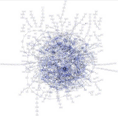
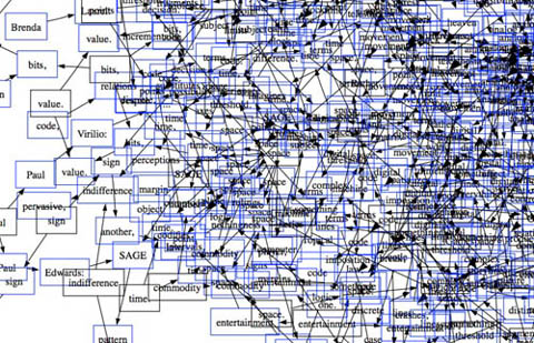
Gazing at these for a while (digital reproductions of course… and on my browser… and brought to my attention through technology blogs), I couldn’t help but start to draw some connections between Quinn’s work and computers. There’s plenty of digital artwork and visualization programs that render text into complex visual formations, sometimes with the intention of discovering new meanings and relationships, other times purely to play with form. Every now and then, someone manages to achieve both. This is a detail from Brad Paley’s rendering of Gamer Theory through his program Text Arc:
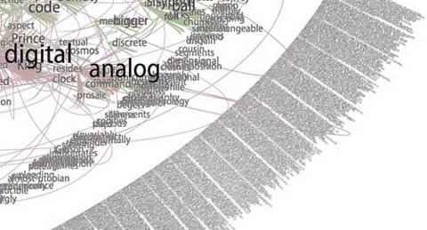
Others can be beautiful to handle, but are ultimately opaque, like Ben Fry’s “Valence”:
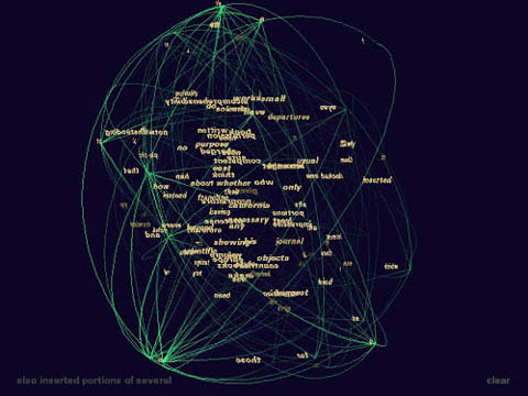
These two images are from another work submitted to our Gamer Theory visualization gallery, a map of nouns and verbs in Wark’s text (first is full, second is a detail). It’s pretty, but basically meaningless.
Quinn’s work is also difficult to penetrate, but something about it holds my attention. I’m not sure how aware Quinn is of the digital work being done today, but viewing his pieces against the contemporary technological backdrop, and his own self-described feeling of being the “subliterate medieval scribe” as he makes his minute articulations, my mind runs off in a number of directions. Seeing that his work is in a way “pixelated” – ?his Es a “basis for visual manufacture” – ?I imagine him as a sort of human computer – ?a monastic machine – ?processing (or intuiting) the text by infintessimal degrees through his own inner algorithm.
After all, a computer’s work is “subliterate.” Algorithms must be designed with intelligence, but the actual running of the program is physical, mindless. Viewed this way, Quinn’s work is like a dive into the mania of operations usually carried out with blazing speed by microprocessors. This is not to diminish it, or to call it cold and mechanical. Rather I’m pondering whether there is perhaps a spiritual dimension to the repetitive, sub-rational activities of our machines, which, if transposed to human scale, can become a sort of devotional exercise, like the routines of Buddhist monks, endlessly painting and carving Chinese characters in order to empty their minds (other links between monks and computers here and here).
What’s particularly evocative to me about the work, however, is how it treads the line between that meditative quality and the obsessive. There is something frightening about them (or about any kind of fanatically detailed artwork, or about computers for that matter), like the reams of psychotic babble typed out ceaselessly by Jack Nicholson in “The Shining.” Or is it Ahab’s vengeance algorithm we’re seeing, running on overdrive until the machine (or ship) crashes?
In the end, Quinn’s images are mysterious, his algorithm inscrutable, although my mind immediately goes to work trying to link up Melville’s themes and images to those endless strings of Es.
Here’s that first image again with a quote from the source text that seemed to me to connect. Chapter 55, “Of the Monstrous Pictures of Whales”:
Moby Dick Chapter 55 or 9200 times E”, 2004, graphite on hemp paper, 11 x 9″
But these manifold mistakes in depicting the whale are not so very surprising after all. Consider! Most of the scientific drawings have been taken from the stranded fish; and these are about as correct as a drawing of a wrecked ship, with broken back, would correctly represent the noble animal itself in all its undashed pride of hull and spars. Though elephants have stood for their full-lengths, the living Leviathan has never yet fairly floated himself for his portrait. The living whale, in his full majesty and significance, is only to be seen at sea in unfathomable waters; and afloat the vast bulk of him is out of sight, like a launched line-of-battle ship; and out of that element it is a thing eternally impossible for mortal man to hoist him bodily into the air, so as to preserve all his mighty swells and undulations.
This one is of chapter 71, “The Jeroboam’s Story” (I spoke briefly on the phone with one of the curators who told me that Quinn had explained this as an inverted halo, reflecting the anti-Christ-like character described in the chapter – ?I almost see an aerial view of a whale cutting through water):

Moby Dick Chapter 71 or 9,814 times E”, 2006, mixed media, 11 x 15″
…but straightway upon the ship’s getting out of sight of land, his insanity broke out in a freshet. He announced himself as the archangel Gabriel, and commanded the captain to jump overboard. He published his manifesto, whereby he set himself forth as the deliverer of the isles of the sea and vicar-general of all Oceanica. The unflinching earnestness with which he declared these things; – the dark, daring play of his sleepless, excited imagination, and all the preternatural terrors of real delirium, united to invest this Gabriel in the minds of the majority of the ignorant crew, with an atmosphere of sacredness. Moreover, they were afraid of him. As such a man, however, was not of much practical use in the ship, especially as he refused to work except when he pleased, the incredulous captain would fain have been rid of him; but apprised that that individual’s intention was to land him in the first convenient port, the archangel forthwith opened all his seals and vials – devoting the ship and all hands to unconditional perdition, in case this intention was carried out. So strongly did he work upon his disciples among the crew, that at last in a body they went to the captain and told him if Gabriel was sent from the ship, not a man of them would remain.
cellphone fiction in japan
 Peter Brantley points to an interesting WSJ piece (free) on the explosion of Japanese cellphone fiction. These are works, often the length of novels, composed specifically for consumption via the phone’s tiny screen. In some cases, they are even written on the phone. Stories are written in terse, unadorned language, in chunks crafted specifically to fit on a single mobile screen. Dialog is favored heavily over narrative description, and from the short excerpts I’ve read, the aim seems to be to conjure cinematic imagery with the greatest economy of words. The WSJ reproduces this passage from Satomi Nakamura’s “To Love You Again”:
Kin Kon Kan Kon (sound of school bell ringing)
(space)
The school bell rang
(space)
“Sigh. We’re missing class”
(space)
She said with an annoyed expression.
This novel clocks in at 200 pages, and was written entirely with Nakamura’s thumb!
About seven years ago, some of these works started making their way into print, initially through self-publishing websites like Maho i-Land. But the popularity of mobile novels soon caught the attention of mainstream publishers and numerous titles have been made into bona fide hits in print, some selling into the millions, with film adaptations, the whole bit.
But if any industry lesson can be taken from this mini case study of Japanese cellphone fic, it’s not the potential for crossover into print, but that emergent electronic literary forms will most likely find their economic model in services and subscriptions rather than in the sale of copies. The WSJ article suggests that the mobile lit genre exploded in Japan in no small part due to recent changes in service options from cellular providers.
About three years ago, phone companies began offering high-speed mobile Internet and affordable flat-rate plans for transmitting data. Users could then access the Internet as much as they wanted to for less than $50 a month.
The now-bustling Maho i-Land has six million members, and the number of mobile novels on its site has jumped, to more than a million today from about 300,000 before the flat-rate plans cut phone bills in half. According to industrywide data cited by Japan’s largest cellphone operator NTT DoCoMo Inc., sales from mobile-book and comic-book services are expected to more than double, to more than $200 million from about $90 million last year.
This would suggest that at least part of the reason cellphone novels haven’t taken off here in the States is the comparatively impoverished service we get from our mobile providers, and the often extortionist rates we pay. True, the mobile lit genre was already a phenomenon there before the rejiggering of service plans, which suggests there were preexisting cultural conditions that led to the emergence of the form: readers’ already well developed appetites for serial comics perhaps, or the peculiar intensity of keitai fetishism. In other words, improved telcom services in the States wouldn’t necessarily translate into a proliferation of cellphone novels, but other mobile media services would undoubtedly start to flourish. Broadband internet access is also pathetically slow in the US compared to countries in Europe and East Asia – ?the Japanese get service eight to 30 times faster than what we get over here. What other new media forms are being stifled by the crappiness of our connections?
commentpress in the classroom 2
There are a couple of nice classroom implementations of CommentPress that I wanted to share, one that we set up by request, another done independently.
1. The first is an edition of Dante’s Inferno (Longfellow translation) for a literature seminar at the Pacific Northwest College of Art, “The Seven Deadly Sins,” taught by Trevor Dodge.
2. The second is “Man-Computer Symbiosis,” a seminal text in the history of computing by J.C.R. Licklider for a Harvard History of Science course, “Introduction to the History of Software and Networks”. This was brought to my attention by the teacher, Christopher Kelty, a professor of anthropology at Rice University, who is teaching this term at Harvard.
It’s still early in the semester but you can already see a substantial amount of discussion unfolding on both sites (be sure to use the “Browse Comments” navigation on the right sidebar to get a sense of where in the document discussion is happening, and who is participating). Kelty in particular encourages other knowledgeable readers from around the Web to make use of the Licklider text.