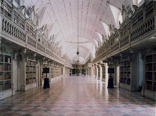
The photographs of libraries in “Portugal,” the current exhibition of Candida Höfer at Sonnabend, show libraries as venerable places where precious objects are stored.

The large format that characterizes Höfer’s photographs of public places, the absence of people, and the angle from which she composes them, invite the viewer “to enter” the rooms and observe. Photography is a silent medium and in Höfer’s libraries this is magnified, creating that feeling of “temple of learning” with which libraries have often been identified. On the other hand, the meticulous attention to detail, hand-painted porcelain markers, ornately carved bookcases, murals, stained glass windows, gilt moldings, and precious tomes are an eloquent representation of libraries as palaces of learning for the privileged. In spite of that, and ever since libraries became public spaces, anyone, in theory, has access to books and the concept of gain or monetary value rarely enters the user’s mind.
Libraries are a book lover’s paradise, a physical compilation of human knowledge in all its labyrinthine intricacy. With digitization, libraries gain storage capacity and readers gain accessibility, but they lose both silence and awe. Even though in the digital context, the basic concept of the library as a place for the preservation of memory remains, for many “enlightened” readers the realization that human memory and knowledge are handled by for-profit enterprises such as Google, produces a feeling of merchants in the temple, a sense that the public interest has fallen, one more time, into private hands.
As we well know, the truly interesting development in the shift from print to digital is the networked environment and its effects on reading and writing. If, as Umberto Eco says, books “are machines that provoke further thoughts” then the born-digital book is a step toward the open text, and the “library” that eventually will hold it, a bird of different feather.
Category Archives: museum
carbon and silver
 Carbon and Silver is a small show of Walker Evans‘ 1935-36 photographs at the UBS gallery in New York. The purpose of this exhibit is to compare printing technologies. It focuses primarily on ink-jet prints in relation to gelatin silver prints, with a small sample of books side by side with their digitally printed counterparts, revealing how lithography literally pales next to the crispness of the digital.
The show invites meditations on the “authenticity” of reproductions, especially in a medium such as photography, in itself based upon printing technology. In this show it is quite difficult to discern the original from the copy, and one questions, as Baudrillard would have it, to which point the copy has come to replace the original.
 Most of the prints exhibited at the UBS belong to Evans’ body of work documenting the effect of the Great Depression on rural families for the Farm Security Administration in 1935-36. As a photographer, he was not particularly interested in producing his own prints as his main interest was to record information. These photographs were originally printed by the FSA as visual evidence reinforcing the New Deal.
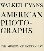
Evans’ own interpretation of them appeared in American Photographs, the book that accompanied his exhibition at the Museum of Modern art (the first one-man photography show ever mounted by a major museum.) John T. Hill says in this exhibition’s catalogue that Evans “scrupulously controlled corrections of the printing plates, and using this process as an extension of his darkroom became a habit.” The interesting thing is that he understood that the book has a permanence that the exhibition does not.
Evans’ photographs have such crispness that they lend themselves to reproduction, even when the print is less than perfect. As a master of his medium he was absolutely aware of the difficulties of rendering full tonal scale in a black and white print. The ink-jet prints in this show are so remarkably close to their gelatin silver sisters that the viewer has to go back and forth from print to print in order to discern any possible difference. Evans loved the detail that an enlarged print brings out and the enlarged digital prints in this exhibition certainly do that.
Hill sums up the advantages of technology without denigrating the magnificence of the original process:
All new media affect voice and timbre. A greater tonal scale and more precise control of values are the two most significant tools offered by digital technology. The information so difficult to maintain in the dark and light ends of the scale using gelatin silver materials is now printable. Gelatin silver has been replaced by carbon black pigments laid onto archival paper. The music is the same; certain subtle notes are now heard more clearly.
flickr as virtual museum
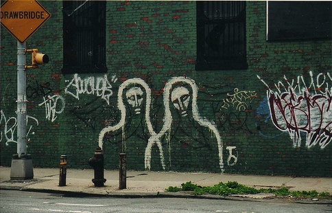
A local story. The Brooklyn Museum has been availing itself of various services at Flickr in conjunction with its new “Grafitti” exhibit, assembling photo sets and creating a group photo pool. In addition, the museum welcomes anyone to contribute photographs of grafitti from around Brooklyn to be incorporated into the main photo stream, along with images of a growing public grafitti mural on-site at the museum where visitors can pick up a colored pencil and start scribbling away. Here’s a picture from the first week of the mural:
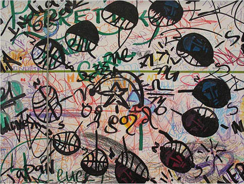
This is an interesting case of a major cultural institution nurturing an outer curatorial ring to complement, and even inform, a central exhibit (the Institute conducted a similar experiment around Christo’s Gates installation in Central Park, 2005). It’s especially well suited to a show about grafitti, which is already a popular subject of amateur street photography. The museum has cleverly enlisted the collective eyes of the community to cover a terrain (a good chunk of the total surface area of Brooklyn) far too vast for any single organization to fully survey. (The quip has no doubt already been made that users be sure not forget to tag their photos.)
Thanks, Alex, for pointing this out.
on appropriation
The Tate Triennial 2006, showcasing new British Art, brings together thirty-six artists who explore the reuse and reshaping of cultural material. Curated by Beatrix Ruf, director of the Kunsthalle in Zurich, the exhibition includes artists from different generations who explore reprocessing and repetition through painting, drawing, sculpture, photography, film, installations and live work.
Historically, the appropriation of images and other cultural matter has been practiced by societies as the reiteration, reshuffling, and eventual transformation of artistic and intellectual human manifestations. It covers a vast range from tribute to pastiche. When visual codes are combined, the end product is either a cohesive whole where influences connect into new and very personal languages, or disparate combinations where influences compete and clash. In today’s art, the different guises of repetition, from collage and montage to file sharing and digital reproduction highlight the existing codes or reveal the artificiality of the object. Today’s combination of codes alludes to a collective sense of memory in a moment when memories have become literally photographic.
One comes out of this exhibition thinking about Duchamp‘s “readymades,” Rauschenberg’s “combines,” and other forms of conceptual “gluing,” (the literal meaning of the word “collage,”) as precursors and/or manifestations of the postmodern condition. This show is a perfect representation of our moment. As Beatrix Ruf says in the catalogue: “Artists today are forging new ways of making sense of reality, reworking ideas of authenticity, directness and social relevance, looking again into art practices that emerged in the previous century.”
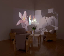
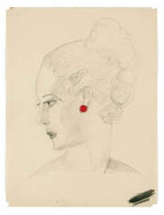
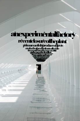
We have artists like Michael Fullerton, who paints contemporary figures in the style of Gainsborough, or Luke Fowler‘s use of archive material to explore the history of Cornelius Cardew’s Scratch Orchestra. Repetition goes beyond inter-referentiality in the work of Marc Camille Chaimowicz, who combines works he made in the 70s with projected images of himself as a young man and as an adult, within a space where a vase of flowers set on a Marcel Breuer’ table and a pendulum swinging back and forth position the images of the past solidly in the present. In “Twelve Angry Women,” Jonathan Monk affixes to the wall twelve found drawings by an unknown artist from the 20s, using different colored pins that work as earrings. Mark Leckey uses Jeff Koons’ silver bunny as a mirror into his studio in the way 17th century masters painted theirs. Liam Gillick creates sculptures of hanging texts made out of factory signage.
Art itself is cumulative. Different generations build upon previous ones in a game of action and reaction. One interesting development in art today is the collective. Groups of artists coming together in couples, teams, or cyberspace communities, sometimes under the identity of a single person, sometimes a single person assuming a multiple identity. Collectives seem to be a new phenomenon, but their roots go back to the concept of workshops in antiquity where artistic collaboration and copying from casts of sculptural masterpieces was the norm. The notion of the individual artist producing radically new and original art belongs to modernity. The return to collectives in the second part of the 20th century, and again now, has a lot to do with the nature of representation, with the desire to go beyond the limits of artistic mimesis or individual interpretation.
On the other hand, appropriation as a form of artistic expression is a postmodern phenomenon. Appropriation is the language of today. Never before the advent of the Internet had people appropriated knowledge, spaces, concepts, and images as we do today. To cite, to copy, to remix, to modify are part of our everyday communication. The difference between appropriation in the 70s and 80s and today resides in the historical moment. As Jean Verwoert says in the Triennial 2006 catalogue:
The standstill of history at the height of the Cold War had, in a sense, collapsed the temporal axis and narrowed the historical horizon to the timeless presence of material culture, a presence that was exacerbated by the imminent prospect that the bomb could wipe everything out at any time. To appropriate the fetishes of material culture, then, is like looting empty shops at the eve of destruction. It is the final party before doomsday. Today, on the contrary, the temporal axis has sprung up again, but this time a whole series of temporal axes cross global space at irregular intervals. Historical time is again of the essence, but this historical time is not the linear or unified timeline of steady progress imagined by modernity: it is a multitude of competing and overlapping temporalities born from the local conflicts that the unresolved predicaments of the modern regimes still produce.
Today, the challenge is to rethink the meaning of appropriation in a moment when capitalist commodity culture has become the determinant of our daily lives. The Internet is perhaps our potential Utopia (though “dystopian” seems to be the adjective of choice now.) But, can it be called upon to fulfill the unfulfilled promises of 20th century’s utopias? To appropriate is to resist the notion of ownership, to appropriate the products of today’s culture is to expose the unresolved questions of a world shaped by the information era. The disparities between those who are entering the technology era and those forced to stay in the times of early industrialization are more pronounced than ever. As opposed to the Cold War, where history was at a standstill, we live in a time of extreme historicity. Permanence is constantly challenged, how to grasp it all continues to be the elusive task.
who really needs to turn the pages?
The following post comes from my friend Sally Northmore, a writer and designer based in New York who lately has been interested in things like animation, video game theory, and (right up our alley) the materiality of books and their transition to a virtual environment. A couple of weeks ago we were talking about the British Library’s rare manuscript digitization project, “Turning the Pages” — something I’d been meaning to discuss here but never gotten around to doing. It turns out Sally had some interesting thoughts about this so I persuaded her to do a brief write-up of the project for if:book. Which is what follows below. Come to think of it, this is especially interesting when juxtaposed with Bob’s post earlier this week on Jefferson Han’s amazing gestural interface design. Here’s Sally… – Ben
The British Library’s collaboration with multimedia impresarios at Armadillo Systems has led to an impressive publishing enterprise, making available electronic 3-D facsimiles of their rare manuscript collection.
“Turning the Pages”, available in CD-ROM, online, and kiosk format, presents the digital incarnation of these treasured texts, allowing the reader to virtually “turn” the pages with a touch and drag function, “pore over” texts with a magnification function, and in some cases, access extras such as supplementary notes, textual secrets, and audio accompaniment.
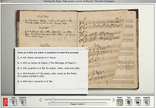
Pages from Mozart’s thematic catalogue — a composition notebook from the last seven years of his life. Allows the reader to listen to works being discussed.
The designers ambitiously mimicked various characteristics of each work in their 3-D computer models. For instance, the shape of a page of velum turning differs from the shape of a page of paper. It falls at a unique speed according to its weight; it casts a unique shadow. The simulation even allows for a discrepancy in how a page would turn depending on what corner of the page you decide to peel from.
Online visitors can download a library of manuscripts in Shockwave although these versions are a bit clunkier and don’t provide the flashier thrills of the enormous touch screen kiosks the British Library now houses.

Mercator’s first atlas of Europe – 1570s
Online, the “Turning the Pages” application forces you to adapt to the nature of its embodiment–to physically re-learn how to use a book. A hand cursor invites the reader to turn each page with a click-and-drag maneuver of the mouse. Sounds simple enough, but I struggled to get the momentum of the drag just right so that the page actually turned. In a few failed attempts, the page lifted just so… only to fall back into place again. Apparently, if you can master the Carpal Tunnel-inducing rhythm, you can learn to manipulate the page-turning function even further, grabbing multiple of pages at once for a faster, abridged read.
The value of providing high resolution scans of rare editions of texts for the general public to experience, a public that otherwise wouldn’t necessarily ever “touch” say, the Lindisfarne Gospels, doesn’t go without kudos. Hey, democratic right? Armadillo Systems provides a list of compelling raisons d’être on their site to this effect. But the content of these texts is already available in reprintable (democratic!) form. Is the virtual page-turning function really necessary for greater understanding of these works, or a game of academic scratch-n-sniff?
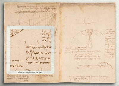
The “enlarge” function even allows readers to reverse the famous mirror writing in Leonardo da Vinci’s notebooks
At the MLA conference in D.C. this past December, where the British Library had set up a demonstration of “Turning the Pages”, this was the question most frequently asked of the BL’s representative. Who really needs to turn the pages? I learned from the rep’s response that, well, nobody does! Scholars are typically more interested studying the page, and the turning function hasn’t proven to enhance or revive scholarly exploration. And surely, the Library enjoyed plenty of biblio-clout and tourist traffic before this program?
But the lure of new, sexy technology can’t be underestimated. From what I understood, the techno-factor is an excellent beacon for attracting investors and funding in multimedia technology. Armadillo’s web site provides an interesting sales pitch:
By converting your manuscripts to “Turning the Pages” applications you can attract visitors, increase website traffic and add a revenue stream – at the same time as broadening access to your collection and informing and entertaining your audience.
The program reveals itself to be a peculiar exercise, tangled in its insistence on fetishizing aspects of the material body of the text–the weight of velum, the karat of gold used to illuminate, the shape of the binding. Such detail and love for each material manuscript went into this project to recreate, as best possible, the “feel” of handling these manuscripts.
Under ideal circumstances, what would the minds behind “Turning the Pages” prefer to create? The original form of the text–the “alpha” manuscript–or the virtual incarnation? Does technological advancement seduce us into valuing the near-perfect simulation over the original? Are we more impressed by the clone, the “Dolly” of hoary manuscripts? And, would one argue that “Turning the Pages” is the best proxy for the real thing, or, another “thing” entirely?
ubu, king again
It’s nice to see that UbuWeb, the great public web library of the avant garde, is back online after “a long summer of rebuilding.” At times when the web feels depressingly shallow, Ubu can be the perfect medecine. Among the many masterworks you will find is Samuel Beckett’s “Film” (1965), starring a very old Buster Keaton. It’s wonderful that anyone can watch this online (I’ve just spent half an hour in its thrall).
Also worth checking out are /ubu Editions – handsomely designed electronic texts ranging across an interesting selection of poetry, prose and theatre, including Ron Silliman’s “The Chinese Notebook,” which Dan blogged about a couple weeks back. These, like everything else on Ubu, are free.
hacking nature

Slate is trying something new with its art criticism: a new “gallery” feature where each month an important artist will be discussed alongside a rich media presentation of their work.
…we’re hoping to emphasize exciting new video and digital art–the kind of art that is hard to reproduce in print magazines.
For their first subject, they don’t push the print envelope terribly far (just a simple slideshow), but they do draw attention to some stunning work by Canadian photographer Edward Burtynsky, who (happily for us New Yorkers) has shows coming this week to the Brooklyn Museum and the Charles Cowles Gallery in Manhattan. Burtynsky documents landscapes bearing the mark of extreme human exploitation – the infernal streams flowing from nickel mines, junked ocean liners rusting in chunks on the beach, abandoned quarries ripe with algae in their cubic trenches, and an arresting series from recent travels through China’s industrial belt.
These photographs carry startling information through the image-surplussed web. But Burtynsky disappoints in one vital, perhaps deciding, respect:
…his position on the moral and political implications of his work is studiously neutral. He doesn’t point fingers or call for change; instead, he accepts industry’s exploitation of the land as the inevitable result of modern progress. “We have extracted from the land from the moment we stood on two feet,” he said in an interview in the exhibition catalog. “The entire 20th century has been a revving up of this large consumptive engine. It’s not a question of whether we are going to stop consuming. It’s not going to happen…”
As someone who believes that struggling to prevent (or at least mitigate) global ecological disaster should be the transcending narrative of our times, I find Burtynsky’s detachment deeply depressing and self-defeating. His images glory in the sick beauty of these ravaged scenes, and the cultural consumers that will no doubt pay large sums for these photographs at his upcoming Chelsea show only compound the cynicism.

