People have done all sorts of interesting things with Google maps, but this one I particularly like. Maplib lets you upload any image (the larger and higher res the better) into the Google map interface, turning the picture into a draggable, zoomable and annotatable terrain — a crude mashup tool that nonetheless suggests new spacial ways of navigating text.
I did a quick and dirty image mapping of W.H. Auden’s “Musee des Beaux Arts” onto Breughel’s “Landscape with the Fall of Icarus,” casting the shepherd as poet. Click the markers and then the details links to read the poem (hint: start with the shepherd).
As you can see, they give you the code to embed image maps on other sites. You can post comments on the individual markers right here on if:book, or if you go to the Maplib site itself you can add your own markers.
I quite like this one that someone uploaded of a southerly view of the Italian peninsula (unfortunately it seems to start larger images off-center):
And here’s an annotated Korean barbecue (yum):
Category Archives: map
some thoughts on mapping
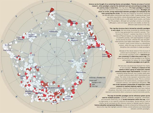
Mapping is a useful abstraction for exploring ideas, and not just for navigation through the physical world. A recent exhibit, Places & Spaces: Mapping Science, (at the New York Public Library of Science, Industry, and Business), presented maps that render the invisible path of scientific progress using metaphors of cartography. The maps ranged in innovation: there were several that imitated traditional geographical and topographical maps, while others created maps based on nodal presenation—tree maps and hyperbolic radial maps. Nearly all relied on citation analysis for the data points. Two interesting projects: Brad Paley’s TextArc Visualization of “The History of Science”, which maps scientific progress as described in the book “The History of Science”; and Ingo Gunther’s Worldprocessor Globes, which are perfectly idiosyncratic in their focus.
But, to me, the exhibit highlighted a fundamental drawback of maps. Every map is an incomplete view of an place or a space. The cartographer makes choices about what information to include, but more significantly, what information to leave out. Each map is a reflection of the cartographer’s point of view on the world in question.
Maps serve to guide—whether from home to a vacation house in the next state, or from the origin of genetic manipulation through to the current replication practices stem-cell research. In physical space, physical objects circumscribe your movement through that space. In mental space, those constraints are missing. How much more important is it, then, to trust your guide, and understand the motivations behind your map? I found myself thinking that mapping as a discipline has the same lack of transparency as traditional publishing.
How do we, in the spirit of exploration, maintain the useful art of mapping, yet expand and extend mapping for the networked age? The network is good at bringing information to people, and collecting feedback. A networked map would have elements of both information sharing, and information collection, in a live, updateable interface. Jeff Jarvis has discussed this idea already in his post on networked mapping. Jarvis proposes mashing up Google maps (or open street map) with other software to create local maps, by and for the community.
This is an excellent start (and I hope we’ll see integration of mapping tools in the near future), but does this address the limitations of cartographic editing? What I’m thinking about is something less like a Google map, and more like an emergent terrain assembled from ground-level and satellite photos, walks, contributed histories, and personal memories. Like the Gates Memory Project we did last year, this space would be derived from the aggregate, built entirely without the structural impositions of a predetermined map. It would have a Borgesian flavor; this derived place does not have to be entirely based on reality. It could include fantasies or false memories of a place, descriptions that only exists in dreams. True, creating a single view of such a map would come up against the same problems as other cartographic projects. But a digital map has the ability to reveal itself in layers (like old acetate overlays did for elevation, roads, and buildings). Wouldn’t it be interesting to see what a collective dreamscape of New York looked like? And then to peel back the layers down to the individual contributions? Instead of finding meaning through abstraction, we find meaningful patterns by sifting through the pile of activity.
We may never be able to collect maps of this scale and depth, but we will be able to see what a weekend of collective psychogeography can produce at the Conflux Festival, which opened yesterday in locations around NYC. The Conflux Festival (formerly the Psychogeography Festival) is “the annual New York festival for contemporary psychogeography, the investigation of everyday urban life through emerging artistic, technological and social practice.” It challenges notions of public and private space, and seeks out areas of exploration within and at the edges of our built environment. It also challenges us, as citizens, to be creative and engaged with the space we inhabit. With events going on in the city simultaneously at various locations, and a team of students from Carleton college recording them, I hope we’ll end up with a map composed of narrative as much as place. Presented as audio- and video-rich interactions within specific contexts and locations in the city, I think it will give us another way to think about mapping.
katrina and the interactive atlas
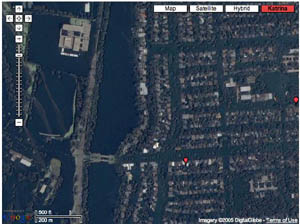
Interactive maps help those of us not in the region to grasp the terrain of devastation wrought by Hurricane Katrina. These maps are suggestive of a new paradigm for the digital page – an interactive canvas, or territory, through which the reader can zoom through orders of magnitude.
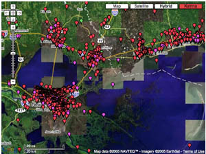
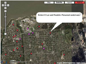
Most talked about is the “visual wiki” at scipionus.com – a re-tooling of Google maps that invites users to post tabs with information pertaining to specific locales (as fine-grained as streetcorners). Tabs are editable and are supposed to be used only for concrete reports, though many have posted pleas for news of specific missing persons or of the condition of certain blocks. Some samples:
“Saw news video 9/2/05 of corner street sign at 10th St. & Pontchartrain Blvd. Water level was about 6 in. below. green street signs.”
“the Ashley’s are in Prattville AL”
“4400 Calumet — dry on Weds?”
“as of 5:00 pm.. the streets from wilson canal to transcontinental are COMPLETELY DRY! source from somebody who stayed and called to tell us the info.”
“Dylan Nash anyone?? call 919-7307018”
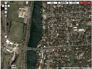
The maps include post-Katrina satellite imagery, which reveals, upon zooming in, horrifying grids of inundated streets, stadiums filled up like soup tureens, city parks transformed into swamps. Wired recently ran a piece about sciponius.
Before & After:
I was also impressed by the interactive maps on washingtonpost.com.
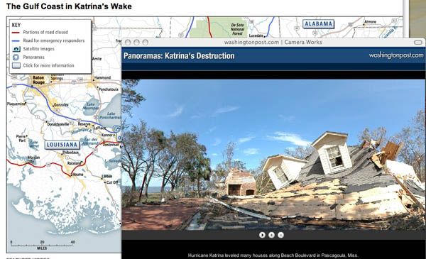
Click on spinning wheels at various points along the coastline and windows pop up with scrolling panoramic shots. Quite stunning. You can click the screen and drag the scroll in either direction, stop it, speed it up, and even pull it up and down to reveal glimpses of the sky or ground. Photojournalism is given new room to play on online newspapers.
(No Need to Click Here – I’m just claiming my feed at Feedster feedster:d50fedfc363272797584521a06a79da5)

