Ben posted a few weeks back about an intriguing new interactive project in the pipeline from Penguin. WeTellStories, produced for Penguin by ARG studio SixToStart is now out in the open. Comprising six stories based on Penguin Classics, released one a week for the next six weeks, WeTellStories aims to create born-digital riffs on classic books.
I played through (‘read’ doesn’t quite describe it) the first of these earlier today: The 21 Steps by Charles Cumming, based on Buchan’s classic thriller The Thirty-Nine Steps. The 21 Steps is told through narrative bubbles that pop up as the story picks its way across a Google Earth-like satellite map, and describes the experience of a man suddenly caught up in sinister events that he can’t seem to escape.
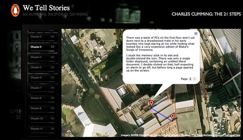
Overall the experience works. The writing is spare enough to keep the pacing high, vital when the other umpteen billion pages I could possibly be surfing are all clamoring for my attention. The dot moving across the map creates a sense of movement forward (as well as some frustration as it crawls between narrative points), and the Google Earth styling is familiar enough as a reading environment for me to focus on enjoying the story rather than diverting too much energy to decoding peripheral material. The interface is simple and tactile in ways that advance the story without distracting from its development, either by offering diverging routes through it or overloading the central ‘chase’ narrative with multimedia clutter. And the satnav pictures add a pleasurable feeling of recognition (‘Look! There’s my house!’) to offset an essentially far-fetched story.
For a single-visit online story experience, it was nearly too long: I found myself checking how many instalments I still had to get through. The ending was somewhat anticlimactic. And though WeTellStories has been rumored to have ARG elements, and is produced by an ARG studio, I did a hunt around for potential ARG-style ‘further reading’ rabbit holes and found nothing. So either it’s too subtle for a journeywoman ARG fan like me, or the overarching ‘game’ element really is just the invitation to follow all six stories and then answer some questions to win a prize.
If so, I’ll be disappointed. But it’s early days still, and there may be more up SixToStart’s sleeve than I’ve seen so far. It’s encouraging to see ‘traditional’ publishers exploring inventive ways of riffing on their swollen backlists’ cachet and immeasurably rich narrative wealth. And The 21 Steps comes closer than most ‘authored’ digital fictions I’ve encountered to achieving some harmony between narrative and delivery mechanism. So though I’m being nitpicky, the project so far hints at the possiblity that we’re beginning to see online creative work that’s finding ways of marrying the Web’s fragmented, kinetic megalomania with the discipline needed for a gripping story.
Category Archives: interactive
more compelling than choice
The first two major ARGs to play out, The Beast and ilovebees, surprised their creators: the collective intelligence of thousands of players was taking down in hours puzzles that the puppetmasters had expected the community to wrestle with for days. And in order for the game not to go stale, new challenges – sometimes created on the fly – had to keep coming. If the content fizzled out, or the puzzles were too easy, the players would become restless and lose interest.
I was reminded of this by the recent discussion on this blog about hypertext. ‘Boring’ is such a loaded word; and yet so much of the Web feels, to me, deeply boring. Even the interesting stuff. Internet addiction is all about clicking across link after link, page after page of content, unable to tear oneself away but still strangely bored. Faced with infinite places to go, all content becomes undifferentiated; lacking in narrative; boring. Much like the paralysis consumers face when confronted with 15 near-identical types of pesto, choice of content made as easy as a click here or there reduces it all to a blur.
I found myself pondering easy choice, supermarket paralysis and internet addiction in the context of the exciting promise and strange underwhelmingness of much hyperfiction. Then, yesterday, interactive game creator and SixToStart ARG writer James Wallis said something that flipped the light on. “Writing for interactive is different to print writing,” he said. But this isn’t in the way someone habituated to storytelling on paper might expect. For such, ‘interactive’ might suggest an exciting opportunity to cast off the formal shackles of one-page-after-the-next. (Certainly, when I first came across HTTP, that’s what it seemed to promise me). “When you think of interactive, you think of the Garden of Forking Paths, non-linear narrative and so on. But if you want people to stay interested, that doesn’t work at all.”
Instead, he says, writing for interactive takes a more or less linear narrative, and makes the reader/user/player work it. In an ARG, a crucial piece of information might be hidden behind a login that needs to be hacked; the story’s progression might depend on a puzzle being solved to reveal a code. The payoff of interactivity, the thing that gives the story a hook that it couldn’t get otherwise, is less about ‘choice’ or a pleasure of diverging from linear narrative, than a sense of active contribution to the progression of that narrative. Of course, because an ARG plays out in real time, players may solve things ‘too’ quickly or take the story in a new direction – then, to avoid shattering the ‘This Is Not A Game’ illusion the puppetmasters must create new content to reflect that divergence.
Earlier, in a comment on the hypertext discussion, I found myself pondering emotional involvement – as measured by whether a story can move you to tears – in the context of interactive narrative. Games that eschew development of ‘characters’ in favor of making you, the central protagonist, the ‘character’ that develops. Tearjerking moments in 1983 text-based adventure games. How does a character or situation creep up on us so that we care enough to be sad when they’re gone?
Perhaps it’s easier to let this happen when you’re being swept along by a movie, or barely noticing as you turn page after page. I can’t prove this, but it feels as though having to make empty, consequence-free choices about where a narrative goes next pulls me back from imaginative involvement to a more meta-level, strategic, structural kind of thinking, that’s inimical to emotional absorption. It’s a bit like something pulling me back from an exciting moment in my book and inviting me to contemplate the paper. Forcing me to choose between narrative possibilities, when that choice has (as in the supermarket, faced with the rows of pesto choices) no consequences, and implying too – as the supermarket does – that choice were in itself a positive addition to my experience, in fact undermines my ability to relax into that experience. Compare that to a hidden group of puppetmasters evolving a narrative on the fly to fit around an amorphous, self-organizing group of players, going to extraordinary lengths to avoid rupturing the story’s consistency, and you can see that here are radically different kinds of ‘interactive’.
Making you work for the next chunk of story, or making you the central protagonist. If these are two narrative tools that demonstrably help make stories work in a digital space, are there more? And are they perceived as markers for quality interactive fiction? Or are game-like narratives still considered somehow a ‘lower’ art form, nerdy and plebeian, unsuitable for ‘serious’ writing or consideration as powerful narrative? I would welcome any evidence to the contrary.
NYTimes reader
[editor’s note: The New York Times released a new software reader. It is Windows only. No Mac compatibility at this time. We asked Christine Boese, of serendipit-e.com, to post her thoughts on the matter.]
I got this off another news clip service I’m on…
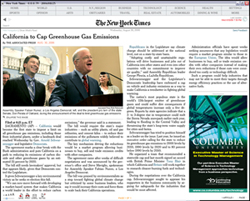
NYT Finally Creates a Readable Online Newspaper (Slate)
Jack Shafer: About six months ago, I canceled my New York Times subscription because I had found the newspaper’s redesigned Web site to be superior to the print Times. I’ve now abandoned the Web version for the New York Times Reader, a new computer edition that has entered general beta release.
I went around to try to sign up for it and get a look. I couldn’t, because the Times IT dept overlooked making its beta available for Macs. I scanned through the screenshots, tho, and the comments on the blog preview of features, sneek peek #1 and #2.
Jack Shafer isn’t exactly an expert in interactive design, so I don’t know if his endorsement means anything other than, "Gee whiz, here’s a neato new thing!".
My initial impressions are that it looks like the International Herald Tribune
with a horizontal orientation I just can’t stand (the Herald Tribune often requires horizontal scrolling, and it’s far easier to read the printable version of stories). Yes, I see there is a narrow screen screenshot, but I’m thinking more about the text flow nightmares this design must cause.
But I think I have bigger reservations about the entire concept behind the Times Reader beta.
Here’s just a summary of questions I’d want answered, if I were actually able to test the beta:
- How is re-creating a facsimile of a print newspaper online a step forward for interactive media? Is it really, or is it just a kind of "horseless carriage" retrenchment? Shafer talks about some non-print-like pages that tell you what you’ve read or haven’t read, to assist browsing and search, but notes that the archives are thin. I wonder if the Times "Most Popular" feature makes the cut.
- Code. The big deal here is that it uses Microsoft .NET and advancers on Vista technology. I smell a walled garden. Is this XML-compatible? RSS-enabled? Is it even in HTML code that can be easily copied and pasted? (Shafer’s piece says it can be, but I want to see for myself) W3 validated? Does its content management system have permalinks? How do bookmarks work?
- Hyperlinks. Will the text accomodate them? Will the Times use them? Or by anchoring themselves firmly in a "reader" technology, perhaps a completely web-independent application, is the Times trying to go beyond simply a code-walled garden and also create a strong CONTENT walled garden as well? Is this a variant of TimesSelect on speed?
- Audience. Presumably the Times has some research that shows a need to court its paper-bound print-loving audience to its online products by making the online products more like the print products.
- Usability and Design. I’ve already mentioned the Mac incompatiblity. What other usability and design issues are present in this Times Reader technology? I’ll leave that to people who actually get use it.
But my question about audience is this: is there a REASON to make heroic efforts to lure print readers online? Isn’t the bigger issue trying to keep print readers attached to print, so that the ad-driven print editions don’t have to go the way of the dinosaur? The online news audience is already massive, and (Pew, Poynter) studies show that during the recent wars, large numbers of people were turning away from traditional news providers and outlets to seek out other sources of information, particularly international information, on the Internet and with news feed readers (RSS/Atom).
So in a competitive online news landscape, the Times makes a strategic turn to become more like its print product? And this will lure large numbers of online news readers back exclusively to the Times exactly HOW? Especially if it is a walled garden that doesn’t integrate well into the Blogosphere or in RSS news feed readers?
People like Terry Heaton and other media consultants (Heaton has a terrific blog, if you haven’t found it yet) are going out and telling traditional news media outlets that they have to move more strongly into an environment of UNBOUND media, to make their products more maleable for an unbound Internet environment. It appears the Times is not a company that has purchased Heaton’s services lately.
From the screenshots I’ve seen, there seems to be very little functionality or interactive user-customizable features at all. I don’t know. Color me stupid, but my gut reaction is that this is nothing more than another variant of the exact PDF version of the paper that the Times put out, only perhaps with better text searching features and dynamic text flow (meaning I’d bet it is XML-based instead of PDF-based, only with some custom-built or Microsoft-blessed walled garden DTD).
You know, for the money the Times spent on this (and the experienced journalists the Times Group laid off this past year), I’d have thought the best use of resources for a big media company would be to develop a really KILLER RSS feed reader, one that finally gets over the usability threshold that keeps feed readers in "Blinking 12-land" for most casual Internet users.
I mean, I know there are a lot of good feed readers out there (I favor Bloglines myself), but have any of you tried to convert non-techie co-workers into using a feed reader lately? I can’t for the LIFE of me figure out why there’s so much resistance to something so purely wonderful and empowering, something I believe is clearly the killer app on par with the first Mosaic browser in 1993. But because feed readers caught on bottom up instead of top down, there’s not only usability problems for the broadest audiences, there’s also a void at the top of the technology industry, by companies that fail to catch on to the RSS vision, mainly because they didn’t think it up themselves.
a future written in electronic ink?
Discussions about the future of newspapers often allude to a moment in the Steven Spielberg film “Minority Report,” set in the year 2054, in which a commuter on the train is reading something that looks like a paper copy of USA Today, but which seems to be automatically updating and rearranging its contents like a web page. This is a comforting vision for the newspaper business: reassigning the un-bottled genie of the internet to the familiar commodity of the broadsheet. But as with most science fiction, the fallacy lies in the projection of our contemporary selves into an imagined future, when in fact people and the way they read may have very much changed by the year 2054.
 Being a newspaper is no fun these days. The demand for news is undiminished, but online readers (most of us now) feel entitled to a free supply. Print circulation numbers continue to plummet, while the cost of newsprint steadily rises — it hovers right now at about $625 per metric ton (according to The Washington Post, a national U.S. paper can go through around 200,000 tons in a year).
Staffs are being cut, hiring freezes put into effect. Some newspapers (The Guardian in Britain and soon the Wall Street Journal) are changing the look and reducing the size of their print product to lure readers and cut costs. But given the rather grim forecast, some papers are beginning to ponder how other technologies might help them survive.
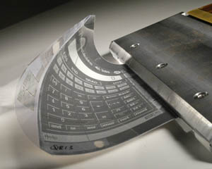
Last week, David Carr wrote in the Times about “an ipod for text” as a possible savior — a popular, portable device that would reinforce the idea of the newspaper as something you have in your hand, that you take with you, thereby rationalizing a new kind of subscription delivery. This weekend, the Washington Post hinted at what that device might actually be: a flexible, paper-like screen using “e-ink” technology.
An e-ink display is essentially a laminated sheet containing a thin layer of fluid sandwiched between positive and negative electrodes. Tiny capsules of black and white pigment float in between and arrange themselves into images and text through variance in the charge (the black are negatively charged and the white positively charged). Since the display is not light-based (like the electronic screens we use today), it has an appearance closer to paper. It can be read in bright sunlight, and requires virtually no power to maintain an image.
 Frank Ahrens, who wrote the Post piece, held a public online chat with Russ Wilcox, the chief exec of E Ink Corp. Wilcox predicts that large e-ink screens will be available within a year or two, opening the door for newspapers to develop an electronic product that combines web and broadsheet. Even offering the screens to subscribers for free, he calculates, would be more cost-efficient than the current paper delivery system.
A number of major newspaper conglomerates — including The Hearst Corporation, Gannett Co. (publisher of USA Today), TOPPAN Printing Company of Japan, and France’s Vivendi Universal Publishing — are interested enough in the potential of e-ink that they have become investors.
But maybe it won’t be the storied old broadsheet that people crave. A little over a month ago at a trade show in Berlin, Philips Polymer Vision presented a prototype of its new “Readius” — a device about the size of a mobile phone with a roll-out e-ink screen. This, too, could be available soon. Like it or not, it might make more sense to watch what’s developing with cell phones to get a hint of the future.
But even if electronic paper catches on — and it seems likely that it, or something similar, will — I wouldn’t count on it to solve the problems of the print news industry. It’s often tempting to think of new technologies that fundamentally change the way we operate as simply a matter of pouring old wine into new bottles. But electronic paper will be a technology for delivering the web, or even internet television — not individual newspapers. So then how do we preserve (or transfer) all that is good about print media, about institutions like the Times and the Post, assuming that their prospects continue to worsen? The answer to that, at least for now, is written in invisible ink.
katrina and the interactive atlas
Interactive maps help those of us not in the region to grasp the terrain of devastation wrought by Hurricane Katrina. These maps are suggestive of a new paradigm for the digital page – an interactive canvas, or territory, through which the reader can zoom through orders of magnitude.
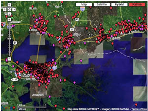
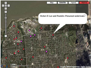
Most talked about is the “visual wiki” at scipionus.com – a re-tooling of Google maps that invites users to post tabs with information pertaining to specific locales (as fine-grained as streetcorners). Tabs are editable and are supposed to be used only for concrete reports, though many have posted pleas for news of specific missing persons or of the condition of certain blocks. Some samples:
“Saw news video 9/2/05 of corner street sign at 10th St. & Pontchartrain Blvd. Water level was about 6 in. below. green street signs.”
“the Ashley’s are in Prattville AL”
“4400 Calumet — dry on Weds?”
“as of 5:00 pm.. the streets from wilson canal to transcontinental are COMPLETELY DRY! source from somebody who stayed and called to tell us the info.”
“Dylan Nash anyone?? call 919-7307018”
The maps include post-Katrina satellite imagery, which reveals, upon zooming in, horrifying grids of inundated streets, stadiums filled up like soup tureens, city parks transformed into swamps. Wired recently ran a piece about sciponius.
Before & After:


I was also impressed by the interactive maps on washingtonpost.com.
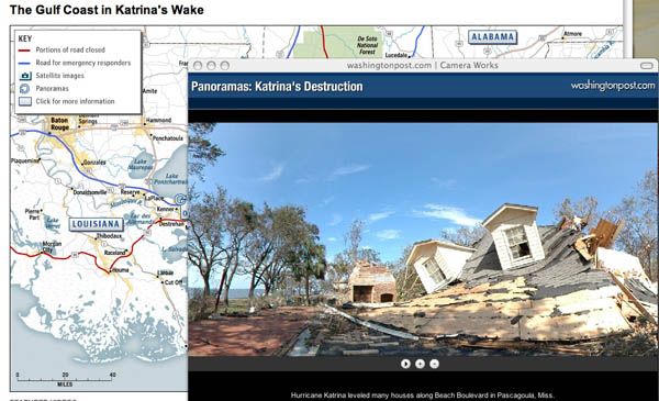
Click on spinning wheels at various points along the coastline and windows pop up with scrolling panoramic shots. Quite stunning. You can click the screen and drag the scroll in either direction, stop it, speed it up, and even pull it up and down to reveal glimpses of the sky or ground. Photojournalism is given new room to play on online newspapers.
(No Need to Click Here – I’m just claiming my feed at Feedster feedster:d50fedfc363272797584521a06a79da5)
convergence sighting: the multi-channel tv screen
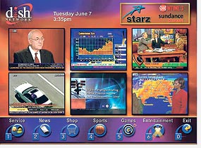
Several new “interactive television” services are soon to arrive that offer “mosaic” views of multiple channels, drawing TV ever nearer to full adoption of the browser, windows, and aggregator paradigms of the web (more in WSJ). It seems that once television is sufficiently like the web, it will simply be the web, or one province thereof.

