The interface design firm TouchGraph recently released a free visual browsing tool for Amazon’s books, movies, music and electronics inventories. My first thought was, aha, here’s a tool that can generate an image of Bob’s thought experiment, which reimagines The Communist Manifesto as a networked book, connected digitally to all the writings it has influenced and all the commentaries that have been written about it. Alas no.
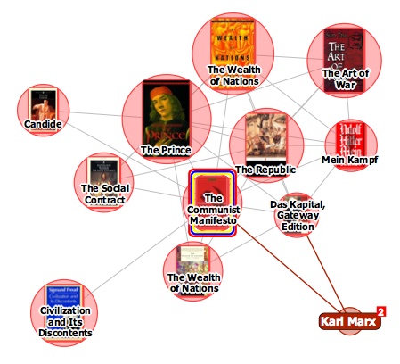
It turns out that relations between items in the TouchGraph clusters are based not on citations across texts but purely on customer purchase patterns, the data that generates the “customers who bought this item also bought” links on Amazon pages. The results, consequently, are a tad shallow. Above you see The Communist Manifesto situated in a small web of political philosophy heavyweights, an image that reveals more about Amazon’s algorithmically derived recommendations than any actual networks of discourse.
TouchGraph has built a nice tool, and I’m sure with further investigation it might reveal interesting patterns in Amazon reading (and buying) behaviors (in the electronics category, it could also come in handy for comparison shopping). But I’d like to see a new verion that factors in citation indexes for books – data that Amazon already provides for many of its titles anyway. They could also look at user-supplied tags, Listmania lists, references from reader reviews etc. And perhaps with the option to view clusters across media types, not simply broken down into book, movie and music categories.
Category Archives: infoviz
monkeybook 2: an evening with brad paley
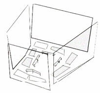 Monkeybook is an occasional series of new media evenings hosted by the Institute for the Future of the Book at Monkeytown, Brooklyn’s premier video art venue. For our second event, we are thrilled to present brilliant interaction designer, friend and collaborator W. Bradford Paley, who will be giving a live tour of his work on four screens. Next Monday, May 7. New Yorkers, save the date!
Brad is one of those rare individuals: an artist who is also a world-class programmer. His work focuses on making elegant, intuitive visualizations of complex data, in projects ranging from TextArc, a dazzling visual concordance of a text (a version of which was presented with the new Gamer Theory edition), to a wireless handheld device used by traders at the New York Stock Exchange to keep up with the blitz of transactions. It’s a crucial area of experimentation that addresses one of the fundamental problems of our time: how to make sense of too much information. And in a field frequently characterized by empty visual titillation, Brad’s designs evince a rare lucidity and usefulness. They convey meaning beautifully – and beauty meaningfully.
Brad is always inspiring when talking about his stuff, which is going to look absolutely stunning in the Monkeytown space. If you’re in the area, be sure not to miss this. For those of you who don’t know it, Monkeytown is unique among film venues in New York — an intimate room with a gigantic screen on each of its four walls, low comfy sofas and fantastic food. A strange and special place. If you think you can come, be sure to make a reservation ASAP as seating will be tight.
More info here.
(Monkeybook 1)
premature burial, or, the electronic word in time and space
We were talking yesterday (and Bob earlier) about how to better organize content on if:book – how to highlight active discussion threads, or draw attention to our various categories. Something more dynamic than a list of links on the sidebar, or a bunch of hot threads advertised at the top. A significant problem with blogs is the tyranny of the vertical column, where new entries call out for attention on a stack of rapidly forgotten material, much of which might still be worth reading even though it was posted back in the dark ages (i.e. three days ago). Some of the posts that get buried still have active discussions stemming from them. Just today, “ways of seeing, ways of writing” – posted nearly two weeks ago – received another comment. The conversation is still going. (See also Dan’s “blog reading: what’s left behind”.)
This points to another thorny problem, still unsolved nearly 15 years into the world wide web, and several years into the blogging craze: how to visualize asynchronous conversations – that is, conversations in which time lapses between remarks. If the conversation is between only two people, a simple chronological column works fine – it’s a basic back-and-forth. But consider the place where some of the most dynamic multi-person asynchronous conversations are going on: in the comment streams of blog entries. Here you have multiple forking paths, hopping back and forth between earlier and later remarks, people sticking close to the thread, people dropping in and out. But again, you have the tyranny of the vertical column.
We’re using an open source platform called Drupal for our NextText project, which has a blog as its central element but can be expanded with modular units to do much more than we’re able to do here. The way Drupal handles comments is nice. You have the usual column arranged chronologically, with comments streaming downward, but readers have the option of replying to specific comments, not just to the parent post. Replies to specific comments are indented slightly, creating a sort of sub-stream, and the the fork can keep on going indefinitely, indenting rightward.
This handles forks and leaps fairly well, but offers at best only a partial solution. We’re still working with a print paradigm: the outline. Headers, sub-headers, bullet points. These distinguish areas in a linear stream, but they don’t handle the non-linear character of complex conversations. There is always the linear element of time, but this is extremely limiting as an organizing principle. Interesting conversations make loops. They tangle. They soar. They sag. They connect to other conversations.
But the web has so far been dominated by time as an organizing principle, new at the top and old at the bottom (or vice versa), and this is one the most-repeated complaints people have about it. The web favors the new, the hot, the immediate. But we’re dealing with a medium than can also handle space, or at least the perception of space. We need not be bound to lists and outlines, we need not plod along in chronological order. We could be looking at conversations as terrains, as topographies.
The electronic word finds itself in an increasingly social context. We need to design a better way to capture this – something that gives the sense of the whole (the big picture), but allows one to dive directly into the details. This would be a great challenge to drop into a design class. Warren Sack developed a “conversation map” for news groups in the late 90s. From what I can tell, it’s a little overwhelming. I’m talking about something that draws people right in and gets them talking. Let’s look around.
the big picture
Though a substantial portion of our reading now takes place online, we still chafe against the electronic page, in part because today’s screens are hostile to the eye, but also, I think, because we are waiting for something new – something beyond a shallow mimicry of print. Occasionally, however, you come across something that suggests a new possibility for what a page, or series of pages, can be when words move to the screen.
I came across such a thing today on CNET’s new site, which has a feature called “The Big Picture,” a dynamic graphical display that places articles at the center of a constellation, drawing connections to related pieces, themes, and company profiles.

Click on another document in the cluster and the items re-arrange around a new center, and so on – ontologies are traced. But CNET’s feature does not go terribly far in illuminating the connections, or rather the different kinds of connections, between articles and ideas. They should consider degrees of relevance, proximity in time, or overlaps in classification. Combined with a tagging system, this could get interesting. As it stands, it doesn’t do much that a simple bullet list of related articles can’t already do admirably, albeit with fewer bells and whistles.
But this is pushing in an interesting direction, testing ways in which a web publication can organize and weave together content, shedding certain holdovers from print that are no longer useful in digital space. CNET should keep playing with this idea of an article ontology viewer – it could be refined into a legitimately useful tool.
making visible the invisible: george legrady installation at seattle central library
A nice companion piece to the “database of intentions” is George Legrady‘s new installation, “Making Visible the Invisible,” at the Rem Koolhaas-designed Seattle Central Library. Six large LED display panels suspended above the “mixing chamber” on the library’s fifth floor display a series of visualizations depicting the circulation of library books and other media across time and classification area, providing “a real-time living picture of what the community is thinking.”
KeyWord Map Attack

Legrady described the project at the Transliteracies conference this past June in Santa Barbara. At that time, Bob blogged:
the pinpoint accuracy of computer-searches, leaves those of us lucky enough to have spent time in library stacks, nostalgic for the unexpected discovery of something we didn’t know we were looking for but which just happened, serendipitously, to be on a nearby shelf. George Legrady, artist and prof at UC Santa Barbara, just showed a project he is working on for the new public library in Seattle that gave the first glimpse of serendipity in online library searching which lets you see all the books that have recently been checked out on a particular subject. Beautiful and Exciting.
Vital Statistics

Floating Titles

Dot Matrix Rain

Other observations:
“New piece for Central Library pushes art to the technical edge” in Seattle Post Intelligencer
Information Aesthetics profile
fertile pages
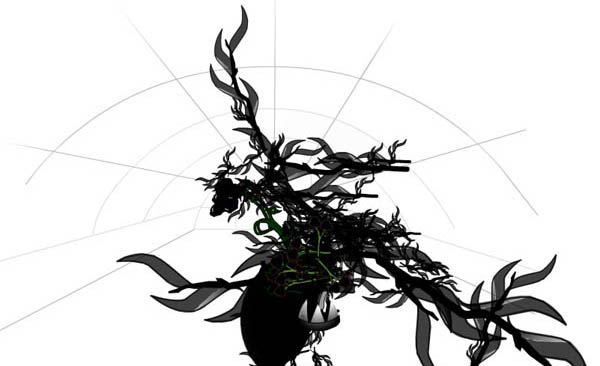
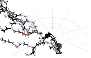
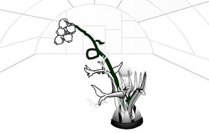
Organic HTML is a wonderful little applet I came across that turns websites into bizarre-looking plants. information aesthetics speculates on how it might work:
the emerging plant appears to use the colors similar to those found in the website HTML, CSS or images, while its size & branches depend on the site structure, content or number of pages. without any readily provided explanation or legend, one keeps trying to feed it URLs to derive the most beautiful flower (while avoiding the sometimes appearing flies)
Plug in a URL and try it out (be warned: it might crash your browser). if:book is apparently an inky species of blog (see above). I’ll add this to our garden. I wonder why there aren’t more sprouts of orange? The New York Times comes out more floral.
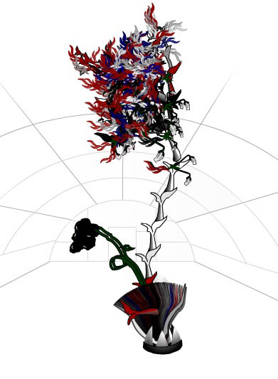
Something interesting I found, take a look at these two plants. One is Google, the other Yahoo! Can you guess which is which? (The larger plant has been scaled down.)
enter the cybrarian
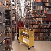 The recent buzz surrounding Google’s library intitiative has everyone talking about the future of research, which inevitably raises the question: how will the digitization of library collections change the role of the librarian? I would guess that, far from becoming obsolete, their role will in fact be elevated in importance, if not necessarily in status. They could very well come to be our indispensible guides through the labyrinth – if perhaps invisible, engineering behind the digital walls.
It’s also important to consider the question of visualization. When you run a search on Google you are given an enormous list. This is already deeply ingrained in the day-to-day business of finding information. But these lists are basically the electronic equivelant of scrolls, with the items algorithmically determined to be most relevant placed at the top. But sooner or later we have to admit that using scrolls for this kind of business is ludicrous. There has to be a better way of arraying these vast harvests of information in a way that allows the researcher to zoom across degrees of specificity and through associative chains of context and meaning. I see no reason why a search shouldn’t take place in some kind of virtual library, emulating the physical architecture of research settings, and allowing for some of the associative or accidental echoes that so often enrich a paper trail blazed through a brick-and-mortar library. Or cannot knowledge resemble a tree, or an arterial matrix? Must we be bound to the scroll?
Returning to the question of the librarian’s role, I recalled this passage from James J O’Donnell’s 1996 paper The Pragmatics of the New: Trithemius, McLuhan, Cassiodorus:
“The librarians of the world have, moreover, already led the way, for academics at least, into the new information environment, not least because they are caught between rising demand from their customers (faculty and students) and rising supply and prices from their suppliers, and so have already been making reality-based decisions about ownership versus access, print versus electronics, and so on. In short, they are just now our leading pragmatists. Can we imagine a time in our universities when the librarians are the well-paid principals and the teachers their mere acolytes in a distribution chain? I do not think we can or should rule out that possibility for a moment”
Related articles:
“Questions and Praise for Google Web Library” – NY Times
“Google’s library plan ‘a huge help'” – USA Today
“Making books readable on computer proves trying task” – USA Today
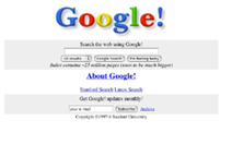
Also, I found this on Searchblog. For a trip down memory lane, check out the original Google in the Stanford archives (click on picture to right). Unfortunately, although it seems interactive, a search just brings up a bunch of stylesheets.
