Category Archives: GAM3R_7H30RY

networked books are disorienting (linear vs. shuffle)

There’s a fascinating thread active in the GAM3R 7H30RY forum discussing the format we’ve designed for reading and responding to McKenzie’s book. There’s a general sense of disorientation, as well as “hyperconsciousness” of one’s reading and commenting behaviors within the book. I take this as a positive sign that we’re pushing uncomfortably at the intersection of print and screen-based reading practices.
A particularly interesting little section:

Ray Cha: We don’t generally navigate websites in the way we read books. Perhaps, what is happening is that, because networked books are still quite new to us, we are hyper-conscious of the way we read them. Once we become more familiar with the form, the technology of the form will become more transparent to us. That is, we never think about how the interface or technology of a table of content or index of a print book works. One day, it will be the same way for the networked book.
Dave Parry: I think that is part of what I find so interesting here, this hyperconsciousness provides us with the oppurtunity to make different sorts of textual interventions, and to become aware of others that might become transparent.
McKenzie Wark: This is what both attracts me to this process and scares the hell out of me. Its the change in the material and social form that makes one aware of writing and reading as practices, but then one has this giddy sense of writing and reading without the comforting handrails of the book as form.
I think it was Victor Shklovsky who said that we become aware of structure when the roof caves in.

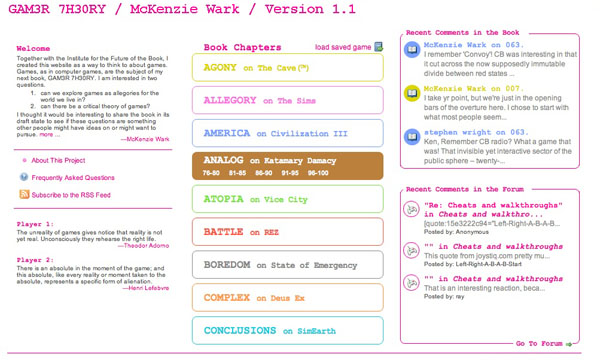
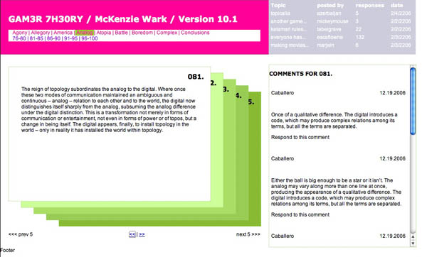
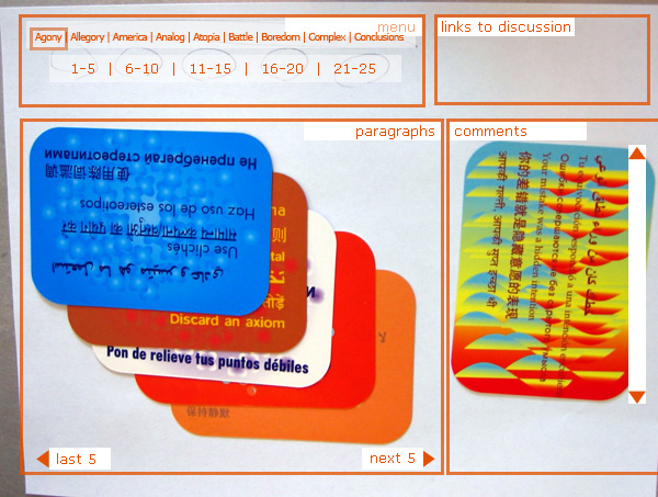
McKenzie composed Gamer Theory in a highly modular structure, which we ran with to the extreme in the card-based design. But emphasizing the chunks in this way — and situating it in a web browser, where people are accustomed to skipping around — we risk giving the impression that paragraphs are self-contained, or that this is a book that can be read selectively.
But this is absolutely a linear work, with an argument that builds through the successive chapters. And so naturally we find ourselves a little confused, at times needlessly debating propositions that are elucidated in subsequent paragraphs, simply because they seemed final in the context of the card. No wonder it scares the hell out of Ken, even as he dives bravely into the unknown: give people a deck of cards and they tend to shuffle it.

GAM3R 7H30RY 1.1 is live!

g7 screenshot.jpg
The Institute has published its first networked book, GAM3R 7H30RY 1.1 by McKenzie Wark! This is a fascinating look at video games as allegories of the world we live in, and (we think) a compelling approach to publishing in the network environment. As with Mitch Stephens’ ongoing experiment at Without Gods, we’re interested here in a process-oriented approach to writing, opening the book up to discussion and debate while it’s still being written.
Inside the book, you’ll find comment streams adjacent to each individual paragraph, inviting readers to respond to the text on a fine-grained level. Doing the comments this way (next to, not below, the parent posts) came out of a desire to break out of the usual top-down hierarchy of blog-based discussion — something we’ve talked about periodically here. There’s also a free-fire forum where people can start their own threads about the games dealt with in the book or about the experience of game play in general. It’s also a place to tackle meta-questions about networked books and to evaluate the successes and failings of our experiment. The gateway to the forum is a graphical topic pool in which conversations float along axes of time and quantity, giving a sense of the shape of the discussion.
Both sections of GAM3R 7H30RY 1.1 — the book and the forum — are designed to challenge current design conventions and to generate thoughtful exchange on the meaning of games. McKenzie will actively participate in these discussions and draw upon them in subsequent drafts of his book. The current version is published under a Creative Commons license.
And like the book, the site is a work in progress. We fully intend to make modifications and add new features as we go. Here’s to putting theory into practice!
(You can read archived posts documenting the various design stages of GAM3R 7H30RY 1.1 here.)

G4M3R 7H30RY: part 4

screencap.gif
We’ve moved past the design stage with the GAM3R 7H30RY blog and forum. We’re releasing the book in two formats: all at once (date to be soon decided), in the page card format, and through RSS syndication. We’re collecting user input and feedback in two ways: from comments submitted through the page-card interface, and in user posts in the forum.
The idea is to nest Ken’s work in the social network that surrounds it, made visible in the number of comments and topics posted. This accomplishes something fairly radical, shifting the focus from an author’s work towards the contributions of a work’s readers. The integration between the blog and forums, and the position of the comments in relation to the author’s work emphasizes this shift. We’re hoping that the use of color as an integrating device will further collapse the usual distance between the author and his reading (and writing) public.
To review all the stages that this project has been through before it arrived at this, check out Part I, Part II, and Part III. The design changes show the evolution of our thought and the recognition of the different problems we were facing: screen real estate, reading environment, maintaining the author’s voice but introducing the public, and making it fun. The basic interaction design emerged from those constraints. The page card concept arose from both the form of Ken’s book—a regimented number of paragraphs with limited length—and the constraints of screen real estate (1024×768). The overlapping arose from the physical handling of the ‘Oblique Strategies’ cards, and helps to present all the information on a single screen. The count of pages (five per section, five sections per chapter) is a further expression of the structure that Ken wrote into the book. Comments were lifted from their usual inglorious spot under the writer’s post to be right beside the work. It lends them some additional weight.
We’ve also reimagined the entry point for the forums with the topic pool. It provides a dynamic view of the forums, raising the traditional list into the realm of something energetic, more accurately reflecting the feeling of live conversation. It also helps clarify the direction of the topic discussion with a first post/last post view (visible in the mouseover state below). This simple preview will let users know whether or not a discussion has kept tightly to the subject or spun out of control into trivialities.
topicpool_screencap.gif
We’ve been careful with the niceties: the forum indicator bars turned on their sides to resemble video game power ups; the top of the comments sitting at the same height as the top of their associated page card; the icons representing comments and replies (thanks to famfamfam).
Each of the designed pages changed several times. The page cards have been the most drastically and frequently changed, but the home page went through a significant series of edits in a matter of a few days. As with many things related to design, I took several missteps before alighting on something which seems, in retrospect, perfectly obvious. Although the ‘table of contents’ is traditionally an integrated part of a bound volume, I tried (and failed) to create a different alignment and layout with it. I’m not sure why—it seemed like a good idea at the time. I also wanted to include a hint of the pages to come—unfortunately it just made it difficult for your eye move smoothly across the page. Finally I settled on a simpler concept, one that harmonized with the other layouts, and it all snapped into place.
homepage_screencap.gif

homepage_screencap.gif
With that we began the production stage, and we’re making it all real. Next update will be a pre-launch announcement.

sonogram of networked book in embryo (GAM3R 7H30RY part 3)

It probably won’t be until mid to late March that we finally roll out McKenzie Wark’s GAM3R 7H30RY Version 10.1, but substantial progress is being made. Here’s a snapshot:
kenwark.final.jpg
After debating (part 1) our way to a final design concept (part 2), we’re now focused (well, mainly Jesse at this point) on hammering the thing together. We’re using all open source software and placing the book under a Creative Commons Attribution-NonCommercial-ShareAlike 2.0 license. Half the site will consist of a digital edition of the book in Word Press with a custom-built card shuffling interface. As mentioned earlier, Ken has given us an incredibly modular structure to work with (a designer’s dream): nine chapters (so far), each consisting of 25 paragraphs. Each chapter will contain five five-paragraph stacks with comments popping up to the side for whichever card is on top. No scrolling is involved except in the comment field, and only then if there is a substantial number of replies.
The graphic above shows the color scale we’re thinking of for the different chapters. As they progress, each five-card stack will move from light to dark within the color of its parent chapter. Floating below the color spectrum is the proud parent of the born-digital book: McKenzie Wark, Space Invader (an image that will appear in some fashion throughout the site). Right now he’s a fairly mean-looking space invader — on a bombing run or something. But we’re thinking of shuffling a few pixels to give him a friendlier appearance.
You are also welcome to view an interactive mock-up of the card view (click on the image below):
wark cards 1.jpg
The other half of the site will be a discussion forum set up in PHP Bulletin Board. Actually, it’ll be a collection of nine discussion forums: one for each chapter of the book, each focusing (except for the first, which is more of an introduction) on a specific video game. Here’s how it breaks down:
* Allegory (on The Sims)
* America (on Civilization III)
* Analog (on Katamari Damarcy)
* Atopia (on Vice City)
* Battle (on Rez)
* Boredom (on State of Emergency)
* Complex (on Deus Ex)
* Conclusions (on SimEarth)
The gateway to each forum will be a two-dimensional topic graph where forum threads float in an x-y matrix. Their position in the graph will be determined by the time they were posted and the number of comments they’ve accumulated so far. Thus, hot topics will rise toward the top while simultaneously being dragged to the left (and eventually off the chart) by the progression of time. Something like this:
topic-graph.jpg
At this point there’s no way of knowing for sure which part of the site will be more successful. The book view is designed to gather commentary, and Ken is sincerely interested in reader feedback as he writes and rewrites. There will also be the option of syndicating the book to be digested serially in an RSS reader. We’re very curious to see how readers interact with the text and hope we’ve designed a compelling environment in which to do so.
Excited as we are about the book interface, our hunch is that the discussion forum component has the potential to become the more vital half of the endeavor. The forum will be quite different from the thousands of gaming sites already active on the web in that it will be less utilitarian and more meditative in its focus. This won’t be a place for posting cheats and walk-throughs but rather a reflective space for talking about the experience of gaming and what players take games to mean. Our hope is that people will have quite a bit to say about this — some of which may end up finding its way into the book.
Although there’s still a ways to go, the process of developing this site has been incredibly illuminating in our thinking about the role of the book in the network. We’re coming to understand how the book might be reinvented as social software while still retaining its cohesion and authorial vision. Stay tuned for further developments.

GAM3R 7H30RY: part 2

Read Part 1
We had a highly productive face to face meeting with Ken this afternoon to review the prior designs and to try and develop, collaboratively, a solution based on the questions that arose from those designs. We were aiming for a solution that provides a compelling interface for Ken’s book and also encourages open-ended discussion of the themes and specific games treated in the book.
What we came up with was a prototype of a blog/book page that presents the entire text of GAM3R 7H30RY, and a discussion board based around the games covered in the book, each corresponding with a specific chapter. These are:

  • Allegory (on The Sims)
  • America (on Civilization III)
  • Analog (on Katamari Damarcy)
  • Atopia (on Vice City)
  • Battle (on Rez)
  • Boredom (on State of Emergency)
  • Complex (on Deus Ex)
  • Conclusions (on SimEarth)

Unlike the thousand of gaming forums that already exist throughout the web, this discussion space will invite personal and social points of view, rather than just walkthroughs and leveling up cheats.
We also discussed the fact that discussion boards tend towards opacity as they grow, and ways to alleviate that situation. Growth is good; it reflects a rich back and forth between board participants. Opacity is bad; it makes it harder for new voices to join the discussion. To make it easier for people to join the discussion, Ken envisioned an innovative gateway into the boards based on a shifting graph of topics ranked by post date (x-axis) and number of responses (y-axis). This solution was inspired in part by “The Pool” — “a collaborative online environment for creating art, code, and texts” developed by Jon Ippolito at the University of Maine — in which ideas and project proposals float in different regions of a two-dimensional graph depending on quantity and tenor of feedback from the collective.
Returning to the book view, to push the boundaries of the blog form, we introduced a presentation format that uniquely fits around McKenzie’s book form—twenty-five regularly sized paragraphs in nine different chapters. Yes, each chapter has exactly 25 paragraphs, making mathematically consistent presentation possible (as an information designer I am elated at this systematic neatness). We decided on showing a cascade of five paragraphs, with one paragraph visible at a time, letting you navigate through chapters and then sets of five paragraphs within a chapter.
As a delightful aside, we started prototyping with a sheet of paper and index cards, but by some sideways luck we pulled out a deck of Brian Eno and Peter Schmidt’s Oblique Strategies cards, which suited our needs perfectly. The resulting paper prototype (photo w/ wireframe cues photoshop’d in):
IMG_0794.jpg
This project has already provided us with a rich discussion regarding authorship and feedback. As we develop the prototypes we will undoubtedly have more questions, but also, hopefully, more solutions that help us redefine the edges and forms of digital discourse.
Ben Vershbow contributed to this post.

GAM3R 7H30RY: a work in progress… in progress

SpaceInvader.jpg
McKenzie Wark

I’m pleased to report that the institute is gearing up for another book-blog experiment to run alongside Mitchell Stephens’ ongoing endeavor at Without Gods — this one a collaboration with McKenzie Wark, professor of cultural and media studies at the New School and author most recently of A Hacker Manifesto. Ken’s next book, Gamer Theory, is an examination of single-player video games that comes out of the analytic tradition of the Frankfurt School (among other influences). Unlike Mitch’s project (a history of atheism), Ken’s book is already written — or a draft of it anyway — so in putting together a public portal, we are faced with a very different set of challenges.
As with Hacker Manifesto, Ken has written Gamer Theory in numbered paragraphs, a modular structure that makes the text highly adaptable to different formats and distribution schemes — be it RSS syndication, ebook, or print copy. We thought the obvious thing to do, then, would be to release the book serially, chunk by chunk, and to gather commentary and feedback from readers as it progressed. The trouble is that if you do only this — that is, syndicate the book and gather feedback — you forfeit the possibility of a more free-flowing discussion, which could end up being just as valuable (or more) as the direct critique of the book. After all, the point of this experiment is to expose the book to the collective knowledge, experience and multiple viewpoints of the network. If new ideas are to be brought to light, then there ought to be ways for readers to contribute, not just in direct response to material the author has put forth, but in their own terms (this returns us to the tricky proprietary nature of blogs that Dan discussed on Monday).
So for the past couple of weeks, we’ve been hashing out a fairly ambitious design for a web site — a blog, but a little more complicated — that attempts to solve (or at least begin to solve) some of the problems outlined above. Our first aim was to infuse the single-author book/blog with the democratic, free-fire discussion of list servers — a feat, of course, that is far easier said than done. Another concern, simply from an interface standpoint, was to find ways of organizing the real estate of the screen that are more intuitive for reading.
Another thing we’ve lamented about blogs, and web sites in general, is their overwhelming verticality. Vertical scrolling fields — an artifact of supercomputer terminals and the long spools of code they spit out — are taken for granted as the standard way to read online. But nowhere was this ordained as the ideal interface — in fact it is designed more for machines than for humans, yet humans are the users on the front end. Text does admittedly flow down, but we read left to right, and its easier to move your eye across a text that is fixed than one that is constantly moving. A site we’ve often admired is The International Herald Tribune, which arranges its articles in elegant, fixed plates that flip horizontally from one to the next. With these things in mind, we set it as a challenge for ourselves to try for some kind of horizontally oriented design for Ken’s blog.
There’s been a fairly rigorous back and forth on email over the past two weeks in which we’ve wrestled with these questions, and in the interest of working in the open, we’ve posted the exchange below (most of it anyway) with the thought that it might actually shed some light on what happens — from design and conceptual standpoints — when you try to mash up two inherently different forms, the blog and the book. Jesse has been the main creative force behind the design, and he’s put together a lovely annotated page explaining the various mockups we’ve developed over the past week. If you read the emails (which are can be found directly below this paragraph) you will see that we are still very much in the midst of figuring this out. Feedback would be much appreciated. (See also GAM3R 7H30RY: part 2).

Continue reading