Category Archives: conferences_and_excursions

transliteracies: the pleasure of the text

A lurid French poster for the film version of Peyton Place which I have, alas, not seen.Two books on my bookshelf: the first, a Penguin paperback of The Recognitions by William Gaddis, the spine reinforced with tape, almost every one of the 976 pages covered with annotations in several different colors of ink, some pages torn, many dogeared, some obvious coffee stains. It’s a survivor of a misbegotten thesis project. The second, an old copy of Grace Metalious’s soapy Peyton Place which I found on 6th Avenue two years ago & read cover to cover over the course of six delirious hours when I had taken more DayQuil than I should have. It’s a cheap paperback from the late 1950s, and its yellow pages have clearly passed through any number of hands, but they’re almost entirely unmarked. (God only knows why I decided that I needed to read Peyton Place. I can’t recommend it.)

An anguished shepherd painted by Hugo van der Goes, from the Portinari altarplace I think. I used to hate this cover, but not any more.One of the themes that arose in the first session of Transliteracies was that there are several different types of reading. When academics talk about reading, they tend to mean an intensive activity; there’s typically a lot of writing involved. A great deal of reading, however, isn’t anywhere near as intensive: like my copy of Peyton Place, the text escapes unmarked by the pen. When we talk about moving reading from the printed page to the screen, this is an important consideration: the screen needs to accommodate both of these. Why can’t we curl up with an electronic book? has been a persistent question since electronic reading became a possibility, but it misses the important point that we don’t want to curl up with every book we read. We can only curl up with something if we’re reading it – to some degree – passively.

transliteracies begins.. reading is complex

Over the next couple of days, we’ll be posting live from the Transliteracies conference..
The conference kicked off with a rich historical lecture by Adrian Johns, a professor at the University of Chicago and author of The Nature of the Book. Johns examined three revolutionary moments in the development of scientific knowledge – Galileo, Newton, and James Clark Maxwell – and their relationship to the evolving print medium and the social practices of interpretation and transmission that were then developing. Beginning with the iconoclastic moment of Galileo’s theological collision with the Catholic church, moving through Newton and the incipient system of journal production – “philosophical transaction” – in authoritative matrices like the Royal Society, up to Maxwell at Cambridge University, his breakthroughs on electricity and magnetism, and the development of written examinations. The overriding lesson: reading is complex. We should not overestimate the power of the book purely as the “container of meaning.” The surrounding social reading practices, the charismatic human deliverers of certain texts, are no less important. Each book has a sort of periodical system that follows from it – its ideas move through local systems of perusal, reinterpretation and dissemination. It gets continually “re-published” through this human ecology.
Then there is the scientific revolution going on today: information technology and medical information. Medical error – diagnostic and prescriptive – kills thousands each year, largely due to interruptions in information flow. Info tech could create seamless systems that greatly reduce error. But Johns points out that a good half of the systems implemented so far fail to solve the problems. In fact, all of them create new kinds of errors – confusions between the different groups in the massive medical tangle. So here we have a kind of online reading that has been tested in a highly consequential setting. Johns suggests that medical reading is more like literary reading than we think. For instance, physicians and pharmacists read differently. They have differences in training, worldview, sense of self. Seemingly cosmetic features of the text – fonts, color, layout – are of great consequence.

transliteracies: research in the technological, social, & cultural practices of online reading

Bob’s post last week about changing patterns of media consumption kicked off an interesting discussion, one that leads up perfectly to the “Transliteracies” conference we are attending this weekend at UC Santa Barbara.
Alan Liu
, director of the Transliteracies project, posted this response, which very elegantly lays out some of the important questions. He’s allowed me to re-post it here..
BEGIN: The relationship between “browsing” and the “sheer volume” of information is complicated. To start with, I think there is much to be gained in complicating our usually uniform concepts of “browsing” (all shallow, fragmented, attention-deficient) and “volume” (“sheer,” as in a towering, monolithic cliff).
We get a sense of the hidden complexity I indicate if we think historically. Below is a passage from Roger Chartier — the leading scholar in the “history of the book” field — that should give us pause about making any quick associations between browsing and today’s information glut:

“Does this reaction toward the end of the [18th] century indicate a consciousness that reading styles had changed, that the elites in western Europe had passed from intensive and reverent reading to a more extensive, nonchalant reading style, and that such a change called for correction? . . . In the older style: (1) Readers had the choice of only a few books, which perpetuated texts of great longevity. (2) Reading was not separated from other cultural activities such as listening to books read aloud time and again in the bosom of the family, the memorization of such texts . . . , or the recitation of texts read aloud and learned by heart. (3) The relation of reader to book was marked by a weighty respect and charged with a strong sense of the sacred character of printed matter. (4) The intense reading and rereading of the same texts shaped minds that were habituated to a particular set of references and inhabited by the same quotations. It was not until the second half of the eighteen century in Germany and the beginning of the nineteenth century in New England that this style of reading yielded to another style, based on the proliferation of accessible books, on the individualization of the act of reading, on its separation from other cultural activities, and on the descralization of the book. Book reading habits became freer, enabling the reader to pass from one text to another and to have a less attentive attitude toward the printed word, which was less concentrated in a few privileged books.” — Roger Chartier, “Urban Reading Practices, 1660-1770,” in his The Cultural Uses of Print in Early Modern France, trans. Lydia G. Cochrane (Princeton: Princeton Univ. Press, 1987), pp. 222-24

It’s pretty certain that browsing in the face of sheer volume were deep habits of literacy (specifically, of high print literacy). By contrast, one might ask: who read so intensely and deeply — to instance the extreme — that they only really read one book? There were probably just three classes of such people: the very poor (I remembe r, but can’t find at present, an essay by Chartier about people in the past who owned just one book, which was found on their body after a coach accident in Paris), the extremely pious (who read the Bible), or the “genius” author. (Think of Blake, for example: no matter how many books he read, he really only had one or two books on his mental bookshelf: the Bible and Milton.) By contrast, everyone else browsed.
Mass literacy in the twentieth century, perhaps, may be a phenomenon of browsing. Think of Reader’s Digest. After my family immigrated to the U.S. in my childhood, we were a kind of microcosm of assimilation (into English literacy) in this regard. There were two major investments in books in my household: the Reader’s Digest series of condensed books (a kind of packaged browsing) and The World Book encyclopedia (a veritable lesson in reading as browsing-cum-volume). I drank deeply from both founts as a child, since these were the main books in the house. I was intense in my browsing.
So now let’s snap back to the present and the act of browsing cyber- or multi-media volumes of information. I’ve started a project (combining humanists, social scientists, and computer scientists) called Transliteracies to look into “online reading.” It’s my hypothesis that there are hidden complexities and intelligences in low-attention modes of browsing/surfing that we don’t yet know how to chart. Google, after all, is making a fortune for algorithms enacting this hypothesis. Or to cite a historical googler: Dr. Johnson, sage of the Age of Reason, was famous for “devouring” books just by browsing them instead of reading “cover to cover.” (To allude to the titles of the two serial magazines he was involved with, he would have called browsing Rambling or Idling [The Rambler, The Idler.)
Just as “browsing” is complex, so I think that there are hidden complexities in the notion of “sheer volume.” Some of the digital artists I know — e.g., George Legrady, Pockets Full of Memories — are “database artists” whose work asks the question, in essence: what happens to the notion of art when we gaze not at one work in rapt wonder but several thousand works — when, in other words, the “work” is “volume”? What if quantity, in other words, was a matter of quality? Aren’t there different kinds of “volume,” some more intelligent, beautiful, kinder, humane (not to mention efficient and flexible, the usual postindustrial desiderata) than others?
I’d better stop, since this comment is too long. As Blake said about volume: “Enough! or too much.”

web marginalia

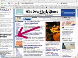
NYTwikalong.jpg About a week ago, I attended a fascinating workshop at USC on Social Software in the Academy – a gathering of some of the most interesting thinkers, teachers and innovators at the intersection of technology and education. I learned a great deal, much of which I’m still processing and will be posting about this week. I also found out about some exciting new tools. One of them is Wikalong, a plugin for the Firefox browser. Wikalong makes it possible to write notes in the margin of a web page (something we take for granted in paper books). Reviews, rebuttals, conversations, subversive commentary, a “roving weblog,” or just plain old notes – all of these are possible in the little sidebar wiki notebook that Wikalong places to the left of any web page you go to. Online reading enhanced.
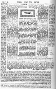
A great part of history is written in the marginalia, and I suspect that networked marginalia is territory worth exploring. Wikalong might be just a literal-minded stepping stone to more interesting forms, but the profundity of the margin (which lies in its spacial relationship to the primary text) shouldn’t be underestimated. 180px-Talmud.png Sparks fly between juxtaposed texts. While hyperlinks enable the reader to leap between textual worlds, they suck you down a wormhole to a distant place. Sometimes it’s better to be in both spaces at the same time (like keeping two browser windows open at once). Think of the Talmud, the great Jewish compendium of law and exegesis. On each page, commentaries are arrayed around a core text. Wikalong may seem insignificant next to this ancient hypertext system, but it points to a related sort of spatial intertextuality that should theoretically be possible in the new medium. If a flat page can be so multi-dimensional, think of how far we might be able to go in a virtual space.
Another handy tool is PurpleSlurple, which provides granular addressability for any existing web page. In other words, it inserts links for paragraphs and headers, allowing you to reference specific sections of text on a given page. Each “slurped” page gets its own URL, as does each individual element that has been anchored with a reference number. It’s primitive, but could come in extremely handy. For bloggers, this provides another way to reference a particular passage in a long web document. Just slurp the page, then link to the specific section.

Nils Peterson
, of Washington State University, presented these tools, along with del.icio.us and a visualization application from Tufts called VUE, as a “juxtaposition of technologies” – a toolkit enabling a web reader or writer to more effectively annotate, reference and quote within the web.

“transliteracies” conference

“How are people today “reading” in digital, networked environments? For example, what is the relation between reading and browsing, or searching? Or between reading and multimedia? Can innovations in technologies or interfaces increase the productivity, variety, and pleasure of these new kinds of reading? How can the historical diversity of human reading practices help us gauge the robustness of the new digital practices; and, inversely, how can contemporary practices provide new ways to understand the technical, social, and cultural dimensions of historical reading?”
June 17-18 at UC Santa Barbara, kicking off the Transliteracies Project: “Research in the Technological, Social, and Cultural Practices of Online Reading”.
(thanks, Grand Text Auto)

abandon all hope, ye who enter here

Silly-sounding business jargon and corporate pep talk abounded at the eBooks in Education Conference at McGraw-Hill in New York. The kind of stuff that makes the eyes and mind glaze over. “Fluidity of work flow.” “Content creation.” “Course-centric versus learner-centric.” The “three-legged stool,” of digital publishing… Books are “learning objects.” A teacher is just a “sage on the stage,” as though teaching were an antiquated idea. Youth is a marketing problem to be solved, the latest batch of young professionals in the making, rolling along the conveyor belt. Tim Magner, a stuffed shirt from our dear own Department of Ed., talked about priming kids for the new global economy (he also took the opportunity to mention that we’re doing the same for Iraq). But nothing about the issues at the heart of education. Nothing about a civil society, an educated citizenry, etc. About nurturing critical faculties in an age of information blitz. About advancing the light against darkness. I don’t doubt the good intentions of many of the speakers and attendees (though I do doubt some) but to someone outside the industry, the conference was plainly nothing more than a congregation of hucksters and homogenizers. Only the accessibility folks (the ones concerned with opening up digital media to people with disabilities), and one soft-spoken tech development manager from the University of Nebraska-Lincoln, seemed to exhibit any kind of public spiritedness, or a belief that technology should be made to serve human beings and not companies.
Then there were the numbing waves of PowerPoint, PowerPoint, PowerPoint! Nothing more perfectly exemplifies the muddled thinking, ignorance of design, and all-around mediocrity of the so-called “ebook industry.” Each presenter – with the exception of George Kerscher of the Daisy Consortium (who is blind) – supplemented their talk with the obligatory PowerPoint presentation, which, after a while, becomes a kind of torture. The slides flip one after the other after the other, the bullet points rattle like hail. Incomprehensible charts and graphs slouch across backgrounds of pastel or mock-marble. There’s a lot of teal. A lot of magenta. The slick veneer of the corporate board room washes over you like microwaved cheese, but the occasional tell-tale typo betrays the obvious haste and lack of consideration with which the things are made. In most cases the presenter abdicates entirely and plays human accompaniment to the PowerPoint show, lamely reading aloud as the panels slide past, sort of like the airline stewardess doing her bit with the oxygen mask while the safety film plays behind. After sitting through a few of these, your brain feels like it’s been flattened out with a rolling pin. I kept thinking of Hart Crane’s lines:
“The mind has shown itself at times
Too much the baked and labeled dough
Divided by accepted multitudes.”

I also thought of Edward Tufte‘s wonderful monograph, “The Cognitive Style of PowerPoint” (encapsulated here), a shrewd critique of sandblasted thinking in Microsoft-era America. It’s a little frightening to hear adults talk about the future of education in the scrubbed, frictionless language of the corporate slideshow. If they are teaching by example, then it is a sorry example indeed.
From Tufte:
“Particularly disturbing is the adoption of the PowerPoint cognitive style in our schools. Rather than learning to write a report using sentences, children are being taught how to formulate client pitches and infomercials. Elementary school PowerPoint exercises (as seen in teacher guides and in student work posted on the Internet) typically consist of 10 to 20 words and a piece of clip art on each slide in a presentation of three to six slides -a total of perhaps 80 words (15 seconds of silent reading) for a week of work. Students would be better off if the schools simply closed down on those days and everyone went to the Exploratorium or wrote an illustrated essay explaining something.”
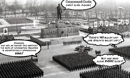
I couldn’t resist including the cover illustration of Tufte’s piece. which gloriously sends up the totalitarianism of PowerPoint..
tufteppoint.jpg

the dinosaurs are myopic: publishing industry clueless about the future of textbooks

I spent yesterday in the McGraw-Hill building listening to the textbook publishing industry’s ideas about the future of the book. It was grim. The abysmal lack of creativity and insight, the singular focus on “revenue models,” and the utter disregard for the needs of students and teachers, made for a dull, and sometimes disturbing, day.
The ebook offerings ranged from plain old PDFs, to web-based books, to jury-rigged versions of Microsoft office. The only panel that offered a forward-looking vision of the future and interesting ebook software to go with it was the accessibility panel, moderated by George Kerscher–Secretary General, Daisy consortium–who is blind. This panel included a demo of Dolphin Audio Publishing’s EasePublisher a tool that facilitates the creation of multimedia content that unites text, audio and images. Dolphin and Elsevier were the only companies that addressed multimedia and its role in the future book. While McGraw-Hill is offering PDF textbooks because they are, “the easiest, fastest, cheapest solution.” Dolphin is thinking about how to enrich the learning experience for everyone. They found that when students with no disabilities used their multimedia books, they learned more. Apparently the combination of text (reading), audio (hearing the text read by a human), and image (photos, videos or illustrations that illuminate the material) enhances learning. Designing electronic textbooks that exploit this opportunity seems like a no-brainer. Teachers I’ve spoken to and my own experience with students in the classroom suggests that multi-media ignites student enthusiasm. Making PDF textbooks is like driving a Jaguar in first gear. But after 10 years of experience in the field, McGraw-Hill’s Ginny Moffet believes that: “students only care about the grade,” and “the biggest challenge to the [electronic textbook] industry is the high cost of content creation.” Hmmm, what about making a high quality product that everyone wants to buy, isn’t that the problem they should be trying to solve? It’s clear that the job of making an interesting electronic textbook is not being taken up by any of the old giants. Our prediction (and our hope) is that the future of the electronic textbook will not be directed by corporations, but by small start-ups, or non-profit consortiums of schools and academics. Efforts like the non-profit, Virtual High School, are an interesting beginning.

6th avenue agriculture

vet.gifEven before the head of the University of Nebraska library began bemoaning how the pictures had fallen out of their collection of vintage agronomy ebooks, the Open eBook Forum conference on ebooks in education felt a great deal like a convention of cattlemen gathered to discuss the latest advances in treating animal ailments and increasing their milkfat percentages. The cattle, of course, are the hapless students, handily divided into K-12 & college lots. The publishing industry, with the help of the software industry, is doing their best to milk them for all they can.
The major image that came to my mind, however, was genetically modified corn. Genetically modified corn is theoretically a good thing: you get a bigger harvest of better corn. But! for the good of the masses – so it doesn’t get loose in the wild – Monsanto’s made their GM corn sterile. What this means for their bottom line: the farmers have to buy new seeds every single year. In short, what should be a renewable resource has become corporate property. And this strategy, more or less, is what the people at the Open Ebook Forum were most delighted about having hit upon. They’re selling coursepacks to college kids which expire at the end of the term, ebooks to libraries which only one user can check out at once, and more software to parents so their kids can do their schoolwork. Hopefully, this technology will let you, the efficient new school administrator, get those pesky teachers out of your payroll. Then: profit!
The future of the book looked incredibly bleak from the McGraw-Hill auditorium. One bright spot of enthusiasm: a few groups of people (including Geoff Freed from the CPB/WGBH National Center for Accessible Media and John Worsfeld from Dolphin Computer Access) working on making media more accessible to people with disabilities. Not coincidentally, they were the only people there not primarily concerned with making money off the students.

ebooks in education

story.100.dollar.laptop.ap.jpg if:book will be spending the day at the Open eBook Forum‘s eBooks in Education Conference at the McGraw-Hill Auditorium in New York.
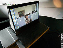
In the spirit of the conference, here’s an AP article from last week that gives a good overview of Nicholas Negroponte‘s $100 laptop project for developing countries.
“Details are still being worked out, but here’s the MIT team’s current recipe: Put the laptop on a software diet; use the freely distributed Linux operating system; design a battery capable of being recharged with a hand crank; and use newly developed ‘electronic ink’ or a novel rear-projected image display with a 12-inch screen. Then, give it Wi-Fi access, and add USB ports to hook up peripheral devices. Most importantly, take profits, sales costs and marketing expenses out of the picture.”

nothing has changed in 3,000 years

stonetalk.jpg Our exploration of digital technology and the revolution it has provoked in our reading and writing practice, tends to focus on the latest gadget and the newest software, but we are also concerned with the things that don’t change and the aspects of human communication that are so deeply a part of our nature that they can not be removed from our reading and writing systems. The first “Information Esthetics” lecture at the Chelsea Museum brought this to the fore last night. Robert Bringhurst spoke about hand-lettered manuscripts, and about typography that respects and preserves the texture and uniqueness of the hand-made mark. He argued for the humanity of fine craftsmanship. He even managed to convince me that slight variations in the shape of letterforms can serve as metaphors for our own individuality.
He also made the point that the devices in our writing/reading systems are physiologically based. The average page is a size that can be held easily in our hands and read at arm’s length. Bringhurst showed a slide of an Egyptian manuscript. The size of the papyrus was very similar to page we use today, and the text was composed in blocks around images. Very much like magazine layouts. As I was admiring the beauty of the manuscript, Bringhurst said, “as you can see, nothing has changed in 3,000 years.” That shouldn’t shock me, but it did. I’ve been so absorbed in thinking about the next new thing, I’d forgotten that reading and writing is a very very old thing.
Interesting to think that whether we are reading something written on stone, papyrus, paper, or a computer screen, we need the same things we’ve aways needed: legibility, context, and “texture.” I’m radically summarizing Bringhurst’s lecture (hope I’m doing it justice). The way I understand it, texture is Bringhurst’s way of describing the particular kind of beauty we look for in cultural artifacts. Texture, is evidence of complexity, information, meaning and the imperfect human hand at work.
So, I’m thinking about how this “texture” manifests in digital manuscripts and it seems to me that it does so in several ways including: the craftsmanship of the digital document itself (which includes the code, the interface, and the composition), the richness of information/meaning that resides in virtual layers or as “links” within the text, and the way beauty can be crafted out of the physical material itself–light emitted by a computer screen.
(photo by Alex Itin)