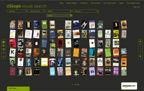
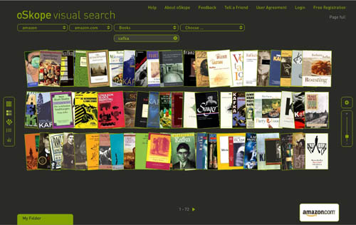
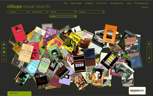
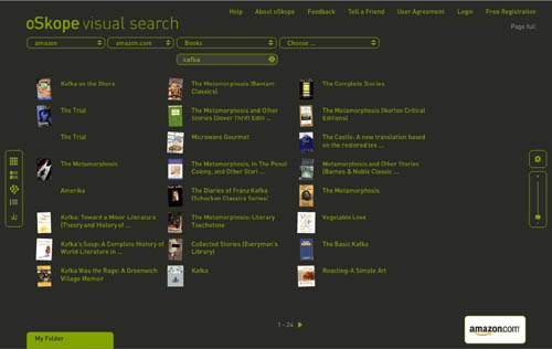
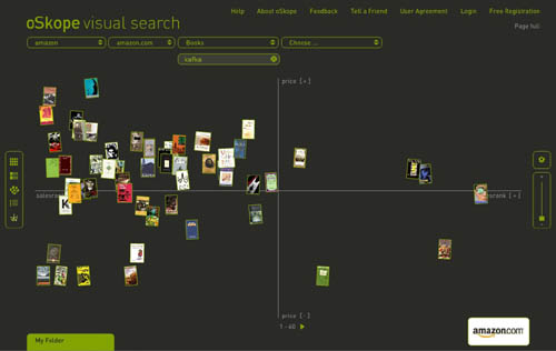
I just came across oSkope, a snazzy new “visual search assistant” built by a Zurich/Berlin outfit that allows you to graphically browse items on Amazon, ebay, Flickr or YouTube. More than a demo or prototype, it’s a fully functioning front end to the search engines of the afore-mentioned sites. I played around a bit in Amazon mode… below are some screenshots of a search for “Kafka” in Amazon’s book category. Each search cluster can be displayed in five different configurations (grid, stack, pile, list and graph), re-scaled with a slide bar, or rearranged manually by dragging items around. Click any cover and a small info window pops up with a link to the Amazon page. You can also drag items down into a folder for future reference. Very smooth, very tactile.
Grid:
Stack:
Pile:
List:
Graph (arranges items along axes of price and sales rank):
A few months back I linked to another visual Amazon browser from TouchGraph that arranges book clusters according to customer purchase patterns (the “people who purchased this also bought…”). I’m still waiting for someone to visualize the connections in the citation indexes: create a cross-referential map that shows the ligatures between texts (as pondered here). Each of these ideas is of course just an incremental step toward more advanced methods of getting the “big picture” view of digital collections.
oSkope, though it could still use some work (Flickr searching was unpredictable and didn’t seem to turn up nearly as much as what I’m sure is in their system, Ebay wasn’t working at all), is a relatively straightforward and useful contribution – ?more than just eye candy. It even helped me stumble upon something wonderful: a recently published study (appropriately, visual) of Kafka, a collab between comic artist R. Crumb and Kafka scholar David Mairowitz.
Browsing graphically is often more engaging than scanning a long list of results, and a crop of new tools – ?LibraryThing, Shelfari, Delicious Library, and now Google Books – ?have recently emerged to address this, all riffing in similar, somewhat nostalgic ways on the experience of shelves (Peter Brantley just blogged another idea in this vein). iTunes too has gotten in on this, its album cover flipper becoming a popular way to sift through one’s music collection.
Perhaps it’s telling, though, that these visual, shelf-inspired browsing tools are focused on old media: books, albums… all bounded objects. You couldn’t simply graft this onto web search and get the same effect (although page previews, of the sort that Snap provides, are becoming increasingly popular). For vast, shifting collections of unbounded, evolving, recombining, and in many cases ephemeral media, different vizualization tools are most likely needed. What might those be?
(oSkope link via Information Aesthetics)
Category Archives: browsing
of shelves and selves
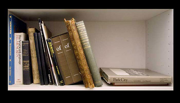
William Drenttel has a lovely post over on Design Observer about the exquisite information of bookshelves, a meditation spurred by 60 photographs of the library of renowned San Francisco designer, typographer, printer and founder of Greenwood Press Jack Stauffacher. Each image (they were taken by Dennis Letbetter) gives a detailed view of one section of Stauffacher’s shelves, a rare glimpse of one individual’s bibliographic DNA, made browseable as a slideshow (unfortunately, the images are not reassembled at the end to give a full view of the collection).
Early evidence suggests that the impulse toward personal mapping through media won’t abate as we go deeper into the digital. Delicious Library and Library Thing are more or less direct transpositions of physical shelves to the computer environment, the latter with an added social dimension (people meeting through their virtual shelves). More generally, social networking sites from Facebook to MySpace are full of self-signification through shelves, or rather lists, of favorite books, movies and music. Social bookmarking sites too bear traces of identity in the websites people save and tag (the tags themselves are a kind of personal signature). Much of the texture and spatial language of the physical may be lost, a new social terrain has opened up, one which we’re only beginning to understand.
But it’s not as though physical bookshelves haven’t always been social. We arrange books not only for our own conceptual orientation, but to give others who venture into our space a sense of our self (or what we’d like to appear as our self), our distinct intellectual algorithm. Browsing a friend’s thoughtfully arranged shelf is like looking through a lens calibrated to their view of the world, especially when those books have played a crucial role, as in Stauffacher’s, in shaping a life’s work. Drenttel savors the idiosyncrasies that inevitably are etched into such a collection:
I have seen many great rare book libraries…. But the libraries I most enjoy are working libraries, where the books have been used and cited and annotated – first editions marred with underlining, notes throughout their pages. (I will always remember the chaos of Susan Sontag’s library, where every book had been touched, read and filled with notes and ephemera.) The organization of a working library is seldom alphabetical…but rather follows some particular mental construct of its owner. Jack Stauffacher’s shelves have some order, one knows. But it is his order, his life.
Or, in Stauffacher’s own words:
Without this working library, I would have no compass, no map, to guide me through the density of our human condition.
visual amazon browser
The interface design firm TouchGraph recently released a free visual browsing tool for Amazon’s books, movies, music and electronics inventories. My first thought was, aha, here’s a tool that can generate an image of Bob’s thought experiment, which reimagines The Communist Manifesto as a networked book, connected digitally to all the writings it has influenced and all the commentaries that have been written about it. Alas no.
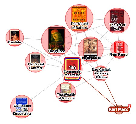
It turns out that relations between items in the TouchGraph clusters are based not on citations across texts but purely on customer purchase patterns, the data that generates the “customers who bought this item also bought” links on Amazon pages. The results, consequently, are a tad shallow. Above you see The Communist Manifesto situated in a small web of political philosophy heavyweights, an image that reveals more about Amazon’s algorithmically derived recommendations than any actual networks of discourse.
TouchGraph has built a nice tool, and I’m sure with further investigation it might reveal interesting patterns in Amazon reading (and buying) behaviors (in the electronics category, it could also come in handy for comparison shopping). But I’d like to see a new verion that factors in citation indexes for books – data that Amazon already provides for many of its titles anyway. They could also look at user-supplied tags, Listmania lists, references from reader reviews etc. And perhaps with the option to view clusters across media types, not simply broken down into book, movie and music categories.
an encyclopedia in my pocket
A while back – last March – there was a great deal of excitement over Wikipodia, an open source project to install Wikipedia on an iPod. Wanting a portable Wikipedia, I installed Linux on my brand new video iPod, a necessary prerequisite, but was disappointed to discover that Wikipodia only worked on older iPods with smaller screens. I’ve waited for an update to Wikipodia since then, but the project seems to have gone dark. Probably Wikipodia wouldn’t have been an ideal solution anyway: it requires you to reboot your iPod into Linux whenever you want to look at Wikipedia. You could have an iPod to listen to music or a Wikipedia to read, but not both at the same time.
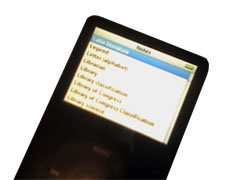 But a partial fulfillment for my desire to have a portable Wikipedia has come along: Matt Swann has posted a script that puts some of the Wikipedia on an iPod, in iPod Notes format. While it’s much simpler than installing a new operating system on your iPod, it’s still not for everybody – it requires using the OS X command line, although there’s an Automator-based version that’s a bit simpler. (PC versions would seem to be available as well, though I don’t know anything about them – check the comments here.) If you’re willing to take the plunge, you can feed the script a page from Wikipedia and it will start filling up your iPod Notes directory with that page and all the pages linked from it. I started from the entry for book; the script downloaded this, then it downloaded the entries for paper, parchment, page, and so on. When it finished those, it downloads all the pages linked from the linked pages, and it keeps doing this until it runs out of space: regardless of iPod size, you can only have 1000 notes in the Notes directory. This doesn’t meant that you get 1000 articles. Because each iPod note can only be 4 kb long, entries that are longer than 4000 characters are split into multiple notes; thus, I wound up with only 216 entries.
Though 216 entries is a tiny subset of Wikipedia, it’s still an interesting experience having a chunk of an encyclopedia in your pocket. What I find most captivating about approaching Wikipedia this was is that I found myself browsing interesting sounding articles rather than searching them directly. The iPod doesn’t have much input functionality: while you can scroll through the list of entries, you can’t search for a subject, as you usually would. (And with only 216 entries, searching would be of limited utility at best. The Wikipodia project promises full text searching, though text entry is a difficult proposition when you only have five keys to type with.) While you can scroll through the list of entries to find something that looks interesting, you’re likely to get sidetracked by something along the way. So you browse.
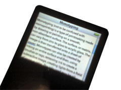 To my mind, browsing is one of the primary virtues of a print encyclopedia: the arbitrary logic of alphabetization makes for a serendipitous reading experience, and you often come away from a print encyclopedia having read something in a nearby article that you didn’t intend to read. This is something that’s generally lost with online reference works: links between articles are supposed to make logical sense. This is also a reflection of our reading behavior: if I search for “book” in Wikipedia, I’m probably looking for something in particular. If I’m interested in book conservation issues, I might click on the link for slow fires. If I’m interested in some other area related to books – how to make vellum, for example – I almost certainly wouldn’t. Instead I’d click on the vellum link and keep looking from there. We tend to be goal-directed when we using Wikipedia online: it’s like going to a library and finding the specific book you want. Wandering in a library is an equally valid behavior: that’s what happens here.
Because you’re not looking for a particular piece of information, you do find yourself reading in a different way. Search-based reading is a different style of reading than browsing, which is slower and more casual. This has a downside when applied to Wikipedia: the often atrocious style is more glaring when you’re reading for pleasure rather than reading for information. And an offline Wikipedia inhibits some of the new reading habits Wikipedia encourages. I caught myself wondering how biased the declarations of the Shāhnāma‘s originality w/r/t other national epics were; without recourse to page histories and talk pages I’m left to wonder until I find myself with an Internet connection.
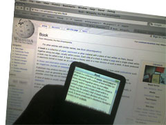 The experience of reading Wikipedia this way isn’t perfect: many links don’t work, and some articles seem to arbitrarily end, some in mid-sentence, some in mid-word. You also realize how many links in Wikipedia aren’t useful at all. If I’m interested in books as a concept, I’m probably not interested in 1907 as a concept, though that is the year that Marc Aurel Stein found The Diamond Sutra, the oldest known block-printed book. Marc Aurel Stein or The Diamond Sutra might be interesting subjects to a book-inclined browser; 1907 isn’t as likely. What you get on your iPod is an arbitrary selection. But there’s something very pleasant about this: it’s nice to have the chance to learn about both Neferirkare Kakai and the Rule of St. Benedict on the subway.
