Category Archives: book-blog_experiments

the networked book: an increasingly contagious idea

pulselogo3.gif Farrar, Straus and Giroux have ventured into waters pretty much uncharted by a big commercial publisher, putting the entire text of one of their latest titles online in a form designed to be read inside a browser. “Pulse,” a sweeping, multi-disciplinary survey by Robert Frenay of “the new biology” — “the coming age of systems and machines inspired by living things” — is now available to readers serially via blog, RSS or email: two installments per day and once per day on weekends.
Naturally, our ears pricked up when we heard they were calling the thing a “networked book” — a concept we’ve been developing for the past year and a half, starting with Kim White’s original post here on “networked book/book as network.” Apparently, the site’s producer, Antony Van Couvering, had never come across if:book and our mad theories before another blogger drew the connection following Pulse’s launch last week. So this would seem to be a case of happy synergy. Let a hundred networked books bloom.
The site is nicely done, employing most of the standard blogger’s toolkit to wire the book into the online discourse: comments, outbound links (embedded by an official “linkologist”), tie-ins to social bookmarking sites, a linkroll to relevant blog carnivals etc. There are also a number of useful tools for exploring the book on-site: a tag cloud, a five-star rating system for individual entries, a full-text concordance, and various ways to filter posts by topic and popularity.
My one major criticism of the Pulse site is that the site is perhaps a little over-accessorized, the design informed less by the book’s inherent structure and themes than by a general enthusiasm for Web 2.0 tools. Pulse clearly was not written for serialization and does not always break down well into self-contained units, so is a blog the ideal reading environment or just the reading environment most readily at hand? Does the abundance of tools perhaps overcrowd the text and intimidate the reader? There has been very little reader commenting or rating activity so far.
But this could all be interpreted as a clever gambit: perhaps FSG is embracing the web with a good faith experiment in sharing and openness, and at the same time relying on the web’s present limitations as a reading interface (and the dribbling pace of syndication — they’ll be rolling this out until November 6) to ultimately drive readers back to the familiar print commodity. We’ll see if it works. In any event, this is an encouraging sign that publishers are beginning to broaden their horizons — light years ahead of what Harper Collins half-heartedly attempted a few months back with one of its more beleaguered titles.
I also applaud FSG for undertaking an experiment like this at a time when the most aggressive movements into online publishing have issued not from publishers but from the likes of Google and Amazon. No doubt, Googlezon’s encroachment into electronic publishing had something to do with FSG’s decision to go ahead with Pulse. Van Couvering urges publishers to take matters into their own hands and start making networked books:

Why get listed in a secondary index when you can be indexed in the primary search results page? Google has been pressuring publishers to make their books available through the Google Books program, arguing (basically) that they’ll get more play if people can search them. Fine, except Google may be getting the play. If you’re producing the content, better do it yourself (before someone else does it).

I hope tht Pulse is not just the lone canary in the coal mine but the first of many such exploratory projects.
Here’s something even more interesting. In a note to readers, Frenay talks about what he’d eventually like to do: make an “open source” version of the book online (incidentally, Yochai Benkler has just done something sort of along these lines with his new book, “The Wealth of Networks” — more on that soon):

At some point I’d like to experiment with putting the full text of Pulse online in a form that anyone can link into and modify, possibly with parallel texts or even by changing or adding to the wording of mine. I like the idea of collaborative texts. I also feel there’s value in the structure and insight that a single, deeply committed author can bring to a subject. So what I want to do is offer my text as an anchor for something that then grows to become its own unique creature. I like to imagine Pulse not just as the book I’ve worked so hard to write, but as a dynamic text that can continue expanding and updating in all directions, to encompass every aspect of this subject (which is also growing so rapidly).

This would come much closer to the networked book as we at the institute have imagined it: a book that evolves over time. It also chimes with Frenay’s theme of modeling technology after nature, repurposing the book as its own intellectual ecosystem. By contrast, the current serialized web version of Pulse is still very much a pre-network kind of book, its structure and substance frozen and non-negotiable; more an experiment in viral marketing than a genuine rethinking of the book model. Whether the open source phase of Pulse ever happens, we have yet to see.
But taking the book for a spin in cyberspace — attracting readers, generating buzz, injecting it into the conversation — is not at all a bad idea, especially in these transitional times when we are continually shifting back and forth between on and offline reading. This is not unlike what we are attempting to do with McKenzie Wark’s “Gamer Theory,” the latest draft of which we are publishing online next month. The web edition of Gamer Theory is designed to gather feedback and to record the conversations of readers, all of which could potentially influence and alter subsequent drafts. Like Pulse, Gamer Theory will eventually be a shelf-based book, but with our experiment we hope to make this networked draft a major stage in its growth, and to suggest what might lie ahead when the networked element is no longer just a version or a stage, but the book itself.

G4M3R 7H30RY: part 4

screencap.gif
We’ve moved past the design stage with the GAM3R 7H30RY blog and forum. We’re releasing the book in two formats: all at once (date to be soon decided), in the page card format, and through RSS syndication. We’re collecting user input and feedback in two ways: from comments submitted through the page-card interface, and in user posts in the forum.
The idea is to nest Ken’s work in the social network that surrounds it, made visible in the number of comments and topics posted. This accomplishes something fairly radical, shifting the focus from an author’s work towards the contributions of a work’s readers. The integration between the blog and forums, and the position of the comments in relation to the author’s work emphasizes this shift. We’re hoping that the use of color as an integrating device will further collapse the usual distance between the author and his reading (and writing) public.
To review all the stages that this project has been through before it arrived at this, check out Part I, Part II, and Part III. The design changes show the evolution of our thought and the recognition of the different problems we were facing: screen real estate, reading environment, maintaining the author’s voice but introducing the public, and making it fun. The basic interaction design emerged from those constraints. The page card concept arose from both the form of Ken’s book—a regimented number of paragraphs with limited length—and the constraints of screen real estate (1024×768). The overlapping arose from the physical handling of the ‘Oblique Strategies’ cards, and helps to present all the information on a single screen. The count of pages (five per section, five sections per chapter) is a further expression of the structure that Ken wrote into the book. Comments were lifted from their usual inglorious spot under the writer’s post to be right beside the work. It lends them some additional weight.
We’ve also reimagined the entry point for the forums with the topic pool. It provides a dynamic view of the forums, raising the traditional list into the realm of something energetic, more accurately reflecting the feeling of live conversation. It also helps clarify the direction of the topic discussion with a first post/last post view (visible in the mouseover state below). This simple preview will let users know whether or not a discussion has kept tightly to the subject or spun out of control into trivialities.
topicpool_screencap.gif
We’ve been careful with the niceties: the forum indicator bars turned on their sides to resemble video game power ups; the top of the comments sitting at the same height as the top of their associated page card; the icons representing comments and replies (thanks to famfamfam).
Each of the designed pages changed several times. The page cards have been the most drastically and frequently changed, but the home page went through a significant series of edits in a matter of a few days. As with many things related to design, I took several missteps before alighting on something which seems, in retrospect, perfectly obvious. Although the ‘table of contents’ is traditionally an integrated part of a bound volume, I tried (and failed) to create a different alignment and layout with it. I’m not sure why—it seemed like a good idea at the time. I also wanted to include a hint of the pages to come—unfortunately it just made it difficult for your eye move smoothly across the page. Finally I settled on a simpler concept, one that harmonized with the other layouts, and it all snapped into place.
homepage_screencap.gif

homepage_screencap.gif
With that we began the production stage, and we’re making it all real. Next update will be a pre-launch announcement.

without gods: born again!

Unrest in the Middle East. Cartoons circulated and Danish flags set ablaze (who knew there were so many Danish flags?) A high-profile debate in the pages of the New York Times between a prominent atheist and a Judeo-Christian humanist. Another setback for the “intelligent design” folks, this time in Utah. Things have been busy of late. The world rife with conflict: belief and disbelief, secular pluralism and religious extremism, faith and reason, and all the hazy territory in between.
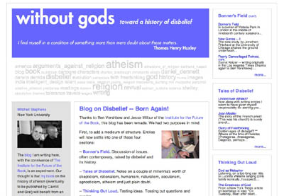
Mitchell Stephens, too, has been busy, grappling with all the above on Without Gods while trying to muster the opening chapters of his book — the blog serving as both helper and hindrance to his process (a fascinating paradox that haunts the book in the network). To reflect these busy times — and Mitch’s busy mind — the blog has undergone slight renovation, reflecting the busier layout of a newspaper while hopefully remaining accessible and easy to read.
without gods new.jpg
There’s a tag cloud near the top serving as a sort of snapshot of Mitch’s themes and characters, while four topic areas to the side give the reader more options for navigating the site. In some ways the new design also reminds me of the clutter of a writer’s desk — a method-infused madness.
As templates were updated and wrinkles ironed out in the code, Mitch posted a few reflections on the pluses and pitfalls of this infant form, the blog:

Newspapers, too, began, in the 17th century, by simply placing short items in columns (in this case from top down). So it was possible to read on page four of a newspaper in England in 1655 that Cardinal Carassa is one of six men with a chance to become the next pope and then read on page nine of the same paper that Carassa “is newly dead.” Won’t we soon be getting similar chuckles out of these early blogs — where leads are routinely buried under supporting paragraphs; where whim is privileged, coherence discouraged; where the newly dead may be resurrected as one scrolls down.
Early newspapers eventually discovered the joys of what journalism’s first editor called a “continued relation.” Later they discovered layout.
Blogs have a lot of discovering ahead of them.

sonogram of networked book in embryo (GAM3R 7H30RY part 3)

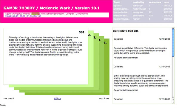
It probably won’t be until mid to late March that we finally roll out McKenzie Wark’s GAM3R 7H30RY Version 10.1, but substantial progress is being made. Here’s a snapshot:
kenwark.final.jpg
After debating (part 1) our way to a final design concept (part 2), we’re now focused (well, mainly Jesse at this point) on hammering the thing together. We’re using all open source software and placing the book under a Creative Commons Attribution-NonCommercial-ShareAlike 2.0 license. Half the site will consist of a digital edition of the book in Word Press with a custom-built card shuffling interface. As mentioned earlier, Ken has given us an incredibly modular structure to work with (a designer’s dream): nine chapters (so far), each consisting of 25 paragraphs. Each chapter will contain five five-paragraph stacks with comments popping up to the side for whichever card is on top. No scrolling is involved except in the comment field, and only then if there is a substantial number of replies.
The graphic above shows the color scale we’re thinking of for the different chapters. As they progress, each five-card stack will move from light to dark within the color of its parent chapter. Floating below the color spectrum is the proud parent of the born-digital book: McKenzie Wark, Space Invader (an image that will appear in some fashion throughout the site). Right now he’s a fairly mean-looking space invader — on a bombing run or something. But we’re thinking of shuffling a few pixels to give him a friendlier appearance.
You are also welcome to view an interactive mock-up of the card view (click on the image below):
wark cards 1.jpg
The other half of the site will be a discussion forum set up in PHP Bulletin Board. Actually, it’ll be a collection of nine discussion forums: one for each chapter of the book, each focusing (except for the first, which is more of an introduction) on a specific video game. Here’s how it breaks down:
* Allegory (on The Sims)
* America (on Civilization III)
* Analog (on Katamari Damarcy)
* Atopia (on Vice City)
* Battle (on Rez)
* Boredom (on State of Emergency)
* Complex (on Deus Ex)
* Conclusions (on SimEarth)
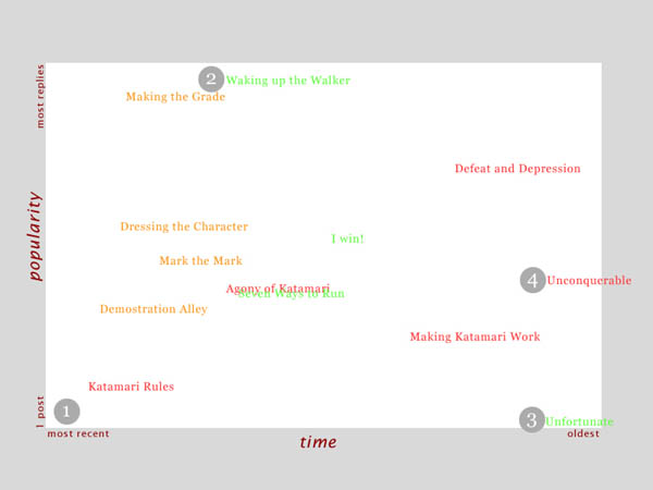
The gateway to each forum will be a two-dimensional topic graph where forum threads float in an x-y matrix. Their position in the graph will be determined by the time they were posted and the number of comments they’ve accumulated so far. Thus, hot topics will rise toward the top while simultaneously being dragged to the left (and eventually off the chart) by the progression of time. Something like this:
topic-graph.jpg
At this point there’s no way of knowing for sure which part of the site will be more successful. The book view is designed to gather commentary, and Ken is sincerely interested in reader feedback as he writes and rewrites. There will also be the option of syndicating the book to be digested serially in an RSS reader. We’re very curious to see how readers interact with the text and hope we’ve designed a compelling environment in which to do so.
Excited as we are about the book interface, our hunch is that the discussion forum component has the potential to become the more vital half of the endeavor. The forum will be quite different from the thousands of gaming sites already active on the web in that it will be less utilitarian and more meditative in its focus. This won’t be a place for posting cheats and walk-throughs but rather a reflective space for talking about the experience of gaming and what players take games to mean. Our hope is that people will have quite a bit to say about this — some of which may end up finding its way into the book.
Although there’s still a ways to go, the process of developing this site has been incredibly illuminating in our thinking about the role of the book in the network. We’re coming to understand how the book might be reinvented as social software while still retaining its cohesion and authorial vision. Stay tuned for further developments.

GAM3R 7H30RY: part 2

Read Part 1
We had a highly productive face to face meeting with Ken this afternoon to review the prior designs and to try and develop, collaboratively, a solution based on the questions that arose from those designs. We were aiming for a solution that provides a compelling interface for Ken’s book and also encourages open-ended discussion of the themes and specific games treated in the book.
What we came up with was a prototype of a blog/book page that presents the entire text of GAM3R 7H30RY, and a discussion board based around the games covered in the book, each corresponding with a specific chapter. These are:

  • Allegory (on The Sims)
  • America (on Civilization III)
  • Analog (on Katamari Damarcy)
  • Atopia (on Vice City)
  • Battle (on Rez)
  • Boredom (on State of Emergency)
  • Complex (on Deus Ex)
  • Conclusions (on SimEarth)

Unlike the thousand of gaming forums that already exist throughout the web, this discussion space will invite personal and social points of view, rather than just walkthroughs and leveling up cheats.
We also discussed the fact that discussion boards tend towards opacity as they grow, and ways to alleviate that situation. Growth is good; it reflects a rich back and forth between board participants. Opacity is bad; it makes it harder for new voices to join the discussion. To make it easier for people to join the discussion, Ken envisioned an innovative gateway into the boards based on a shifting graph of topics ranked by post date (x-axis) and number of responses (y-axis). This solution was inspired in part by “The Pool” — “a collaborative online environment for creating art, code, and texts” developed by Jon Ippolito at the University of Maine — in which ideas and project proposals float in different regions of a two-dimensional graph depending on quantity and tenor of feedback from the collective.
Returning to the book view, to push the boundaries of the blog form, we introduced a presentation format that uniquely fits around McKenzie’s book form—twenty-five regularly sized paragraphs in nine different chapters. Yes, each chapter has exactly 25 paragraphs, making mathematically consistent presentation possible (as an information designer I am elated at this systematic neatness). We decided on showing a cascade of five paragraphs, with one paragraph visible at a time, letting you navigate through chapters and then sets of five paragraphs within a chapter.
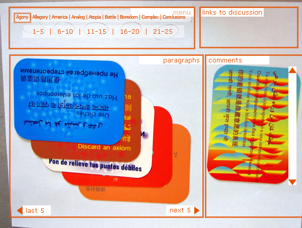
As a delightful aside, we started prototyping with a sheet of paper and index cards, but by some sideways luck we pulled out a deck of Brian Eno and Peter Schmidt’s Oblique Strategies cards, which suited our needs perfectly. The resulting paper prototype (photo w/ wireframe cues photoshop’d in):
IMG_0794.jpg
This project has already provided us with a rich discussion regarding authorship and feedback. As we develop the prototypes we will undoubtedly have more questions, but also, hopefully, more solutions that help us redefine the edges and forms of digital discourse.
Ben Vershbow contributed to this post.

exploring the book-blog nexus

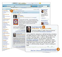
It appears that Amazon is going to start hosting blogs for authors. Sort of. Amazon Connect, a new free service designed to boost sales and readership, will host what are essentially stripped-down blogs where registered authors can post announcements, news and general musings. amazon connect.jpg Eventually, customers can keep track of individual writers by subscribing to bulletins that collect in an aggregated “plog” stream on their Amazon home page. But comments and RSS feeds — two of the most popular features of blogs — will not be supported. Engagement with readers will be strictly one-way, and connection to the larger blogosphere basically nil. A missed opportunity if you ask me.
Then again, Amazon probably figured it would be a misapplication of resources to establish a whole new province of blogland. This is more like the special events department of a book store — arranging readings, book singings and the like. There has on occasion, however, been some entertaining author-public interaction in Amazon’s reader reviews, most famously Anne Rice’s lashing out at readers for their chilly reception of her novel Blood Canticle (link – scroll down to first review). But evidently Connect blogs are not aimed at sparking this sort of exchange. Genuine literary commotion will have to occur in the nooks and crannies of Amazon’s architecture.
It’s interesting, though, to see this happening just as our own book-blog experiment, Without Gods, is getting underway. Over the past few weeks, Mitchell Stephens has been writing a blog (hosted by the institute) as a way of publicly stoking the fire of his latest book project, a narrative history of atheism to be published next year by Carroll and Graf. While Amazon’s blogs are mainly for PR purposes, our project seeks to foster a more substantive relationship between Mitch and his readers (though, naturally, Mitch and his publisher hope it will have a favorable effect on sales as well). We announced Without Gods a little over two weeks ago and already it has collected well over 100 comments, a high percentage of which are thoughtful and useful.
We are curious to learn how blogging will impact the process of writing the book. By working partially in the open, Mitch in effect raises the stakes of his research — assumptions will be challenged and theses tested. Our hunch isn’t so much that this procedure would be ideal for all books or authors, but that for certain ones it might yield some tangible benefit, whether due to the nature or breadth of their subject, the stage they’re at in their thinking, or simply a desire to try something new.
An example. This past week, Mitch posted a very thinking-out-loud sort of entry on “a positive idea of atheism” in which he wrestles with Nietzsche and the concepts of void and nothingness. This led to a brief exchange in the comment stream where a reader recommended that Mitch investigate the writings of Gora, a self-avowed atheist and figure in the Indian independence movement in the 30s. Apparently, Gora wrote what sounds like a very intriguing memoir of his meeting with Gandhi (whom he greatly admired) and his various struggles with the religious component of the great leader’s philosophy. Mitch had not previously been acquainted with Gora or his writings, but thanks to the blog and the community that has begun to form around it, he now knows to take a look.
What’s more, Mitch is currently traveling in India, so this could not have come at a more appropriate time. It’s possible that the commenter had noted this from a previous post, which may have helped trigger the Gora association in his mind. Regardless, these are the sorts of the serendipitous discoveries one craves while writing book. I’m thrilled to see the blog making connections where none previously existed.

without gods: an experiment

without gods screenshot.jpg Just in time for the holidays, a little god-free fun…
The institute is pleased to announce the launch of Without Gods, a new blog by New York University journalism professor and media historian Mitchell Stephens that will serve as a public workshop and forum for the writing of his latest book. Mitch, whose previous works include A History of News and the rise of the image the fall of the word, is in the early stages of writing a narrative history of atheism, to be published in 2007 by Carroll and Graf. The book will tell the story of the human struggle to live without gods, focusing on those individuals, “from Greek philosophers to Romantic poets to formerly Islamic novelists,” who have undertaken the cause of atheism – “a cause that promises no heavenly reward.”
Without Gods will be a place for Mitch to think out loud and begin a substantive exchange with readers. Our hope is that the conversation will be joined, that ideas will be challenged, facts corrected, queries and probes answered; that lively and intelligent discussion will ensue. As Mitch says: “We expect that the book’s acknowledgements will eventually include a number of individuals best known to me by email address.”
Without Gods is the first in a series of blogs the institute is hosting to challenge the traditional relationship between authors and readers, to learn how the network might more directly inform the usually solitary business of authorship. We are interested to see how a partial exposure of the writing process might affect the eventual finished book, and at the same time to gently undermine the notion that a book can ever be entirely finished. We invite you to read Without Gods, to spread the word, and to take part in this experiment.

writing in the open

Mitch Stephens, NYU professor, was here for lunch today. when Ben and I met with him about a month ago about the academic bloggers/public intellectuals project, Mitch mentioned he had just signed a contract with Carroll & Graf to write a book on the history of atheism. today’s lunch was to follow up a suggestion we made that he might consider starting a blog to parallel the research and writing of the book. i’m delighted to report that Mitch has enthusiastically taken up the idea. sometime in the next few weeks we’ll launch a new blog, tentatively called Only Sky (shortened from the lyric of john lennon’s Imagine “. . . Above us only sky”). it will be an experiment to see whether blogging can be useful to the process of writing a book. i expect Mitch will be thinking out loud and asking all sorts of interesting questions. i also think that readers will likely provide important insight as well as ask their own fascinating questions which will in turn suggest fruitful directions of inquiry. stay tuned.