Category Archives: art

Variations on a theme

I spent a day last week at MASS MoCA, touring Sol LeWitt: A Wall Drawing Retrospective. (It was finally profiled in the New York Times this morning, and NPR reported it yesterday.) The exhibit takes up an entire building, wall after wall installed for the (re)creation of LeWitt’s work. LeWitt did not want his work to be limited to a single canvas; he created careful records of each of his drawings so they could be produced on any wall by himself or other artists. He compared this to architecture and music; it can be reproduced and will vary depending upon the people and spaces involved in each production. He planned this exhibit well before his death last year.
For the retrospective, MASS MoCA commissioned sixty-odd students and artists, among them Adrian Piper and Jerry Orter, to produce the wall drawings. Thousands of crayons, graphite pencils, colored pencils, and gallons of acrylic paint later, Building 7 was transformed into a celebration of LeWitt’s career.
Walking through the building is like walking through LeWitt’s brain: you can see his earliest experiments and echoes of these in his later work. These pieces are presented in a way that is varied and spectacular in the exhibit; I am going to present them below in a much more linear format, but you have to go visit to get the full effect. (Unless otherwise noted, all photos in this entry belong to MASS MoCA.)
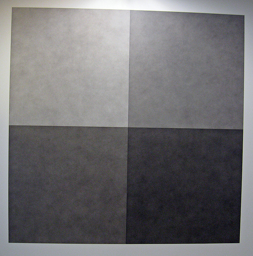
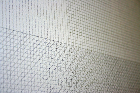
He begins with simple lines, and advances to levels of shading.
lewitt simple lines.jpg

lewitt grey.jpg

Image via Sasquatch Madness on Flickr.

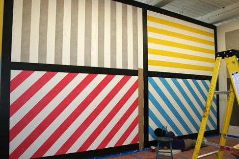
You can see his first foray into the world of color, then what seems to be his signature (four blocks) emerge from these. LeWitt doesn’t blend colors, he layers one color on top of another. He often uses diagonal lines coming from several directions in primary colors, in the following pattern: vertical, horizontal, diagonal left, and diagonal right. He superimposes these lines to create gradations in colors (or greys).
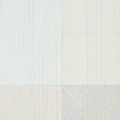
lewitt colored pencil.jpg

lewitt chart.JPG

lewitt stripes.jpg

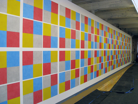
He places the blocks together like a quilt pattern that can span an enormous amount of space.
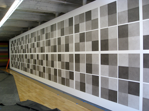
lewitt grey wall.jpg

lewitt color wall.jpg

He (or rather, his talented production team) then blends color by carefully layering primary colors directly on the wall. The result is something like this:
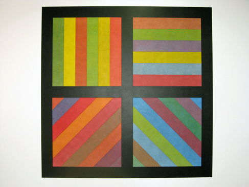
lewitt stripes color.jpg

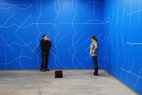
If you look carefully, you see the grids beneath his work. One piece, produced originally on white walls with blue lines, and produced in this retrospective on blue walls with white lines, is a clear demonstration of his lexicon. LeWitt uses music terms to explain how his work is produced. I must resort to linguistic terms to describe it – even the brochure slips into a description of his shapes as though they are language. This blue piece is the largest in the exhibit, showing each of the forms LeWitt used at the time, and presenting them all together on a grid. The grid is still visible in the finished product, and piece feels like a blueprint as well as a finished product. LeWitt worked with an architect for a time, and it’s hard not to compare his work to architecture, geometry, or even early computer programming (which was going on as some of his work was being created).
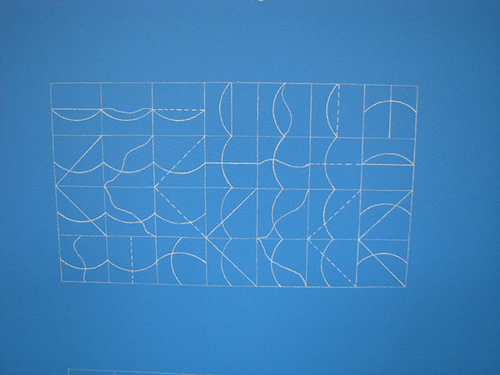
lewittblue.jpg

Lewitt blue via Flickr.

lewitt blue room.jpg

Image from albany_tim on Flickr.

I’m including the second photo with people in it so you can imagine how your relationship with this piece will change when you see in on four walls that tower above you. A piece like this completely immerses the museum-goer the language of his compositions. As you explore, you can learn the syntax of each color, each painting technique, and each pattern. Once you understand the rules, the artist can break them. On the third floor, LeWitt throws walls at you like this:
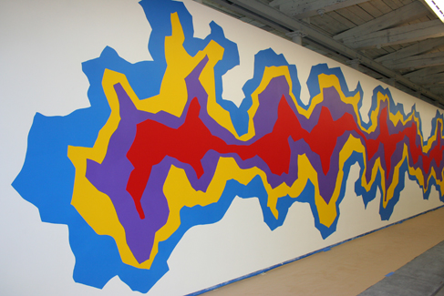
lewitt splat.jpg
That’s Wall Drawing 958, with the description “Splat.” LeWitt subverts his own vocabulary. He leaves behind the “Splat” plan on a sheet for an overhead projector – perhaps he grew less interested in the variation borne of multiple production teams and many different spaces. (If he had been a composer, this would be the point in his life where he records himself playing all the parts of a piece instead of leaving it up to interpretation.)
One of his later pieces that I especially like is below. Everyone who walked by seemed to comment upon its resemblance to a board game. The instructions LeWitt wrote say specifically that none of the same colors can touch, and no matter how carefully the draftsmen planned, they inevitably had to touch it up to make sure this order was preserved.

Sol Lewitt Wall Drawing #1112 & #1152 from jackadam on Vimeo.

(JackAdam has a collection of videos that record the process of creating these drawings, which are worth investigating.)

His final pieces seem to wait quietly to the side while his brightest walls parade around the third floor. These quiet, distant pieces are scribble drawings made with graphite that bring a new level of depth to his work. Color bars have nothing on a spiral piece that appears to spin as it catches the light. NPR used the word “trippy” to describe the work on the third floor – it’s in motion, and it’s coming toward you.
But a piece that stands out in the corner is Wall Drawing 1171. These is beside a few other graphite works that have no color, but add much dimension (this one can flip as you watch it).
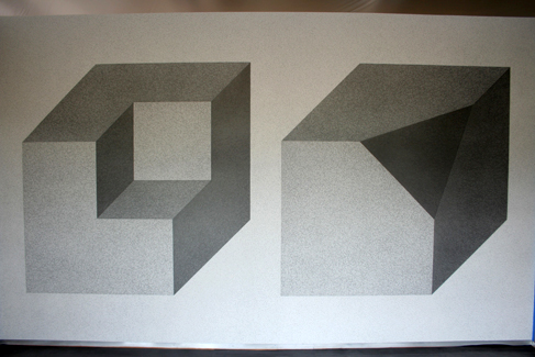
lewitt end of career.jpg
The “cube without a cube” is a three-dimensional cousin of the earliest grey blocks, and in fact the earliest grey lines. It’s as though LeWitt found a favorite verb and conjugated it: grey line blocks, colored pencils block, dark acrylic wall blocks, bright acrylic wall blocks, graphite shapes block. I block, you block, we block.
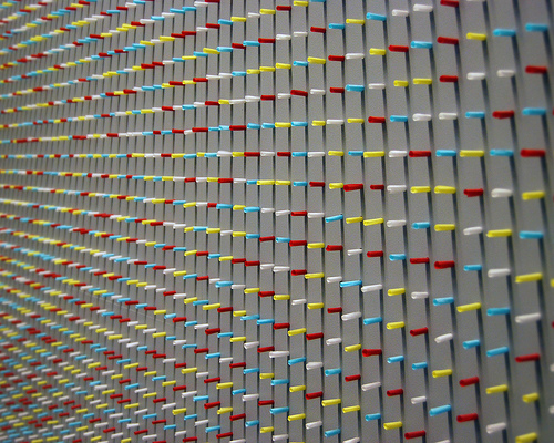
I hadn’t realized I had soaked in LeWitt’s language until I browsed the website and stumbled upon the caption below Wall Drawing 38. This is an unusual piece, employing a pegboard wall to hold thousands of tiny rolls of colored tissue paper. These pieces were supposed to be put in at random, but anyone can imagine how difficult it is to generate a random pattern that appears random – surely the draftsmen had to touch it up, the way they touched up Wall Drawing 1121 (in the video above).
Additionally, this piece is set on three walls: the first wall has yellow and white paper, the second has white, yellow and red, and the third has white, yellow, red, and blue.
The website reveals that this piece was designed for four walls. The first wall had only white tissue. This is a piece that conjugates the block formation with a fresh medium, and a three-dimensional one at that.
lewit tissue 2.jpg

Image by albany_tim on Flickr.

In this case, LeWitt wants you to be inside the blocks (on the second floor) before he removes a cube from a cube (on the third floor, at the end of his life). He makes use of the wall space to trap you, to make you more directly involved with his experiments in color and space. I like this play upon the theme.
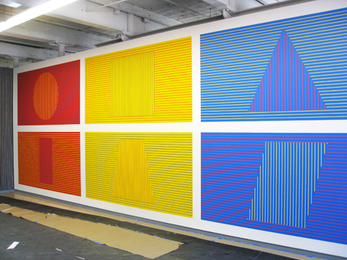
LeWitt wrote, “When an artist uses a conceptual form of art, it means that all of the planning and decisions are made beforehand and the execution is a perfunctory affair. The idea becomes a machine that makes the art.” This exhibit was created by anything but machine. It takes real chopsticks to get those pieces of tissue paper in the peg holes. You the viewer are invited to simultaneously study the artist’s plan, and also the interpretation of each plan within the architectural space, the interpretation and choices of the artists LeWitt knew, and finally the labor of the people who put these pieces together. It’s a very active form of taking in art. You often hear people dismiss modern art because they feel they could have done a piece themselves. In this exhibit, it’s true, and LeWitt wants you to. Let me know if you have the time and energy to create a wall like this in your house. Really, I’d love to see it.
lewitt crayon.jpg

There is a nice piece in The Believer about following LeWitt’s instructions, and a photo essay of the pieces going up.
We were discussing in the Who Built America meeting the way that academics, historians, and writers – many people in the humanities – prefer to keep their work isolated prior to publication. It is supposed to have had some sort of immaculate conception; one cannot reveal the mistakes or the rough edges prior to the moment other scholars see it.
MASS MoCA does an extraordinarily good job of revealing the process behind the exhibit. You can see LeWitt’s transparencies as you enter the exhibit, you can watch videos of some of the pieces going up. You can view the whole exhibit online, by grid or by floorplan, or listen to the audio tour. You can begin to synthesize the work for yourself.

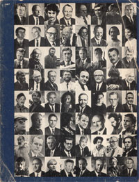
art and technology, 1971

the cover of the art and technology catalogueA quite note to point out that LACMA has announced that they’ve posted the long out-of-print catalogue for their 1971 Art and Technology show online in its entirety in both web and PDF format. It’s worth looking at: Maurice Tuchman and Jane Livingston, the curators of the show, attempted to match artists from the 1960s with corporations working with technology to see what would happen. The process of collaboration is an integral part of the documentation of the project. Sometimes attempted collaborations didn’t work out, and their failure is represented in a refreshingly candid fashion: John Baldessari wanted to work in a botany lab coloring plants; George Brecht wanted IBM & Rand’s help to move the British Isles into the Mediterranean; Donald Judd seems to have wandered off in California. And some of the collaborations worked: Andy Warhol made holograms; Richard Serra worked with a steel foundry; and Jackson Mac Low worked with programmers from IBM to make concrete poetry, among many others.
One contributor who might be unexpected in this context is Jeff Raskin (his first name later lost an “f”), who at the time was an arts professor at UCSD; he’s now best known as the guy behind the Apple Macintosh’s interface. We’ve mentioned his zooming interface and work on humane interfaces for computers on if:book in the past; if you’ve never looked at his zoom demo, it’s worth a look. Back in 1971, he was trying to make modular units that didn’t restrict the builder’s designs; it didn’t quite get off the ground. Microcomputers would come along a few years later.

step inside the books: new york event this friday (3/21)

If you’re in the New York area, don’t miss this. Friday, March 21, 2008, 7-9pm – ?New York, NY – ?125 Maiden Lane, 2nd Floor.
FOR ONE NIGHT ONLY: Step inside three books, drink free beer and wine, and experience the future of the book:
fieldguidenorthamerican.jpgMI.jpgitinlibrary1.jpg
Mark Batty Publisher, Hotel St. George Press, the Institute for the Future of the Book, and the Lower Manhattan Cultural Council‘s Workspace Writers Residency program offer a night of multi-media readings that invite attendees to step inside books, celebrating how new media and traditional publishing fuse to create innovative projects that are more than “just books.” On this night, authors Garth Risk Hallberg, Alex Rose, and Alex Itin demonstrate how their stories rely on more than just words.
Hallberg’s illustrated novella, A Field Guide to the North American Family, documents two fictional families through 63 entries accompanied by evocative photographs contributed by some of today’s freshest photographic talents, as culled from the book’s ongoing companion website, afieldguide.com. Read from start to finish or in a “choose your own adventure” style, Hallberg’s attention to narrative detail makes clear why he was included in the 2008 Harcourt Best New American Voices anthology, and why Print called A Field Guide to the North American Family “a modern illuminated manuscript.” Hallberg will project photographs from the book.
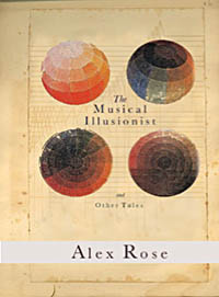
The interwoven, post-modern folktales that comprise The Musical Illusionist by Alex Rose muse upon historical arcana, tethered together by music and topography. Drawing on his experience as a director whose films, videos, and animations have appeared on HBO, MTV, Comedy Central, Showtime, and the BBC, Rose conjures, in the words of the Village Voice, “the playful parables of Jorge Luis Borges . . . exotic maps and exquisite prints further suggest a volume passed down from an epoch much more enthralled with mystery than our own.” Rose will read from the title story of his collection, accompanied by a surround-sound score composed by David Little and recorded by the Formalist Quartet.
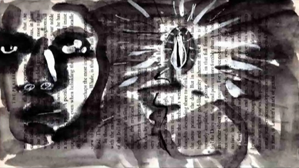
As an artist-in-residence at Brooklyn’s Institute for the Future of the Book, Alex Itin uses text, original illustrations and animations, and music to encourage readers to reconsider the definition of a book. Take for example Itin’s Orson Whales: Melville’s Moby Dick meets Orson Welles, and Led Zeppelin. Itin’s multi-media books will be screened.
The LMCC is the leading voice for arts and culture in downtown New York City, producing cultural events and promoting the arts through grants, services, advocacy, and cultural development programs.

trade-offs

Alex Itin just cross-posted a wonderful new piece on his blog, and Vimeo.
I watched it on Vimeo and was struck by the terrific back and forth discussion between Alex and the people who are looking at his work. It’s gone beyond “cool video dude” and “you rock” to include rather thoughtful sharing of feelings and riffs on ideas for new work. By engaging with his “readers” in the way that he is, Alex is building a community around his work. He is inventing a new medium and unconsciously taking on the role of “author in a networked environment” that we talk about so often on these pages.
Check out this exchange on Vimeo about the video:
itin log.jpg
I am struck by the compromise Alex has to make as an artist in order to build a community around his work. When we first met, Alex was making brilliant multi-modal works combining his paintings, video and audio mash-ups. While on the one hand he had complete control over how the elements appeared and combined it was done in proprietary software which created standalone documents which seriously limited the size of his potential audience. In 2005 he became the institute’s first artist in residence and we made a blog for him where he started posting a continuous stream of individual works. Moving onto the web provided a much larger audience, but the blog format meant that he lost the ability to make complex layered works. Alex’s big web breakthrough came when he started to post his paintings to Flickr and his videos to Vimeo. This allowed him to begin a dialog with his audience and even to begin a series of exciting collaborations with other artists. But at the expense of having to put his paintings on one site and his videos on another.
The balkanization of art works (video here, photos there, and audio in yet another space) in the web 2.0 environment is frustrating, but i completely understand why it’s better to show your work in a place which fosters a dynamic and lively back and forth. I look forward to the day when artists won’t have to make a trade-off between form/content and community.
Sophie 1.0 is being released next week and Alex is the first artist we’re giving it to. Sophie documents don’t display in a web page (yet) but they do have an online component which enables people to have a conversation about the work in the “margin” of the work itself. Stay tuned, we’ll put an announcement up here of Alex’s first Sophie.

poem for no one

Just came across something lovely. Video for “Jed’s Other Poem (Beautiful Ground)” by the now disbanded Grandaddy from their great album The Sophtware Slump (2000). Jed is a character who weaves in and out of the album, a forlorn humanoid robot made of junk parts who eventually dies, leaving behind a few mournful poems.

Creator Stewart Smith: “I programmed this entirely in Applesoft BASIC on a vintage 1979 Apple ][+ with 48K of RAM — a computer so old it has no hard drive, mouse up/down arrow keys, and only types in capitals. First open-source music video, code available on website. Cinematography by Jeff Bernier.” A nice detail of the story is that this was originally a fan vid but was eventually adopted as the “official” video for the song.
Thanks to Alex Itin for the link!

wood book seed key water word

Thanks to James Long of Pan Macmillan for this link to the 370 Day Project, a huge wooden book made by South African artist Willem Boshoff:
CLICK HERE
Boshoff writes:
“I have been playing with the concept of secrecy in my work,” Boshoff said, “because I believe it plays a vital part in nature and in the universe. But I have tried to use it creatively.
“This is an intensely personal statement, and I look upon it in the same light as a book. A book is closed and concealed once it is read until you reopen it, perhaps only once or twice in a lifetime, for a reminder, or for a refreshment…”
Steve Dearden, a key figure on the Literature Development scene in the UK sent me this link to Christopher Woebken’s http://NEW SENSUAL INTERFACES
Finally, Julius Popp’s bit.fall, seems relevant here – it isn’t new, but it’s beautiful.

Bit.Fall – MyVideo

the noble rot

Observe these gorgeous Rorshach mold blots blooming their way across the pages of old books. A video by Ben Hemmendinger, found on Vimeo.

The piece is titled “Edelfäule,” which a little Googling reveals to be German for “noble rot” -? “referring to BOTRYTIS CINEREA, the beneficial mold responsible for the TROCKENBEERENAUSLESE wines.” (Epicurious Wine Dictionary).
Thanks Alex for the link!

eeeeeeeeeee…..eeeeeeee…eeeee

quinn_ch55_2.gif
Moby Dick Chapter 55 or 9200 times E”, 2004, graphite on hemp paper, 11 x 9″
In one of those odd, blogospheric delayed reactions, I just came across (via Information Aesthetics, via Kottke) a fabulous exhibit that took place this past March by an artist named Justin Quinn, who does beautiful, mysterious work with text. Quinn’s Moby-Dick series is made up of obsessively detailed prints and graphite drawings composed entirely of the letter E. Each E corresponds to a letter in a chapter of Melville’s book, so each piece is composed of literally thousands of characters. The effect is almost that of a mosaic or a concrete poem. This series was shown at MMGalleries in San Francisco and has since moved elsewhere (Miami possibly?), but there are still a number of images online (also here). Quinn explains his obsession with E:

The distance between reading and seeing has been an ongoing interest for me. Since 1998 I have been exploring this space through the use of letterforms, and have used the letter E as my primary starting point for the last two years. Since E is often found at the top of vision charts, I questioned what I saw as a familiar hierarchy. Was this letter more important than other letters? E is, after all, the most commonly used letter in the English language, it denotes a natural number (2.71828), and has a visual presence that interests me greatly. In my research E has become a surrogate for all letters in the alphabet. It now replaces the other letters and becomes a universal letter (or Letter), and a string of Es now becomes a generic language (or Language). This substitution denies written words their use as legible signifiers, allowing language to become a vacant parallel Language -? a basis for visual manufacture.
After months of compiling Es into abstract compositions through various systemic arrangements, I started recognizing my studio time as a quasi-monastic experience. There was something sublime about both the compositions that I was making and the solitude in which they were made. It was as if I were translating some great text like a subliterate medieval scribe would have years ago – ?with no direct understanding of the source material. The next logical step was to find a source. Herman Melville’s novel Moby Dick, a story rich in theology, philosophy, and psychosis provides me with a roadmap for my work, but also with a series of underlying narratives. My drawings, prints, and collages continue to speak of language and the transferal of information, but now as a conduit to Melville’s sublime narratives.

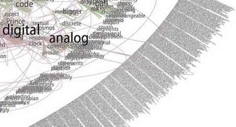
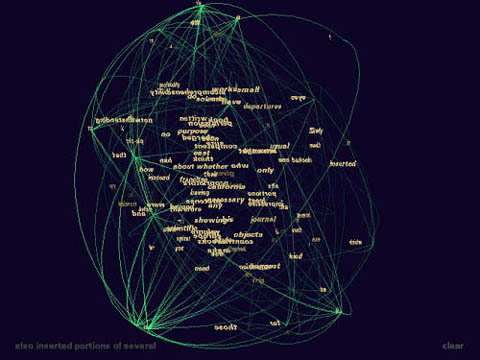
Gazing at these for a while (digital reproductions of course… and on my browser… and brought to my attention through technology blogs), I couldn’t help but start to draw some connections between Quinn’s work and computers. There’s plenty of digital artwork and visualization programs that render text into complex visual formations, sometimes with the intention of discovering new meanings and relationships, other times purely to play with form. Every now and then, someone manages to achieve both. This is a detail from Brad Paley’s rendering of Gamer Theory through his program Text Arc:
gamerarcscrnsht2smaller.jpg
Others can be beautiful to handle, but are ultimately opaque, like Ben Fry’s “Valence”:
valence.jpg
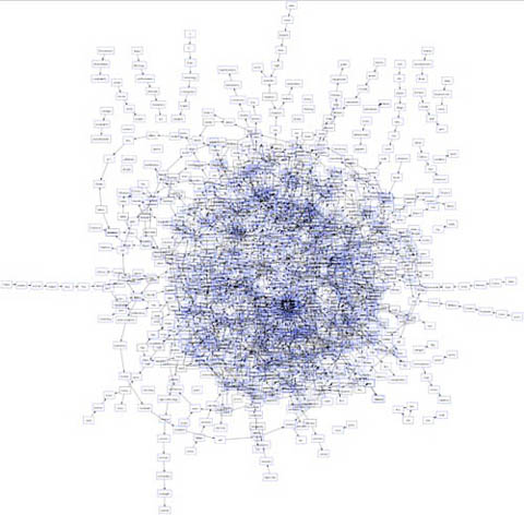
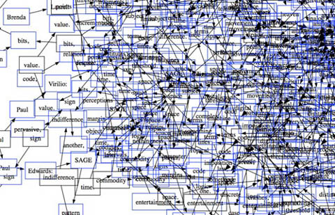
These two images are from another work submitted to our Gamer Theory visualization gallery, a map of nouns and verbs in Wark’s text (first is full, second is a detail). It’s pretty, but basically meaningless.
nounsversbs1.jpg
nounsverbs2.jpg
Quinn’s work is also difficult to penetrate, but something about it holds my attention. I’m not sure how aware Quinn is of the digital work being done today, but viewing his pieces against the contemporary technological backdrop, and his own self-described feeling of being the “subliterate medieval scribe” as he makes his minute articulations, my mind runs off in a number of directions. Seeing that his work is in a way “pixelated” – ?his Es a “basis for visual manufacture” – ?I imagine him as a sort of human computer – ?a monastic machine – ?processing (or intuiting) the text by infintessimal degrees through his own inner algorithm.
After all, a computer’s work is “subliterate.” Algorithms must be designed with intelligence, but the actual running of the program is physical, mindless. Viewed this way, Quinn’s work is like a dive into the mania of operations usually carried out with blazing speed by microprocessors. This is not to diminish it, or to call it cold and mechanical. Rather I’m pondering whether there is perhaps a spiritual dimension to the repetitive, sub-rational activities of our machines, which, if transposed to human scale, can become a sort of devotional exercise, like the routines of Buddhist monks, endlessly painting and carving Chinese characters in order to empty their minds (other links between monks and computers here and here).
What’s particularly evocative to me about the work, however, is how it treads the line between that meditative quality and the obsessive. There is something frightening about them (or about any kind of fanatically detailed artwork, or about computers for that matter), like the reams of psychotic babble typed out ceaselessly by Jack Nicholson in “The Shining.” Or is it Ahab’s vengeance algorithm we’re seeing, running on overdrive until the machine (or ship) crashes?
In the end, Quinn’s images are mysterious, his algorithm inscrutable, although my mind immediately goes to work trying to link up Melville’s themes and images to those endless strings of Es.
Here’s that first image again with a quote from the source text that seemed to me to connect. Chapter 55, “Of the Monstrous Pictures of Whales”:
quinn_ch55_2.gif
Moby Dick Chapter 55 or 9200 times E”, 2004, graphite on hemp paper, 11 x 9″
But these manifold mistakes in depicting the whale are not so very surprising after all. Consider! Most of the scientific drawings have been taken from the stranded fish; and these are about as correct as a drawing of a wrecked ship, with broken back, would correctly represent the noble animal itself in all its undashed pride of hull and spars. Though elephants have stood for their full-lengths, the living Leviathan has never yet fairly floated himself for his portrait. The living whale, in his full majesty and significance, is only to be seen at sea in unfathomable waters; and afloat the vast bulk of him is out of sight, like a launched line-of-battle ship; and out of that element it is a thing eternally impossible for mortal man to hoist him bodily into the air, so as to preserve all his mighty swells and undulations.
This one is of chapter 71, “The Jeroboam’s Story” (I spoke briefly on the phone with one of the curators who told me that Quinn had explained this as an inverted halo, reflecting the anti-Christ-like character described in the chapter – ?I almost see an aerial view of a whale cutting through water):
quinn_ch71.gif
Moby Dick Chapter 71 or 9,814 times E”, 2006, mixed media, 11 x 15″
…but straightway upon the ship’s getting out of sight of land, his insanity broke out in a freshet. He announced himself as the archangel Gabriel, and commanded the captain to jump overboard. He published his manifesto, whereby he set himself forth as the deliverer of the isles of the sea and vicar-general of all Oceanica. The unflinching earnestness with which he declared these things; – the dark, daring play of his sleepless, excited imagination, and all the preternatural terrors of real delirium, united to invest this Gabriel in the minds of the majority of the ignorant crew, with an atmosphere of sacredness. Moreover, they were afraid of him. As such a man, however, was not of much practical use in the ship, especially as he refused to work except when he pleased, the incredulous captain would fain have been rid of him; but apprised that that individual’s intention was to land him in the first convenient port, the archangel forthwith opened all his seals and vials – devoting the ship and all hands to unconditional perdition, in case this intention was carried out. So strongly did he work upon his disciples among the crew, that at last in a body they went to the captain and told him if Gabriel was sent from the ship, not a man of them would remain.