The following quote was in AP story i read in MIT’s Technology Review this morning about Microsoft licensing Adobe’s mobile Flash and PDF software.
“Flash content is the most prolific content on the web today; it is the way people express themselves on the Internet,” Adobe spokesman Gary Kovacs said.
Hmmm . . . . i suppose it might be true that if you add up all the gigabytes of You-Tube videos that more content on the web is in Flash than any other format. But to say that Flash is the way that most people express themselves seems just a tad disingenuous. You-Tube and other sites convert amateur production into Flash; only a small minority of that content is actually created in Flash. But the reason i’m bothering to post this isn’t to call Adobe out for misleading numbers it’s to raise a warning flag — actually two warning flags
1. Converting amateur production into Flash as You-Tube and other for-profit sites do, effectively moves that content into a proprietary format which resists re-use and re-mix. This is not a good thing.
2. Flash is not easy software to master. If it were true that most conent on the web was created natively in Flash rather than converted into it after the fact, that would mean that content creation had moved decisively into the province of the professional, returning us to the built-in the hierarchies of print and broadcast media. Also not a good thing.
Category Archives: adobe
digital editions
Yesterday Adobe announced the release of their Digital Editions software. The software’s been available in a beta format for a while; I downloaded it back then & didn’t think it was interesting enough to write about. I’ve spent the past two days playing with the new release. I’m still not sure that it’s worth attention, but I’ll try to explain why it’s not interesting.
What is Digital Editions? It’s still a bit hard to tell. When I downloaded the beta version, it seemed to be a lightweight remake of Adobe Reader (née Acrobat Reader), Adobe’s PDF viewer. The full release expands the capabilities of Digital Editions: in addition to being a PDF viewer, it’s also a viewer for the new EPUB format. It also seems to be a front end for future web-based electronic book sellers, like Apple’s iTunes for music. I’ll go through each of these three uses in turn, but first a few notes on how Digital Editions works.
Digital Editions looks more like a web application than a desktop application. There are no menu bars to speak of, and its interface borrows nothing from the operating system. This is nice in that it feels like it’s a reading environment: the interface is black-on-black, which should block out the distractions rampant on the desktop. Certainly there’s none of the excess frippery that comes with Acrobat. However, the minimalism may be a bit excessive: it can be difficult to find black buttons and sliders to turn pages. (I’d be curious to see a review of the application from someone interested in accessibility for the disabled.) And some controls don’t behave the way a user might expect: given a scrollbar along the right edge of a page, I expect to be able to click at a point where the slider isn’t to move the slider. No such luck. Nor can you drag-select to change which part of the page is visible when the page is larger than the window, or drag a file into the window to open it.
Many of my problems with it stem from it not behaving like Mac software; I suspect a PC user would have similar complaints about it not behaving like PC software. This wouldn’t matter if the interface were an improvement over the operating systems – in both there’s plenty of room for improvement – but it’s not a noticeable improvement. It’s simply different, and that slows users down.
1. as a PDF reader
As mentioned above, Digital Editions initially seemed to be a remake of Adobe Reader, which has become hideously bloated with time. The current OS X version of the software is 108Mb; it’s a slow program. While I look at a fair number of PDFs on a daily basis, I’ve long since stopped using Acrobat in any of its forms if I don’t have to; Apple’s Preview application is much faster and delivers almost all the functionality that I want out of a PDF reader. I suspect most other Mac users do the same. Acrobat can be useful if you’re doing print pre-press work or working with forms, but neither of those are things I do that often.
Digital Editions does work as a PDF viewer. It’s based around a library concept, so every time you open a PDF in DE, an image of the front page is saved in the library; you can click on this image to open it. Once you have a PDF, you can look at it as a single page, as a double page (even if the PDF hasn’t been set up for this), at the width of the screen, or with a zoom widget that lets you use 18 levels of zoom from 87% to 919%. Here’s how a PDF from /ubu editions looks:
Digital Editions is clearly built around a different PDF rendering engine than the rest of Adobe’s software. (The FAQ explains that this engine was designed to be used on cellphones.) Image quality is noticeably worse than in Acrobat or Preview. Text is poorly aliased, and spacing between characters seems to be off for some fonts at some zoom levels. Graphics are notably grainy, and weird rendering artifacts sometimes show up. (In the image above, for example, note that there’s a light blue rectangle under the text on the left. This doesn’t show up in any other PDF viewer.) Some PDFs have extras that shouldn’t have been there, blocks of background color, for example. One illustration of the color picker in the Sophie help PDF I made a couple weeks back turns a lovely shade of purple:
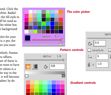
This is frustrating: one of Adobe’s chief selling points of PDF as a format has been that a PDF will look the same on every machine in every viewer. Not this one. Adobe offers sample PDFs for download at their Digital Editions website (see below), which are similarly perplexing. Although these appear to be ordinary PDFs (with no restrictions), they don’t behave like regular PDFs. They can’t be opened in any PDF viewer that’s not Digital Editions. Preview shows only blank pages; opening them in the current Adobe Reader takes you to a webpage where you can download Digital Editions; and opening them in an older version of Acrobat brings up a message asking whether I’d like to learn more about documents protected with Adobe DRM. Clicking yes takes me to a pre-Digital Editions Adobe ebooks page. PDFs have become popular because they can be used in a variety of ways across a variety of platforms. This seems like a significant step backwards for Adobe: interoperability is taking a back seat to DRM.
2. as an EPUB reader
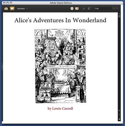
But Digital Editions isn’t only a PDF viewer; it’s also a viewer for EPUB format. EPUB is the work of the IDPF; it’s essentially an XHTML format for ebooks. You can get sample EPUBs from Adobe’s website. If you have the latest version of Adobe InDesign, you can make them yourself (more about that in a bit). Here’s the front page of their edition of Alice’s Adventures in Wonderland:
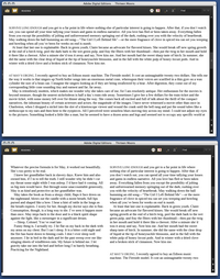
Perhaps not surprisingly for an XHTML format, the experience of reading an EPUB in Digital Editions is similar to reading a web page. The text becomes as wide as the Digital Editions window; if the window is wide enough, the text may reflow into more columns. When this happens is unclear to me: in some books, the text column is much too wide to read well before the text is reflowed:
You can choose between 4 different font sizes; you can’t change the fonts. (Some EPUB books include their own fonts; some use system fonts.) As in the Digital Editions PDF viewer, there’s some bookmarking capability: you can select text and click “Add bookmark” to add a note at a particular point in the text. Books have tables of contents; there’s a search function. You can print books (or, on a Mac, convert them to PDFs); this seems to be in two columns by default.
That seems to be all you can do with these books. The books that Adobe provides are noticeably ugly: most of the graphics included are low resolution. Text looks weirdly bad: in the default font, the italic text seems to actually be slanted roman characters, which you’d think Adobe would be embarrassed about. To my eye, the text looks much better in Safari or even Firefox. You can make this comparison if you rename the .epub file .zip and unzip it; in the resulting folder, you’ll find a bunch of HTML pages, the images used, and fonts, if they’re included.
Adobe trumpets the one-click creation of EPUB files in the new version of InDesign. So I fired up InDesign and made some EPUBs to see how those worked in Digital Editions. Try for yourself: here is a version of the Sophie help PDF in EPUB format. The results are a bit disappointing: all the graphics have been dumped at the end of the document, much of the formatting has been lost, and the table of contents I laboriously set up for PDF export has been eliminated. One-click conversion evidently doesn’t allow exporting the fonts the document uses; and even though I have the Avenir and Scala fonts on my machine, it displays in the default Digital Editions font. The graphics do display in their real color, which is more than you can say for the way Digital Editions handles the PDF, though many of them do seem to have been converted to JPEGs in a lossy way.
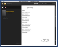
As a whim, I fed InDesign’s converter some foreign-language poetry to see how it would handle Unicode text. French came through okay. Lithuanian was mangled beyond recognition. Some Chinese poetry didn’t work at all:
It’s clear that this needs a lot of work before it can be taken seriously.
3. as a store
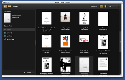
From Adobe’s press release, it’s clear that the main impetus behind Digital Editions is to provide a local front end for web-based selling of ebooks. The model that Adobe is working on becomes apparent when you open it up: the program maintains a library of all the PDF files you look at, in the same way that iTunes maintains a library of the MP3s on your computer:
Categories of books (on the left in the above screenshot) include “Borrowed” and “Purchased”. The iTunes model of incorporating a store in software isn’t necessarily a bad one: Linotype has embedded a font store in their free font management software, with some degree of success. It’s hard to tell how well Adobe’s integration will work. They’ve tried selling ebooks before with little success; I have a couple of PDFs bought from Amazon that I’ve long since despaired of ever opening again. (Some progress may be reported: clicking on these now now opens DigitalEditions, where I get a different cryptic error than I did before in Acrobat.) The same sort of problems are likely with ebooks designed for DigitalEditions; it does worry me that even PDFs without DRM can’t be opened outside of the software.
DRM are probably the logical place to end this overlong review. One of the major reasons that we haven’t spent much time covering the efforts of the IDPF is that it’s devoted to standards that satisfy producers rather than consumers; many producers are concerned with locking down their products as thoroughly as possible. It may be a reasonable position from their perspective, but it’s resulted in products that aren’t particularly useful to consumers. DigitalEditions looks like it might be a big piece in the puzzle for DRM-focused producers. Unfortunately, readers are being neglected.
adobe acrobat 8 is probably not for you
Adobe just announced the release of Acrobat 8, their PDF production software. To promote it, they hosted three “webinars” on Tuesday to demonstrate some of the new features to the interested public. Your correspondent was there (well, here) to see what glimmers might be discerned about the future of electronic reading.
Who cares about Acrobat?
What does Acrobat have to do with electronic books? You’re probably familiar with Acrobat Reader: it’s the program that opens up PDFs. Acrobat is the “author” program: it lets people make PDFs. This is very important in the world of print design and publishing: probably 90% of the new printed material you see every day goes through Acrobat in some form or another. Acrobat’s not quite as ubiquitous as it once was – newer programs like Adobe InDesign, for example, let designers create PDFs that can be sent to the printer’s without bothering with Acrobat, and it’s easy to make PDFs out of anything in Mac OS X. But Acrobat remains an enormous force in the world of print design.
PDF, of course, has been presented as being a suitable format for electronic books; see here for an example. Acrobat provided the ability for publishers to lock down the PDFs that Amazon (for example) sold with DRM; publishers jumped on board. The system wasn’t successful, not least because opening the locked PDFs proved chancey: I have a couple of PDFs I bought during Amazon’s experiment selling them which, on opening, download a lot of “verification information” and then give inscrutable errors. In part because of these troubles, Amazon’s largely abandoned the format – notice their sad-looking ebook store.
Why keep an eye on Acrobat? One reason is because Acrobat 8 is Adobe’s first major release since merging with Macromedia, a union that sent shockwaves across the world of print and web design. Adobe now releases almost most significant programs used in print design. (A single exception is Quark XPress, which has been quietly rolling away towards oblivion of its own accord since around the millennium.) With the acquisition of Macromedia’s web technologies – including Flash and Dreamweaver – Adobe is inching towards a Microsoft-style monopoly of Web design. In short: where Acrobat goes is where Adobe goes; and where Adobe goes is where design goes. And where design goes is where books go, maybe.
So what does Acrobat 8 do?
Acrobat 8 provides a number of updated features that will be useful to people who do pre-press and probably uninteresting to anyone else. They’ve made a number of minor improvements – the U. S. government will be happy to know that they can now use Acrobat to redact information without having to worry about the press looking under their black boxes. You can now use Acrobat to take a bunch of documents (PDF or otherwise) and lump them together into a “bundle”. All nice things, but nothing to get excited about. More DRM than you could shake a stick at, but that’s to be expected.
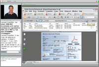 The most interesting thing that Acrobat 8 does – and the reason I’m bringing this up here – is called Acrobat Connect. Acrobat Connect allows users to host web conferences around a document – it was what Adobe was using to hold their “webinars”. (There’s a screenshot to the right; click on the thumbnail for the full-sized image.) These conferences can be joined by anyone with an Internet connection and the Flash plugin. Pages can be turned and annotations can be made by those with sufficient privileges. Audio chatting is available, as is text-based chatting. The whole “conversation” can be recorded for future reference as a Flash-based movie file.
There are a lot of possibilities that this technology suggests: take an electronic book as your source text and you could have an electronic book club. Teachers could work their way through a text with students. You could use it to copy-edit a book that’s being published. A group of people could get together to argue about a particularly interesting blog post. Reading could become a social experience.
But what’s the catch?
There’s one catch, and it’s a big one: the infrastructure that Acrobat 8 uses: you have to use Adobe’s server, and there’s a price for that. It was suggested that chat-hosting access would be provided for $39 a month or $395 a year. This isn’t entirely a surprise: more and more software companies are trying to rope consumers into subscription-based models. This might well work for Adobe: I’m sure there are plenty of corporations that won’t balk at shelling out $395 a year for what Acrobat Connect offers (plus $449 for the software). Maybe some private schools will see the benefit of doing that. But I can’t imagine, however, that there are going to be many private individuals who will. Much as I’d like to, I won’t.
I’m not faulting Adobe for this stance: they know who butters their bread. But I think it’s worth noting what’s happening here: a divide between the technology available to the corporate world and the general public, and, more specifically, a divide that doesn’t need to exist. Though they don’t have the motive to do so, Adobe could presumably make a version of Acrobat Connect that would work on anyone’s server. This would open up a new realm of possibility in the world of online reading. Instead, what’s going to happen is that the worker bees of the corporate world will find themselves forced to sit through more PowerPoint presentations at their desks.
While a bunch of people reading PowerPoint could be seen as a social reading experience, so much more is possible. We, the public, should be demanding more out of our software.


