Author Archives: sarah northmore

ITIN place | 2007 redux: design journal, part 3

CarGlas4.jpg(read parts 1&2)
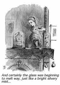
[3] I’d just begun hard coding navigational elements for the new ITIN archives, when I suspected Through the Looking-Glass might be an apt, fun read to offset the growing angst around coding. Maybe something in literature would provide the gestalt I felt missing from the minutia of writing lines of functions, booleans, and parameters. Sounds holistic maybe, but this suspicion plus a Wikipedia entry I’d read on Lewis Carol convinced me it’d be the perfect read just now. So, when I was walking through Penn Staten earlier last month, I found a bookseller in the LIRR station and, all excited, I picked up a copy of Alice’s Adventures, with the intentions of breezing through it in order to move onto Looking-Glass. It was nice to open ITIN place the next day to find Stormy Blues For Alice In The Looking Glass. Somehow, the two had already met.
Sally: I’ve been trying to figure out some of the back-end stuff for the past few days, namely, how to get your entire archive to link up to something like this. Do you have any programming / web design wizard friends who might be able to offer me some technical advice?
Alex: God know…. I guess we’ll have to build them manually…some 700 links? yipes.
Alex: I mean, god no….LOL
Sally: Hey, I’m working with a programmer now on a script that will allow the archive to thumbnail images from your entries and automatically load them (& URLs to the corresponding entries) into the Flash file. I don’t know PHP, which is likely the language needed to thumbnail your images automatically, so I’m getting help on that. Once that’s in place, we should be able to (a) play further with layout aspects! and (b) the archive should automatically update every time you publish an entry. Getting closer…
Alex: and it will still do that animated scale up and down trick?
Sally: my PHP programmer who would work on the thumbnail-ing flaked out on me, seems programmers can be as flaky as drummers… So, I set it upon myself to teach myself Flash-based blog applications. At its simplest, it requires a little PHP, a little XML and Flash, all in conversation with what you post online.

itinxml.gif

Ben: As for PHP gurus… We do in fact have someone working with us right now who’s an experience PHP coder. We’re keeping him pretty busy right now with MediaCommons stuff, but I think he could help you out with this stuff in a few weeks.
Sally: I also imagine there should be more than one way to search / browse the archives. One might be a linear “wall” from month to month that we could click/scroll through, another might be a drop-down menu of months say, to the right of the “wall” of images. Any thoughts on that?
Meanwhile, I’d plotted out on my whiteboard a map of the flash file. It looked to me that there were two methods of approach, interface-wise. Either the zoom function would scale up the size of an entire month’s calendar, and a re-center or panning function would allow the user to focus on a particular entry – or – the zoom function would simply scale up one entry at a time onrollOver (the original idea).
I am (still) drawn to the first idea, even though I’ve put it aside, since that would best recreate the sense of approaching a gallery wall, or landing on the (x,y) of Alex’s blog. But, caveats abound — if an onPress fires the zoom and re-center, then how do you click the entry’s permalink and/or zoom out? Is this overcomplicating things? Here is an example of an unweildy new zoom (an attempt to manage dragging and zooming).



htmlentry.jpg Then I started to think about loading in individual blog entries from the XML. I talked to my friend Mike about this for a while and in exchange for some brownies (although really only out of his extreme kindness and generosity) he constructed an XML format, sample.xml, and guided me on a way to load in the HTML of each individual entry into a small clip.
The great thing about using the HTML of each entry in the previous example is that it would allow the archives to build completely dynamically. Any changes Alex made in an archived post would reflect in real time in the flash file. Unfortunately, this doesn’t cut down on load time and I can’t coax the videos and animated .gifs to appear (of which there are considerable number). Here is an example of one entry pulled into the Flash file with HTML. CSS can be incorporated, but it’s obviously slow loading.
Mike brought up something I’d wondered too too: are we going to have one XML file for the entire archive? It seems to make more sense for each month to have it’s own.
So, after a few weeks, I caught up with Future of the Book’s expert developer Eddie Tejeda, and we decided to put an XML document within each month. On an exciting note, Eddie devised a great scheme (script) to take screen shots of all of ITIN place’s entries. He’s working on getting the image size down, so as to minimize loading time.
Eddie’s screen shots would load much faster than pure HTML, but it could possibly cut the dynamism. This would build something like this, only faster:


Most of the hard coding of the archive is done. Design matters remain: At the moment, the entries load in rather like a retro computer solitaire game, and drop down menus are disconnected and unskinned. It’s a task to go back and forth between design and developing — I’m just cutting my teeth on some of this and the dryness of programming can dilute creative inspiration (if this is anything to go by). The archive is very close to complete; it will be a thrill to use this gentler beast.

ITIN place | 2007 redux: design journal, parts 1 & 2

ITIN place — May 2006 archives (left two columns with live links):


[1] SUMMER 2006
At the beginning of the summer, Ben Vershbow, Alex Itin, and I began to discuss a redesign of IT IN place‘s archives. Itin blogs prolifically, his posts rich with media: scans of paintings, animated .gifs, Vimeo linked video collages. As a result, at present, his blog archive is enormous, slow loading, and unweildy. The archive requires better display and search capabilities—a map— to foreground the sheer volume of Itin’s work, rather than bury it. Below is a series of exchanges, both visual and conversational, following the redesign of IT IN place‘s archives…

Continue reading

dark waters? scholarly presses tread along…

_jh22366.jpg
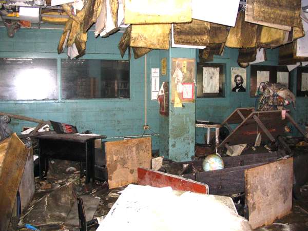
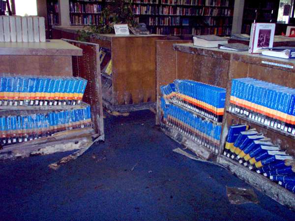
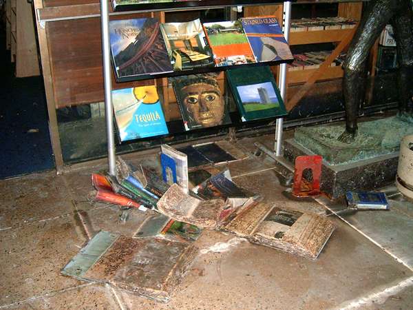
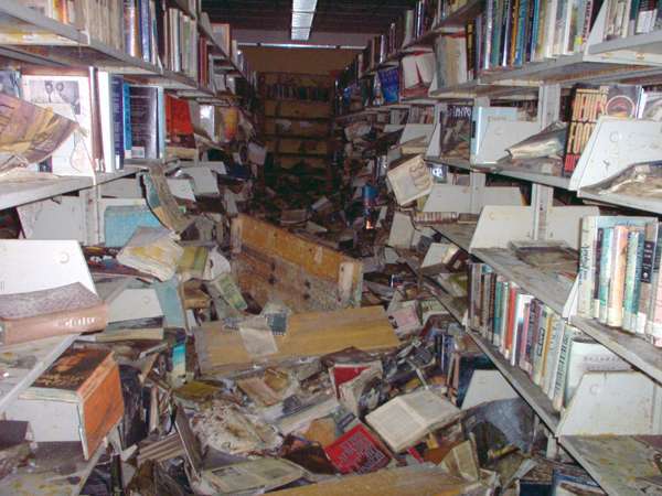
Recently in New Orleans, I was working at AAUP‘s annual meeting of university presses. At the opening banquet, Times-Picayune editor Jim Amoss brought a large audience of publishing folk through a blow-by-blow of New Orleans’ storm last fall. What I found particularly resonant in his recount, beyond his staff’s stamina in the face of “the big one”, was the Big Bang phenomena that occured in tandem with the flooding, instantly expanding the relationship between their print and internet editions.
Their print infrastructure wrecked, The Times-Picayune immediately turned to the internet to broadcast the crisis that was flooding in around them. Even the more troglodytic staffers familiarized themselves with blogging and online publishing. By the time some of their print had arrived from offsite and reporters were using it as currency to get through military checkpoints, their staff had adapted to web publishing technologies and now, Amoss told me, they all use it on a daily basis.
mlk07.jpg
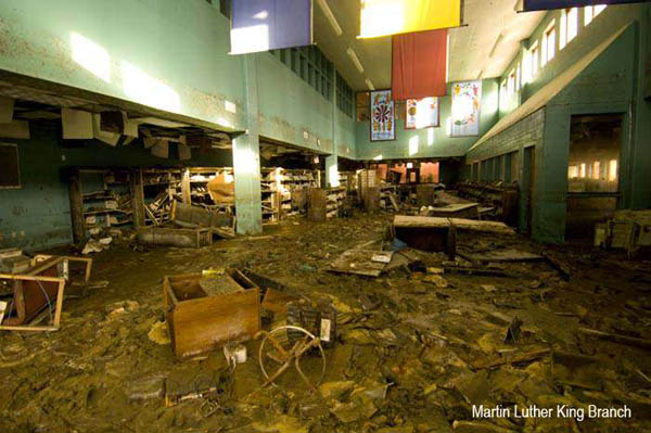
Martin Luther King Branch
If the Times-Picayune, a daily publication of considerable city-paper bulk, can adapt within a week to the web, what is taking university presses so long? Surely, we shouldn’t wait for a crisis of Noah’s Ark proportions to push academe to leap into the future present. What I think Amoss’s talk subtly arrived at was a reassessment of *crisis* for the constituency of scholarly publishing that sat before him.
“Part of the problem is that much of this new technology wasn’t developed within the publishing houses,” a director mentioned to me in response to my wonderings. “So there’s a general feeling of this technology pushing in on the presses from the outside.”
eno11.jpg
East New Orleans Regional Branch
But “general feeling” belies what were substantially disparate opinions among attendees. Frustration emanated from the more tech-adventurous on the failure of traditional and un-tech’d folks to “get with the program,” whereas those unschooled on wikis and Web 2.0 tried to wrap their brains around the publishing “crisis” as they saw it: outdating their business models, scrambling their workflow charts and threatening to render their print operations obsolete.
That said, cutting through this noise were some promising talks on developments. A handful of presses have established e-publishing initiatives, many of which were conceived of with their university libraries. By piggybacking on the techno-knowledge and skill of librarians who are already digitizing their collections and acquiring digital titles (librarians whose acquisitions budgets far surpass those of many university presses,) presses have brought forth inventive virtual nodes of scholarship. Interestingly, these joint digital endeavors often explore disciplines that now have difficulty making their way to print.
Some projects to look at:
MITH (Maryland); NINES (scholar driven open-access project); Martha Nell Smith’s Dickinson Electronic Archives Project; Rotunda (Virginia); DART (Columbia); Anthrosource (California: Their member portal has communities of interest establishing in various fields, which may evolve into new journals.)
eno18.jpg
East New Orleans Regional Branch
While the marriage of the university library and press serves to reify their shared mandate to disseminate scholarship, compatibility issues arise in the accessibility and custody of projects. Libraries would like content to be open, and university presses prefer to focus on revenue generating subscribership.
One Digital Publishing session shed light on more theoretical concerns of presses. As MLA reviews the tenure system, partly in response to the decline of monograph publication opportunities, some argued that the nature of the monograph (sustained argument and narrative) doesn’t lend itself well to online reading. But, as the monograph will stay, how do presses publish them economically?
navra03.jpg
Nora Navra Branch
On the peer review front, another concern critiqued the web’s predominantly fact-based interaction: “The web seems to be pushing us back from an emphasis on ideas and synthesis/analysis to focus on facts.”
Access to facts opens up opportunities for creative presentation of information, but scholarly presses are struggling with how interpretive work can be built on that digitally. A UVA respondant noted, “Librarians say people are looking for info on the web, but then moving to print for the interpretation; at Rotunda, the experience is that you have to put up the mass of information allowing the user to find the raw information, but what to do next is lacking online.”
Promising comments came from Peter Brantley (California Digital Library) on the journal side: peer review isn’t everything and avenues already exist to evaluate content and comment on work (linkages, citation analysis, etc.) To my relief, he suggested folks look at the Institute for the Future of the Book, who are exploring new forms of narrative and participatory material, and Nature’s experiments in peer review.
Sure, at this point, there lacks a concrete theoretical underpinning of how the Internet should provide information, and which kinds. But most of us view this flux as its strength. For university presses, crises arise when what scholar Martha Nell Smith dubs the “priestly voice” of scholarship and authoritative texts, is challenged. Fortifying against the evolution and burgeoning pluralism won’t work. Unstifled, collaborative exploration amongst a range of key players will reveal the possiblities of the terrain, and ease the press out of rising waters.
smith03.jpg
Robert E. Smith Regional Branch
All images from New Orleans Public Library