Author Archives: dan visel

the persistence of memory

(nostalgia)1.pngJorge Luis Borges tells the story of “Funes, the Memorious,” a man from Uruguay who, after an accident, finds himself blessed with perfect memory. Ireneo Funes remembers everything that he encounters; he can forget nothing that he’s seen or heard, no matter how minor. As one might expect, this blessing turns out to be a curse: overwhelmed by his impressions of the world, Funes can’t leave his darkened room. Worse, he can’t make sense of the vast volume of his impressions by classifying them. Funes’s world is made up entirely of hapax legomena. He has no general concepts:

“Not only was it difficult for him to see that the generic symbol ‘dog’ took in all the dissimilar individuals of all shapes and sizes, it irritated him that the ‘dog’ of three-fourteen in the afternoon, seen in profile, should be indicated by the same noun as the dog of three-fifteen, seen frontally. His own face in the mirror, his own hands, surprised him every time he saw them.”

(nostalgia)2.png(p. 136 in Andrew Hurley’s translation of Collected Fictions.) Funes dies prematurely, alone and unrecognized by the world; while we are told that he died of “pulmonary congestion,” it’s clear that Funes has drowned in his memories. While there are advantages to remembering everything, Borges’s narrator realizes his superiority to Funes:

“He had effortlessly learned English, French, Portuguese, Latin. I suspect, nevertheless, that he was not very good at thinking. To think is to ignore (or forget) differences, to generalize, to abstract. In the teeming world of Ireneo Funes there was nothing but particulars – and they were virtually immediate particulars.”

(nostalgia)3.png(p. 137) Borges’s story isn’t really about memory as much as it is about how we make sense of the world. It’s important to forget things, to ignore the minor differences between similar objects. We recognize that the dog the Funes sees at three-fourteen and the dog that he sees at three-fifteen are the same; Funes does not. Funes dies insane; we, hopefully, do not.
(nostalgia)4.pngI won’t pretend to be the first to see in the Internet parallels to the all-remembering mind of Funes; a book could be written, if it hasn’t already been, on how Borges invented the Internet. It’s interesting, however, to see that the problems of Funes are increasingly everyone’s problems. As humans, we forget by default; maybe it’s the greatest sign of the Internet’s inhumanity that it remembers. With time things become more obscure on the Internet; you might need to plumb the Wayback Machine at archive.org rather than Google to find a website from 1997. History becomes obscure, but it only very rarely disappears entirely on the Internet.
(nostalgia)5.pngA recent working paper by Viktor Mayer-Schoenberger, a professor at Harvard’s Kennedy School of Government, recognizes the problems of the Internet’s elephantine memory. He suggests pre-emptively dealing with the issues that are sure to spring up in the future by actively building forgetting into the systems that comprise the network. Mayer-Schoenberger envisions that some of this forgetting would be legally enforced: commercial sites might be required to state how long they will keep customer’s information, for example.
(nostalgia)6.pngIt’s an interesting proposal, if firmly in the realm of the theoretical: it’s hard to imagine that the public will be proactive enough about this issue to push the government to take issue any time soon. Give it time, though: in a decade, there will be a generation dealing with embarrassing ten-year-old MySpace photos. Maybe we’ll no longer be embarrassed about our pasts; maybe we won’t trust anything on the Internet at that point; maybe we’ll demand mandatory forgetting so that we don’t all go crazy.

Images from Hollis Frampton’s film (nostalgia), 1971.

texts over time

There’s a striking passage in “The Folio Restored”, an article by Jonathan Bate in the April 20 issue of the Times Literary Supplement on the perils of editing Shakespeare because of the differences between various editions:

“Perhaps it would be best to abandon the idea that any one text represents the ‘definitive’ version of a Shakespeare play. After all, the quest for a ‘definitive’ text, based on a ‘single lost original’, was premissed on the principles of Classical and biblical textual criticism. It is not necessarily appropriate for more modern literary and, especially, dramatic texts. ‘Version-based editing’ now seems a more fitting way of approaching authors (such as Wordsworth in The Prelude, or Henry James in the New York Edition of his novels) who self-consciously revised their word. Theatre is a supremely mobile art form, and we need a similar version-based approach to Shakespeare. We cannot be confident about the degree of authorial control in the revision of Shakespeare’s plays, or the extent to which it was systematic or haphazard; but we can be confident that many of the thousands of differences between the quarto and Folio texts are best explained by accepting that the texts embody different moments in those plays’ theatrical lives.”

(p. 12 of the 20 April 2007 issue; online here, though their archive is subscriber-only.) I don’t think you need to be interested in the details of textual minutiae to see that this is an interesting way of thinking about texts, and especially about how they can function in a digital age. Texts might be thought of as souls metempsychosing through bodies, temporarily alighting in books as they pass through time.

a problem

A screaming comes across the sky: the familiar roar of the growing Media Event, gathering power as it leaves the launchpad – the shootings at Virginia Tech – behind it. It has happened before, and it will happen again, and we know exactly how it will work: cover stories and TV coverage of Seung-Hui Cho will proliferate for the next few weeks, while journalists try furiously to get to the bottom of what caused this, feeling out the endless ramifications.
I don’t have any noteworthy opinions on Cho. I am, however, interested in the news cycle and how it impacts the way we think about the world we live in. This is something brought home last week by this post from Wonkette, which points out that 160 people were killed in Iraq at roughly the same time as the Virginia Tech massacre. The tone is crass, but I think it’s on target: Iraqbodycount.org estimates that 700 people died in Iraq last week, over twenty times the number killed in Virginia. That’s not a ratio reflected by coverage in the American media: looking at the front pages of The New York Times for the past week, I find seven stories on Cho, two on deaths in Iraq. It’s a strange and problematic disparity when you think about it. While it’s difficult to predict where and when the next school shooting will occur, there’s a high probability that a similarly high number of people will die in Iraq in the coming week. Predictability doesn’t translate into preventability, but there’s some correlation: we can still do something about Iraq.
The media is very good at reporting on sharply punctuated events (the death of Anna Nicole Smith; the rise and fall of Sanjaya; French politics when there’s an election happening). The news cycle feeds on novelty. I’m sure in the weeks to come we’ll learn more than we ever wanted to about the sad life of Cho. The media’s not very good at reporting on things that go on for a long time: as the war in Iraq grinds past its fourth anniversary, it’s hard for anyone to get excited about what’s happening there, no matter how horrific they are. Any number of similar long-standing issues are similarly poorly served: when was the last time you heard about what’s going on in New Orleans? Afghanistan? post-tsunami Indonesia?
This becomes an if:book issue simply because temporality has become such an enormous part of the way we deal with electronic media. The past few years have witnessed the ascendency of blog-based writing online; when we read blogs, we tend to read the most recent posts, to look at what’s new. This works very well for targeting certain sorts of problems: a snippy post at Boing Boing about some perceived wrong will target thousands of would-be hackers’ wrath. But we don’t seem to have a good way to deal with big, lasting problems that aren’t changing quickly, in part because the media forms that we have to use are so strongly time-based. Historically, this is a space in which books have functioned: consider the role of Thomas Paine’s pamphlets or Uncle Tom’s Cabin in fomenting past wars. An open-ended question: how can this be done in today’s media environment? Are the forms we have good enough? Or do we not know how to use them?

jonas mekas has a plan

Jonas Mekas was mentioned in passing on this blog last week, which seems fortuitous timing. Mekas has just announced (by video, of course) a plan to release a short film every day next year. All will be formatted for the video iPod; however, video formatted this way doesn’t need a video iPod for playback.

jonas mekas playing the accordianSome background: Jonas Mekas is primarily an experimental film maker, having used film to document his life for the past fifty years. Along with Michael Apted’s 7 Up series, Mekas’s As I Was Moving Ahead, Occasionally I Saw Brief Glimpses of Beauty is one of the twentieth century’s great works of biography. He’s one of the most respected Lithuanian poets of the last century. And he’s also been a central force for avant-garde film culture in New York. Anthology Film Archives, his current cinema, presents an incredibly wide range of historical and contemporary film. It’s one of the great things about living in New York: the vast majority of what’s shown there simply isn’t distributed, and is inaccessible any other way.

Mekas has been taken in by the Maya Stendhal Gallery, which is currently hosting an exhibit of forty of his recent films (“recent” defined rather loosely). I spent an hour or so at the gallery yesterday; in the darkened space, flat-screen monitors present Mekas’s films on repeat. The selection of films at Maya Stendhal is tilted to the celebrity: there’s Andy Warhol at work, Salvador Dalí and Gala clowning about with broken-down cars somewhere in Chelsea, John Lennon and Yoko Ono’s bed-in in Montréal, Jackie Onassis at home, the elderly Carl Jung carving stones.

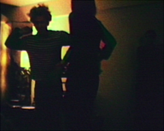
velvet underground dancingIt’s a nice experience, but it’s difficult to actually watch the films there: the monitors are installed in series, so while watching one you can’t help but be distracted by what’s going on to the left and right. Mekas’s private epiphanies (Stan Brakhage making an enormous pile of pancakes for his children, for example) are interrupted by famous faces. But perhaps the most interesting thing about this exhibit isn’t actually going on in the gallery itself: the Maya Stendhal gallery is presenting the forty films online for public downloading. Currently, they’re available in iPod format – 320 x 240 pixel QuickTime files – but a few are available in high resolution: I downloaded a 665Mb file of the Velvet Underground’s first public appearance, at a psychiatrist’s convention in 1965. This is DVD quality: 720 x 576 pixels.

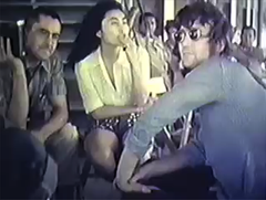
george maciunas, yoko ono, and john lennon on a fluxus cruise up the hudsonMekas’s films aren’t free, but they’re relatively cheap: $3.99 for iPod quality, $6.99 for high resolution. The money isn’t going straight to Mekas: it’s going through the gallery. But there’s something that feels exciting about this: an artist taking over the reigns of distribution. This isn’t work that the general public is interested in; neither the artist nor the audience would be well-served by a regular distributor. Here there’s a more direct connection. Mekas curates an enormous library of film at Anthology Film Archives; it would be a tremendous achievement if that could be made available online.

Mekas’s upcoming project to make a film a day and present it online is also interesting as an experiment in networked culture. Working online will create a much faster feedback loop for Mekas: there will almost certainly be a much greater role for the audience, not dissimilar to what we’ve been examining with our Thinking Out Loud series.

an encyclopedia in my pocket

A while back – last March – there was a great deal of excitement over Wikipodia, an open source project to install Wikipedia on an iPod. Wanting a portable Wikipedia, I installed Linux on my brand new video iPod, a necessary prerequisite, but was disappointed to discover that Wikipodia only worked on older iPods with smaller screens. I’ve waited for an update to Wikipodia since then, but the project seems to have gone dark. Probably Wikipodia wouldn’t have been an ideal solution anyway: it requires you to reboot your iPod into Linux whenever you want to look at Wikipedia. You could have an iPod to listen to music or a Wikipedia to read, but not both at the same time.

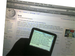
ipodwikipedia.jpgBut a partial fulfillment for my desire to have a portable Wikipedia has come along: Matt Swann has posted a script that puts some of the Wikipedia on an iPod, in iPod Notes format. While it’s much simpler than installing a new operating system on your iPod, it’s still not for everybody – it requires using the OS X command line, although there’s an Automator-based version that’s a bit simpler. (PC versions would seem to be available as well, though I don’t know anything about them – check the comments here.) If you’re willing to take the plunge, you can feed the script a page from Wikipedia and it will start filling up your iPod Notes directory with that page and all the pages linked from it. I started from the entry for book; the script downloaded this, then it downloaded the entries for paper, parchment, page, and so on. When it finished those, it downloads all the pages linked from the linked pages, and it keeps doing this until it runs out of space: regardless of iPod size, you can only have 1000 notes in the Notes directory. This doesn’t meant that you get 1000 articles. Because each iPod note can only be 4 kb long, entries that are longer than 4000 characters are split into multiple notes; thus, I wound up with only 216 entries.

Though 216 entries is a tiny subset of Wikipedia, it’s still an interesting experience having a chunk of an encyclopedia in your pocket. What I find most captivating about approaching Wikipedia this was is that I found myself browsing interesting sounding articles rather than searching them directly. The iPod doesn’t have much input functionality: while you can scroll through the list of entries, you can’t search for a subject, as you usually would. (And with only 216 entries, searching would be of limited utility at best. The Wikipodia project promises full text searching, though text entry is a difficult proposition when you only have five keys to type with.) While you can scroll through the list of entries to find something that looks interesting, you’re likely to get sidetracked by something along the way. So you browse.

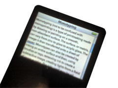
monotyping.jpgTo my mind, browsing is one of the primary virtues of a print encyclopedia: the arbitrary logic of alphabetization makes for a serendipitous reading experience, and you often come away from a print encyclopedia having read something in a nearby article that you didn’t intend to read. This is something that’s generally lost with online reference works: links between articles are supposed to make logical sense. This is also a reflection of our reading behavior: if I search for “book” in Wikipedia, I’m probably looking for something in particular. If I’m interested in book conservation issues, I might click on the link for slow fires. If I’m interested in some other area related to books – how to make vellum, for example – I almost certainly wouldn’t. Instead I’d click on the vellum link and keep looking from there. We tend to be goal-directed when we using Wikipedia online: it’s like going to a library and finding the specific book you want. Wandering in a library is an equally valid behavior: that’s what happens here.

Because you’re not looking for a particular piece of information, you do find yourself reading in a different way. Search-based reading is a different style of reading than browsing, which is slower and more casual. This has a downside when applied to Wikipedia: the often atrocious style is more glaring when you’re reading for pleasure rather than reading for information. And an offline Wikipedia inhibits some of the new reading habits Wikipedia encourages. I caught myself wondering how biased the declarations of the Shāhnāma‘s originality w/r/t other national epics were; without recourse to page histories and talk pages I’m left to wonder until I find myself with an Internet connection.

book-bookwhite.jpgThe experience of reading Wikipedia this way isn’t perfect: many links don’t work, and some articles seem to arbitrarily end, some in mid-sentence, some in mid-word. You also realize how many links in Wikipedia aren’t useful at all. If I’m interested in books as a concept, I’m probably not interested in 1907 as a concept, though that is the year that Marc Aurel Stein found The Diamond Sutra, the oldest known block-printed book. Marc Aurel Stein or The Diamond Sutra might be interesting subjects to a book-inclined browser; 1907 isn’t as likely. What you get on your iPod is an arbitrary selection. But there’s something very pleasant about this: it’s nice to have the chance to learn about both Neferirkare Kakai and the Rule of St. Benedict on the subway.

what we talk about when we talk about books

I spent the past weekend at the Fourth International Conference on the Book, hosted by Emerson College in Boston this year. I was there for a conversation with Sven Birkerts (author of The Gutenberg Elegies) which happened to kick off the conference. The two of us had been invited to discuss the future of the book, which is a great deal to talk about in an hour. While Sven was cast as the old curmudgeon and I was the Young Turk, I’m not sure that our positions are that dissimilar. We both value books highly, though I think my definition of book is a good deal broader than his. Instead of a single future of the book, I suggested that we need to be talking about futures of the book.
This conciliatory note inadvertently described the conference as a whole, the schedule of which can be inspected here. The subjects discussed wandered all over the place, from people trying to carry out studies on how well students learned with an ebook device to a frankly reactionary presentation of book art. Bob Young of Lulu proclaimed the value of print on demand for authors; Jason Epstein proclaimed the value of print on demand for publishers. Publishers wondered whether the recent rash of falsified memoirs would hurt sales. Educators talked about the need for DRM to encrypt online texts. There was a talk on using animals to deliver books which I’m very sorry that I missed. A Derridean examination of the paratexts of Don Quixote suggested out that for Cervantes, the idea of publishing a book – as opposed to writing one – suggested death, perhaps what I’d been trying to argue last week.
Everyone involved was dealing with books in some way or another; a spectrum could be drawn from those who were talking about the physical form of the book and those who were talking about content of the book entirely removed from the physical. These are two wildly different things, which made this a disorienting conference. The cumulative effect was something like if you decided to convene a conference on people and had a session with theologians arguing about the soul in one room while in another room a bunch of body builders tried to decide who was the most attractive. Similarly, everyone at the Conference on the Book had something to do with books; however, many people weren’t speaking the same language.
This isn’t necessarily their fault. One of the most apt presentations was by Catherine Zekri of the Université de Montréal, who attempted to decipher exactly what a “book” was from usage. She noted the confusion between the object of the book and its contents, and pointed out that this confusion carried over into the electronic realm, where “ebook” can either mean a device (like the Sony Reader) or the text that’s being read on the device. A thirty-minute session wasn’t nearly long enough to suss out the differences being talked about, and I’ll be interested to read her paper when it’s finally published.
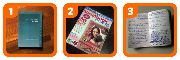
As an experiment paralleling Zekri’s, here are three objects:

threebooks.png

There are certain similarities all of these objects share: they’re all made of paper and have a cover and pages. Some similarities are only shared by some of the objects: what’s the best way of grouping these? Three relationships seem possible. Objects 1 & 2 were bought containing text; object 3 was blank when bought, though I’ve written in it since. Objects 2 & 3 are bound by staples; object 1 is bound by glue. Objects 1 & 3 were written by a single person (Maurice Blanchot in the case of 1, myself in the case of 3); object 2 was written by a number people.
If we were to classify these objects, how would we do it? Linguistically, the decision has already been made: object 1 is a book, object 2 is a magazine, and object 3 is a notebook, which is, the Oxford English Dictionary says, “a small book with blank or ruled pages for writing notes in”. By the words we use to describe them, objects 1 & 3 are books. A magazine isn’t a book: it’s “a periodical publication containing articles by various writers” (the OED again). This is something seems intuitive: a magazine isn’t a book. It’s a magazine.
But why isn’t a magazine a book, especially if a notebook is a book? If you look again at the relationships I suggested between the three objects above, the shared attributes of the book and the magazine seem more logical and important than the attributes shared between the book and the notebook. Why don’t we think of a magazine as a book? To use the language of evolutionary biology, the word “book” seems to be a polyphyletic taxon, a group of descendants from a common ancestor that excludes other descendants from the same ancestor.
One answer might be that a single issue of a magazine isn’t complete; rather, it is part of a sequence in time, a sequence which can be called a magazine just as easily as a single issue can. I can say that I’ve read a book, which presumably means that I’ve read and understood every word in it. I can say the same thing about a particular issue of The Atlantic (“I read that magazine.”). I can’t say the same thing about the entire run of The Atlantic, which started long before I was born and continues today. A complete edition of The Atlantic might be closer to a library than a book. Or maybe the problem is time: the date on the cover foregrounds a magazine’s existence in time in a way that a book’s existence in time isn’t something we usually think about.
To expand this: I looked up these definitions in the online OED, where the dictionary exists as a database that can be queried. Is this a book? I have a single-volume OED at home with much the same content, though the online version has changed since the print edition: it points out that since 1983, the word “notebook” can also mean a portable computer. My copy of the OED at home is clearly a book; is the online edition, with its evolving content, also a book? (A stylistic question: we italicize the title of a book when we use it in text – do we italicize the title of a database?)
We’ve been calling things like Wikipedia, which goes even further than the online OED in terms of its mutability over time, a “networked book”. But even with much simpler online projects, issues arise: take Gamer Theory, for example. If much the content of what appears on the Gamer Theory website appears in Harvard University Press’s version of the book, most people would agree that the online version is a book, or a draft of one. But what are the boundaries of this kind of book? Are the comments in the website part of the book? Is the forum part of the book? Are the spam comments that we deleted from the forum part of the book? This also has something to do with Bob’s post on Monday, where he wondered how sharply defined the authorial voice of a book needs to be to make it worthwhile as a book.
What we have here is a language problem: the forms that we can create are evolving faster than our language – and possibly our understanding – can keep up with them.

finishing things

One of the most interesting things about the emerging online forms of discourse is how they manage to tear open all our old assumptions. Even if new media hasn’t yet managed to definitively change the rules, it has put them into contention. Here’s one, presented as a rhetorical question: why do we bother to finish things?
The importance of process is something that’s come up again and again over the past two years at the Institute. Process, that is, rather than the finished work. Can Wikipedia ever be finished? Can a blog be finished? They could, of course, but that’s not interesting: what’s fascinating about a blog is its emulation of conversation, it’s back-and-forth nature. Even the unit of conversation – a post on a blog, say – may never really be finished: the author can go back and change it, so that the post you viewed at six o’clock is not the post you viewed at four o’clock. This is deeply frustrating to new readers of blogs; but in time, it becomes normal.

*     *     *     *     *

But before talking about new media, let’s look at old media. How important is finishing things historically? If we look, there’s a whole tradition of things refusing to be finished. We can go back to Tristram Shandy, of course, at the very start of the English novel: while Samuel Richardson started everything off by rigorously trapping plots in fixed arcs made of letters, Laurence Sterne’s novel, ostensibly the autobiography of the narrator, gets sidetracked in cock and bull stories and disasters with windows, failing to trace his life past his first year. A Sentimental Journey through France and Italy, Sterne’s other major work of fiction, takes the tendency even further: the narrative has barely made it into France, to say nothing of Italy, before it collapses in the middle of a sentence at a particularly ticklish point.
There’s something unspoken here: in Sterne’s refusal to finish his novels in any conventional way is a refusal to confront the mortality implicit in plot. An autobiography can never be finished; a biography must end with its subject’s death. If Tristram never grows up, he can never die: we can imagine Sterne’s Parson Yorrick forever on the point of grabbing the fille de chambre‘s ———.
Henry James on the problem in a famous passage from The Art of the Novel:

Really, universally, relations stop nowhere, and the exquisite problem of the artist is eternally but to draw, by a geometry of his own, the circle within which they shall happily appear to do so. He is in the perpetual predicament that the continuity of things is the whole matter, for him, of comedy or tragedy; that this continuity is never, by the space of an instant or an inch, broken, or that, to do anything at all, he has at once intensely to consult and intensely to ignore it. All of which will perhaps pass but for a supersubtle way of pointing the plain moral that a young embroiderer of the canvas of life soon began to work in terror, fairly, of the vast expanse of that surface.

But James himself refused to let his novels – masterpieces of plot, it doesn’t need to be said – be finished. In 1906, a decade before his death, James started work on his New York Edition, a uniform selection of his work for posterity. James couldn’t resist the urge to re-edit his work from the way it was originally published; thus, there are two different editions of many of his novels, and readers and scholars continue to argue about the merits of the two, just as cinephiles argue about the merits of the regular release and the director’s cut.
This isn’t an uncommon issue in literature. One notices in the later volumes of Marcel Proust’s À la recherche du temps perdu that there are more and more loose ends, details that aren’t quite right. While Proust lived to finish his novel, he hadn’t finished correcting the last volumes before his death. Nor is death necessarily always the agent of the unfinished: consider Walt Whitman’s Leaves of Grass. David M. Levy, in Scrolling Forward: Making Sense of Documents in the Digital Age, points out the problems with trying to assemble a definitive online version of Whitman’s collection of poetry: there were a number of differing editions of Whitman’s collection of poems even during his life, a problem compounded after his death. The Whitman Archive, created after Levy wrote his book, can help to sort out the mess, but it can’t quite work at the root of the problem: we say we know Leaves of Grass, but there’s not so much a single book by that title as a small library.
The great unfinished novel of the twentieth century is Robert Musil’s The Man without Qualities, an Austrian novel that might have rivaled Joyce and Proust had it not come crashing to a halt when Musil, in exile in Switzerland in 1942, died from too much weightlifting. It’s a lovely book, one that deserves more readers than it gets; probably most are scared off by its unfinished state. Musil’s novel takes place in Vienna in the early 1910s: he sets his characters tracing out intrigues over a thousand finished pages. Another eight hundred pages of notes suggest possible futures before the historical inevitability of World War I must bring their way of life to an utter and complete close. What’s interesting about Musil’s notes are that they reveal that he hadn’t figured out how to end his novel: most of the sequences he follows for hundreds of pages are mutually exclusive. There’s no real clue how it could be ended: perhaps Musil knew that he would die before he could finish his work.

*     *     *     *     *

The visual arts in the twentieth century present another way of looking at the problem of finishing things. Most people know that Marcel Duchamp gave up art for chess; not everyone realizes that when he was giving up art, he was giving up working on one specific piece, The Bride Stripped Bare by Her Bachelors, Even. Duchamp actually made two things by this name: the first was a large painting on glass which stands today in the Philadelphia Museum of Art. Duchamp gave up working on the glass in 1923, though he kept working on the second Bride Stripped Bare by Her Bachelors, Even, a “book” published in 1934: a green box that contained facsimiles of his working notes for his large glass.
Duchamp, despite his protestations to the contrary, hadn’t actually given up art. The notes in the Green Box are, in the end, much more interesting – both to Duchamp and art historians – than the Large Glass itself, which he eventually declared “definitively unfinished”. Among a great many other things, Duchamp’s readymades are conceived in the notes. Duchamp’s notes, which he would continue to publish until his death in 1968, function as an embodiment of the idea that the process of thinking something through can be more worthwhile than the finished product. His notes are why Duchamp is important; his notes kickstarted most of the significant artistic movements of the second half of the twentieth century.
Duchamp’s ideas found fruit in the Fluxus movement in New York from the early 1960s. There’s not a lot of Fluxus work in museums: a good deal of Fluxus resisted the idea of art as commodity in preference to the idea of art as process or experience. Yoko Ono’s Cut Piece is perhaps the most well known Fluxus work and perhaps exemplary: a performer sits still while the audience is invited to cut pieces of cloth from her (or his) clothes. While there was an emphasis on music and performance – a number of the members studied composition with John Cage – Fluxus cut across media: there were Fluxus films, boxes, and dinners. (There’s currently a Fluxus podcast, which contains just about everything.) Along the way, they also managed to set the stage for the gentrification of SoHo.
There was a particularly rigorous Fluxus publishing program; Dick Higgins helmed the Something Else Press, which published seminal volumes of concrete poetry and artists’ books, while George Maciunas, the leader of Fluxus inasmuch as it had one, worked as a graphic designer, cranking out manifestos, charts of art movements, newsletters, and ideas for future projects. Particularly ideas for future projects: John Hendricks’s Fluxus Codex, an attempt to catalogue the work of the movement, lists far more proposed projects than completed ones. Owen Smith, in Fluxus: The History of an Attitude, describes a particularly interesting idea, an unending book:

This concept developed out of Maciunas’ discussions with George Brecht and what Maciunas refers to in several letters as a “Soviet Encyclopedia.” Sometime in the fall of 1962, Brecht wrote to Maciunas about the general plans for the “complete works” series and about his own ideas for projects. In this letter Brecht mentions that he was “interested in assembling an ‘endless’ book, which consists mainly of a set of cards which are added to from time to time . . . [and] has extensions outside itself so that its beginning and end are indeterminate.” Although the date on this letter is not certain, it was sent after Newsletter No. 4 and prior to the middle of December when Maciunas responded to it.} This idea for a expandable box is later mentioned by Maciunas as being related to “that of Soviet encyclopedia – which means not a static box or encyclopedia but a constantly renewable – dynamic box.”

Maciunas and Brecht never got around to making their Soviet encyclopedia, but it’s an idea that might resonate more now than in did in 1962. What they were imagining is something that’s strikingly akin to a blog. Blogs do start somewhere, but most readers of blogs don’t start from the beginning: they plunge it at random and keep reading as the blog grows and grows.

*     *     *     *     *

One Fluxus-related project that did see publication was An Anecdoted Topography of Chance, a book credited to Daniel Spoerri, a Romanian-born artist who might be best explained as a European Robert Rauschenberg if Rauschenberg were more interested in food than paint. The basis of the book is admirably simple: Spoerri decided to make a list of everything that was on his rather messy kitchen table one morning in 1961. He made a map of all the objects on his not-quite rectangular table, numbered them, and, with the help of his friend Robert Filliou, set about describing (or “anecdoting”) them. From this simple procedure springs the magic of the book: while most of the objects are extremely mundane (burnt matches, wine stoppers, an egg cup), telling how even the most simple object came to be on the table requires bringing in most of Spoerri’s friends & much of his life.
Having finished this first version of the book (in French), Spoerri’s friend Emmett Williams translated into English. Williams is more intrusive than most translators: even before he began his translation, he appeared in a lot of the stories told. As is the case with any story, Williams had his own, slightly different version of many of the events described, and in his translation Williams added these notes, clarifying and otherwise, to Spoerri’s text. A fourth friend, Dieter Roth, translated the book into German, kept Williams’s notes and added his own, some as footnotes of footnotes, generally not very clarifying, but full of somewhat related stories and wordplay. Spoerri’s book was becoming their book as well. Somewhere along the line, Spoerri added his own notes. As subsequent editions have been printed, more and more notes accrete; in the English version of 1995, some of them are now eight levels deep. A German translation has been made since then, and a new French edition is in the works, which will be the twelfth edition of the book. The text has grown bigger and bigger like a snowball rolling downhill. In addition to footnotes, the book has also gained several introductions, sketches of the objects by Roland Topor, a few explanatory appendices, and an annotated index of the hundreds of people mentioned in the book.
Part of the genius of Spoerri’s book is that it’s so simple. Anyone could do it: most of us have tables, and a good number of those tables are messy enough that we could anecdote them, and most of us have friends that we could cajole into anecdoting our anecdotes. The book is essentially making something out of nothing: Spoerri self-deprecatingly refers to the book as a sort of “human garbage can”, collecting histories that would be discarded. But the value of of the Topography isn’t rooted in the objects themselves, it’s in the relations they engender: between people and objects, between objects and memory, between people and other people, and between people and themselves across time. In Emmett Williams’s notes on Spoerri’s eggshells, we see not just eggshells but the relationship between the two friends. A network of relationships is created through commenting.
George LeGrady seized on the hypertextual nature of the book and produced, in 1993, his own Anecdoted Archive of the Cold War. (He also reproduced a tiny piece of the book online, which gives something of a feel for its structure.) But what’s most interesting to me isn’t how this book is internally hypertextual: plenty of printed books are hypertextual if you look at them through the right lens. What’s interesting is how its internal structure is mirrored by the external structure of its history as a book, differing editions across time and language. The notes are helpfully dated; this matters when you, the reader, approach the text with thirty-odd years of notes to sort through, notes which can’t help being a very slow, public conversation. There’s more than a hint of Wikipedia in the process that underlies the book, which seems to form a private encyclopedia of the lives of the authors.
And what’s ultimately interesting about the Topography is that it’s unfinished. My particular copy will remain an autobiography rather than a biography, trapped in a particular moment in time: though it registers the death of Robert Filliou, those of Dieter Roth and Roland Topor haven’t yet happened. Publishing has frozen the text, creating something that’s temporarily finished.

*     *     *     *     *

We’re moving towards an era in which publishing – the inevitable finishing stroke in most of the examples above – might not be quite so inevitable. Publishing might be more of an ongoing process than an event: projects like the Topography, which exists as a succession of differing editions, might become the norm. When you’re publishing a book online, like we did with Gamer Theory, the boundaries of publishing become porous: there’s nothing to stop you from making changes for as long as you can.

an excursion into old media

1. in which our hero goes to canada and winds up with a typewriter and then a record player

ironwhim.jpgLast summer on a trip to Canada I picked up a copy of Darren Wershler-Henry’s The Iron Whim: a Fragmented History of Typewriting. It’s a look at our relationship with one particular piece of technology through a compound eye, investigating why so many books striving to be “literary” have typewriter keys on the cover, novelists’ feelings for their typewriters, and the complicated relationship between typewriter making and gunsmithing, among a great many other things. The book ends too soon, as Wershler-Henry doesn’t extend his thinking about typewriters and writing into broader conclusions about how technology affects writing (for that see Hugh Kenner’s The Mechanic Muse) but it’s still worth tracking down.
It did start me thinking about my use of technology. Back in junior high I was taught to type on hulking IBM Selectrics, but the last time I’d used a typewriter was to type up my college application essays. (This demonstrates my age: my baby brother’s interactions with typewriters have been limited to once finding the family typewriter in the basement; though he played with it, he says that he “never really produced anything of note on it,” and he found my query about whether or not he’d typed his college essays so ridiculous as not to merit reply.) Had I been missing out? A little investigation revealed a thriving typewriter market on eBay; for $20 (plus shipping & handling) I bought myself a Hermes Baby Featherweight. With a new ribbon and some oiling it works well, though it’s probably from the 1930s.
my girlfriend had the camera so i had to use my cellphone to take this picture which is why it looks so badNext I got myself a record player. I would like to note that this acquisition didn’t immediately follow my buying a typewriter: old technology isn’t that slippery a slope. This was because I happened to see a record player that was cute as a button (a Numark PT-01) and cheap. It’s also because much of the music I’ve been listening to lately doesn’t get released on CD: dance music is still mostly vinyl-based, though it’s made the jump to MP3s without much trouble. There wasn’t much reasoning past that: after buying my record player I started buying records, almost all things I’d previously heard as MP3s. And, of course, I’d never owned a record player and I was curious what it would be like.

2. self-justification over, our hero starts banging on the typewriter & playing records

So what happened when I started using this technology of an older generation? The first thing you notice about using a typewriter (and I’m specifically talking about using a non-electric typewriter) is how much sense it makes. When my typewriter arrived, it was filthy. I scrubbed the gunk off the top, then unscrewed the bottom of it to get at the gunk inside it. Inside, typewriters turn out to be simple machines. A key is a lever that triggers the hammer with the key on it. The energy from my action of pressing the key makes the hammer hit the paper. There are some other mechanisms in there to move the carriage and so on, but that’s basically it.
my girlfriend had the camera so i had to use my cellphone to take this picture which is why it looks so badA record player’s more complicated than a typewriter, but it’s still something that you can understand. Technologically, a record player isn’t very complicated: you need a motor that turns the record at a certain speed, a pickup, something to turn the vibrations into sound, and an amplifier. Even without amplification, the needle in the groove makes a tiny but audible noise: this guy has made a record player out of paper. If you look at the record, you can see from the grooves where the tracks begin and end; quiet passages don’t look the same as loud passages. You don’t get any such information from a CD: a burned CD looks different depending on how much information it has on it, but the bottom from every CD from the store looks completely identical. Without a label, you can’t tell whether a disc is an audio CD, a CD-ROM, or a DVD.

3. in which our hero worries about the monkeys

my girlfriend had the camera so i had to use my cellphone to take this picture which is why it looks so badThere’s something admirably simple about this. On my typewriter, pressing the A key always gets you the letter A. It may be an uppercase A or a lowercase a, but it’s always an A. (Caveat: if it’s oiled and in good working condition and you have a good ribbon. There are a lot of things that can go wrong with a typewriter.) This is blatantly obvious. It only becomes interesting when you set it against the way we type now. If I type an A key on my laptop, sometimes an A appears on my screen. If my computer’s set to use Arabic or Persian input, typing an A might get me the Arabic letter ش. But if I’m not in a text field, typing an A won’t get me anything. Typing A in the Apple Finder, for example, selects a file starting with that letter. Typing an A in a web browser usually doesn’t do anything at all. On a computer, the function of the A key is context-specific.
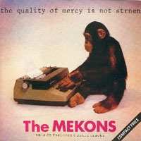
qualityof-front.jpgWhat my excursion into old technology makes me notice is how comparatively opaque our current technology is. It’s not hard to figure out how a typewriter works: were a monkey to decide that she wanted to write Hamlet, she could figure out how to use a typewriter without any problem. (Though I’m sure it exists, I couldn’t dig up any footage on YouTube of a monkey using a record player. This cat operating a record player bodes well for them, though.) It would be much more difficult, if not impossible, for even a monkey and a cat working together to figure out how to use a laptop to do the same thing.

Obviously, designing technologies for monkeys is a foolish idea. Computers are useful because they’re abstract. I can do things with it that the makers of my Hermes Baby Featherweight couldn’t begin to imagine in 1936 (although I am quite certain than my MacBook Pro won’t be functional in seventy years). It does give me pause, however, to realize that I have no real idea at all what’s happening between when I press the A key and when an A appears on my screen. In a certain sense, the workings of my computer are closed to me.

4. in which our hero wonders about the future

click on this for a better explanation of what's going on here
Let me add some nuance to a previous statement: not only are computers abstract, they have layers of abstraction in them. Somewhere deep inside my computer there is Unix, then on top of that there’s my operating system, then on top of that there’s Microsoft Word, and then there’s the paper I’m trying to write. (It’s more complicated than this, I know, but allow me this simplification for argument’s sake.) But these layers of abstraction are tremendously useful for the users of a computer: you don’t have to know what Unix or an operating system is to write a paper in Microsoft Word, you just need to know how to use Word. It doesn’t matter whether you’re using a Mac or a PC.
The world wide web takes this structure of abstraction layers even further. With the internet, it doesn’t matter which computer you’re on as long as you have an internet connection and a web browser. Thus I can go to another country and sit down at an internet café and check my email, which is pretty fantastic.
And yet there are still problems. Though everyone can use the Internet, it’s imperfect. The same webpage will almost certainly look different on different browsers and on different computers. This is annoying if you’re making a web page. Here at the Institute, we’ve spent ridiculous amounts of time trying to ascertain that video will play on different computers and in different web browsers, or wondering whether websites will work for people who have small screens.
A solution that pops up more and more often is Flash. Flash content works on any computer that has the Flash browser plugin, which most people have. Flash content looks exactly the same on every computer. As Ben noted yesterday, Flash video made YouTube possible, and now we can all watch videos of cats using record players.
But there’s something that nags about Flash, the same thing that bothers Ben about Flash, and in my head it’s consonant with what I notice about computers after using a typewriter or a record player. Flash is opaque. Somebody makes the Flash & you open the file on your computer, but there’s no way to figure out exactly how it works. The View Source command in your web browser will show you the relatively simple HTML that makes up this blog entry; should you be so inclined, you could figure out exactly how it worked. You could take this entry and replace all the pictures with ones that you prefer, or you could run the text through a faux-Cockney filter to make it sound even more ridiculous than it does. You can’t do the same thing with Flash: once something’s in Flash, it’s in Flash.
0380815931.01._AA240_SCLZZZ.jpgA couple years ago, Neal Stephenson wrote an essay called “In the Beginning Was the Command Line,” which looked at why it made a difference whether you had an open or closed operating system. It’s a bit out of date by now, as Stephenson has admitted: while the debate is the same, the terms have changed. It doesn’t really matter which operating system you use when more and more of our work is being done on web applications. The question of whether we use open or closed systems is still important: maybe it’s important to more of us, now that it’s about how we store our text, our images, our audio, our video.

adobe acrobat 8 is probably not for you

Adobe just announced the release of Acrobat 8, their PDF production software. To promote it, they hosted three “webinars” on Tuesday to demonstrate some of the new features to the interested public. Your correspondent was there (well, here) to see what glimmers might be discerned about the future of electronic reading.

Who cares about Acrobat?

What does Acrobat have to do with electronic books? You’re probably familiar with Acrobat Reader: it’s the program that opens up PDFs. Acrobat is the “author” program: it lets people make PDFs. This is very important in the world of print design and publishing: probably 90% of the new printed material you see every day goes through Acrobat in some form or another. Acrobat’s not quite as ubiquitous as it once was – newer programs like Adobe InDesign, for example, let designers create PDFs that can be sent to the printer’s without bothering with Acrobat, and it’s easy to make PDFs out of anything in Mac OS X. But Acrobat remains an enormous force in the world of print design.

PDF, of course, has been presented as being a suitable format for electronic books; see here for an example. Acrobat provided the ability for publishers to lock down the PDFs that Amazon (for example) sold with DRM; publishers jumped on board. The system wasn’t successful, not least because opening the locked PDFs proved chancey: I have a couple of PDFs I bought during Amazon’s experiment selling them which, on opening, download a lot of “verification information” and then give inscrutable errors. In part because of these troubles, Amazon’s largely abandoned the format – notice their sad-looking ebook store.

Why keep an eye on Acrobat? One reason is because Acrobat 8 is Adobe’s first major release since merging with Macromedia, a union that sent shockwaves across the world of print and web design. Adobe now releases almost most significant programs used in print design. (A single exception is Quark XPress, which has been quietly rolling away towards oblivion of its own accord since around the millennium.) With the acquisition of Macromedia’s web technologies – including Flash and Dreamweaver – Adobe is inching towards a Microsoft-style monopoly of Web design. In short: where Acrobat goes is where Adobe goes; and where Adobe goes is where design goes. And where design goes is where books go, maybe.

So what does Acrobat 8 do?

Acrobat 8 provides a number of updated features that will be useful to people who do pre-press and probably uninteresting to anyone else. They’ve made a number of minor improvements – the U. S. government will be happy to know that they can now use Acrobat to redact information without having to worry about the press looking under their black boxes. You can now use Acrobat to take a bunch of documents (PDF or otherwise) and lump them together into a “bundle”. All nice things, but nothing to get excited about. More DRM than you could shake a stick at, but that’s to be expected.

HERE IS WHAT A WEBINAR LOOKS LIKEThe most interesting thing that Acrobat 8 does – and the reason I’m bringing this up here – is called Acrobat Connect. Acrobat Connect allows users to host web conferences around a document – it was what Adobe was using to hold their “webinars”. (There’s a screenshot to the right; click on the thumbnail for the full-sized image.) These conferences can be joined by anyone with an Internet connection and the Flash plugin. Pages can be turned and annotations can be made by those with sufficient privileges. Audio chatting is available, as is text-based chatting. The whole “conversation” can be recorded for future reference as a Flash-based movie file.

There are a lot of possibilities that this technology suggests: take an electronic book as your source text and you could have an electronic book club. Teachers could work their way through a text with students. You could use it to copy-edit a book that’s being published. A group of people could get together to argue about a particularly interesting blog post. Reading could become a social experience.

But what’s the catch?

There’s one catch, and it’s a big one: the infrastructure that Acrobat 8 uses: you have to use Adobe’s server, and there’s a price for that. It was suggested that chat-hosting access would be provided for $39 a month or $395 a year. This isn’t entirely a surprise: more and more software companies are trying to rope consumers into subscription-based models. This might well work for Adobe: I’m sure there are plenty of corporations that won’t balk at shelling out $395 a year for what Acrobat Connect offers (plus $449 for the software). Maybe some private schools will see the benefit of doing that. But I can’t imagine, however, that there are going to be many private individuals who will. Much as I’d like to, I won’t.

I’m not faulting Adobe for this stance: they know who butters their bread. But I think it’s worth noting what’s happening here: a divide between the technology available to the corporate world and the general public, and, more specifically, a divide that doesn’t need to exist. Though they don’t have the motive to do so, Adobe could presumably make a version of Acrobat Connect that would work on anyone’s server. This would open up a new realm of possibility in the world of online reading. Instead, what’s going to happen is that the worker bees of the corporate world will find themselves forced to sit through more PowerPoint presentations at their desks.

While a bunch of people reading PowerPoint could be seen as a social reading experience, so much more is possible. We, the public, should be demanding more out of our software.