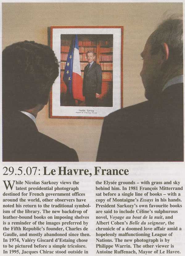
Author Archives: dan visel

thinking about indexing

Once upon a time, a long time ago, I was an editor for Let’s Go, a series of travel guides. While there, I learned a great many things about making books, not all of them useful. One of them: how to make an index. Let’s Go had at that time – maybe it still does, I’m not sure how things are run now – an odd relationship with the publisher of the series, St. Martin’s Press: Let’s Go laid the books out in-house and sent finished files (PostScript in those days) to St. Martin’s, who took care of getting the books printed and in stores. The editors were thus responsible for everything that appeared in the books, from the title page down to the index. Because Let’s Go is staffed by college students, the staff mostly turns over every year; because it was staffed by college students, most of them didn’t know how to edit. Consequently, every year, the tasks involved in editing books must be retaught. And thus it was that one summer I was taught to index a book, and the next summer I found myself teaching others to index books.
As an editor of a book at Let’s Go, you were responsible for creating an index for your book. There’s something to be said to having the person who created the book also controlling how it’s accessed: presumably, the person who put the book together knows what’s important in it and what readers should find in it. The vast majority of the publishing world works differently: generally once a book has been edited, it’s sent off to professional indexers, who independently create an index for the book. There’s an argument for this: knowing how to create an index is specialized knowledge: it’s information architecture, to use the common phrase. It doesn’t necessarily follow that someone who’s good at editing a book will know how to organize an index that will be useful to readers.
But Let’s Go maintained a child-like faith in the malleability of its editors, and editors were made to index their own books, quality be damned. The books were being edited (and typeset) in a program called Adobe FrameMaker, which is generally used to produce technical manuals; in FrameMaker, if you highlight text and press a certain key command, an index window pops up. The index window attaches a reference to the page number of the highlighted text to the book’s index with whatever descriptive text desired. At the end of every week, editors did something called “generating their book”, which updated all the page numbers, giving a page count for the book in progress, and produced an index, which could be scrutinized. In theory, editors were supposed to add terms to their index as they worked; in practice, most ended up racing to finish their index the week before the book was due to be typeset.
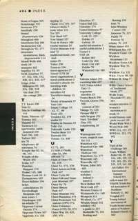
a sample page of an index which you could click to see in larger form if you really wanted toIt must be admitted that most of the indices constructed in this way were not very good. A lot of index jokes were attempted, not all successfully. (In an Ireland guide, for example, “trad 72” was immediately followed by “traditional music, see trad”. Funny phrases were indexed almost as much as useful topics (in the same book, “giant babies 433” is followed by “giant lobster clutching a Guinness 248”). Friends’ names turned up with an unfortunate frequency. One finds that there’s something casual about an index. If we think of a book as a house, the table of contents is the front door, the way a visitor is supposed to enter. The index is the back door, the one used by friends.
Thinking about indices in print books isn’t something that happens as much any more. In an era when less and less profit can be made off printed books, niceties like indices often get lost for cost reasons: they both cost money to make and they take pages to print. More and more indices wind up as online-only supplements. Much of the function of the index seems to have been obviated by full-text searching: rather than taking the index’s word for where a particular name appears in a text, it’s much simpler to press command-F to find it.
But while the terms may have changed, the problem of making easy paths into a text hasn’t gone away. The problem of organizing information quickly comes to light when keeping a blog that isn’t strictly time-based like this one: while we set out a few years back with nicely defined categories for posts, we quickly realized that the categories weren’t enough. Like many people, we moved to tags to attempt to classify what we were talking about; our tags, unpruned, are as messy a thicket as the most unwieldy index.

* * * * *

the cover of cloud, the, 3I came across Helen Mirra’s book Cloud, the, 3 last week at 192 Books in Chelsea. I’d seen & liked some of Mirra’s work in a show at Peter Blum in the spring where she had a piece based on Robert Walser, one of my pet favorite writers. It was a thick book for someone I’d thought of as a visual artist: I picked it up & flipped through it, which turns out to be the best way to approach this book: the viewer is left with the impression of an index that’s been exploded or turned into a flip book, an index spread out to cover a whole book. The pages are almost entirely blank, each with an entry or two.
A note at the back explains what the book is: “The preceding text is an index of John Dewey’s Reconstruction in Philosophy (New York: Beacon, 1920), written by Helen Mirra in 2005/6.” An afterword by Lynn Hejinian goes into more detail, including why Mirra is working from this particular volume of Dewey, in which he attempts to bring philosophy to bear on the problems of the real world. But the central idea is simple enough: Mirra constructed her own index to a book. Dewey’s book (the edition Mirra used can be examined here) already has an index, eight stately pages that move through the terms used in Reconstruction in Philosophy from “Absolute reality, 23, 27” to “World, nomenal and phenomenal, 23”.
There’s some overlap between Dewey’s index – is it really his index, constructed by John Dewey himself? – and Mirra’s index. Dewey’s index, for example, contains “Errors, 34”. Mirra’s version contains “Errors, of our ancestors, 35–36”. Mirra’s working from the same book, but her index finds poetry in Dewey’s prose: “Environment, 10, 14, 19; even a clam modifies the, 84; given, 156.” “Color in contrast with pure light, a, 88.” “Habitually reasonable thoughts, 6.” “Half-concealed and half-apologetic life, 210.” “Sailor compared with the weaver, the, 11.” “True method as comparable to the operations of the bee, 32.” Consulting Dewey’s book at those pages reveals that Mirra’s made up nothing. Her index, however, reveals her own personal reading of the book.
Cloud, the, 3 is an artist’s book, a book that is meant to function as an art object rather than being a conduit of information. In a way, this seems perfectly appropriate: in a world where Dewey’s book is fully searchable online, indexing can seem superfluous, no longer a practical concern. (This hasn’t always been the case: Art & Language, a conceptual collective started in the late 1960s, pursued indexing as a Marxist tactic to bring knowledge to the masses.) One can make the argument that in structure Mirra’s book is not that dissimilar from the unwieldy tag cloud that graces the right side of this blog, the “frightful taxonomic bog” that we periodically fret over & fail to do anything about. But I think the object-status of Mirra’s book enables us to think about its contents in a way that, for example, a tagcloud doesn’t: as an object that doesn’t need to exist, we question its existence and wonder why it is accorded financial value. A tag cloud, all too often, is just one more widget. I like Mirra’s book because it didn’t have to exist: the artist had to work to create it.

* * * * *

Most of the publishing industry doesn’t follow Let’s Go’s example: in general, it’s much more hierarchical. Writers write, editors edit, indexers index, and typesetters typeset. Perhaps it’s economically necessary to have everyone specialize in this way; however, there’s an inefficiency built into this system which necessitates that people less familiar with the text are constructing the ways into it. On the Internet, by contrast, we increasingly realize that we are all editors now. We could all be indexers too.

the future of print?

On Demand Books has installed an Espresso Book Machine in the New York Public Library’s Science, Industry, and Business Library and is offering to print books for anyone who comes by to request one. Their machine has been running since June (and will run until the end of the month), but the Internet seems to have only taken just notice of it and there was a flurry of publicity this past week. I went over to 34th Street to take a look at it on Wednesday afternoon (just after the New York Times visited, I think).
They’ve installed the machine prominently on the first floor of the library. It’s about the size of a small car and it looks like a bunch of laser printers were smashed together and a computer was stuck on top. Signs explain why it looks jerryrigged: this machine is a prototype, “On Demand Books Espresso Book Machine Model 1.5,” although the Model 2, about half the size and looking much more sleek, is on the way. While the press release suggested that anyone could come up and start printing out books, in reality the machine was cordoned off from the public and being run by an operator.
For this demonstration, there’s a list of 20 available titles: the usual assortment of out of print Open Content Alliance books (Dickens, Tom Sawyer, Beatrix Potter), a couple of scientific papers (Einstein, also out of print; a paper from the AMS), and two recent ones related to the venture: Jason Epstein’s Book Business, which made the case for machines like this being the future of bookselling in 2001, and Chris Anderson’s The Long Tail. And one odd one: Faulkner’s Three Famous Short Novels, published by Vintage in 1942, which is still in copyright (and in print). The operator suggested that Moby-Dick would take too long to print – because it’s so long, it would be printed in two volumes – and tried to get me to choose The Long Tail, which is nice and short. I wanted something that I’d actually read and I was curious about how the Faulkner volume wound up in the list, so I went for it. Was I sure I didn’t want The Long Tail? I was sure.
The operator clicked a button on the computer’s display and the machine soon started making printing sounds. This continued for the next fifteen minutes. First the pages of the book were printed; they were printed on standard 8.5” x 11” paper, double-sided. The Faulkner book has around 160 leaves; this took a long time, and was exactly as exciting as waiting for a printer to print 160 pages. When all the pages were printed, they were apparently moved to another part of the machine where glue was applied to one edge. (While the machine has translucent sides, it’s hard to see what’s going on inside it for the most part.) They were moved down to another printer, this one color, which printed the cover on thicker stock. The cover was then glued to the pages and folder around them. Finally, the book was moved to the last section, where it was clamped down and rotated three times to cut off the extra trim, making a book that’s about 5” x 7”. The waste paper dropped down to a bin at the bottom of the machine; the newly minted book came out a slot in the front of the machine. The operator picked it up and handed it to me.
How does it look? It looks like a cheap paperback. My copy wasn’t quite cut right and there’s a little spur of excess paper rising from the top right corner, which gives it a modicum of uniqueness. Like the other Open Content-printed books that I’ve seen, the print isn’t wonderful: they seem to be working from screen-resolution scans of the books, and they appear notably grainy when printed. It looks very much like a book that someone photocopied on a copier with the contrast set a bit too high. But like a photocopied book, it’s certainly legible. It’s worth pointing out that this grainy quality is a function of the scan rather than the machine: a copy of The Long Tail looked just like a PDF printed through a regular laser printer would look. It still doesn’t look like a regularly printed book, but it certainly works as proof of concept.
More importantly, what does it mean? While there’s certainly work that needs to be done on these machines, they certainly seem viable. Epstein proposed these machines as a solution for a single problem: the unavailable backlist. It’s not hard to imagine, however, that a decade from now the entire bookstore will have been replaced by one of these machines at the FedExKinkosBarnes&Noble. Holding my copy of Faulkner in my hands, the overwhelming feeling was one of cheapness: the book had been reduced, finally, to being a disposable consumer object, available as easily as a latte at Starbuck’s. The books that the Espresso was putting out every twenty minutes existed for demonstration purposes: although passersby oohed and ahed at the possibility of the machine and happily took the sample books, I sensed that the books probably wouldn’t be read.
We’ve noted here how young people don’t tend to keep CDs: when they buy them, they immediately rip them into the computer, often throwing away the packaging and the CD itself. Over the past five years, music stores have been closing at a precipitous clip; so have video rental stores. There hasn’t been a tremendous outcry about this: we get enough out of the convenience of the iTunes store or Netflix that we don’t care that Tower Records went under and that Blockbuster is struggling. What happens if the book goes in this direction? It’s certainly technically possible – both Google’s book-scanning project and the Espresso machine demonstrate that. But technology has moved faster than our sense of how our culture will be affected. There’s a discussion here that needs to happen.

horseless carriages

The “horseless carriage” is a metaphor that’s often used when talking about reading in a screen environment. Offhand, I don’t know where this metaphor started (McLuhan probably had a hand in it). The idea is basic but important: thinking about the automobile as a “horseless carriage” blinds one to what an automobile can do that a carriage can’t do. Metaphors carry historical deadweight.

Last year the Noguchi Museum had an exhibition on collaborations between Isamu Noguchi and Buckminster Fuller which featured video of Fuller’s Dymaxion car. Through the wonder of Youtube, you can watch it now:

One of Fuller’s main innovations with the Dymaxion car was to move the steering from the front – as is the case when you’re steering horses from a carriage – to the rear, which mechanically makes more sense. This video of the Dymaxion car is revelatory: we have so much trouble parallel parking because automotive engineers unthinkingly followed old models.

a little weekend reading

There’s an interesting post by Kenneth Goldsmith at Harriet, the blog of the Poetry Foundation about writing and the Web. Kenneth Goldsmith is probably best known – or not known? – to those who read if:book as the force behind UbuWeb; there was a fascinating interview with him recently at Archinect which provides a great deal of background on his work there. He’s also an accomplished poet; see, for example, his piece Soliloquy. In his post at Harriet, Goldsmith starts with a provocative statement: “With the rise of the web, writing has met its photography.” He argues that writing needs to redefine itself for the new parameters the Web offers; it’s a provocative argument, and one that deserves to stir up a broad discussion.

poetry in motion

I’m not sure why we didn’t note QuickMuse last year when it debuted. No matter: the concept isn’t dated and the passing year has allowed it to accrue an archive worth visiting. On the backend, QuickMuse is a project built on software by Fletcher Moore that tracks what a writer does over time; when played back, the visitor with a Javascript-enabled browser sees how the composition was written over time, sped up if desired. On the front, editor Ken Gordon has invited a number of poets to compose a poem in fifteen minutes, based, usually, on some found text. The poetry thus created isn’t necessarily the best, but that’s immaterial: it’s interesting to see how people write. (If you’d like to try this yourself, you can use Dlog.)
Composition speeds vary. Rick Moody starts writing early, making mistakes and minor corrections, but ceaselessly moving forward at a formidable clip until his fifteen minutes are up; you get the impression he could happily keep writing at the same pace for hours. The sentence “Every year South American disappears” hangs alone in Mary Jo Salter’s composition for thirty seconds; you imagine the poet turning the phrase over in her mind to find the next sentence. Lines are added, slowly, always with time passing.
What this underscores in my mind is how writing is a weirdly private act. In a sense, the reader of QuickMuse is very close to the writer, watching the poem as it unfolds; the letters appear at the exact speed at which the writer’s fingers type them in. There’s a sense of intimacy that comes with the shared time. But the thought behind the action of typing is conspicuously absent. Is the pause a pregnant moment of decision? or simply the writer not paying attention? It’s impossible to say.

digital editions

Yesterday Adobe announced the release of their Digital Editions software. The software’s been available in a beta format for a while; I downloaded it back then & didn’t think it was interesting enough to write about. I’ve spent the past two days playing with the new release. I’m still not sure that it’s worth attention, but I’ll try to explain why it’s not interesting.
What is Digital Editions? It’s still a bit hard to tell. When I downloaded the beta version, it seemed to be a lightweight remake of Adobe Reader (née Acrobat Reader), Adobe’s PDF viewer. The full release expands the capabilities of Digital Editions: in addition to being a PDF viewer, it’s also a viewer for the new EPUB format. It also seems to be a front end for future web-based electronic book sellers, like Apple’s iTunes for music. I’ll go through each of these three uses in turn, but first a few notes on how Digital Editions works.
Digital Editions looks more like a web application than a desktop application. There are no menu bars to speak of, and its interface borrows nothing from the operating system. This is nice in that it feels like it’s a reading environment: the interface is black-on-black, which should block out the distractions rampant on the desktop. Certainly there’s none of the excess frippery that comes with Acrobat. However, the minimalism may be a bit excessive: it can be difficult to find black buttons and sliders to turn pages. (I’d be curious to see a review of the application from someone interested in accessibility for the disabled.) And some controls don’t behave the way a user might expect: given a scrollbar along the right edge of a page, I expect to be able to click at a point where the slider isn’t to move the slider. No such luck. Nor can you drag-select to change which part of the page is visible when the page is larger than the window, or drag a file into the window to open it.
Many of my problems with it stem from it not behaving like Mac software; I suspect a PC user would have similar complaints about it not behaving like PC software. This wouldn’t matter if the interface were an improvement over the operating systems – in both there’s plenty of room for improvement – but it’s not a noticeable improvement. It’s simply different, and that slows users down.
1. as a PDF reader
As mentioned above, Digital Editions initially seemed to be a remake of Adobe Reader, which has become hideously bloated with time. The current OS X version of the software is 108Mb; it’s a slow program. While I look at a fair number of PDFs on a daily basis, I’ve long since stopped using Acrobat in any of its forms if I don’t have to; Apple’s Preview application is much faster and delivers almost all the functionality that I want out of a PDF reader. I suspect most other Mac users do the same. Acrobat can be useful if you’re doing print pre-press work or working with forms, but neither of those are things I do that often.
Digital Editions does work as a PDF viewer. It’s based around a library concept, so every time you open a PDF in DE, an image of the front page is saved in the library; you can click on this image to open it. Once you have a PDF, you can look at it as a single page, as a double page (even if the PDF hasn’t been set up for this), at the width of the screen, or with a zoom widget that lets you use 18 levels of zoom from 87% to 919%. Here’s how a PDF from /ubu editions looks:

basic screenshot

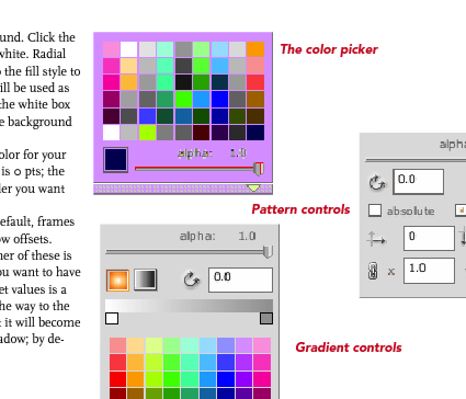
Digital Editions is clearly built around a different PDF rendering engine than the rest of Adobe’s software. (The FAQ explains that this engine was designed to be used on cellphones.) Image quality is noticeably worse than in Acrobat or Preview. Text is poorly aliased, and spacing between characters seems to be off for some fonts at some zoom levels. Graphics are notably grainy, and weird rendering artifacts sometimes show up. (In the image above, for example, note that there’s a light blue rectangle under the text on the left. This doesn’t show up in any other PDF viewer.) Some PDFs have extras that shouldn’t have been there, blocks of background color, for example. One illustration of the color picker in the Sophie help PDF I made a couple weeks back turns a lovely shade of purple:

colorpicker.png

This is frustrating: one of Adobe’s chief selling points of PDF as a format has been that a PDF will look the same on every machine in every viewer. Not this one. Adobe offers sample PDFs for download at their Digital Editions website (see below), which are similarly perplexing. Although these appear to be ordinary PDFs (with no restrictions), they don’t behave like regular PDFs. They can’t be opened in any PDF viewer that’s not Digital Editions. Preview shows only blank pages; opening them in the current Adobe Reader takes you to a webpage where you can download Digital Editions; and opening them in an older version of Acrobat brings up a message asking whether I’d like to learn more about documents protected with Adobe DRM. Clicking yes takes me to a pre-Digital Editions Adobe ebooks page. PDFs have become popular because they can be used in a variety of ways across a variety of platforms. This seems like a significant step backwards for Adobe: interoperability is taking a back seat to DRM.
2. as an EPUB reader
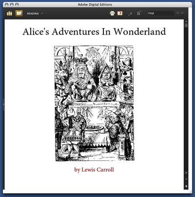
But Digital Editions isn’t only a PDF viewer; it’s also a viewer for EPUB format. EPUB is the work of the IDPF; it’s essentially an XHTML format for ebooks. You can get sample EPUBs from Adobe’s website. If you have the latest version of Adobe InDesign, you can make them yourself (more about that in a bit). Here’s the front page of their edition of Alice’s Adventures in Wonderland:

epub cover.png

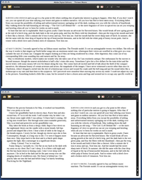
Perhaps not surprisingly for an XHTML format, the experience of reading an EPUB in Digital Editions is similar to reading a web page. The text becomes as wide as the Digital Editions window; if the window is wide enough, the text may reflow into more columns. When this happens is unclear to me: in some books, the text column is much too wide to read well before the text is reflowed:

wideness.png

You can choose between 4 different font sizes; you can’t change the fonts. (Some EPUB books include their own fonts; some use system fonts.) As in the Digital Editions PDF viewer, there’s some bookmarking capability: you can select text and click “Add bookmark” to add a note at a particular point in the text. Books have tables of contents; there’s a search function. You can print books (or, on a Mac, convert them to PDFs); this seems to be in two columns by default.
That seems to be all you can do with these books. The books that Adobe provides are noticeably ugly: most of the graphics included are low resolution. Text looks weirdly bad: in the default font, the italic text seems to actually be slanted roman characters, which you’d think Adobe would be embarrassed about. To my eye, the text looks much better in Safari or even Firefox. You can make this comparison if you rename the .epub file .zip and unzip it; in the resulting folder, you’ll find a bunch of HTML pages, the images used, and fonts, if they’re included.
Adobe trumpets the one-click creation of EPUB files in the new version of InDesign. So I fired up InDesign and made some EPUBs to see how those worked in Digital Editions. Try for yourself: here is a version of the Sophie help PDF in EPUB format. The results are a bit disappointing: all the graphics have been dumped at the end of the document, much of the formatting has been lost, and the table of contents I laboriously set up for PDF export has been eliminated. One-click conversion evidently doesn’t allow exporting the fonts the document uses; and even though I have the Avenir and Scala fonts on my machine, it displays in the default Digital Editions font. The graphics do display in their real color, which is more than you can say for the way Digital Editions handles the PDF, though many of them do seem to have been converted to JPEGs in a lossy way.
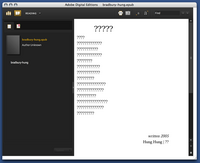
As a whim, I fed InDesign’s converter some foreign-language poetry to see how it would handle Unicode text. French came through okay. Lithuanian was mangled beyond recognition. Some Chinese poetry didn’t work at all:

chinese poetry.png

It’s clear that this needs a lot of work before it can be taken seriously.
3. as a store
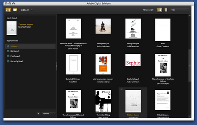
From Adobe’s press release, it’s clear that the main impetus behind Digital Editions is to provide a local front end for web-based selling of ebooks. The model that Adobe is working on becomes apparent when you open it up: the program maintains a library of all the PDF files you look at, in the same way that iTunes maintains a library of the MP3s on your computer:

library.png

Categories of books (on the left in the above screenshot) include “Borrowed” and “Purchased”. The iTunes model of incorporating a store in software isn’t necessarily a bad one: Linotype has embedded a font store in their free font management software, with some degree of success. It’s hard to tell how well Adobe’s integration will work. They’ve tried selling ebooks before with little success; I have a couple of PDFs bought from Amazon that I’ve long since despaired of ever opening again. (Some progress may be reported: clicking on these now now opens DigitalEditions, where I get a different cryptic error than I did before in Acrobat.) The same sort of problems are likely with ebooks designed for DigitalEditions; it does worry me that even PDFs without DRM can’t be opened outside of the software.
DRM are probably the logical place to end this overlong review. One of the major reasons that we haven’t spent much time covering the efforts of the IDPF is that it’s devoted to standards that satisfy producers rather than consumers; many producers are concerned with locking down their products as thoroughly as possible. It may be a reasonable position from their perspective, but it’s resulted in products that aren’t particularly useful to consumers. DigitalEditions looks like it might be a big piece in the puzzle for DRM-focused producers. Unfortunately, readers are being neglected.

another chapter in the prehistory of the networked book

A quick post to note that there’s an interesting article at the Brooklyn Rail by Dara Greenwald on the early history of video collectives. I know next to nothing about the history of video, but it’s a fascinating piece & her description of the way video collectives worked in the early 1970s is eye-opening. In particular, the model of interactivity they espoused resonates strongly with the way media works across the network today. An excerpt:

Many of the 1970s groups worked in a style termed “street tapes,” interviewing passersby on the streets, in their homes, or on doorsteps. As Deirdre Boyle writes in Subject to Change: Guerrilla Television Revisited (1997), the goal of street tapes was to create an “interactive information loop” with the subject in order to contest the one-way communication model of network television. One collective, The People’s Video Theater, were specifically interested in the social possibilities of video. On the streets of NYC, they would interview people and then invite them back to their loft to watch the tapes that night. This fit into the theoretical framework that groups were working with at the time, the idea of feedback. Feedback was considered both a technological and social idea. As already stated, they saw a danger in the one-way communication structure of mainstream television, and street tapes allowed for direct people-to-people communications. Some media makers were also interested in feeding back the medium itself in the way that musicians have experimented with amp feedback; jamming communication and creating interference or noise in the communications structures.
Video was also used to mediate between groups in disagreement or in social conflict. Instead of talking back to the television, some groups attempted to talk through it. One example of video’s use as a mediation tool in the early 70s was a project of the students at the Media Co-op at NYU. They taped interviews with squatters and disgruntled neighbors and then had each party view the other’s tape for better understanding. The students believed they were encouraging a more “real” dialogue than a face-to-face encounter would allow because the conflicting parties had an easier time expressing their position and communicating when the other was not in the same room.

Is YouTube being used this way? The tools the video collectives were using are now widely available; I’m sure there are efforts like this out there, but I don’t know of them.
Greenwald’s piece also appears in Realizing the Impossible: Art Against Authority, a collection edited by Josh MacPhee and Erik Reuland which looks worthwhile.

translating the past

At a certain point in college, I started doing all my word processing using Adobe FrameMaker. I won’t go into why I did this – I was indulging any number of idiosyncrasies then, many of them similarly unreasonable – but I did, and I kept using FrameMaker for most of my writing for a couple of years. Even in the happiest of times, there weren’t many people who used FrameMaker; in 2001, Adobe decided to cut their losses and stop supporting the Mac version of FrameMaker, which only ran in Classic mode anyway. I now have an Intel Mac that won’t run my old copy of FrameMaker; I now have a couple hundred pages of text in files with the extension “.fm” that I can’t read any more. Could I convert these to some modern format? Sure, given time and an old Mac. Is it worth it? Probably not: I’m pretty sure there’s nothing interesting in there. But I’m still loathe to delete the files. They’re a part, however minor, of a personal archive.
This is a familiar narrative when it comes to electronic media. The Institute has a room full of Voyager CD-ROMs which we have to fire up an old iBook to use, to say nothing of the complete collection of Criterion laser discs. I have a copy of Chris Marker’s CD-ROM Immemory which I can no longer play; a catalogue of a show on Futurism that an enterprising Italian museum put out on CD-ROM similarly no longer works. Unlike my FrameMaker documents, these were interesting products, which it would be nice to look at from time to time. Unfortunately, the relentless pace of technology has eliminated that choice.
bpNichol is excited to see you!Which brings me to the poet bpNichol, and what Jim Andrews’s site vispo.com has done for him. Born Barrie Phillip Nichol, bpNichol played an enormous part in the explosion of concrete and sound poetry in the 1960s. While he’s not particularly well known in the U.S., he was a fairly major figure in the Canadian poetry world, roughly analogous to the place of Ian Hamilton Finlay in Scotland. Nichol took poetry into a wide range of places it hadn’t been before; in 1983, he took it to the Apple IIe. Using the BASIC language, Nichol programmed poetry that took advantage of the dynamic new “page” offered by the computer screen. This wasn’t the first intersection of the computer and poetry – as far back as 1968, Dick Higgins wrote a FORTRAN program to randomize the lines in his Book of Love & War & Death – but it was certainly one of the first attempts to take advantage of this new form of text. Nichol distributed the text – a dozen poems – on a hundred 5.25” floppy disks, calling the collection First Screening.
bpNichol died in 1988, about the time the Apple IIe became obsolete; four years later, a HyperCard version of the program was constructed. HyperCard’s more or less obsolete now. In 2004, Jim Andrews, Geof Huth, Lionel Kerns, Marko Niemi, and Dan Waber began a three-year process of making First Screening available to modern readers; their results are up at http://vispo.com/bp/. They’ve made Nichol’s program available in four forms: image files of the original disk that can be run with an Apple II emulator, with the original source should you want to type in the program yourself; the HyperCard version that was made in 1992; a QuickTime movie of the emulated version playing; and a JavaScript implementation of the original program. They also provide abundant and well thought out criticism and context for what Nichol did.
Looking at the poems in any version, there’s a sweetness to the work that’s immediately winning, whatever you think of concrete poetry or digital literature. Apple BASIC seems cartoonishly primitive from our distance, but Nichol took his medium and did as much as he could with it. Vispo.com’s preservation effort is to be applauded as exemplary digital archiving.
But some questions do arise: does a work like this, defined so precisely around a particular time and environment, make sense now? Certainly it’s important historically, but can we really imagine that we’re seeing the work as Nichol intended it to be seen? In his printed introduction included with the original disks, Nichol speaks to this problem:

As ever, new technology opens up new formal problems, and the problems of babel raise themselves all over again in the field of computer languages and operating systems. Thus the fact that this disk is only available in an Applesoft Basic version (the only language I know at the moment) precisely because translation is involved in moving it out further. But that inherent problem doesn’t take away from the fact that computers & computer languages also open up new ways of expressing old contents, of revivifying them. One is in a position to make it new.

disk sleeve from original edition of first screeningNichol’s invocation of translation seems apropos: vispo.com’s versions of First Screening might best be thought of as translations from a language no longer spoken. Translation of poetry is the art of failing gracefully: there are a lot of different ways to do it, and in each way something different is lost. The QuickTime version accurately shows the poems as they appeared on the original computer, but video introduces flickering discrepancies because of the frame rate. With the Javascript version, our eyes aren’t drawn to the craggy bitmapped letters (in a way that eyes looking at an Apple monitor in 1983 would not have been), but there’s no way to interact with the code in the way Nichol suggests because the code is different.
Vispo.com’s work is quite obviously a labor of love. But it does raise a lot of questions: if Nichol’s work wasn’t so well-loved, would anyone have bothered preserving it like this? Part of the reason that Nichol’s work can be revived is that he left his code open. Given the media he was working in, he didn’t have that much of a choice; indeed, he makes it part of the work. If he hadn’t – and this is certainly the case with a great deal of work contemporary to his – the possibilities of translation would have been severely limited. And a bigger question: if vispo.com’s work is to herald a new era of resurrecting past electronic work, as bpNichol might have imagined that his work was to herald a new era of electronic poetry, where will the translators come from?

the problem of criticism

a picture of richard powers taken by the redoubtable marion ettlingerAn email fluttered into my inbox yesterday afternoon, advertising a reading that night by the novelist Richard Powers, a “talk-piece about literature, empathy, and collective forgetting in the age of blogs.” Powers is on a short list of American novelists who write convincingly about how technology affects our humanity – see, for example: Three Farmers on Their Way to a Dance, on the mechanical reproduction of art; Galatea 2.2, on artificial intelligence; Ploughing the Dark, on virtual reality and collective imagination – and I’ve been wondering about the problem of forgetting, so I wandered over to the Morgan Library, curious to hear what he had to say.
There’s always room for trepidation about the old guard confronting the new – one remembers the embarrassingly malformed web address that figures in at least the first edition of Don DeLillo’s Underworld – but Powers didn’t disappoint: his piece, entitled “The Moving Finger,” nicely conveys how blog-reading works, and in particular the voyeur-like experience of being caught up with an individual voice. Speaking in the first person, Powers recounted the story of a novelist obsessed with a blog entitled Speculum Ludi, helmed by someone who calls himself Funes the Memoirist, whose ranting posts on the deeper meaning of mirror neurons and advances in cognitive neurobiology were quite ably read by the critic John Leonard. Powers finds Funes’s blog by accident, then follows a common blog-reading trajectory: he doubts its credibility, finds himself compelled by the turns of phrase, sleuths down who must be behind it, lingers over his RSS reader, waiting for updates. And then he’s caught: Funes eventually realizes that he has only a single reader and calls him out by IP address. Powers panics; Funes retaliates by shutting down his blog & erasing all traces of it from the Internet. (This last bit might be where Powers goes too far.)
There’s a weird sense of intimacy that comes from reading blogs. When we read a novel, we know exactly where we stand with respect to the author; what’s in the book is packaged and done. A blog goes on. While I’m sure Powers’s piece will end up in print sooner or later, it makes sense as an oral presentation, leapfrogging the solidity of written language into the memory of his listeners. (And from there to the inevitable blog reports: see Ed Park’s and Galleycat’s). There’s an echo of this in Powers’s widely discussed writing method: he composes via tablet PC and dictation software, bypassing the abstraction of the keyboard altogether.
this is a fake image that i made myself: she did not actually get this score in real life.But that said, it would be a mistake to read Powers as championing the new at the expense of the old. There’s been a great deal of worry of late about litblogs killing off newspaper book reviews; naturally this came up in the discussion afterwards. Powers pointed out that while there’s an enormous amount of potential in the pluralist free-for-all that is the blogosphere, online criticism isn’t free of the same market forces that increasingly dictate the content of newspaper book reviews. Amazon.com maintains what’s probably the biggest collection of book reviews in the world; Powers wondered how many of those reviews would be written if the reviewers weren’t allowed to declare how many stars a book merited. There’s something tempting about giving an under-appreciated book five stars; there’s equally tempting about bringing down the rating of something that’s overrated. But this sort of quick evaluation, he argued, isn’t the same thing as criticism; while all books may be judged with the same scale in the eyes of the market, rating a book isn’t necessarily engaging with it in a substantive way. The reciprocity in web reading writing is fantastic, but it comes with demands: among them the need for equitable discourse. Criticism is communication, not grading. Powers’s narrator fails because he refuses to be critic as well as reader. We may all be critics now, but there’s a responsibility that comes from that.