Author Archives: dan visel

mothlight

i. the text of light

a moth wing, from _mothlight_The filmmaker Stan Brakhage is one of those people whose work hangs in the back of my mind with a frequency well out of proportion to my actually engaging with his work. I first (and really, only, until recently) saw his films about seven years ago, when he introduced a marathon screening of what must have been almost his complete works. Hours later, I stumbled out of the theatre, knowing that this was someone whose work I should have seen years before, having seen on the screen something new to me, a new way of looking at the possibility of film. I’ve felt an analogous sensation with only a handful of artists and writers; I’ve found it again in the luminously fractured English of Amos Tutuola, Ray Johnson’s conceptual games of “correspondance”, and Michel Butor’s reimagining of the page and narrative.

some tiny flowers, from _mothlight_But Brakhage. His films tend to be short and silent. His editing, if it can be called such, is quick – often an image only shows for a frame, then it’s gone. In most of his films, he cuts quickly between shots; in some of his work he abandoned the camera entirely to work directly with the film stock itself, painting on it or gluing things to it. Jean-Luc Godard said that the cinema was the truth twenty-four times a second; rarely has this been so literally explicated as in Brakhage’s films. Mitchell Stephens, in The Rise of the Image, the Fall of the Word saw in the lighting-fast editing style that Brakhage introduced a possible future for communication. But Brakhage was following his own very particular muse. His aim, he declared in one of his later films, was to show on film what the eye sees when it is closed, the phenomenon of dancing spots of color that’s been termed hypnogogic vision.

a flower petal, from _mothlight_Mothlight, stills from which can be seen floating about this post, was one of the films that stuck most clearly in my mind. In it, Brakhage set out to show “what a moth might see from birth to death if black were white and white were black.” The ratio of the size of the moth to that of ourselves is roughly that of the size of a film negative to the blown up film; with this in mind, and a collection of dead moths that had flown into a light and perished, Brakhage composed a three-minute film, every frame of which is composed of things from the moth’s world: wings, plant leaves, and flowers. Brakhage pasted these objects directly onto the film stock. When the film is projected there’s a rush of images made unfamiliar by size: a moth wing or a flower twenty feet wide is something we’ve never seen before. Though constructed of objects that we imagine we know, the moth’s world as Brakhage depicts it is utterly foreign to us. Speed has a lot to do with it: the eye can’t possibly process twenty-four different images per second. The moth’s world is much faster than our own.

The memory of that flicker of images has stayed with me, as much for its ephemerality as anything else: I’d seen something briefly, not long enough to remember the images themselves, but long enough to remember the film more clearly than nearly anything else I saw that year.

ii. the act of seeing with one’s own eyes

a leaf, from _mothlight_The Criterion Collection released a two-DVD set of some of Brakhage’s films a few years ago, a year or so before he passed away and was briefly in the news again. I’m not sure why I held off buying a copy of the DVD: maybe a devotion to the ephemerality of memory? I did convince an old roommate, a painter, to buy his own copy soon after it was released: independently, he had been trying to capture with oils hypnogogic visions of his own. But I didn’t get a copy until a few weeks ago, when after finding him again in Mitchell Stephens’s book, I broke down for an online Christmas DVD sale. It arrived, and I inserted one of the discs into my Powerbook, curious to see how his films compared to my memory of them.

a flower, from _mothlight_Watching him the first time, I’d been supine before the screen. Watching him on my laptop was something different, something surprising. My first impulse after starting one of the films playing was the obvious one when something’s going too fast, but not an option that one has when you’re part of an audience: to hit the pause button. The moth wings, spider webs, flowers, and blades of grass instantly snap into startling focus: around every object, you can see the halo of glue that Brakhage used to hold it to the celluloid. Then another pleasant surprise: on the Apple DVD player, if you then press the right arrow button, you can advance one frame. Not another frame in the same shot, as one would expect in an ordinary film, but another image entirely, though sometimes, you realize, a connected object: in some frames one sees the top of a plant leaf, in the following, the bottom, exactly as Brakhage constructed the film. (Images of the film stock itself – not just screencaptures from the DVD – can be seen at critic Fred Camper’s website, which offers a dizzying amount of information on Stan Brakhage.)

Technically, this is not very exciting at all: pausing to see a crisp frame is just one of the niceties of the DVD that we’re all used to. But what this does to the viewer’s experience of the film is immeasurable. Instead of the imposed stricture of watching the images projected at 24 frames per second, you’re free to proceed through Brakhage’s frames at any rate you like – his film becomes something like a slide show. As great a change, though, is imparted to the viewer, who goes from being a passive recipient of speeding images to an active participant with control over what’s being shown.

a spider web, or something, from _mothlight_This isn’t, it’s worth pausing to consider, something that would have been possible with a VHS tape. Video didn’t respect the frames of film, and a paused VHS tape generally gives you a blurred and indistinct image. Presumably with a projector and a copy of the original films, you could do the same thing. (This would also resolve the incongruity of looking at images that are meant to have light projected through them rather than being composed of red, green, and blue blips of it, as on my computer screen.) Alas, not many of us have our own movie theater to try this out in. For the rest of us, this amount of control is something that arrives with new digital media, and deserves to be considered as a function of it.

From time to time, Bob talks to the programmers busy making Sophie about imagining film as being a book that’s flipping through 86,400 pages per hour. This sort of talk tends to throw them into conniptions (to paraphrase: nobody in their right mind thinks that way & how current processors don’t have nearly enough computational power and they probably won’t for the next fifty years). But despite their objections, that’s almost exactly what we have here, if not through design. It’s worth noting, of course, that the tools for reading film in this way aren’t yet perfect: while I can press the right arrow to advance a frame in my DVD player, I can’t, for some reason, press the left arrow to go back a frame: you have to rewind. I can’t look at several consecutive frames together without a fair amount of work. There’s more work for the programmers.

iii. mothlight

an iris, from _mothlight_Thinking about technology for the past month or so, I’ve often found myself in a mild funk, which might be the sort of thing one expects to set in around the end of the year, when I, at least, find myself wanting to neatly box the disjointed events of the past year to take up to the attic for storage. The crux of my worrying: while there’s clearly no shortage for ideas of new ways to say things – as even a cursory reading of this blog will readily attest – there seems to be a comparative paucity of new ways to understand things. Maybe this makes sense: people like novelty. It’s more exciting to announce something brand new and different than to find a new way to look at something familiar. Who can be bothered to care about a fourteenth way of looking at a blackbird when you can make your own genetically-modified fuchsia- and chartreuse-birds?

a flower, from _mothlight_My funk wasn’t straight misoneism: I’m all for new forms else I wouldn’t be working here. But if we’re to create new forms that resonate as strongly as the physical book has been able to historically – a project that I suspect Brakhage considered himself engaged in – it’s just as important to find new ways to understand how what we’ve created works. And this is I think why the simple gesture of hitting the “pause” button in the middle of a film feels like something of a revelation to me, puncturing my December miasma. It’s not a blinding Damascene conversion, and that’s perhaps the point: it’s a realization that there are plenty of possibilities for new ways to look at things. We just need to notice them.

The late Guy Davenport, one of Brakhage’s friends and a kindred spirit, defended the unity of some of his own work – short stories that included his own drawings as an integral part of the story – by arguing that text, picture, and film weren’t in opposition, but were all images alike:

“A page, which I think of as a picture, is essentially a texture of images. . . . The text of a story is therefore a continuous graph, kin to the imagist poem, to a collage (Ernst, Willi Baumeister, El Lissitzky), a page of Pound, a Brakhage film.”
(from “Ernst Machs Max Ernst”, pp. 374-5 in The Geography of the Imagination)

another flower, from _mothlight_Davenport’s declaration can be turned inside-out: we can now take a Brakhage film and read it as a series of pages. The word and the image still aren’t quite the same thing, but digital media allows us to think about them in some of the same ways. Watching with the pause button ready, we can scrutinize the composition of a single frame of film just as you might scrutinize an individual line or words in a poem, a page of a book.

Or again: historically, the coming of the book might be seen as freeing the reader from the dominion of time. The pre-literate can only listen to a text being read, while the literate is free to read at leisure. It’s a pause button, of a sort. Brakhage’s moth seems an apt tool for thinking here. I haven’t done the math, but I’d imagine the ratio of the length of a moth’s life to our own is about the same as the ratio of the moth’s size to our own. When we look at a moth, we see a being utterly bound by time. But it doesn’t have to be that way.

trapped in the closet & the form of the blook

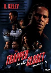
the cover of the trapped in the closet dvdMost of the people reading this blog probably don’t give R. Kelly – the R&B singer known for his buttery voice and slippery morals – the attention that I do, which is completely understandable. But unfortunate, because he’s very much worth keeping an eye on. For the past six months, he’s been engaged in the most formally interesting experiment in pop music in a while. I’m referring, of course, to “Trapped in the Closet”. Bear with me a bit: while it might seem like I’m off on a frolic of my own, this will get around to having something to do with the future of the book.
“Trapped in the Closet” is, in brief, Kelly’s experiment in making a serialized pop song. The first installment of it (“Chapter 1”) arrived on a CD single last May, squeezed between “Set in the Kitchen” (a song about sex in the kitchen) and “Sex in the Kitchen (remix)” (another song about sex in the kitchen). It’s a three-and-a-half minute long song without a chorus in which Kelly lays out a plot involving multiple adulteries, a closet, and a cell phone that goes off at an inopportune moment. It ends on a cliffhanger – the narrator, hiding in the titular closet, draws his gun as the husband he’s cuckolded is about to open the door. Kelly followed this up by releasing four subsequent chapters to the radio – followed shortly by music videos – which, rather than tying up loose ends, drew out the plot wider and wider, piling adultery upon adultery, bringing a gay pastor, a police officer, and leg cramps into the story. All the chapters have the same backing music and run to the same length. And despite revelation after revelation, they all end on a cliffhanger of some sort.

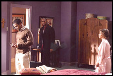
this shows chuck, sylvester (=r. kelly, sometimes) and kathy in chapter two, i think.For the next seven chapters, Kelly moved directly to video: he’s just released a DVD video of the first twelve chapters, where he and others act out the drama he’s narrating for thirty-nine minutes. New characters are introduced and the plot becomes steadily more labyrinthine (a midget and an allergy to cherries figure prominently) and fails to resolve much of anything. Kelly’s said to be busy thinking up a dozen more installments to the story. Through it all, the music remains the same; each episode is still three minute pop song, which do get played on the radio as such. Wikipedia does have a surprisingly good summary of the twists and turns of Kelly’s saga, though it is written in an unfortunate wink-wink-nudge-nudge style. There’s a video of the first chapter is available here; the Web being the Web, there’s a lot of so-so derivative work here, and even machinima versions of the videos here.

What’s interesting about this to me? It’s partially interesting for the unbridled creativity of the endeavor: to all appearances, R. Kelly would seem to be making up the story as he goes along, happily jumping between media. But I find the most interesting aspect of this to be that R. Kelly is trying to construct a large story modularly. Each of the chapters of his story ostensibly should be able to have a life of its own as a pop song. This doesn’t quite work because his plot has become fiendishly complicated, and none save the moved devoted can make out exactly what the relationship of Rufus to Bridget might be. Presumably this is why the latest chapters were released straight to DVD, where they play sequentially. But formally each of the chapters remains identical: they all have the same backing music, start with a revelation resolving the previous cliffhanger, and end by setting up a new cliffhanger. These constraints limit what Kelly can do with the song: accordingly, his plots must become progressively more ridiculous to keep the story interesting for his listeners or viewers.

There’s an obvious analogy to the serialized novel, a recurring trope around here – we could once again trot out Charles Dickens (to whom Kelly might have been obliquely referring when he explained that ” ‘Trapped in the Closet’ was designed to go around the world sort of like the Ghost of Christmas Past – house to house, this situation to that situation, sometimes exposing people in their regular lives”). But closer at hand, there’s clearly a relevant comparison to be made to how entries function within a blog here. Just as “Trapped in the Closet” is composed of modular “chapters”, blogs are composed of entries, which are intended to stand by themselves. Kelly’s ongoing opera isn’t quite a blog, but it’s rather similar in structure.

What does it functionally mean to have a serialized narrative? One thing that shouldn’t be forgotten when scrutinizing new media forms is that form inevitably inflicts itself on content. Another: the example par excellence of the serialized narrative is the soap opera, unglamorous as that might be. Because R. Kelly has to end each chapter on a cliffhanger, his plot must become even more convoluted with every chapter. Watching the thirty-nine minutes of Trapped in the Closet Chapters 1–12 is exhausting because of this: a three minute bon bon of plot becomes cloying sweet over time. At thirty-nine minutes, Kelly’s DVD should feel like a movie. It doesn’t: its repetitiveness makes it feels like something else entirely, something that we haven’t quite seen before. Does it work? It’s hard to say.

There’s no lack of connection between the serialized narrative and the new media forms we survey here (note, for example Lisa’s post from today). I’m most interested in the formal problem that arises from the publishing industry’s latest bad idea, making books out of blogs. This does seem appealingly simple: people are writing online, if they’re good and they’ve written enough, you can slap a cover on it and call it a book. It turns out, however, that a book is more than the sum of its parts. I’m willing to give R. Kelly the benefit of the doubt with his strange DVD because it doesn’t quite feel like anything else. The problems with blogs presented as books, however, is that we expect them to behave like a book, which they don’t.

Julia Child wielding a mallet.An example at hand: a friend gave my girlfriend a copy of Julie & Julia, the book that was made from Julie Powell’s blog, in which she reports on her attempts to cook all of the recipes in Julia Child’s Mastering the Art of French Cooking. My girlfriend, a self-identified cookbook snob & long-time devotée of Julia Child, was predictably horrified, and has spent the past week complaining about how dreadful this book is. Part of her anger is an issue of substance: she believes that Julia Child should not be dealt with so flippantly. But part of what makes her angry about the book is how the book is written. It’s not quite episodic – the editor wasn’t quite so sloppy as string together a series of blog posts and call it a book – but it does inherit much of its character from its episodic origin, which is what brings me back around to R. Kelly.

What makes a blog readable isn’t the same thing that makes a book readable. The two forms have different concerns: on a blog, an enormous part of the task of the writer is to make sure that what’s written about are interesting enough that readers keep coming back. A reader might start reading a blog at any point, so this is an ongoing concern. (Thus R. Kelly’s cliffhangers.) This isn’t nearly as necessary with a physical book: readers still need to be hooked by the concept of the book, but generally you don’t need to keep hooking them.

here is julia child with an enormous fish.It might be best explained by looking at the difference between Mastering the Art of French Cooking & Powell’s book. The former was conceived as a unified whole: it’s a single big idea, elucidated in steps, from the simple to the complicated. Later parts of that book are built upon the former: they don’t work well by themselves unless you’ve already absorbed the earlier information. Julie & Julia is constructed as a series of snapshots from the life of the author, each of which seeks to be individually interesting in and of itself. How does this play out in the pages of the book? An easy example: Powell’s sex life keeps popping up in a rather gratuitous fashion. The subject isn’t without relevance in a culinary work (M.F.K. Fisher could pull this off this sort of thing astonishingly well, for example); rather, it’s the way in which it’s constantly presented in passing. This makes perfect sense for a blog: a dash of sex spices up a blog entry nicely, and will keep the readers coming back for more. A blog is explicitly built on a relationship between the reader and the writer: the writer can respond to the readers. This doesn’t work so well in a published book: this sort of interjection, rather than serving to keep the reader hooked, feels more like a constant distraction in a book not explicitly about food & sex. The reader’s already bought the book. They don’t need to be hooked again.

(Something of a counterexample: one of the most vexing things I found about Thomas de Zengatita’s Mediated (which we recently discussed at the Institute) was the style in which it’s written. Every page or so there’s a pithy, one-sentence paragraph. These zingers are employed over the 200 pages of the book; for the reader, it becomes immensely wearing. But just as a thought-experiment: if Zengotita had chopped the book up into page-sized chunks and turned it into a blog, the single-sentence zingers probably wouldn’t have been so bothersome; I might not have noticed them enough to comment on them. I’ve never found Zengatita’s much shorter essays in Harper’s annoyingly written. Some traits only becomes visible with length or time.)

While it’s very easy to fuse the words blog and book to get blook, that doesn’t automatically mean that a successful blog will become a successful book (or vice versa). These are very different forms. What could Julie Powell have learned from R. Kelly, besides any number of things which can’t be printed in a family-oriented blog? First, it’s a difficult job to make a coherent work out of unified pieces. It’s possible that R. Kelly could wrap up all of his narrative loose ends in future chapters, but I’m not holding my breath. Something else: even if it lacks any Aristotelian unities, “Trapped in the Closet” is interesting because it’s unique. Nobody else is making serialized pop music videos: we have nothing to judge it against, so it has novelty. (Yes, this might be damning with faint praise – that’s the other side of the coin.) A blog turned into a book doesn’t have that same sort of novelty. We end up judging it against the criteria by which we’d judge any other book – we compare Powell’s book to M. F. K. Fisher, though we wouldn’t have thought to do that with her blog. The blook inevitably suffers, because the content has been stuffed into a form which it doesn’t quite fit. Let blogs be blogs.

A question to throw out to end this with: could you develop the sort of big ideas that the physical book excels at moving around on a blog, given their modular construction?

multimedia vs intermedia

Dick Higgins performing Danger Music No. 17
One of the odd things that strikes me about so much writing about technology is the seeming assumption that technology (and the ideas associated with it) arise from some sort of cultural vacuum. It’s an odd myopia, if not an intellectual arrogance, and it results in a widespream failure to notice many connections that should be obvious. One such connection is that between the work of many of the conceptual artists of the 1960s and continuing attempts to sort out what it means to read when books don’t need to be limited to text & illustrations. (This, of course, is a primary concern of the Institute.)

Lately I’ve been delving through the work of Dick Higgins (1938–1998), a self-described “polyartist” who might be most easily situated by declaring him to be a student of John Cage and part of the Fluxus group of artists. This doesn’t quite do him justice: Higgins’s work bounced back and forth between genres of the avant-garde, from music composition (in the rather frightening photo above, he’s performing his Danger Music No. 17, which instructs the performer to scream as loudly as possible for as long as possible) to visual poetry to street theatre. He supported himself by working as a printer: the first of several publishing ventures was the Something Else Press, which he ran from 1963 to 1974, publishing a variety of works by artists and poets as well as critical writing.

Click to see a larger version of Dick Higgins poetry intermedia poster“Betweenness” might be taken as the defining quality of his work, and this betweenness is what interests me. Higgins recognized this – he was perhaps as strong a critic as an artist – and in 1964, he coined the term “intermedia” to describe what he & his fellow Fluxus artists were doing: going between media, taking aspects from established forms to create new ones. An example of this might be visual, or concrete poetry, of which that of Jackson Mac Low or Ian Hamilton Finlay – both of whom Higgins published – might be taken as representative. Visual poetry exists as an intermediate form between poetry and graphic design, taking on aspects of both. This is elaborated (in an apposite form) in his poster on poetry & its intermedia; click on the thumbnail to the right to see a (much) larger version with legible type.

Higgins certainly did not imagine he was the first to use the idea of intermedia; he traced the word itself back to Samuel Taylor Coleridge, who had used it in the same sense in 1812. The concept has similarities to Richard Wagner’s idea of opera as Gesamkunstwerk, the “total artwork”, combining theatre and music. But Higgins suggested that the roots of the idea could be found in the sixteenth century, in Giordano Bruno’s On the Composition of Signs and Images, which he translated into English and annotated. And though it might be an old idea, a quote from a text about intermedia that he wrote in 1965 (available online at the always reliable Ubuweb) suggests parallels between the avant-garde world Higgins was working in forty years ago and our concern at the Institute, the way the book seems to be changing in the electronic world:

Much of the best work being produced today seems to fall between media. This is no accident. The concept of the separation between media arose in the Renaissance. The idea that a painting is made of paint on canvas or that a sculpture should not be painted seems characteristic of the kind of social thought–categorizing and dividing society into nobility with its various subdivisions, untitled gentry, artisans, serfs and landless workers–which we call the feudal conception of the Great Chain of Being. This essentially mechanistic approach continued to be relevant throughout the first two industrial revolutions, just concluded, and into the present era of automation, which constitutes, in fact, a third industrial revolution.

Higgins isn’t explicitly mentioning the print revolution started by Gutenberg or the corresponding changes in how reading is increasingly moving from the page to the screen, but that doesn’t seem like an enormous leap to make. A chart he made in 1995 diagrams the interactions between various sorts of intermedia:

higgins_intermedia_chart.gif

Note the question marks – Higgins knew there was terrain yet to be mapped out, and an interview suggests that he imagined that the genre-mixing facilitated by the computer might be able to fill in those spaces.

“Multimedia” is something that comes up all the time when we’re talking about what computers do to reading. The concept is simple: you take a book & you add pictures and sound clips and movies. To me it’s always suggested an assemblage of different kinds of media with a rubber band – the computer program or the webpage – around them, an assemblage that usually doesn’t work as a whole because the elements comprising it are too disparate. Higgins’s intermedia is a more appealing idea: something that falls in between forms is more likely to bear scrutiny as a unified object than a collection of objects. The simple equation text + pictures (the simplest and most common way we think about multimedia) is less interesting to me than a unified whole that falls between text and pictures. When you have text + pictures, it’s all too easy to criticize the text and pictures separately: this picture compared to all other possible pictures invariably suffered, just as this text compared to all other possible texts must suffer. Put in other terms, it’s a design failure.

A note added to the essay quoted above in 1981 more explicitly presents the ways in which intermedia can be a useful tool for approaching new work:

It is today, as it was in 1965, a useful way to approach some new work; one asks oneself, “what that I know does this new work lie between?” But it is more useful at the outset of a critical process than at the later stages of it. Perhaps I did not see that at the time, but it is clear to me now. Perhaps, in all the excitement of what was, for me, a discovery, I overvalued it. I do not wish to compensate with a second error of judgment and to undervalue it now. But it would seem that to proceed further in the understanding of any given work, one must look elsewhere–to all the aspects of a work and not just to its formal origins, and at the horizons which the work implies, to find an appropriate hermeneutic process for seeing the whole of the work in my own relation to it.

The last sentence bears no small relevance to new media criticism: while a video game might be kind of like a film or kind of like a book, it’s not simply the sum of its parts. This might be seen as the difference between thinking about terms of multimedia and in terms of intermedia. We might use it as a guideline for thinking about the book to come, which isn’t a simple replacement for the printed book, but a new form entirely. While we can think about the future book as incorporating existing pieces – text, film, pictures, sound – we will only really be able to appreciate these objects when we find a way to look at them as a whole.

An addendum: “Intermedia” got picked up as the name of a hypertext project out of Brown started in 1985 that Ted Nelson, among others, was involved with. It’s hard to tell whether it was thus named because of familiarity with Higgins’s work, but I suspect not: these two threads, the technologic and the artistic, seem to be running in parallel. But this isn’t necessarily, as is commonly suuposed, because the artists weren’t interested in technical possibilities. Higgins’s Book of Love & Death & War, published in 1972, might merit a chapter in the history of books & computers: a book-length aleatory poem, he notes in his preface that one of its cantos was composed with the help of a FORTRAN IV program that he wrote to randomize its lines. (Canto One of the poem is online at Ubuweb; this is not, however, the computer-generated part of the work.)

And another addendum: something else to take from Higgins might be his resistance to commodification. Because his work fell between the crevices of recognized forms, it couldn’t easily be marketed: how would you go about selling his metadramas, for example? It does, however, appear perfectly suited for the web & perhaps this resistance to commodification is apropos right now, in the midst of furious debates about whether information wants to be free or not. “The word,” notes Higgins in one of his Aphorisms for a Rainy Day in the poster above, “is not dead, it is merely changing its skin.”

marjane satrapi on times select

The first panel of Marjane Satrapis blog for the NYTimesEveryone (and that includes us) has spent a lot of time complaining about Times Select, the paid online access to the New York Times editorial content. As I still subscribe to the paper version & thus get free access, I haven’t complained so much. One thing that seems not to have been noticed in the debate is that Times Select coverage isn’t exactly the same as the print version: increasingly, they’ve been creating dedicated web content which wouldn’t work on the paper version at all. The most notable web-only content so far has been that they’ve given Marjane Satrapi, her own blog, titled An Iranian in Paris. Satrapi’s a Persian graphic novelist; her Persepolis beautifully illustrates her experience growing up in Iran before, during, and after the revolution.

Her blog’s worth a look – get someone else’s account info, if you don’t have an account. It reminds me not a little of the blog of Alex Itin, our artist in perpetual residence, who continues to fill his blog with pictures, some moving, with occasional dollops of text. Satrapi’s work here feels astonishingly human and casual, thanks in no small part to the handwriting fonts used for the text. It’s interesting to me that they’ve chosen to put this on the web: it’s decidedly paper-based art. But the Web lets her be a bit more expansive than her usual black and white work: consider this image, where she seems to have scanned her passport, than drawn over its image, which would be difficult with electronic technology.

She’s posted three (extended) entries so far, and the Times has given no indication of how long they intend to keep this up – or, really, any explanation of what they’re trying to do here – leading one to hope that this is an open-ended series. Is this worth shelling out money for Times Select? Maybe not by itself. But if they keep providing this sort of web-dedicated content, naysayers might think about reconsidering.

ted nelson & the ideologies of documents

I. Nelson’s criticism

Ted Nelson (introduced last week by Ben) is a lonely revolutionary marching a lonely march, and whenever he’s in the news mockery is heard. Some of this is with good reason: nobody’s willing to dismantle the Internet we have for his improved version of the Internet (which doesn’t quite work yet). You don’t have to poke around too long on his website to find things that reek of crackpottery. But the problems that Nelson has identified in the electronic world are real, even if the solutions he’s proposing prove to be untenable. I’d like to expand on on one particular aspect of Nelson’s thought prominent in his latest missive: his ideas about the inherent ideologies of document formats. While this sounds very blue sky, I think his ideas do have some repercussions for what we’re doing at the Institute, and it’s worth investigating them, if not necessarily buying off on Xanadu.

Nelson starts from the position that attempting to simulate paper with computers is a mistaken idea. (He’s not talking about e-ink & the idea of electronic paper, though a related criticism could be made of that: e-ink by itself won’t solve the problem of reading on screens.) This is correct: we could do many more things with virtual space than we can with a static page. Look at this Flash demonstration of Jef Raskin’s proposed zooming interface (previously discussed here), for example. But we don’t usually go that far because we tend to think of electronic space in terms of the technology that preceded it – paper space. This has carried over into the way in which we structure documents for online reading.

There are two major types of electronic documents online. In one, the debt to paper space is explicit: PDFs, one of the major formats currently used for electronic books, are a compressed version of Postscript, a specification designed to tell a printer exactly what should be on a printed page. While a PDF has more functionality than a printed page – you can search it, for example, and if you’re tricky you can embed hyperlinks and tables of content in them – it’s built on the same paradigm. A PDF is also like a printed page in that it’s a finalized product: while content in a PDF can be written over with annotations, it’s difficult to make substantial changes to it. A PDF is designed to be an electronic reproduction of the printed page. More functionality has been welded on to it by Adobe, who created the format, but it is, at its heart attempting to maintain fidelity to the printed page.

The other dominant paradigm is that of the markup language. A quick, not too technical introduction: a markup language is a way of encoding instructions for how a text is to be structured and formatted in the text. HTML is a markup language; so is XML. This web page is created in a markup language; if you look at it with the “View Source” option on your browser, you’ll see that it’s a text file divided up by a lot of HTML tags, which are specially designed to format web pages: putting <i> and </i> around a word, for example, makes it italic. XML is a broader concept than HTML: it’s a specification that allows people to create their own tags to do other things: some people are using their own version of XML to represent ebooks.

There’s a lot of excitement about XML – it’s a technology that can be (and is)bent to many different uses. A huge percentage of the system files on your computer, for example, probably use some flavor of XML, even if you’ve never thought of composing an XML documents. Nelson’s point, however, is that there’s a central premise to all XML: that all information can be divided up into a logical hierarchy – an outline, if you will. A lot of documents do work this way: book is divided into chapters; a chapter is divided into paragraphs; paragraphs are divided into words. A newspaper is divided into stories; each story has a headline and body copy; the body copy is divided into paragraphs; a paragraph is divided into sentences; a sentence is divided into words; and words are divided into letters, the atom of the markup universe.

II. A Victorian example

But while this is the dominant way we arrange information, this isn’t necessarily a natural way to arrange things, Nelson points out, or the only way. It’s one way of many possible ones. Consider this spread of pages (double-click to enlarge them):

Click here to enlarge this image.

This is a title page from a book printed by William Morris, another self-identified humanist. We mostly think of William Morris (when we’re not confusing him with the talent agency) as a source of wallpaper, but his work as a book designer can’t be overvalued. The book was printed in 1893; it’s entitled The Tale of King Florus and the Fair Jehane. Like all of Morris’s books, it’s sumptuous to the point of being unreadable: Morris was dead set on bringing beauty back into design’s balance of aesthetics & utility, and maybe over-corrected to offset the Victorian fixation on the latter.

I offer this spread of pages as an example because the elements that make up the page don’t break down easily into hierarchical units. Let’s imagine that we wanted to come up with an outline for what’s on these pages – let’s consider how we would structure them if we wanted to represent them in XML. I’m not interested in how we could represent this on the Web or somewhere else – it’s easy enough to do that as an image. I’m more interested in how we would make something like this if we were starting from scratch & wanted to emulate Morris’s type and woodcuts – a more theoretical proposition.

First, we can look at the elements that comprise the page. We can tell each page is individually important. Each page has a text box, with decorative grapevines around the text box; inside the text box, the title gets its own page; on the second page, there’s the title repeated, followed by two body paragraphs, separated by a fleuron. The first paragraph gets an illustrated dropcap. Each word, if you want to go down that far, is composed of letters.

But if you look closer, you’ll find that the elements on the page don’t decompose into categories quite so neatly. If you look at the left-hand page, you can see that the title’s not all there – this is the second title page in the book. The title isn’t part of the page – as would almost certainly be assumed under XML – rather, they’re overlapping units. And the page backgrounds aren’t mirror images of each other: each has been created uniquely. Look at the title at the top of the right-hand page: it’s followed by seven fleurons because it takes seven of them to nicely fill the space. Everything here’s been minutely adjusted by hand. Notice the characters in the title on the right and how they interact with the flourishes around them: the two A’s are different, as are the two F’s, the two N’s, the two R’s, the two E’s. You couldn’t replicate this lettering with a font. You can’t really build a schema to represent what’s on these two pages. A further argument: to make this spread of pages rigorous, as you’d have to to represent it in XML, would be to ruin them aesthetically. The vines are the way they are because the letters are the way they are: they’ve been created together.

The inability of XML to adequately handle what’s shown on these pages isn’t a function of the screen environment. It’s a function of the way we build electronic documents right now. Morris could build pages this way because he didn’t have to answer to the particular restraints we do now.

III. The ideologies of documents

Let’s go back to Ted:

Nearly every form of electronic document- Word, Acrobat, HTML, XML- represents some business or ideological agenda. Many believe Word and Acrobat are out to entrap users; HTML and XML enact a very limited kind of hypertext with great internal complexity. All imitate paper and (internally) hierarchy.

For years, hierarchy simulation and paper simulation have been imposed throughout the computer world and the world of electronic documents. Falsely portrayed as necessitated by “technology,” these are really just the world-view of those who build software. I believe that for representing human documents and thought, which are parallel and interpenetrating– some like to say “intertwingled”– hierarchy and paper simulation are all wrong.

It’s possible to imagine software that would let us follow our fancy and create on the screen pages that look like William Morris’s – a tool that would let a designer make an electronic woodcut with ease. Certainly there are approximations. But the sort of tool I imagine doesn’t exist right now. This is the sort of tool we should have – there’s no reason not to have it already. Ted again:

I propose a different document agenda: I believe we need new electronic documents which are transparent, public, principled, and freed from the traditions of hierarchy and paper. In that case they can be far more powerful, with deep and rich new interconnections and properties- able to quote dynamically from other documents and buckle sideways to other documents, such as comments or successive versions; able to present third-party links; and much more.

Most urgently: if we have different document structures we can build a new copyright realm, where everything can be freely and legally quoted and remixed in any amount without negotiation.

Ben does a fine job of going into the ramifications of Nelson’s ideas about transclusion, which he proposes as a solution. I think it’s an interesting idea which will probably never be implemented on a grand scale because there’s not enough of an impetus to do so. But again: just because Nelson’s work is unpragmatic doesn’t mean that his critique is baseless.

I feel there’s something similar in the grandiosity of Nelson’s ideas and Morris’s beautiful but unreadable pages. William Morris wasn’t just a designer: he saw his program of arts and crafts (of which his books were a part) as a way to emphasize the beauty of individual creation as a course correction to the increasingly mechanized & dehumanized Victorian world. Walter Benjamin declares (in “The Author as Producer”) that there is “a difference between merely supplying a production apparatus and trying to change the production apparatus”. You don’t have to make books exactly like William Morris’s or implement Ted Nelson’s particular production apparatus to have your thinking changed by them. Morris, like Nelson, was trying to change the production apparatus because he saw that another world was possible.

And a postscript: as mentioned around here occasionally, the Institute’s in the process of creating new tools for electronic book-making. I’m in the process of writing up an introduction to Sophie (which will be posted soon) which does its best to justify the need for something new in an overcrowded world: Nelson’s statement neatly dovetailed with my own thinking on the subject on why we need something new: so that we have the opportunity to make things in other ways. Sophie won’t be quite as radical as Nelson’s vision, but we will have something out next year. It would be nice if Nelson could do the same.

everything bad is . . .

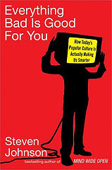
the cover of the book in questionHi Steven,

first up: I appreciate you coming over to defend yourself. The blogosphere is far too often self-reinforcing – the left (for example) reads left-leaning blogs and the right reads right-leaning blogs & there’s not a lot of dialogue between people on opposite sides, to everyone’s loss.

Here’s something that’s been nagging me for the past week or so: your book seems to effectively be conservative. Bear with me for a bit: I’m not saying that it’s Bill O’Reilly-style invective. I do think, however, that it effectively reinforces the status quo. Would I be wrong in taking away as the message of the book the chain of logic that:

  1. Our pop culture’s making us smarter.
  2. Therefore it must be good.
  3. Therefore we don’t need to change what we’re doing.

I’ll wager that you wouldn’t sign off on (3) & would argue that your book isn’t in the business of prescribing further action. I’m not accusing you of having malicious intentions, and we can’t entirely blame a writer for the distortions we bring to their work as readers (hey Nietzsche!). But I think (3)’s implicitly in the book: this is certainly the message most reviewers, at least, seem to be taking away from the book. Certainly you offer caveats (if the kids are watching television, there’s good television & there’s bad television), but I think this is ultimately a Panglossian view of the world: everything is getting better and better, we just need to stand back and let pop culture work upon us. Granted, the title may be a joke, but can you really expect us, the attention-deficit-addled masses, to realize that?

Even to get to (2) in that chain of reasoning, you need to buy into (1), which I don’t know that I do. Even before you can prove that rising intelligence is linked to the increased complexity of popular culture – which I’ll agree is interesting & does invite scrunity – you need to make the argument that intelligence is something that can be measured in a meaningful way. Entirely coincidentally – really – I happened to re-read Stephen Jay Gould’s Mismeasure of Man before starting in on EBIGFY; not, as I’m sure you know, a happy combination, but I think a relevant one. Not to reopen the internecine warfare of the Harvard evolutionary biology department in the 1990s, but I think the argument that Gould wrings out of the morass of intelligence/IQ studies still holds: if you know who your “smart” kids are, you can define “smartness” in their favor. There remain severe misgivings about the concept of g, which you skirt: I’m not an expert on the current state of thought on IQ, so I’ll skirt this too. But I do think it’s worth noting that while you’re not coming to Murray & Herrnstein’s racist conclusions, you’re still making use of the same data & methodology they used for The Bell Curve, the same data & methodology that Gould persuasively argued was fundamentally flawed. Science, the history of intelligence testing sadly proves, doesn’t exist outside of a political and economic context.

But even if smartness can be measured as an abstract quantity and if we are “smarter” than those of times past, to what end? This is the phrase I found myself writing over and over in the margin of your book. Is there a concrete result in this world of our being better at standardized tests? Sure, it’s interesting that we seem to be smarter, but what does that mean for us? Maybe the weakest part of your book argues that we’re now able to do a better job of picking political leaders. Are you living in the same country I’m living in? and watching the same elections? If we get any smarter, we’ll all be done for.

I’ll grant that you didn’t have political intentions in writing this, but the ramifications are there, and need to be explored if we’re going to seriously engage with your ideas. Technology – the application of science to the world in which we live – can’t exist in an economic and political vacuum.

we’ve come unstuck

Something’s gone wrong with our server, and if:book has gone back in time three years. We’re attempting to figure out the problem. In the meantime, if you’re looking for Bob Stein’s post on a unified field theory of publishing, click here to go directly to that post. Things will be back to normal soon! we hope.

a book is not a text: the noise made by people

The frontispiece for _Tristram Shandy_
Momus – a.k.a. Nick Currie, electronic folk musician, Wired columnist, and inveterate blogger – has posted an interesting short video on his blog, Click Opera. He’s teaching a class on electronic music composition & narrative for Benneton’s Fabrica in Venice. His video encourages students to listen for the environmental sounds that they can make with electronic instruments: not the sounds that they’re designed to make, but the incidental noises that they make – the clicking of keys on a Powerbook, for example – that we usually ignore as being just that, incidental. We ignore the fact that these noises are made directly by people, without the machine’s intercession.

Momus’s remarks put me in mind of something said by Jerome McGann at the Transliteracies conference in Santa Barbara last June – maybe the most important thing that was said at the conference, even if it didn’t warrant much attention at the time. What we tend to forget when talking about reading, he said, was that books – even regular old print books – are full of metadata. (Everybody was talking about metadata in June, like they were talking about XML a couple of years ago – it was the buzzword that everyone knew they needed to have an opinion about. If not, they swung the word about feverishly in the hopes of hitting something.) McGann qualified his remarks by referring to Ezra Pound’s idea of melopoeia, phanopoeia, and logopoeia – specific qualities in language that make it evocative:

. . . you can still charge words with meaning mainly in three ways, called phanopoeia, melopoeia, logopoeia. You can use a word to throw a visual image on to the reader’s imagination, or you charge it by sound, or you use groups of words to do this.

(The ABC of Reading, p.37) In other words, words aren’t always just words: when used well, they refer beyond themselves. This process of referring, McGann was claiming, is a sort of metadata, even if technologists don’t think about it this way: the way in which words are used provides the attuned reader with information about their composition beyond the meaning of the words themselves.

But thinking about McGann’s comments in terms of book design might suggest wider implications for the future of the book. Let’s take a quick excursion to the past of the book. Once it was true that you couldn’t judge a book by its cover. Fifty years ago, master book designer Jan Tschichold opined about book jackets:

A jacket is not an actual part of the book. The essential portion is the inner book, the block of pages . . . [U]nless he is a collector of book jackets as samples of graphic art, the genuine reader discards it before he begins.

(“Jacket and Wrapper,” in The Form of the Book: Essays on the Morality of Good Design) Tschichold’s statement seems bizarre today: nobody throws away book jackets, especially not collectors. Why? Because today we take it for granted that we judge books by their covers. The cover has been subsumed into our idea of the book: it’s a signifying part of the book. By looking at a cover, you, the prospective book-buyer, can immediately tell if a recently-published piece of fiction is meant to be capital-L Literature, Nora Roberts-style fluff, or somewhere in between. Contextual details like the cover are increasingly important.

Where does the electronic book fit into this, if at all? Apologists for the electronic book are constantly about the need for an ideal device as the be-all and end-all: when we have e-Ink or e-Paper and a well-designed device which can be unrolled like a scroll, electronic books will suddenly take off. This isn’t true, and I think it has something to do with the way people read books, something that hasn’t been taken into account by soi-disant futurists, and something like what Jerome McGann was gesturing at. A book is not a text. It’s more than a text. It’s a text and a collection of information around that text, some of which we consciously recognize and some of which we don’t.

A few days ago, I excoriated Project Gutenberg’s version of Tristram Shandy. This is why: a library of texts is not the same thing as a library of books. A quick example: download, if you wish, the plain text or HTML version of Tristram Shandy, which you can get here. Look at the opening pages of the HTML version. Recognizing that this particular book needs to be more than plain old seven-bit ASCII, they’ve included scans of the engravings that appear in the book (some by William Hogarth, like this; a nice explication of this quality of the book can be found here). What’s interesting to me about these illustrations that Project Gutenberg is how poorly done these are. These are – let’s not beat around the bush – bad scans. The contrast is off; things that should be square look rectangular. The Greek on the title page is illegible.

Let’s go back to Momus listening to the unintentional noises made by humans using machines: what we have here is the debris of another noisy computer, the noise of a key that we weren’t supposed to notice. Something about the way these scans is dated in a very particular way – half of the internet looked like this in 1997, before everyone learned to use Photoshop properly. Which is when, in fact, this particular document was constructed. In this ugliness we have, unintentionally, humanity. John Ruskin (not a name often conjured with when talking about the future) declared that one of the hallmarks of the Gothic as an architectural style was a perceived “savageness”: it was not smoothed off like his Victorian contemporaries would have liked. But “savageness”, for him, was no reproach: instead, it was a trace of the labor that went into it, a trace of the work’s humanity. Perfection, for him, was inhumane: humanity

. . . was not intended to work with the accuracy of tools, to be precise and perfect in all their actions. If you will have that precision out of them, and make their fingers measure degrees like cog-wheels, and their arms strike curves like compasses, you must unhumanize them . . 

(The Stones of Venice) What we have here is, I think, something similar. While Project Gutenberg is probably ashamed of the quality of these graphics, there’s something to be appreciated here. This is a text on its way to becoming a book; it unintentionally reveals its human origins, the labor of the anonymous worker who scanned in the illustrations. It’s a step in the right direction, but there’s a great distance still to go.

ron silliman: “the chinese notebook”

5. Language is, first of all, a political question.

The cover of Ron Silliman's _The Chinese Notebook_Like the problem of hunger in the world, the problem with publishing in the United States isn’t one of supply but one of distribution.

What’s worried me lately: that I go to airport bookshops and always see the same books. Because I live in New York, I can go to any number of specialized bookshops & find just about anything I want. The same is not true in many other parts of the country; the same is certainly not true in many other parts of the world. What worries me about airport bookshops is how few books they carry: how narrow a range of ideas is presented. May God help you if you’d like to buy anything other than Dan Brown in the Minneapolis/St. Paul airport. This is an exaggeration, but not by much. James Patterson is also available, as are the collected works of J. K. Rowling, and, for a limited time, those of J. R. R. Tolkien.

Into this emptiness is paraded the miracle of electronic publishing. As pushed by Jason Epstein, amongst others, the idea of print-on-demand will solve the question of supply forever more – you could go to a bookstore, request a book, and Barnes & Noble would print it out for you. (Let’s not think about copyright for the moment.) Jason Epstein believes these machines will be small enough to fit into an airport bookstore. This hasn’t happened yet, and I’m doubtful that it will any time soon, if at all. Booksellers have the supply & distribution issue down cold for Brown & Patterson & J. K. Rowling – they have no incentive to invest in these machines. When was the last time you, member of the reading public, went to complain to Barnes & Noble about their selection?

Until this marvelous future creates itself out of publishers’ good will towards humanity, people are presenting texts online, with varying degrees of success. If you have a laptop in the MSP airport (& a credit card to pay for wireless internet there), or, for that matter, any computer connected to the internet, you can go to ubu.com and browse their archive of documents of the avant-garde. Among the treasures are /ubu editions, an imprint that electronically reprints various texts as PDFs. They’re free. I have a copy of Ron Silliman’s The Chinese Notebook, a reprint of a 26-page poem which originally appeared in The Age of Huts. Ubu reprinted it (and the other two parts of The Age of Huts) with Silliman’s permission.

6. I wrote this sentence with a ballpoint pen. If I had used another, would it be a different sentence?

/Ubu editions (edited by Brian Kim Stefans) aren’t really electronic books, and don’t conceive of themselves as such. Rather, they are a way of electronically distributing a book. This PDF is 8.5” x 11”. While you can read it from a screen – I did – it’s meant to be printed out at home & read on paper. That said, this isn’t a quick and dirty presentation. Somebody (a mysterious “Goldsmith”) has gone to the trouble of making it an attractive object. It has a title page with attractive, interesting, and appropriate art (an interactive study by Mel Bochner from Aspen issue 5–6; ubu.com graciously hosts this online as well). There’s a copyright page that explains the previous. There’s even a half title page – somebody clearly knows something about book design. (How useful a half title page is in a book that’s meant to be printed out I’m not sure. It’s a pretty half title page, but it’s using another piece of your paper to print itself.) There’s also a final page, rounding off the total to 30 pages; if you print this off double-sided, you’ll have your very own beautiful stack of paper.

(Which is better than nothing.)

8. This is not speech. I wrote it.

Silliman’s text is (as these quotes might suggest) a list of 223 numbered thoughts about poetry and writing that forms a (self-contained) poem in prose. It is explicitly concerned with the form of language.

Karl Marx anticipating Walter J. Ong: “Is the Iliad possible when the printing press, and even printing machines, exist? Is it not inevitable that with the emergence of the press, the singing and the telling and the muse cease; that is, that the conditions necessary for epic poetry disappear?” (The German Ideology, p. 150; quoted in Neil Postman’s A Bridge to the 18th Century: How the Past Can Improve Our Future).

17. Everything here tends away from an aesthetic decision, which, in itself, is one.

Silliman’s text is nicely set – not beautifully, but well enough, using Baskerville. Baskerville is a neoclassical typeface, cool and rational, a product of the 18th century. Did Silliman think about this? Was the designer thinking about this? Is this how his book looked in print? in the eponymous Chinese notebook in which he wrote it? I don’t know, although my recognition of the connotations of the type inflects itself on my reading of Silliman’s poem.

21. Poem in a notebook, manuscript, magazine, book, reprinted in an anthology. Scripts and contexts differ. How could it be the same poem?

Would Silliman’s poem be the same poem if it were presented as, say, HTML? Could it be presented as HTML? This section of The Age of Huts is prose and could be without too many changes; other sections are more dependent on lines and spacing. Once a poem is in a PDF (or on a printed page), it is frozen, like a bug in amber; in HTML, type wiggles around at the viewer’s convenience. (I speak of the horrors HTML can wreak on poetry from some experience: in the evenings, I set non-English poems (in print, for the most part) for Circumference.)

47. Have we come so very far since Sterne or Pope?

Neil Postman, in his book, wonders about the same thing, answers “no”, and explains that in fact we’ve gone backwards. Disappointingly, there’s little reference to Sterne in Postman’s book, although he does point out that Oliver Goldsmith’s The Vicar of Wakefield was more widely read in the eighteenth century: possibly the literary public has never cared for the challenging.

Project Gutenberg happily presents their version of Tristram Shandy online in a plain text version: at certain points, the reader sees “(two marble plates)” or “(two lines of Greek)” and is left to wonder how much the text has changed between the page and the screen. Sterne’s novel, like Pope’s poetry, is agreeably self-aware: how Sterne would have laughed at “(page numbering skips ten pages)” in an edition without page numbers. There are a few lapses in ubu.com’s presentation of Silliman, but they’re comparably minor: some of the entries in Silliman’s list aren’t separated by a blank space, leading one to suspect the pagination was thrown out of whack in Quark. When something’s free . . .

53. Is the possibility of publishing this work automatically a part of the writing? Does it alter decisions in the work? Could I have written that if it did not?

A writer writes to communicate with a reader unknown. Publishers publish to make money. These statements are not always true – there’s no shortage of craven writers if there’s a sad dearth of virtuous publishers – but they can be taken as general rules of thumb. Where does electronic publishing fit into this set of equations? Certainly when Silliman was writing this twenty years ago he wasn’t thinking seriously about distributing his work over the Internet.

(Silliman has, for what it’s worth, an excellent blog, suggesting that had the possiblity been around twenty years ago, he would have been thinking about it.)

56. As economic conditions worsen, printing becomes prohibitive. Writers posit less emphasis on the page or book.

Why does ubu.com’s reprinting of Ron Silliman’s poetry seem more interesting to me than what Project Gutenberg is doing? Even the cheapest edition of Tristram Shandy that I can buy looks better than what they put out. (Ashamed of their text edition, one supposes, they’ve put out an HTML version of the book, which is an improvement, but not enough of one that I’d consider reading it for six hundred pages.) More to the point: it’s not that hard to find a copy of Tristram Shandy. You can even find one in one of the better airport bookstores. It’s out of copyright and any would-be publisher who wants to can print their own version of it without bothering with paying for rights.

I could not, alas, go to a bookstore and buy myself a copy of The Age of Huts because it’s been out of print for years. Thanks a lot, publishing. Good work. I could go to Amazon.com and buy a “used/collectible” copy for $113.20 – but precisely none of that money would go to Ron Silliman. But I don’t want a collectible copy: I’m interested in reading Silliman, not hoarding him. (Perhaps I start to contradict myself here.)

223. This is it.

But there are still questions. How do we ascribe value to a piece of art in a market economy? Are Plato’s ideas less valuable than those of Malcolm Gladwell because you can easily pick up the collected works of the first for less than 10% of what the two books of the second would cost you? when you can download old English translations for free on the Internet?

How valuable is a free poem on the Internet? How much more valuable is an attractive edition of a free poem on the Internet? even if you have to print it out to read it?

Why aren’t more people doing this?

infinite canvas comics

A while back, I posted on this demo (Flash, 8.4Mb) of Jef Raskin‘s proposed zooming interface for his Archy system. There’s more than an echo of that work in these infinite canvas comics made using the Tarquin Engine, a template for Macromedia Flash that lets authors easily create scrolling, zoomable comics. While I can’t say I’m enthralled by the content of any of the comics on display, there’s something exciting about the possibilities of the form. I do wish the format was free & open, enabling more dabbling by amateurs: there are clearly any number of directions that this could take.