Read Part 1
We had a highly productive face to face meeting with Ken this afternoon to review the prior designs and to try and develop, collaboratively, a solution based on the questions that arose from those designs. We were aiming for a solution that provides a compelling interface for Ken’s book and also encourages open-ended discussion of the themes and specific games treated in the book.
What we came up with was a prototype of a blog/book page that presents the entire text of GAM3R 7H30RY, and a discussion board based around the games covered in the book, each corresponding with a specific chapter. These are:
- Allegory (on The Sims)
- America (on Civilization III)
- Analog (on Katamari Damarcy)
- Atopia (on Vice City)
- Battle (on Rez)
- Boredom (on State of Emergency)
- Complex (on Deus Ex)
- Conclusions (on SimEarth)
Unlike the thousand of gaming forums that already exist throughout the web, this discussion space will invite personal and social points of view, rather than just walkthroughs and leveling up cheats.
We also discussed the fact that discussion boards tend towards opacity as they grow, and ways to alleviate that situation. Growth is good; it reflects a rich back and forth between board participants. Opacity is bad; it makes it harder for new voices to join the discussion. To make it easier for people to join the discussion, Ken envisioned an innovative gateway into the boards based on a shifting graph of topics ranked by post date (x-axis) and number of responses (y-axis). This solution was inspired in part by “The Pool” — “a collaborative online environment for creating art, code, and texts” developed by Jon Ippolito at the University of Maine — in which ideas and project proposals float in different regions of a two-dimensional graph depending on quantity and tenor of feedback from the collective.
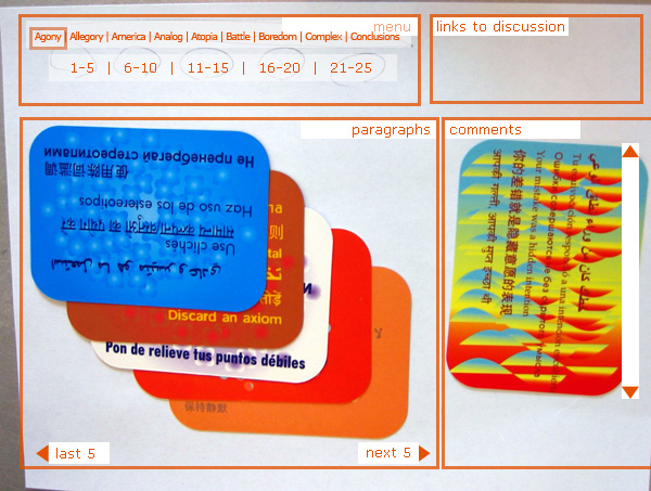
Returning to the book view, to push the boundaries of the blog form, we introduced a presentation format that uniquely fits around McKenzie’s book form—twenty-five regularly sized paragraphs in nine different chapters. Yes, each chapter has exactly 25 paragraphs, making mathematically consistent presentation possible (as an information designer I am elated at this systematic neatness). We decided on showing a cascade of five paragraphs, with one paragraph visible at a time, letting you navigate through chapters and then sets of five paragraphs within a chapter.
As a delightful aside, we started prototyping with a sheet of paper and index cards, but by some sideways luck we pulled out a deck of Brian Eno and Peter Schmidt’s Oblique Strategies cards, which suited our needs perfectly. The resulting paper prototype (photo w/ wireframe cues photoshop’d in):

This project has already provided us with a rich discussion regarding authorship and feedback. As we develop the prototypes we will undoubtedly have more questions, but also, hopefully, more solutions that help us redefine the edges and forms of digital discourse.
Ben Vershbow contributed to this post.

why is this so beautiful?
I think its coming along nicely, Jesse. It’s hard to know how people might like to interact with a book via the web, so its good thatw e can experiment with it a bit. As a writer, i’m still interested in big chunks of text, which is something the web is not yet ideal for. Hence books of the dead tree type still exist.
got anything you can show us yet?
i did a sample of the hacker manifesto,
but i’ve been waiting to put it up until i
see what you guys are doing here…
-bowerbird
our mockup of the above wireframe is here.
This represents a partially functional mockup only, and everything here is subject change/refinement/additions.
We’ve already made a few tweaks to the above. Plus, that only represents the book view section of the site — discussion forums will be an equal if not larger part of the endeavor. All told, still probably about a month til the whole thing is launched. Bowerbird, let us know where we can view your Hacker Manifesto sample.
hey bowerbird, i’d like to see your version of hackfest myself! I have seen some interesting versions of it. One as a graph. One as a sculpture. Readers are very inventive people. That’s part of the challenge of this GAM3R 7H30RY site, i think.
mckenzie said:
> hey bowerbird, i’d like to see your version of hackfest myself!
ok, i’ll throw it up somewhere, on thursday or friday.
but it ain’t pretty, being completely devoid of design.
> One as a graph. One as a sculpture.
well, i’m afraid my version is nothing so artsy.
it’s just a wireframe commenting infrastructure.
> Readers are very inventive people.
i’m more of a programmer on this than a reader.
but programmers can be inventive too… :+)
-bowerbird