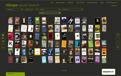
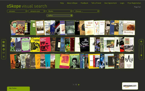
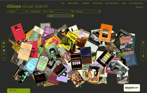
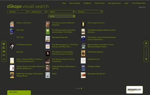
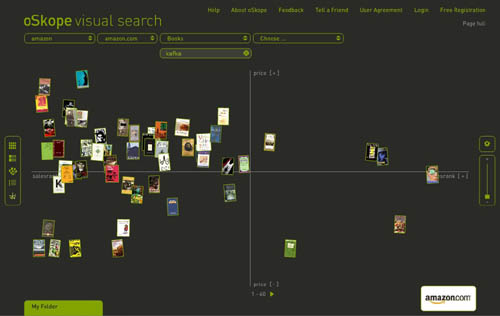
I just came across oSkope, a snazzy new “visual search assistant” built by a Zurich/Berlin outfit that allows you to graphically browse items on Amazon, ebay, Flickr or YouTube. More than a demo or prototype, it’s a fully functioning front end to the search engines of the afore-mentioned sites. I played around a bit in Amazon mode… below are some screenshots of a search for “Kafka” in Amazon’s book category. Each search cluster can be displayed in five different configurations (grid, stack, pile, list and graph), re-scaled with a slide bar, or rearranged manually by dragging items around. Click any cover and a small info window pops up with a link to the Amazon page. You can also drag items down into a folder for future reference. Very smooth, very tactile.
Grid:
Stack:
Pile:
List:
Graph (arranges items along axes of price and sales rank):
A few months back I linked to another visual Amazon browser from TouchGraph that arranges book clusters according to customer purchase patterns (the “people who purchased this also bought…”). I’m still waiting for someone to visualize the connections in the citation indexes: create a cross-referential map that shows the ligatures between texts (as pondered here). Each of these ideas is of course just an incremental step toward more advanced methods of getting the “big picture” view of digital collections.
oSkope, though it could still use some work (Flickr searching was unpredictable and didn’t seem to turn up nearly as much as what I’m sure is in their system, Ebay wasn’t working at all), is a relatively straightforward and useful contribution – ?more than just eye candy. It even helped me stumble upon something wonderful: a recently published study (appropriately, visual) of Kafka, a collab between comic artist R. Crumb and Kafka scholar David Mairowitz.
Browsing graphically is often more engaging than scanning a long list of results, and a crop of new tools – ?LibraryThing, Shelfari, Delicious Library, and now Google Books – ?have recently emerged to address this, all riffing in similar, somewhat nostalgic ways on the experience of shelves (Peter Brantley just blogged another idea in this vein). iTunes too has gotten in on this, its album cover flipper becoming a popular way to sift through one’s music collection.
Perhaps it’s telling, though, that these visual, shelf-inspired browsing tools are focused on old media: books, albums… all bounded objects. You couldn’t simply graft this onto web search and get the same effect (although page previews, of the sort that Snap provides, are becoming increasingly popular). For vast, shifting collections of unbounded, evolving, recombining, and in many cases ephemeral media, different vizualization tools are most likely needed. What might those be?
(oSkope link via Information Aesthetics)
if:book
A Project of the Institute for the Future of the Book

“For vast, shifting collections of unbounded, evolving, recombining, and in many cases ephemeral media, different vizualization tools are most likely needed. What might those be?”
The same kind of question seems to appear in the comments to bumptop 3D desktop project
http://www.youtube.com/watch?v=M0ODskdEPnQ