CommentPress, be it remembered, is a blog hack. A fairly robust one to be sure, and one which we expect to get significant near-term mileage out of, but still an adaptation of a relatively brittle publishing architecture. BookGlutton – ?a new community reading site that goes public beta next month – ?takes a shot at building social reading tools from scratch, and the first glimpses look promising. I’m still awaiting my beta tester account so it’s hard to say how well this actually works (and whether it’s Flash-based or Ajax-driven etc.), but a demo on their development blog walks through most of the social features of their browser-based “Unbound Reader.” They seem to have gotten a lot right, but I’m still curious to see how, if at all, they handle multimedia and interlinking between and within books. We’ll be watching this one closely…..Also, below the video, check out some explanatory material by BookGlutton’s creators, Aaron Miller and Travis Alber, that was forwarded to us the other day.
The first, the main BookGlutton website, is a catalog and community where users can upload work or select a piece of public domain writing, create reading groups and tag literature. The second part of the site – its centerpiece – is the Unbound Reader. It has a web-based format where users can read and discuss the book right inside the text. The Unbound Reader uses “proximity chat,” which allows users to discuss the book with other readers close to them in the text (thus focusing discussion, and, as an added benefit, keeping people from hearing about the end). It also has shared annotations, so people can leave a comment on any paragraph and other readers can respond. By encouraging users to talk in a context-specific way about what they’re reading, Bookglutton hopes to help those who want to talk about books (or original writing) with their friends (across cities, for example), students who want to discuss classic works (perhaps for a class), or writers who want to get feedback on their own pieces. Naturally, when the conversation becomes distracting, a user can close off the discussion without exiting the Reader.
Additionally, BookGlutton is working to facilitate adoption of on-line reading. Book design is an important aspect of the reader, and it incorporates design elements, like dynamic dropcaps. Moreover, the works presented in the catalog are standards-based (BookGlutton is an early adopter of the International Digital Publishing Forum’s .epub format for ebooks), and allows users to download a copy of anything they upload in this format for use elsewhere.
Monthly Archives: October 2007
wood book seed key water word
Thanks to James Long of Pan Macmillan for this link to the 370 Day Project, a huge wooden book made by South African artist Willem Boshoff:
CLICK HERE
Boshoff writes:
“I have been playing with the concept of secrecy in my work,” Boshoff said, “because I believe it plays a vital part in nature and in the universe. But I have tried to use it creatively.
“This is an intensely personal statement, and I look upon it in the same light as a book. A book is closed and concealed once it is read until you reopen it, perhaps only once or twice in a lifetime, for a reminder, or for a refreshment…”
Steve Dearden, a key figure on the Literature Development scene in the UK sent me this link to Christopher Woebken’s http://NEW SENSUAL INTERFACES
Finally, Julius Popp’s bit.fall, seems relevant here – it isn’t new, but it’s beautiful.
Bit.Fall – MyVideo
of forests and trees
On Salon Machinist Farhad Manjoo considers the virtues of skimming and contemplates what is lost in the transition from print broadsheets to Web browsers:
It’s well-nigh impossible to pull off the same sort of skimming trick on the Web. On the Times site, stories not big enough to make the front page end up in one of the various inside section pages — World, U.S., etc. — as well as in Today’s Paper, a long list of every story published that day.
But these collections show just a headline and a short description of each story, and thus aren’t nearly as useful as a page of newsprint, where many stories are printed in full. On the Web, in order to determine if a piece is important, you’ve got to click on it — and the more clicking you’re doing, the less skimming.
Manjoo notes the recent Poynter study that used eye-tracking goggles to see how much time readers spent on individual stories in print and online news. The seemingly suprising result was that people read an average of 15% more of a story online than in print. But this was based on a rather simplistic notion of the different types of reading we do, and how, ideally, they add up to an “informed” view of the world.
On the Web we are like moles, tunneling into stories, blurbs and bliplets that catch our eye in the blitzy surface of home pages, link aggregators, search engines or the personalized recommendation space of email. But those stories have to vie for our attention in an increasingly contracted space, i.e. a computer screen -? a situation that becomes all the more pronounced on the tiny displays of mobile devices. Inevitably, certain kinds of worthy but less attention-grabby stories begin to fall off the head of the pin. If newspapers are windows onto the world, what are the consequences of shrinking that window to the size of an ipod screen?
This is in many ways a design question. It will be a triumph of interface design when a practical way is found to take the richness and interconnectedness of networked media and to spread it out before us in something analogous to a broadsheet, something that flattens the world into a map of relations instead of cramming it through a series of narrow hyperlinked wormholes. For now we are trying to sense the forest one tree at a time.
booker shortlist set free
CORRECTION: a commenter kindly points out that the Times jumped the gun on this one. What follows is in fact not true. Further clarification here.
The Times of London reports that the Man Booker Prize soon will make the full text of its winning and shortlisted novels free online. Sounds as though this will be downloads only, not Web texts. Unclear whether this will be in perpetuity or a limited-time offer.
Negotiations are under way with the British Council and publishers over digitising the novels and reaching parts – particularly in Africa and Asia – that the actual books would not otherwise reach.
Jonathan Taylor, chairman of The Booker Prize Foundation, said that the initiative was well advanced, although details were still being thrashed out.
The downloads will not impact on sales, it is thought. If readers like a novel tasted on the internet, they may just be inspired to buy the actual book.
the noble rot
Observe these gorgeous Rorshach mold blots blooming their way across the pages of old books. A video by Ben Hemmendinger, found on Vimeo.
The piece is titled “Edelfäule,” which a little Googling reveals to be German for “noble rot” -? “referring to BOTRYTIS CINEREA, the beneficial mold responsible for the TROCKENBEERENAUSLESE wines.” (Epicurious Wine Dictionary).
Thanks Alex for the link!
googlesoft gets the brush-off
This is welcome. Several leading American research libraries including the Boston Public and the Smithsonian have said no thanks to Google and Microsoft book digitization deals, opting instead for the more costly but less restrictive Open Content Alliance/Internet Archive program. The NY Times reports, and explains how private foundations like Sloan are funding some of the OCA partnerships.
machinimacroatia
The first machinima festival to be held in Europe took place at DMU in Leicester – and in Second Life – on 12-14 October. This quickly-growing genre fuses film-making and computer gaming to provide a quick and cost-effective way to create animated films. Bob Stein’s interview in This Spartan Life is a wonderful example.
Best Experimental award went to Cirque du Machinima: Cuckoo Clock by Tom Jantol of Croatia. it’s great to see something made in this way which has such a thoroughly non-Hollywood aesthetic. There’s amazing potential here for writers – and readers – to create visualisations of work without teams of techies and budgets of millions.
playing with words
In London next week our first if:book:group brings together a small group of people from the worlds of new media, literature, theatre and playground design to discuss Narrative, Interactivity and Play.
New media fiction has been described as writing in colour rather than black and white. It’s a winning description, but they say radio has better pictures than TV, and the same may still be true of a good story in print versus a slow and clunky multimedia experiment with swimming text and sludgy soundtrack. But things are changing fast.
A funky new reader device – like the pinchable, strokeable iPhone perhaps – and, more importantly, a truly riveting, essentially digital masterpiece could quickly bring a mass readership to this kind of literature.
My sister and I have just bought my mother a widescreen tv. Mum felt I was trying to foist a monstrosity on her. Why would she want some huge, ugly screen dominating her sitting room, what was wrong with the (tiny) telly she already owned? After sleepless nights worrying she’d hate it, in the event, her conversion took less than five minutes. A schools’ programme about the Nile won her round. The quality of sound and image is outstanding; instead of getting an illustrated talk about a place, this screen transports her there.
The boundaries between page and screen, inside and outside, imagination and reality are shifting around us. We are fumbling towards new ways to make and publish fictions online. Interaction needs to be more than the multiple choice options for what’s next. Readers want to inhabit a good book, not be pressured into helping to write it. This was a point made by Guy Parsons, one of the team involved in the PerplexCity game, at a seminar on 27th September on the Reader/Writer Mash Up organised by the Reading Agency and Creative Partnerships in London
Earlier that month an ‘Unconference’ at the Institute of Creative Technologies, De Montfort University, raised the question of what skills we need to make and read multi-platform narratives. Are the channel hopping, multi-tasking children of today exhibiting attention deficit or vital skills in transliteracy?
Instead of visiting one site a time, now we go to our screens and mix up for ourselves a cocktail of activity: emailing friends, checking news feeds, googling for information and surfing fpr pleasure, writing our own documents while listening to music, taking a break to watch a youtube or two… This is the wwwreader in creative control.
Snug & Outdoor is a playground design company I work with which has developed a kit of abstract shapes that children themselves can arrange as they wish to reshape the schoolyard into a changing playscape. The Snug Kit, launched this November, has grown out of observation of how children actually play; they don’t enact complete adventures but drop in and out of narrative threads – walk along a wall and you’re escaping across a chasm; clamber up a tree and you’re creeping up on an enemy; enter an enclosed space and it becomes a homestead where imaginary meals are cooked and served.
So if children so effortlessly switch narratives in their play, how come I still get hooked on formulaic TV and film, over and over and over drawn in by the need to find out whodunnit, whether boy gets girl or goody escapes baddy, when we all know what’s bound to happen and have no reason to care if it didn’t? Can we overcome our addiction to conclusions and find more compelling ways to play with those seven core stories of which all fiction is made?
To be continued…
ted nelson is still on the job
It’s been a while since we’ve mentioned Ted Nelson on this blog. Ted Nelson came up with the idea of hypertext in 1963; since then, in his estimation, most of what’s happened in computer interfaces and the way we use electronic documents has been a colossal disappointment. This would be a presumptuous idea to have, but Nelson does have some claim to being a genius, and his analyses of what’s wrong with the way we use computers are cogent and worth taking seriously. If you have an hour, there’s a worthwhile video of him presenting the basics of his ideas at Google at GoogleVideo. There’s an even better (if longer) presentation of a talk he gave at Oxford in 2005, where he holds forth on the history of science and technology, why the systems that win out aren’t necessarily the best ones, and what’s wrong with the standard metaphors of cut, copy, and paste as used on computers since 1984. Nelson’s a computer scientist, but he’s talking about issues that increasingly affect everyone in today’s world. Viewing both – especially in the first, where his audience is an unenthusiastic group of Google engineers – it’s hard not to feel some sympathy for him as a romantic figure. His view of technology bears a certain similarity with the view of American history laid out in Thomas Pynchon’s Mason & Dixon: that of vast potential squandered in the name of power and the market.
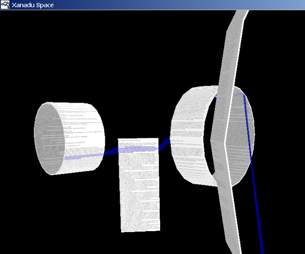
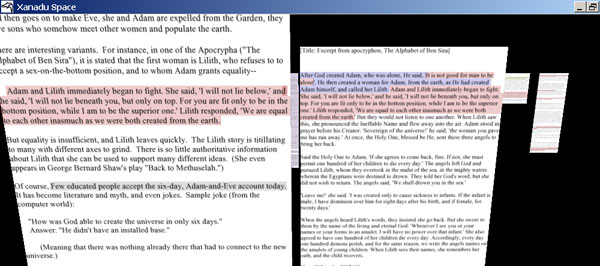
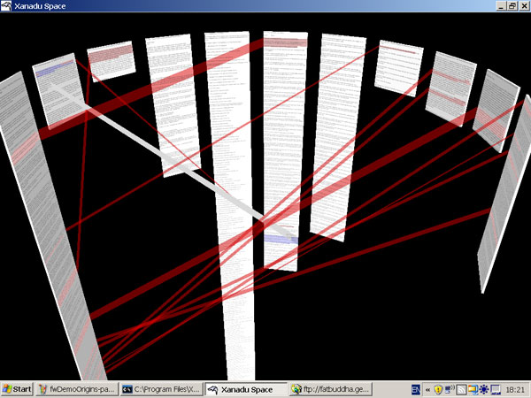
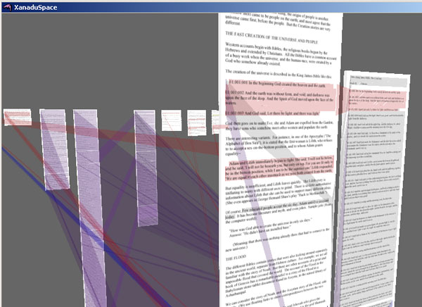
As I’ve argued before, Ted Nelson’s ideas are essential to engage with if we’re thinking seriously about how we compose and read using computers. His central thesis (which is strangely echoed by Gary Frost‘s comments on this blog) is that from Xerox PARC on, electronic documents have been designed to mimic their paper antecedents. In Nelson’s view, this is where everything went wrong: electronic documents could and should behave entirely differently from paper ones. Since 1960, Nelson’s been attempting to remedy this problem by creating a replacement for the World Wide Web which he calls Project Xanadu. In 1995, Wired termed it the “longest-running vaporware story in the history of the computer industry”. Twelve years later, Project Xanadu isn’t much closer to replacing the web, but it’s somewhat less vaporware: Nelson’s group has released Xanadu Space, Windows-only software that lets you create primitive transcluded documents. We unfortunately don’t have a PC in the office to try it out on, but you can see Nelson running it in the Google video, and there are intriguing screenshots:
There’s more information here; I’d be curious to hear how well it actually works.
commentpress and the communications circuit
So much to say about this but for the moment I only have time for a quick link. Our close friend and colleague Kathleen Fitzpatrick just published a must-read paper on MediaCommons, in conjunction with the Journal of Electronic Publishing. The paper is about CommentPress, but it’s a lot more than that. It’s a deep look at how Internet-based technologies hold the potential for a large-scale shift in scholarly communication toward a more communal model, taking CommentPress as just a small intimation of things possibly to come. What’s particularly gratifying for this reader is how Kathleen puts CommentPress in the larger context from which it was developed-?in particular, the rise of blogs and the move in some wired circles of the academy back to something resembling the coffeehouse model of scholarly conversation.
Two years ago we held an informal meeting of leading academic bloggers to discuss how this new Web-based conversation perhaps contained the seeds of broader change in scholarly publishing. Out of the ideas that were thrown about in that meeting grew our series of blog hacks that we loosely termed “networked books,” which, in turn, eventually evolved into CommentPress (not to mention MediaCommons). Kathleen’s paper brilliantly draws it all together.
Of course, CommentPress represents only the tiniest step forward. But perhaps out of Kathleen’s elegant, lucid argument we can draw the idea for the next experiment. To that end, I urge everyone to spend time on the CommentPress version (always nice when form engages so directly with content) and to continue the conversation there.
p.s. -? also feel free to look at an earlier version of this paper, which Kathleen workshopped in CommentPress.


